Brand & Web Design for New Way Spanish

Embark on New Ways' Spanish Speaking Journey...
Dive into the immersive world of New Way Spanish, a program crafted exclusively for adults seeking more than just traditional language classes. Their approach is centered on active engagement, real-world practice, and cultural immersion—key ingredients for achieving true fluency in Spanish.

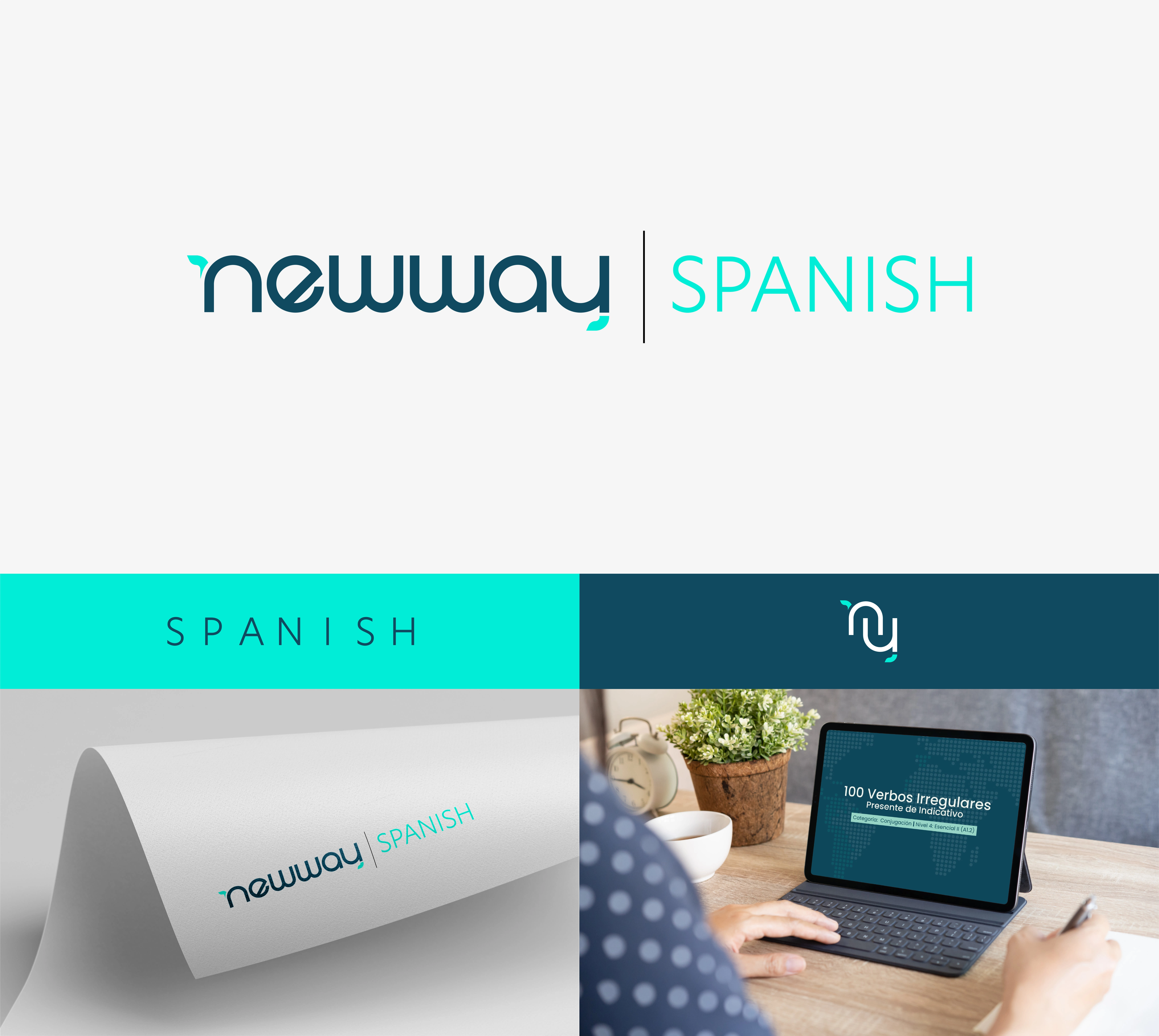
When conceptualizing the New Way Spanish logo, I opted for a stylized version of the company's name. Notice the unique graphic termination on the letters "N" and "Y," symbolizing the continuous process of learning a new language—one that never truly ends.

Color Palette and Pattern
The color "Biscay Blue" signifies education and innovation, while "Bright Turquoise" represents the promising future that language mastery can unfold. Our secondary color palette mirrors the various stages of our learning program, serving as accents and highlights in New Way's communications.
The outcome? A vibrant and dynamic brand that has seamlessly connected with our target audience, drawing in more eager students.

Website, Social Media, and Presentation.
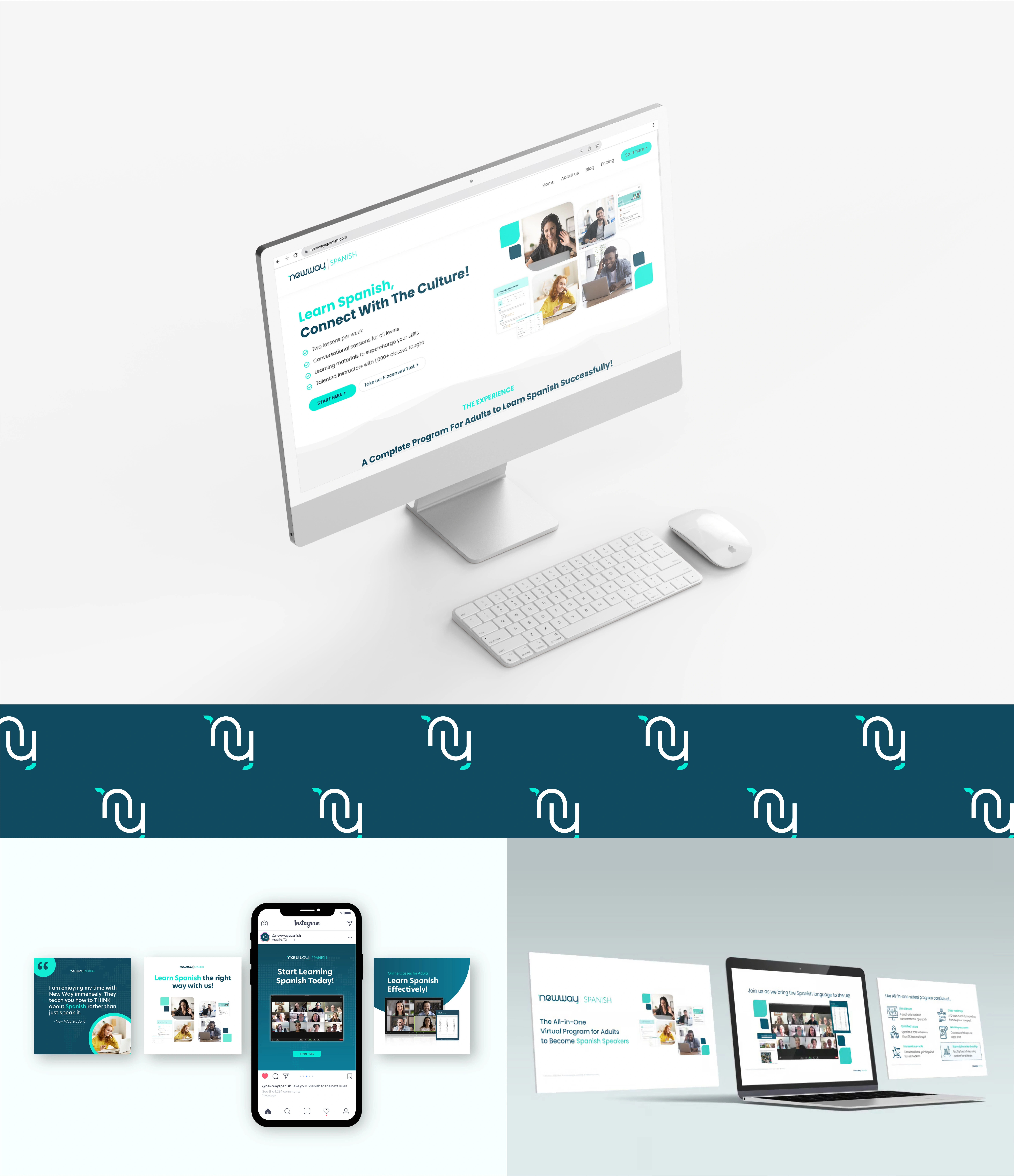
As New Way expanded its horizons, a new website became essential to showcase its evolving programs and services. Enter a minimalist and modern 5-page website meticulously designed to spotlight its offerings and upcoming services. Experience it live at newwayspanish.com
Like this project
Posted Nov 9, 2023
Crafted with creativity and purpose, the New Way Spanish brand resonates with vibrancy, seamlessly connecting with its audience.


