Brand Identity Website Design for Primary Care
Obstudio .co
Primary revolutionizes medical practices by combining the best of human touch and technology. We designed a brand identity for them that is as warm as it is modern, bringing together two worlds: the IRL and the virtual.
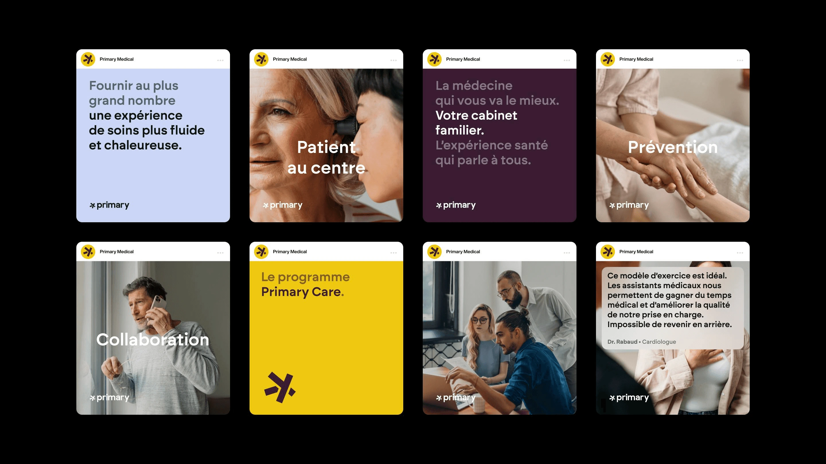
The logo, with its unique typography, incorporates the XY symbols of medicine and the five branches of primary care, reflecting the ease of use of the service. To build trust, forget the magazines published 10 years ago in the dark waiting room of your GP. The art direction focuses on a warm yellow palette, softs rounded edges and illustrations combining drawing and 3D. The photography emphasizes the human touch, reinforcing the bond between patient and practitioner.
The branding extends to the practitioner's gowns and practice decorations, designed for Primary's interior designers.
Medicine is an exact science, and so is design.
Client:
Primary CareDate:
2024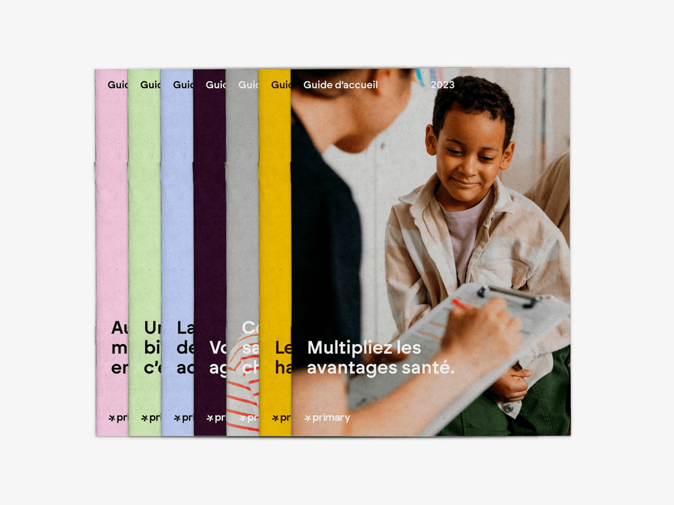
Like this project
Posted Jun 4, 2025
Designed a modern brand identity for Primary Care, combining human touch and technology.
Likes
2
Views
9
Timeline
Jun 24, 2024 - Aug 13, 2024