Alloy | Jewellery Lookbook
Vladana Stepanets
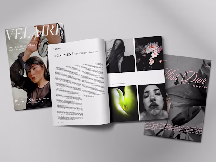
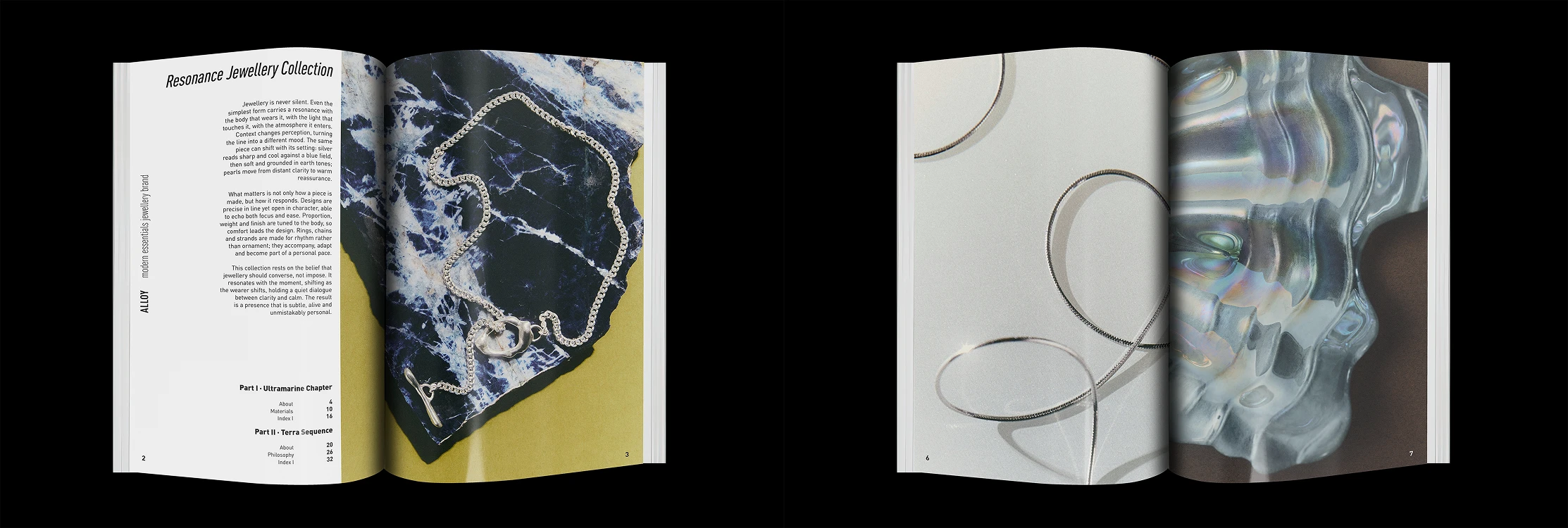
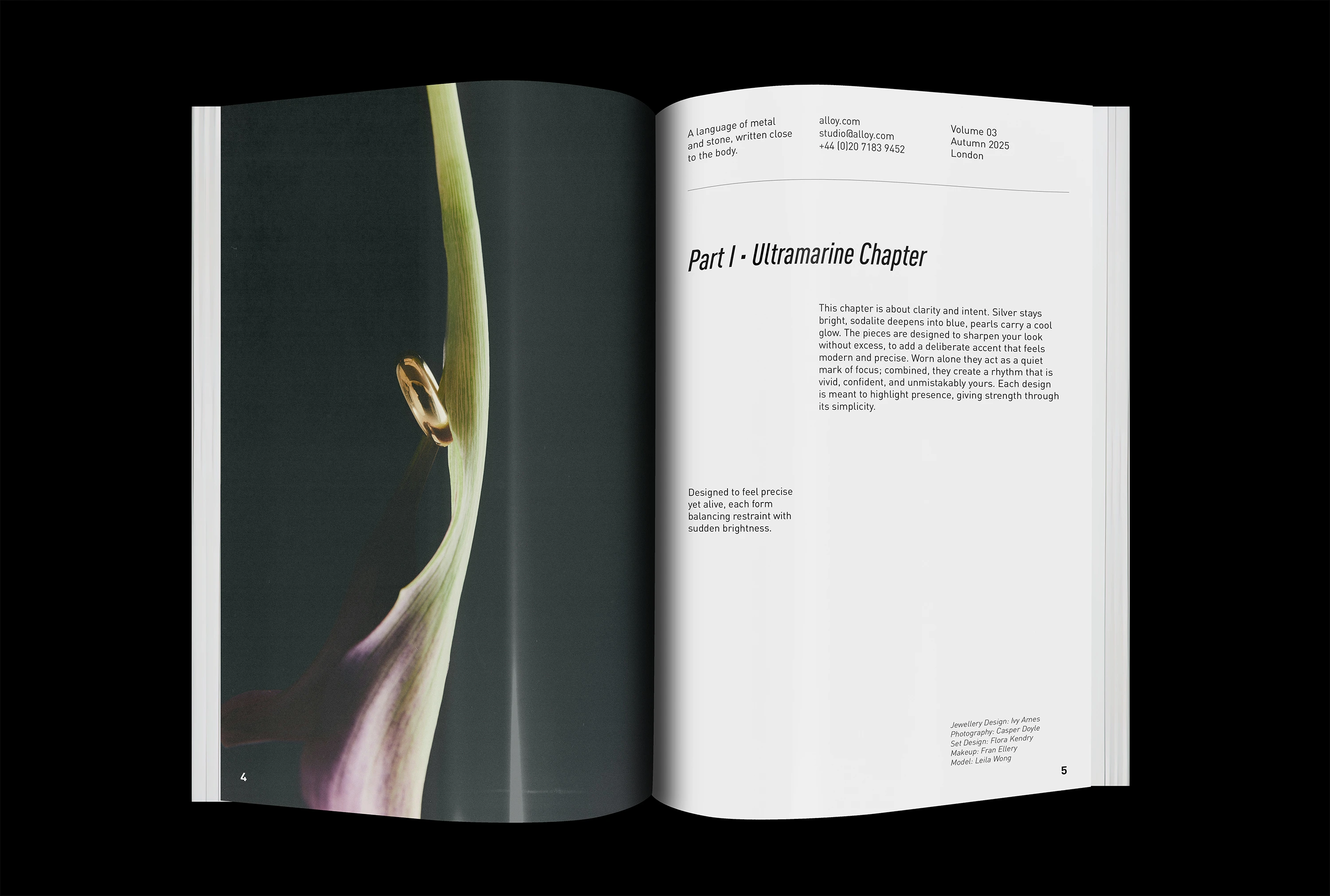
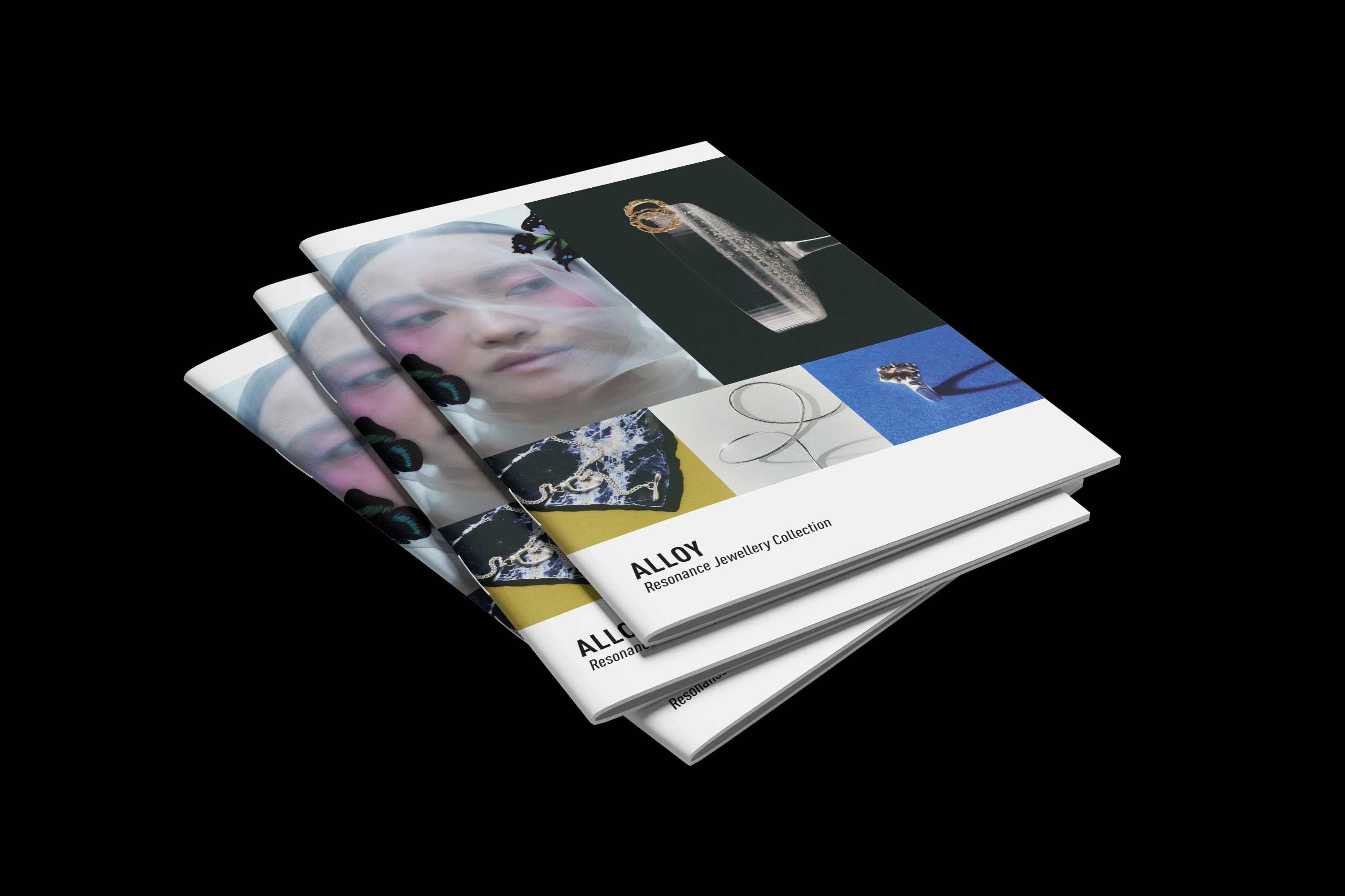
Alloy — Resonance Jewellery Collection · Lookbook
Universal pieces, two moods, one editorial system
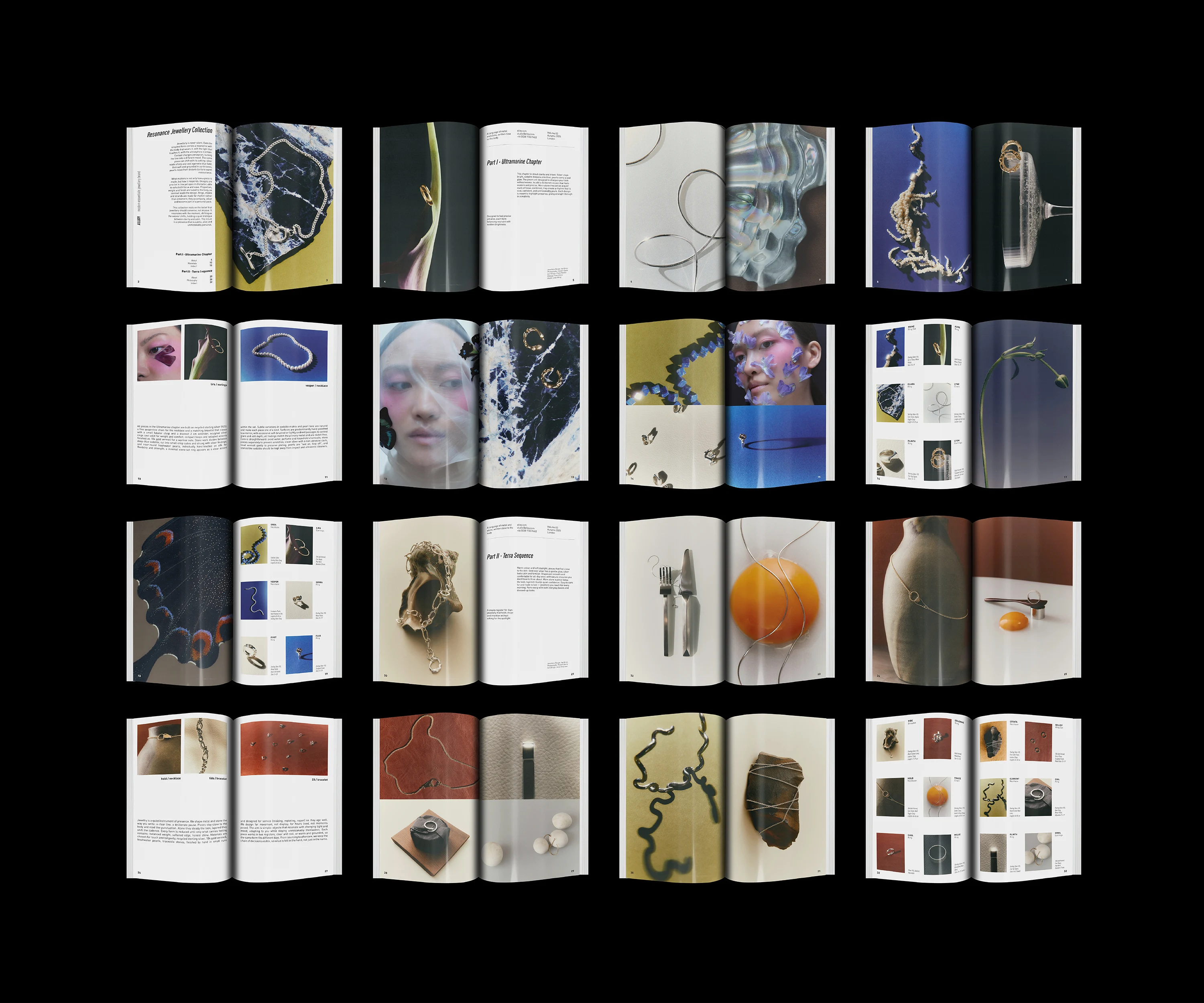
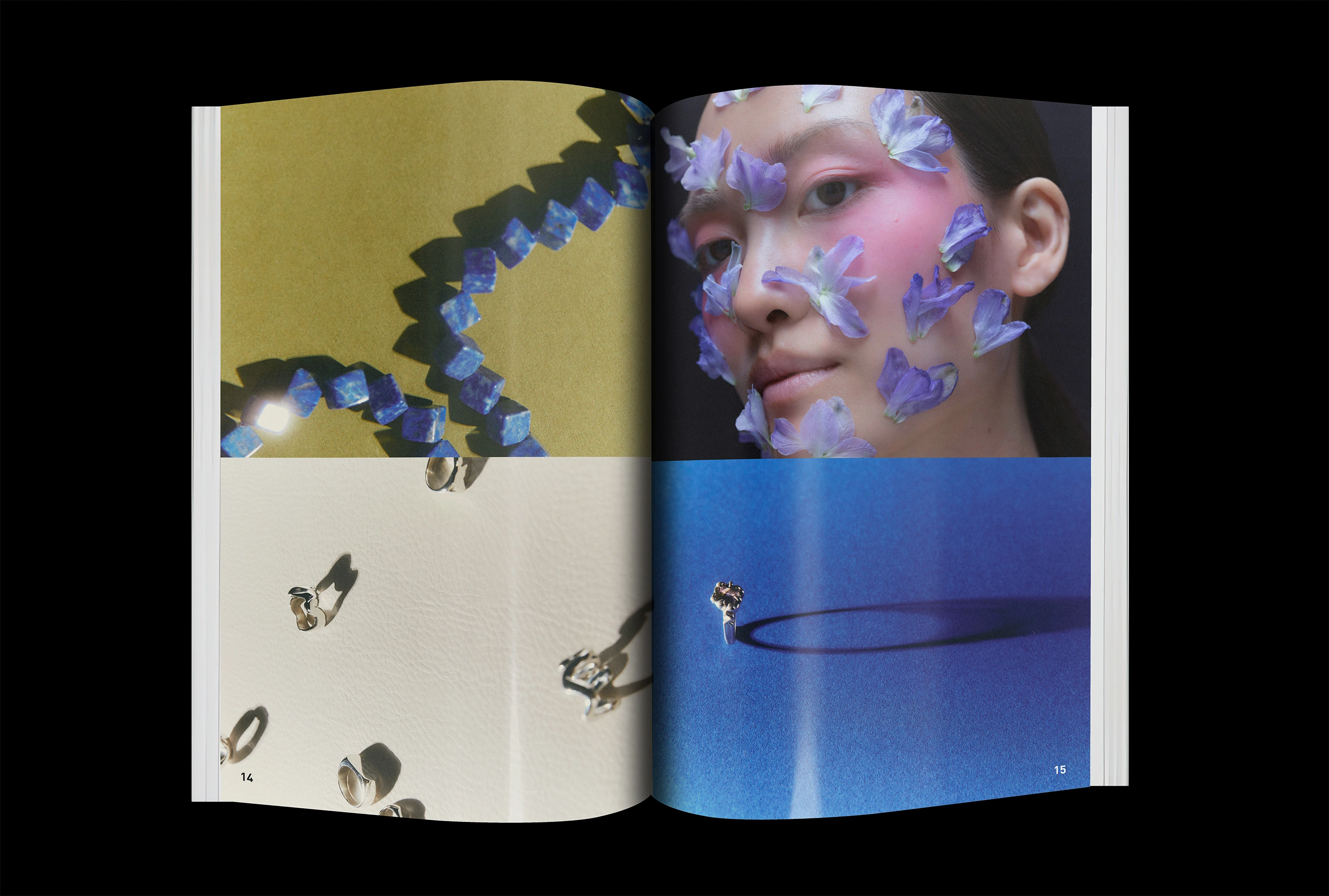
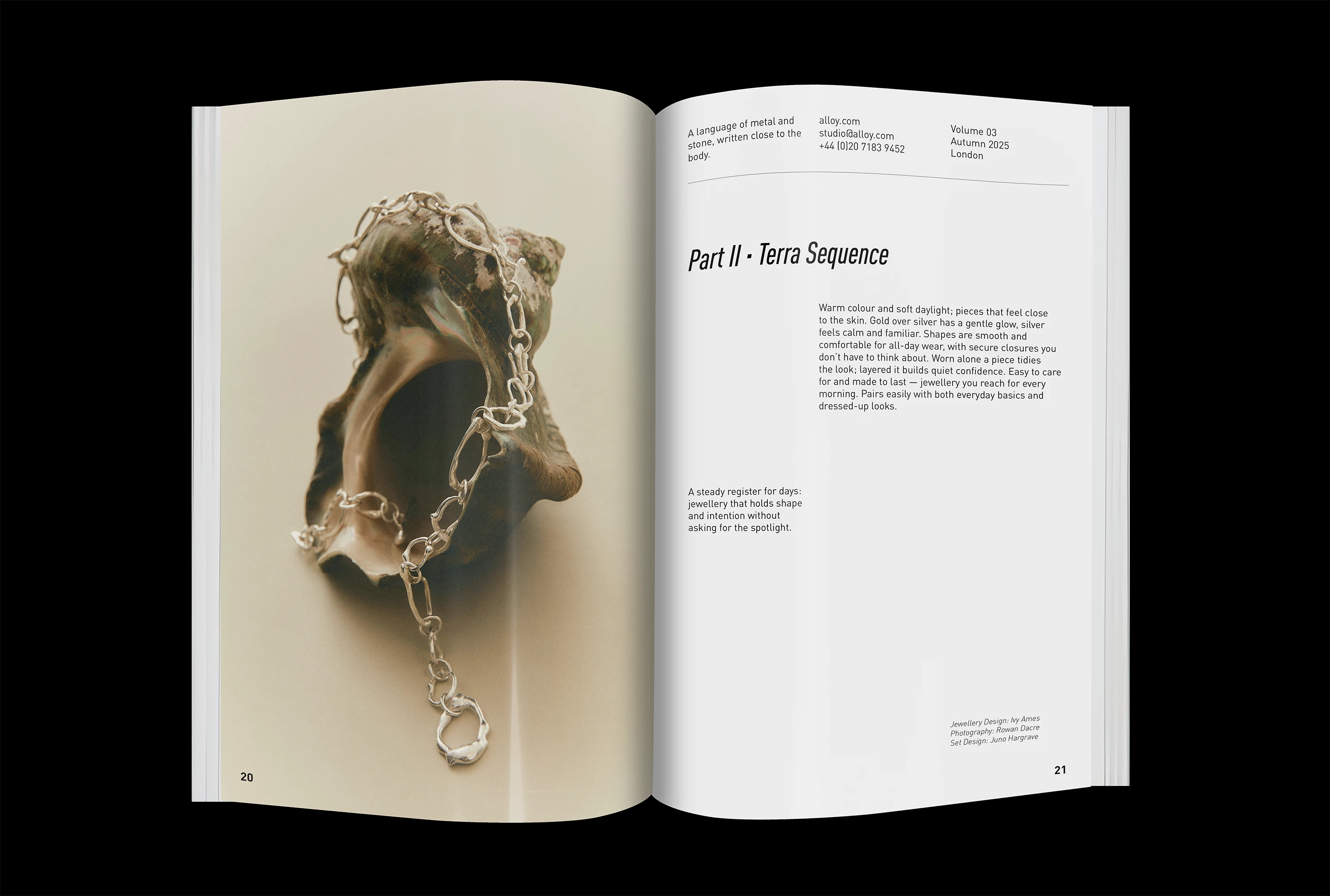
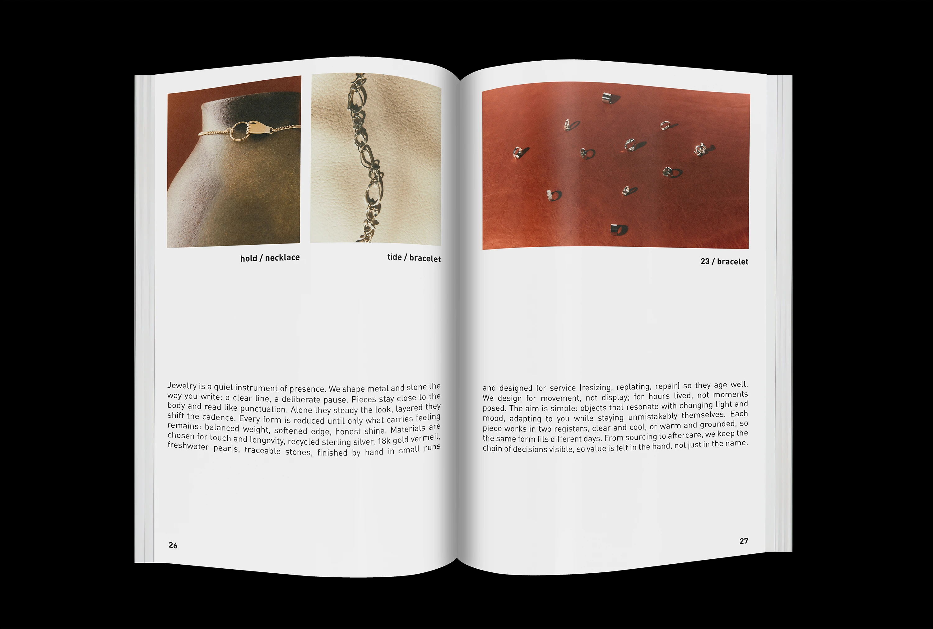
The goal was to reveal the collection and shape it into a complete, readable editorial object. The photography leads: the lookbook puts images first, supports them with clear pacing, and adds a precise structure that holds the story together. One vision contains two chapters that show the same pieces in different registers: Ultramarine reads vivid and precise; Terra reads warm and grounded.
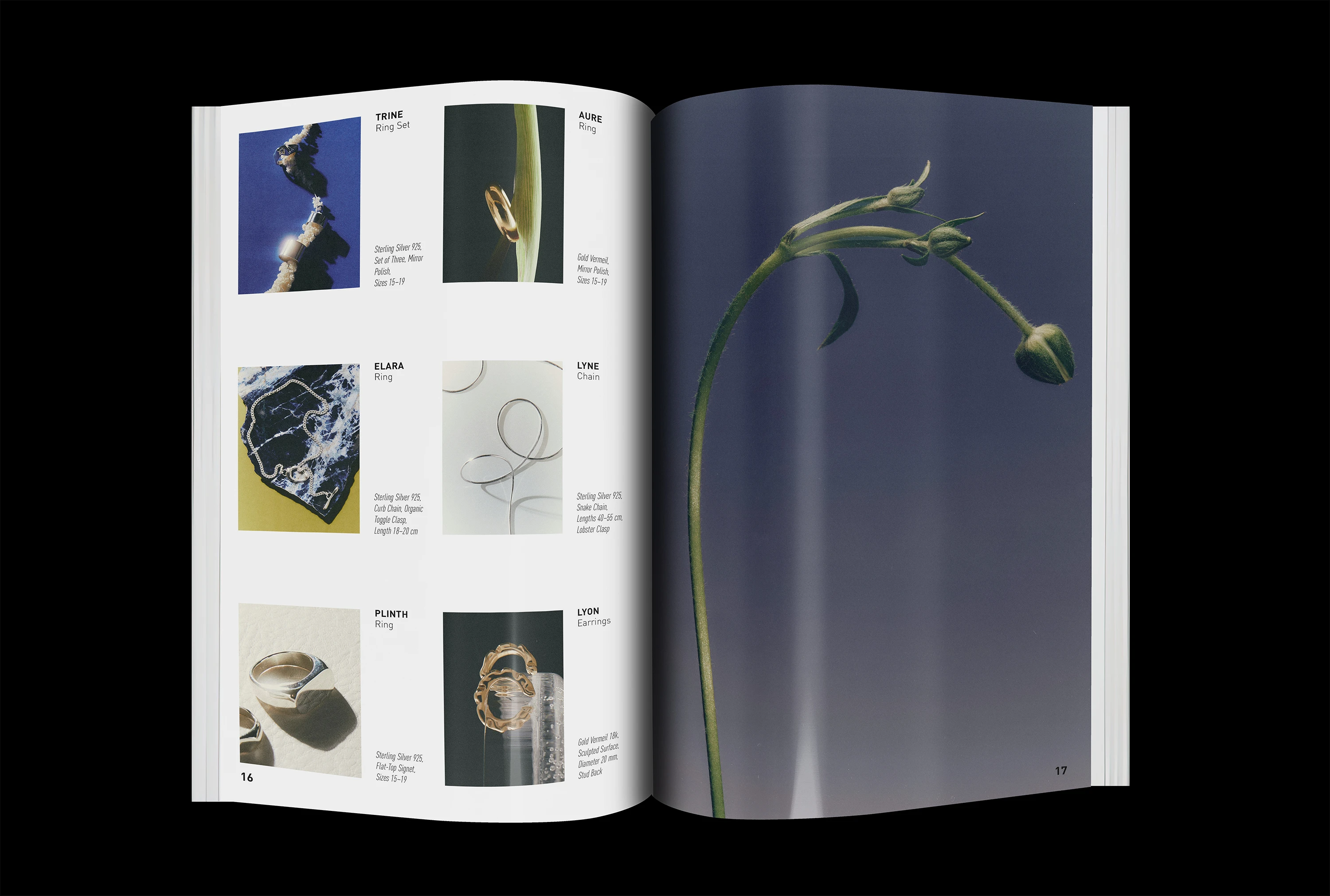
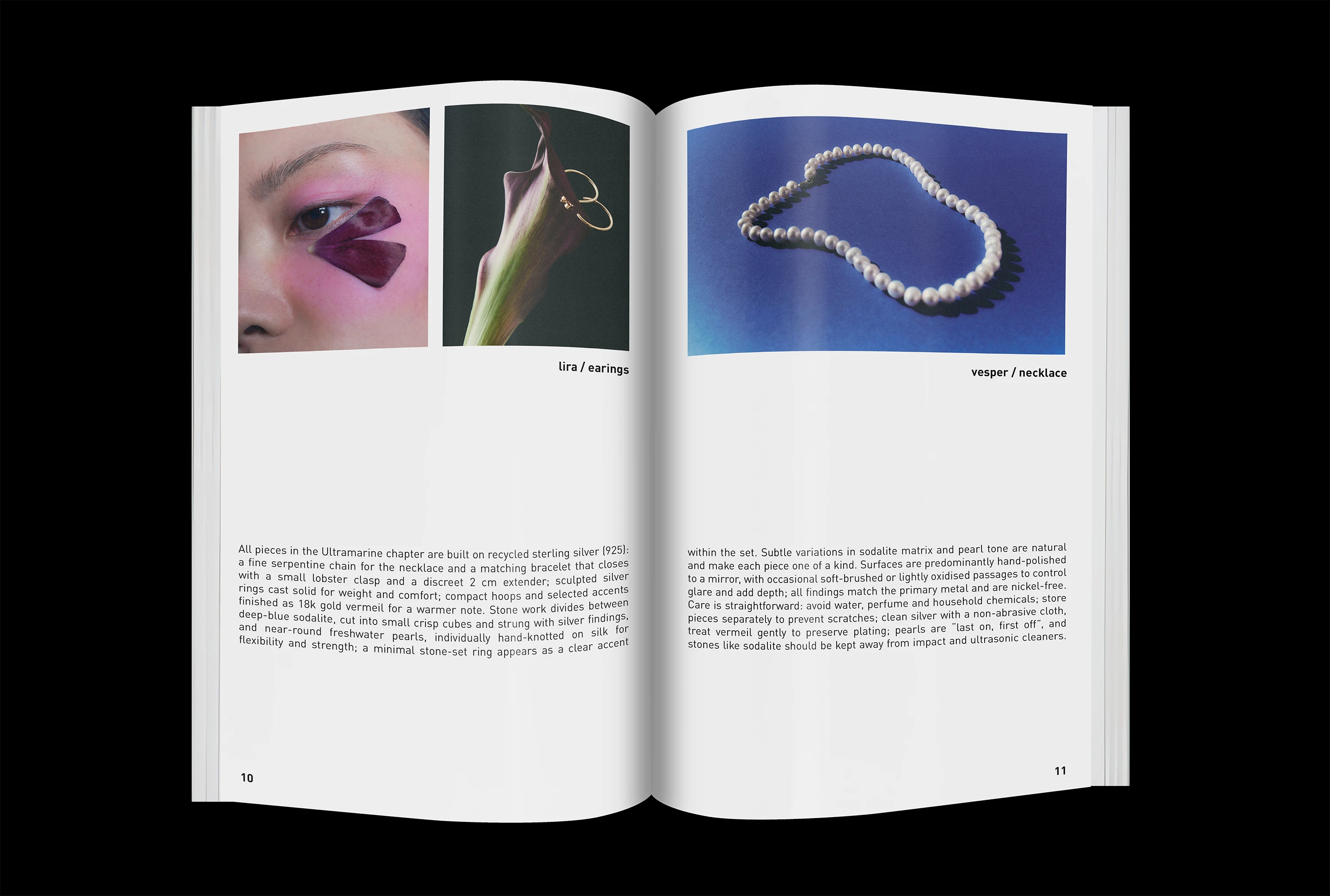
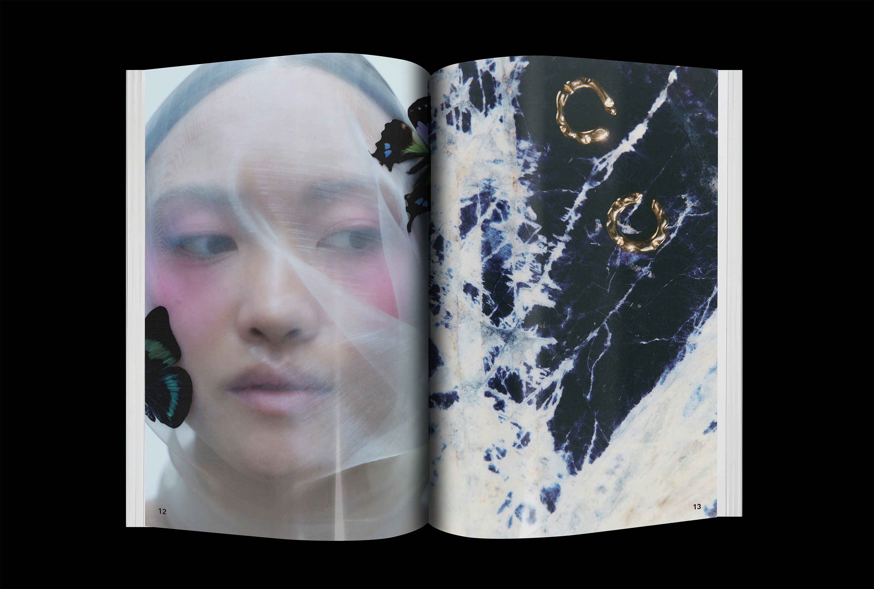
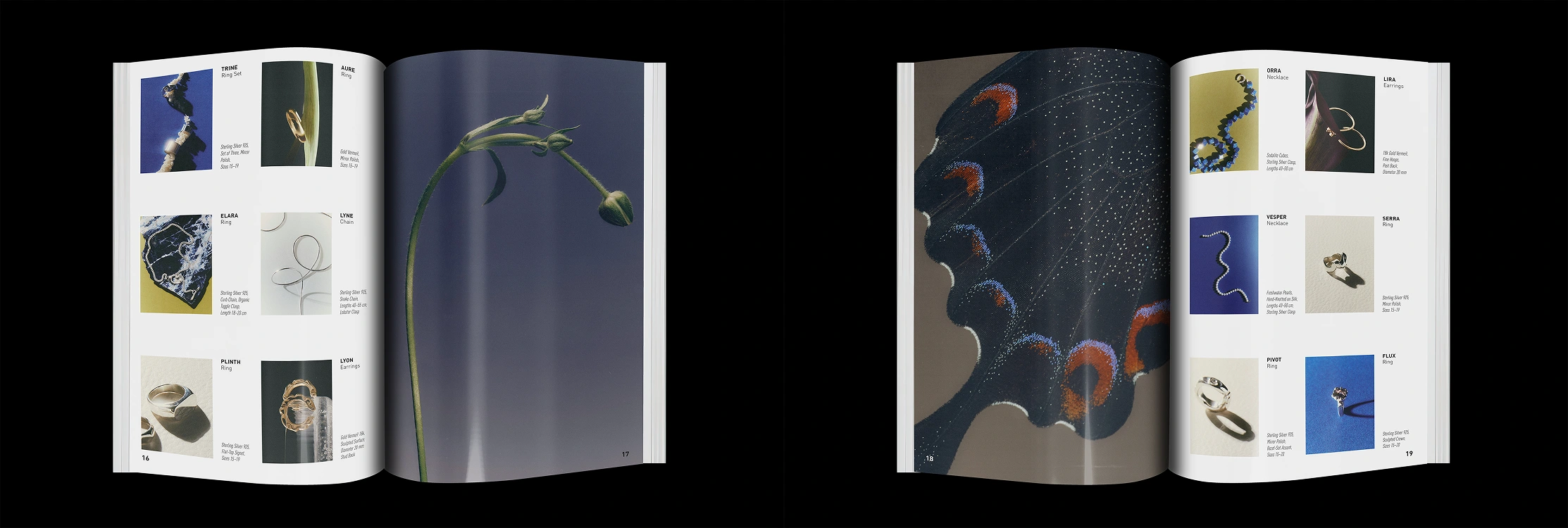
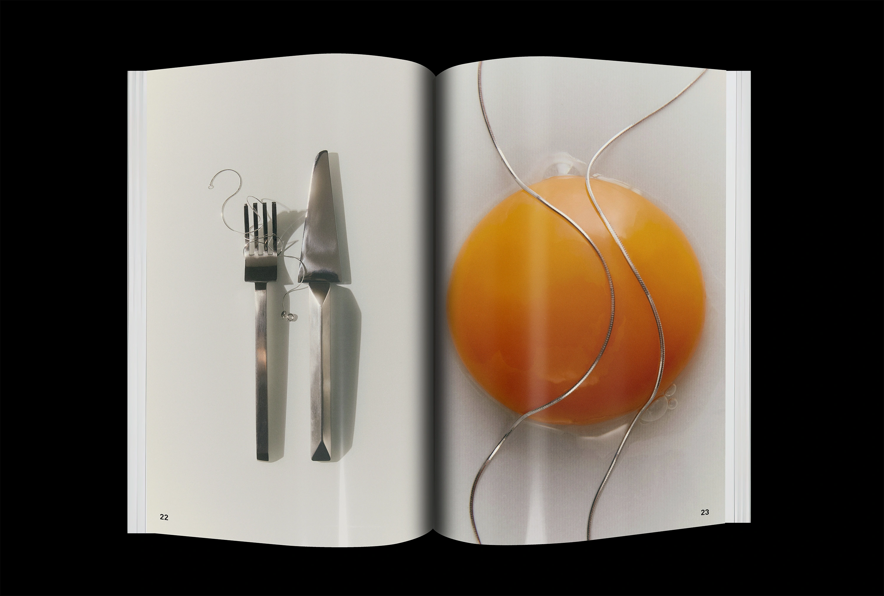
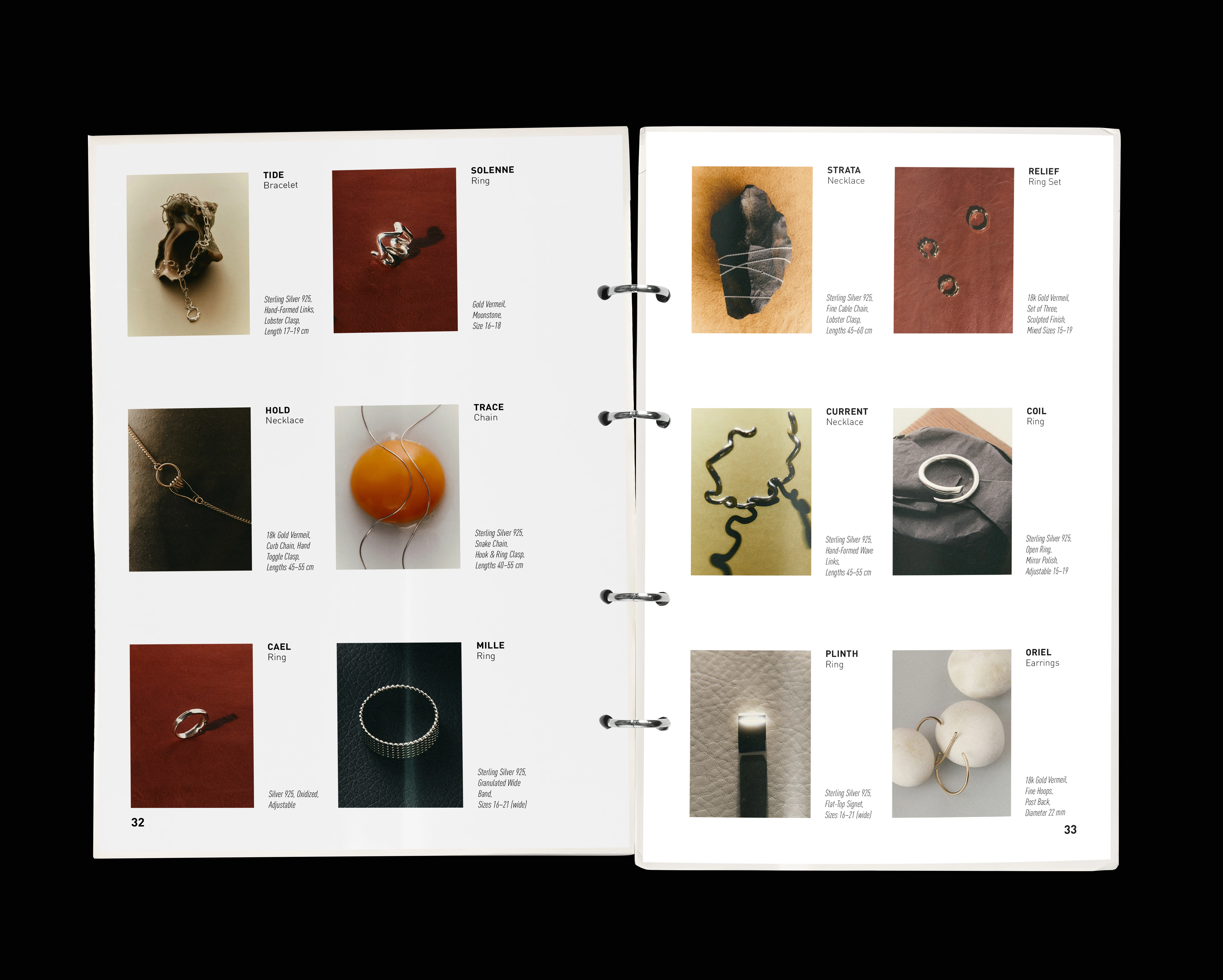
Each chapter runs as one flow: full-bleed opener, a one-page introduction, continuous plates. Every chapter also includes two editorial anchors: a Philosophy spread that states the idea in plain language, and, where relevant, concise Materials and Care notes embedded inside that spread rather than as a separate section. The sequence stays cinematic while giving the reader a compact, useful layer of information.
The system uses DIN Pro as a language of precision, with a six-column grid and an eight-row vertical rhythm that align body, captions and credits while letting images breathe. Ultramarine and Terra share typography and layout so the mood can change without the system changing. The same design adapts to a perfect-bound magazine with bleeds and to a ring-binder set with punched sheets, with only margins and inner gutter adjusted. Built end to end in InDesign by me; photography licensed from Death to Stock; concept case with fictional credits.
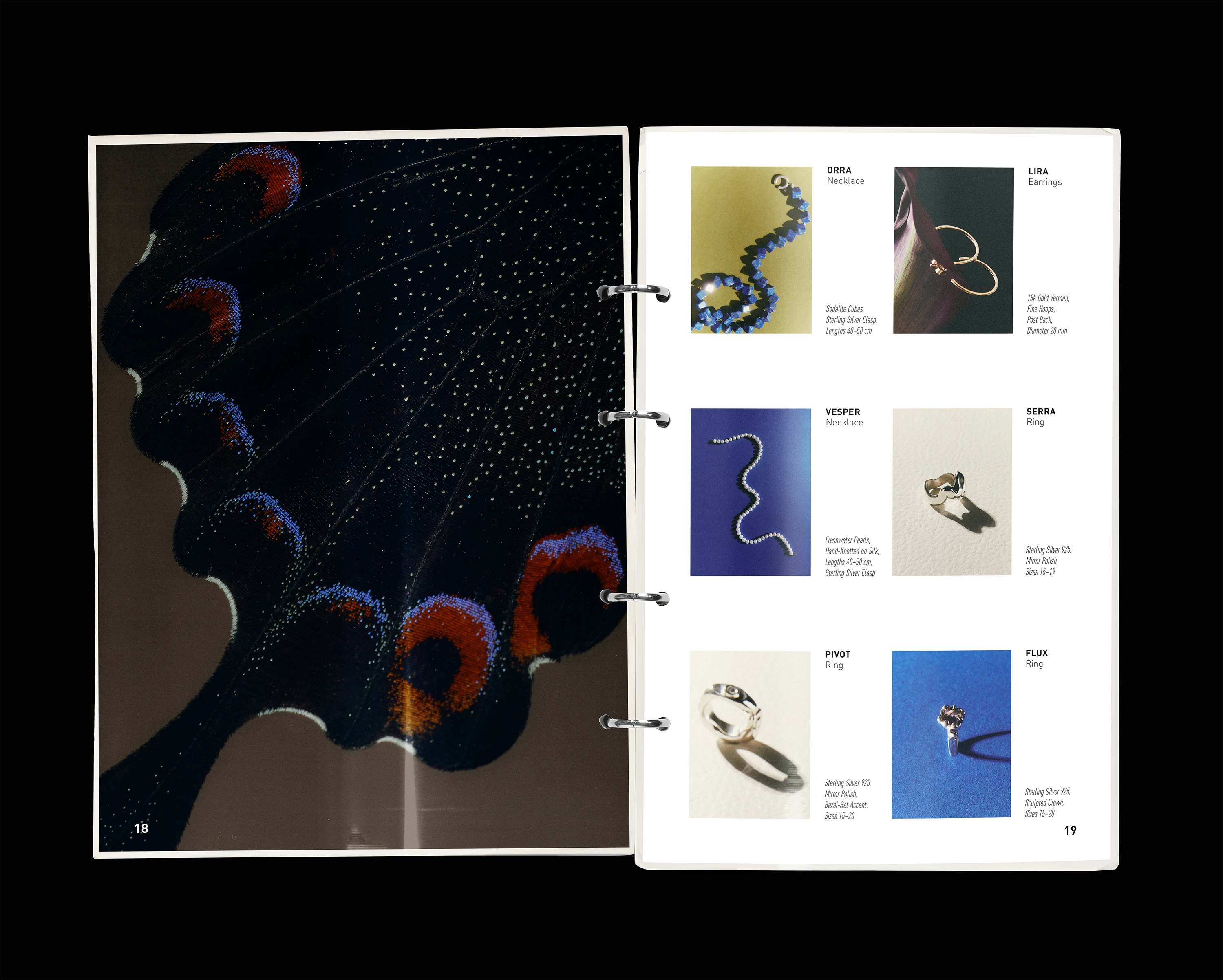
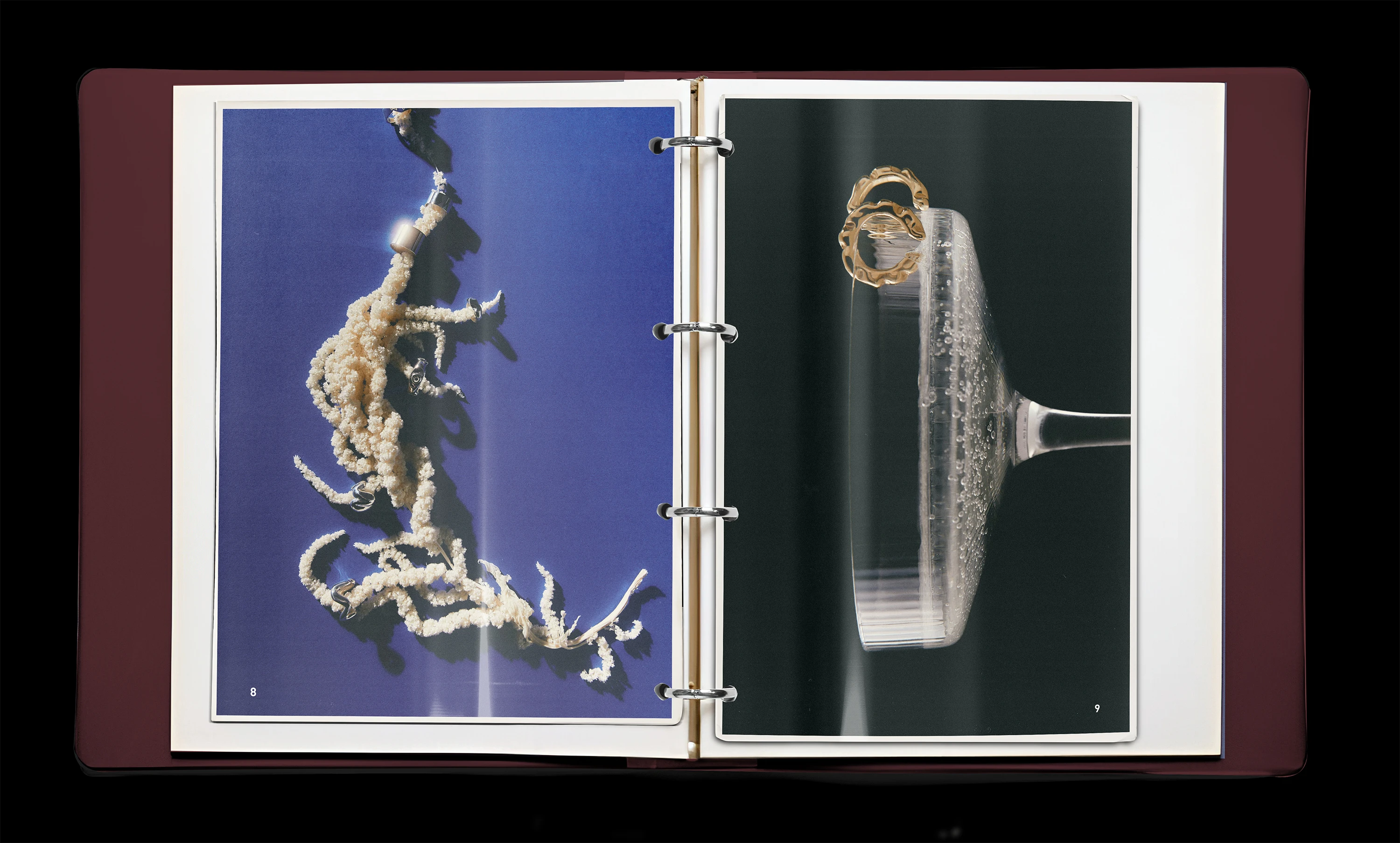
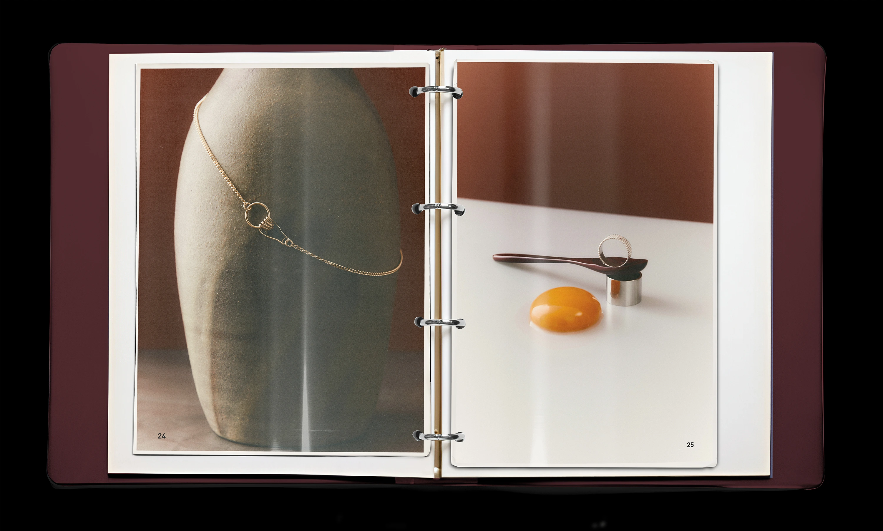
One design, two formats: the layout works as a perfect bound magazine with full bleeds and as a ring-binder edition
with punched sheets. The grid and typography stay the same; only margins and inner gutter adapt to the binding.
Thank you for watching!
Like this project
Posted Oct 15, 2025
Created an editorial lookbook for a jewellery collection, built on one precise system that holds two contrasting visual moods
Likes
0
Views
2