
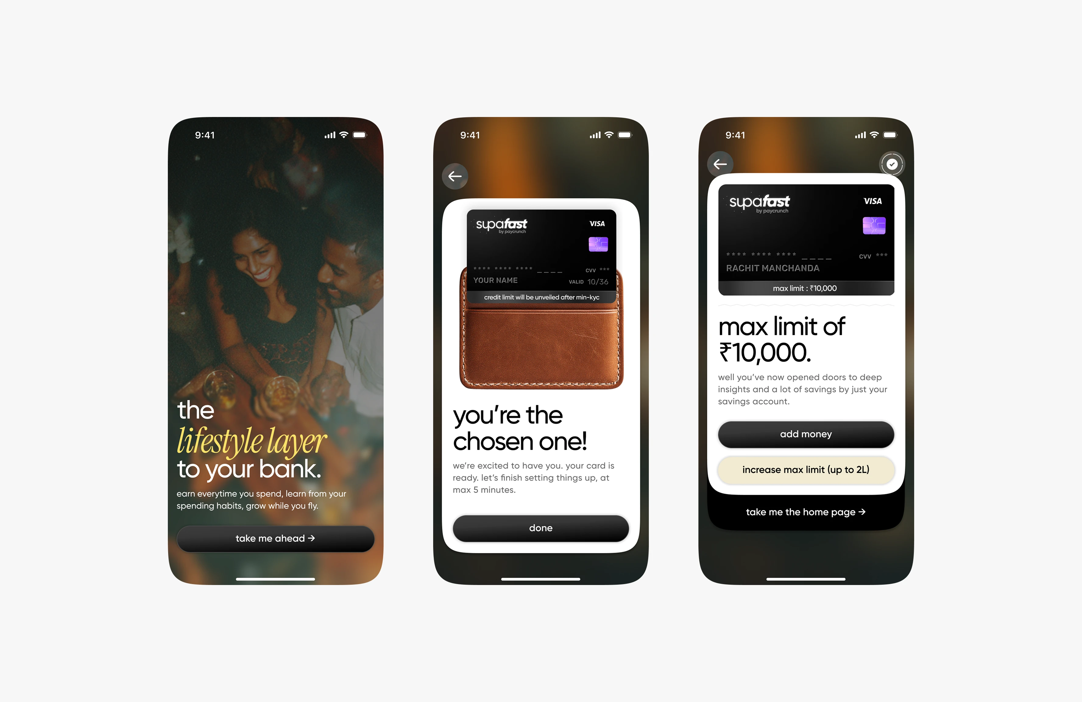
fly — a product redesign that 10x-ed their market.
before
fly started as a prepaid wallet built for gen z.
bright, quirky, but narrow. the product leaned on trends, not usability.
older audiences — parents, professionals — bounced off.
the brand wanted to scale beyond college kids.
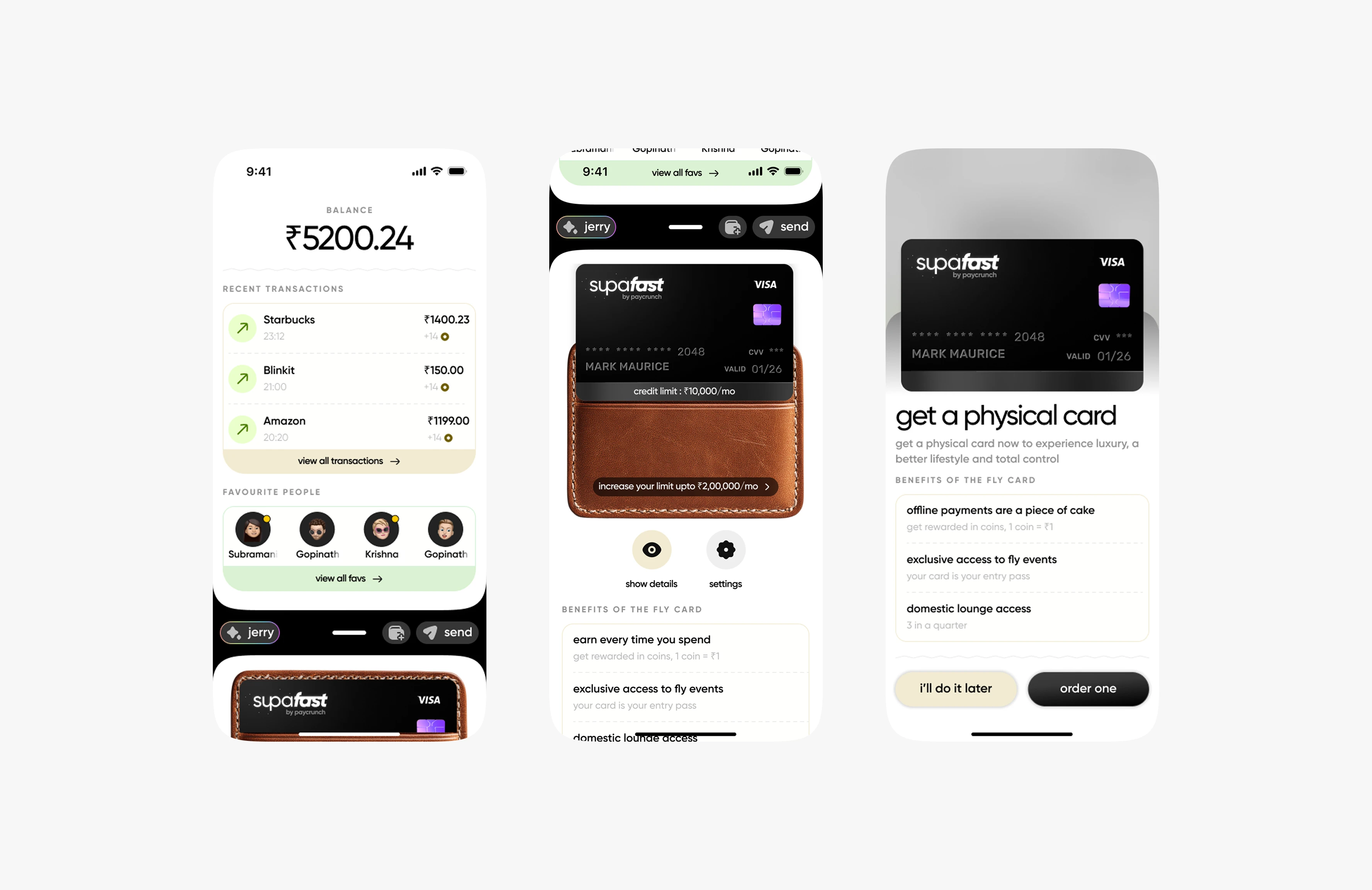
The Home Page
after
i led a revamp that repositioned fly as a lifestyle financial product anyone could use. the goal: design it so even my father could understand and enjoy it. we stripped away gimmicks, simplified the core, and added features that scaled across demographics:
fly search → made transaction history conversational. “where did i spend the most last month?” → answer in one tap.
split + rewards → reimagined bill-splitting as something gratifying, not tedious. rewards created habit loops across all age groups.
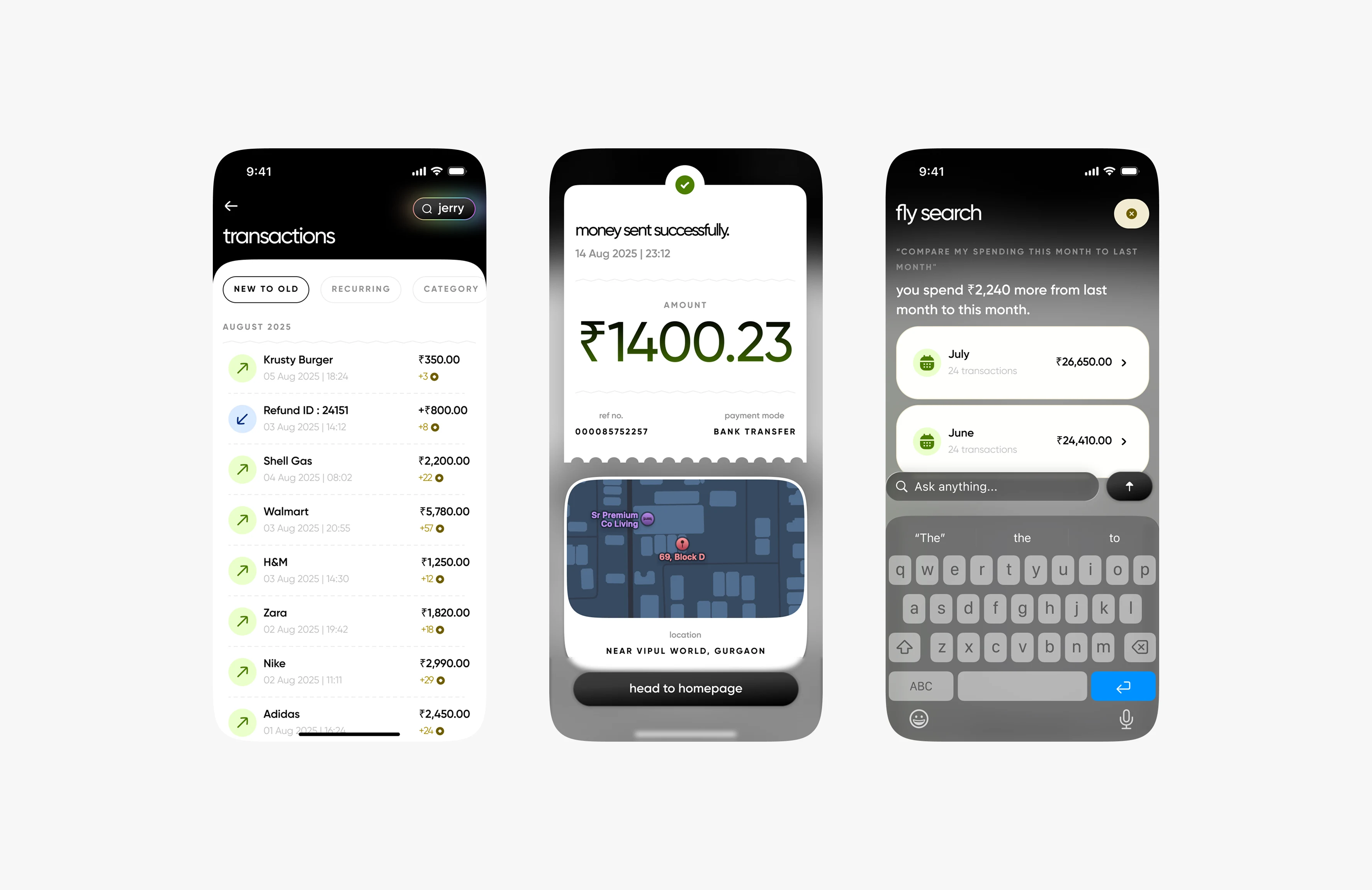
Fly Search
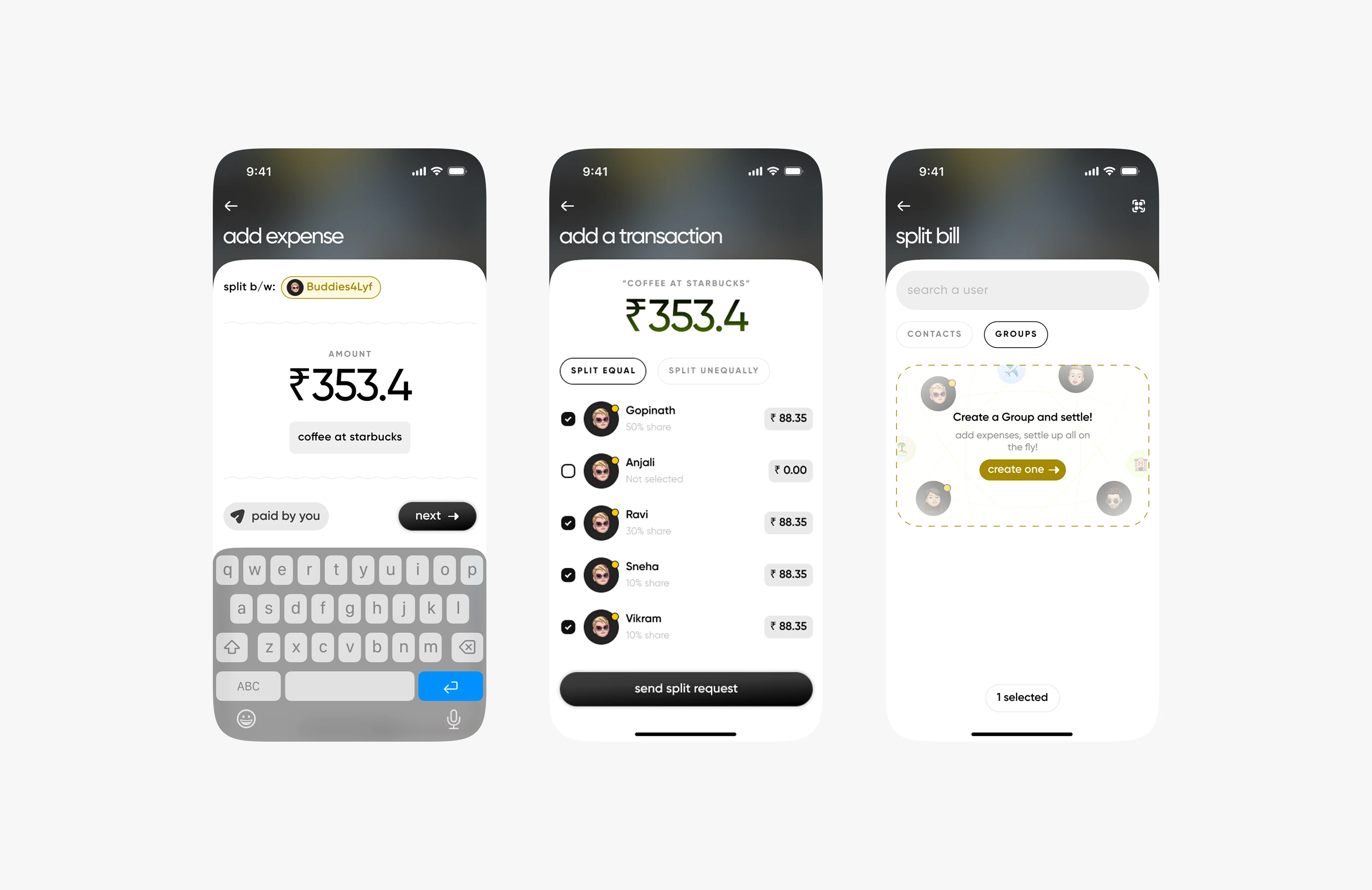
Splitting Between Friends
impact
shifted fly from a gen z-only wallet into a lifestyle financial product built for everyone. usability improved, engagement grew, and the product was positioned for mainstream adoption.
0 likes · 3 views · Sep 20, 2025
Redesigned fly to expand its market beyond Gen Z, improving usability and engagement.

