The Martyn Group LLC – Crafting a Professional Brand Identity
Qamer Razzaq
Client Overview
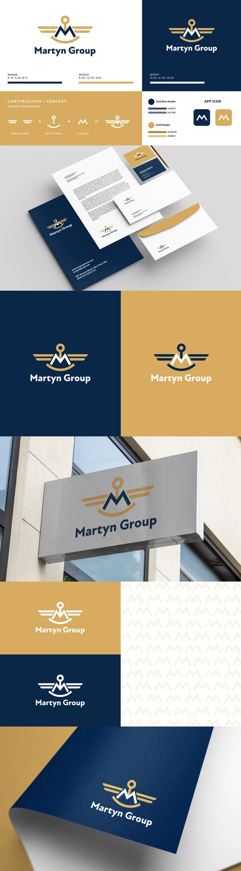
The Martyn Group LLC is a newly established company with a focus on professionalism and versatility across sectors such as aviation and manufacturing. The brand seeks a clean, adaptable logo that works well on formal materials like letterheads and business cards.
Project Objective
To create a sophisticated, clean logo that reflects Martyn Group's industry presence and values. Design elements should convey professionalism and versatility, with a color palette focused on shades of blue and gold.
Logo Concept
Design Elements: The logo incorporates a sleek, typographic focus with “The Martyn Group” as the primary text, complemented by streamlined wings representing aviation and an anchor symbolizing navy. These elements subtly hint at the company's themes without overwhelming the clean design.
Color Palette:
Blue: Symbolizing trust, professionalism, and stability, aligning with the brand’s industry.
Gold: Adding a touch of elegance and quality, reinforcing the company’s prestige.
Results
The final logo achieved a professional, streamlined look that balances the formal requirements of corporate branding with subtle nods to aviation and manufacturing. With a versatile color palette and minimalist design, the logo now establishes The Martyn Group as a reputable and enduring brand across multiple platforms and mediums.
Like this project
Posted Nov 5, 2024
Martyn Group logo uses sleek text with subtle wings for aviation and an anchor for navy, hinting at industry themes while keeping a clean, professional look.