Visualizing and Predicting California Housing Prices: A Linear …
Hi!!
Introduction
In this project, I explored the intricacies of California’s housing market by visualizing key data features and predicting property prices using a Linear Regression model. By examining factors like location, income, and housing attributes, I aimed to reveal the patterns that influence real estate prices. Through detailed visualizations and a carefully constructed model, this project offers insights and predictions that can guide informed decision-making in the California real estate market.
Real Estate Price Prediction: Process I Followed
Below is the process I followed for predicting real estate prices using linear regression, aimed at helping make informed decisions in the real estate market analysis:
Gather Data: I sourced a comprehensive dataset from Kaggle, which includes various features related to California housing prices . This dataset is ideal for our analysis and prediction tasks.
Data Preparation: The collected data was cleaned and prepared by handling missing values, removing outliers, and converting categorical variables into numerical formats.
Feature Engineering: I created and transformed features to capture essential information that influences housing prices. This step involved adding new variables and modifying existing ones to improve model performance.
Exploratory Data Analysis (EDA): I explored and visualized the data to understand its distribution, correlations, and patterns. This analysis provided insights into the relationships between features and the target variable.
Model Selection: I applied linear regression, a fundamental machine learning algorithm, to predict house prices based on the features provided. Linear regression was chosen for its simplicity and effectiveness in modeling relationships between variables.
Model Training and Evaluation: The linear regression model was trained on the prepared dataset, with careful tuning of parameters to enhance prediction accuracy. I evaluated the model’s performance using appropriate metrics to ensure reliable predictions.
For this analysis, i used historical data with various features impacting property prices. You can download the dataset from Kaggle.
Importing the necessary Python libraries and the dataset:
import pandas as pd
import numpy as np
import matplotlib.image as mpimg
from pandas.plotting import scatter_matrix
import missingno as msno
import seaborn as sns
import matplotlib.pyplot as plt
%matplotlib inline
from sklearn.model_selection import train_test_split
from sklearn.metrics import accuracy_score
from sklearn.model_selection import train_test_split
from sklearn.linear_model import LinearRegression
from sklearn.metrics import mean_squared_error, r2_score
from sklearn.preprocessing import LabelEncoder
housing = pd.read_csv('/kaggle/input/california-housing-prices/housing.csv')
housing.head()
longitudelatitudehousing_median_agetotal_roomstotal_bedroomspopulationhouseholdsmedian_incomemedian_house_valueocean_proximity-122.2337.8841.0880.0129.0322.0126.08.3252452600.0NEAR BAY-122.2237.8621.07099.01106.02401.01138.08.3014358500.0NEAR BAY-122.2437.8552.01467.0190.0496.0177.07.2574352100.0NEAR BAY-122.2537.8552.01274.0235.0558.0219.05.6431341300.0NEAR BAY-122.2537.8552.01627.0280.0565.0259.03.8462342200.0NEAR BAYhousing.info()
<class 'pandas.core.frame.DataFrame'>
RangeIndex: 20640 entries, 0 to 20639
Data columns (total 10 columns):
# Column Non-Null Count Dtype
--- ------ -------------- -----
0 longitude 20640 non-null float64
1 latitude 20640 non-null float64
2 housing_median_age 20640 non-null float64
3 total_rooms 20640 non-null float64
4 total_bedrooms 20433 non-null float64
5 population 20640 non-null float64
6 households 20640 non-null float64
7 median_income 20640 non-null float64
8 median_house_value 20640 non-null float64
9 ocean_proximity 20640 non-null object
dtypes: float64(9), object(1)
memory usage: 1.6+ MB
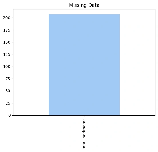
Now, let’s have a look if the data contains any null values or not:
missing = housing.isnull().sum()
missing = missing[missing > 0]
missing = missing.sort_values(ascending = False)
palette = sns.color_palette('pastel')
missing.plot.bar(color=palette[0])
plt.title('Missing Data');

missing_columns = [col for col in housing.columns if housing[col].isnull().sum() > 0]
missing_columns
def get_numerical_summary(housing):
total = housing.shape[0]
missing_columns = [col for col in housing.columns if housing[col].isnull().sum() > 0]
missing_percent = {}
for col in missing_columns:
null_count = housing[col].isnull().sum()
per = (null_count/total) * 100
missing_percent[col] = per
print("{} : {} ({}%)".format(col, null_count, round(per, 3)))
return missing_percent
missing_percent = get_numerical_summary(housing)
total_bedrooms : 207 (1.003%)
As null values are not significant it is better to remove data conatining them.
housing_modified = housing.dropna(subset=['total_bedrooms'])
Label Encoding
In our dataset, one categorical column contained character values, which needed to be converted into numerical format for compatibility with our machine learning model. Since this column had a limited number of unique values, we applied label encoding.
Label encoding assigns a unique integer to each distinct category in the column, effectively converting categorical data into a format that can be processed by our linear regression model. This approach is suitable here because the number of unique categories is manageable and doesn’t require more complex encoding techniques.
housing_modified.info()
<class 'pandas.core.frame.DataFrame'>
Index: 20433 entries, 0 to 20639
Data columns (total 10 columns):
# Column Non-Null Count Dtype
--- ------ -------------- -----
0 longitude 20433 non-null float64
1 latitude 20433 non-null float64
2 housing_median_age 20433 non-null float64
3 total_rooms 20433 non-null float64
4 total_bedrooms 20433 non-null float64
5 population 20433 non-null float64
6 households 20433 non-null float64
7 median_income 20433 non-null float64
8 median_house_value 20433 non-null float64
9 ocean_proximity 20433 non-null object
dtypes: float64(9), object(1)
memory usage: 1.7+ MB
value_counts = housing_modified['ocean_proximity'].value_counts()
value_counts
ocean_proximity
<1H OCEAN 9034
INLAND 6496
NEAR OCEAN 2628
NEAR BAY 2270
ISLAND 5
Name: count, dtype: int64
category_counts = housing_modified['ocean_proximity'].value_counts()
# Plot the bar plot
category_counts.plot(kind='bar', color='skyblue')
plt.title('Distribution of Ocean Proximity')
plt.xlabel('Ocean Proximity')
plt.ylabel('Count')
plt.xticks(rotation=45)
plt.show()
label_encoder = LabelEncoder()
data=housing_modified.copy()
# Encode the categorical column
data['ocean_proximity_encoded'] = label_encoder.fit_transform(data['ocean_proximity'])
data=data.drop(columns=['ocean_proximity'])
Now, let’s have a look at the histograms of all the features:
sns.set_style("whitegrid")
fig, axes = plt.subplots(nrows=3, ncols=3, figsize=(15, 15))
fig.suptitle('Histograms of Real Estate Data', fontsize=16)
cols = ['latitude', 'longitude', 'housing_median_age' , 'total_rooms', 'total_bedrooms', 'population' , 'households' , 'median_income' , 'ocean_proximity_encoded']
axes = axes.flatten()
for i, col in enumerate(cols):
sns.histplot(data[col], kde=True, ax=axes[i])
axes[i].set_title(col)
axes[i].set_xlabel('')
axes[i].set_ylabel('')
plt.tight_layout(rect=[0, 0.03, 1, 0.95])
plt.show()
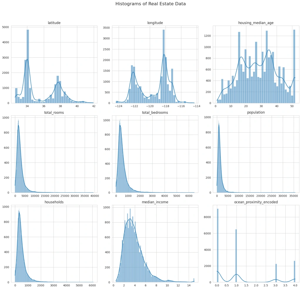
The histograms provide insights into the distribution of each variable. Next, I’ll create scatter plots to explore the relationships between these variables and the house price. It will help us understand which factors might be influencing property prices more significantly:
# Scatter plots to observe the relationship with house price
fig, axes = plt.subplots(nrows=4, ncols=2, figsize=(12, 16))
fig.suptitle('Scatter Plots with House Price of Unit Area', fontsize=16)
# Scatter plot for each variable against the house price
sns.scatterplot(data=data, x='housing_median_age', y='median_house_value', ax=axes[0, 0])
sns.scatterplot(data=data, x='ocean_proximity_encoded', y='median_house_value', ax=axes[0, 1])
sns.scatterplot(data=data, x='total_bedrooms', y='median_house_value', ax=axes[1, 0])
sns.scatterplot(data=data, x='total_rooms', y='median_house_value', ax=axes[1, 1])
sns.scatterplot(data=data, x='population', y='median_house_value', ax=axes[2, 0])
sns.scatterplot(data=data, x='households', y='median_house_value', ax=axes[2, 1])
sns.scatterplot(data=data, x='longitude', y='median_house_value', ax=axes[3, 0])
sns.scatterplot(data=data, x='latitude', y='median_house_value', ax=axes[3, 1])
plt.tight_layout(rect=[0, 0.03, 1, 0.95])
plt.show()
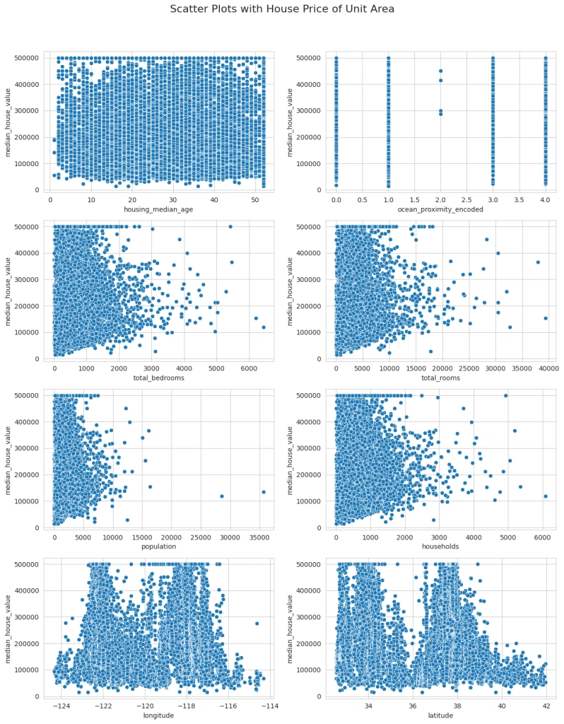
The scatter plots revealed interesting relationships between various factors and house prices. Finally, it would be beneficial to perform a correlation analysis to quantify the relationships between these variables, especially how each one correlates with the house price:
# Compute the correlation matrix
corr_matrix = data.corr()
# Plot the correlation matrix
plt.figure(figsize=(10, 8))
sns.heatmap(corr_matrix, annot=True, cmap='coolwarm', fmt='.2f')
plt.title('Correlation Matrix with Encoded Categorical Variables')
plt.show()
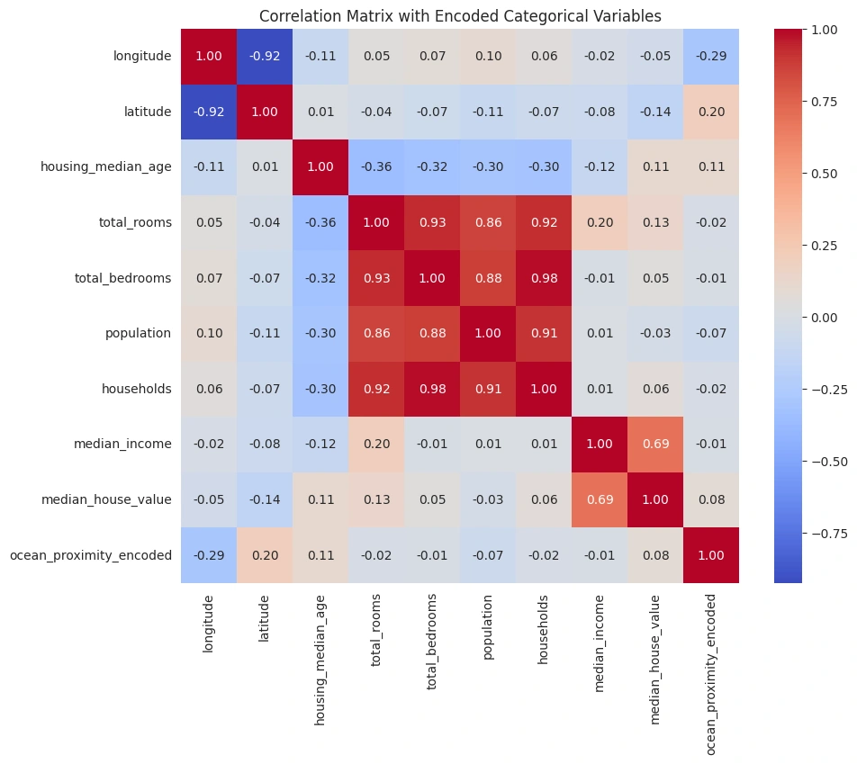
The correlation matrix provides quantified insights into how each variable is related to the others, especially with respect to the Median house value.
Now, let’s build a regression model to predict the real estate prices by using the Linear Regression algorithm using the most significant factors affecting house prices in this dataset (you can choose others too):
# Selecting features and target variable
features = ['median_income', 'longitude', 'latitude', 'total_rooms']
target = 'median_house_value'
X = data[features]
y = data[target]
# Splitting the dataset into training and testing sets
X_train, X_test, y_train, y_test = train_test_split(X, y, test_size=0.2, random_state=42)
# Model initialization
model = LinearRegression()
# Training the model
model.fit(X_train, y_train)
LinearRegression()
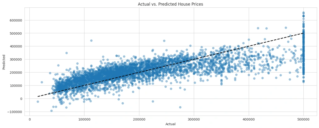
Now, let’s visualize the actual versus predicted values to assess how well our model is performing:
# Making predictions using the linear regression model
y_pred_lr = model.predict(X_test)
# Visualization: Actual vs. Predicted values
plt.figure(figsize=(16, 6))
plt.scatter(y_test, y_pred_lr, alpha=0.4)
plt.plot([y_test.min(), y_test.max()], [y_test.min(), y_test.max()], 'k--', lw=2)
plt.xlabel('Actual')
plt.ylabel('Predicted')
plt.title('Actual vs. Predicted House Prices')
plt.show()
# Making predictions
y_pred = model.predict(X_test)
# Creating a DataFrame with actual vs. predicted values
results_df = pd.DataFrame({
'Actual': y_test.reset_index(drop=True), # Reset index to align with predictions
'Predicted': y_pred
})
# Display the results
print(results_df.head())
Actual Predicted
0 245800.0 201484.439861
1 137900.0 203382.643352
2 218200.0 195888.808632
3 220800.0 182013.280895
4 170500.0 215647.189533
I hope you liked this Real Estate Price Prediction with Machine Learning.
Like this project
Posted Sep 11, 2024
Through detailed visualizations and a carefully constructed model, this project offers insights and predictions in the decision-making real estate market.
Likes
0
Views
76

