Energy Consumption SaaS Dashboard

Matija Sain

Like this project
Posted Dec 3, 2023
Crafted an intuitive SaaS dashboard for real-time energy tracking, offering actionable insights for efficiency.
Likes
1
Views
84


Project Introduction: Energy Consumption SaaS Dashboard
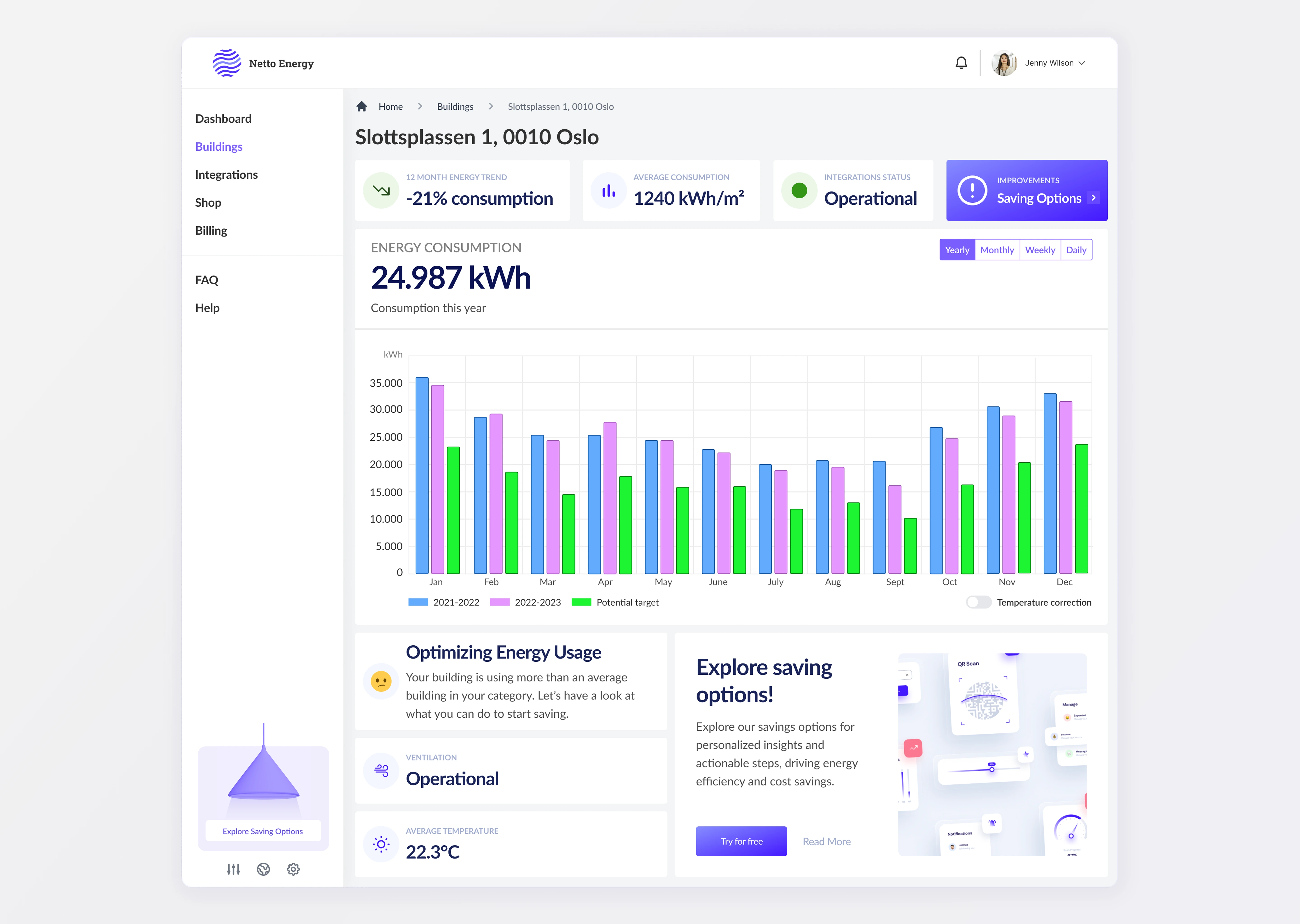
Netto Energy Dashboard
Embarking on a journey to enhance energy management, I took on the Netto Energy Dashboard—a SaaS platform designed to provide intricate energy consumption data and actionable insights. This project's cornerstone was to craft an interface where precision meets user-centric design, providing a seamless experience across monitoring, analyzing, and optimizing energy use.
User-Centric Interface Design
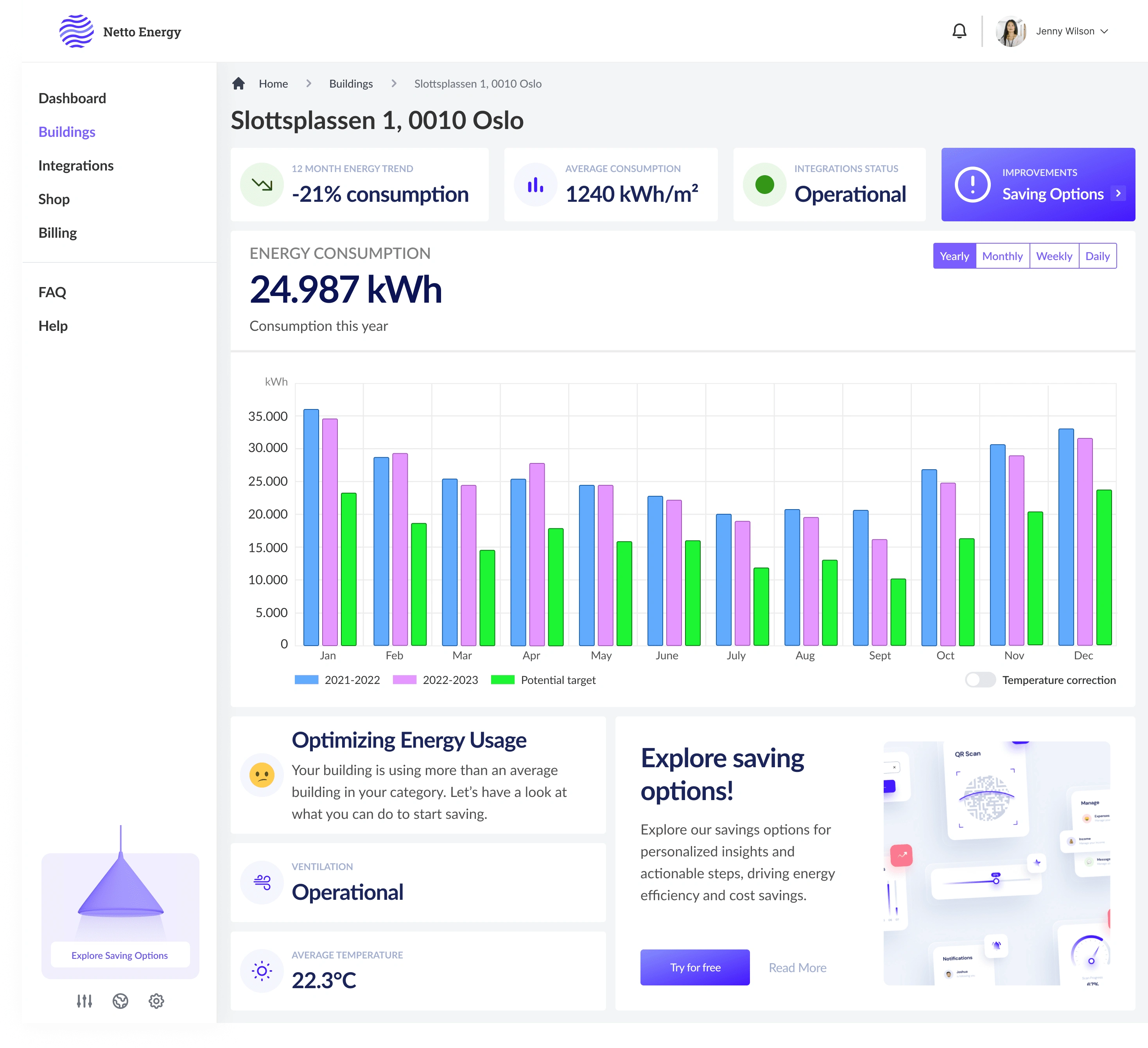
Intuitive Navigation & Accessibility: Central to the dashboard's design was an intuitive navigation system. Users could effortlessly glide through different sections, whether it was comparing energy trends across buildings or diving into specifics with a hover-over feature that reveals detailed consumption data.
Data-Driven Dashboard: At the heart of the interface was the dashboard, where users were greeted with a visual feast of bar graphs depicting energy consumption over time. The design leveraged color contrasts to distinguish between current and past years' data, as well as potential targets, fostering an environment of continuous improvement.
Advanced Data Visualization
Analytical Rigor: My design philosophy injected analytical rigor into the visualization elements. Customizable views—from yearly to daily—allowed users to scrutinize energy consumption patterns with granularity. A hover-over detail function on bars enabled a deep dive into specific data points, marrying accessibility with sophistication.
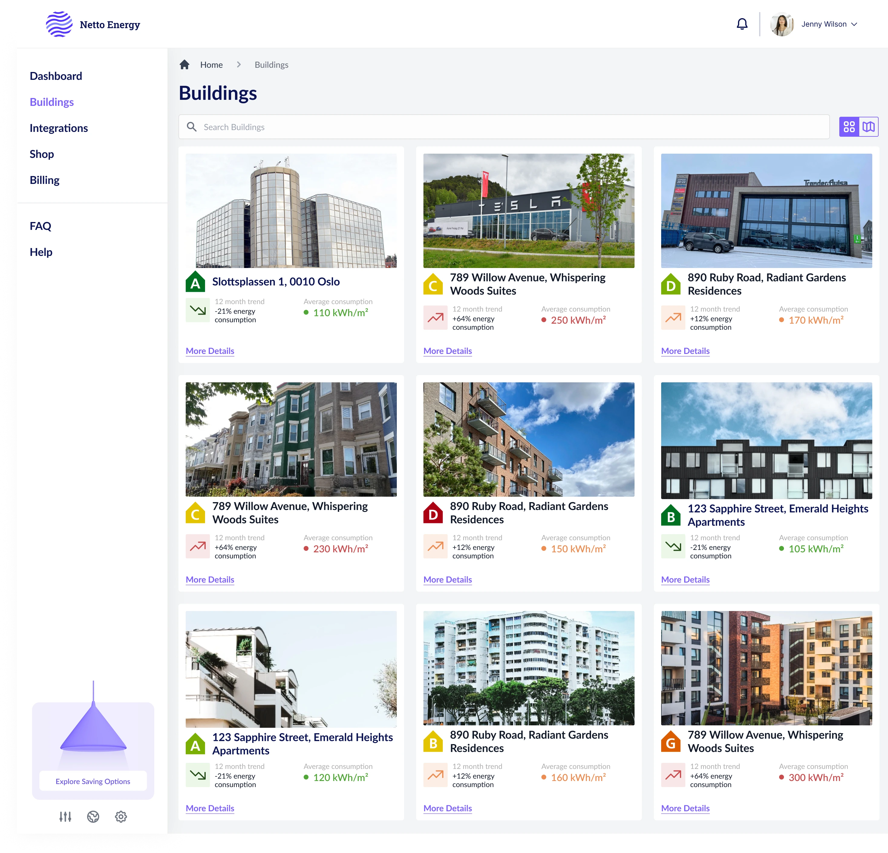
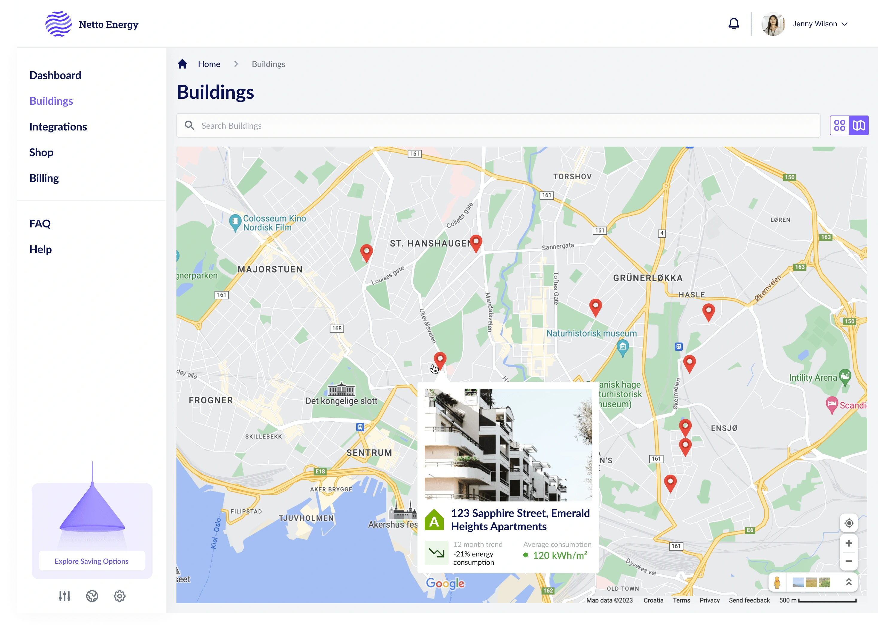
Geographic Mapping & Insights
Interactive Mapping: A dynamic map view integrated geographical data, enabling users to visualize their buildings' locations alongside energy statistics. This spatial analysis tool enriched the decision-making process, allowing for location-specific energy management strategies.
Actionable Energy Efficiency Recommendations
Optimization Opportunities: The dashboard was not just a passive display; it was an active participant in energy optimization. Users were prompted with personalized saving options, nudging them towards more efficient energy use. "Explore Saving Options" became more than a feature—it was a call to action.
User Engagement through Personalization: The platform's design encouraged user interaction by providing personalized insights. The system analyzed consumption patterns, suggesting specific areas for improvement, directly linking user behavior with energy efficiency.
Reflective Design Philosophy
Aesthetic and Functional Harmony: The visual language of the dashboard was carefully curated to balance aesthetic appeal with functional simplicity. My approach was to create an engaging experience that users would not only benefit from but also enjoy.
Responsiveness & Adaptability: The design was responsive, adapting to various devices and screen sizes, ensuring that users could access crucial energy data anytime, anywhere.
Project Impact
The Netto Energy Dashboard is more than a tool—it's a reflection of how meticulous UX/UI design can pave the way for sustainable energy consumption. By presenting data in an intuitive, visually engaging, and actionable manner, the dashboard stands as a testament to the transformative power of design in the energy sector.