🌸Logo Design for IRODORI
Ayaka Fuji
🌸Logo Design for IRODORI
Project Information
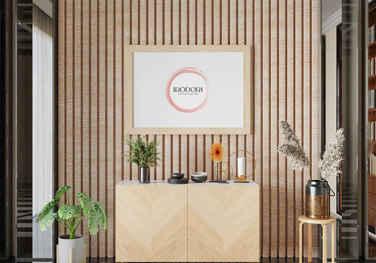
A local New Zealand business IRODORI, offering a curated selection of authentic Japanese ceramics, founded by a Kiwi-Japanese couple in Christchurch.
With a collection that showcases the vibrant hues and intricate designs of Japanese ceramics, I developed IRODORI’s visual identity to enhance their brand with a touch of elegance that reflects Japanese culture and touch.
Project Team
Ayaka Fuji (Logo Designer)
My Role
Brand Identity
Logo Design
Visual Identity - A Beautiful Moment of Japan
The story of IRODORI began with a couple deeply connected to Japanese culture and cuisine, captivated by the elegance and creativity of Japanese food.
They were enchanted not only by its delicious taste but also by how each meal is a visual masterpiece.
Just as their carefully curated Japanese ceramics tell a story and enhance the dining experience, the brand identity reflects a sense of grace and sophistication.
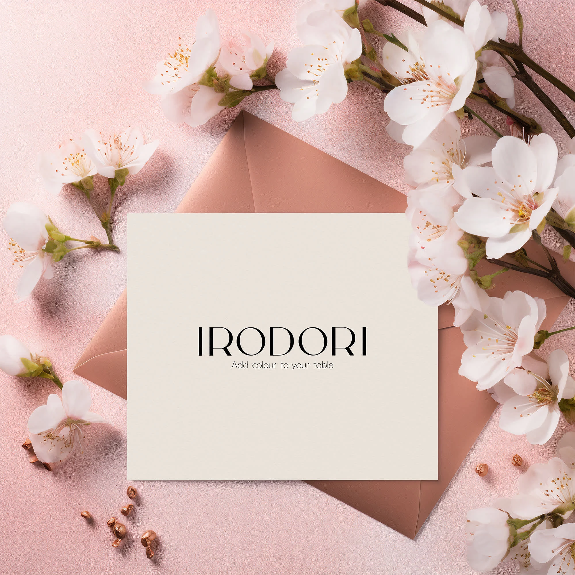
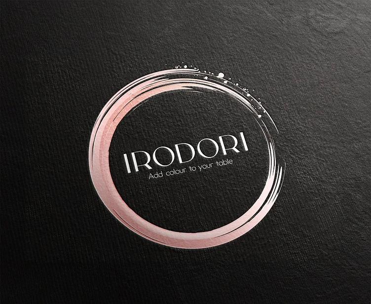
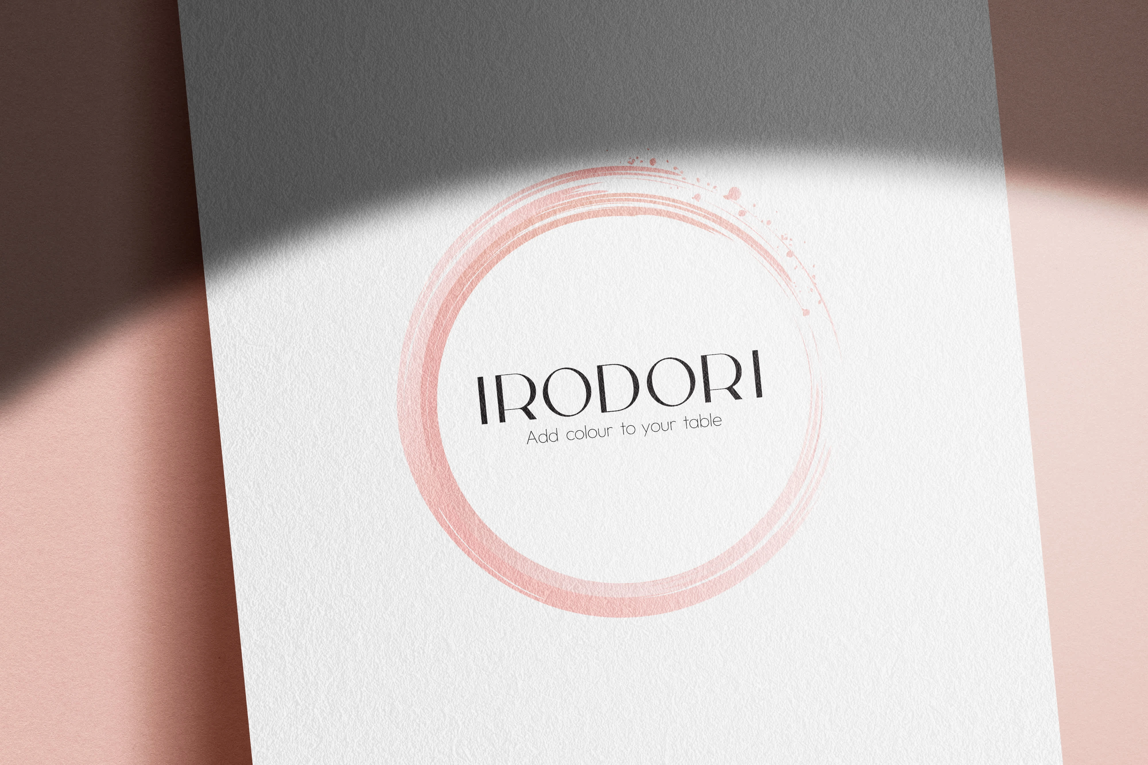
To reflect IRODORI’s story and their vision of "bringing the essence of Japanese cuisine to modern New Zealand homes," I drew inspiration from traditional Japanese calligraphy and cherry blossoms gently dancing in the wind.
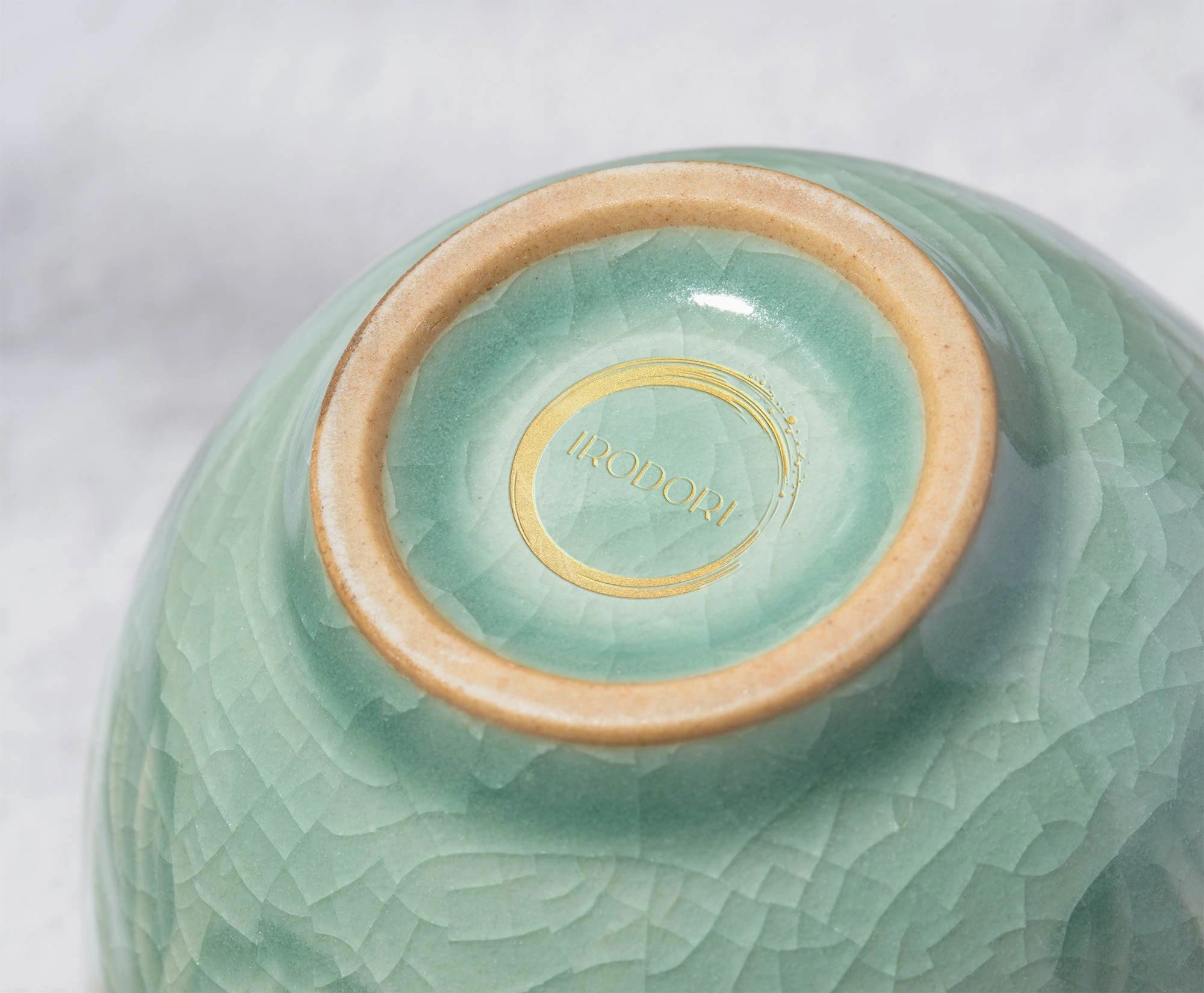
The logo design combines the powerful brushstroke symbol with delicate cherry blossom petals, capturing "a beautiful moment of Japan."
Brand colours
IRODORI Irodori' (彩) means the art of coloring in Japanese. For this project, I designed their premium color palette to highlight the timeless beauty of Japanese design. Based on traditional Japanese colors, IRODORI's color palette features delicate cherryblossom and Plum pink, symbolizing beauty and softness, also refined sumi (墨)black - Calligraphy ink, evoking elegance and tradition.
Typography
For the primary fonts, the modern and elegant typography of Carla Sans evokes both refinement and a soft, relaxed feel. It bridges traditional Japanese aesthetics with minimalist, contemporary design, embodying IRODORI’s brand identity.
The secondary font is Outfit. Its stylish, geometric characteristics complement the various shapes of the ceramics and dishes that IRODORI offers, adding a touch of playfulness to everyday life.
Final output
I believe that through the carefully selected Japanese tableware offered by IRODORI, they can become a bridge connecting New Zealand and Japan.
We hope that the logo, representing the powerful yet delicate traditions of Japan, will be cherished as a brand that not only enhances everyday meals but also adds richness and beauty to modern life for years to come.
Like this project
Posted May 8, 2025
Logo design and brand identity for IRODORI, a local select shop in New Zealand that offering a curated selection of authentic Japanese tableware and ceramics.
Likes
2
Views
16
Timeline
Apr 1, 2024 - Apr 30, 2024
Clients
Irodori