E-Commerce App Mobile App UI/UX Design

Seemak Iqbal


Overview
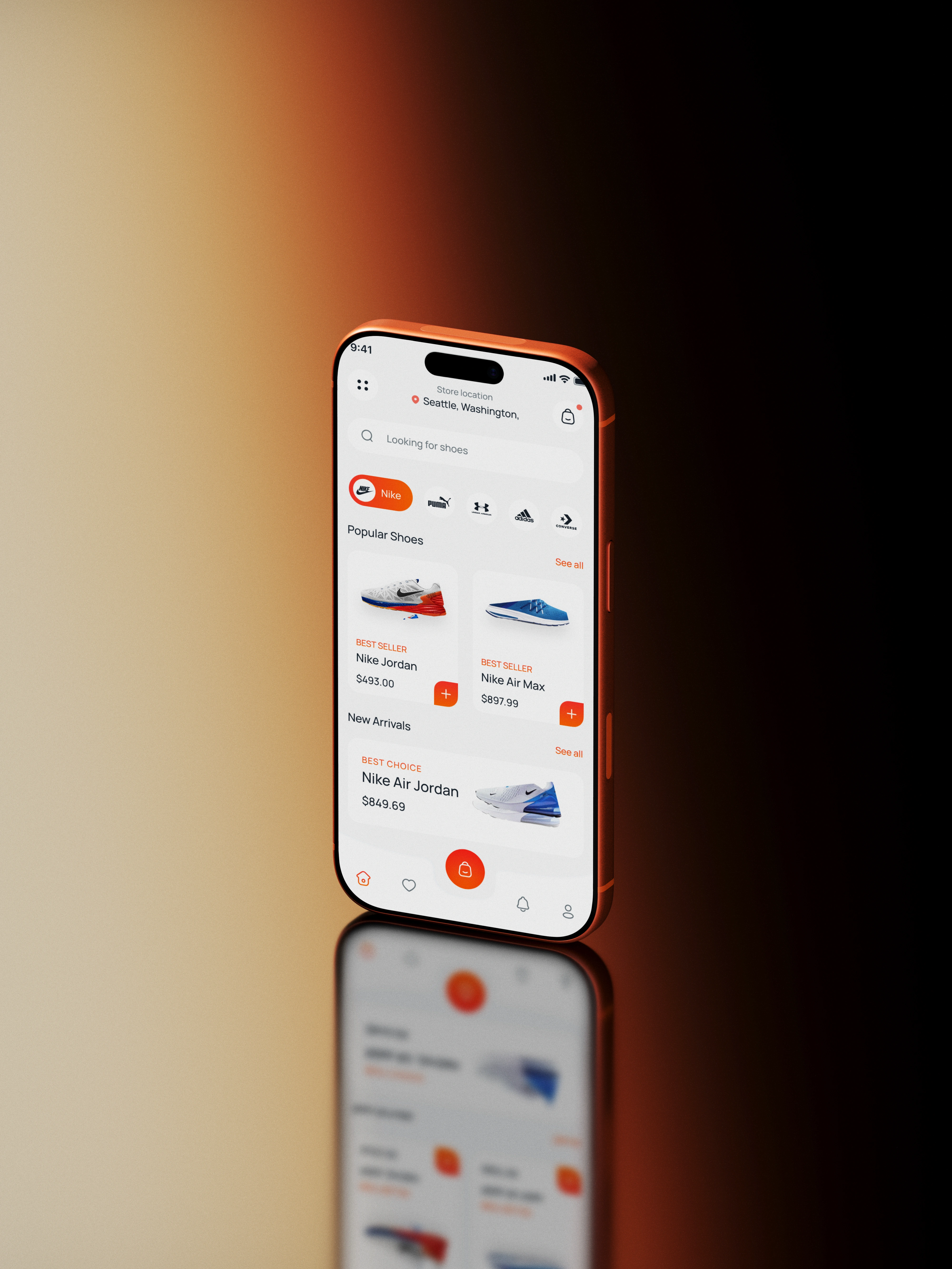
Stride is a shoe shopping app built to fix one specific pain point: checkout. In most shoe apps, getting from "I want these" to "order placed" takes too many steps, too many screens, and too many chances to give up halfway. I designed Stride to make browsing enjoyable and checkout fast, so the moment someone decides to buy, nothing gets in their way.
The Problem
I looked at how people actually behave when shopping for shoes on mobile: they browse casually, they compare a few pairs, and then they decide quickly. But most checkout flows don't match that decisiveness they ask for size, then address, then payment, then confirmation, often across separate screens with repeated taps and re-entered information. Cart abandonment isn't usually about price. It's about friction at the exact moment someone is ready to pay.
The goal was simple: shorten the distance between "add to cart" and "order confirmed," without cutting corners on the details people actually need size, color, delivery time, total cost.
Home / Browse
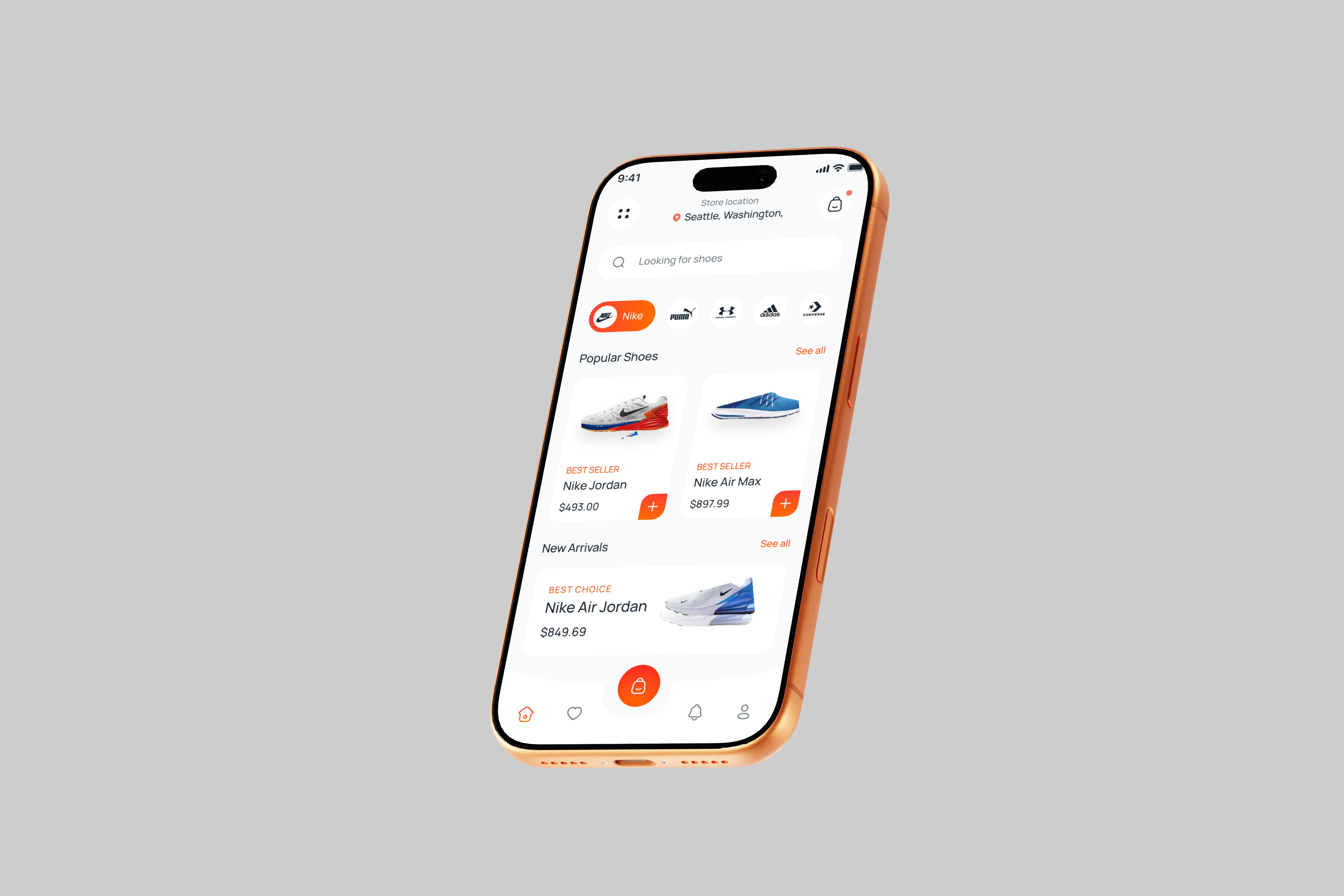
The home screen leads with large, well-lit product photography and minimal text, so shoes are the focus, not the interface. Categories sit in a single horizontal row up top, and filters (size, brand, price) are reachable in one tap rather than buried in a separate page. I kept card sizes consistent across the grid so scanning feels rhythmic, not cluttered.
Product Detail
The product page shows size and color options above the fold, next to the price, so the two decisions a buyer needs to make happen right where they're looking. Stock status is shown per size, so people aren't disappointed at checkout. A short, plain-language product description sits below the fold for anyone who wants more detail, but the primary action Add to Cart is never more than a thumb's reach away.
Cart & Checkout
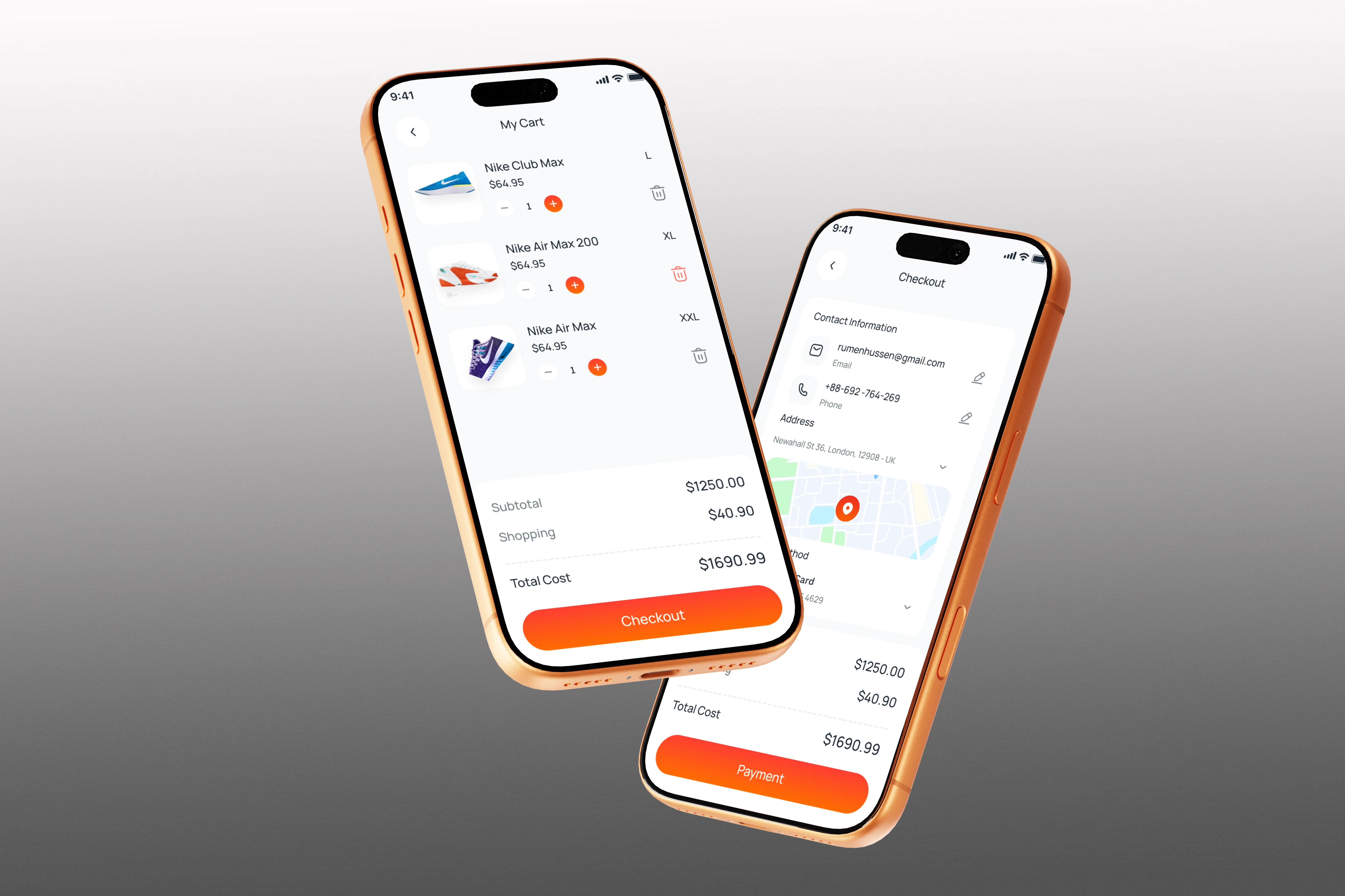
This is where the redesign mattered most. Instead of a multi-page checkout, I combined shipping, delivery speed, and payment into a single scrollable screen with clear sections instead of separate pages. Saved addresses and saved cards are shown by default, so returning buyers can complete an order in two taps. New buyers still get a clean, guided form, but nothing forces them to leave the checkout screen to get there.
Order summary stays visible throughout item, size, price, shipping cost, total so there's no surprise total at the final step.
Outcome
The result is a checkout flow that respects how quickly people actually decide to buy. Fewer screens, fewer re-entries, and a clear line of sight from product to purchase.
Like this project
Posted Aug 26, 2026
Designed Stride app to streamline shoe shopping checkout process.
Likes
2
Views
3