Keel design system
The problem
Before hiring me to design and build a new design system, NYSHEX was relying on the free & open source Material UI design system to build their product. While this worked for simple elements likes buttons and alerts, Material UI required a lot of hacks and overrides for components such as tables and filtering. And since NYSHEX is a very table-heavy app, this meant lots of extra work for designers and developers to customize Material UI to get it do what they needed it to do.
Additionally, while Material UI looks and works great for a lot of apps, eventually your product starts to look like many other apps. And as NYSHEX matured and set its eyes on a Series C, it was decided that a new look and feel combined with the existing engineering challenges necessitated a new design system.
I joined in January of 2023 to become the 3rd product designer at NYSHEX and set out to build a new design system that was:
Atomic
Documented
Accessible
Prototyped (with accessible components)
Built on top of tokens
Supported white labeling for NYSHEX's customers.
My role
As the sole designer to work on the design system, my responsibilities included:
Setting up the Figma project and component naming structure
Creating the underlying design token system
Working directly with engineers to implement components and adopt best practices
Project timeline
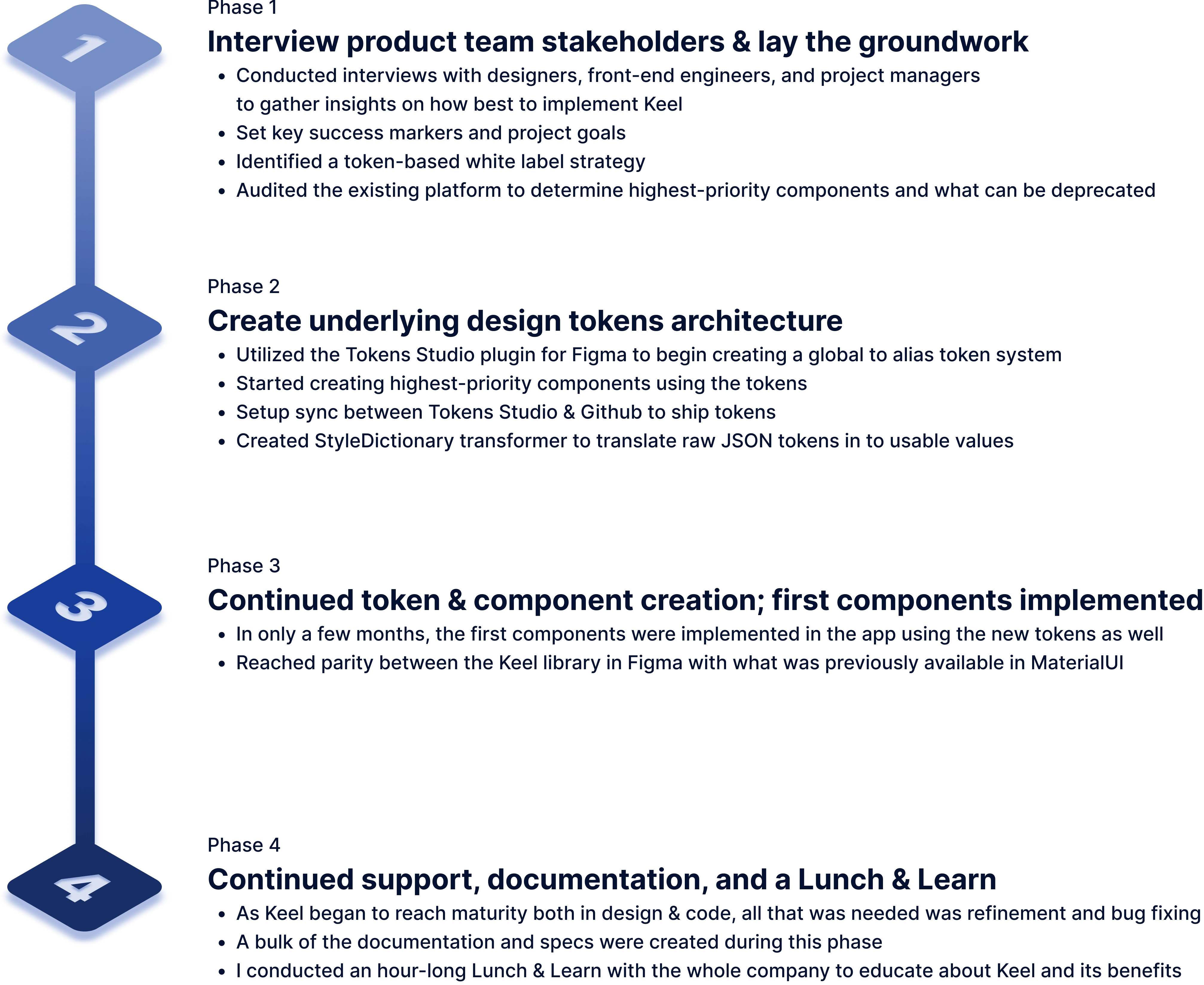
Keel design system phases
Naming & Logo
All great design systems have a name, and Keel was to be no exception. In sticking with the nautical theme of NYSHEX, I settled on "Keel" as the name. On a ship, the keel is "the bottom-most structural member around which the hull of a ship is built." And since a design system is the structure on which a product is built, it fit perfectly.
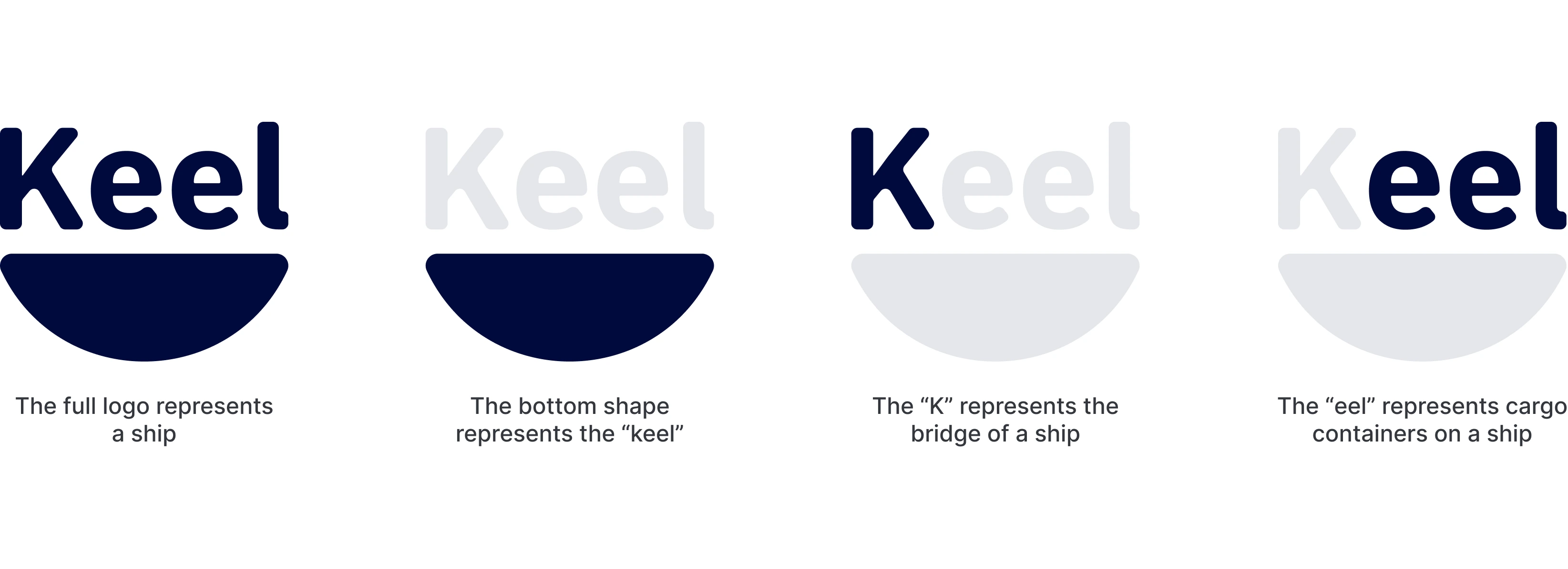
Keel design system logo
Creating a consistent color palette
Based around the core brand color, I set out to create a new color palette that was both accessible, but also consistent between different colors at the same position in the ramp. To accomplish this, I used the Leonardo tool and manually tweaked contrast values to dial in a varied and consistent color palette.
Complete color palette
Split across 9 colors and each with at least 8 shades, a new palette was created that kept relative luminosity and saturation consistent across the same step in a different color. This means that ColorOcean600 has the same relative brightness and saturation when placed next to an element with a color of ColorCoral600.
As you may notice, each color is nautically themed as well.As you may notice, each color is nautically themed as well. level. By using similar relative saturation and luminosity, none of the alerts stand out against each other in terms of color.
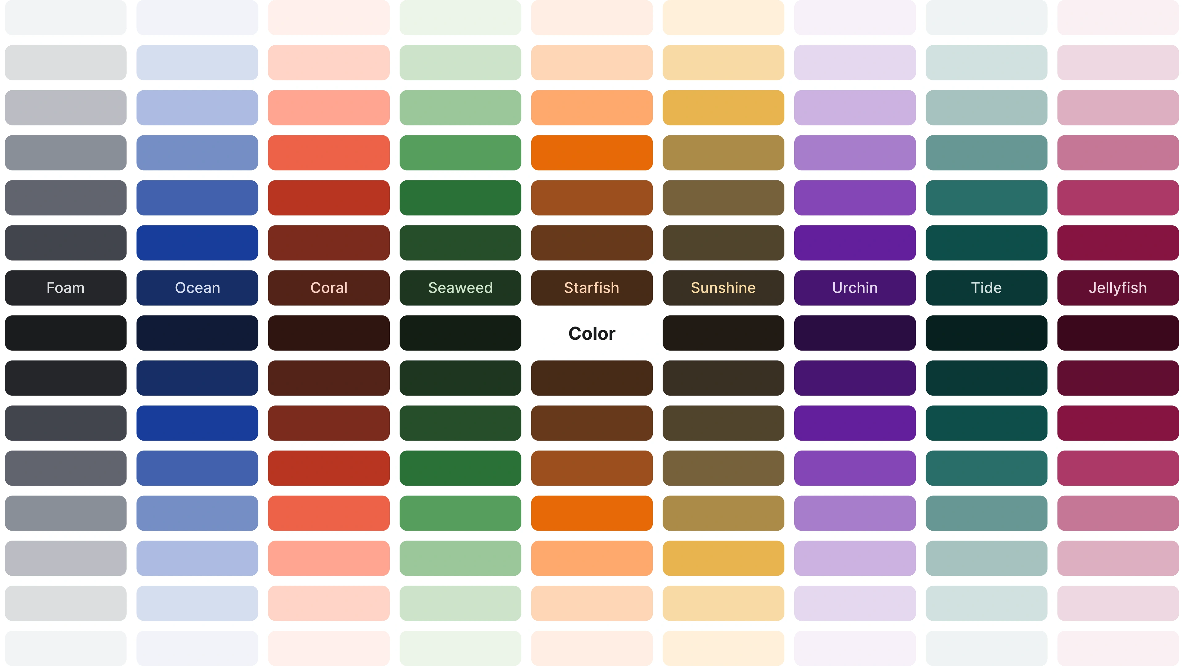
Keel design system color palette
Color scale comparison
In the below example of an Alert component, the background of each alert has a 100 level background color, and the text and icons are 600 level. By using similar relative saturation and luminosity, none of the alerts stand out against each other in terms of color.

Keel design system color palette comparison
Grayscale comparison
When converted to grayscale, the uniform color ramp can be seen more clearly.
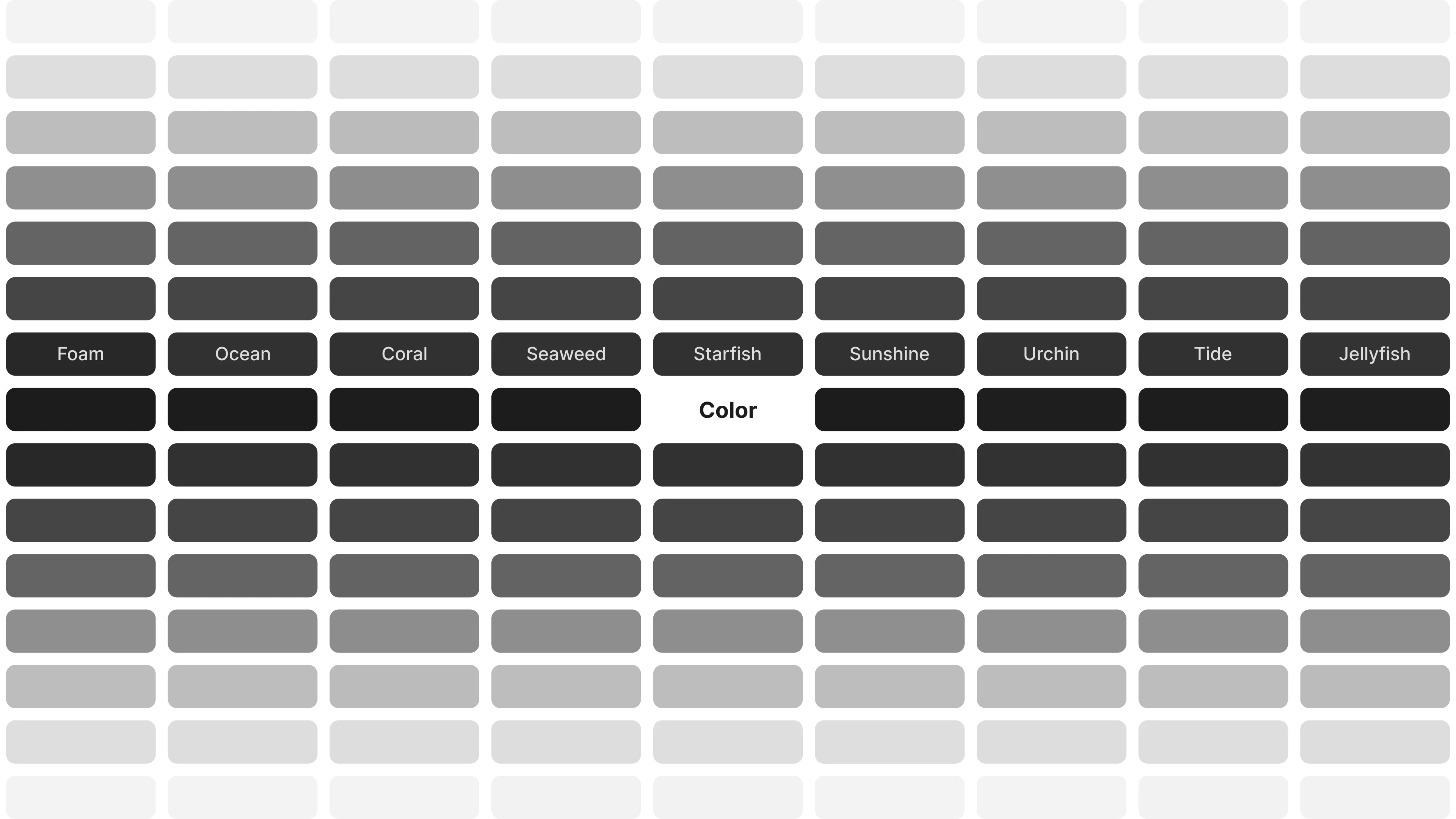
Keel design system color palette comparison
Keel's design tokens
To make component development easier, as well as support NYSHEX's goal of full white-label support for its customers, a full token architecture was created from scratch using Tokens Studio. Early on in the project, I met with the engineering team to define a token strategy and naming convention.
After much discussion (and leaning on my past experience with Quilt, we settled on a Global to Alias level token nomenclature.
Global tokens
While every token starts as a global token, some also end as global tokens. For the sake of ease of use, these tokens remained as global tokens and never received an alias token:
Spacing (margin, gap and padding)
Sizing (specifically declared width & height)
Corner radius
Alias tokens
Alias tokens take global tokens and apply one level of specificity to them. We applied alias tokens to:
Typography
Color
Border
Component token example

Keel design system token example
Exposure in Figma Dev Mode

Keel design system tokens in dev mode
Whitelabel support
Identified early on in the project was the absolute necessity for Keel and the tokens to support whitelabeling the app for NYSHEX's various carrier clients. To accomplish this, I built a "core" set of tokens that contained the tokens that would be consistent for all themes (such as spacing and sizing), and then a separate theme for each whitelabel that contained brand-specific colors and typography.
Below is a video showing whitelabel theme switching within Figma. Note: carrier names have been anonymized and the video is slightly sped up.
Whitelabel theme switching in Figma
Components
Below is a list of components such as Alert, Text Badge, Date Picker, and Stepper (which is the most complex component in Keel)
Alert

Keel design system Alert component
Date Picker

Keel design system Date Picker component
Text Badge
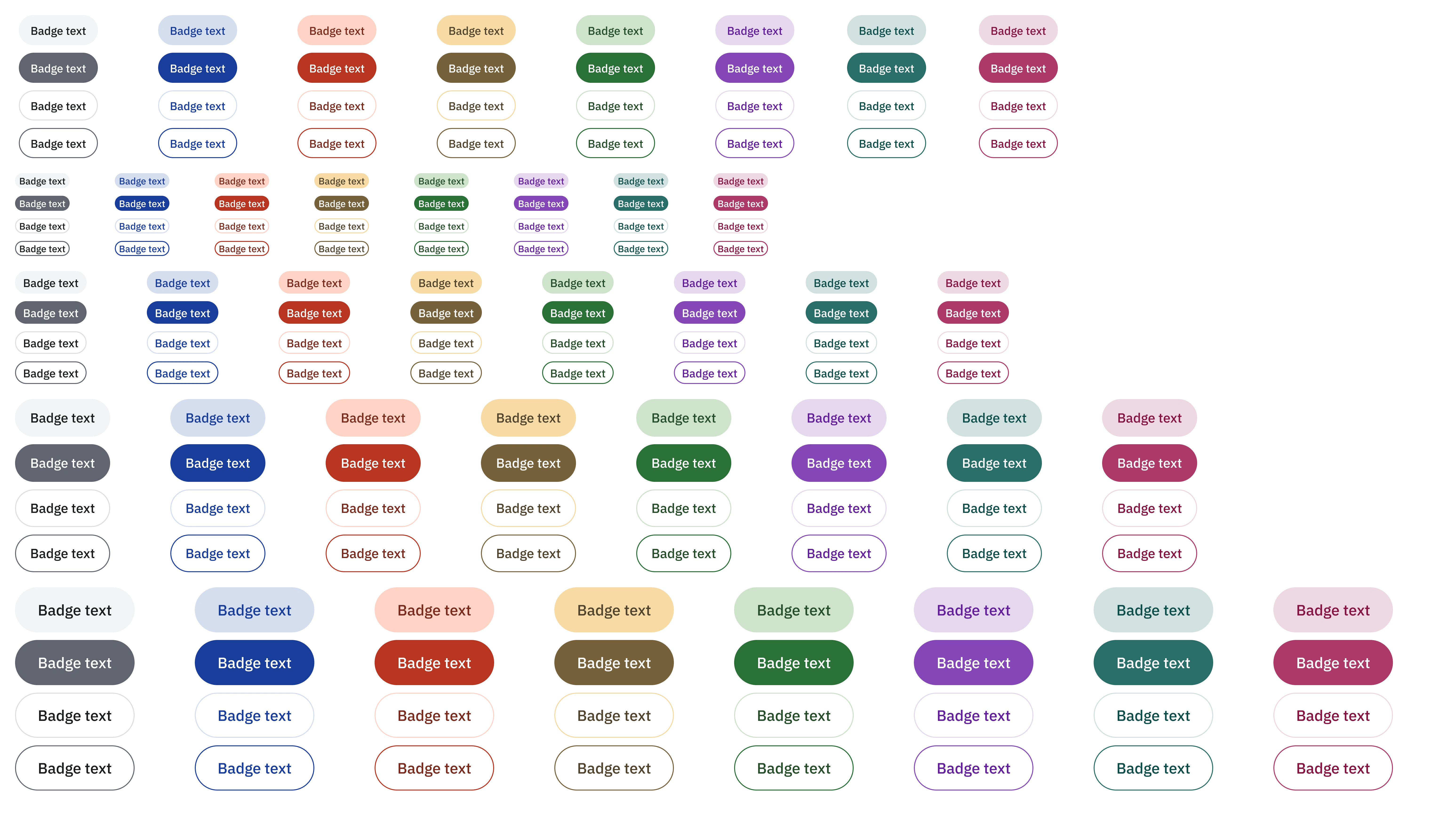
Keel design system Text Badge component
File Uploader

Keel design system File Uploader component
FigJam Process Overview
I re-used the same successful FigJam overview from Quilt to handoff to devs & designers on the overall process of how to successfully use Keel or make changes and implement new components.
Figma-component-level engineering specs
Every component in Figma received detailed specs on how the component was setup, the different variants, states, as well as which tokens were being used.

Keel design system component spec
Notion Documentation
For easier discovery and more engineering-focused documentation, I co-created documentation in Notion more centered around engineering.

Keel design system notion documentation
Keel Lunch & Learn Engineering Benefits
Below is a slide the front end engineers created to summarize the benefits Keel was providing the engineering team.
Keel in total
In total, Keel is currently 127 components. All in all, Keel has the following components (and sub-components):

Keel design system component list
Like this project
Posted Jul 2, 2024
Keel is a bespoke new design system built from scratch to usher in a new design and development process for the New York Shipping Exchange (NYSHEX). Designed en
Likes
0
Views
9

