Local Solana - Brand design
Samuele Capri
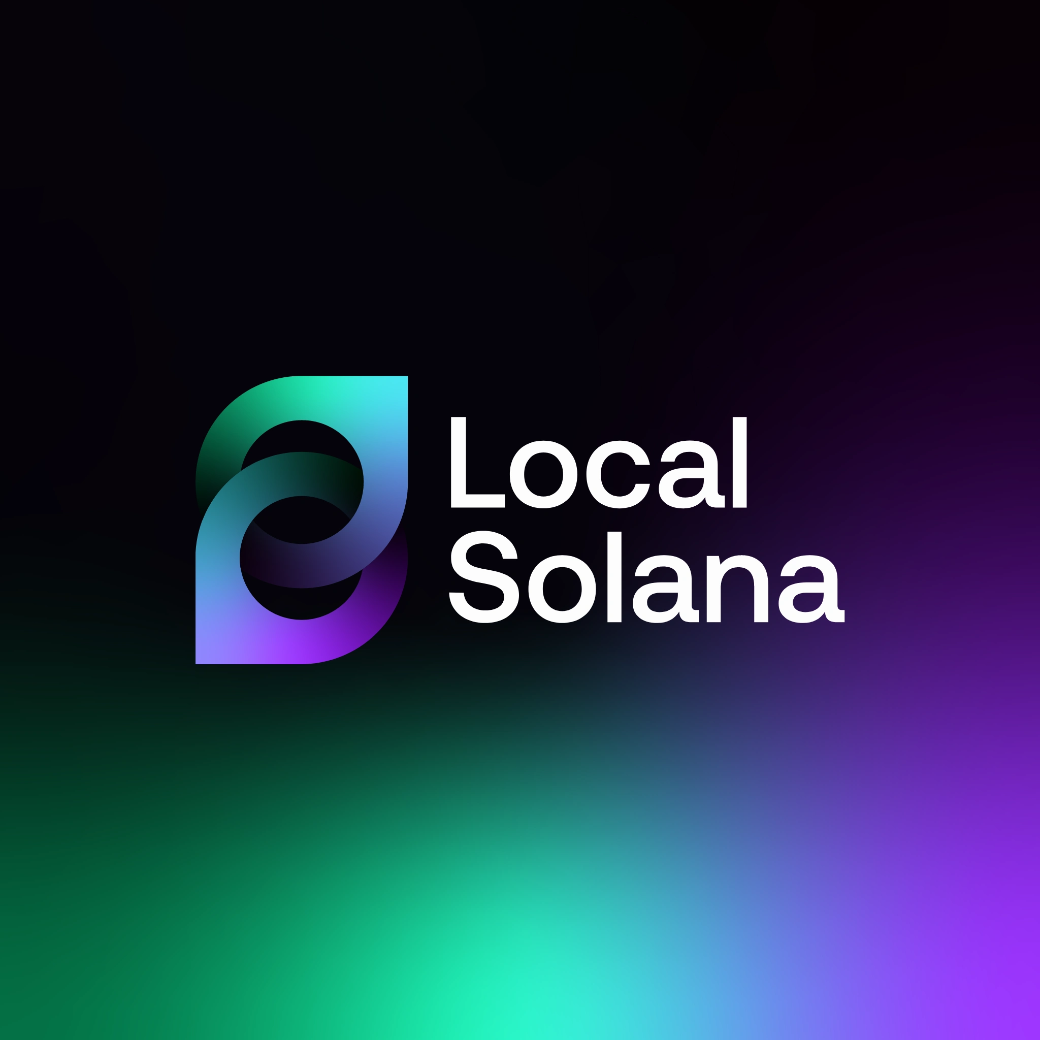
Local Solana is a decentralized finance (DeFi) wallet built on the Solana blockchain, designed to facilitate peer-to-peer transactions within local communities. The branding project, completed in 2024 by GetPoisoned, aimed to create a visual identity that reflects the project's mission of enabling global wealth exchange through a relatable and user-friendly interface.
The logo design incorporates elements from the original branding, including a location pin shape, symbolizing the project's focus on local transactions. The color palette draws inspiration from the Solana ecosystem, ensuring brand alignment and continuity. The chosen typeface is bold and clear, offering high legibility and adaptability across various platforms and assets.
The website design emphasizes simplicity and accessibility, aligning with the project's goal of making decentralized finance more approachable for everyday users. The overall branding strategy effectively communicates Local Solana's vision of a decentralized, community-driven financial ecosystem.
DELIVERABLES:
- Logo design
- Brand Identity
- Brand guidelines
- Web design
Like this project
Posted May 21, 2025
Developed branding for Local Solana, a DeFi wallet on Solana blockchain.
Likes
0
Views
7
Timeline
Nov 6, 2024 - Nov 30, 2024