The Ape Shape - Brand Identity
Samuele Capri
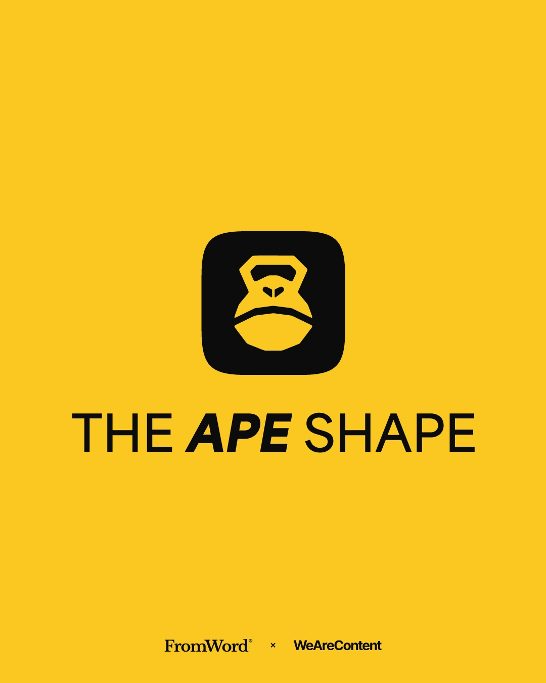
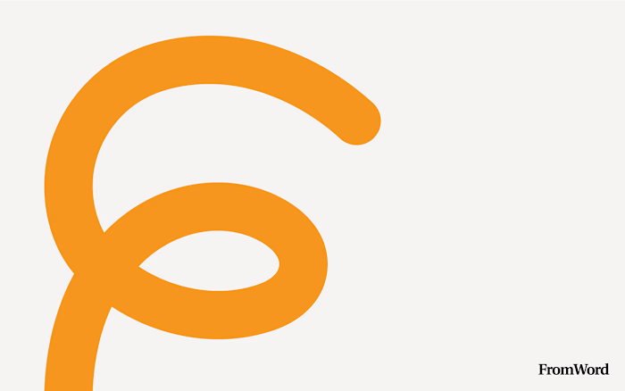
The Ape Shape is a fitness brand designed to embody strength and dynamism. FromWord developed its brand identity in 2024, completing the project within a month. The logo cleverly merges the image of an ape with a kettlebell, symbolizing the power and explosiveness inherent in both the animal and the workouts offered by The Ape Shape.
The chosen typeface is clean and straightforward, capable of becoming bold and dynamic when necessary, reflecting the brand's assertive nature.
The color palette features vibrant and prominent hues, emphasizing the brand's desire to stand out and ensuring high visibility. These elements are applied across various physical items, translating the brand's essence into tangible experiences.
Overall, The Ape Shape's branding captures the energy and creativity of the fitness world, delivering a fresh and engaging design experience.
DELIVERABLES:
- Logo Design
- Brand Identity
-Brand Guidelines
Like this project
Posted May 21, 2025
Developed brand identity for The Ape Shape, a fitness brand, in 2024.
Likes
0
Views
13
Timeline
Jan 1, 2024 - Feb 1, 2024