Innovating a Delivery App Experience

Ricardo Sanchez

Like this project
Posted Apr 1, 2025
Designing Listo's app
Likes
0
Views
1


Introduction
In an industry crowded with lookalike delivery apps, Listo! wanted to break the mold. Unlike Uber Eats or Glovo, our goal wasn’t just to deliver food—it was to create a delightful and vibrant experience. From my position in Hömann Hux, I led the design of this app to reflect Listo!’s playful brand identity while ensuring seamless functionality, redefining how Ecuadorians interact with fast food delivery.
My Role
As the lead product designer, I was responsible for the entire product design lifecycle, from conceptualization to final delivery. I focused on creating a distinctive user journey, designing key features like onboarding, product selection, and order tracking. My role extended beyond design; I collaborated closely with software engineers and a product manager to ensure the app delivered on its promise of being intuitive, engaging, and uniquely Listo!.
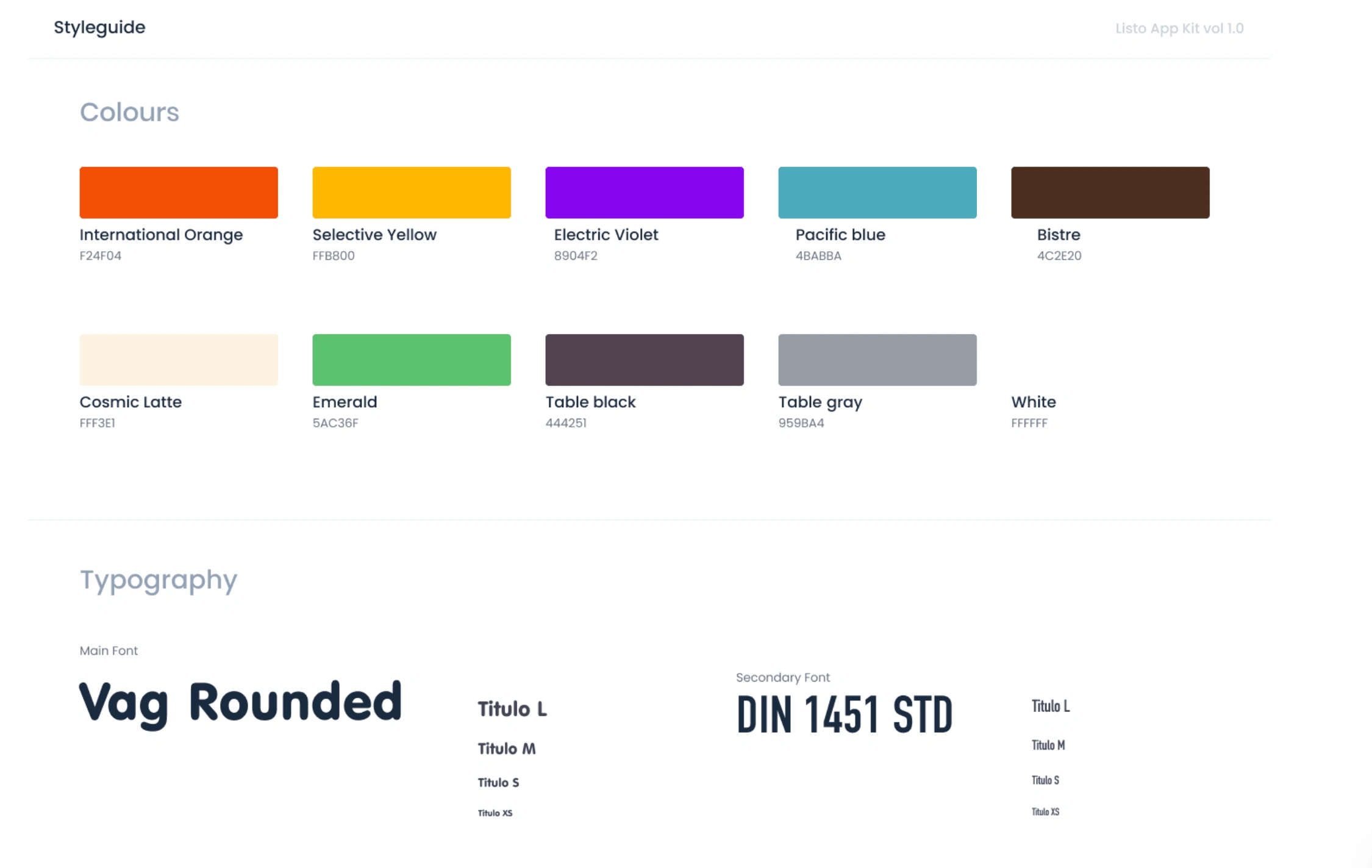
My Contributions
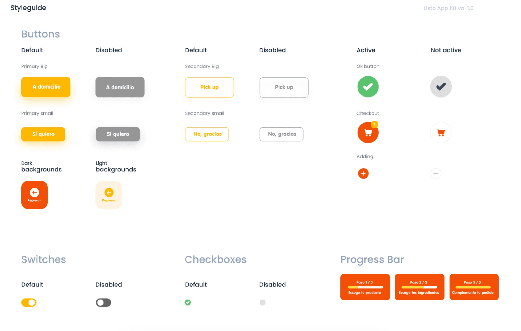
We began the project by setting up the foundation of a design system to ensure consistency and coherence across the app. This included defining a vibrant color palette that aligned with Listo!’s bold and playful identity, as well as establishing basic UI components such as buttons, switches, checkboxes, and progress bars. These elements were designed to be versatile and adaptable, creating a cohesive visual language while keeping the user experience simple and intuitive.
Onboarding
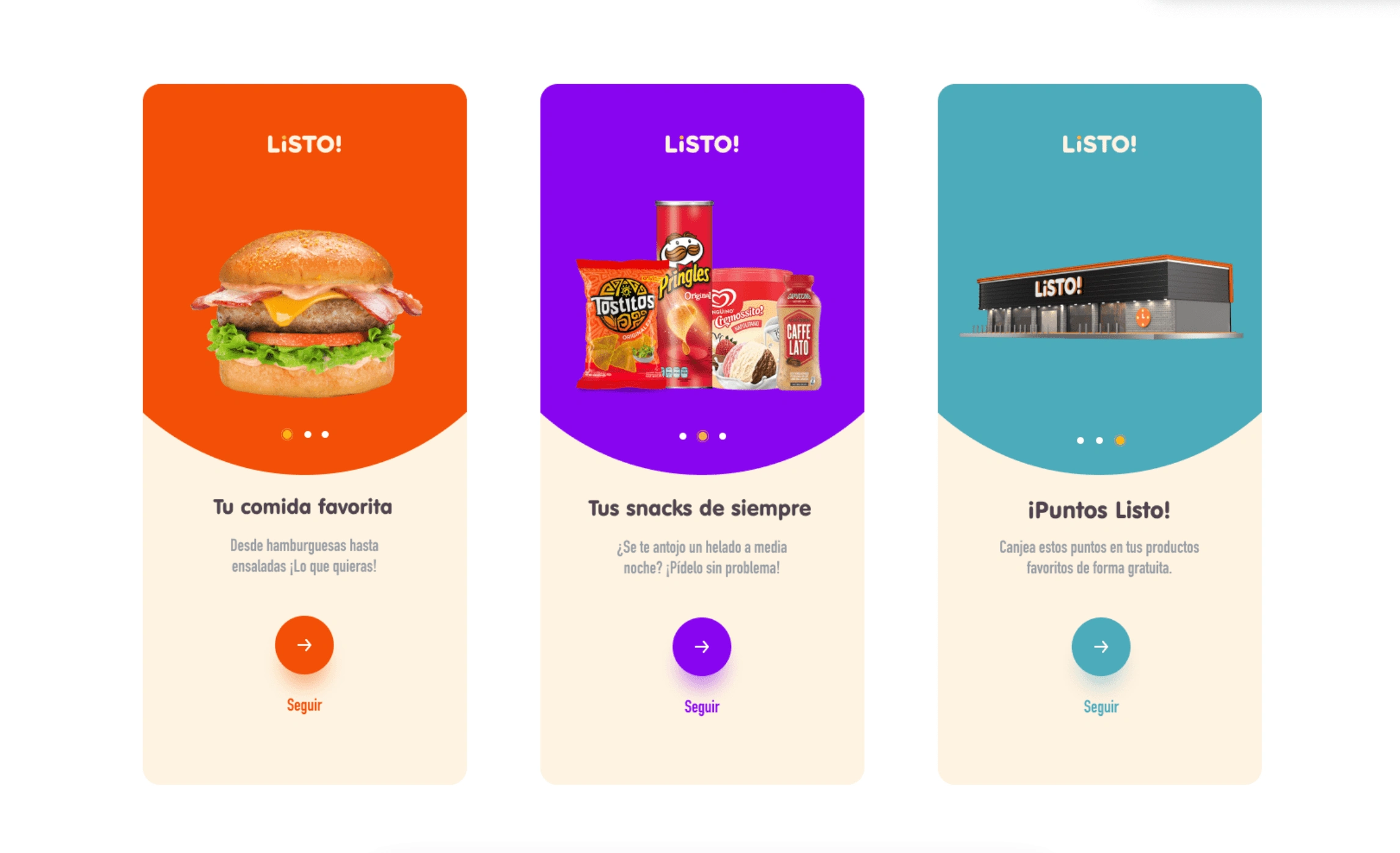
The onboarding was designed to quickly introduce users to Listo!’s key features, like customizable meals, snack options, and the loyalty rewards program. Using bold visuals, clear messaging, and simple navigation, we ensured users could understand the app’s value in just a few steps. Each screen focused on a single concept with clear call-to-actions, making the process intuitive and fast, while setting the tone for an engaging experience.
Menu and product selection
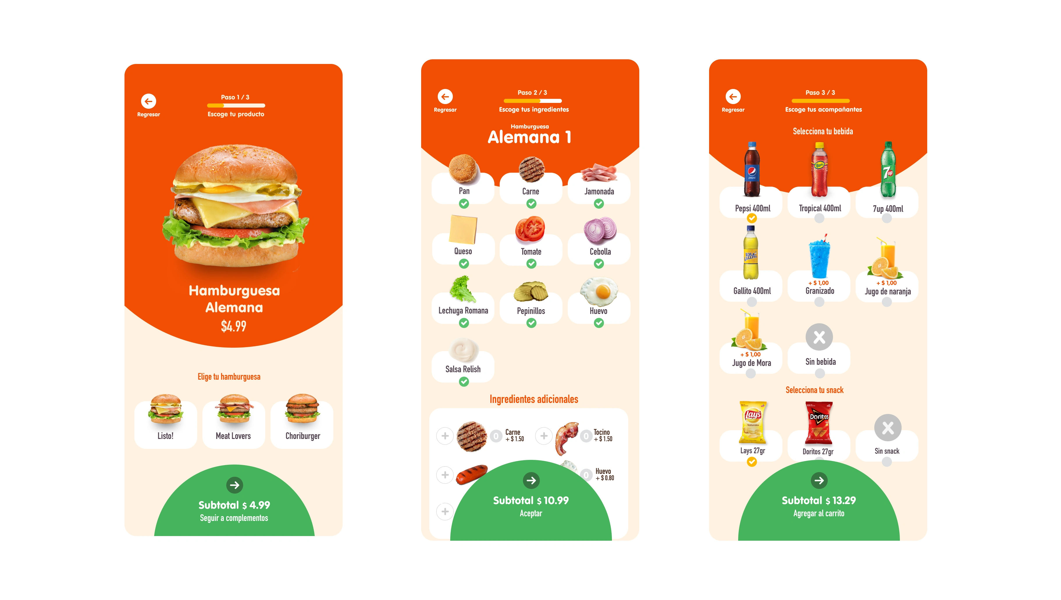
The menu and product selection process was designed to be visual and intuitive, making it easy for users to customize their orders step by step. A step UI indicator at the top provided clear guidance, ensuring users always knew where they were in the process. We incorporated large, high-quality images for the menu items and ingredients, creating a more engaging and appetizing experience. Ingredient selection used simple checkbox inputs paired with visuals, allowing users to personalize their meals with just a tap.
Registration process
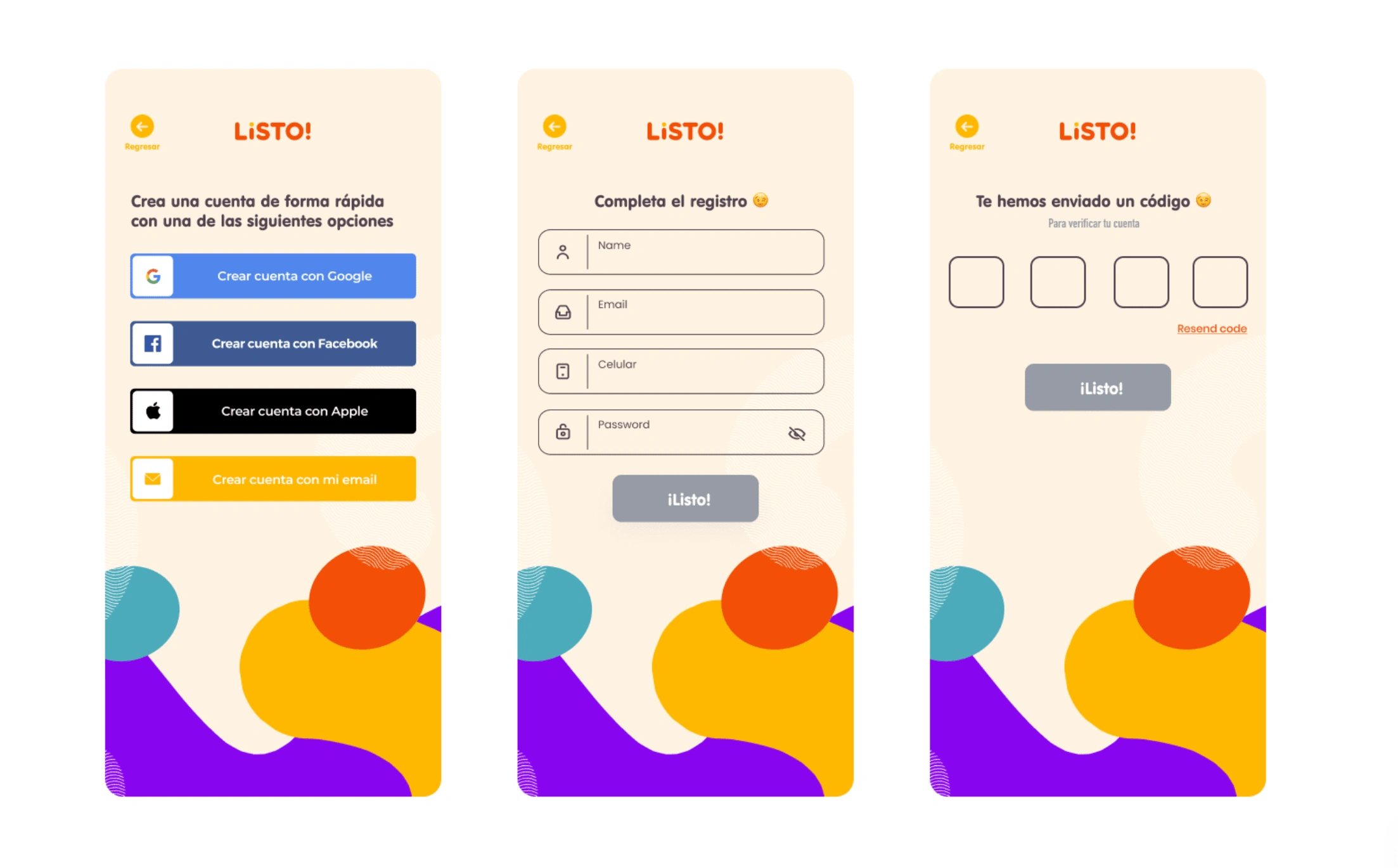
The registration process was designed to be as simple and efficient as possible. Users could quickly create an account using social media options like Google, Facebook, or Apple, or opt for traditional email registration. The flow included a straightforward form with only essential fields, ensuring minimal friction. To enhance security and confirm authenticity, a code validation step was introduced, where users received a unique code to verify their account. This streamlined process ensured users could get started with the app effortlessly while maintaining a secure and trustworthy experience.
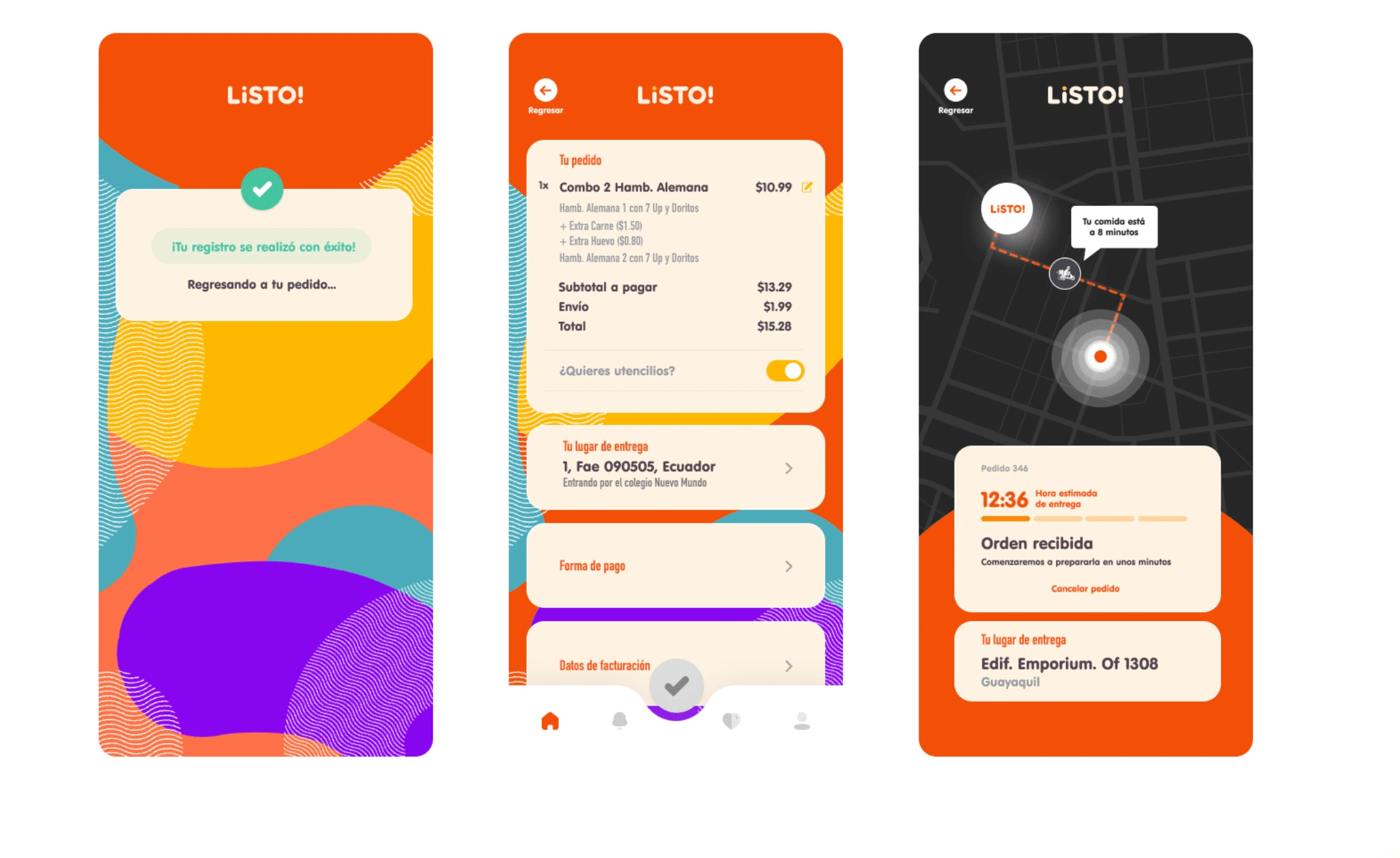
Order Confirmation and Tracking
After placing an order, users are guided through a smooth confirmation process followed by an engaging waiting experience. The confirmation screen provides a clear summary of the order, including items, pricing, and delivery details, ensuring users can double-check everything at a glance. The waiting time screen uses a dynamic map to track the delivery in real-time, showing the current location of the food and estimated time of arrival. Subtle animations and progress indicators keep the user informed and engaged, transforming what is typically idle time into a seamless and reassuring experience. This approach ensures transparency while maintaining user satisfaction during the critical waiting period.
Conclusion
The Listo! app wasn’t just about food delivery—it was about creating a joyful experience that users would want to come back to. By approaching each touchpoint, from onboarding to delivery tracking, with both empathy and creativity, I helped Listo! redefine what a food delivery app could be. The project proved that design, when aligned with a brand’s identity and user needs, can turn a functional tool into an unforgettable experience.