Tank Slapper Community
Tank Slapper Community was a Sharpen challenge project that I completed in two hours. I was given a challenge to design a text-based app for a skate shop that featured an unusual style relative to my other work.
I chose to make a text-only forum app, following the conventions of digital brutalism and the no frills philosophy of skate culture. My inspiration (below) was taken from Tony Hawk's Pro Skater games, Blockhead Skateboards, and a wide array of digital brutalist works.
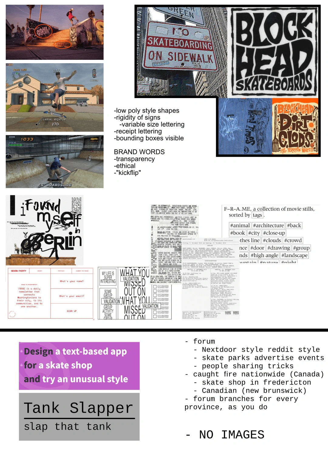
Here's the story I wrote for this challenge: Tank Slapper, a skate shop in Fredericton, New Brunswick, created a text-based forum for local/provincewide events to be advertised and for users to discuss skating. After the forum gained a nationwide userbase, the shop and their web team decided to make a mobile app for the site - but it had to continue the shop's philosophy of transparency, ethics, and cool factor (you might notice that I decided the word the shop would use to capture this feeling is "kickflip").
One of the key decisions I made for this challenge was trying to emulate the appearance of bounding boxes and not using margins for many elements, including forum post titles and text. To me, this communicates a certain radical transparency - these are the exact borders of this text box, nothing more, nothing less. This idea is most present on the posts page, but it also features on the landing page where I bounded the blue text, which would be hyperlinks to various recent or popular posts.
A deep dive on the landing page:
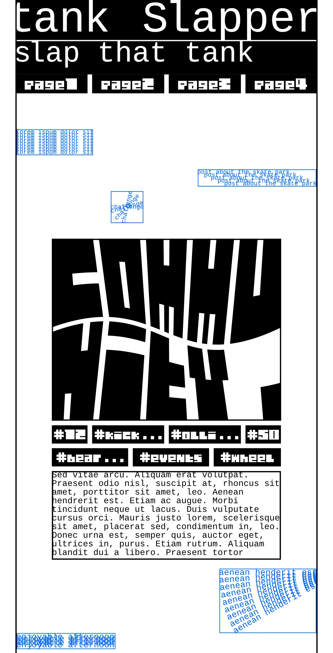
At the top is the Tank Slapper logo, which I chose to style with a lowercase t at the beginning to better work with the marginless look. The bottoms and tops of the letterforms touch the dividing line I put between the name and tagline as another expression of edgy, neo-brutalist irreverence. To give all of the content a little bit of room, I used margins on the sides of the screen, which are also visible bounds.
Underneath the logo/tagline section is the navigation bar, which uses placeholder page names in this mockup, but would not read numbered pages with final text; the actual pages the buttons point to would include the landing/home page, posts page, and two others - maybe a link to the shop, a list view of events, or an online users display.
The "community" logo was done as a reference to the Blockhead Skateboards type I put on my inspiration board, but I used a bitmap-style typeface to evoke a different feeling - more digital, a little more uniform, but still quirky. Directly below it are buttons the user can tap to go to posts with tags like the ones listed, and below that is space for a variety of copy, but I would imagine that Tank Slapper keeps a manifesto of sorts in that box (which is bounded with only a bottom margin).
The blue text and boxes are the links to popular and recent posts mentioned above. The actual text in use would be the titles of those posts, but they would be styled similarly, in odd repetitions, spacing, and rotation. Each one would be bounded in the style pictured to delineate the clickable space.
A deep dive on the posts page:
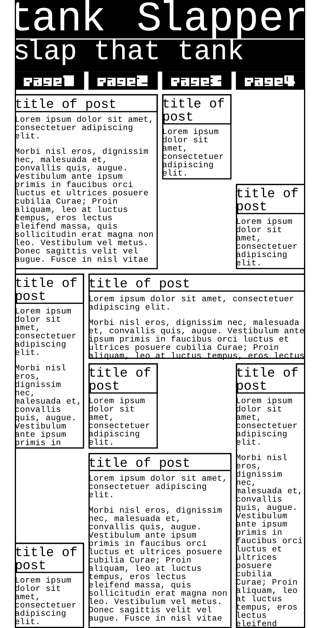
Again, we have the static header and navigation bar, and the page keeps the margin bounds, which would be consistent across the app.
The post previews themselves are bounded with no margins on the text box (but not necessarily on the actual text, an element that reinforces the no frills approach). Text is allowed to align to the left with no justification in the preview, and the preview boxes themselves are based on a four-column grid that aligns with the navigation bar.
The boxes would be sized according to the length of the post previewed, not necessarily including the entire post. The boxes used just happen to end at the bottom of the mockup shown, and the posts page would be infinite scroll, not paginated.
Some takeaways: This was a challenge completed in a short span of time, so some oversights were made! I neglected to add a search and filter element to the posts page - an easy fix that I would have easily implemented upon seeing the project with fresh eyes. Displaying one or two tags on each post would be helpful and visually interesting, and I could have leaned more into the branches for every province.
Had I gone into deeper detail for this project (and I may in the future), I would like to add that search and filter system, two more pages (or maybe three) as indicated in the nav bar, and a tag display system for post previews. The bones for this mockup are so cool - I am not a skater, but the subculture's aesthetics and values resonate with me, and I'm so happy that I rolled up this challenge.
Like this project
Posted Jul 27, 2024
A Sharpen challenge project that I completed in two hours: a text-based app for a skate shop that features an unusual style.
Likes
0
Views
12
