Haus Type — E-Commerce Website Design in Framer

Memouna D


The Challenge
Haus Type is a typeface company with a timeless typographic identity, but their online presence wasn't doing it justice. They needed an e-commerce site that could guide visitors from font discovery to purchase without friction, while reinforcing the brand's premium positioning.
The Approach
I worked with Haus Type to design and develop a conversion-focused e-commerce website built entirely in Framer. The priority was creating a smooth, intuitive user experience where the typefaces are the star, not the interface.
Key design decisions:
Clean, structured layouts that showcase each typeface at its best
Intuitive navigation so visitors can browse, compare, and preview fonts quickly
Smooth checkout flow designed to minimize drop-off between browsing and buying
3D elements built in Spline to add depth and visual interest without slowing the site
Fully responsive across all devices
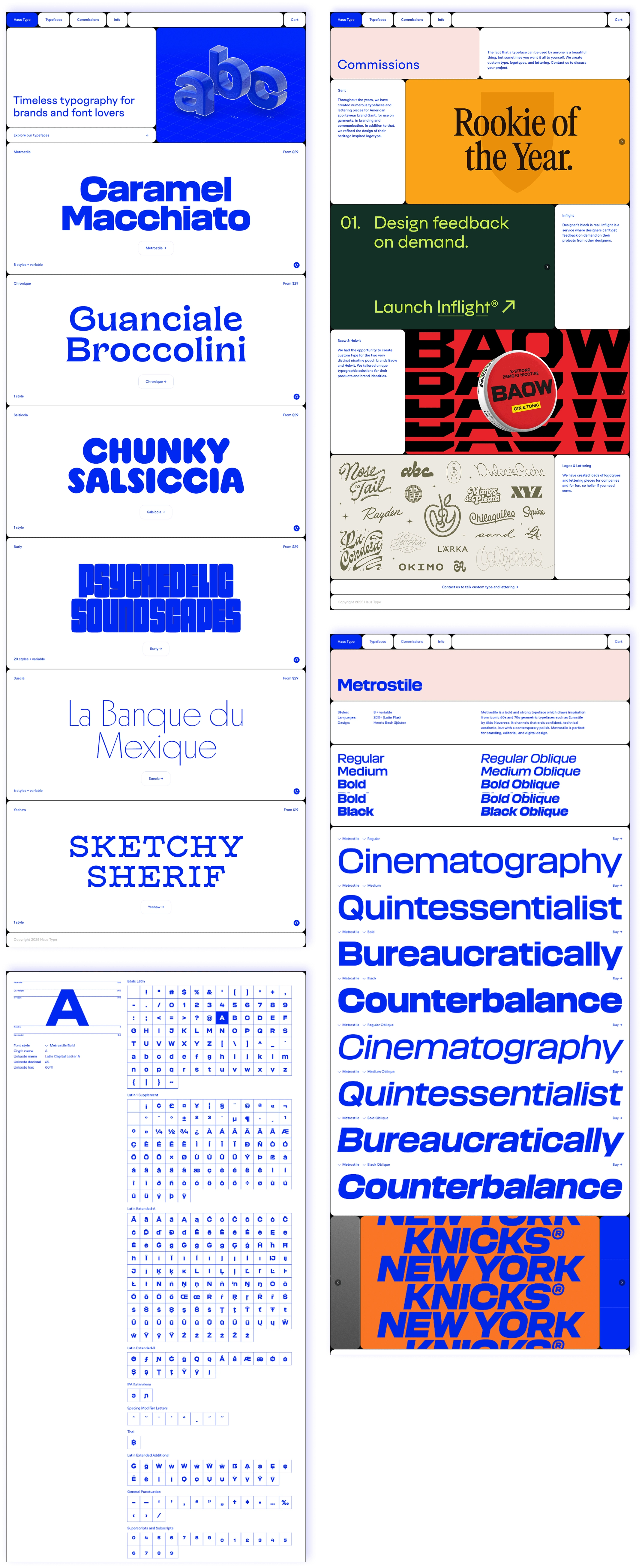
Haus Type Full Site
Brand Meets Commerce
The biggest challenge was balancing brand credibility with sales efficiency. A type foundry site needs to feel premium and editorial, but it also needs to function as a store. I solved this by keeping the visual language minimal and letting the typography do the heavy lifting, then layering in clear CTAs and a frictionless cart experience on top.
Every page was designed with a clear purpose: the homepage builds trust, the specimen pages sell the fonts, and the checkout closes the deal.
The Result
The final website reflects Haus Type's identity while working hard as a sales tool. Clean presentation, fast performance, and a buying experience that feels effortless. The site is live at haustype.com.
Like this project
Posted Dec 7, 2024
Designed and developed a conversion-focused e-commerce website for a typeface brand. Clean layouts, intuitive font browsing, and a smooth checkout flow, all built in Framer with 3D elements via Spline.