CenturyLink


What is CenturyLink?
CenturyLink is a global technology company that provides communication, networking, and IT services to consumers, businesses, and government entities. The company operates as a major internet service provider (ISP) in the United States, offering high-speed internet, digital TV, and home phone services to residential customers.
The Problem
CenturyLink was seeking a consumer-facing security interface for iOS that would be easy to use and has a simple, yet powerful interface. The goal was to provide a free utility to their residential consumers, primarily in the mid-20s to early 60s age range, that would allow them to control their connected devices, set bandwidth limitations, and monitor their security preferences.
The Solution
A native security app that would allow CenturyLink residential and commercial customers to access the security threats and vulnerabilities of their personal and professional networks.
Understanding the User
I started the research process by interviewing the client and gathering requirements. Their expertise in cyber security provided me with much information on the industry but not the pain points of the user, that I had to determine by working with customer service and reading the report logs that were sent to them in order to determine what types of threats do customers report, what are the most typical, and so forth.
Research Insight
Here were some of the insights gathered from the research:
Users to have visibility into their residential and commercial networks
Users wanted to be able to control what devices had access to the networks in a more intuitive and visual way
Users wanted an easy way to escalate a security vulnerability or incident
Personas
Following the analysis of user research findings, the next step was to develop personas, which aided in envisioning the intended audience. To facilitate the design process, I ensured that one particular persona effectively represented a user that was interested in helping understand their personal and business security network needs , and who was enthusiastic about improving the workflow process, taking into account their pain points and frustrations.
This persona served as a constant reference point throughout the entirety of the product design journey, helping to maintain a clear focus when making design choices.
Sitemap
Afterward, the focus shifted towards conceptualizing the structure of the product mainly thinking about what the functions and main actions required at this particular part of the process.
Given this perspective, I prioritized the use of iOS devices and proceeded to design a sitemap that visually depicted the primary user journey within the product.
Sketches
At the onset of the design phase, I initiated the process by creating preliminary sketches outlining the desired page layout. My objective was to enable users to easily navigate all of their network devices, while also keeping an eye on any suspicious network activity.
Low-Fidelity Prototype
With the foundation of the website's structure in place, the next step involved crafting low-fidelity wireframes. These wireframes served as initial representations of each screen's layout and content. Subsequently, these wireframes were transformed into lo-fi prototypes, allowing for a rapid assessment of how the screens should seamlessly flow together.
User Testing
Before moving on to high-fidelity mockups, I tested the lo-fi mockups with the lead product owner, and small group of customers that were provided by CenturyLink. Here are some of the improvements made based on user feedback:
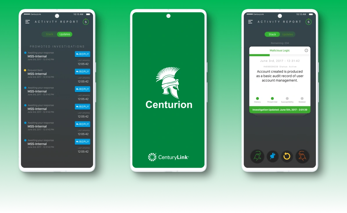
Users didn't know that they could swipe a card, and thought they could only press the buttons on the bottom menu
Users wanted to understand if their request were being attended to and the lo-fi prototype didn't address that properly
Final Design
After taking into account user feedback and iterating on the lofi design, the final design was complete. By providing a clearer message to the user that the reported incident is being viewed by the security service team the user was more relieved knowing someone was on the incident and now have to wonder if that was the case. Adding the swipe icon in green made it more apparent that the user could swipe but that the button would perform the same function.
Login
Card Stack View (Home)
Navigation Menu
Security Posture Tier 5
Takeaways
Looking back on the CenturyLink project, our team acknowledges that there were a few things we could have done differently. Firstly, we should have spoken with other parties early on, especially with marketing, to coordinate properly with their branding limitations and best practices. This would have saved us some headaches in the design process.
Secondly, we should have gotten feedback from other stakeholders about the gamifying process and allowed them to be a part of it instead of just moving forward with our ideas. This would have provided a stronger impact on the project and could have potentially improved the overall experience for the end-users.
Next Steps
What additional opportunities are being missed with Desktop? While this project was solely an iOS mobile app, it would be useful and easier to navigate, add, and remove devices from the network, especially for businesses.
What can be improved with the design? UX design is an ongoing process. The next steps include continuing usability testing and constant iteration, in particular on the Mobile version.
What other opportunities exist to expand the offering? Outside of simply being a a network security monitoring service wrapped up in an application, what other settings or configurations could be surfaced for greater ease, and customizability for the consumer.
Like this project
Posted Feb 22, 2024
What is CenturyLink?


