Corporate yet NOT QUITE presentation design
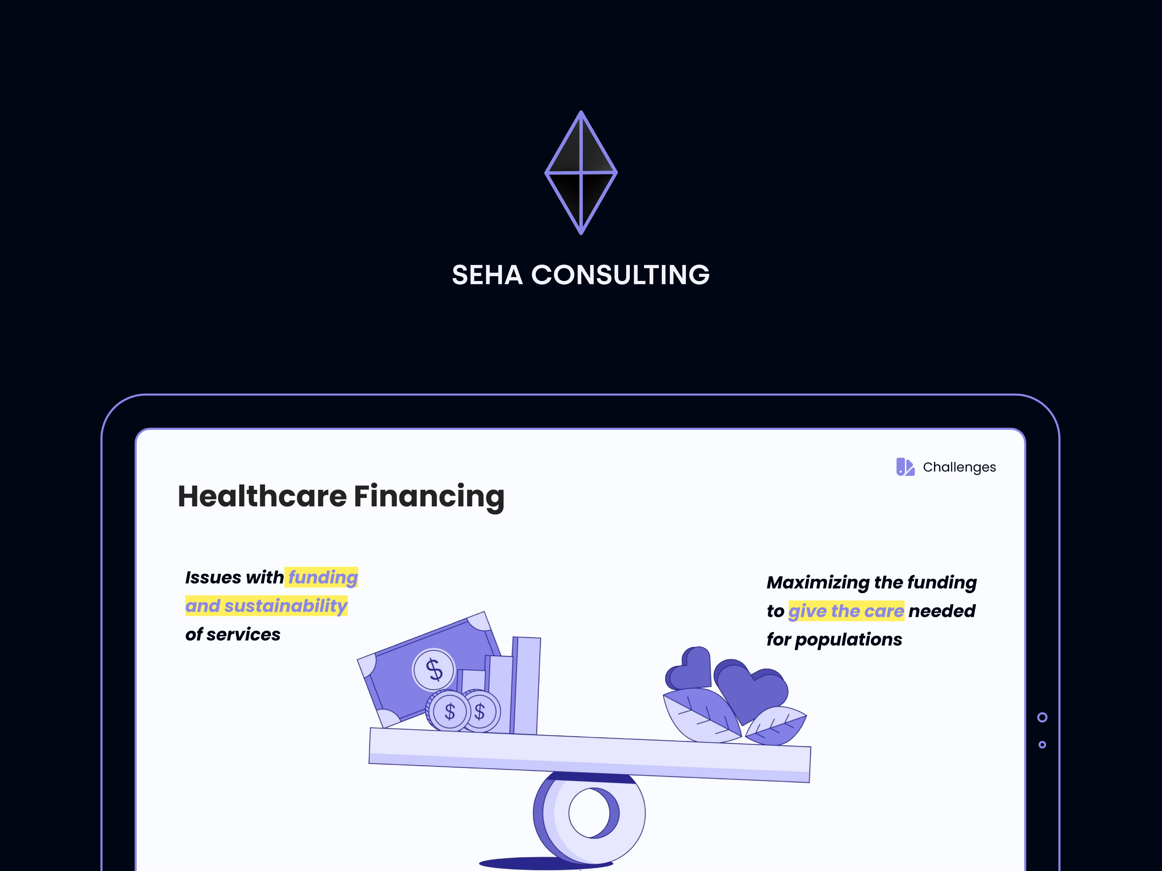
SEHA Consulting
Presentation design & brand alignment
I crafted a presentation for SEHA Consulting that served as the company’s inaugural visual representation for potential clients - slightly corporate, understated, yet distinctly recognizable. It was designed the way so Seha could introduce their services to potential clients in healthcare niche. The design and content presentation emphasizes on structure, visual coherence, brand trustworthiness, and ease of comprehension.
My contributions included:
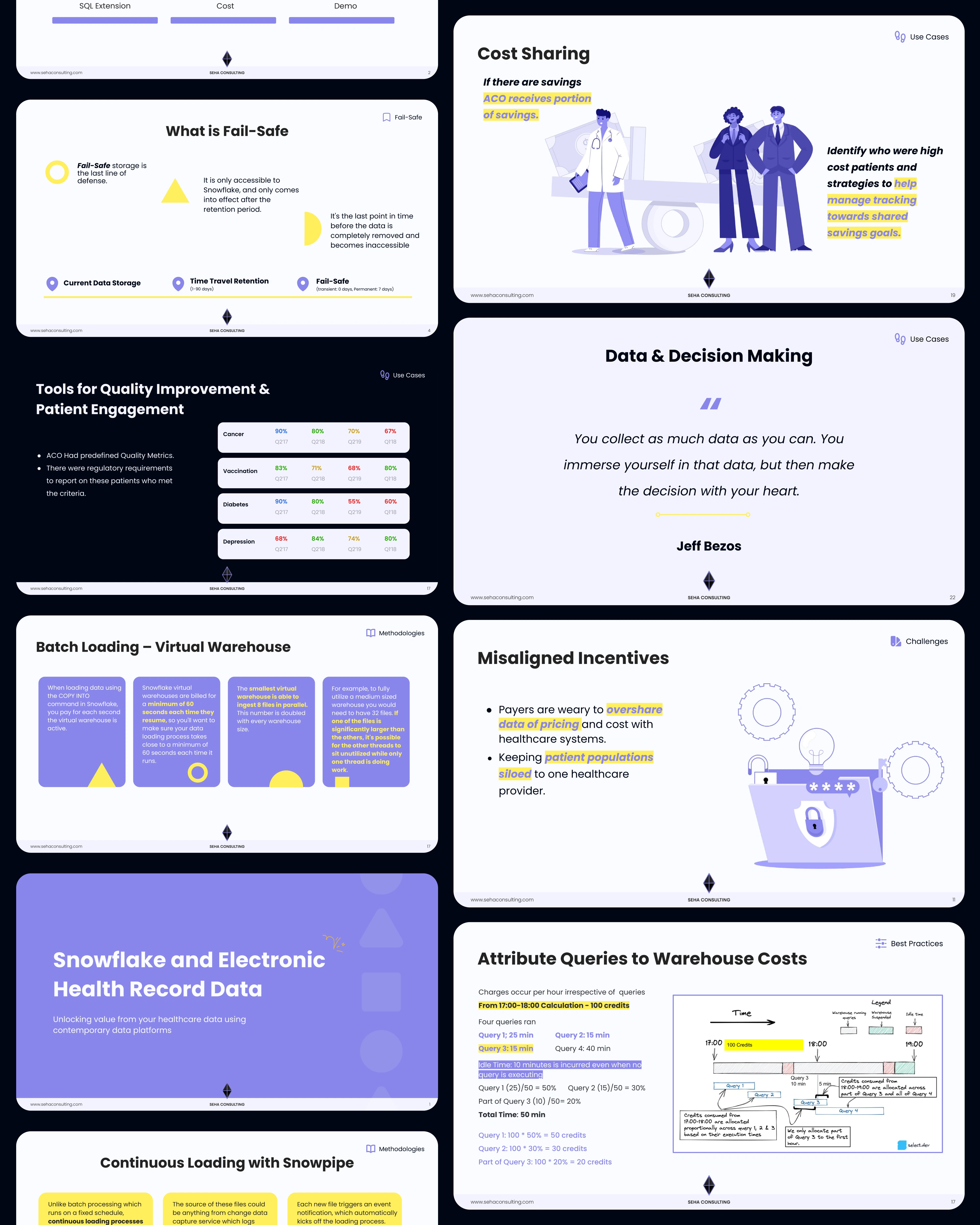
Checking out the initial deck, and adjusting content to fit the presentation format for face-to-face meetings as well as later send-off. The major point was to define visual cliches in consulting services and find the balance between corporate, strict and approachable and go-to consultancy.
Since I've done the Seha branding previously, I've followed my lead in expanding visual style to the presentations as well, keeping in mind focal points :)
I've collaborated with my fav illustrator to create suitable illustrations, that will support content and enhance understanding in slightly complex content (healthcare, huh).
Below you can find a couple of snippets aka slides designed for the deck.
Like this project
Posted May 29, 2025
Designed SEHA Consulting's opening presentation for healthcare niche.

