Banking apps scatter your controls

Orbix Studio

Banking apps scatter your controls everywhere. This one doesn't.
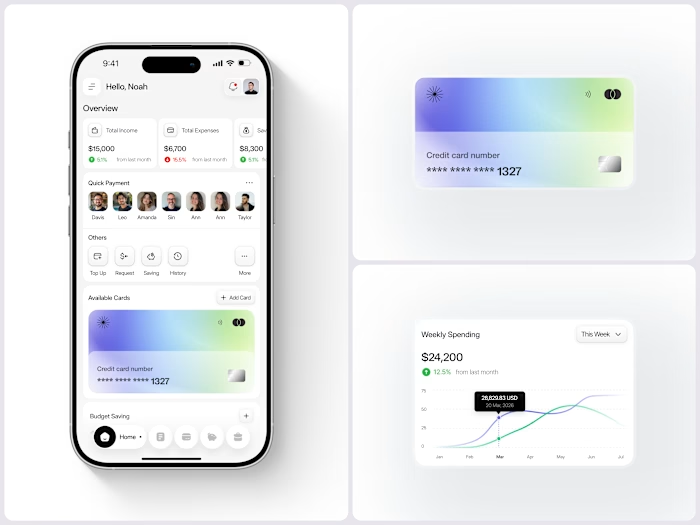
Payno was designed to close that gap. Not just with numbers - but with clarity. Dashboard overview: balance, recent activity, spending breakdown. Card management: virtual and physical unified. Spending controls: front and center, not buried.
The dashboard handles the daily view - your balance, recent transactions, card status, and quick actions. The spending screen goes deeper - category breakdown, monthly limits showing spent vs available, and transaction insights. The card management screen pulls it all together - unified card control, payment options, and activity history in one clean panel.
Three screens. Every financial question answered before it's asked.
This is what banking UI looks like when it treats users like adults who want control, not just data.
Does this feel like a fintech app that would actually change how someone manages their money? 👇
Designed by Orbix Studio ·
See full view 👉 https://www.behance.net/gallery/255260777/Payno-Finance-Solution-Orbix-Studio-Mobile-App
Tools: Figma
Like this project
Posted Sep 18, 2026
Banking apps scatter your controls everywhere. This one doesn't. Payno was designed to close that gap. Not just with numbers - but with clarity. Dashboard ov...
Likes
0
Views
1