E-Commerce store Branding and Landing page design
Good Rosebud - Branding and landing page case study
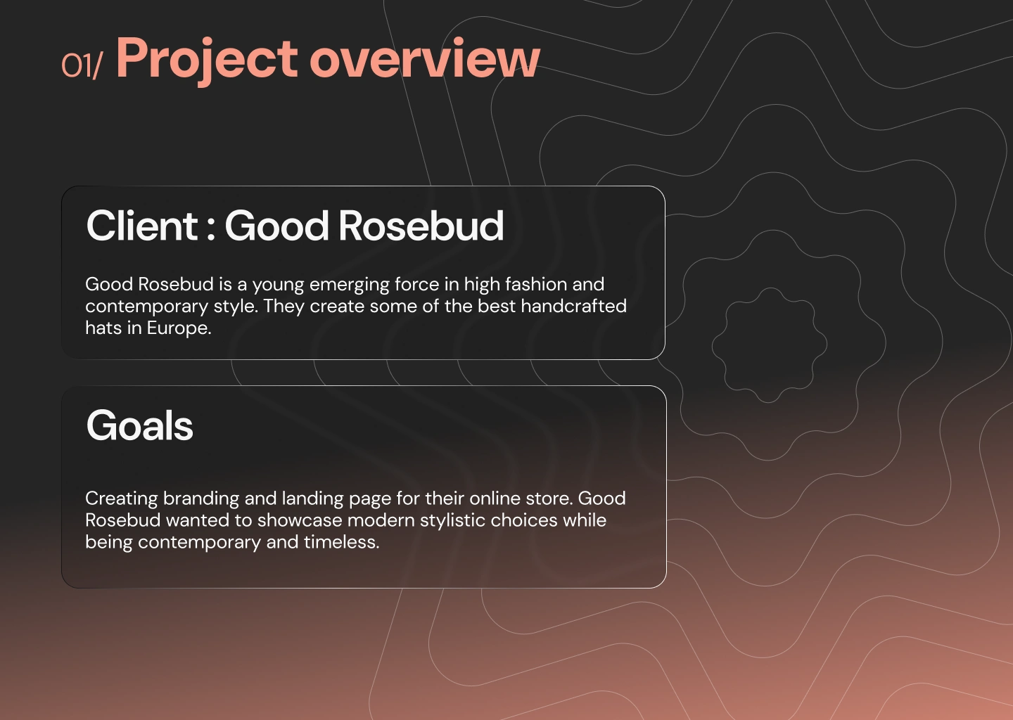
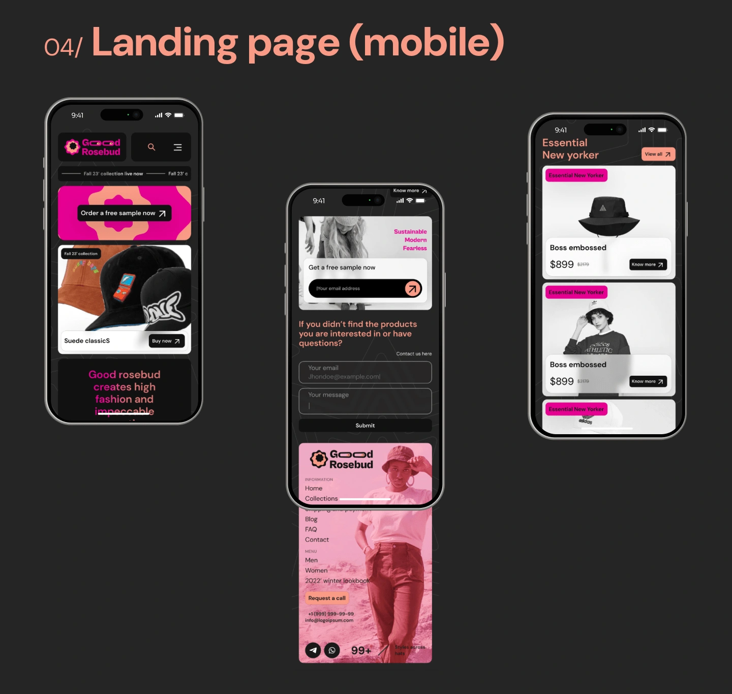
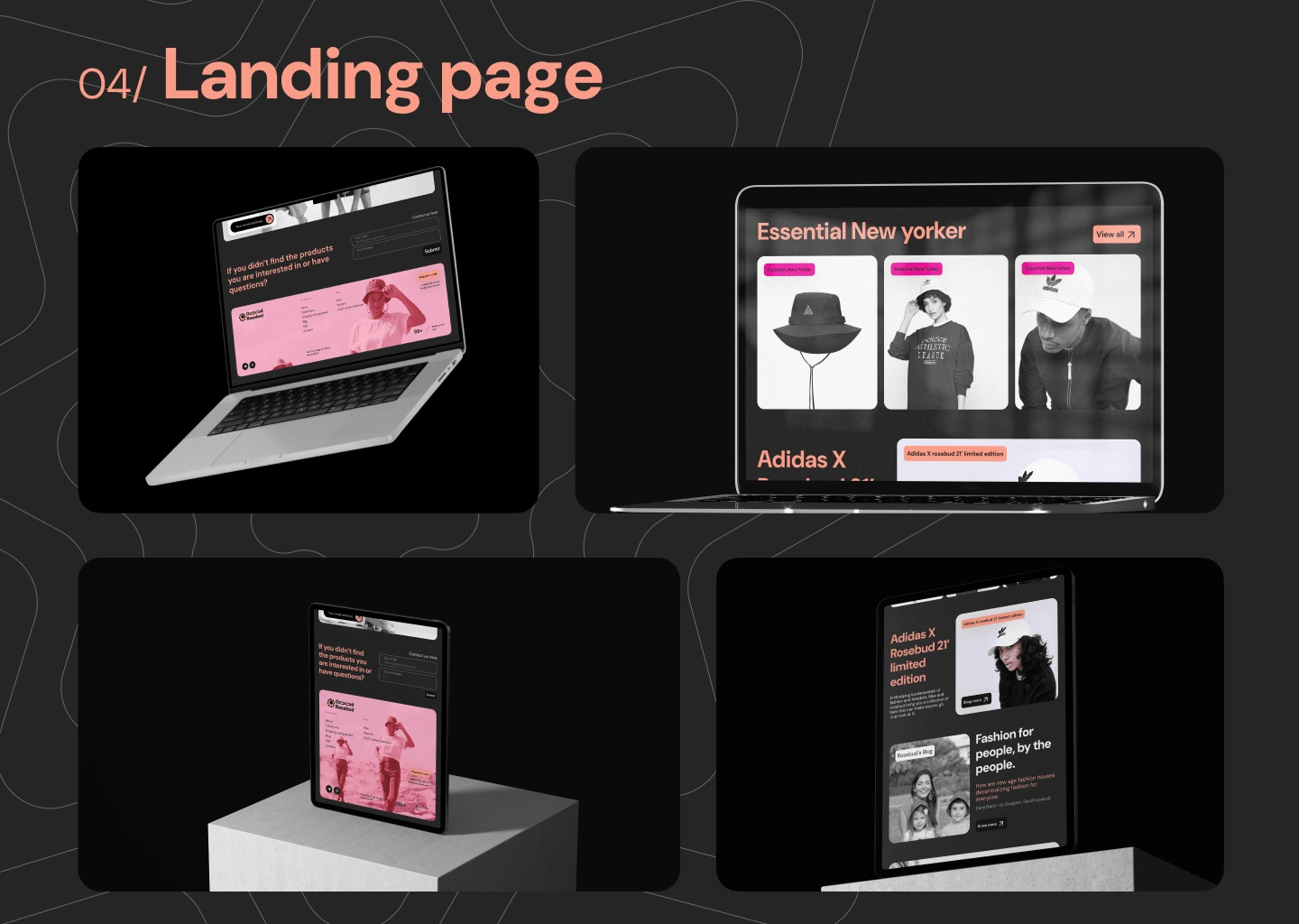
Primary stakeholders for the project were Good rosebud and our main focus was to showcase brand's key ideas through website.
For the whole project my process was as follows (keeping the brand identity part in the loop as well)
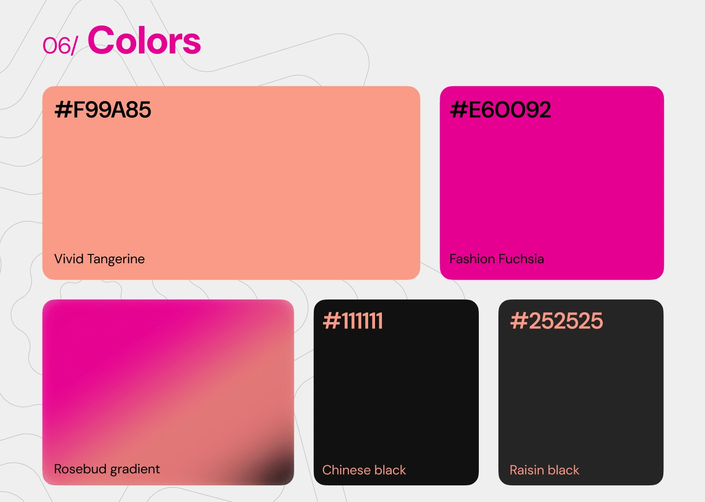
Understand- both user and stakeholders' perspective for the landing page. It shouldn't be hard to assimilate from first look what the company is about. As simple as the principle is it often gets buried in fancy animations and stylistic choices, and then however great your UI is, it would not be serving any purpose. During discovery phase I curated various examples of what the page could be inspired from and also understood what aspects worked in specific contexts. Given I also had to establish a brand identity I got started on that first, defining my logo ideas and color options so a system could be built to scale for Good Rosebud.After understanding users and stakeholders via modes like survey, user interviews, stakeholder meetings for this unique project I had some insights:
1. If the company focuses on a single category of products, they like to have slight context.
2. Bespoke craft and personalization is an advantage that can attract users for longer times.
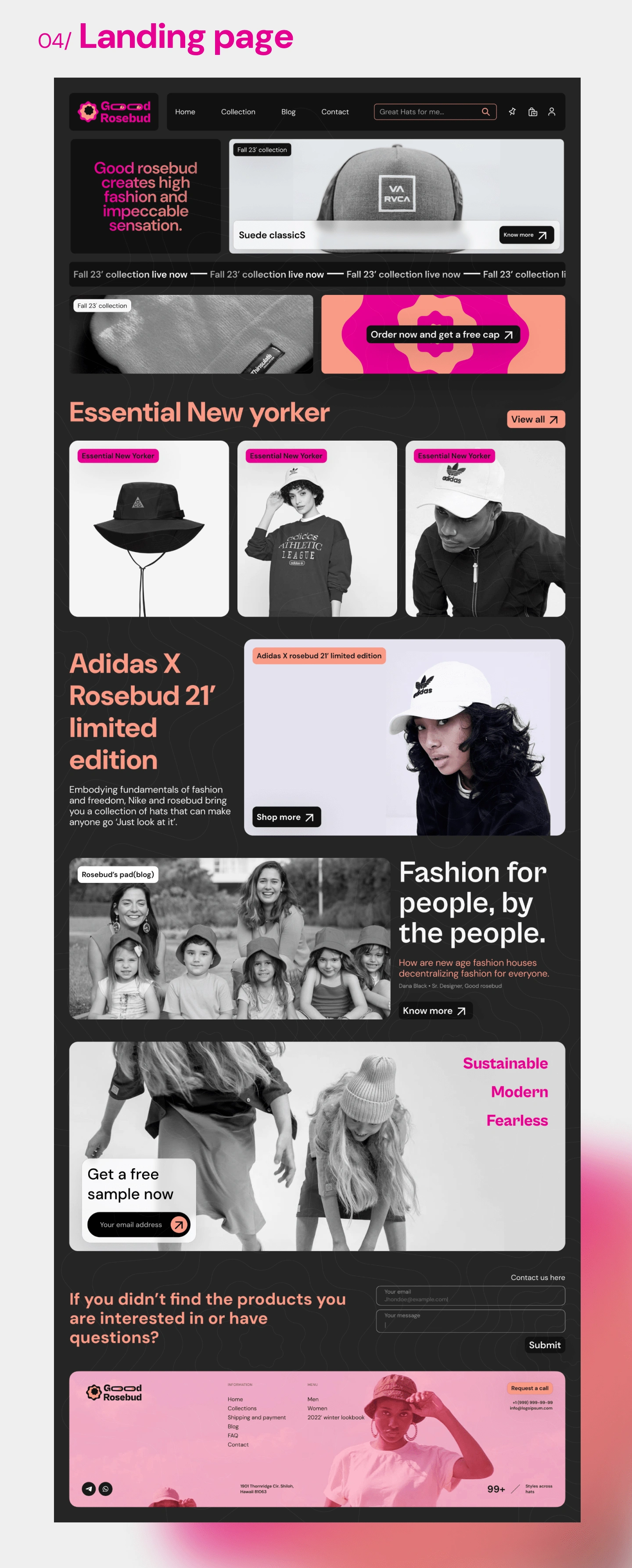
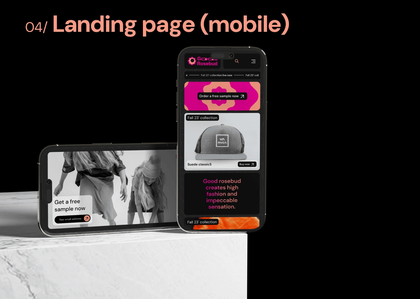
3. Stakeholders wanted users to know about getting a sample set of caps to try feature but also to keep it in same minimal style that identity was built around.
With this I moved to the next phase:
Creation.I quickly whipped up 4/5 options for hero sections with different styles and upon discussion bento grid felt natural to the brand and could be more dynamic than other trends or established layouts.
The final phase of the process is:
LearnI ran some usability tests for the page and with slight updates to animations and hero our landing page looked much better and performed better.
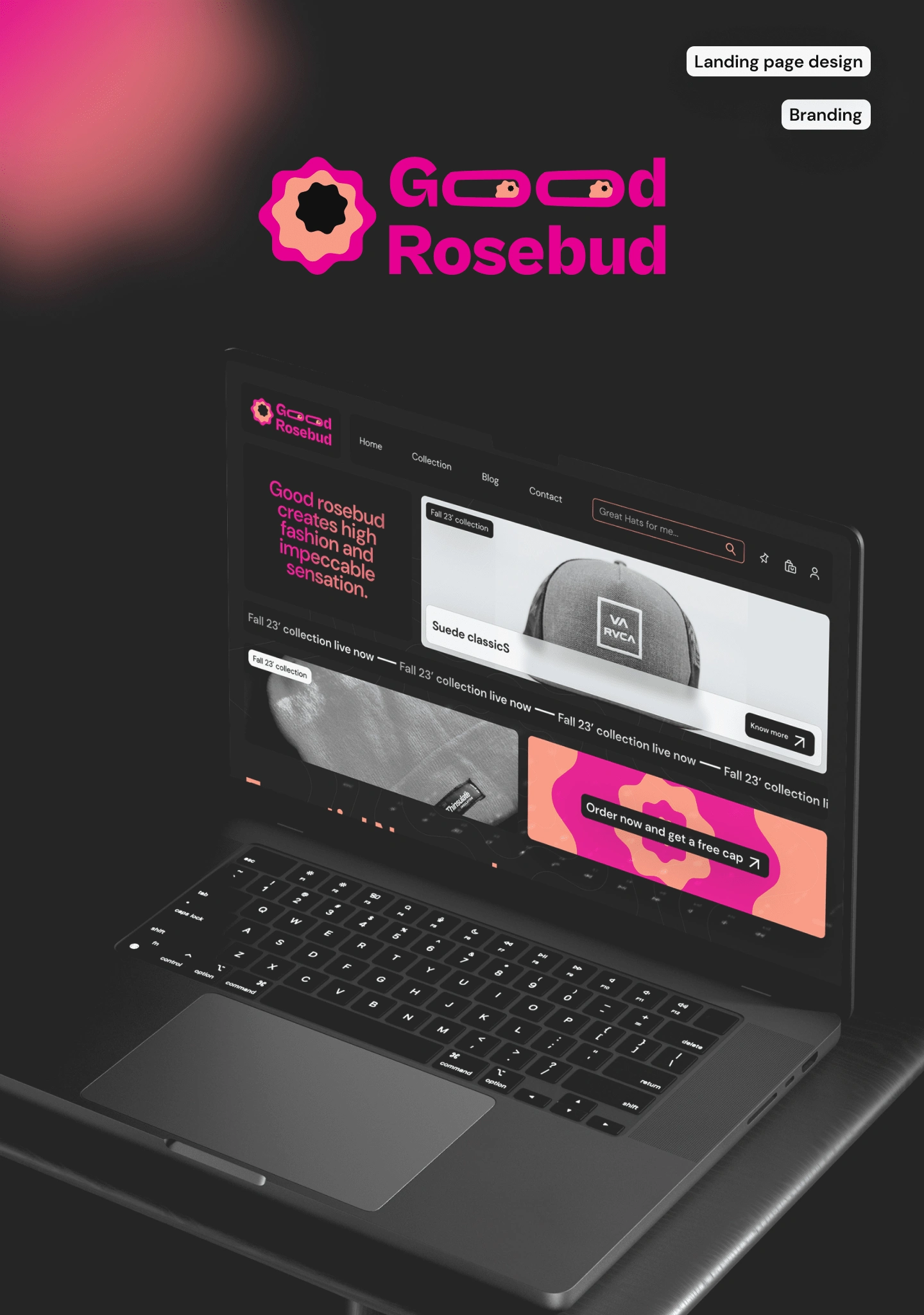
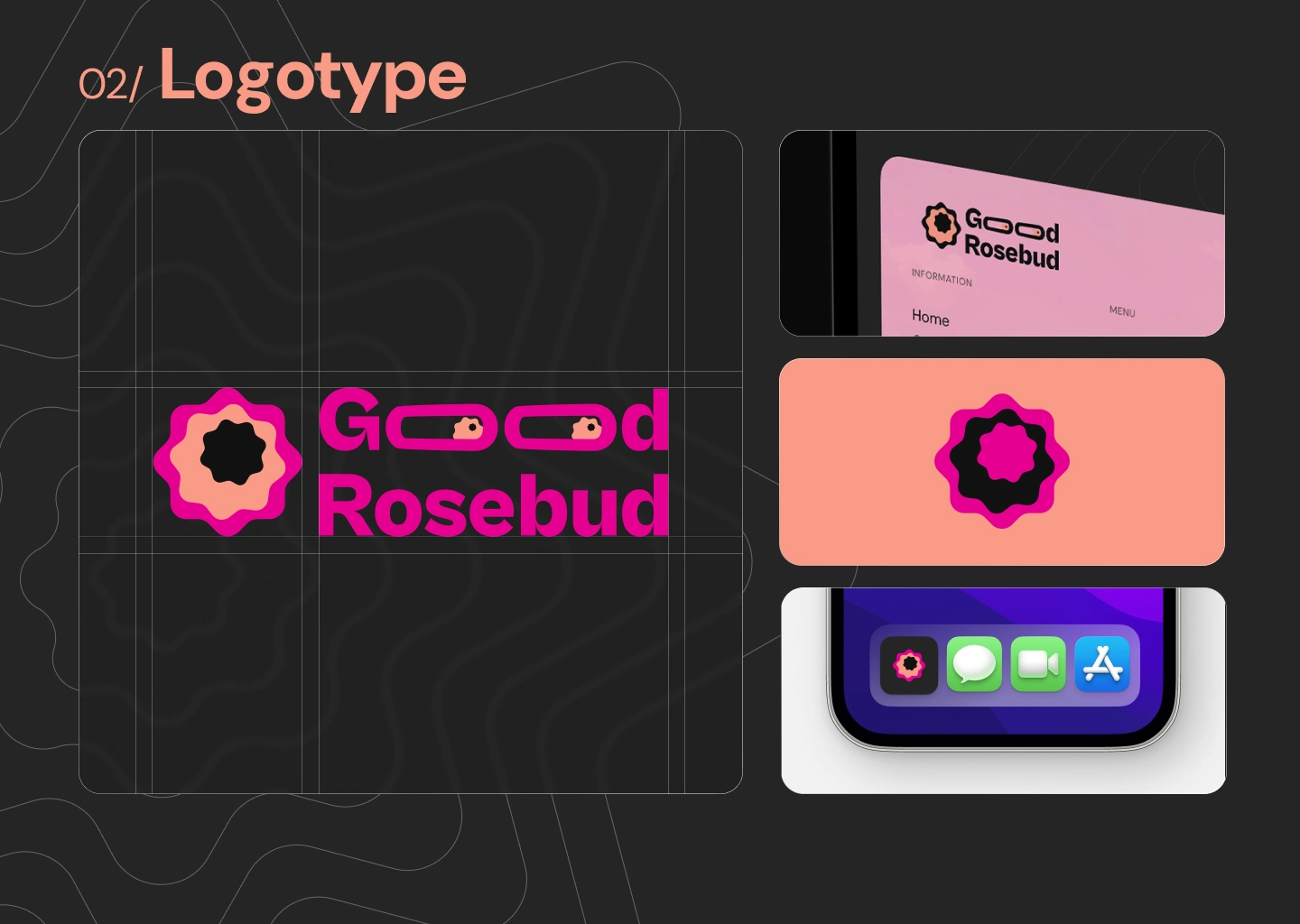
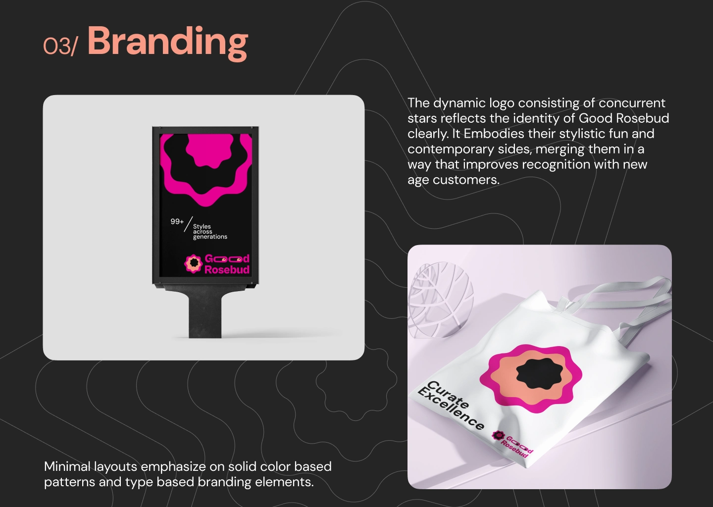
Our main logo is a mix of modern minimalism and early 40's - 60's character-based logos where 'O' of 'Good' are depicted as eyes. The softened star shape is inspired by a mix of contemporary and modern logo styles. Offset gives the perfect shape a dynamic property showcasing company values of innovation

Like this project
Posted Jan 7, 2024
Landing page design and brand identity design for Good Rosebud - a bespoke hat manufacturer and retailer in Europe combining minimalism and royal details.

