Built with Kajabi
Website Audit, Redesign & Kajabi Optimization
Serge Herasymchuk
Verified
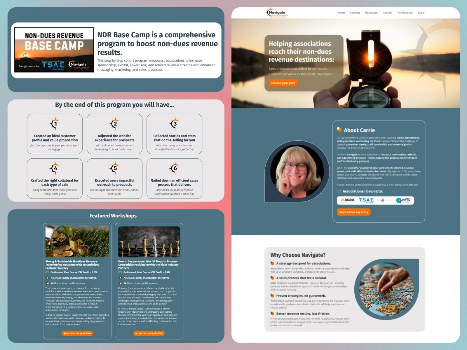
Carrie McIntyre – Website Restructure & Kajabi Optimization
Project Overview
We helped Carrie streamline her complex Kajabi website by restructuring its logic, simplifying navigation, refreshing the design, and optimizing her entire digital backend, resulting in a cleaner user experience and a system she can confidently scale.
Phase 1 – Website Audit & Strategic Restructuring
Carrie came to us with a site that had grown complicated and overwhelming. There were too many pages, duplicated messaging, and no clear direction for the user journey. Before touching the design, we performed a deep strategic audit of her website and digital ecosystem.
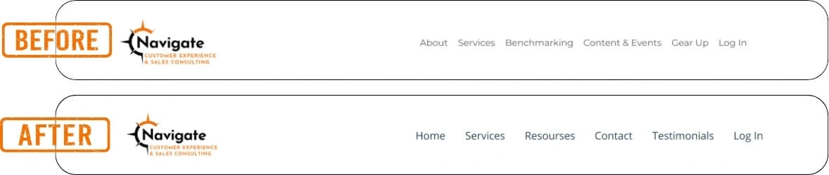
Reviewed every page across the site, identified redundancies, and mapped which pages could be removed or hidden
Built a clear, simplified sitemap prioritizing usability and conversion
Structured a clean journey for new and returning visitors with clear entry points: Homepage → Services (with her signature cohort program) → Resources → Contact.
Clarified page purpose and messaging to reduce confusion and increase time-on-site
This phase laid the groundwork for a user-friendly experience that aligns with her business goals and audience needs.
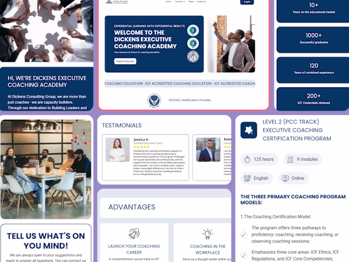
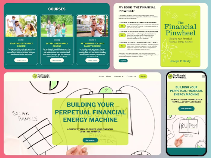
Phase 2 – Visual Refresh & Course Experience Redesign
While major rebranding wasn’t required, the site’s appearance needed polishing. We introduced visual updates that made a huge difference in clarity and aesthetic appeal, without overwhelming the original brand.
Redesigned the key pages in Figma (Home, Services, Resources, Contact, System pages like 404, Login, Thank You, etc.)
Enhanced typography, layout consistency, and image quality for a more professional and inviting look
Streamlined sections to reduce clutter and increase readability
Refined the course presentation inside Kajabi, ensuring her flagship cohort program (Non-Dues Revenue Base Camp) was visually aligned and easy to navigate for participants
All designs were reviewed and approved by the client before moving into development.
Before/After
Phase 3 – Kajabi Offer & Automation Optimization
Finally, we moved behind the scenes to bring structure and efficiency to the platform’s backend. Our goal was to create a sustainable system Carrie could manage and grow with ease.
Reviewed and cleaned up all Kajabi offers, forms, and checkout flows
Standardized naming conventions and added proper tags to organize automation
Updated and tested sequences for her waitlist and future upsell potential
Audited the community setup and provided recommendations for future improvement
Now, Carrie has a high-functioning Kajabi setup that reflects her expertise and is ready to support her growing client base.
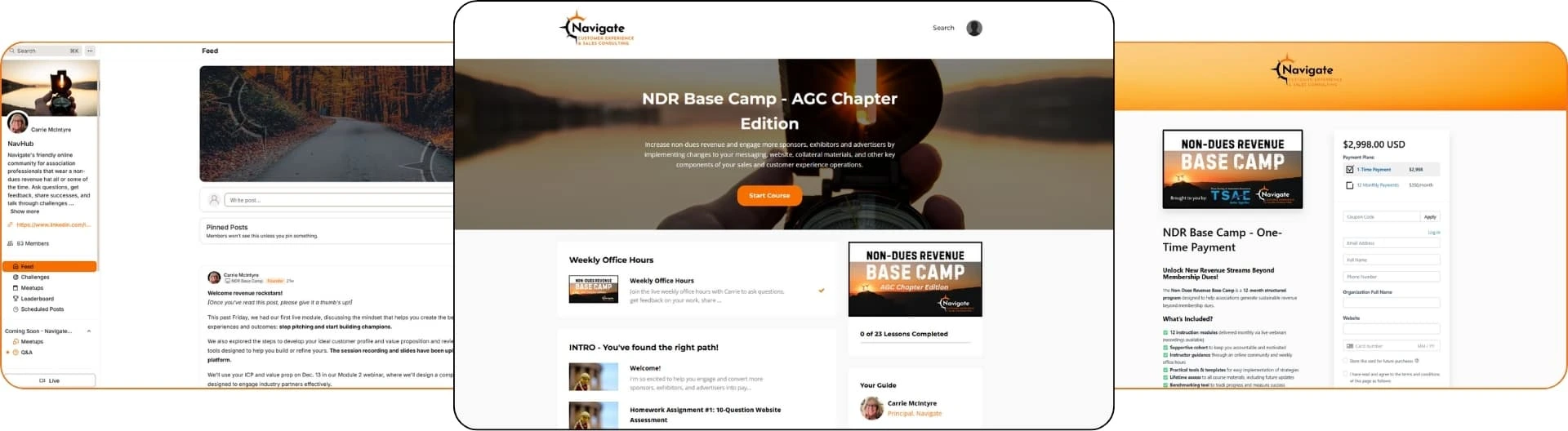
Community & Course & Checkout Setup
Final Overview
This project was never about surface-level aesthetics - it was about clarity, usability, and structure. Carrie’s business is rooted in strategic thinking and practical outcomes, and her website needed to reflect exactly that.
By first untangling the complexity of her original site, we created a streamlined structure that guides users effortlessly through her offerings. The refreshed design added a professional, polished look while staying true to her brand’s approachable tone. And under the hood, we implemented a clean, scalable system inside Kajabi -from course delivery to offers and automations - that empowers her to focus on what she does best: helping associations grow their non-dues revenue.
Like this project
Posted Apr 25, 2025
Strategically restructured and simplified an overloaded Kajabi website into a clear, compelling platform.
Likes
3
Views
27
Timeline
Apr 3, 2025 - Apr 24, 2025
Clients
Navigate CES, LLC
Featured on