Built with Framer
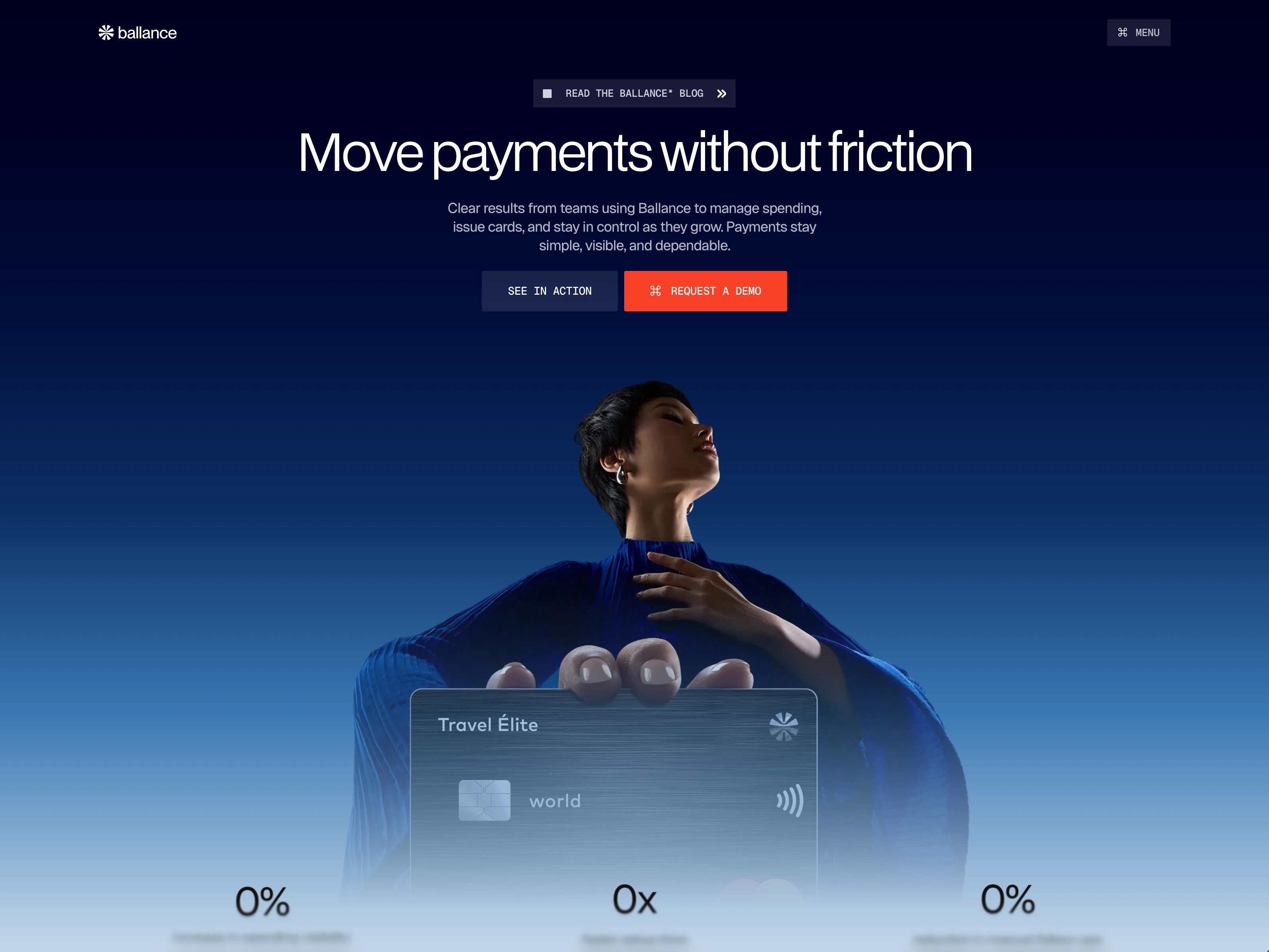
Fintech Website Design for Ballance
Moyin Ipinmoroti
💳 Overview
Ballance is a modern fintech website crafted for digital payment platforms, financial products, and money management services. Designed in Framer, it helps financial brands communicate trust, speed, and reliability through a refined interface that balances product education with conversion-focused design.
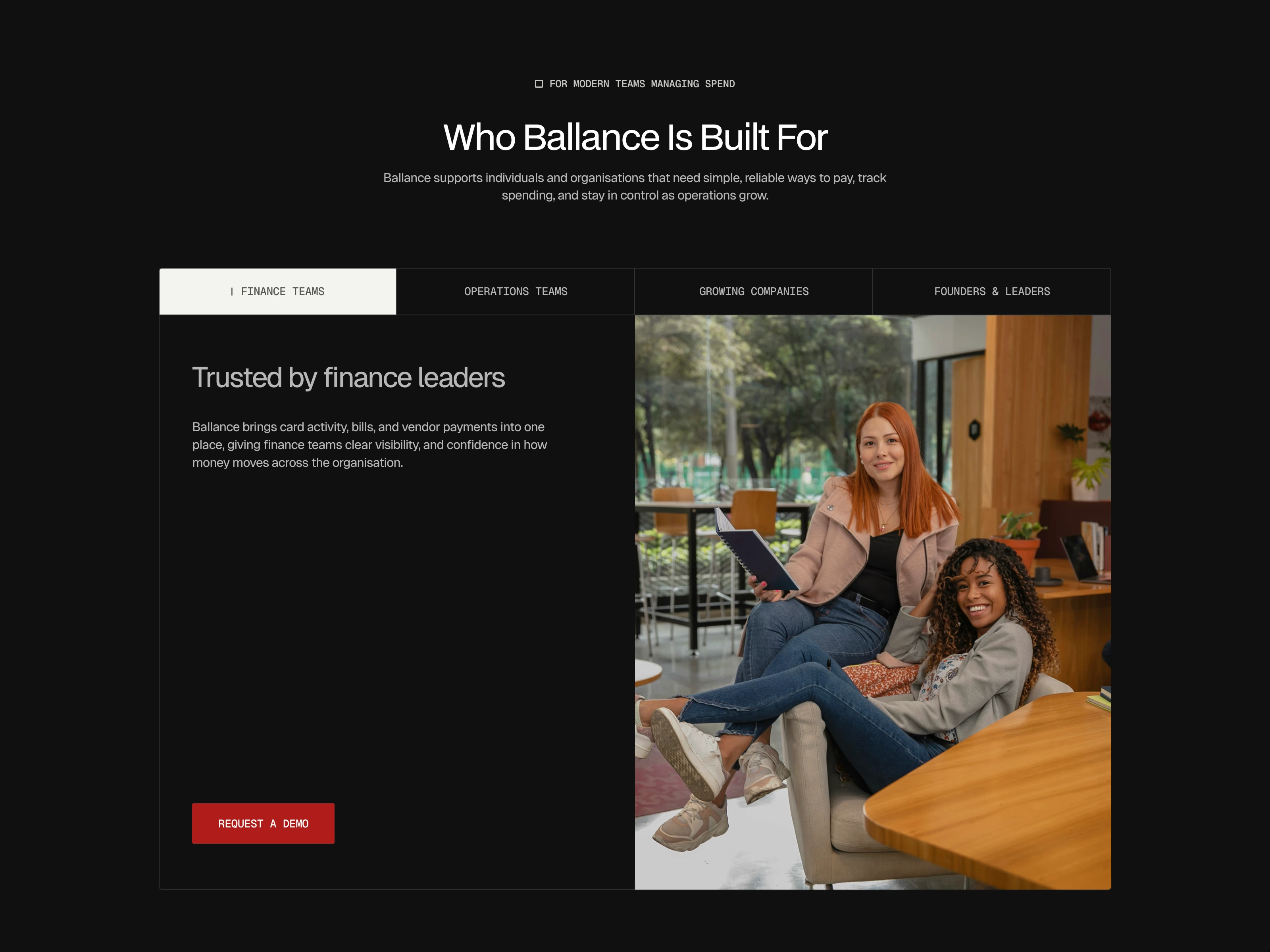
features section of the Ballance site
⚖️ Design Philosophy: Trust Through Clarity
Credibility by Design
Every design decision reinforces confidence. A restrained visual language, consistent spacing, and deliberate use of color create an experience that feels dependable without becoming overly corporate.
Explaining Finance Without Friction
Financial products often introduce complexity. Ballance simplifies that complexity through clear information architecture, concise messaging, and progressive disclosure, allowing visitors to understand the product naturally as they move through the page.
Structured Visual Hierarchy
Large headings, balanced layouts, and purposeful contrast establish a reading flow that prioritizes the most important information first. Product benefits, statistics, features, and calls to action each occupy their own visual space, making the experience effortless to scan while encouraging deeper exploration.
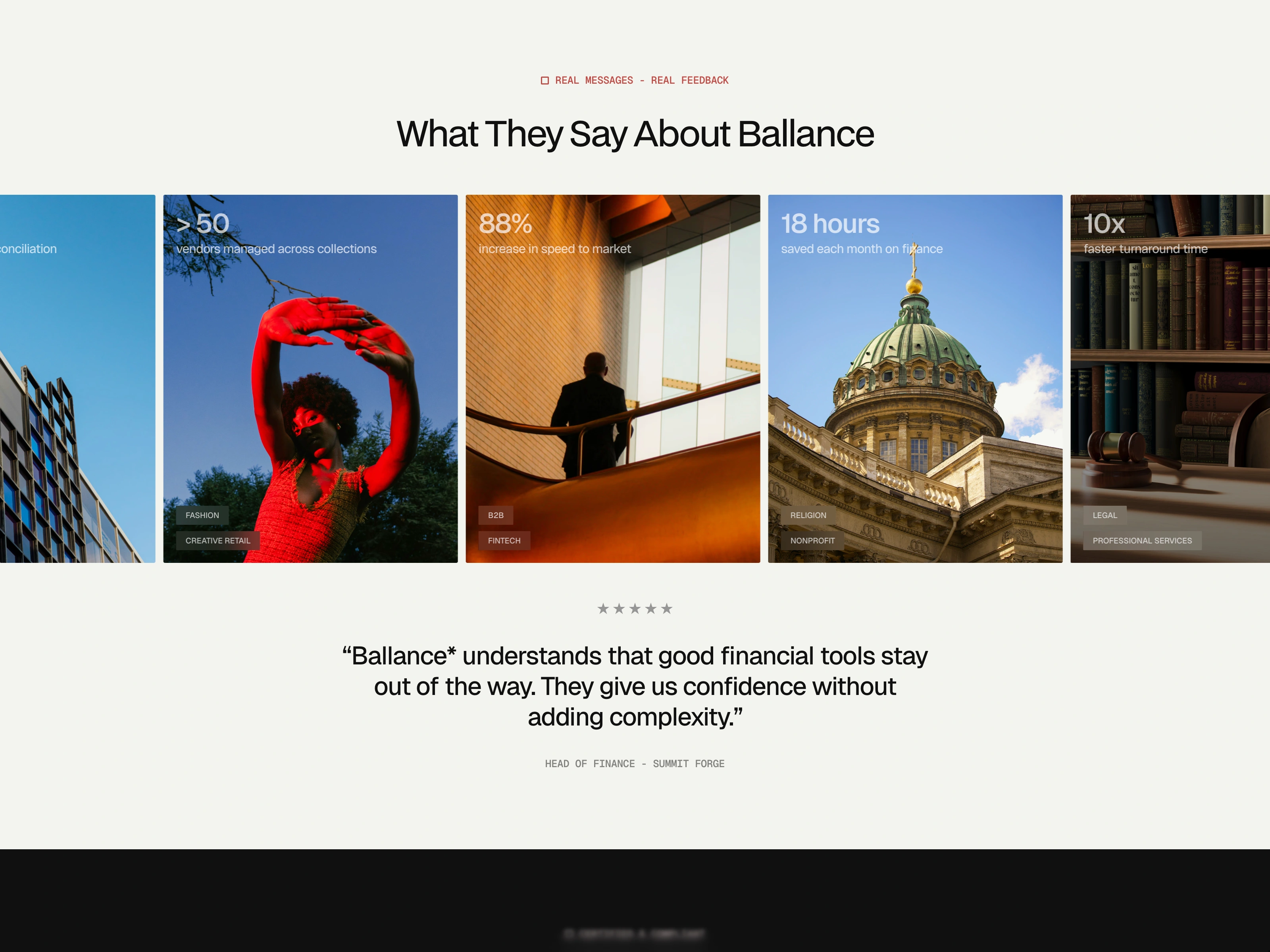
testimonials section
🚀 Functional Execution
Built for Conversion
Every section supports a clear business objective, from communicating product value to reducing hesitation before sign-up. Strategic call-to-actions and logical content progression help move users confidently through the conversion journey.
Modular & CMS Ready
Reusable components and CMS collections make it easy to expand the website with new features, updates, blog content, or product announcements while maintaining design consistency.
Interactive Without Distraction
Subtle animations, transitions, and interface feedback create a polished experience that feels responsive without competing with the content. Motion is used to reinforce usability rather than decoration.
about company
📈 Impact on User Experience
Ballance creates an experience that feels secure, efficient, and easy to understand. Information is presented in manageable sections that reduce cognitive load while helping visitors quickly grasp the platform's capabilities.
Instead of overwhelming users with financial terminology or excessive interface elements, the design focuses on clarity and reassurance. This makes the product approachable for first-time users while maintaining the professionalism expected from modern financial technology.

team section
🌍 Comparative Insight: What Makes Ballance Different
Many fintech websites rely on oversized dashboards, glowing gradients, and highly technical visuals to communicate innovation. Ballance takes a different approach by emphasizing confidence through simplicity and thoughtful content structure.
The design demonstrates that a financial platform can appear advanced without becoming visually overwhelming. By combining clean layouts, carefully paced storytelling, and conversion-driven UX principles, Ballance delivers a product experience that feels modern, trustworthy, and built for long-term credibility rather than short-term visual trends.
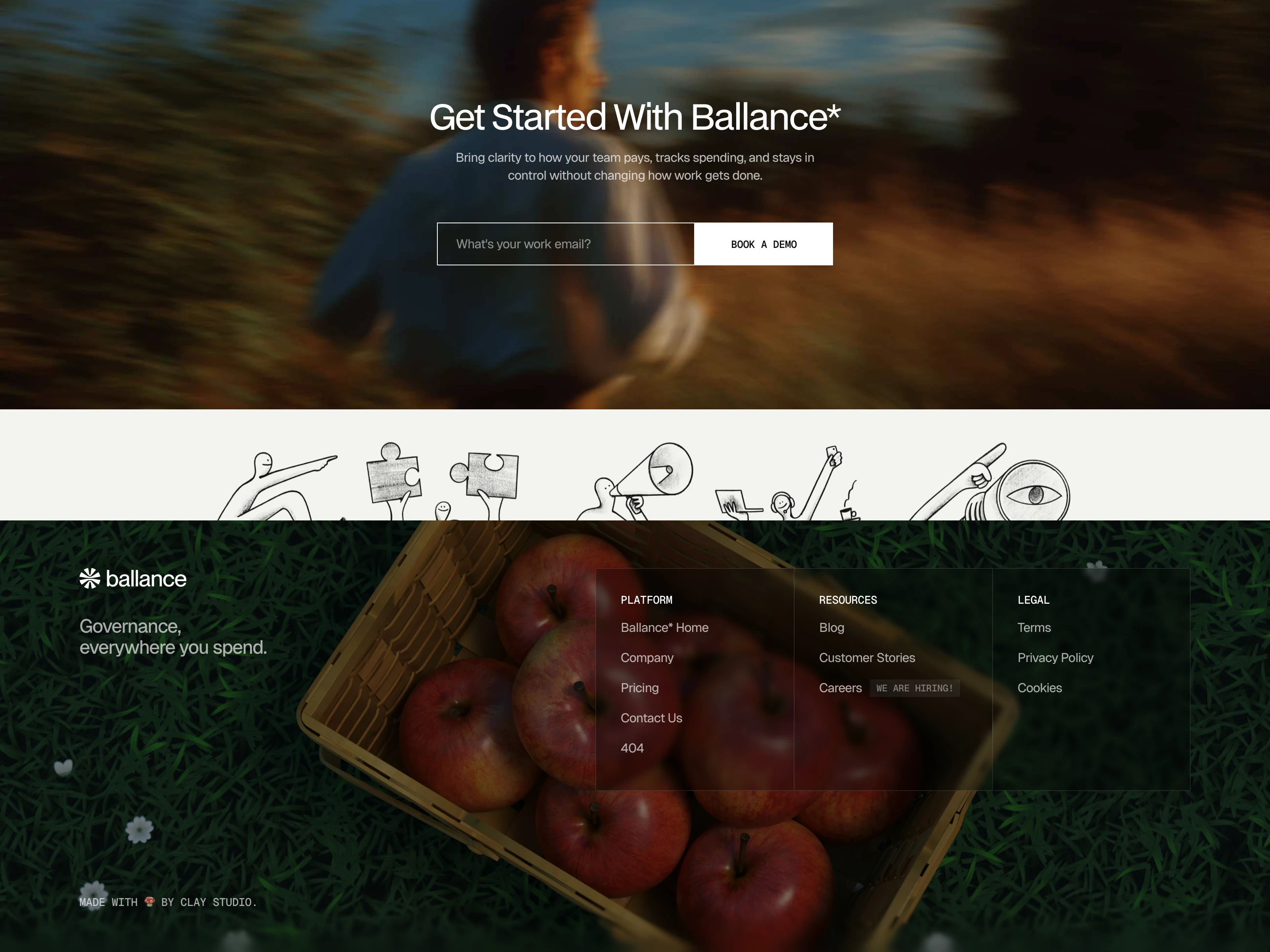
footer section
Like this project
Posted Jun 30, 2026
Designed Ballance, a modern fintech website focused on building trust, simplifying digital payments, and turning visitors into confident users.
Likes
1
Views
7
Timeline
Jan 5, 2026 - Jan 18, 2026