Built with Framer
Bleau Agency Portfolio Website Design & Development
Moyin Ipinmoroti
👻 Overview
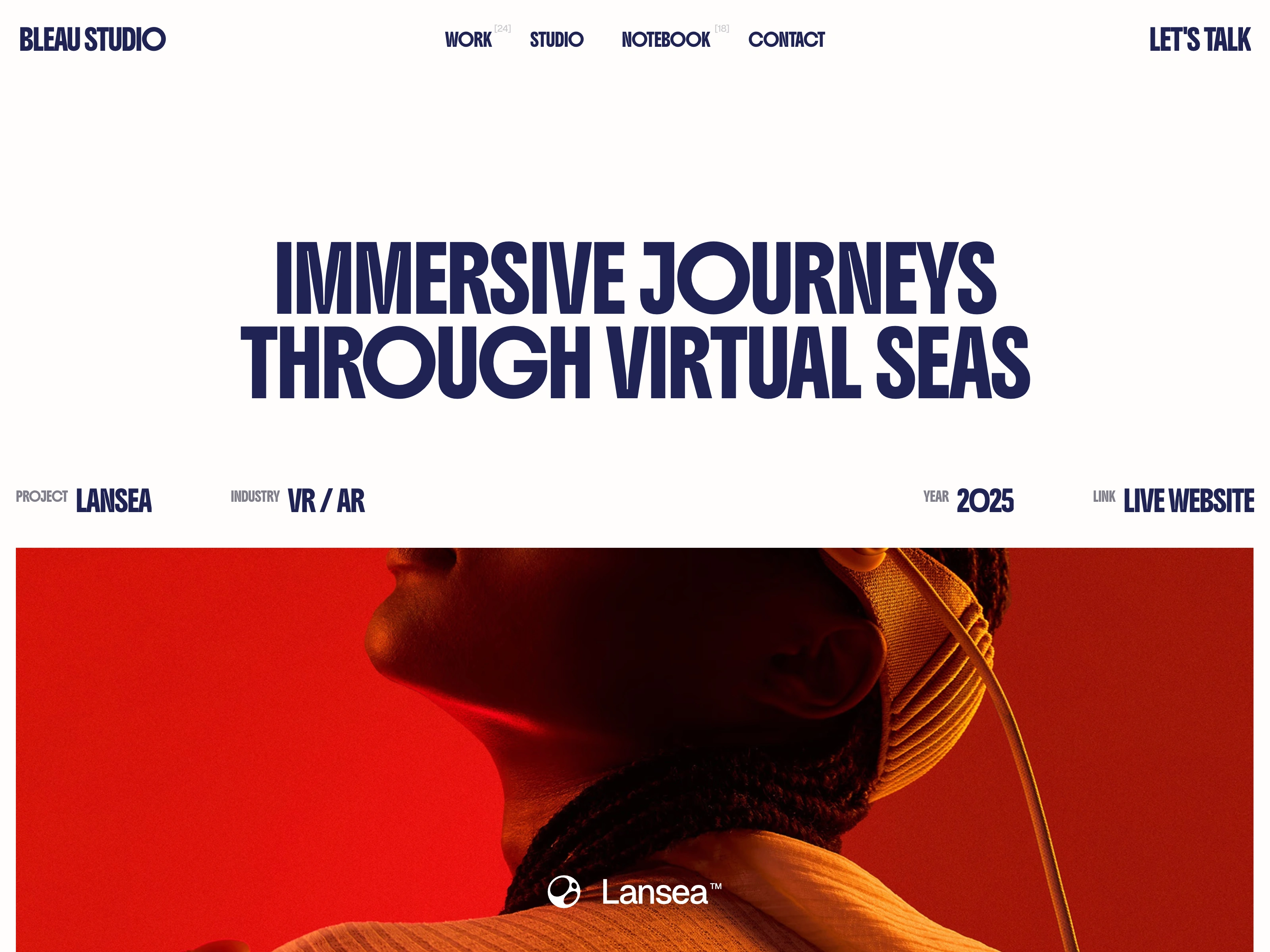
Bleau is an agency portfolio website built to communicate craft, clarity, and cultural relevance. Designed and developed in Framer, the site presents the studio’s work, services, and philosophy through a calm, confident interface that prioritizes storytelling over spectacle.
Rather than relying on heavy visual effects, the experience is driven by structure, pacing, and typographic presence. Every section feels intentional, guiding visitors through the studio’s thinking, selected projects, and capabilities with a sense of editorial rhythm.
🎯 Design Philosophy: Clarity as Positioning
Focus Before Flourish
The design strips away ornamental noise to foreground the work and the studio’s point of view. Visual restraint becomes a positioning tool, signaling confidence and maturity rather than minimal effort.
Narrative Over Decoration
Each page is structured as a story. Large statements introduce intent, followed by contextual details, case highlights, and service explanations. This sequencing ensures visitors understand the thinking behind the visuals, not just the visuals themselves.
Typography as Voice
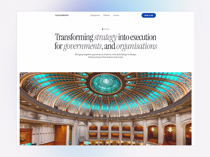
Bold, expressive type carries much of the visual weight. Headlines function as editorial pull quotes, while supporting text uses measured scale and spacing to create a readable, cinematic flow from top to bottom.
🧩 Functional Execution
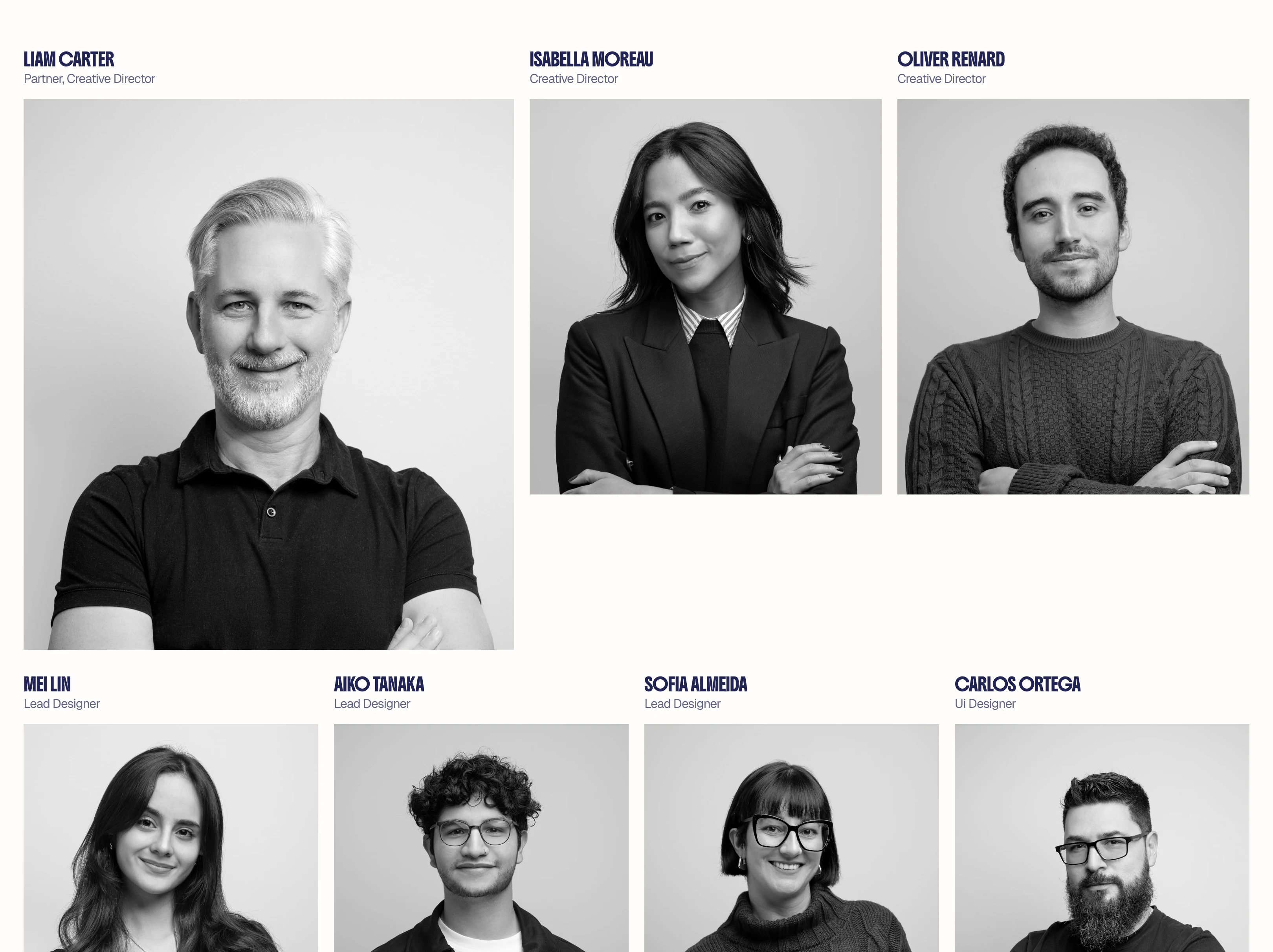
The website is built natively in Framer using a modular, component-driven architecture. Core sections such as case study previews, testimonials, and service highlights are designed as reusable blocks, making it easy to rearrange or expand pages while maintaining strict visual and structural consistency across the entire site.
Responsiveness is treated as a first-class design constraint rather than an afterthought. Each layout is carefully reflowed for different breakpoints so hierarchy, spacing, and reading rhythm remain intact on mobile and tablet. Smaller screens are given purpose-built compositions instead of compressed desktop layouts.
🆚 Comparative Insight: A Different Kind of Agency Portfolio
Many agency sites compete on visual density, layering effects, colors, and complex layouts to signal creativity. Bleau takes the opposite stance.
By reducing visual clutter and letting typography, structure, and carefully chosen imagery do the work, the site communicates confidence and editorial taste. It feels closer to a well designed publication than a conventional agency grid of thumbnails.
This restraint becomes the differentiator. The portfolio stands out not by adding more, but by removing everything that does not serve the story of the work.
Like this project
Posted Jan 30, 2026
Bleau is an agency portfolio built to showcase work with clarity and intention, turning each project into an editorial story of craft, strategy, and culture.
Likes
0
Views
41
Timeline
Aug 7, 2025 - Jan 17, 2026
Clients
Bleau