SAJCO Precast Logo Modernization
Maryam Shakeel
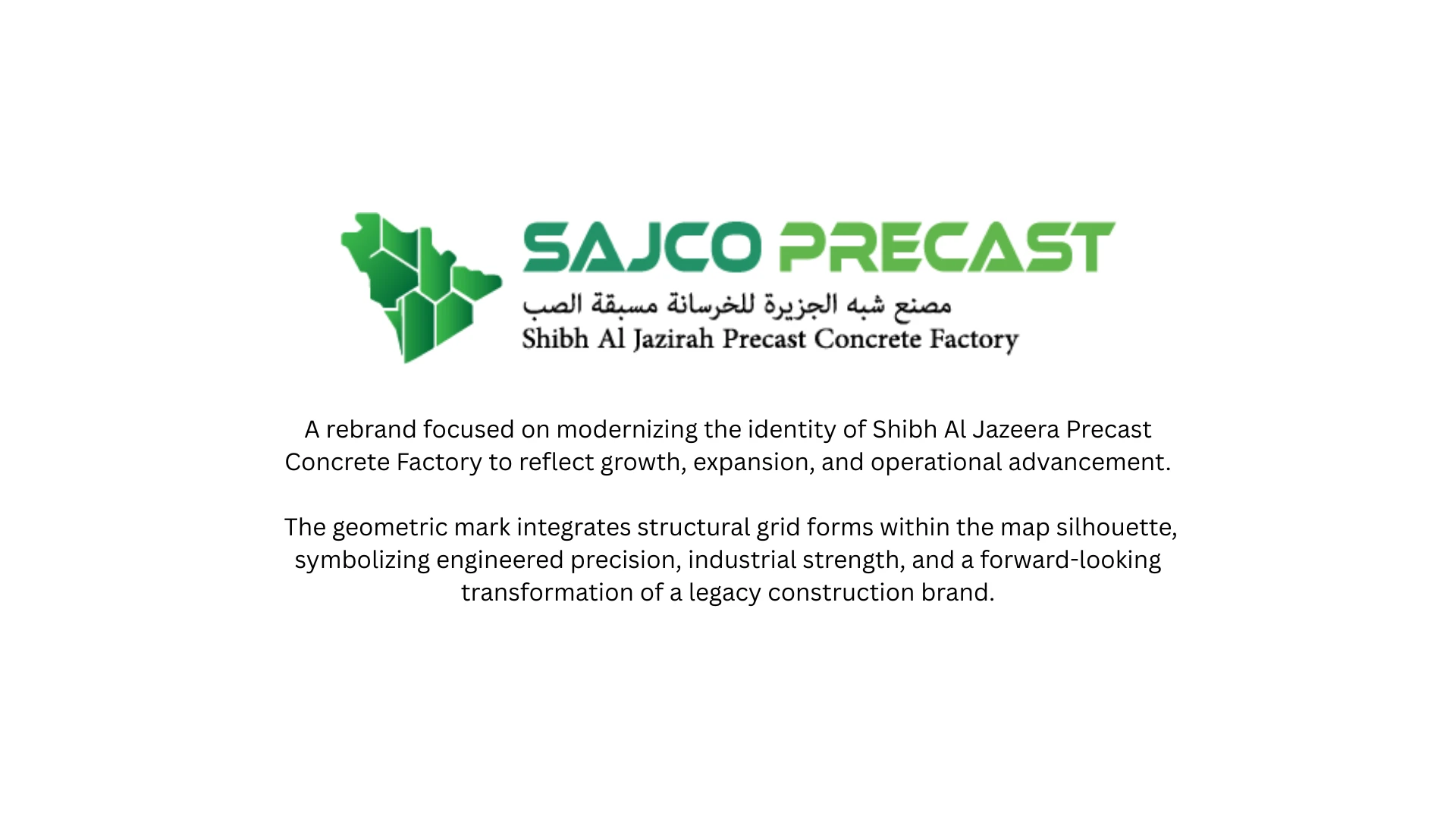
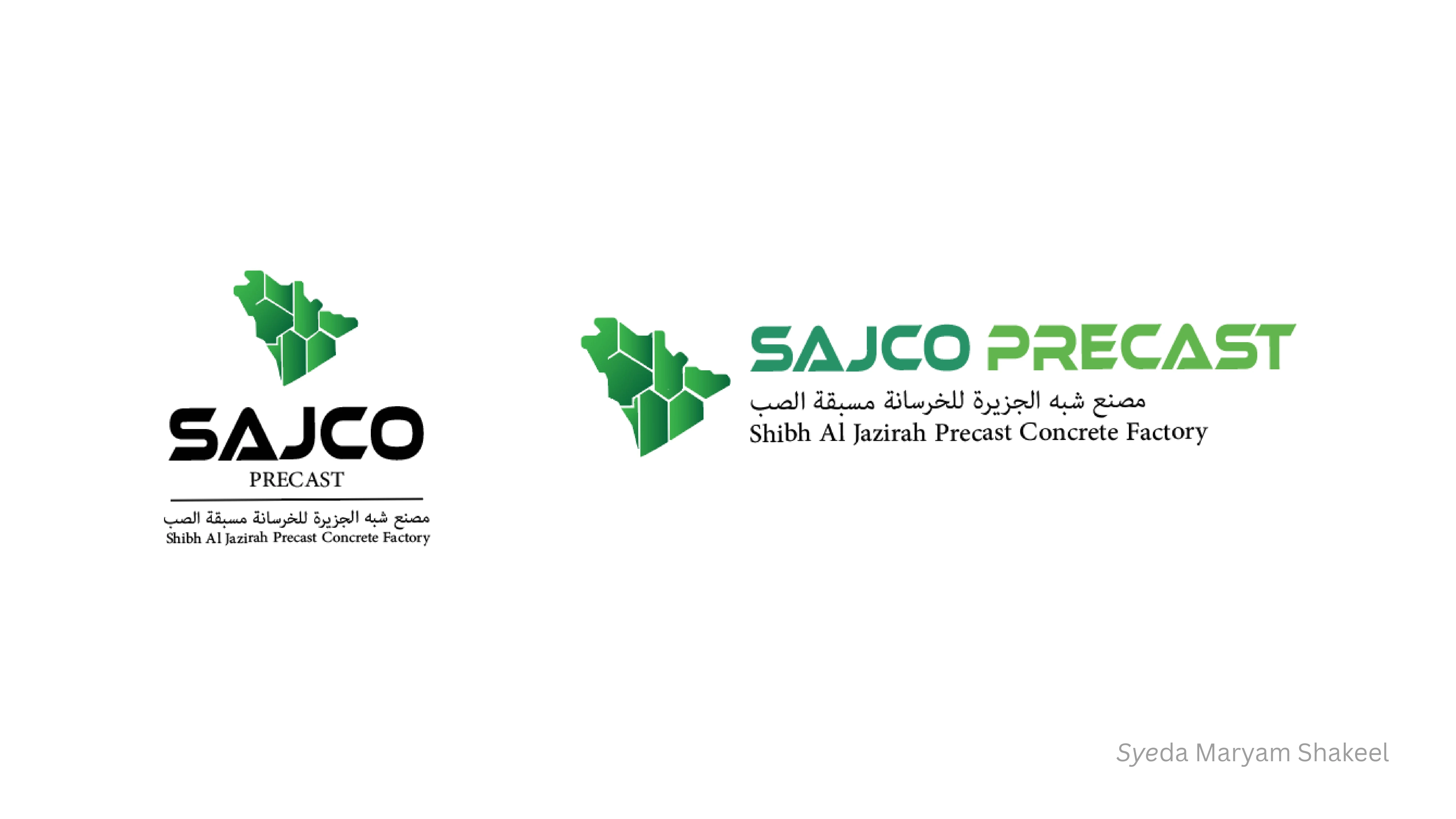
SAJCO Precast
Modernizing a Regional Industrial Identity Without Losing National Character
Overview
SAJCO Precast is a Saudi-based precast concrete factory and one of the recognized industrial players in the Jazirah region. With strong regional roots and established credibility, the brand required a logo modernization that would elevate its visual identity while preserving its national and geographic significance.
The challenge was clear: evolve without erasing heritage.
The Challenge
SAJCO’s legacy identity carried regional pride and industrial strength, but visually it lacked the refinement and scalability needed for a modern industrial brand operating across digital platforms, large-scale machinery, and corporate documentation.
The objective was to:
Modernize the visual language
Retain national symbolism
Communicate structural expertise
Ensure scalability across industrial applications
Maintain credibility within a conservative regional market
This was not a rebrand. It was a strategic evolution.
Strategic Insight
For a Saudi industrial manufacturer, national identity is not decorative. It is foundational.
Instead of abandoning regional symbolism, the solution leaned into it intentionally. Both proposed concepts centered around a stylized form of the Arabian Peninsula, immediately anchoring the brand within its geographic and cultural context.
The design language then translated industrial relevance into visual structure.
Concept 1: Layered Regional Identity
The first concept used overlapping green, blue, yellow, and gray forms within the stylized peninsula.
Strategic Thinking Behind It:
The layered shapes represent geological strata and construction materials
The visual stacking subtly references sectional views used in engineering
The organic curves soften the industrial tone while remaining modern
The icon stands independently for machinery, uniforms, signage, and digital use
This direction balanced approachability with technical relevance.
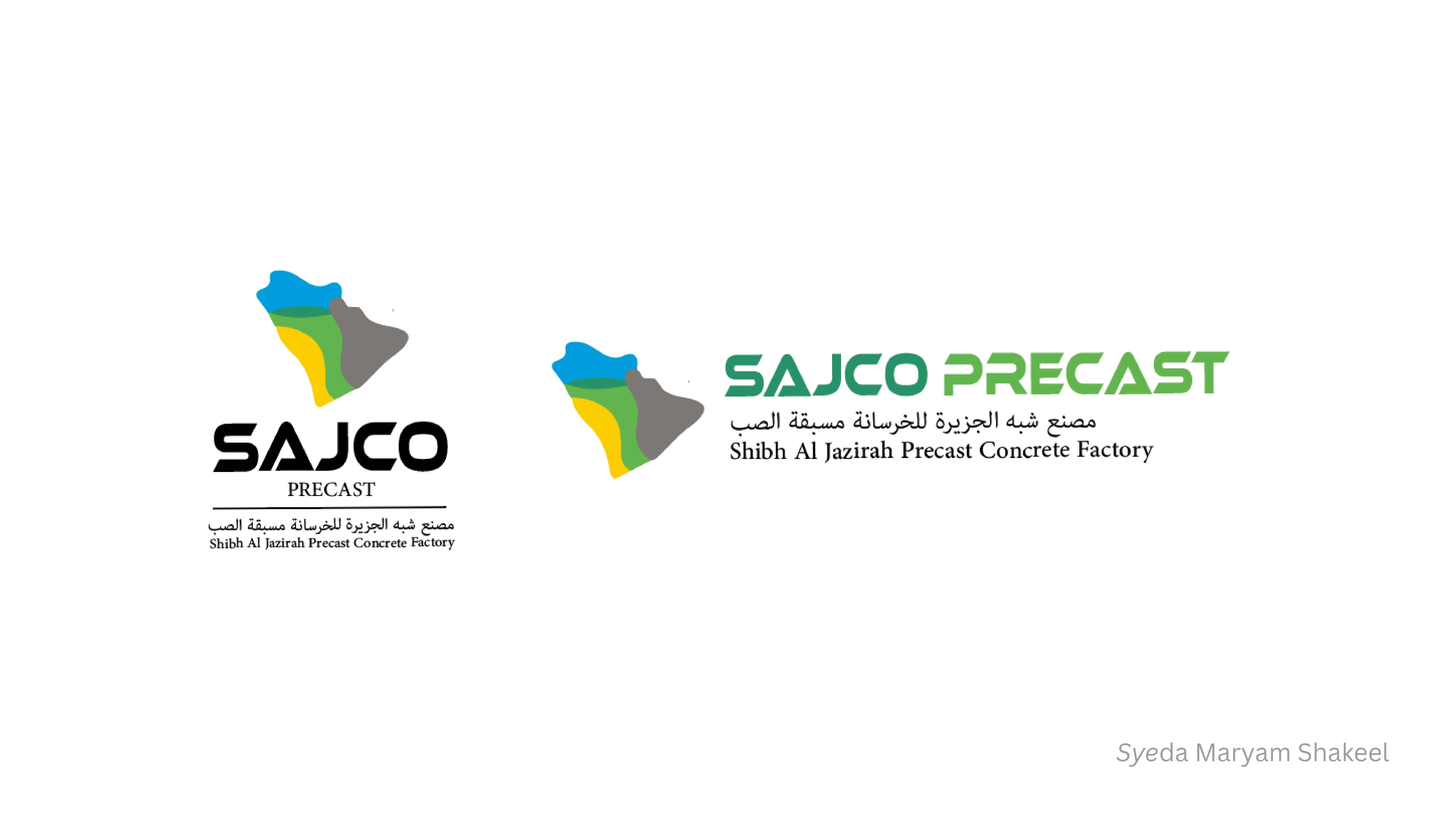
Concept 2: Structural Precision
The second concept introduced internal white-line segmentation within the green peninsula shape.
Strategic Thinking Behind It:
The internal divisions resemble architectural plans and structural schematics
The white negative space mirrors sectional drawing techniques
The sharp geometry communicates precision and technical expertise
The simplified palette enhances premium, scalable application
This concept leaned further into engineering authority and minimalism.
Typography & System
Both concepts retained strong, bold typography to reinforce industrial credibility. The Arabic and English naming structure preserved cultural alignment and operational legitimacy.
The logo system was designed for versatility across:
Factory signage
Machinery branding
Safety uniforms
Tender documents
Corporate presentations
Digital platforms
Outcome
The result was a modernized visual identity that:
Preserved national pride
Elevated industrial sophistication
Communicated structural expertise
Increased brand clarity across mediums
Positioned SAJCO as both legacy-rooted and forward-facing
This project demonstrated that modernization does not require abandoning heritage. When handled strategically, evolution strengthens identity rather than diluting it.
Like this project
Posted Mar 4, 2026
Modernized a Saudi industrial leader’s logo, preserving regional identity while elevating structural precision and scalability.