Aromatherapy Candle Branding and Packaging
Iuliia Azarova
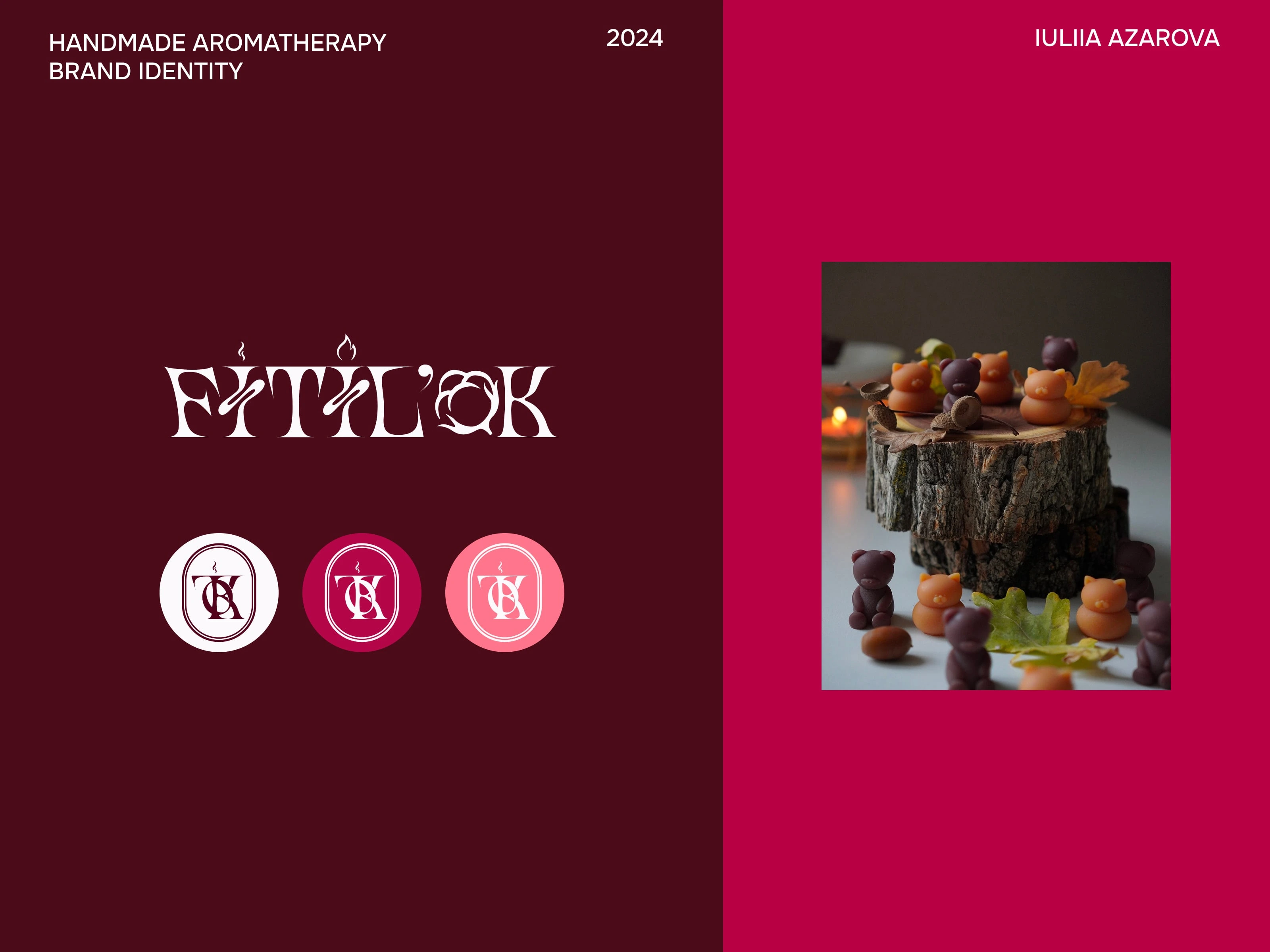
Aromatherapy Candle Branding, Logo & Packaging
Client & Business Goal
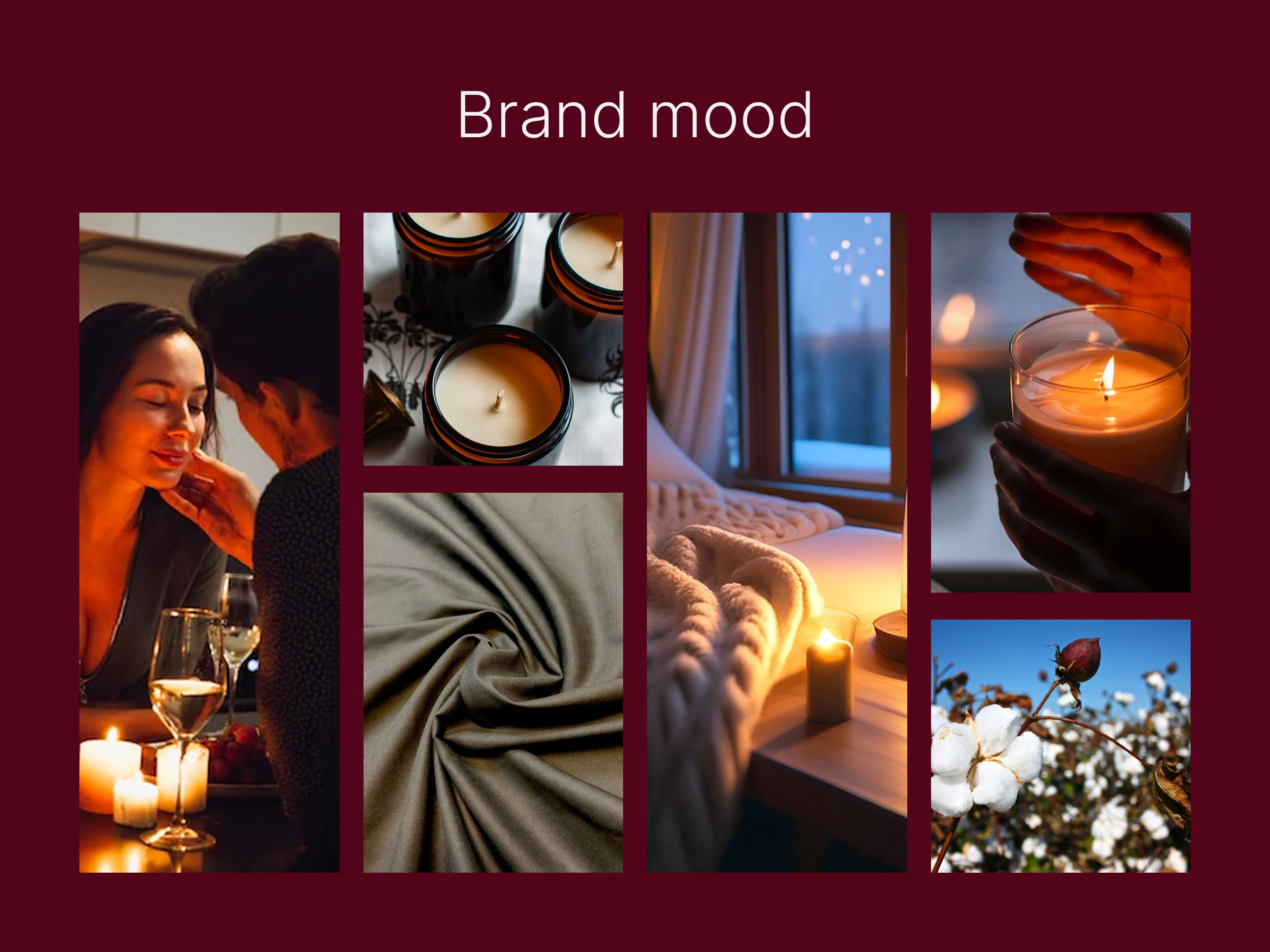
The client, FITIL'OK, is a hand-poured candle brand focused on natural ingredients, coziness, and complex, luxurious aromas. The goal was to develop a distinct visual identity to elevate the brand on the handmade market, attract a new audience, and visually translate the values of natural quality and sophistication.
Logo and Brand Identity
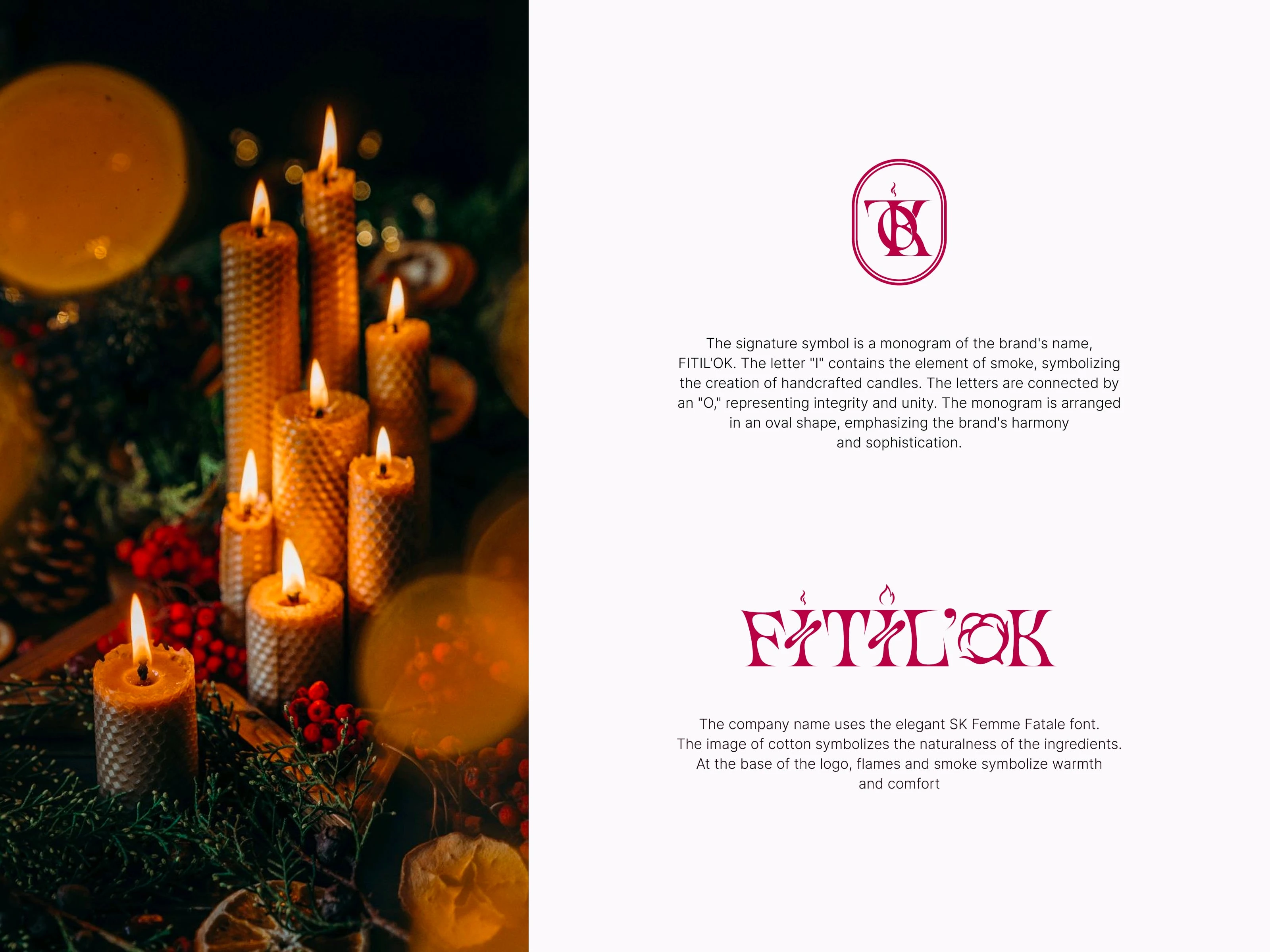
The identity is built around a refined monogram (FITIL'OK initials), subtly featuring smoke and a wick element to symbolize the handmade process and warmth. The logo is enclosed in an oval form, conveying harmony and elegance.
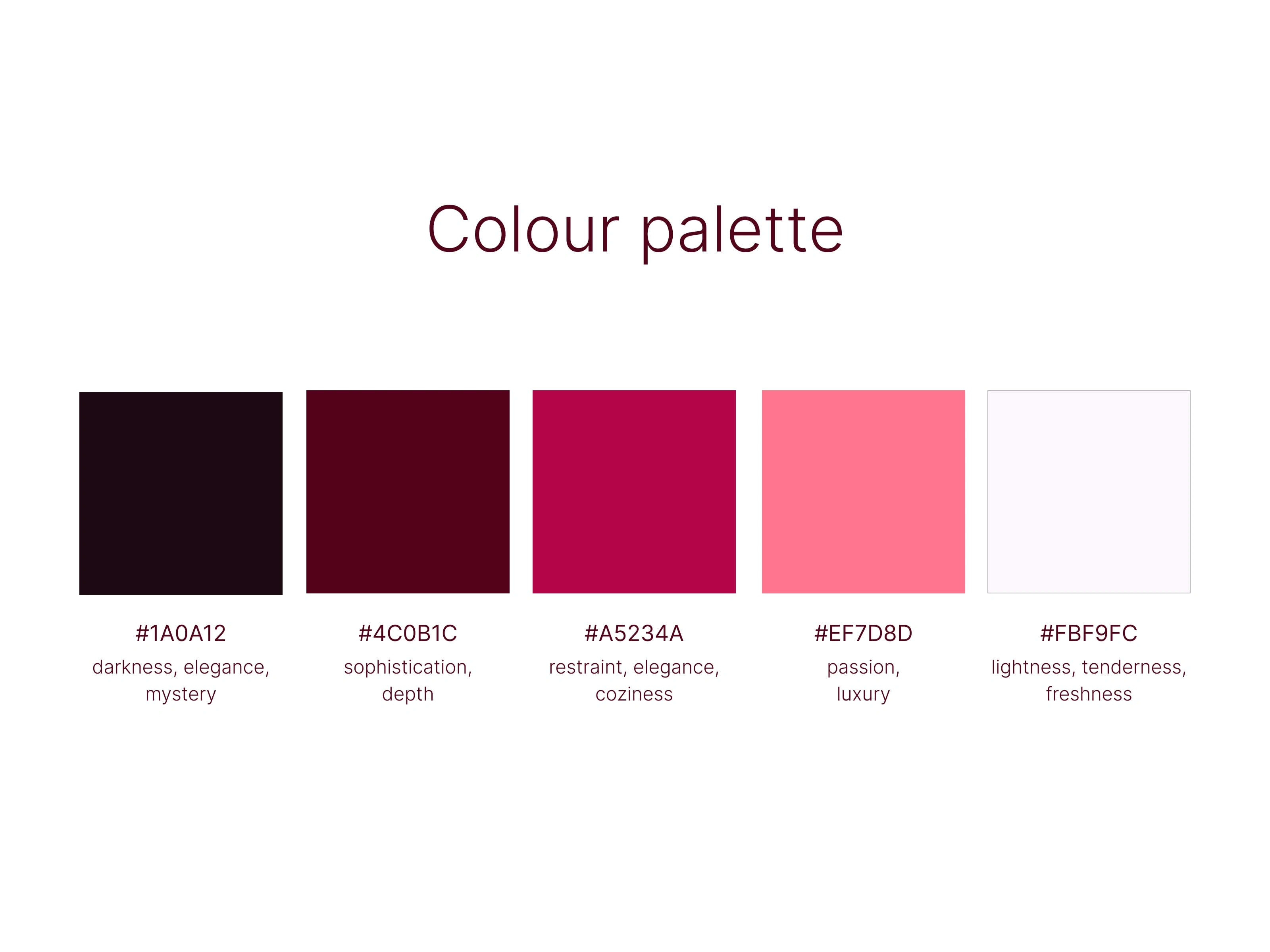
Color Palette: A rich, deep palette (#1A0A12,#4C0B1C,#A5234A) was chosen to communicate status, complexity, and warmth.
Typography: The elegant SK Femme Fatale font reinforces the brand's sophisticated aesthetic.
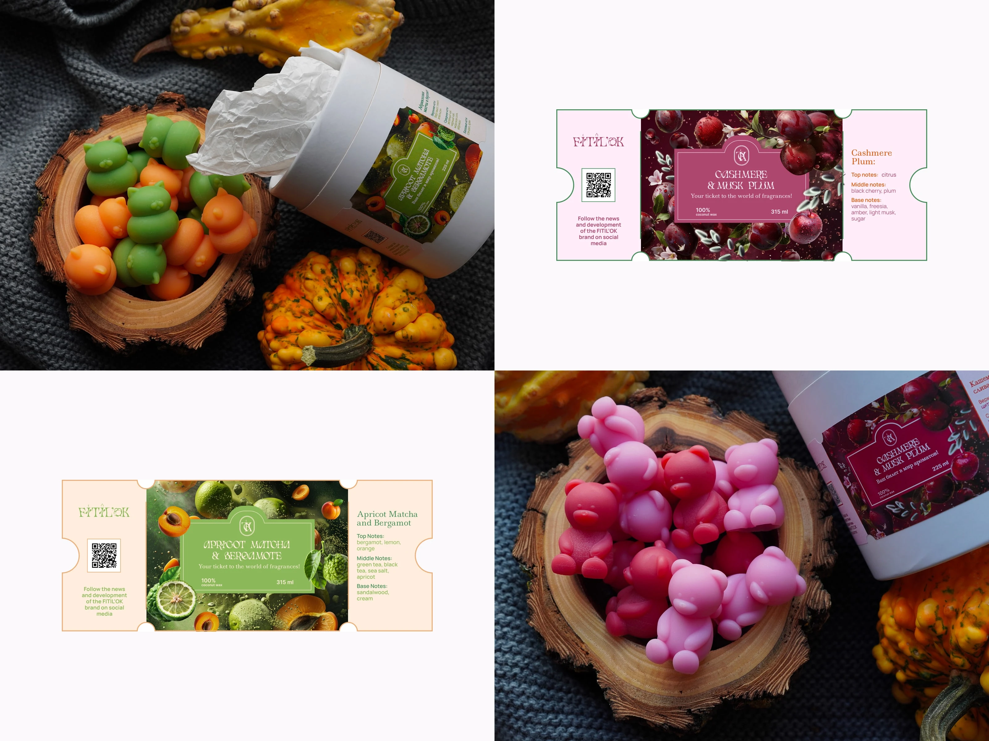
Packaging Innovation (The Ticket Concept)
A key innovation was the label design based on a boarding pass or travel ticket. This format serves as a metaphor for the journey that begins with each lit candle. For each unique aroma, a custom image was generated via Midjourney to visually convey the composition’s complexity, resulting in a unique, collectible piece of art.
This project delivers a full-cycle visual brand that successfully merges luxury aesthetics with a unique, creative packaging concept.
Like this project
Posted Feb 14, 2026
Developed refined brand identity and innovative packaging for FITIL'OK candles.
Likes
0
Views
2
Timeline
Jul 14, 2024 - Sep 25, 2024