Essentials | Menswear eCommerce Store on Wix Studio

Devansh Prakash

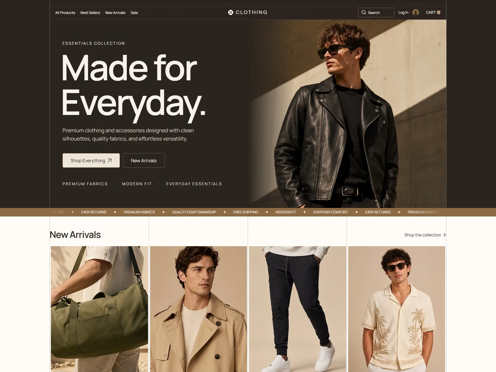
A menswear label selling premium basics — clean silhouettes, quality fabrics, everyday versatility. The storefront had to sell on those terms rather than on discount badges, which meant giving the photography room and keeping every other element quiet.
Editorial first
The home page reads like a lookbook: one strong hero, a marquee of the things the brand actually competes on, then new arrivals as a grid of full-bleed shots. Category pages hold the same restraint, so browsing never feels like a sales floor.
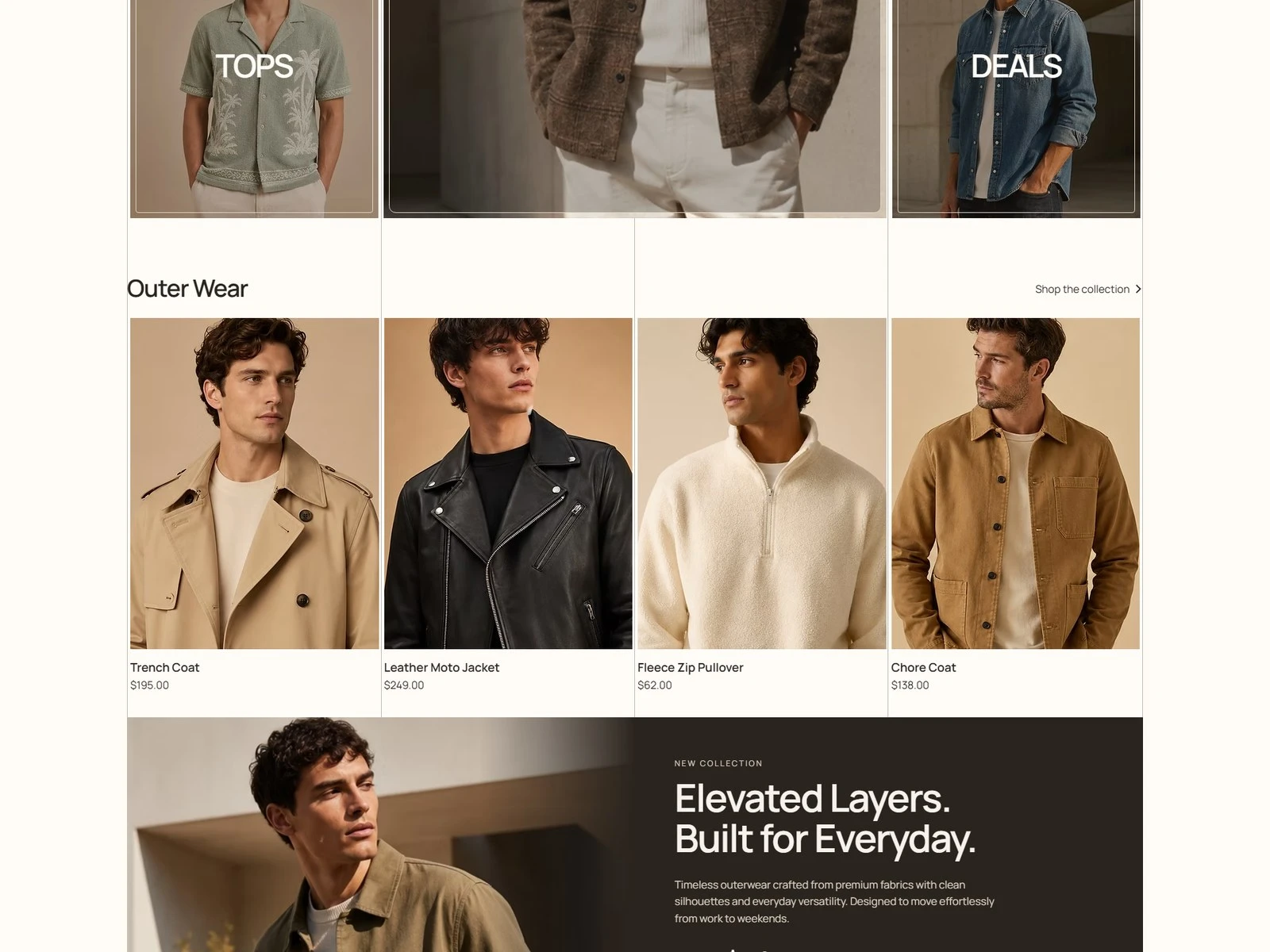
Home — new arrivals
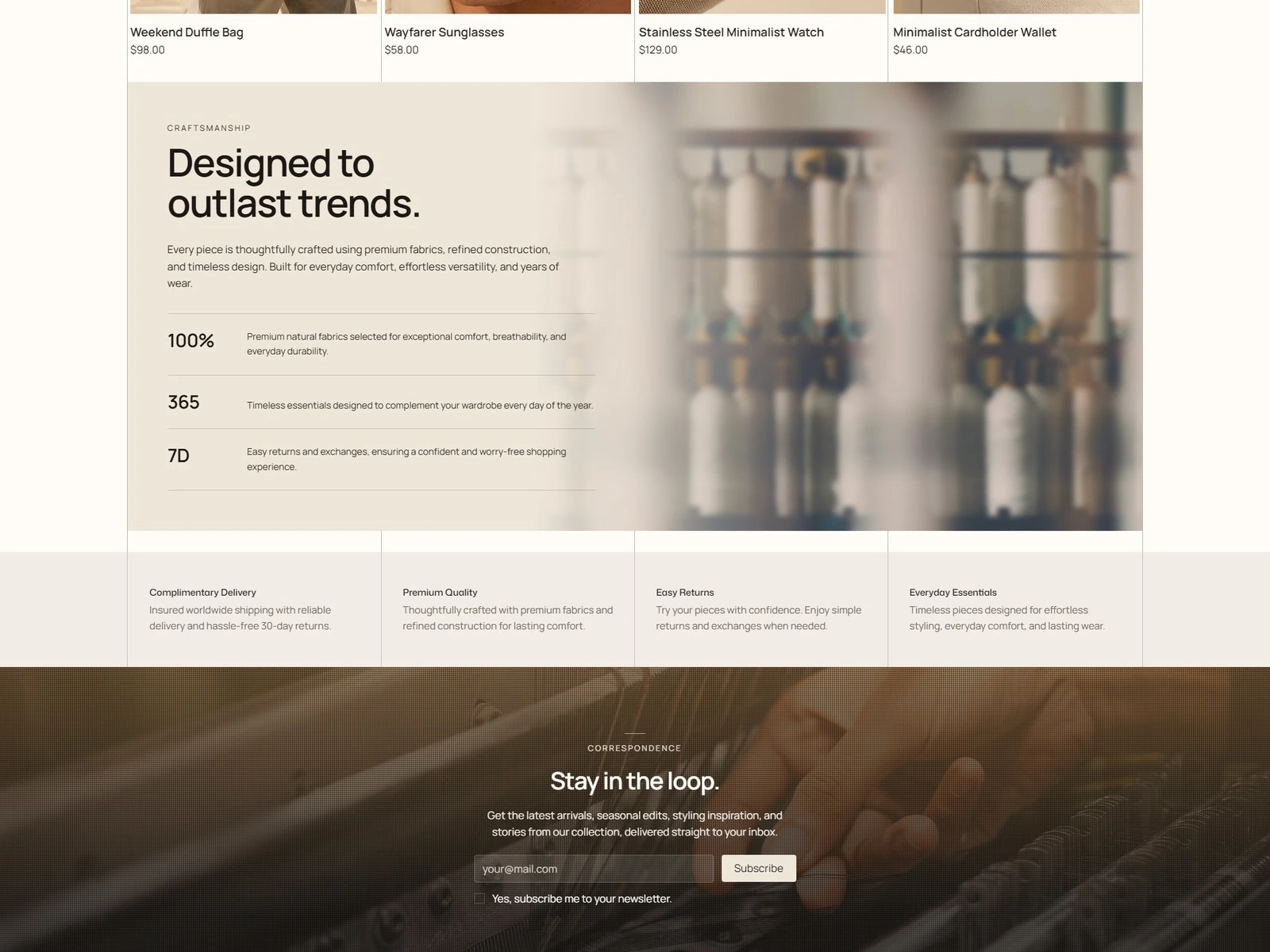
Down the homepage
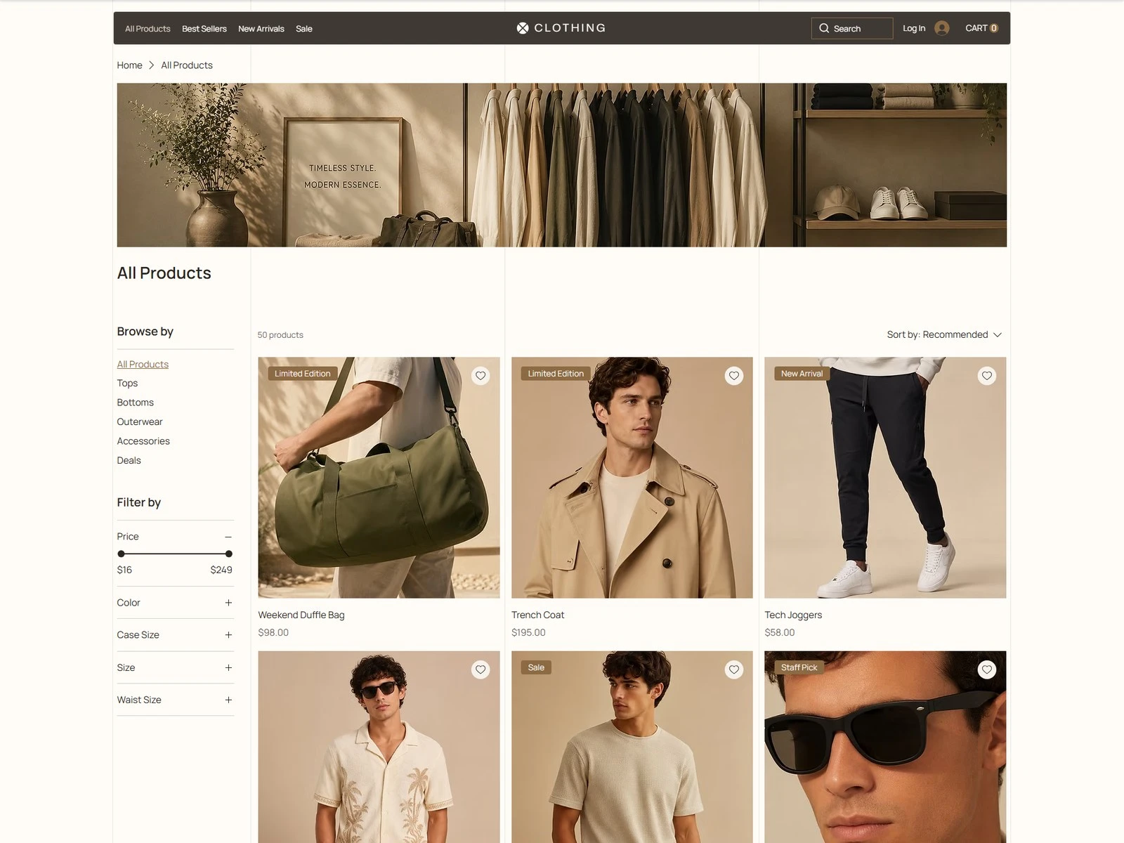
All products
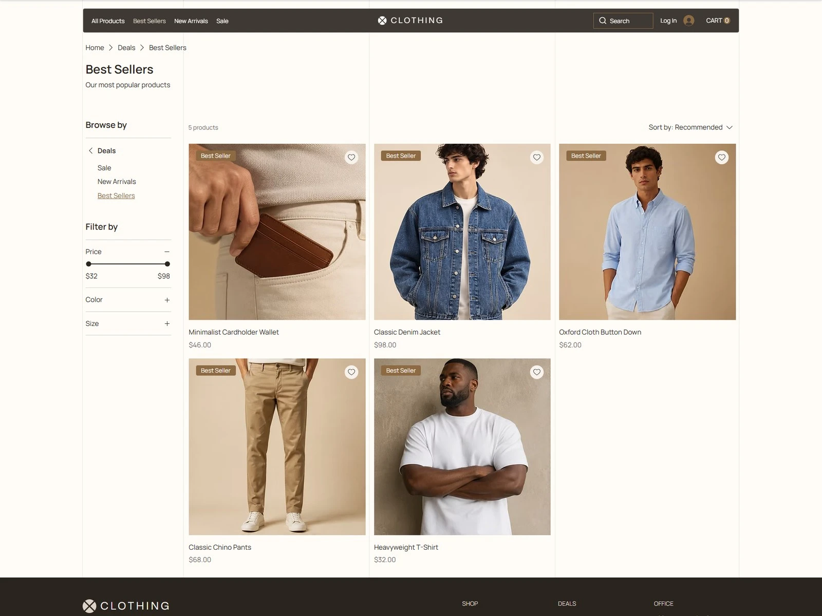
Best sellers
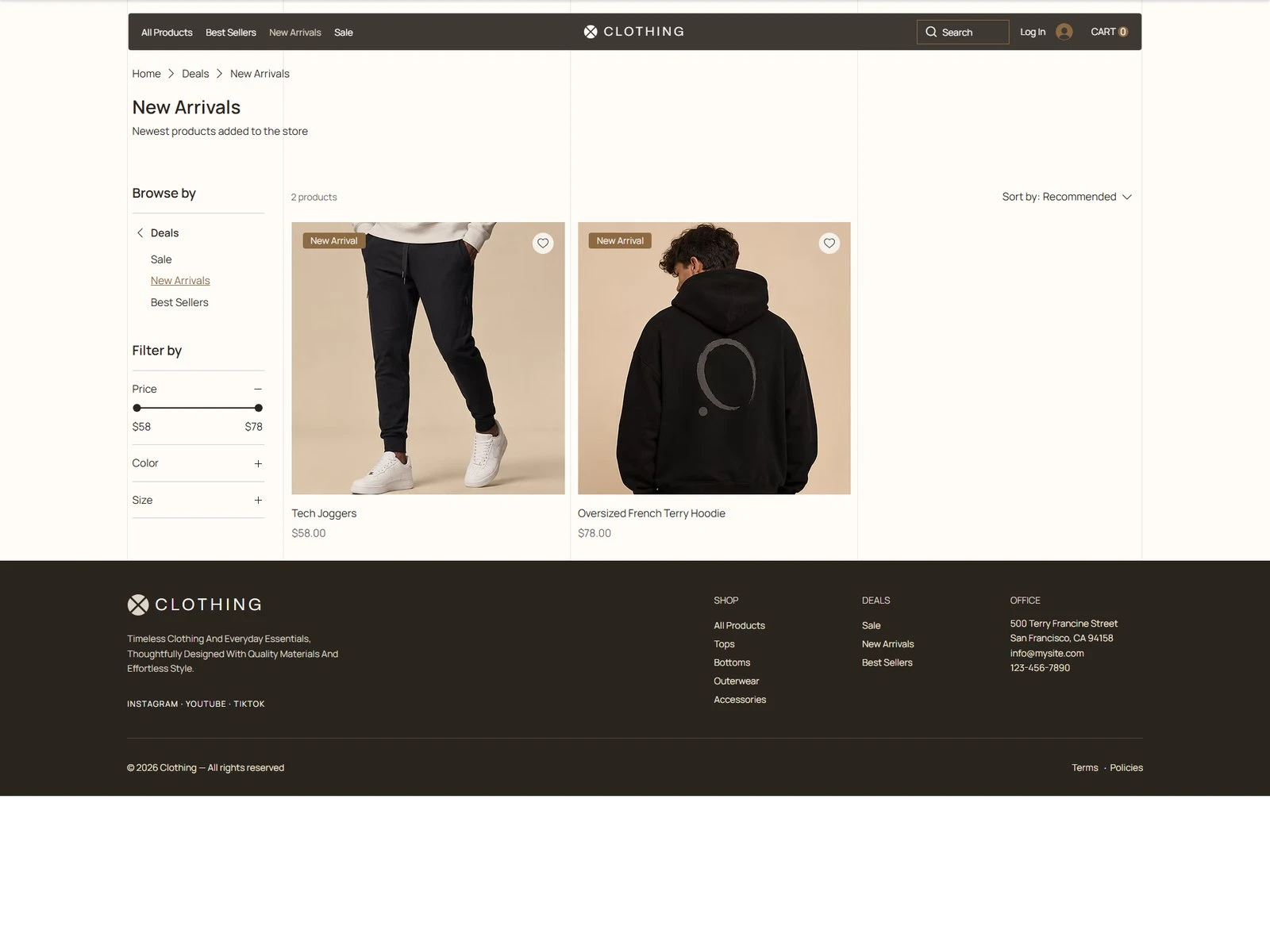
New arrivals
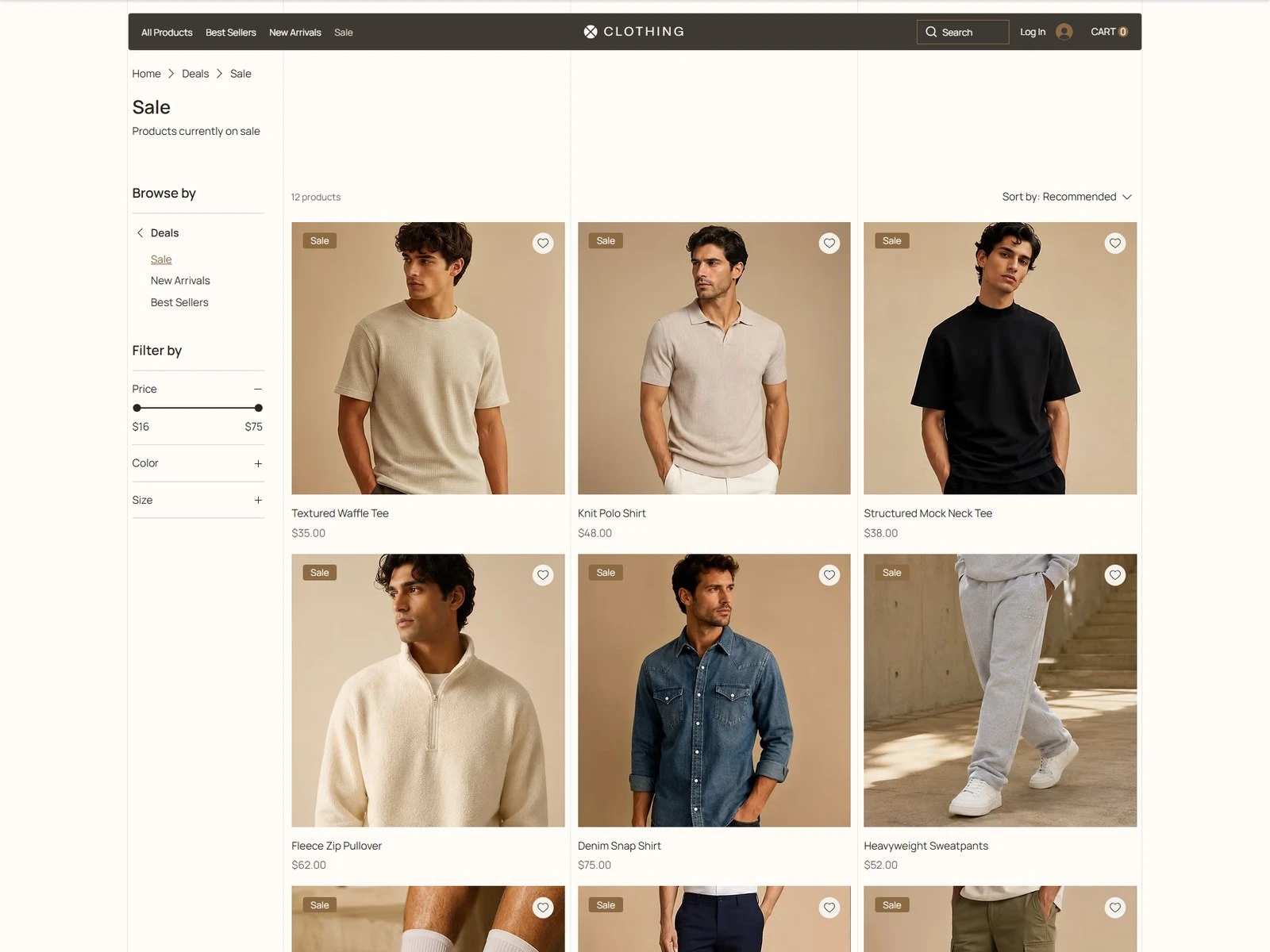
Sale — without the shouting
Then it has to convert
The product page carries fit, fabric and sizing without turning into a spec sheet, and the cart is deliberately ordinary — the one place where surprise costs money. Store, payments and forms all run natively on Wix Studio.
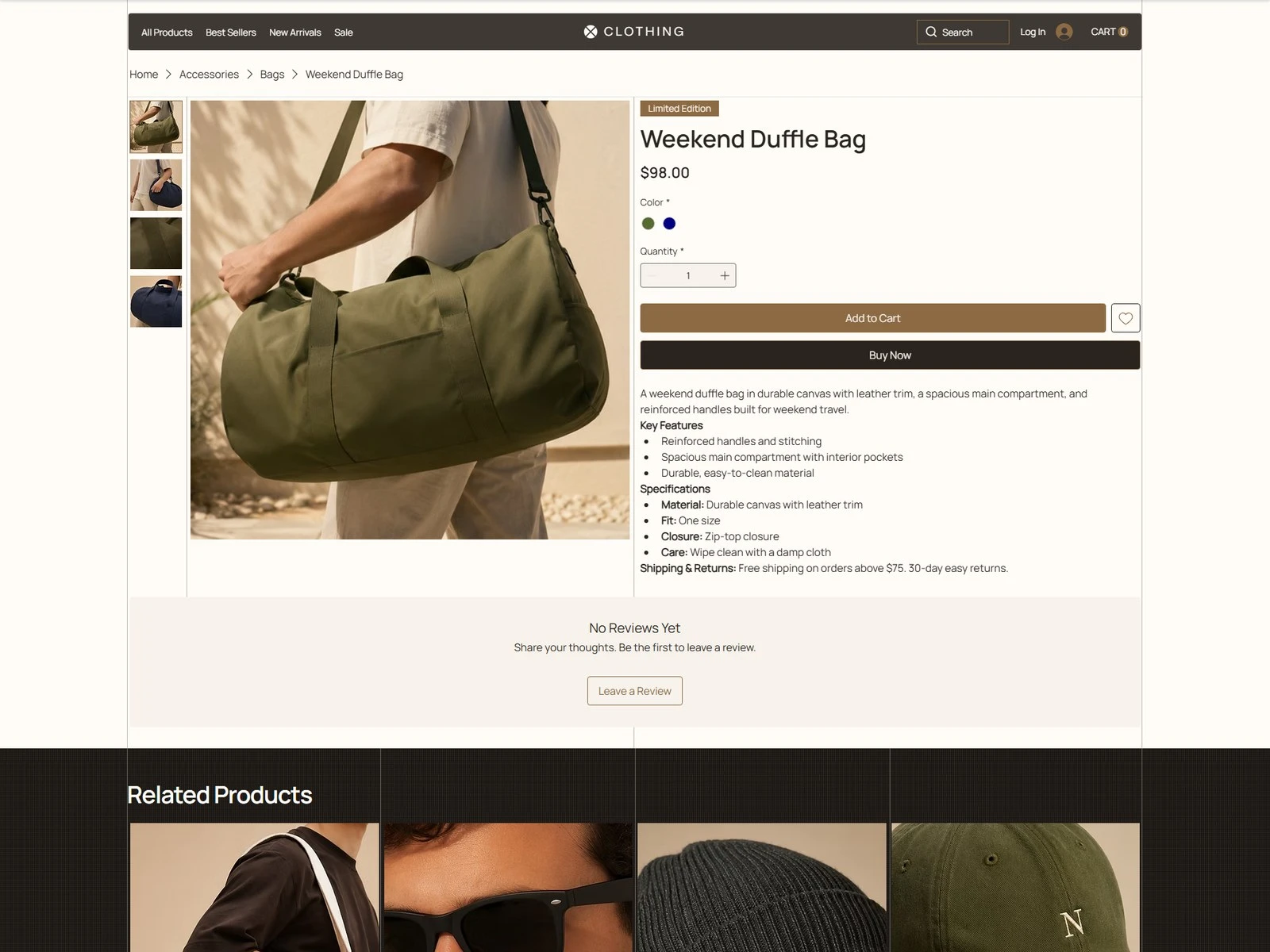
Weekend Duffle Bag — product page
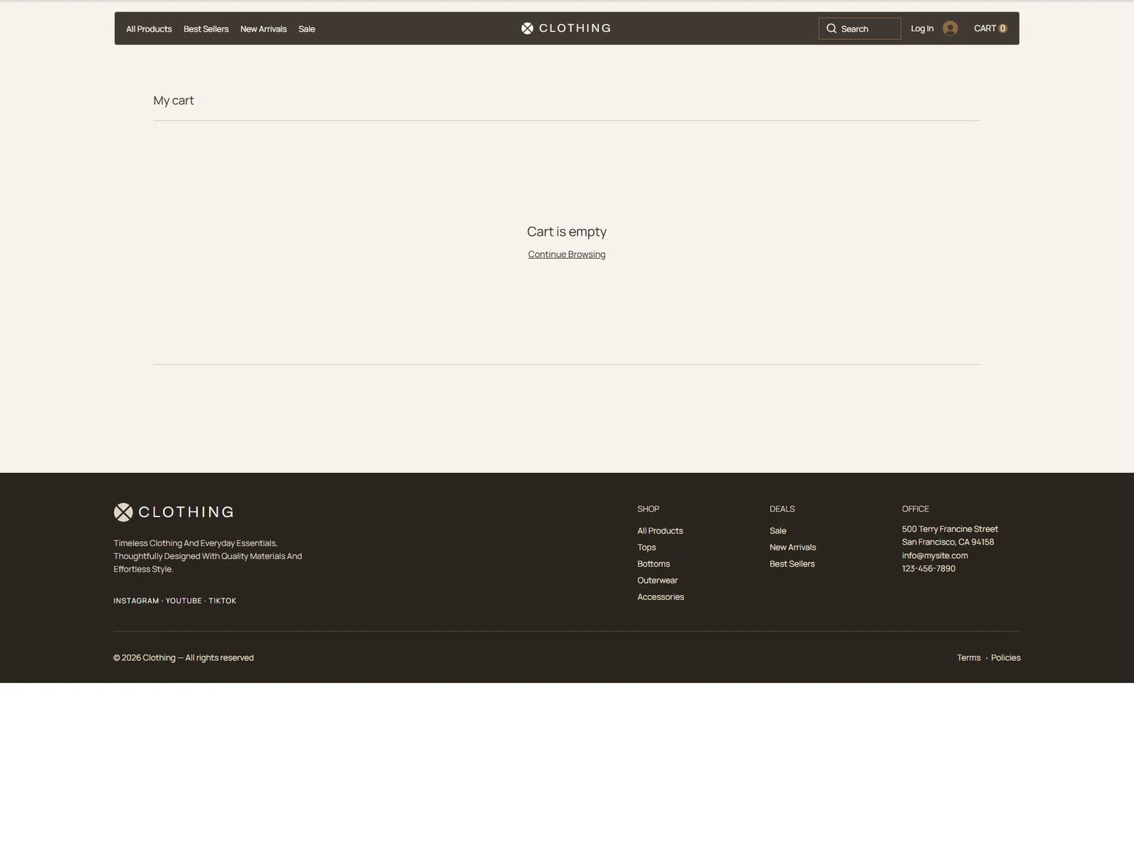
Cart
A storefront that reads like a brand and behaves like a shop.
Like this project
Posted Sep 2, 2026
A menswear storefront built on clean silhouettes — editorial product photography, category pages that stay quiet, and a checkout that gets out of the way.
Likes
0
Views
6