
Fund managers competing for the same deal. Same information. Different outcomes.
Liquidity Edge is a London-based advisory firm. They help corporate treasurers choose the right liquidity funds, a joint venture with ArlingClose.
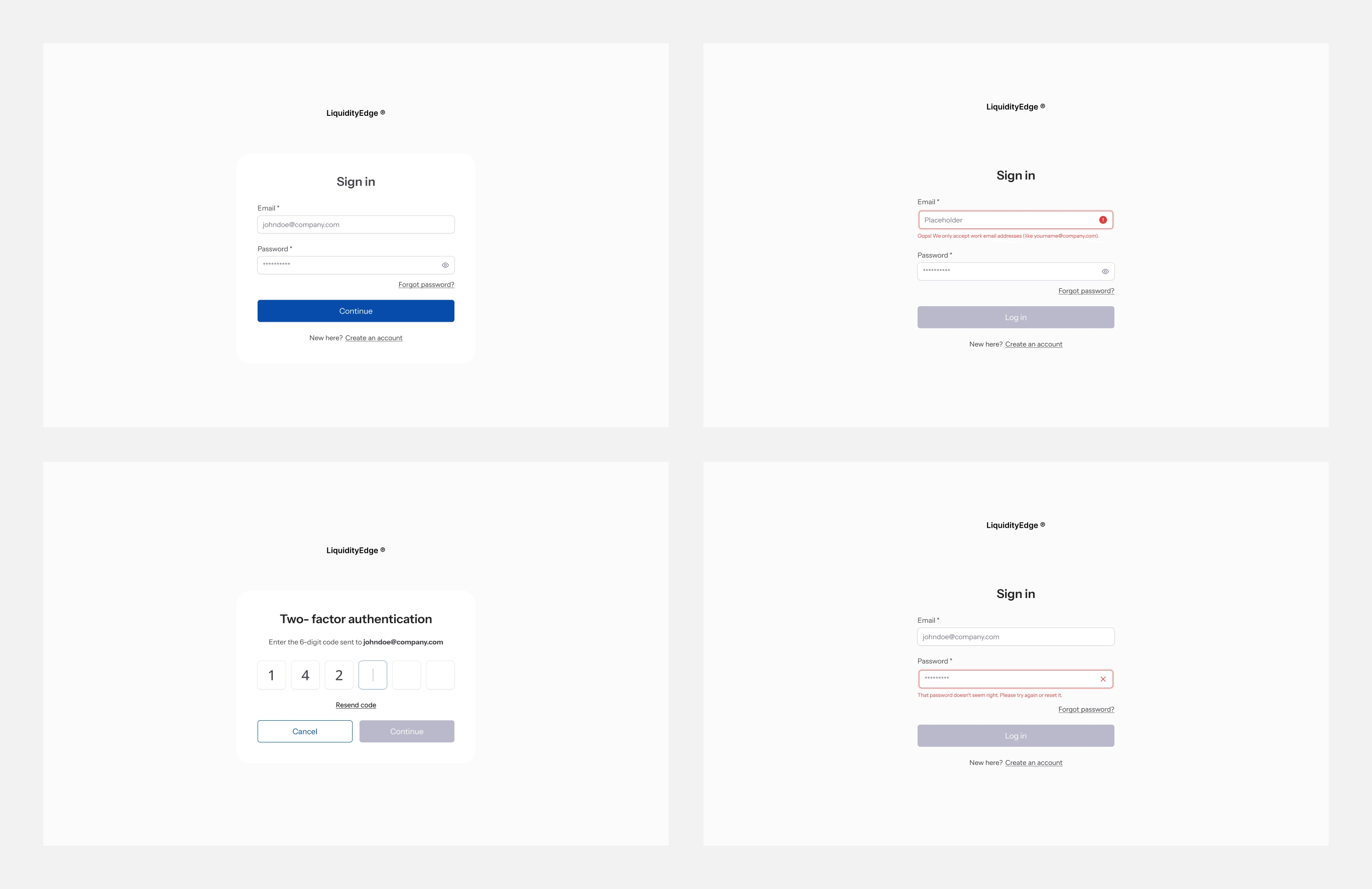
Wireframes Login
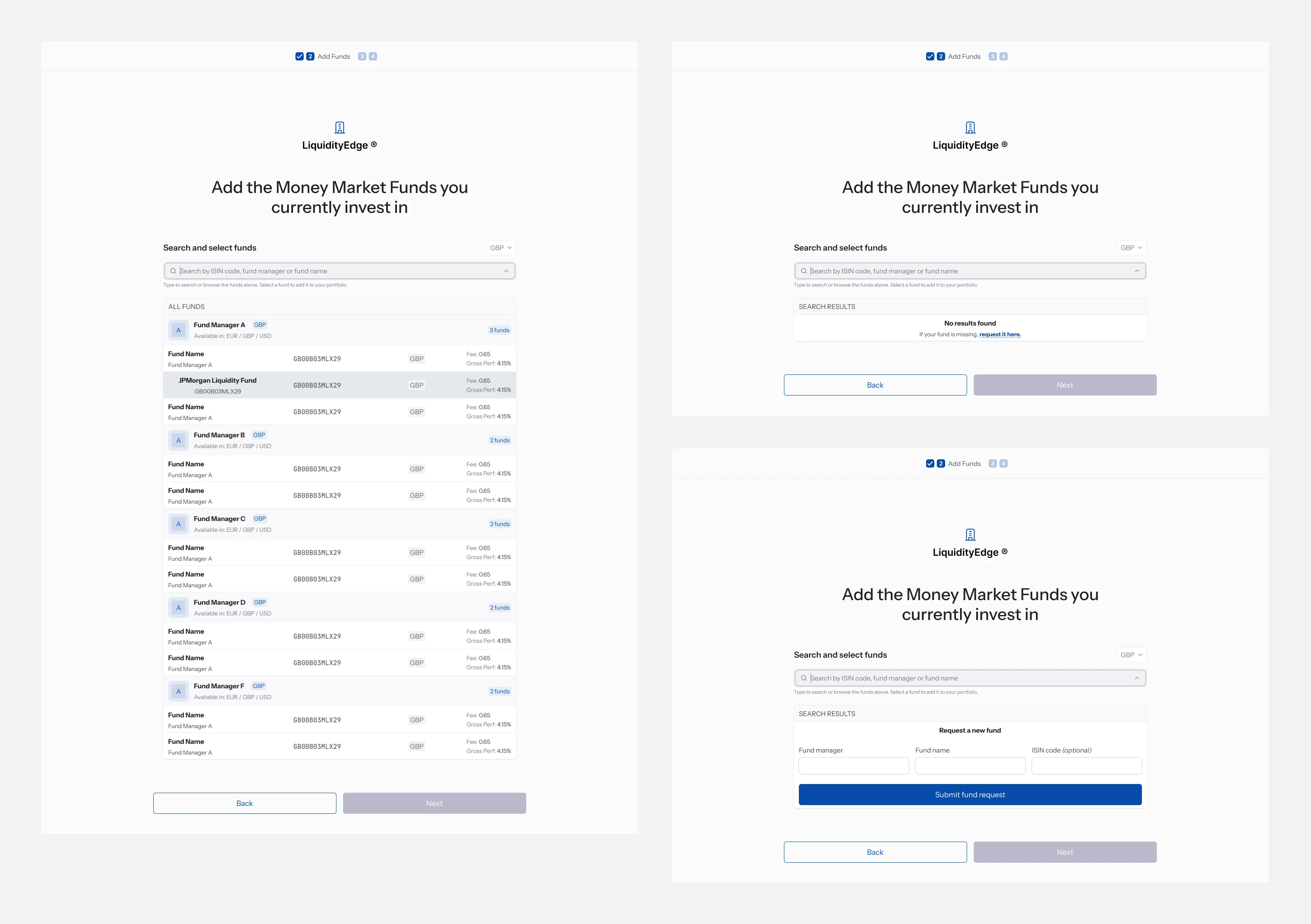
Wireframes Onboarding
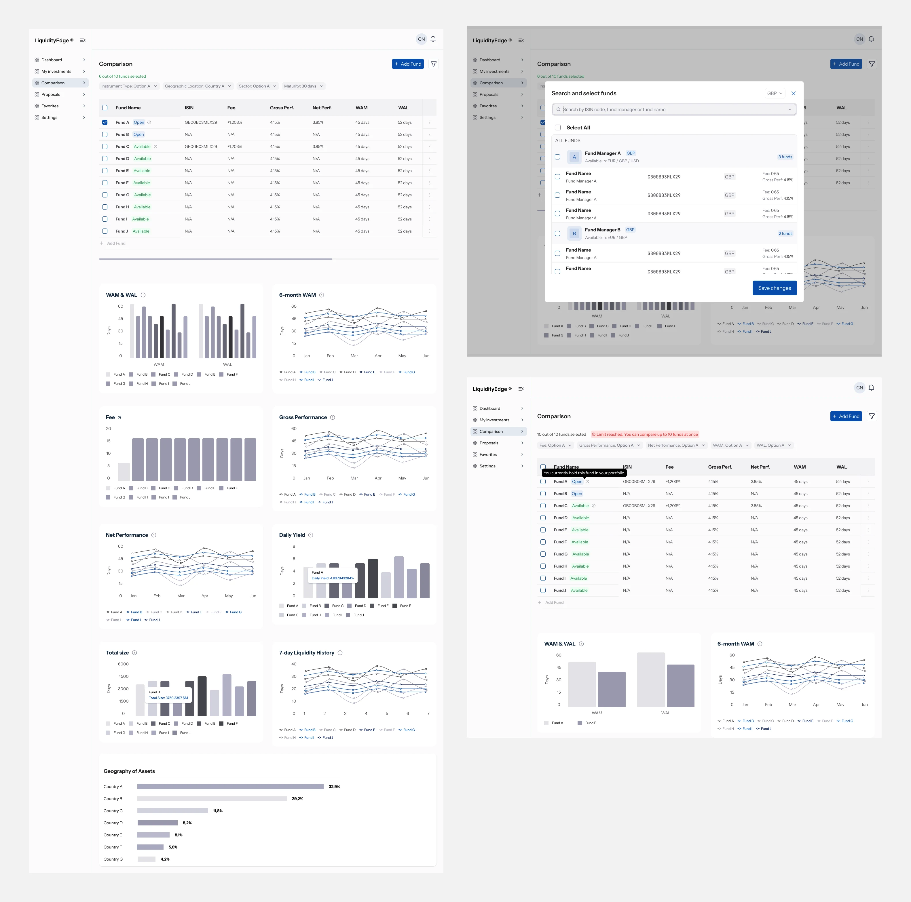
Wireframes Funds Comparison
The Challenge
Every negotiation ran manually. Treasurers' data, fund comparisons, outreach to fund managers, all of it by email and spreadsheet, one deal at a time.
That doesn't scale. Liquidity Edge needed to automate the entire process, for three different users with three different needs: treasurers, fund managers, and their own internal team.
The hardest part wasn't the UI. It was the trust problem, fund managers had to compete for the same deal without knowing who else was bidding, while treasurers still needed to trust every quote they received.
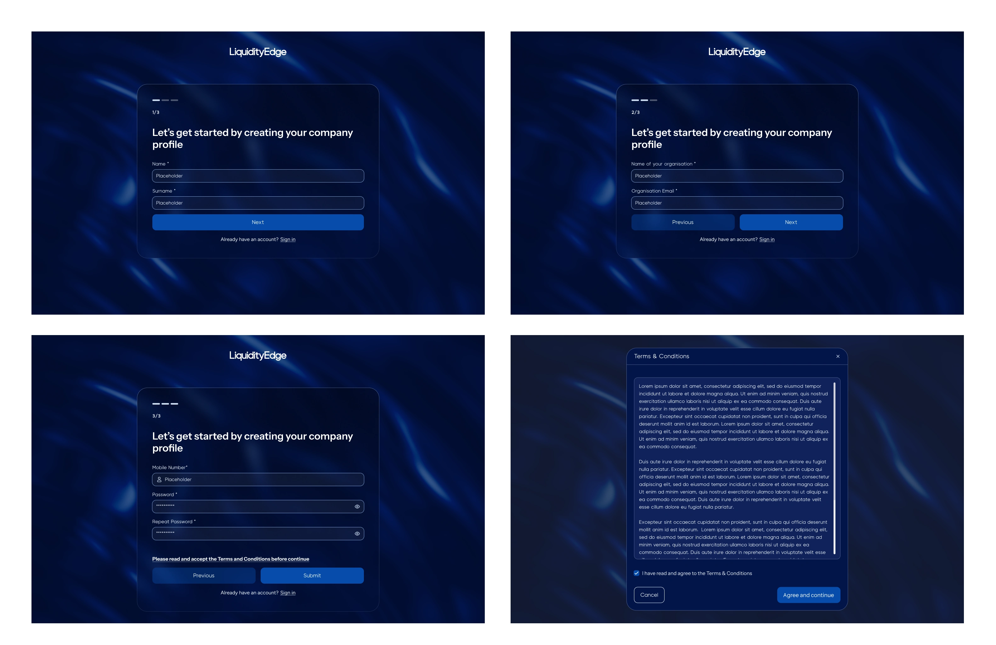
UI Design - Onboarding
The Process
We started with the logic.
→ User flow first: mapping what each of the three roles actually needs to do, and what they should never see.
→ Wireframes, to stress-test that logic before any styling.
→ Iterating on functionality. This took the longest, and it should have. Every screen had to answer: what does this person need to see, and what should stay hidden?
→ Visual design, once the structure actually held.
→ Developer handoff, documented and ready to build.
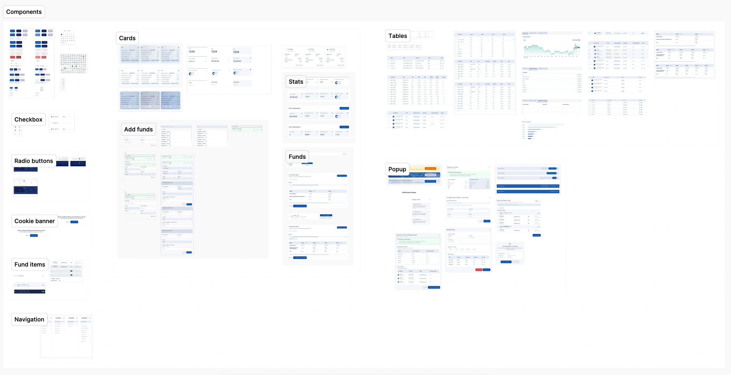
Components page
The Outcome
A platform where treasurers upload their fund holdings, compare them against the market, and request quotes in a few clicks. Fund managers respond anonymously, inside the product, never by email. Admins run the entire operation from one dashboard.
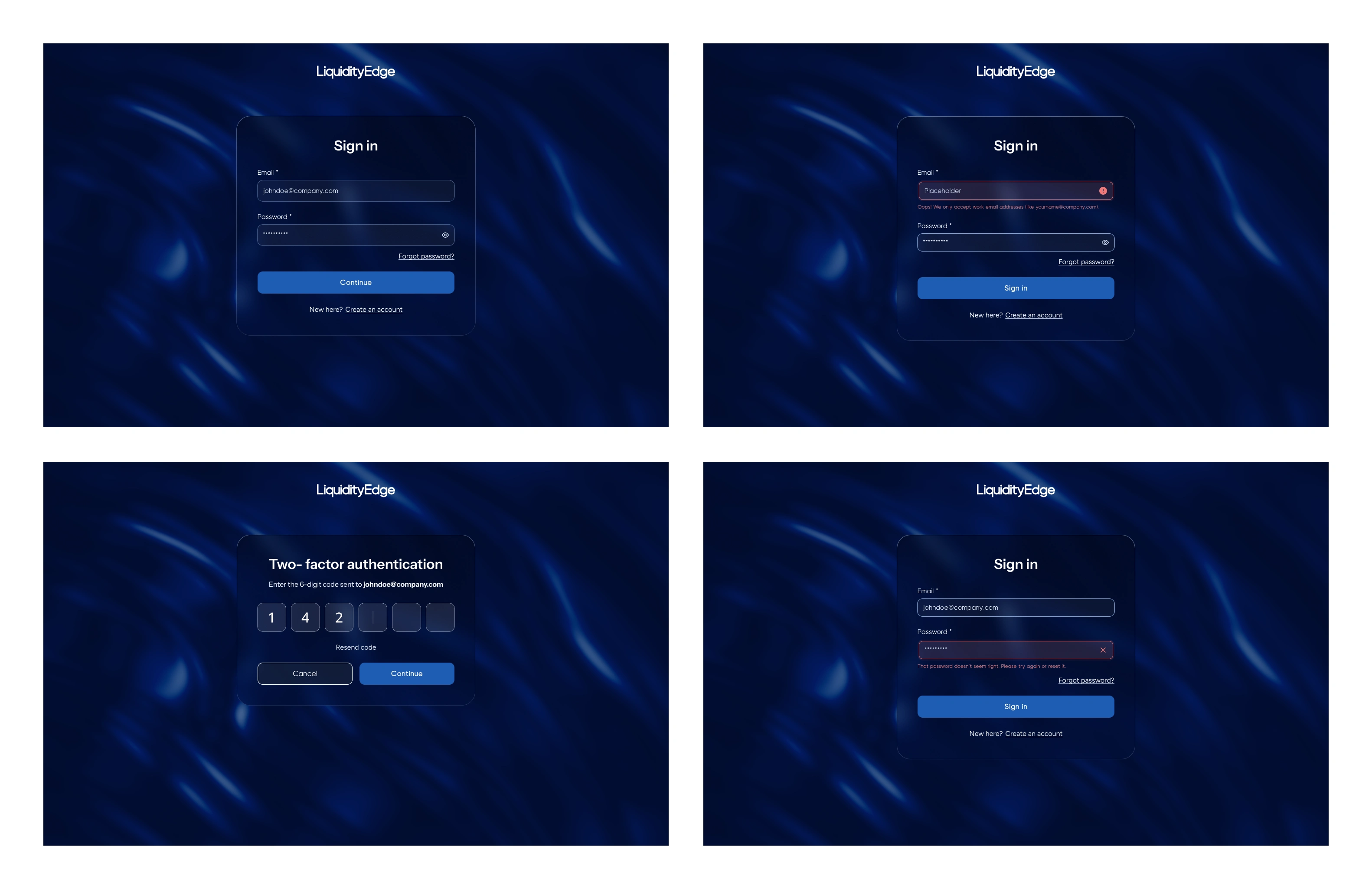
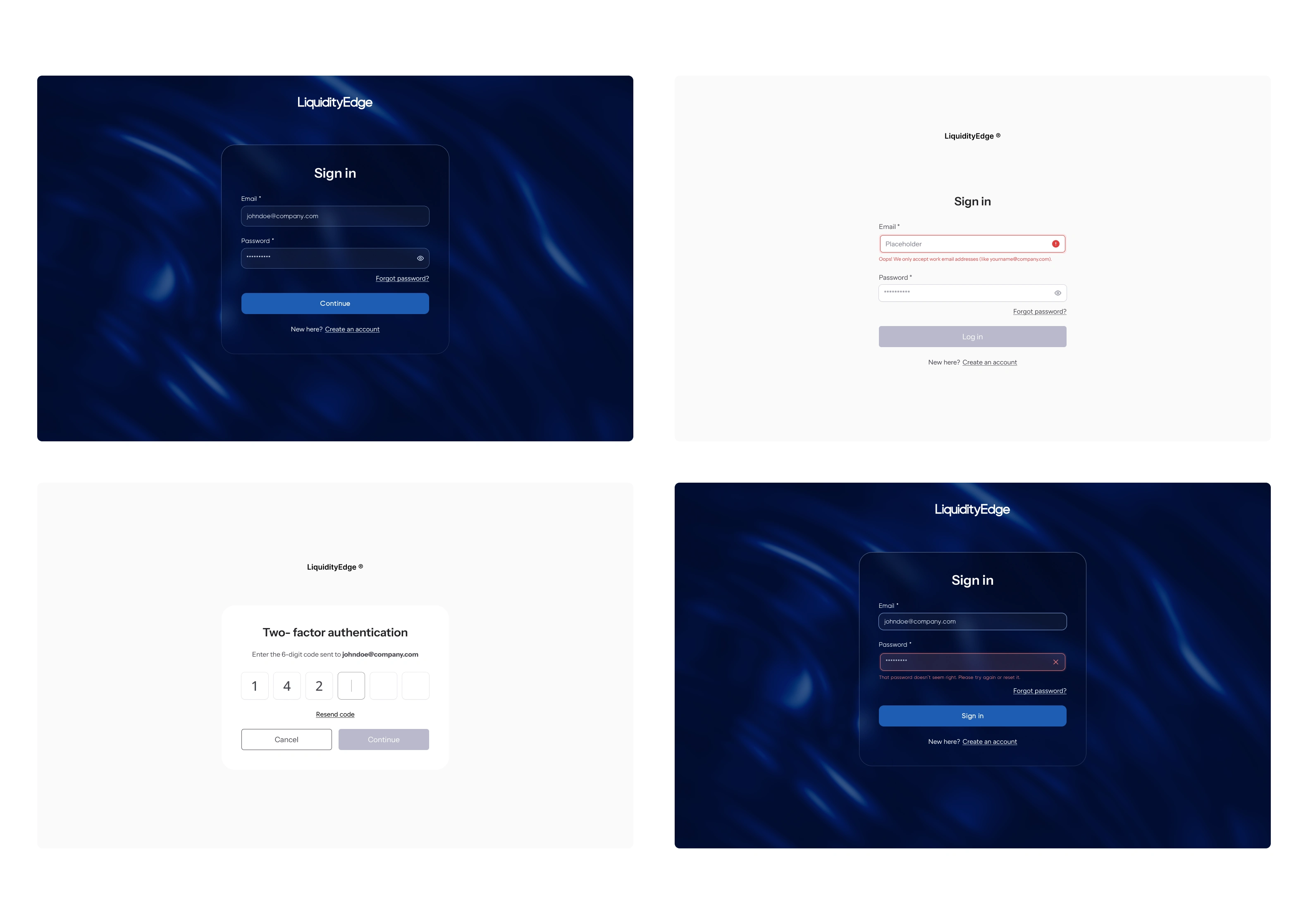
UI Design - Login
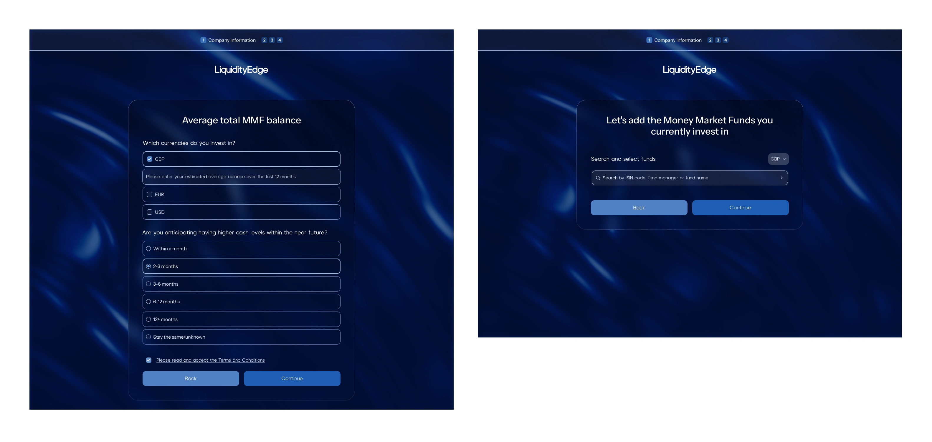
UI Design - Onboarding
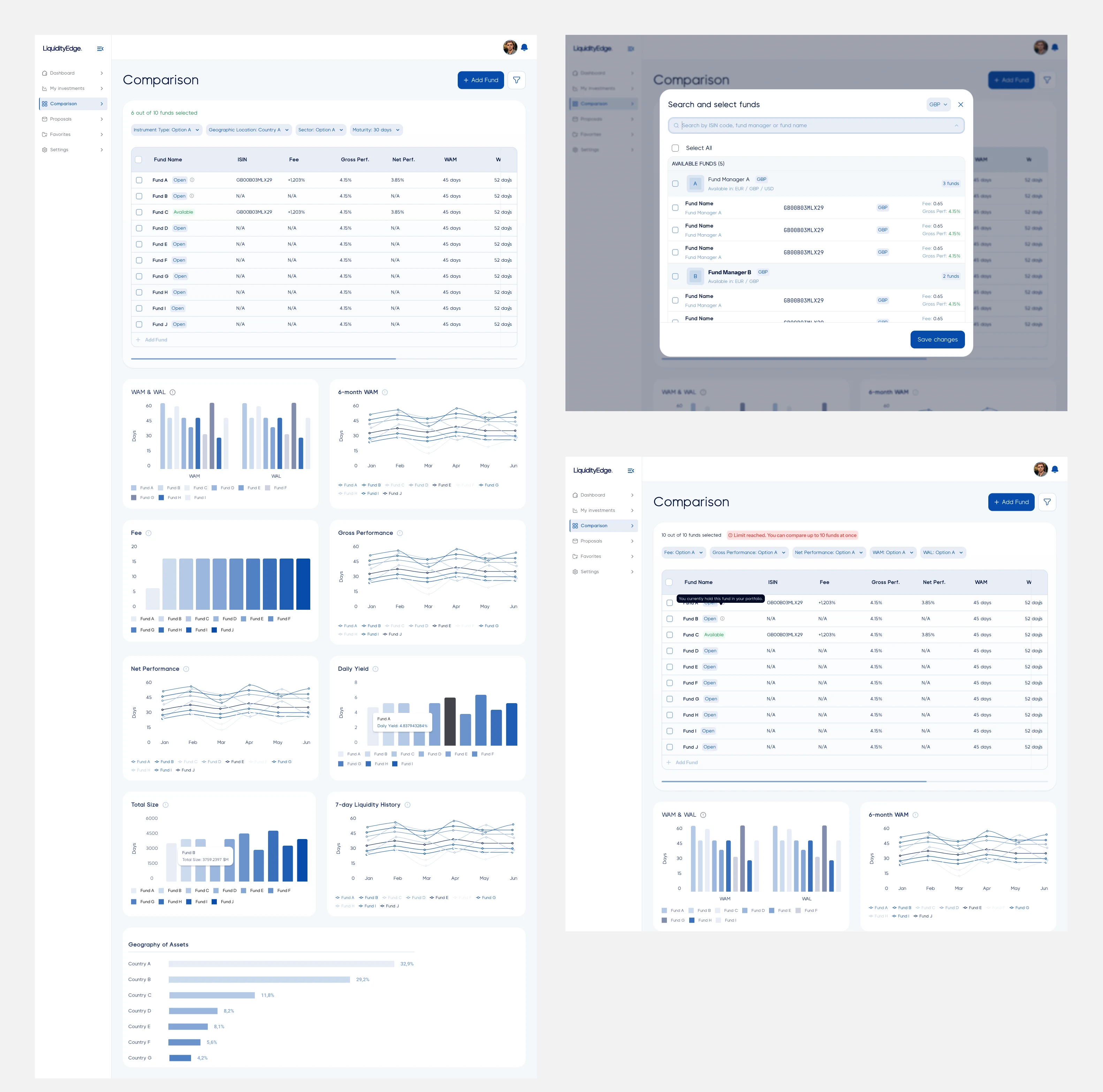
UI Design - Fund comparison
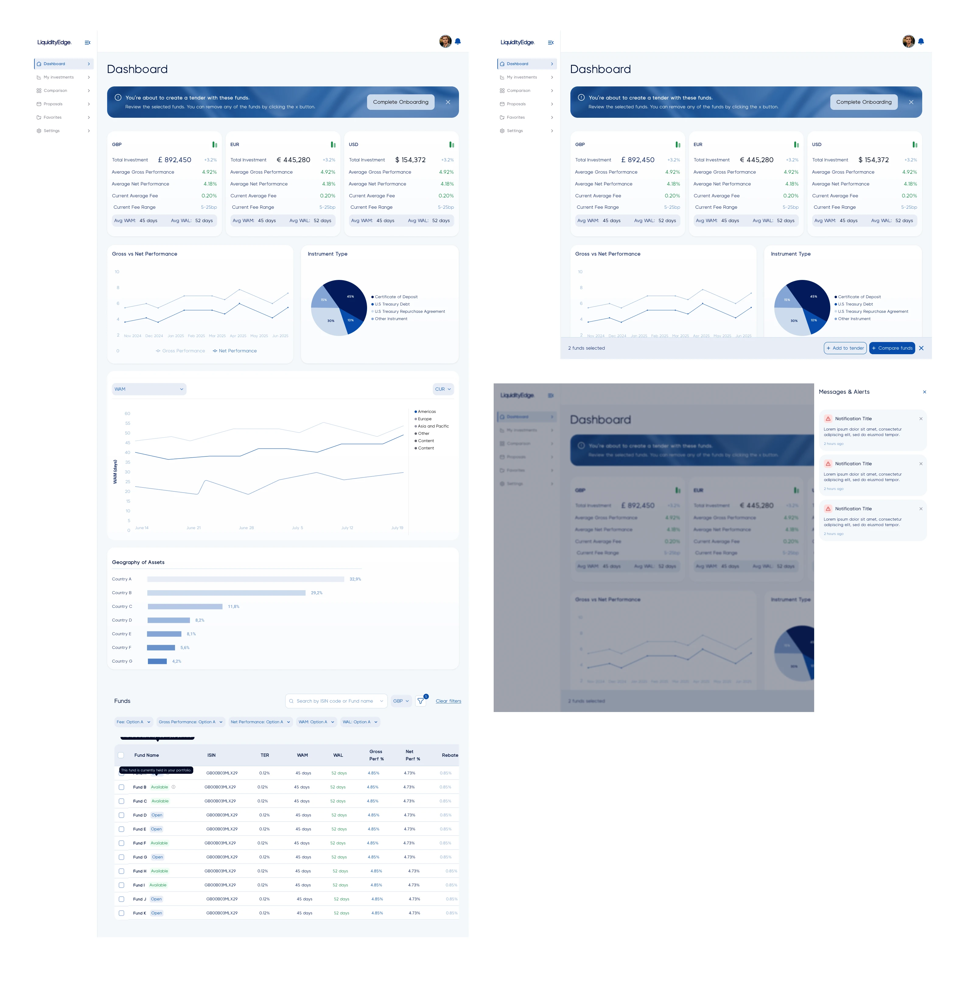
UI Design - dashboard page
Need a partner to think through your design? Let's talk
0 likes · 14 views · Jul 6, 2026
UX and product design for a fintech platform connecting treasurers, fund managers, and admins, built for Liquidity Edge
