Valise - Case Study
Client
Valise is a high-end luggage service company with the mission of making tourists' and business travellers' lives easier by taking care of their luggage. By collecting the luggage from the airport to the hotel (final destination) or vice versa, Valise is offering the customers the possibility of maximizing their time when visiting a country, focusing on the things that matter.
Project
Brand Identity, Product Design and UX/UI
Project Manager
Ricardo Abreu
UX, UI and Graphic Design
Délcio Baptista
Branding
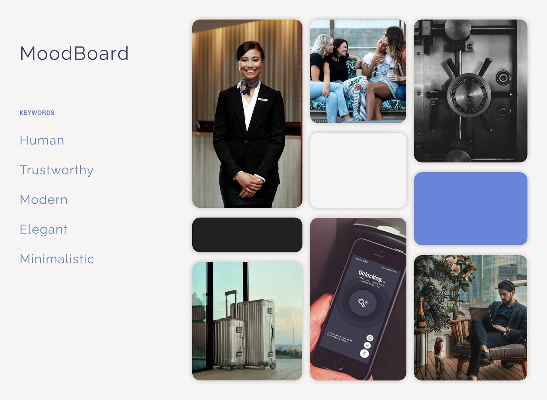
The brand's visuals are designed to represent key values such as professionalism, trustworthiness, modernity, and cleanliness. These values are not only relevant to the field of operation but are also important to customers. To achieve this, I have taken a minimalistic approach, focusing only on the essential visual content.
When making my decisions, I took the logotype into account since it was not created by me and no briefing was provided. As a result, I developed the branding to complement the logo.
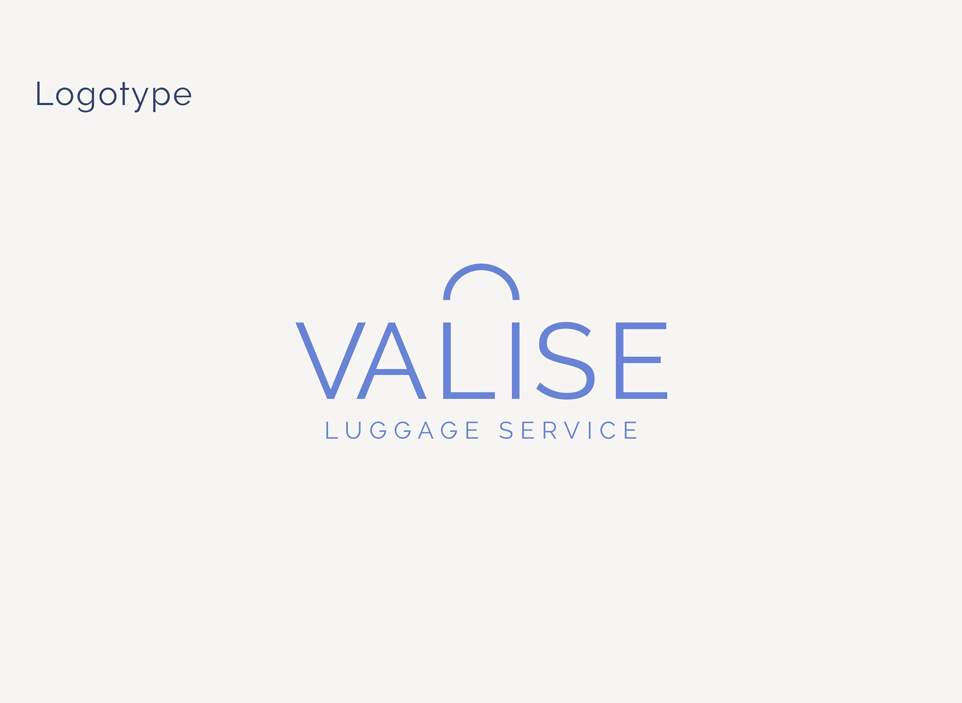
Although the logo concept wasn't my idea I made some changes related to the typeface, from Helvetica to Raleway.
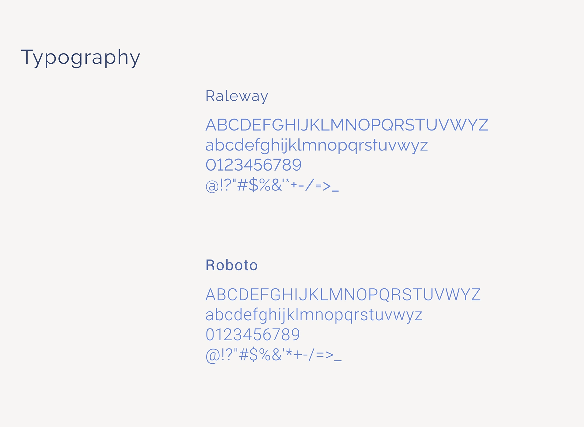
Raleway is a modern and elegant typeface with unique details in its shape, making it the perfect choice for titles and calls to action in this project. For the body text, I opted for a more rational and easy-to-read typeface, Roboto. By adjusting the font sizes and spacing between them, it was possible to convey the idea of a high-end service or product, which is precisely what the founders of Valise wanted to achieve.
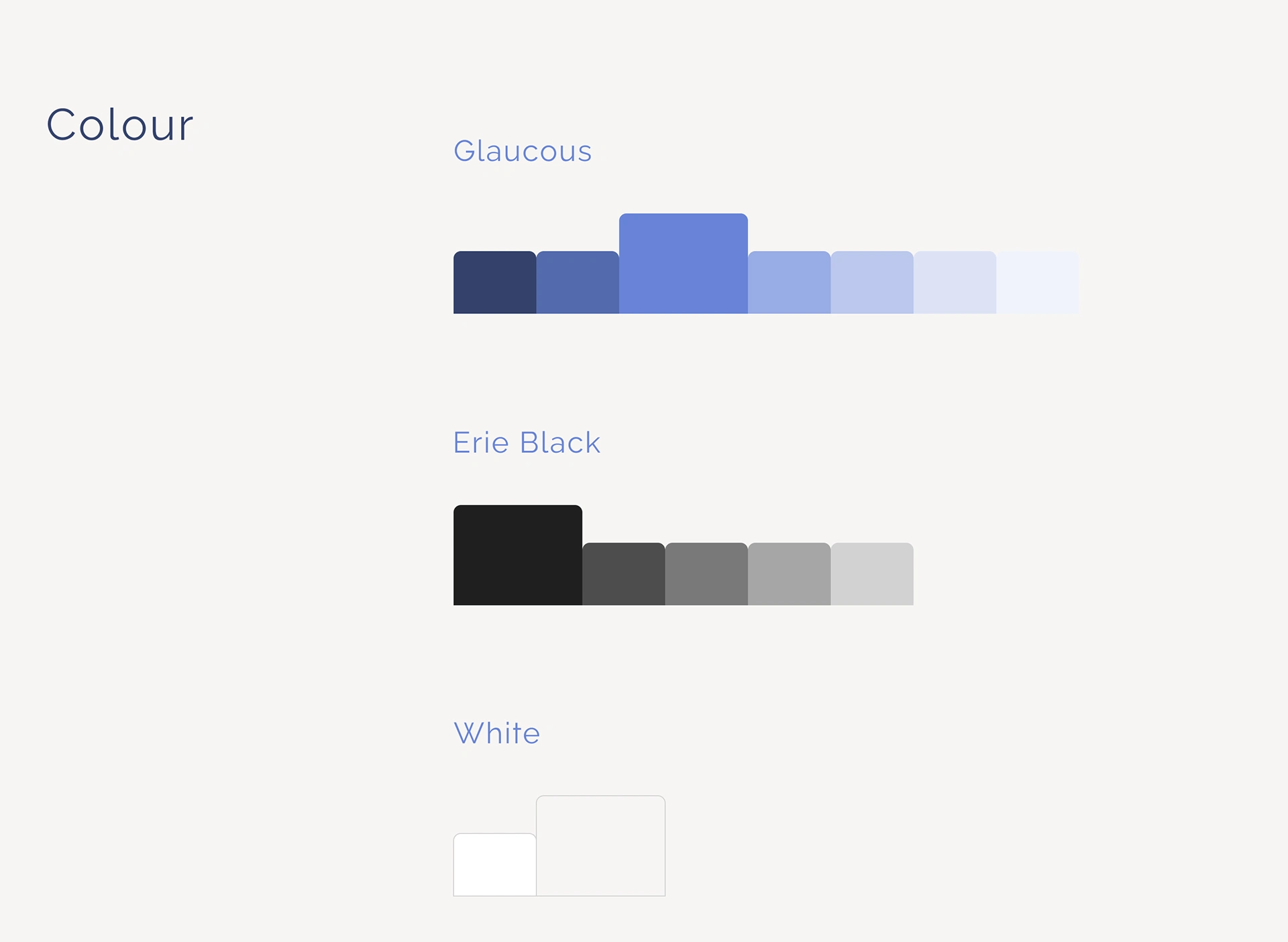
The colour blue can symbolize security, confidence and royalty so it made perfect sense to be the main colour of Valise. This specific blue has the name Glaucous, I selected several shades and tints of this colour to create a monochromatic palette. Additionally, white, black and shades of grey were added this allows us to create situations of greater or lesser contrast according to our needs.
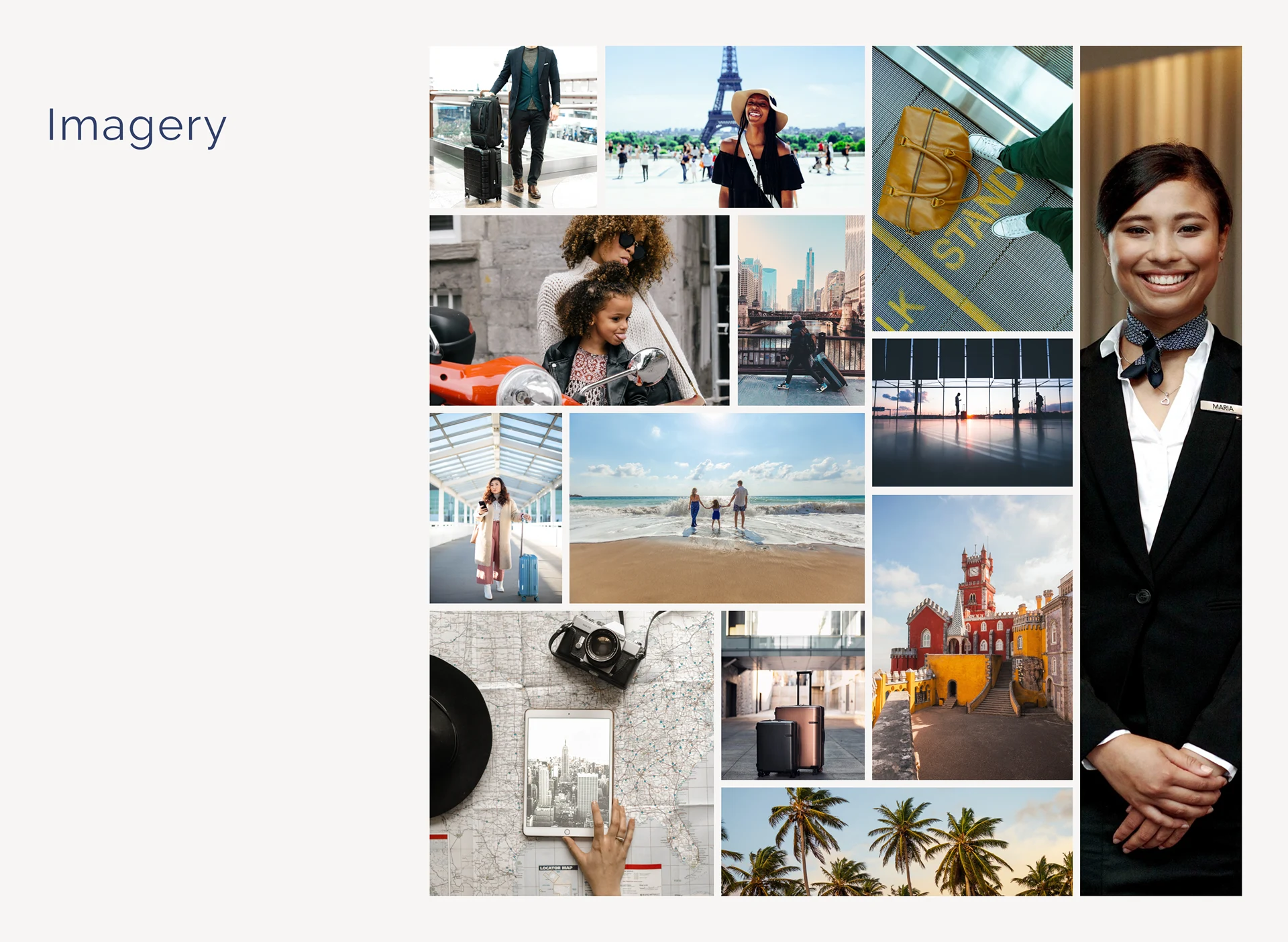
Valise requires photos that showcase their target audience and lifestyle. The images should be of high quality and have an upbeat atmosphere, with diversity and inclusivity being important factors to consider during the selection process.
UX
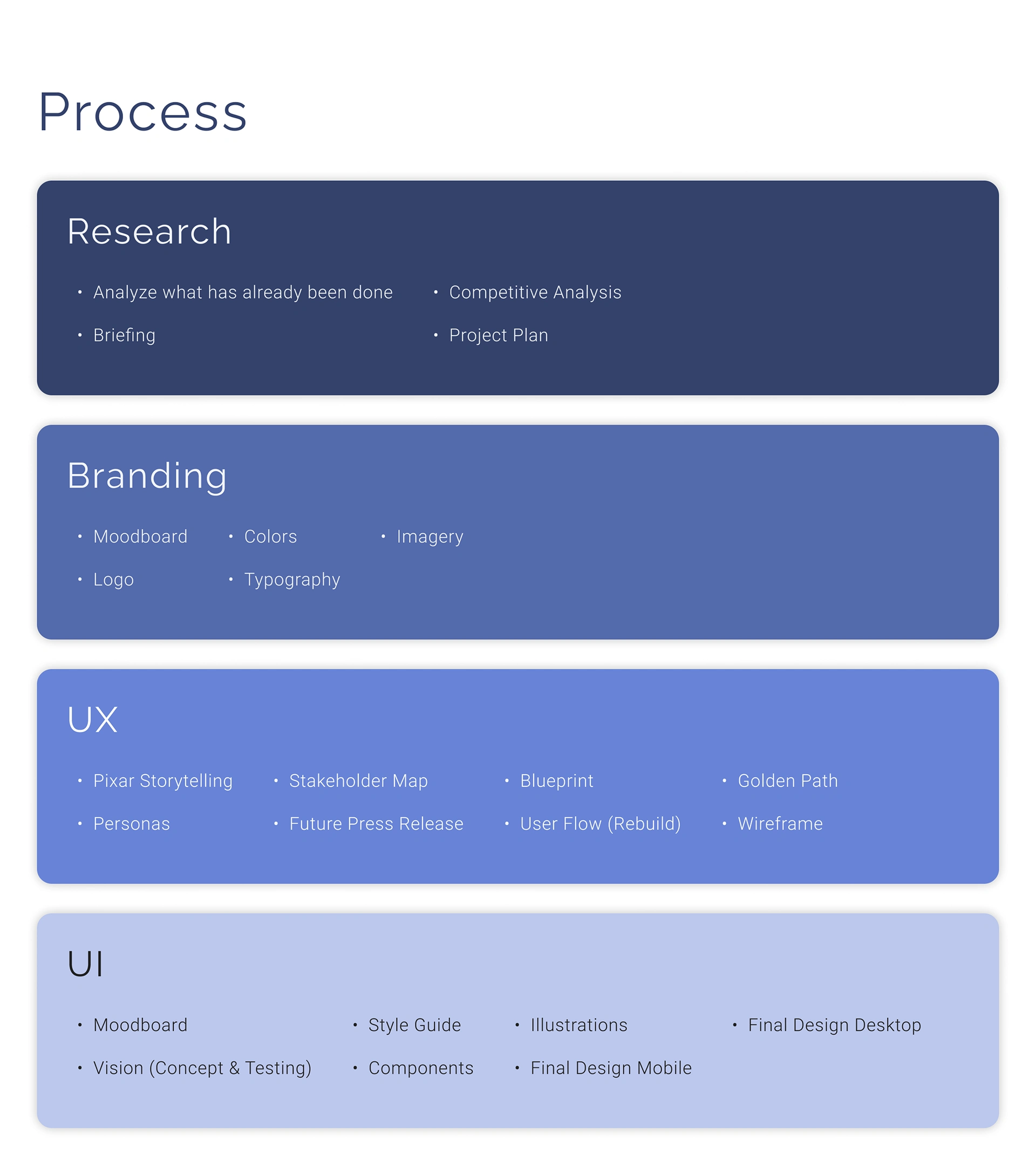
When building the user experience (UX), we aimed to keep it intuitive and straightforward, which is usually the case when dealing with UX design. To accomplish this, we employed various tools such as storytelling, personas, future press releases, blueprints, and user flow. These tools helped us to identify new features and better understand the user's needs throughout the booking and post-booking process.
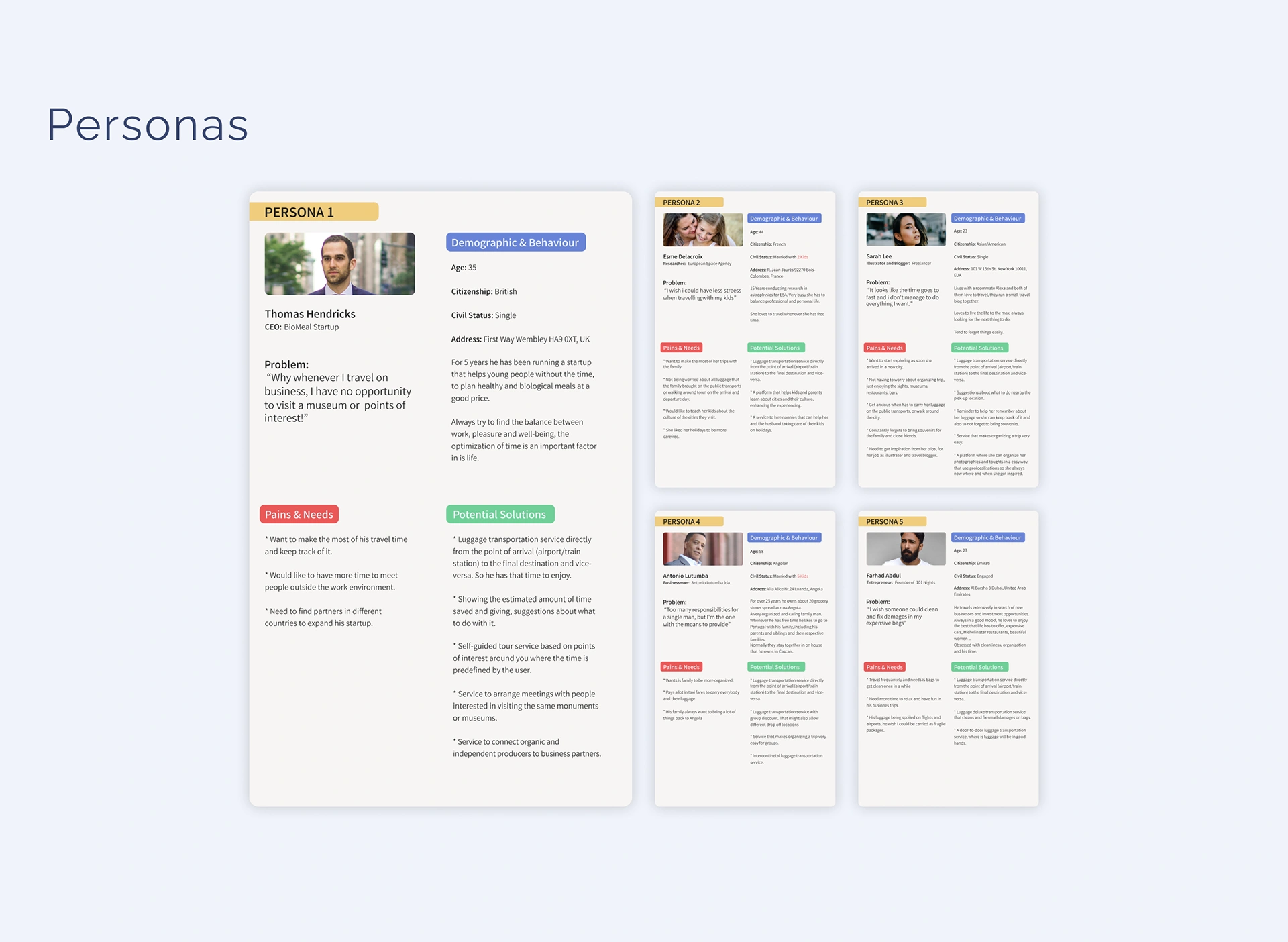
Personas help us understand and relate to our target audience, anticipate their needs, and come up with possible solutions. They also remind us who we're working for.
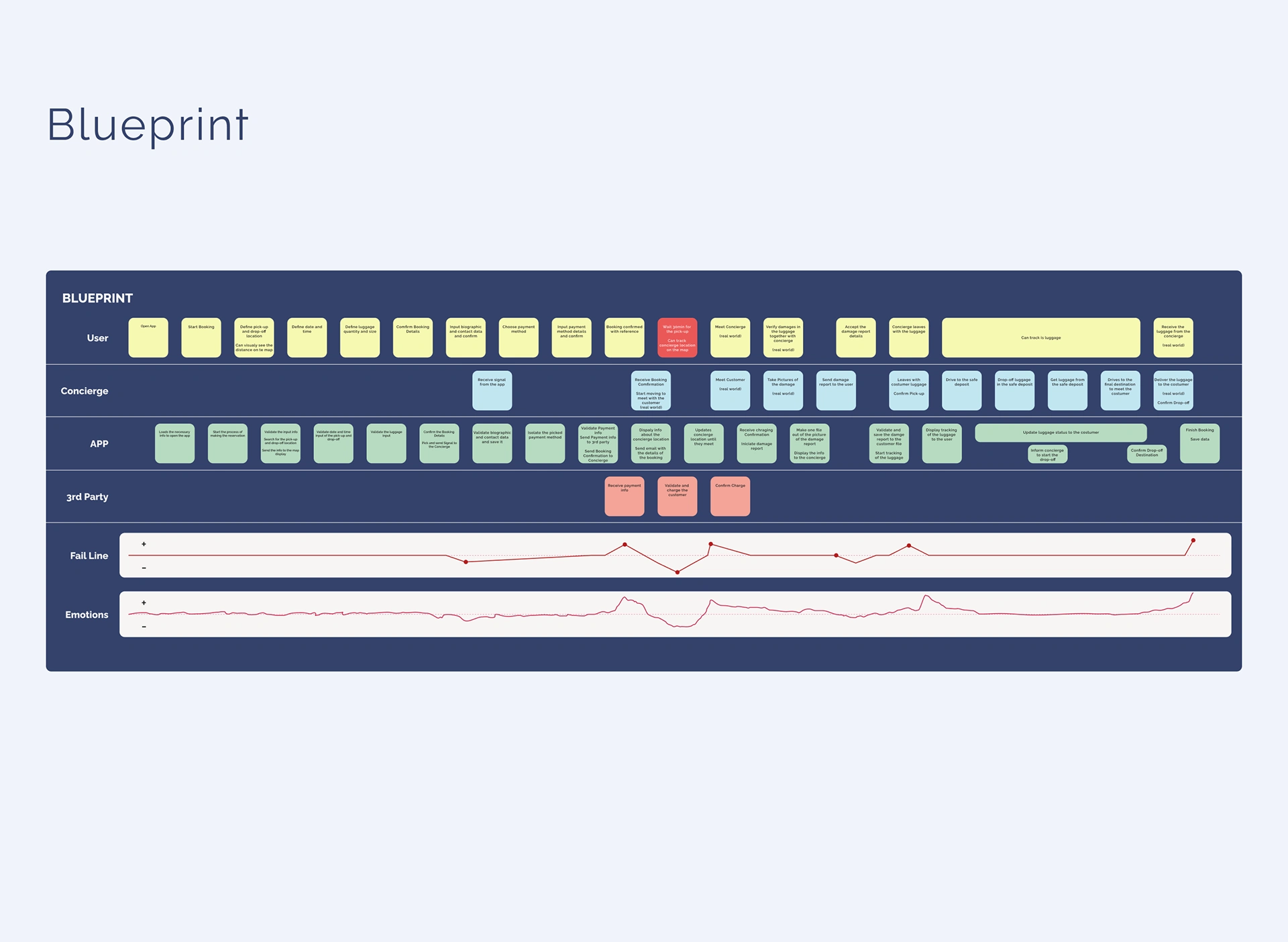
A Blueprint is a helpful tool that enables us to map out all the actions and processes involved when using a product or service, as well as the role each actor plays. With this tool, we can easily identify critical moments and develop effective solutions to any issues that may arise. In this particular case, we have identified that it is not possible to make pick-ups in less than 30 minutes after the user has placed an order.
An ideal solution would be to allow users to make a reservation anytime before their flight. Additionally, a feature could be added to link flights to the reservation. This would enable the pick-up time to be updated automatically so that Valise's concierge will be waiting for the user upon their arrival.
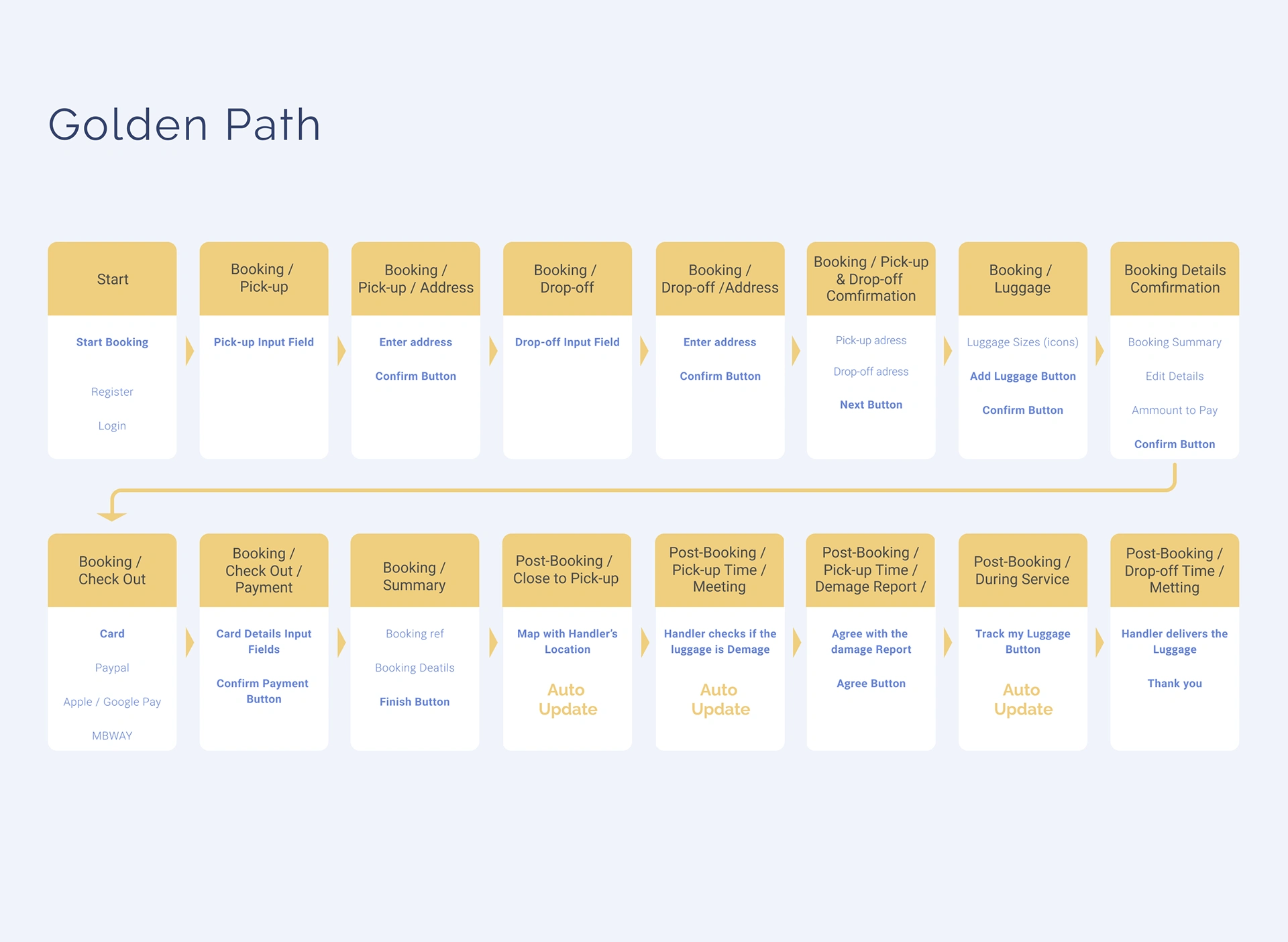
Golden Path is the quickest way for users to complete an action on an app. For Valise, the most important action is booking a trip.
The booking process is divided into five steps: defining locations, date and time, items, identifying oneself, and payment. Customers with an account will have the last two steps streamlined.
There are three stages after booking a service. First, you can make changes or book another service while waiting for the concierge. Second, the concierge will verify and collect your luggage during the physical interaction. Finally, you can track your luggage to its destination.
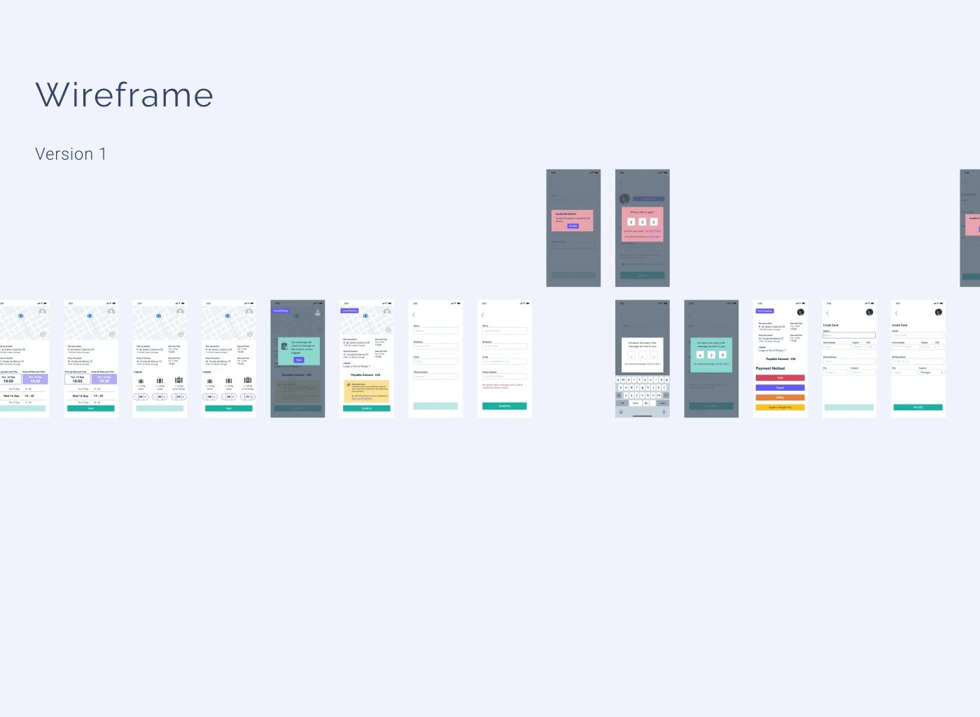
Wireframes are essentially sketches of the screens in your app. By organizing them into a flow, you can visualize how the interaction will work. This is extremely useful for testing on users or presenting to stakeholders and collecting feedback before moving forward with the project. View wireframes here.
UI
UI design is based on branding and UX, with a focus on simplicity, cleanliness, and ease of use. Illustrations aid in understanding information on the web app.
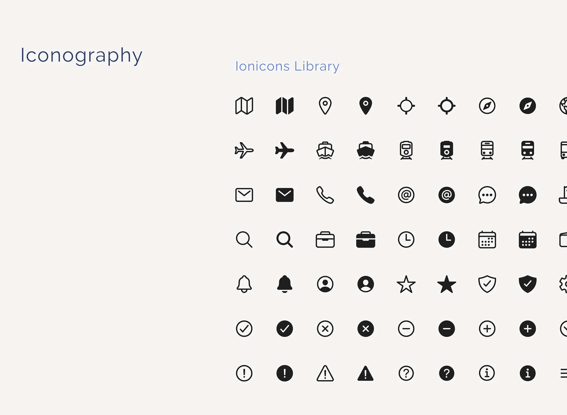
It was important for the icons to have both an outline and a filled version. Ionicons is an open-source library with a huge variety of well-designed icons. And they make the implementation easy.
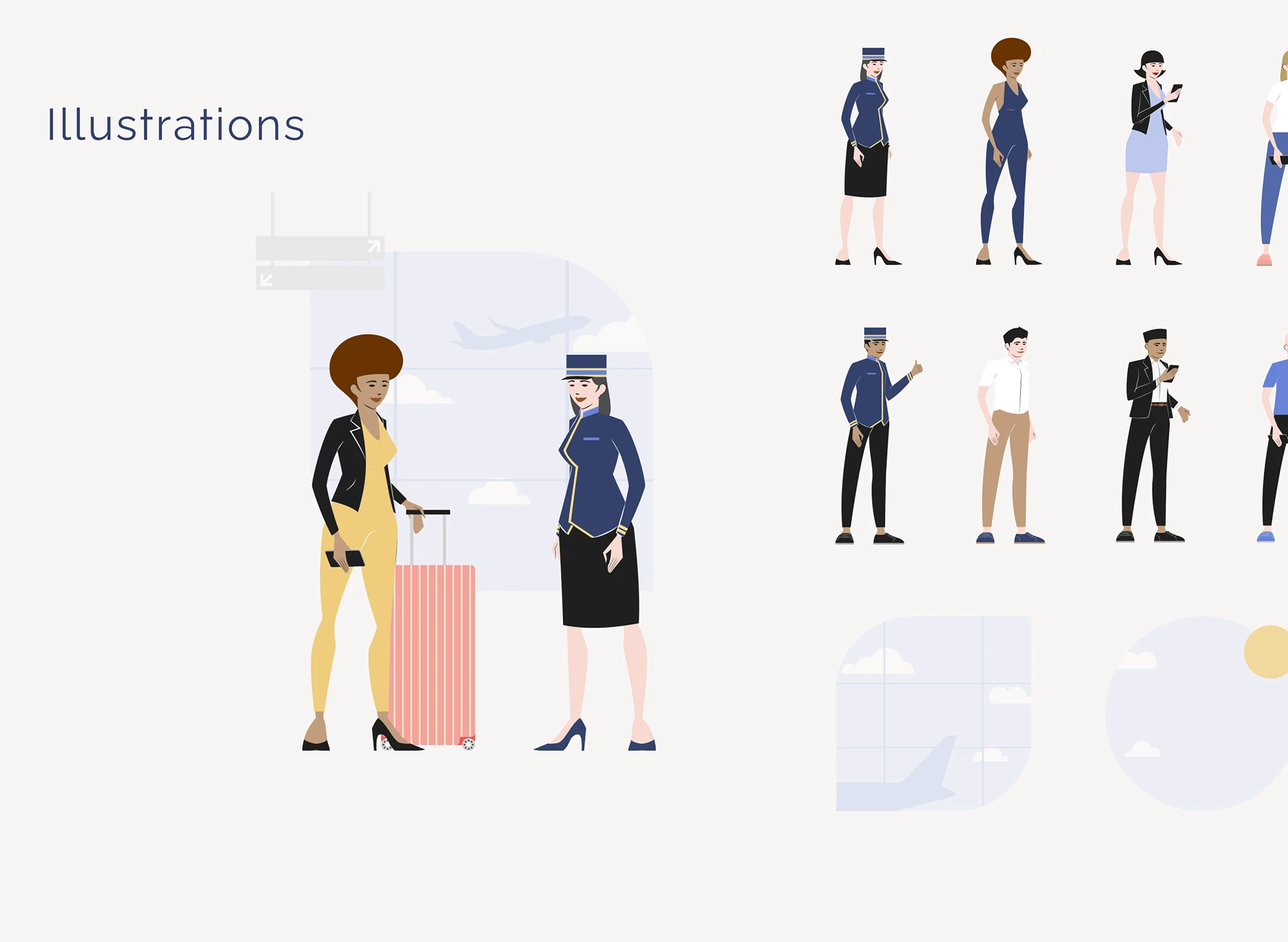
The purpose of the illustrations is to enhance the user experience and make it more enjoyable. Just like photographs, they depict the intended audience and showcase diversity. The illustrations were created in a way that aligns with the brand, with the human figure stylized using straight lines, sharp edges, and almost realistic proportions, lending it a certain elegance. To maintain a clean appearance, flat colours without shading were used, with outlines only being used where necessary.
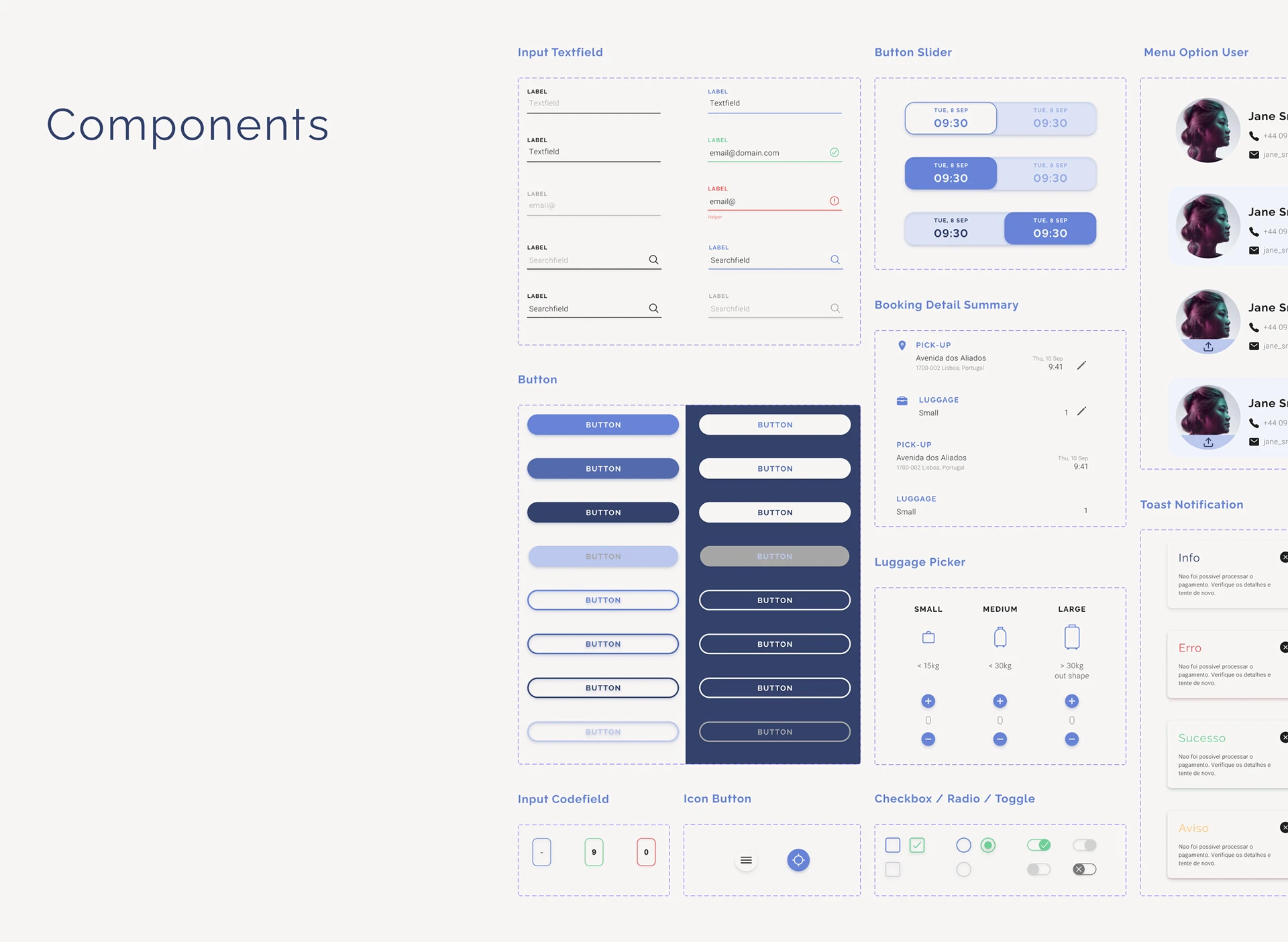
The components represent the design system taking shape. They are the building blocks that compose the app screens, including grids, typography, icons, illustrations, and colours.
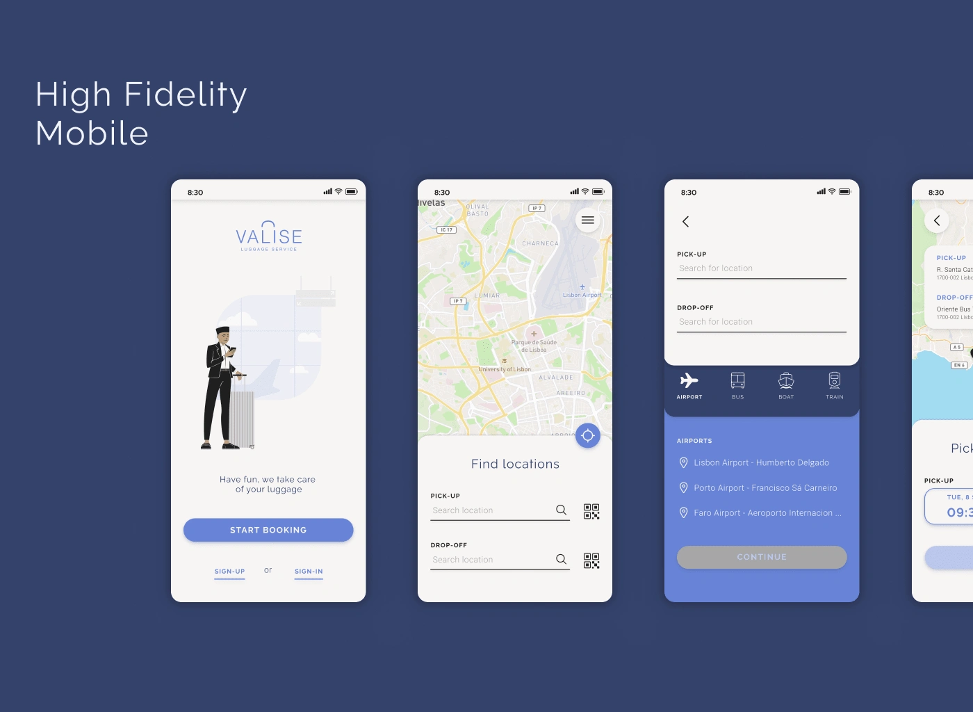
View more High Fidelity Mobile here.
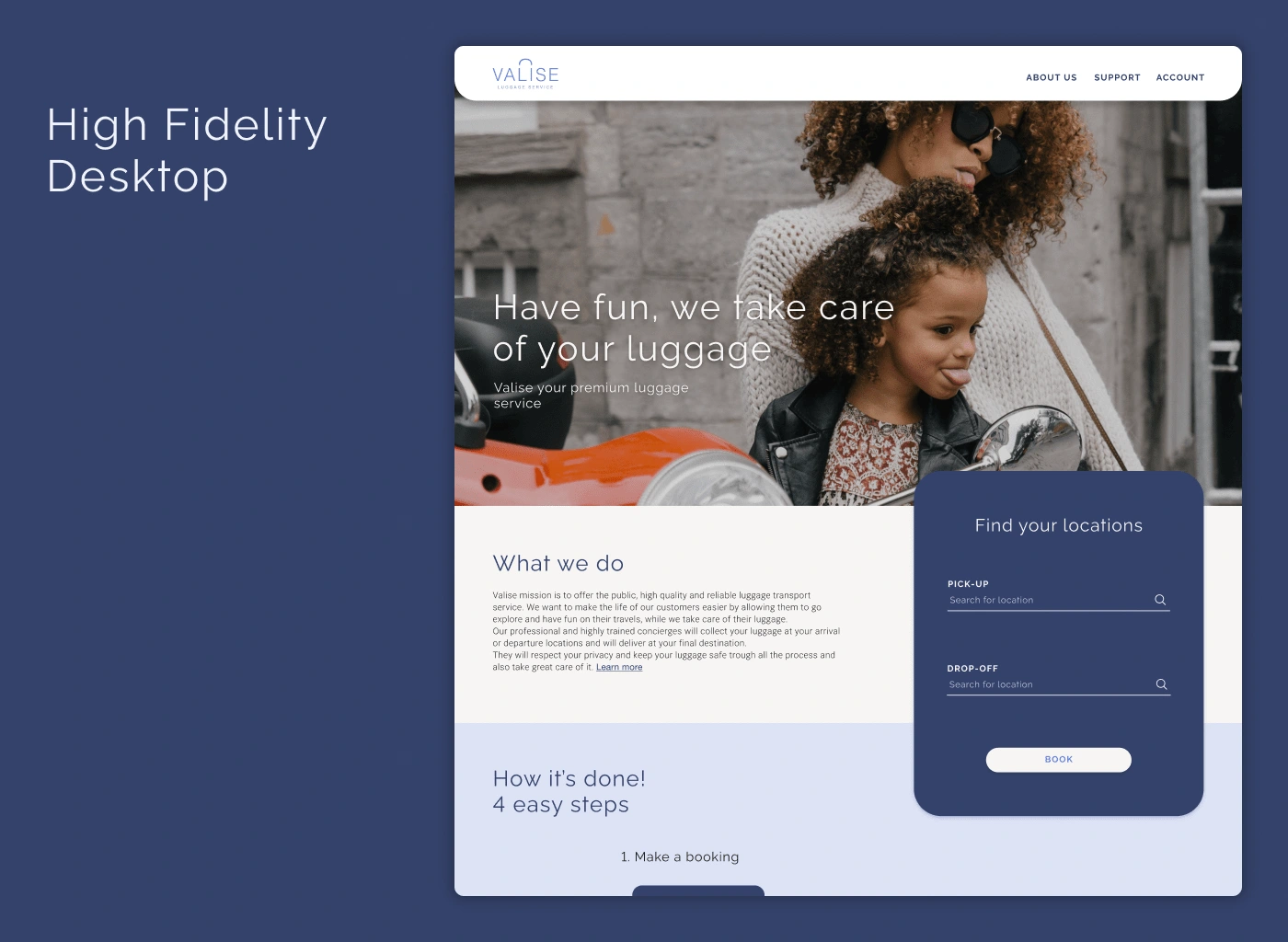
View more High Fidelity Desktop here.
Design Sprints: I heard about this tool before but it was the first time that I worked under this technique, basically in one week your team had to conceptualize and test a product. We didn't use the same strategy as described in most articles and tutorials but an adaptation was made by the project manager. It wasn't easy but is doable and rewarding.
Because you can Design does not mean it should be done: I'm a designer coming from the print media to the UX/UI world, and sometimes we get carried away by our ideas when designing for the web we have to think about things like how long is going to take for the webpage to load, how difficult is to code this and is this making the user experience easier!
Features and more features: Sometimes we also find features that look cool and we want to add everything, but we have to be aware of the time and budget limitations. In the end is better to be good at one thing than ok at a lot of them.
UX/UI: I'm no stranger to the UX/UI design world but this is my first professional experience, so I have been learning and relearning a lot of things related to it.
Like this project
Posted Feb 23, 2024
A case study detailing my first experience as a UX and UI designer. This showcases the design process and my thought process behind each decision.
Likes
0
Views
12
