Skill assessment mobile app - Product design
Don Precious
Background
Skill learning is at an all-time high. This app aims to provide a platform that helps users learn and assess their skills and abilities in different fields remotely. The results of these assessments can then be used to identify areas for improvement, help users set goals, or assist in making decisions about career paths or educational programs.
Upskill also aims to provide the necessary resources and training materials to help users improve or learn new skills.
My Role
I was the UX designer on this project. Charged with overseeing, researching, wireframing, testing, and designing this project from end to end.
The 5W's
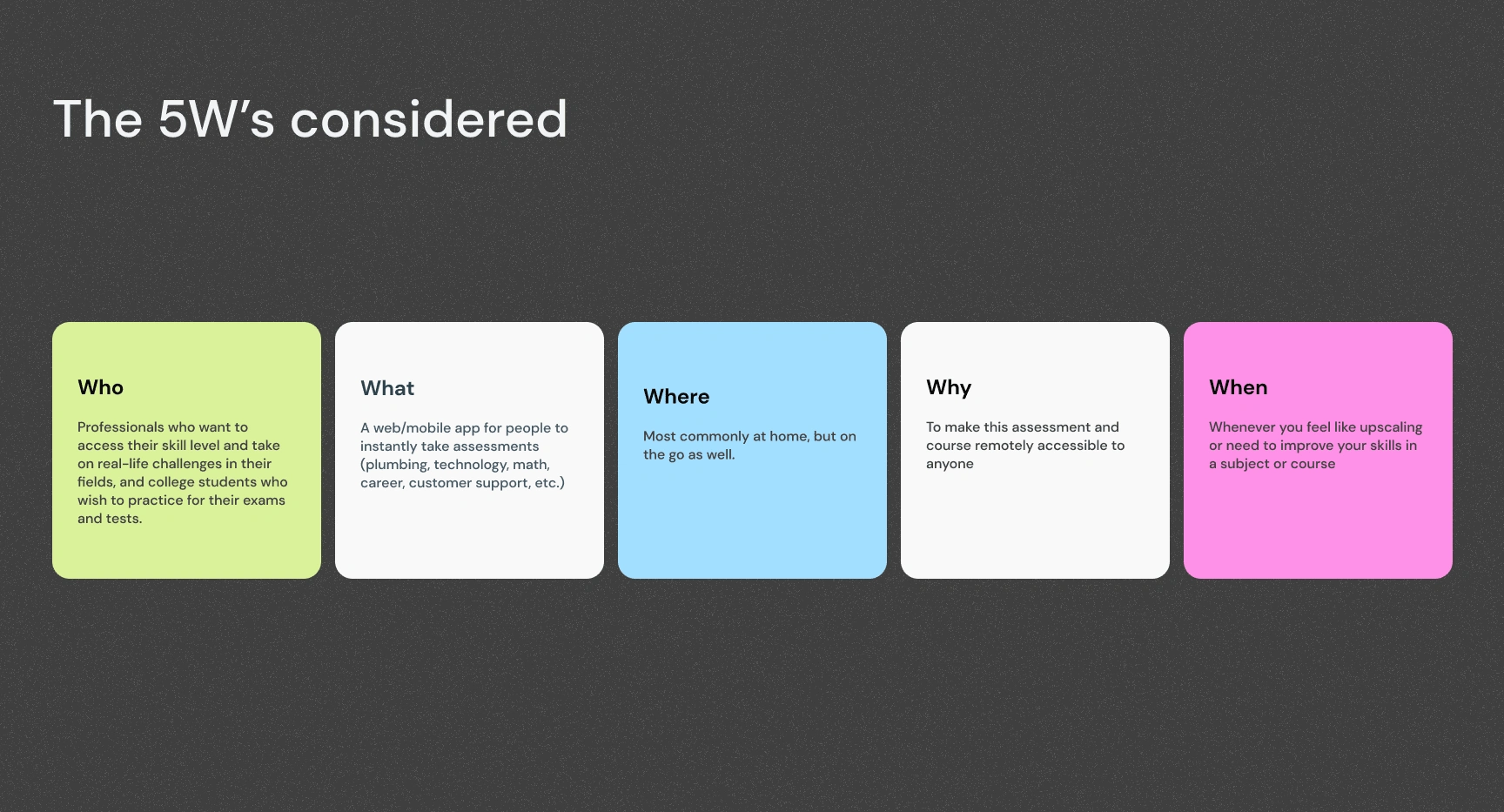
A screen showing 5W's
Challenge
Transitioning into tech was a decision I made during the COVID-19 pandemic. While there's a wealth of information on how to transition, I faced the dilemma of navigating around the ecosystem and successfully transitioning. I realized that my journey took longer than I initially anticipated, and while I was interviewing users, I realized that self-learning people faced the same issues.
Hence the decision to design a product that caters to and tries to solve this learning gap.
User Research
I carried out user research to understand the pain points and learning gaps faced by self-learners to design a product that caters to their needs, helping them successfully navigate and transition into any industry of their choice, and reducing the time and difficulties associated with it.
Competitive Analysis
My competitive analysis is a comparison of functionality within competitors, to gain insights into the strengths and weaknesses of existing competitors, identify opportunities for differentiation, and ensure the app offers a unique user experience.
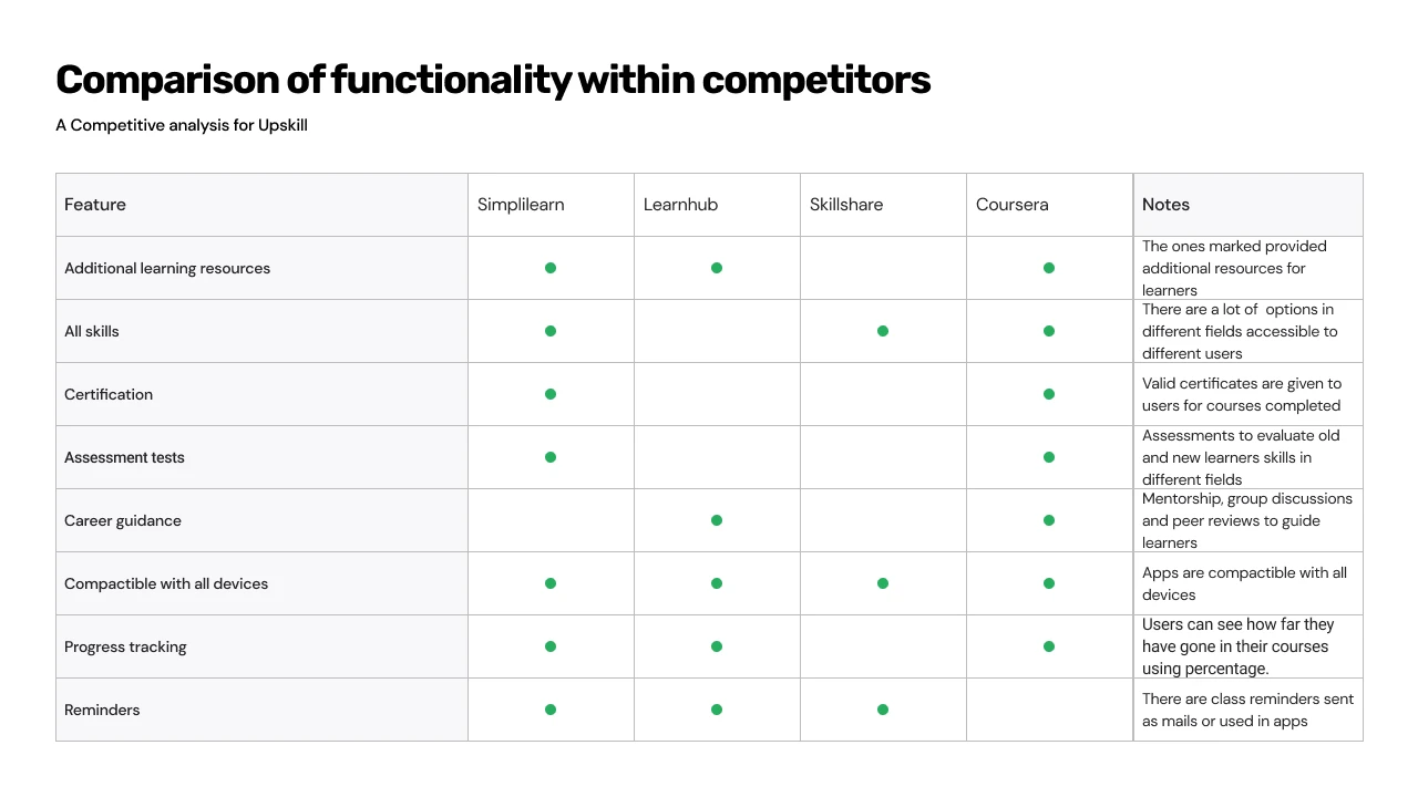
An image showing different functionalities for competitors
Conceptualization
I used the Crazy Eight concepts to produce and come up with different ideas about how the app will work and how users will experience the app. Then I sketched to bring the ideas to life on paper. Experimenting on how features will align.
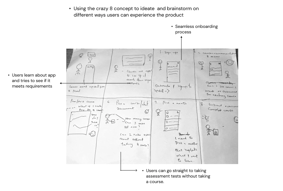
Crazy 8 conceptualization
Rough paper sketch for feature ideation
Information Architecture
I designed an information architecture that organizes the app's features and content logically and structured, enabling users to navigate through the app and access the desired functionality easily.
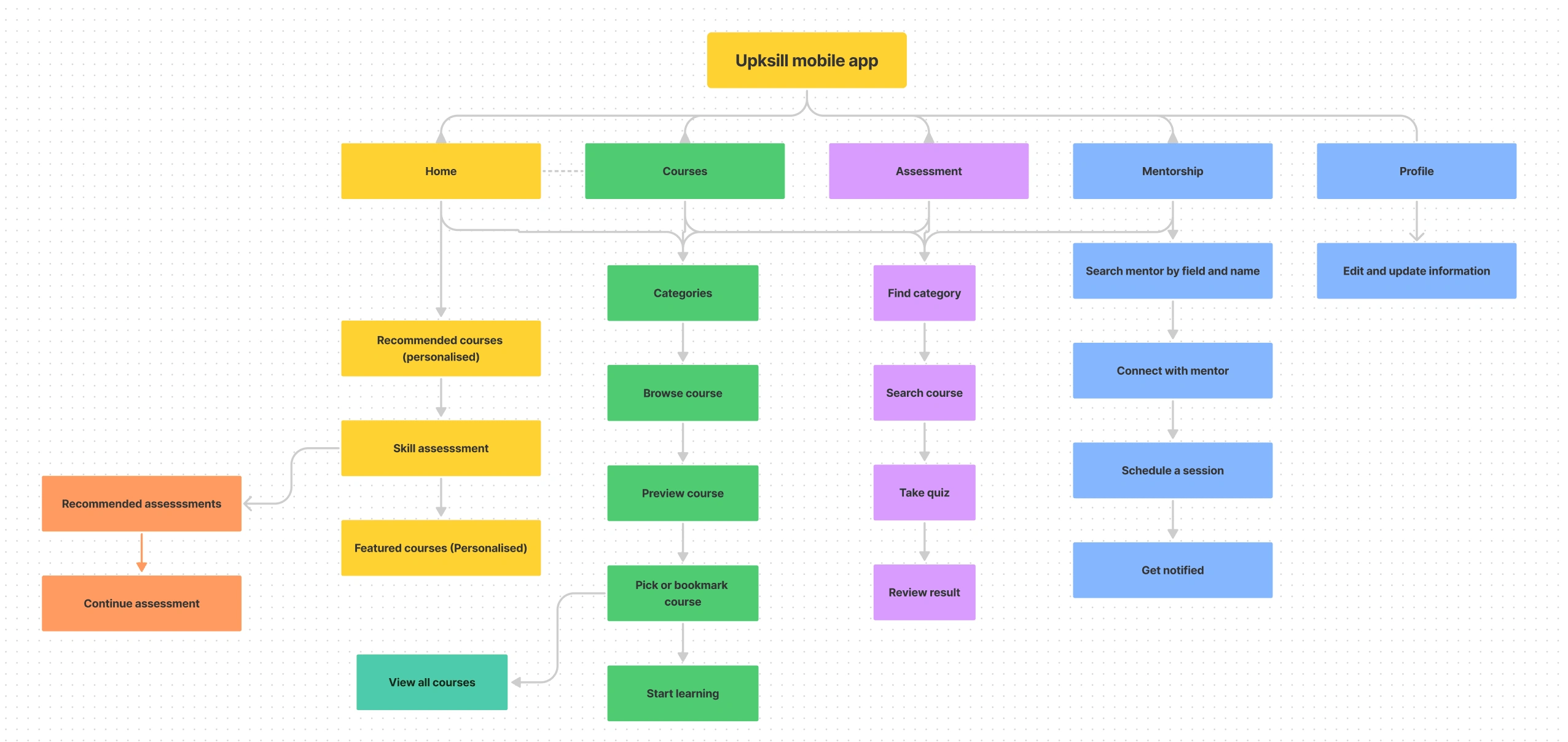
Information Architecture
Designing the solution
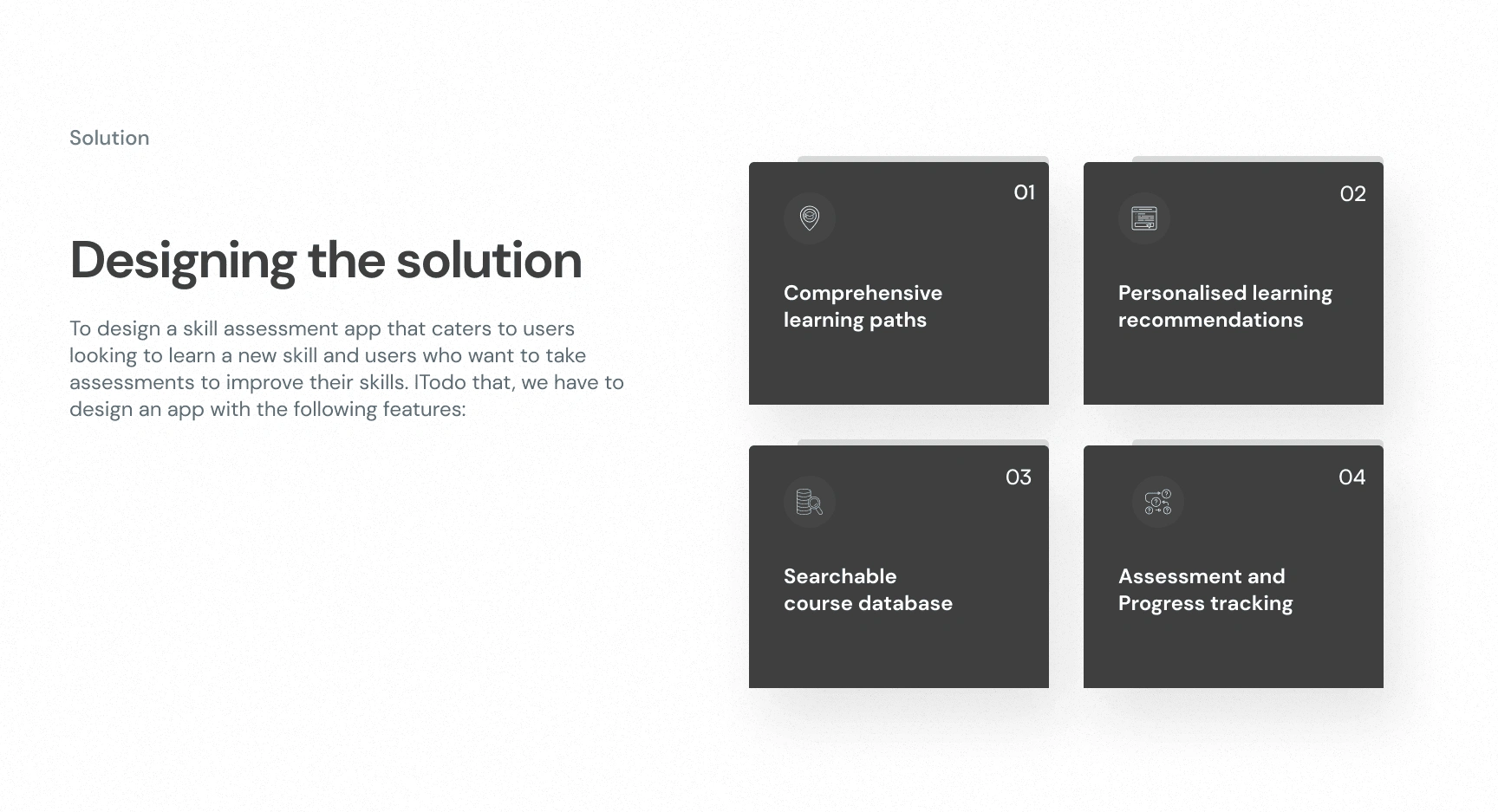
screen showing the process of designing the solution to problems identfied
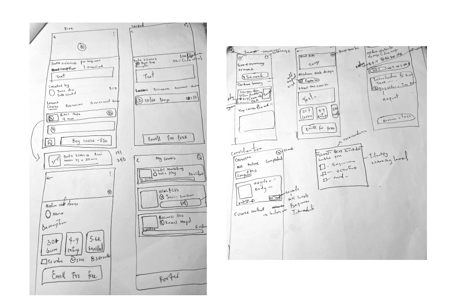
Wireframes
I created wireframes to visually outline the structure and layout of the app I was designing. This allowed me to efficiently communicate the design concept, test with users, and iteratively improve the user experience, ensuring that the final product would effectively cater to users' needs and bridge the learning gap in the learning space.
some of the wireframes for testing.
Experiencing the App
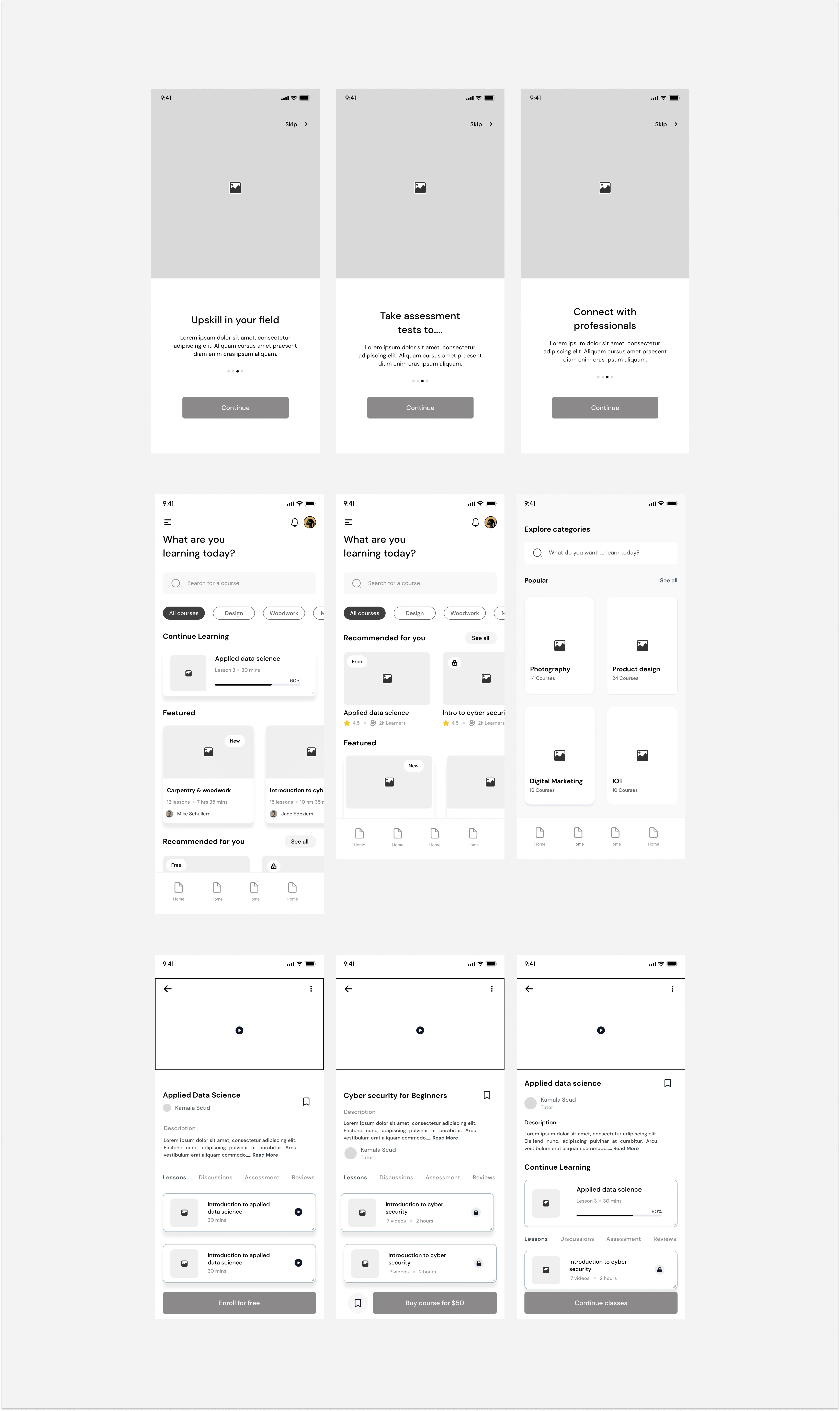
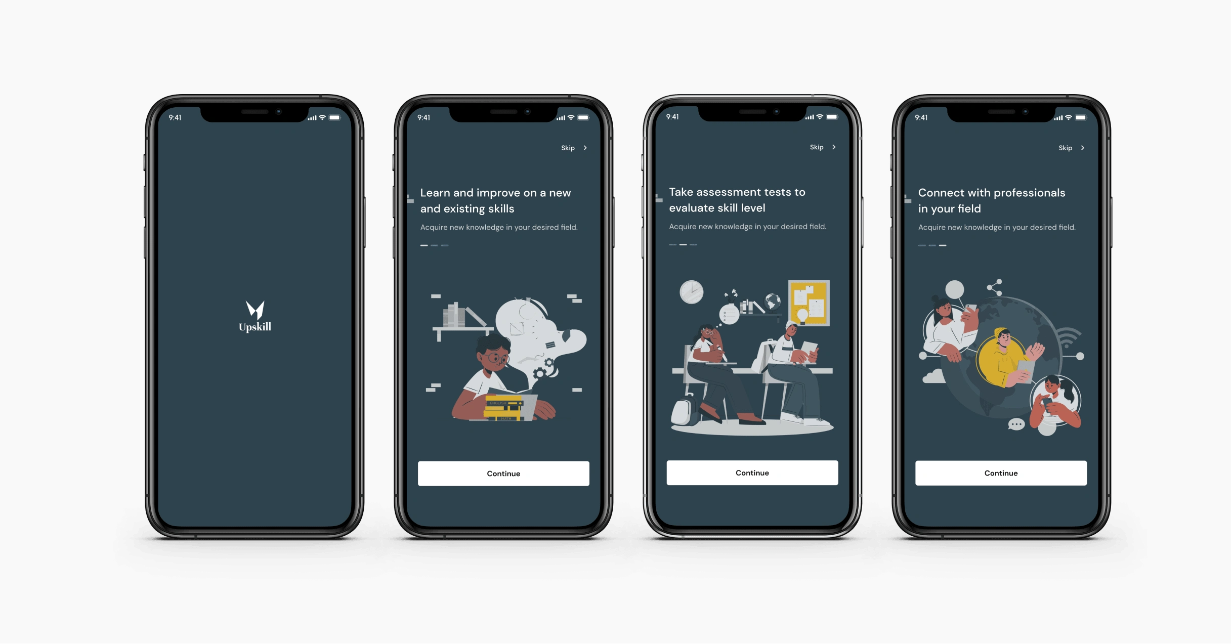
Onboarding
These screens help personalize and streamline users' learning experiences. The information gotten from here is what will be used to recommend courses and assessments for users.
During the testing stage, users pointed out that there was no way to know how many steps they had to take so I added a bar to let them know how many more steps were left to complete onboarding.
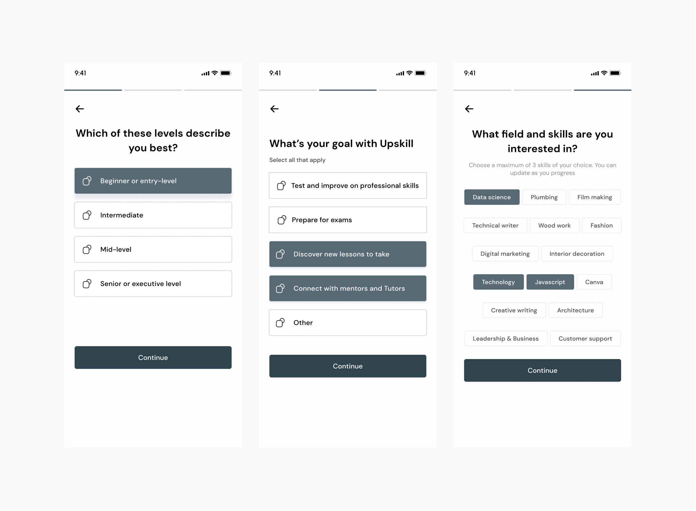
Onboarding screens for Upskill App
Home Screens
The first screen is for returning users as evidenced in the "continue learning" shown on the first screen. The second screen is for new users.
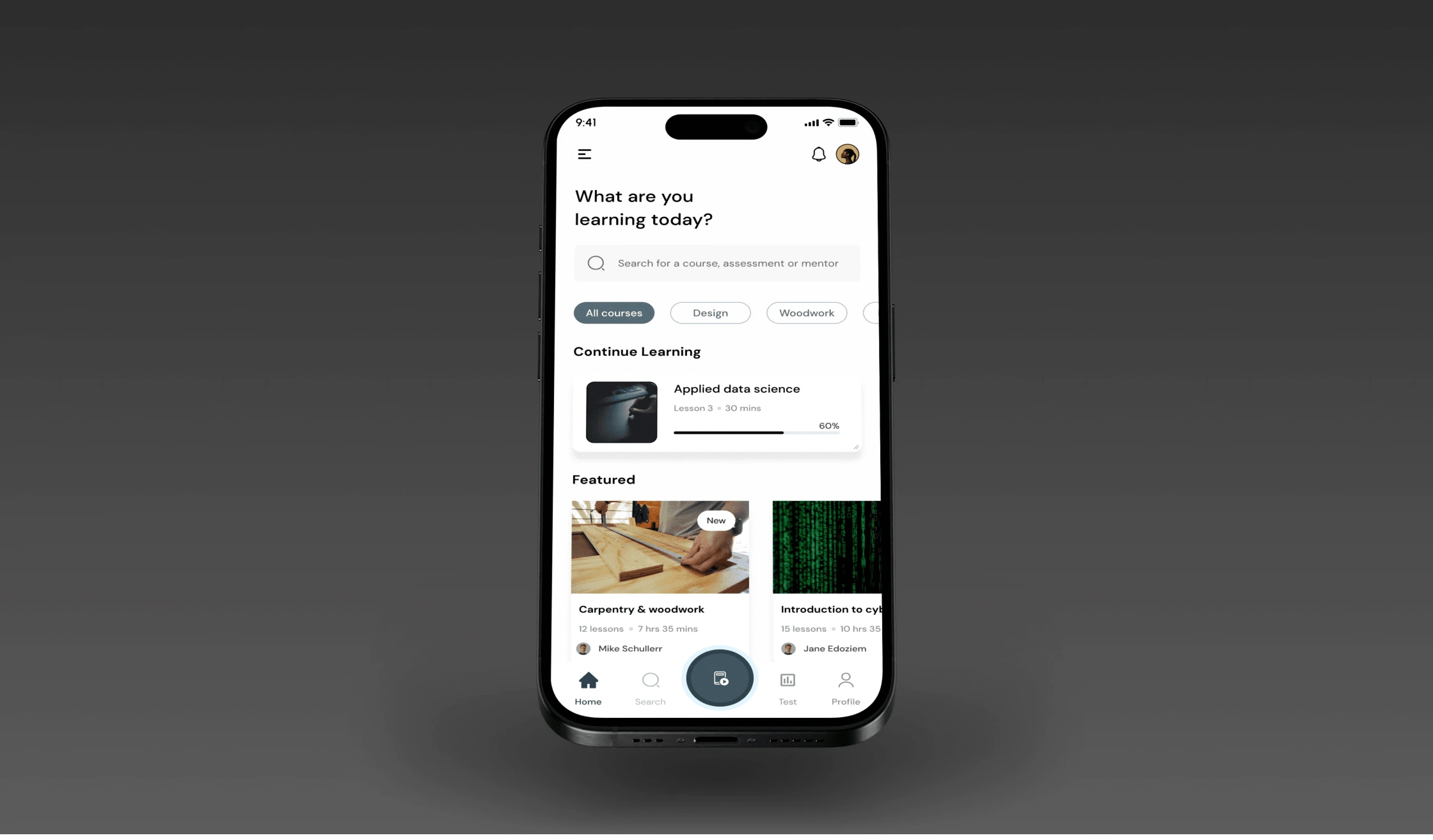
Home screen
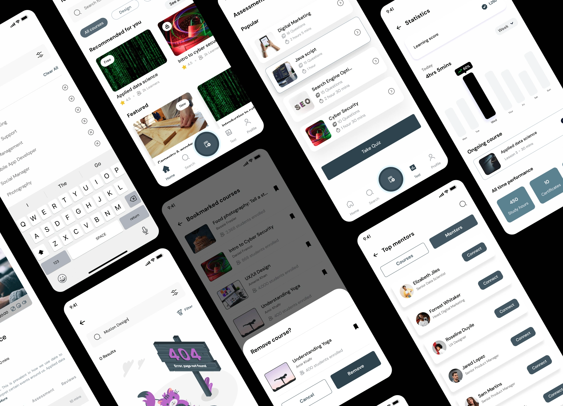
Explore mentors and course categories
Search for courses you want and connect with mentors in different fields for guidance on how to navigate any career space.
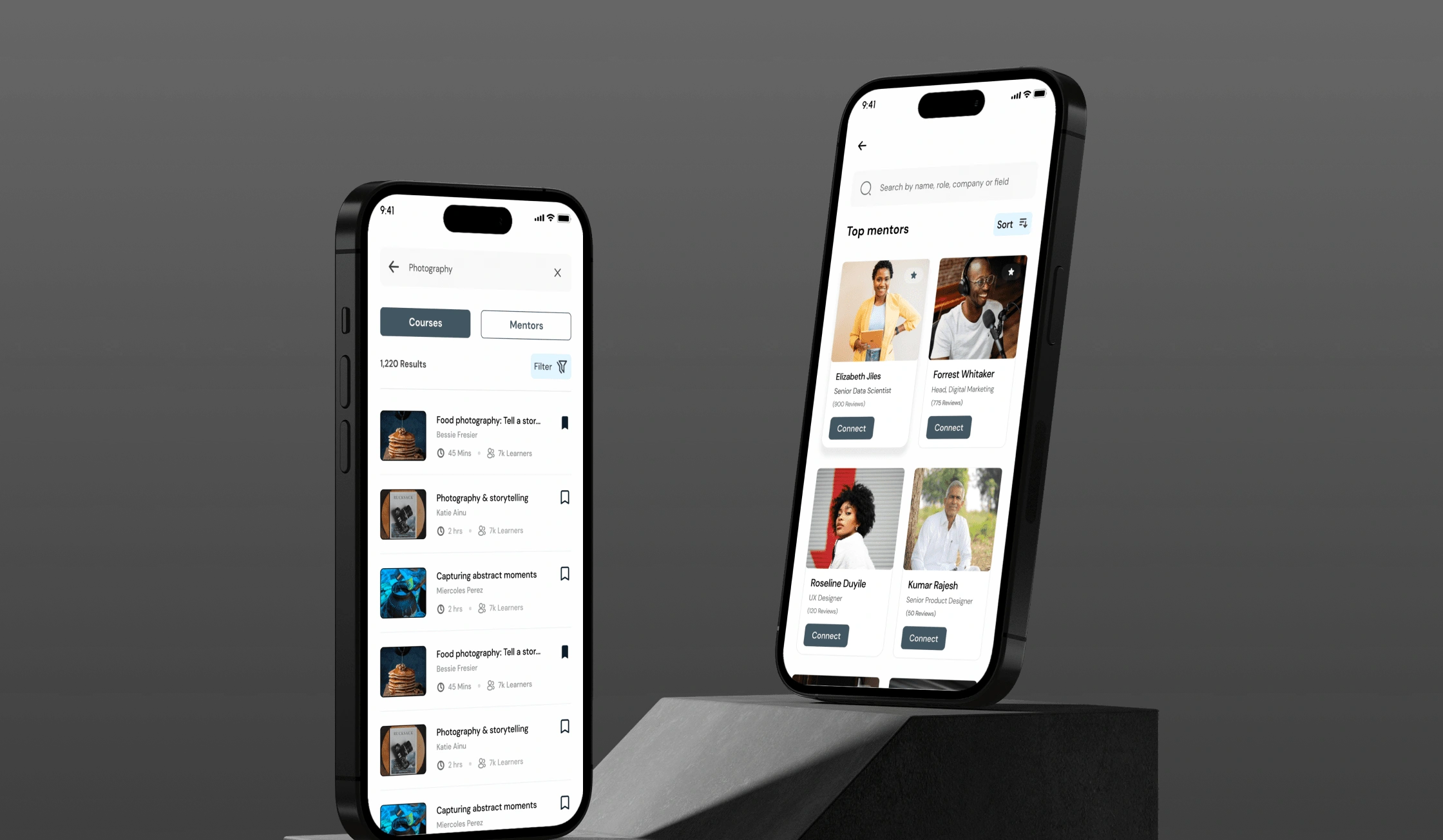
Explore mentors and course categories
Learning path
Pick and bookmark courses of your choice and start learning. Get access to online assessments and resources.
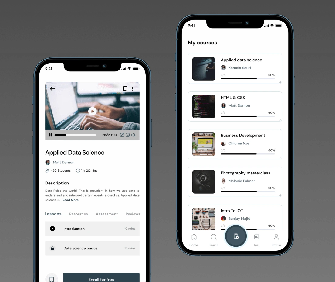
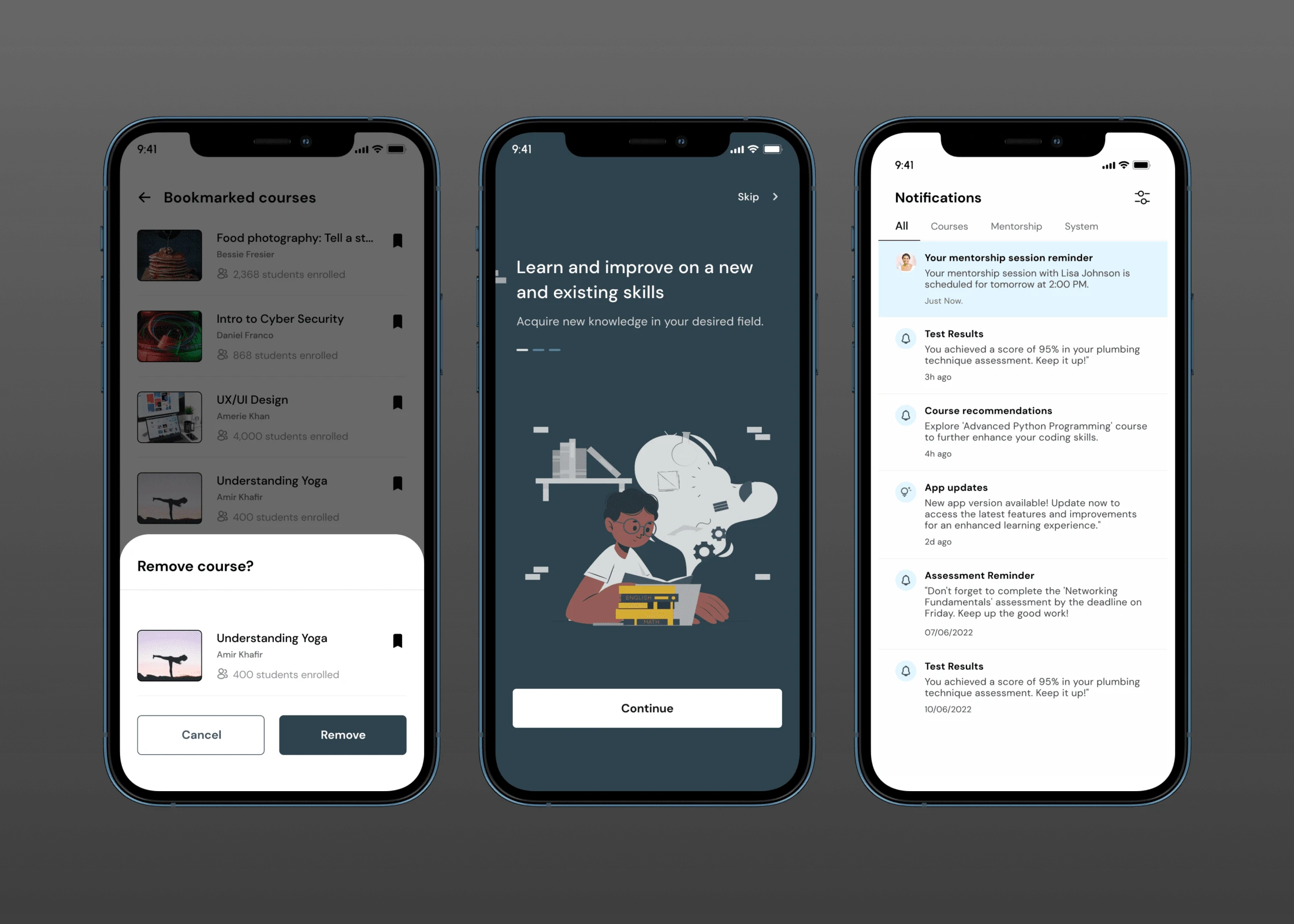
Bookmarked courses
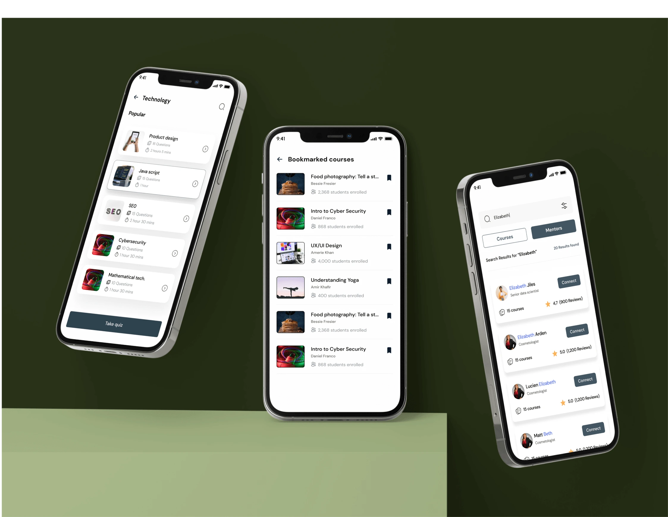
Bookmarked course
Assessments
Take assesssments to highlight users strengths and areas that need improvement.
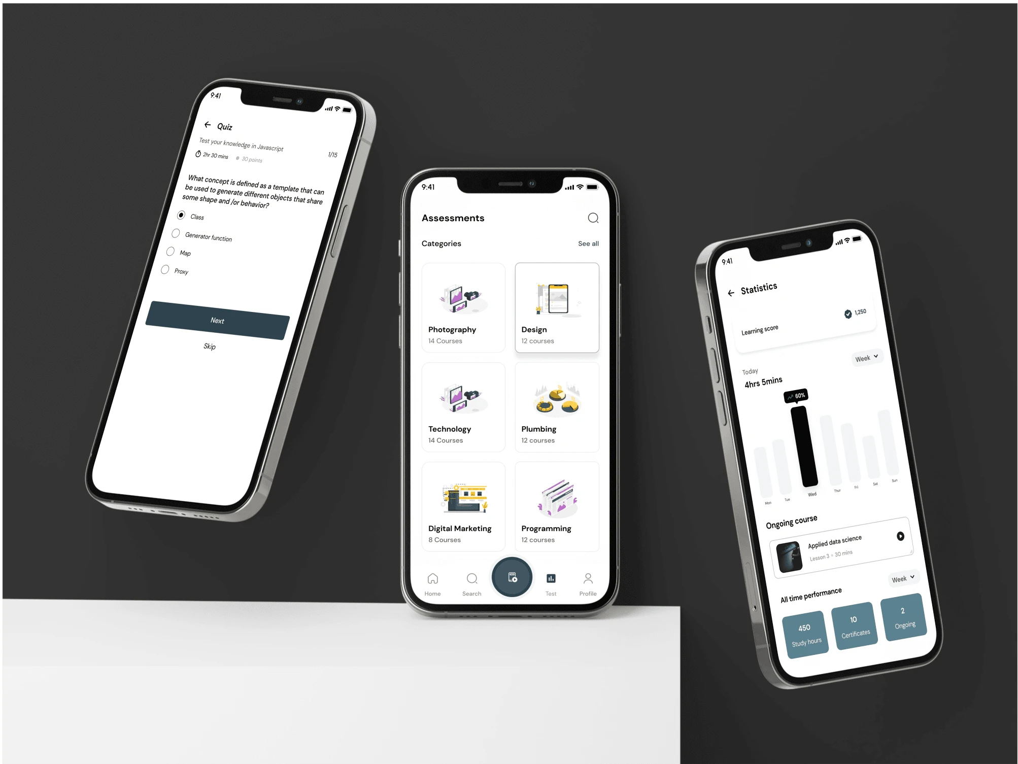
Assesments and learning statistics
Get Notified
Get notifications, reminders and updates on courses, mentorship and etc.
Notifications et al
More screens
Splash screens
To view the designs in its rawrest form, click here
Like this project
Posted Jul 4, 2023
Skill learning is at an all-time high. The purpose of this app is to help users learn, and assess their skills and abilities in a particular area.
Likes
0
Views
45