Job Portal UX Optimization
Bobby
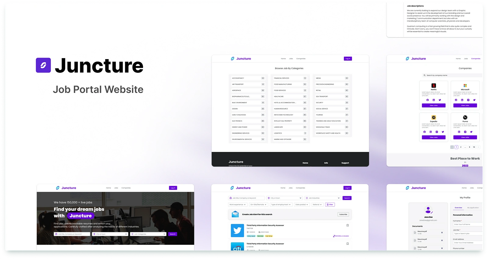
Designing a Job Portal
My Journey in Optimizing User Experience
Project Overview
Timeline: December 2022 — January 2023
Role: UI/UX Designer (Collaborated with a colleague designer)
Tools Used: Polaris Design System, Figma (for hi-fi mockups), Miro (for sitemaps)
Constraints: Tight deadlines, limited resources, reliance on existing design systems
Background
The goal of this project was to enhance the user experience of a job portal website. Due to time and resource constraints, we opted to optimize the existing design rather than starting from scratch. By leveraging the Polaris design system and customizing it to fit our needs, we aimed to:
Improve the search and filter functionality for job listings.
Streamline the registration and login processes.
Increase user engagement through clear and actionable CTAs.
This project was a great opportunity to work within limitations, prioritize efficiency, and deliver a functional and user-friendly design.
Process
1. Strategy & Planning
Stakeholder Interviews: Regular discussions with stakeholders ensured their vision aligned with our design goals. We gathered insights into their priorities, such as ease of use and scalability.
Constraints Acknowledgment: Due to tight timelines, we focused on optimizing existing features rather than reinventing the wheel.
Sitemap Creation: Collaborating with a senior UX designer, we developed a sitemap to ensure a logical and intuitive user flow.
Design System Customization: Using the Polaris design system as a foundation, we customized components to align with the job portal’s unique requirements. This allowed us to save time while maintaining consistency.
Brainstorming & Ideation: Through collaboration, we explored various solutions for improving search, filters, and user onboarding.
2. Design Execution
Hi-Fi Mockups: We created high-fidelity mockups to visualize the final design. These included:
A streamlined search and filter interface.
Simplified registration and login flows.
Clear CTAs to guide users through key actions.
Iterative Feedback: Regular check-ins with stakeholders and team members ensured the design met both user and business needs.
Outcome
While post-launch metrics are still pending, the project has already received positive feedback from internal stakeholders and early users. Key achievements include:
Improved Usability: The optimized search and filter functions made it easier for users to find relevant job listings.
Streamlined Onboarding: The simplified registration and login processes reduced friction for new users.
Enhanced Engagement: Clear CTAs and intuitive navigation increased user interaction with the platform.
Challenges & Learnings
This project came with its fair share of challenges, but each one provided valuable lessons:
Working Within Constraints: Tight deadlines and limited resources taught me how to prioritize effectively and make the most of existing tools like the Polaris design system.
Collaboration: Regular brainstorming sessions and stakeholder interviews reinforced the importance of communication and alignment in achieving a shared vision.
Adaptability: The ability to pivot and adapt to feedback was crucial in delivering a functional and user-friendly design.
Reflection
While the project had its limitations, it was a valuable learning experience that honed my skills in:
Design System Utilization: Customizing and leveraging existing systems to save time and maintain consistency.
Stakeholder Management: Balancing stakeholder expectations with user needs.
Problem-Solving: Delivering a functional and visually appealing design under tight constraints.
This project reinforced my belief that even with limitations, a thoughtful and collaborative approach can lead to meaningful improvements in user experience.
Like this project
Posted Jul 17, 2025
Enhanced user experience for a job portal using Polaris, Figma, and Miro.
Likes
0
Views
2
Timeline
Dec 1, 2022 - Jan 31, 2023