Some logos try to say

Husnain Ali


Some logos try to say everything.
The best ones say just enough.
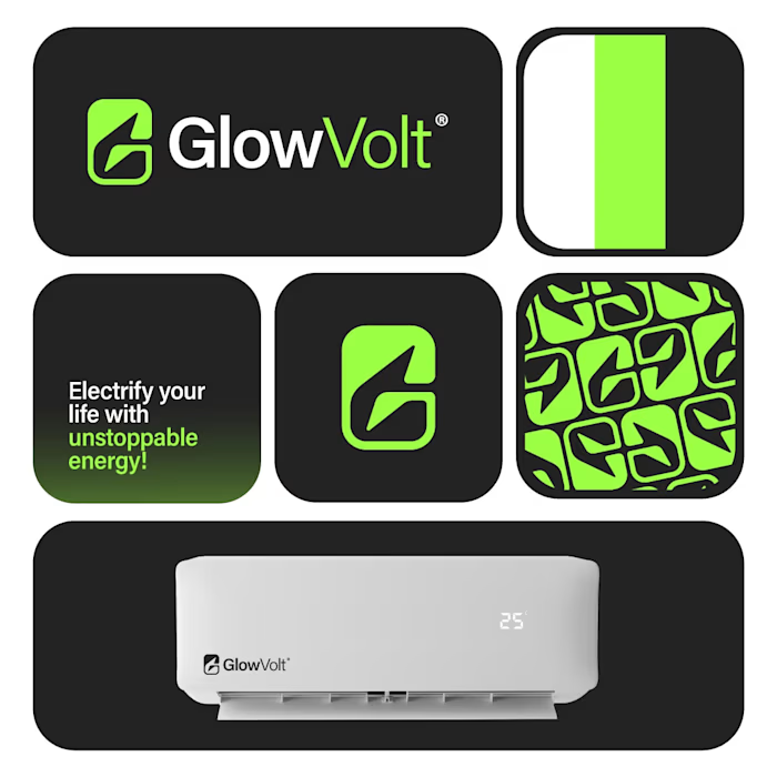
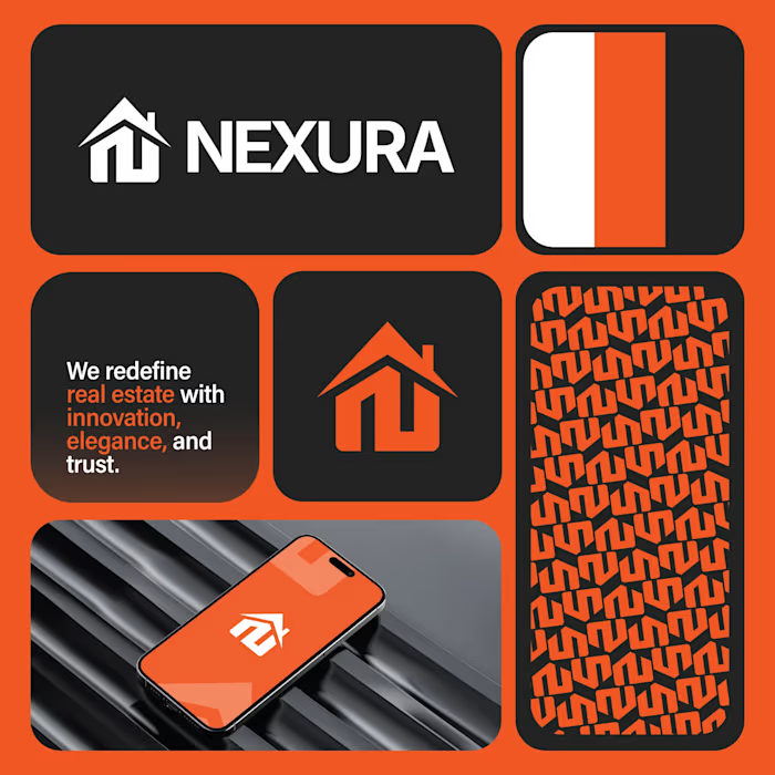
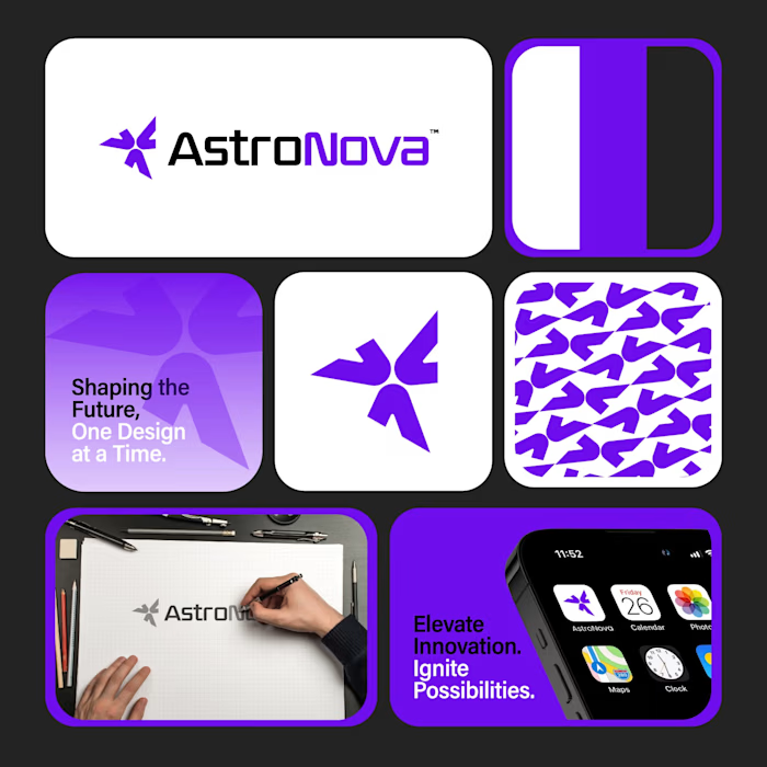
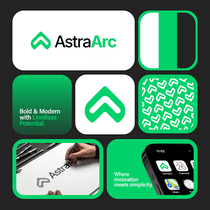
Tricore was built around a simple visual concept:
three connected elements working together as one system.
No unnecessary details.
No visual noise.
Just a clean identity designed to be memorable across screens, products, and future brand applications.
A strong logo should still be recognizable when:
• Scaled down
• Viewed quickly
• Seen from a distance
That's the standard I try to design for.
What's your first impression of this identity?
👇 One word only.
Like this project
Posted Sep 19, 2026
Some logos try to say everything. The best ones say just enough. Tricore was built around a simple visual concept: three connected elements working together ...