HOME | Thug - WE'RE DECLARING WAR ON BUGS
1. Design Process in Figma
The THUG website needed a bold, visually captivating design that would reflect the brand’s creative and edgy identity. The design process was centered around creating a dynamic and unique online presence that resonated with THUG’s target audience. The design in Figma evolved through several stages, ensuring that every element worked cohesively to reflect the brand's personality and aesthetic.
a. Discovery & Research
Before starting the design, thorough research and discovery were essential:
Brand Identity Exploration: Understanding THUG’s ethos, target audience, and values was crucial to shaping the visual direction. The goal was to communicate their bold, creative nature through design.
Audience Research: The website was tailored to appeal to creative professionals, industry collaborators, and potential clients who were looking for innovative solutions. This helped define the types of content (portfolio, services, etc.) and user flow.
Competitive Benchmarking: Analyzing competitors in the creative industry to see how they were presenting their work allowed us to create a unique design that stood out.
b. Wireframing
Using Figma, wireframes were created to establish the layout and functionality of the website. These wireframes provided a blueprint for how users would interact with the content and navigate through the site:
Core Layouts: Wireframes for key pages like the homepage, portfolio, services, and about us were built to ensure that important elements were prioritized and easily accessible.
Navigation Structure: The wireframes outlined a navigation system that was simple yet intuitive, with easy access to key sections like the portfolio, services, and contact page.
Interactive Flow: Basic wireframes also demonstrated user interaction points like hover effects, scrolling elements, and call-to-action (CTA) placements to guide users through the site.
c. High-Fidelity Design
After the wireframes were approved, the design was transformed into high-fidelity mockups that incorporated bold visuals and design elements:
Bold Typography: The typography was one of the key elements in representing THUG’s brand. Large, impactful fonts were used for headings and CTAs, ensuring they caught the visitor’s attention right away.
Striking Imagery & Visuals: High-quality, visually impactful imagery was incorporated throughout the design to showcase THUG’s creative work. Images were used to evoke emotion, with large hero images and fullscreen backgrounds.
Color Scheme: The color palette was chosen to be strong, bold, and expressive. Contrasting colors like black, white, neon, or metallic tones were selected to create a high-energy, modern aesthetic.
Unique Layouts: The layout was designed to feel unconventional and dynamic, with elements like asymmetrical grids, floating visuals, and unconventional navigation to reinforce THUG’s creative brand.
Interactive Prototypes: Interactive prototypes were built in Figma to demonstrate how animations and interactions would work. This allowed for user testing and validation before moving into development. Prototypes helped ensure smooth transitions, hover effects, and other interactive features worked across different screen sizes.
d. Feedback & Iteration
Once the high-fidelity design was created, it was presented to stakeholders for feedback. Some of the adjustments included:
Refining Navigation: The navigation bar was tweaked to be more prominent and clear without losing the bold design feel.
CTA Optimization: Calls to action (such as “Get in Touch” and “View Portfolio”) were made more visually striking by experimenting with different button sizes and color contrasts to enhance conversion.
Content Layout Adjustments: Minor tweaks were made to spacing and alignment to ensure that the website felt clean and organized despite its edgy design.
2. Development Process in Webstudio
Once the design was finalized, the development process moved to Webstudio, a powerful, intuitive platform that allowed for smooth transitions from design to live website. Webstudio’s flexible tools and features helped bring the bold and creative design to life, while ensuring the website was fully functional and responsive.
a. Setting Up the Webstudio Project
The development phase began by creating the structure for the website in Webstudio:
Responsive Layouts: Using Webstudio’s drag-and-drop design tools, a responsive layout was created to ensure the website looked great on desktop, tablet, and mobile devices. The layout adjusted seamlessly to different screen sizes, ensuring that users had a smooth browsing experience.
Global Styles: Consistent design elements like typography, colors, and spacing were established globally, ensuring uniformity across all pages of the site.
b. Implementing Dynamic Content & Animations
The dynamic content and interactive animations were key components of the THUG website, elevating the user experience and adding visual intrigue:
Dynamic Project Showcases: THUG’s portfolio was dynamically integrated into the website. Using Webstudio’s CMS, the portfolio could be easily updated with new work and displayed in an engaging grid or carousel layout. Each project page dynamically loaded its content, including images, videos, and descriptions.
Animations & Microinteractions: Interactive animations were added to elements like buttons, images, and text. These animations provided engaging feedback to user interactions, such as hover effects, image fades, and subtle motion on scroll.
Scroll-triggered Effects: As users scrolled down the page, various elements (such as images, text blocks, or project tiles) would animate into view, adding a sense of interactivity and flow to the page.
Interactive Hover States: Hover states on links and buttons were designed to be visually striking, with smooth transitions that encouraged user engagement.
c. Navigation & User Experience
The website needed to have a smooth and intuitive user experience despite its bold design elements:
Sticky Navigation: A sticky navigation bar was implemented to ensure that users could easily access the key sections of the site at any time, even as they scrolled down through long pages of content.
Smooth Transitions & Page Flow: When navigating between pages, smooth transitions were created to ensure that the shift from one page to another felt fluid and modern. The goal was to keep users engaged without feeling any interruption.
Custom Interactions: Webstudio’s design tools were used to create custom interactions such as parallax scrolling and content reveals, ensuring that each page felt unique and alive.
d. SEO & Performance Optimization
Ensuring the site’s visibility and performance was crucial for its success:
SEO Optimization: The website was developed with SEO best practices in mind. This included optimizing meta tags, images, and headings for search engines, ensuring that THUG’s work would appear in relevant search results.
Image Optimization: Given the heavy use of imagery, images were optimized for web use, ensuring quick load times without sacrificing visual quality.
Performance Testing: Load times were thoroughly tested, and the website was optimized for fast performance, ensuring that the site functioned efficiently on all devices without lag or delays.
e. Testing & Quality Assurance
Before the website was launched, extensive testing took place:
Cross-Browser Compatibility: The website was tested across all major browsers to ensure consistent performance and design.
Device Testing: Testing was conducted on various devices (smartphones, tablets, desktops) to ensure that the responsive layout worked as expected, with visual integrity and usability maintained.
User Experience Testing: The interactive elements (animations, hover states, and transitions) were tested with real users to ensure they were intuitive and engaging.
f. Launch & Post-Launch Support
Once the website was fully tested and optimized, it was launched:
Client Training: The THUG team was trained on how to use Webstudio’s CMS to easily manage and update their content, such as adding new projects or editing text.
Monitoring & Optimization: Post-launch, the website’s performance was continually monitored to ensure that it was running smoothly. Analytics were set up to track user behavior, allowing THUG to fine-tune the user experience.
Final Outcome
The final THUG website is a bold, visually striking platform that perfectly embodies the brand’s creative spirit. The combination of Figma for design and Webstudio for development resulted in a modern, high-performance website with dynamic interactions, smooth animations, and responsive layouts. The website is not only visually captivating but also easy to navigate and manage, ensuring that THUG can continue to showcase their creative work in an engaging way. The optimized design and performance features ensure that the site stands out in both aesthetics and functionality, leaving a lasting impression on visitors.
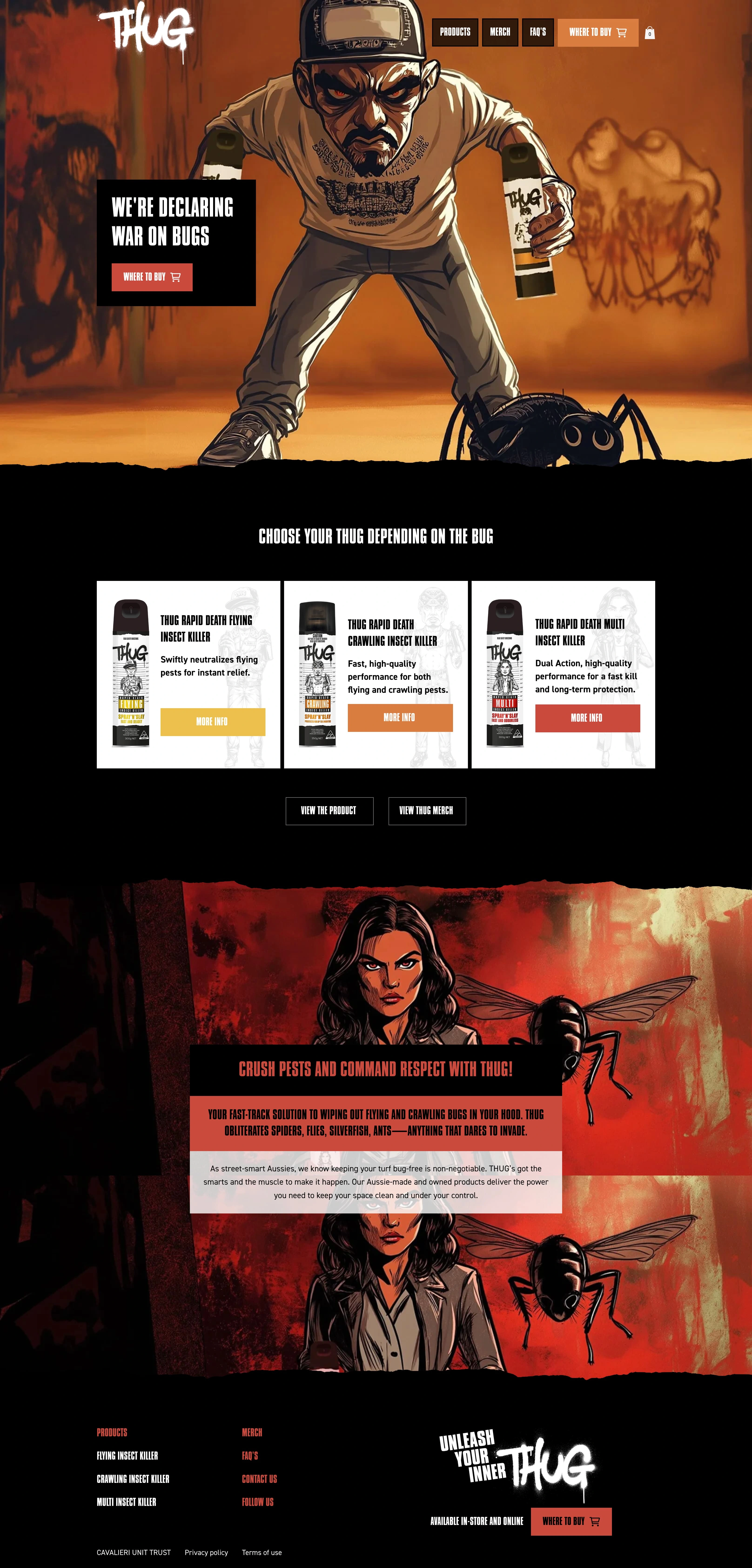
Landing page of the website
Like this project
Posted Nov 2, 2024
The website was redesigned in Figma and then developed in Wix Studio. The results were awesome and 100% client satisfaction.
Likes
0
Views
15

