Hero Section Redesign for UrbanThings.co
Vinay Juneja
🧠 Project: Hero Section Redesign - UrbanThings.co
I got a DM from someone who wanted a hero section redesign for their website.
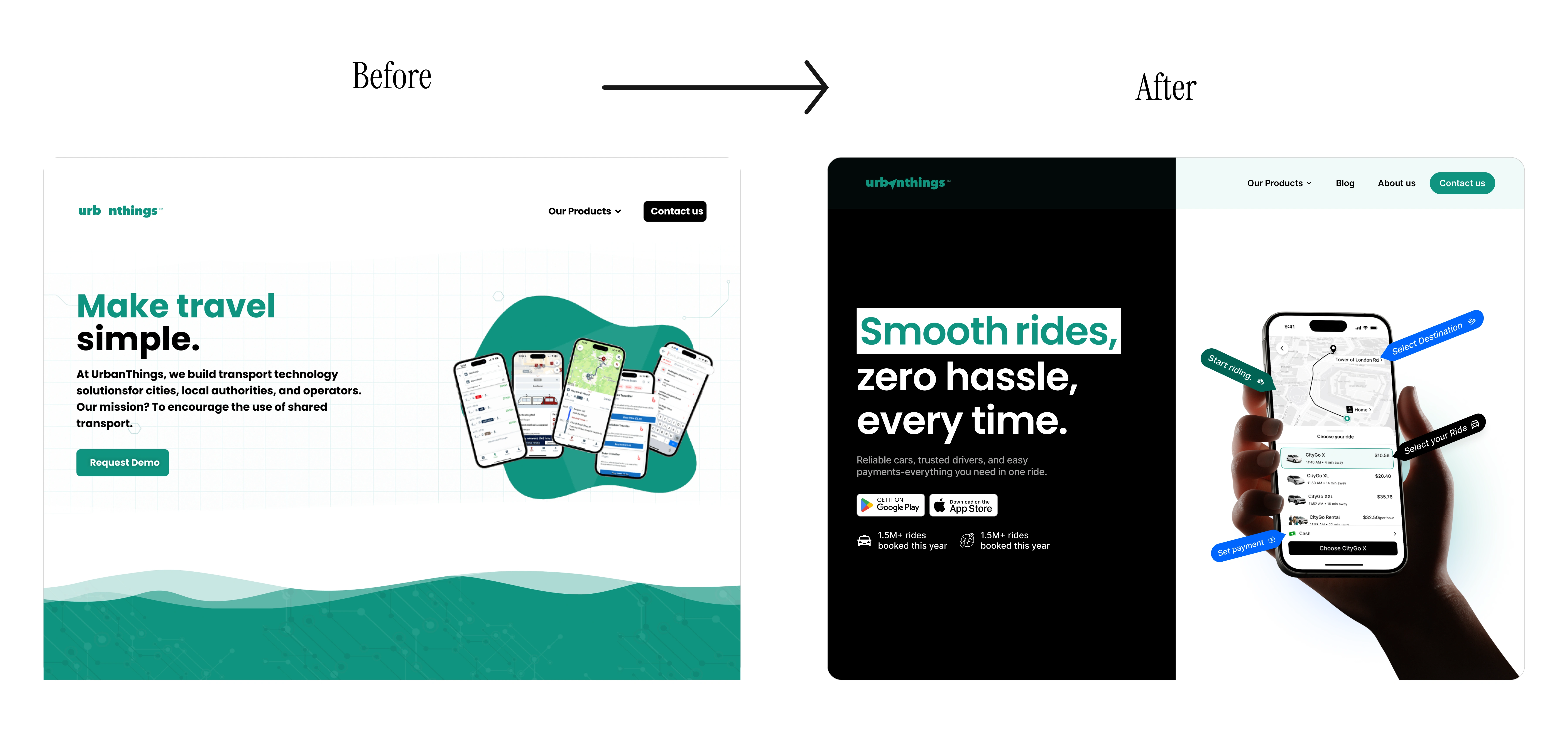
Before (Old Design)
Unclear messaging: The hero failed to communicate what the product actually does or how users benefit.
Poor visual hierarchy: The app screenshots were blurry, too small, and lacked context, making it hard to understand the app’s functionality.
Weak trust signals: No ride data, testimonials, or proof points were shown, giving the page a generic, low-credibility feel.
Overall look: A mix of plain typography, minimal contrast, and no visual hook for visitors.
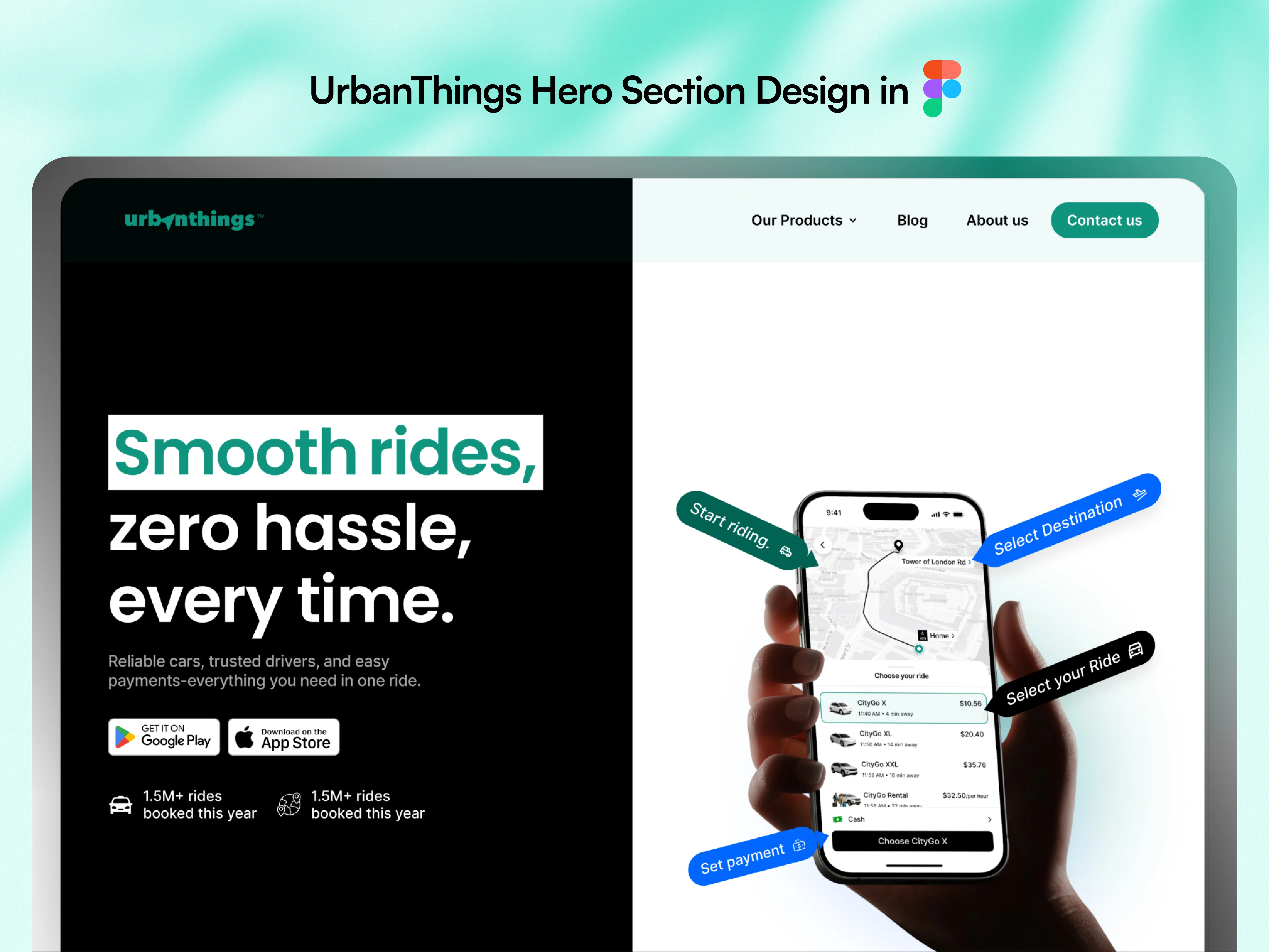
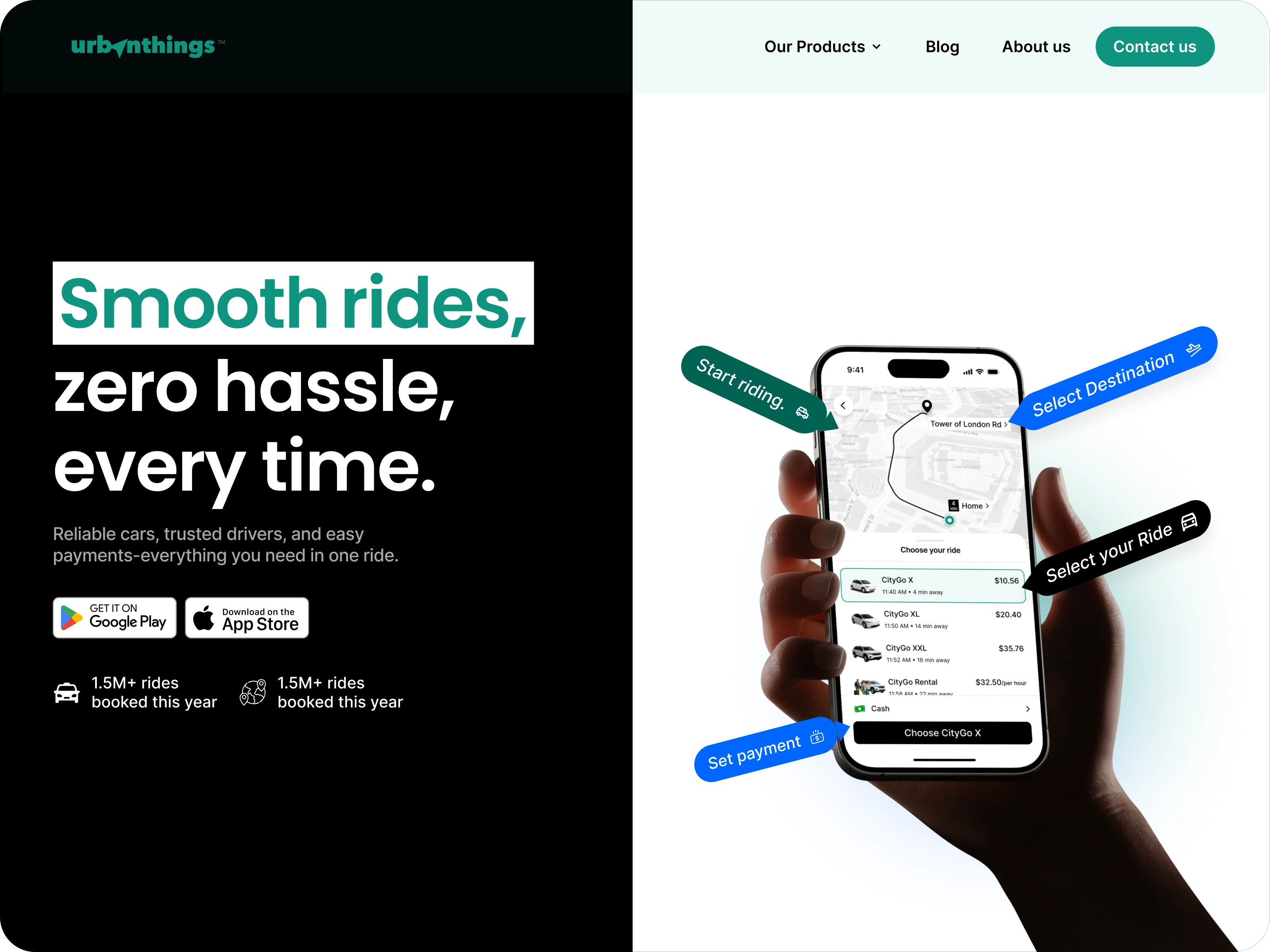
After (My Redesign)
Clear & relatable headline: Simplified the value proposition - “Smooth rides, zero hassle, every time.”
Visual storytelling: Placed a realistic mobile mockup showing app flow (destination → ride → payment → start), helping users instantly grasp how it works.
Added trust indicators: Included stats like “1.5M+ rides booked this year” and store badges for credibility.
High-contrast layout: Clean typography, bold highlight colors, and clear CTAs for stronger conversion.
Modern feel: Balanced minimal design with functional clarity, making it look like a product people can trust.
✨ Impact:
Turned an unclear, low-engagement hero into a conversion-ready design that tells the story of the product in seconds - clear benefits, real visuals, and user trust all in one frame.
Like this project
Posted Oct 27, 2025
Redesigned UrbanThings’ hero section for clarity and trust - sharper visuals, clear messaging, and a product story that connects instantly.
Likes
1
Views
13
Timeline
Aug 19, 2025 - Aug 20, 2025