Accelerator – Brand Identity Design

Pankaj Shah


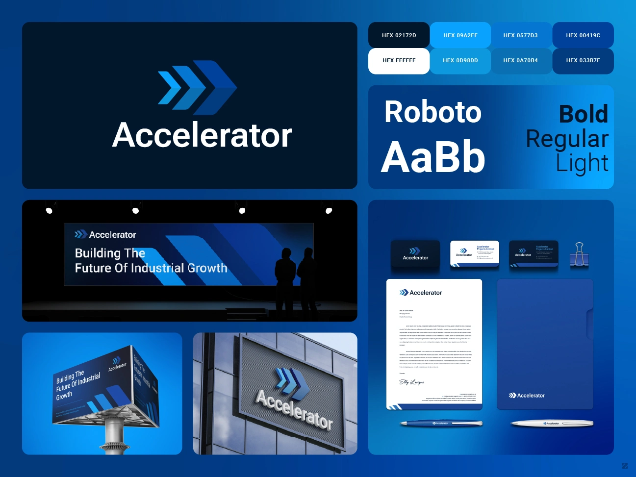
Accelerator – Brand Identity Design
Accelerator: From Logo Concept to Investor-Ready Brand System
Accelerator Projects needed more than a logo; they needed a modern, timeless logo design that would still hold up years from now, not just at launch. The identity centers on a layered arrow mark that steps from light to deep blue, signaling forward momentum, paired with a bold geometric wordmark that leans gradually into motion. It’s a design built to work well across every scale and surface, from a business card to a building façade, without ever feeling dated.
Industry: Manufacturing, Engineering & Industrial Growth
Location: London, United Kingdom
Client: Accelerator Projects ↗
Services: Logo Redesign, Brand Identity, Stationery Design, Banner Design, Logo Variations, Pitch Deck Design (Adobe Illustrator)
Timeline: Multi-phase project, delivered in stages against tight investor-pitch deadlines
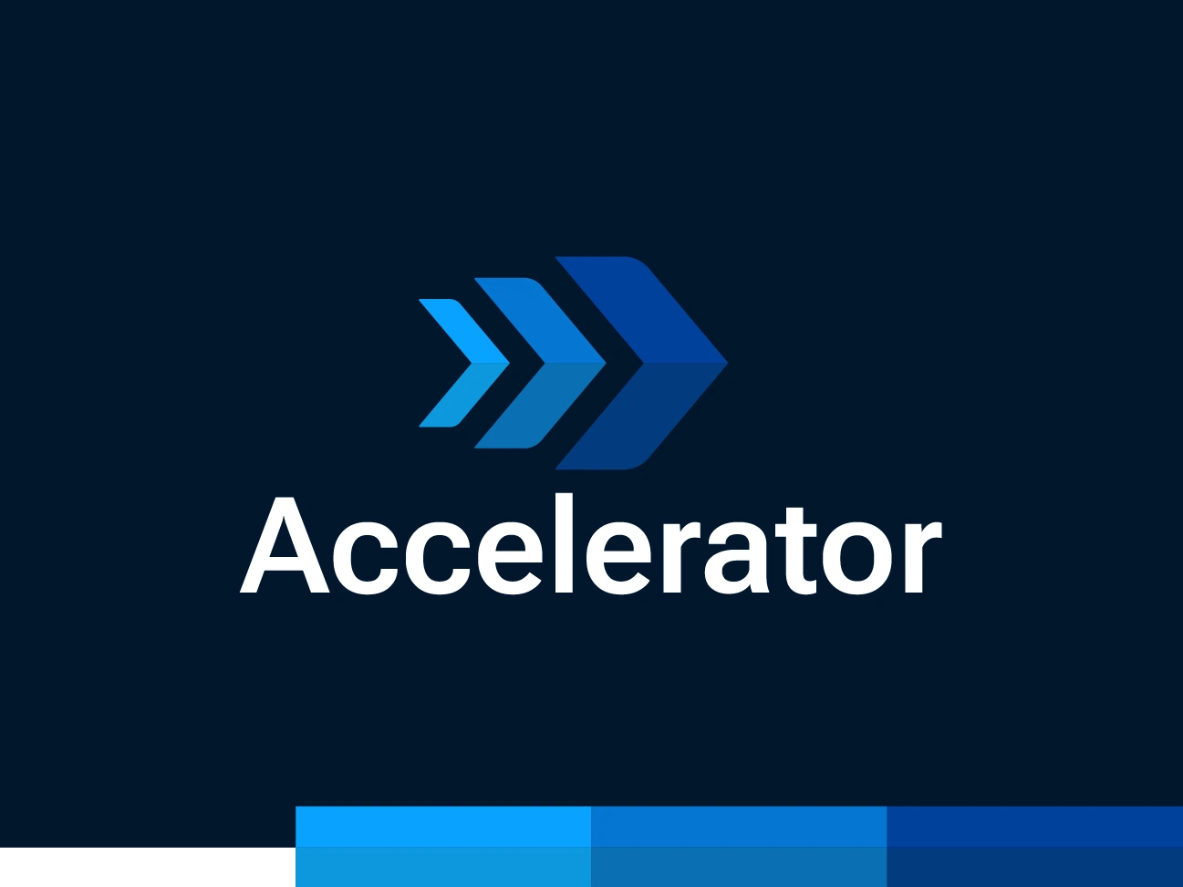
Accelerator brand logo with progressive lean wordmark
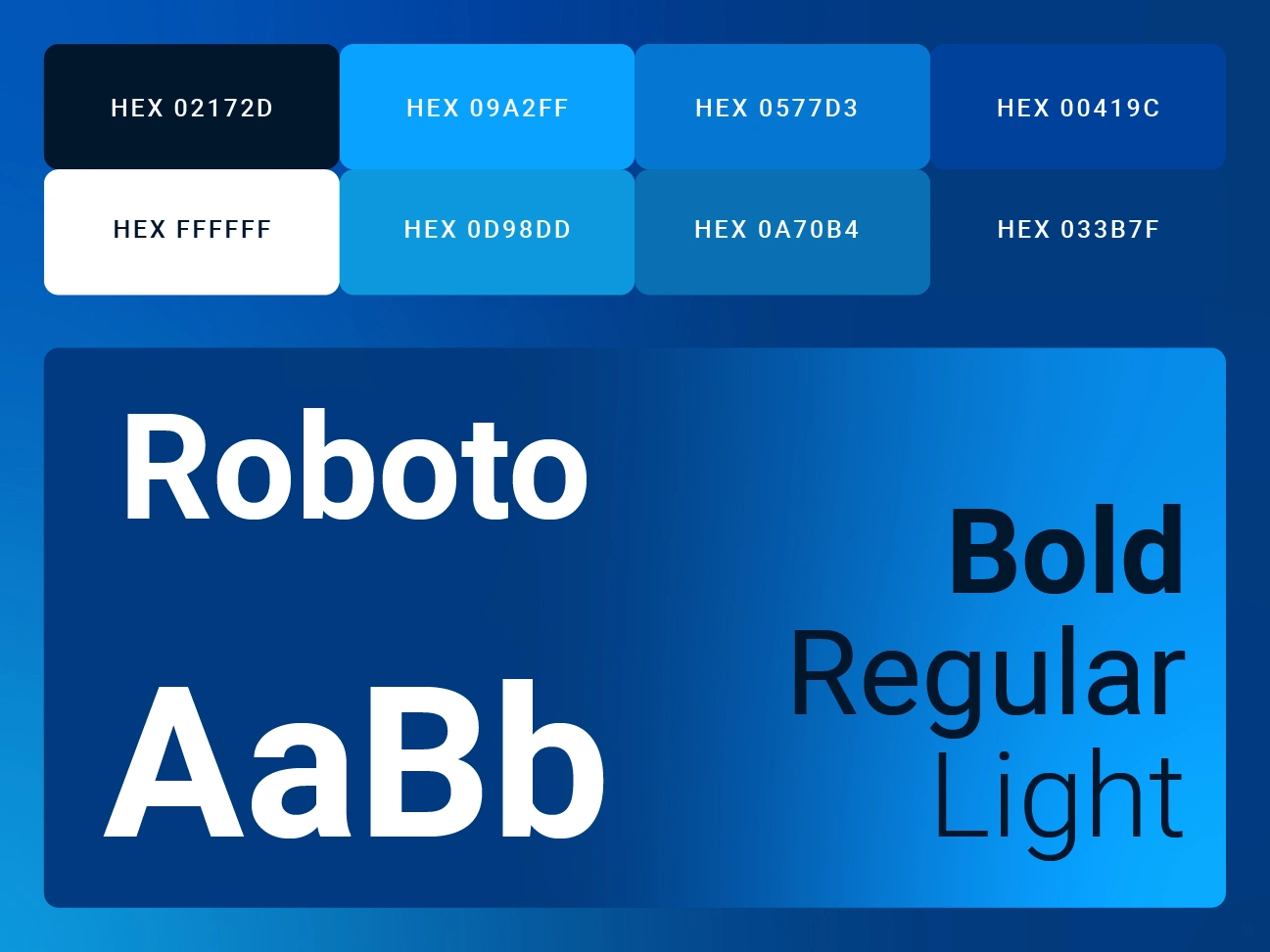
Accelerator Projects typography brand color palette with hex codes
Accelerator Brand Identity Design: The Brief
Accelerator Projects Limited came to ZakDesignz with a logo concept they’d sketched out using AI tooling, a solid starting idea, but not something investor-ready. The brief was specific: keep the geometric arrow symbol that signals forward momentum and growth, but rebuild it as clean, professional vector art. The wordmark needed a subtle design detail: “Accelerator” starting upright and gradually leaning further right toward the end of the word, suggesting motion without sacrificing legibility.
Two lockups were required from day one: a symbol above the wordmark and a symbol to the left of it, both needed as fully separated vector elements (symbol and type independently editable) for maximum flexibility across future applications.
The context mattered: this logo was going in front of investors. Every deliverable needed to look boardroom-ready.
Phase 1 – Logo Refinement
Working from the client’s AI-generated reference, the arrow symbol was redrawn as precise geometric vector shapes, preserving the layered, forward-motion concept and the colour progression across each arrow. Two to three wordmark directions were prepared so the client could compare lean angles before committing, since, as they put it, “this might take a few revisions to get right.” Once a direction was approved, the finished logo was delivered as a complete package: horizontal and vertical layouts, both lockup styles, and all standard file formats for print and digital use (AI, EPS, PDF, PNG, JPG, SVG, plus a black-and-white version).
Phase 2 – Speed Under Pressure: Stationery, Logo Variations & the Pitch Deck
Logo variations – a set of sub-brand and divisional lockups built from the finalized master logo, each combining the primary mark with a secondary word (covering the parent company name and several project/division labels), delivered in individually organized folders so the client’s team could track each variation independently.
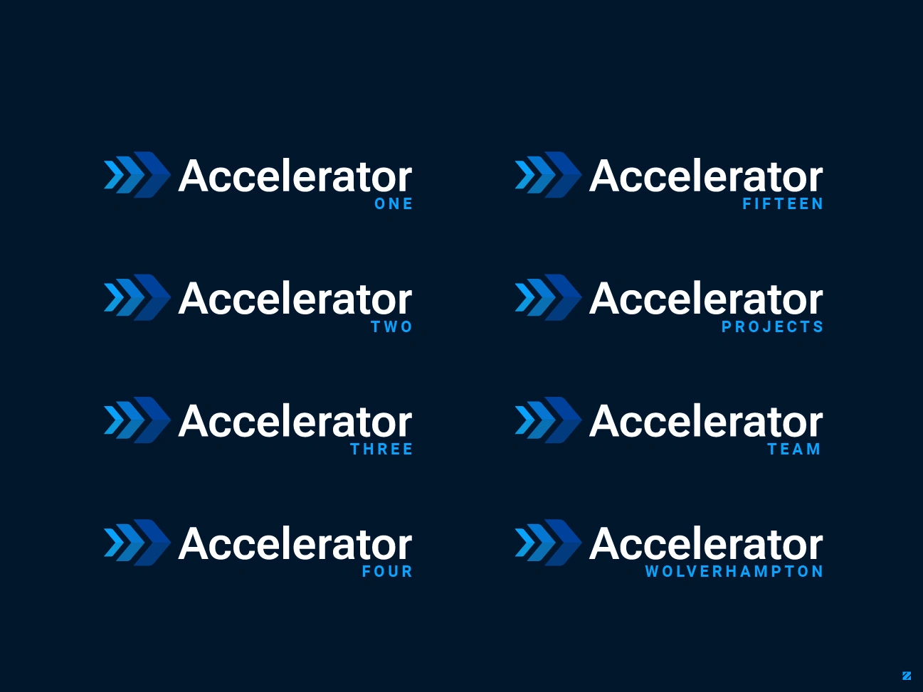
Accelerator Projects Logo variations
Stationery design – business cards and letterhead, refined through several rounds of real-world detail (adding both office and mobile contact numbers, correcting a domain extension across every asset, and adjusting spacing and type size for print clarity) – the kind of finishing work that keeps a brand looking consistent once it’s out of a designer’s hands and into a client’s own team’s.
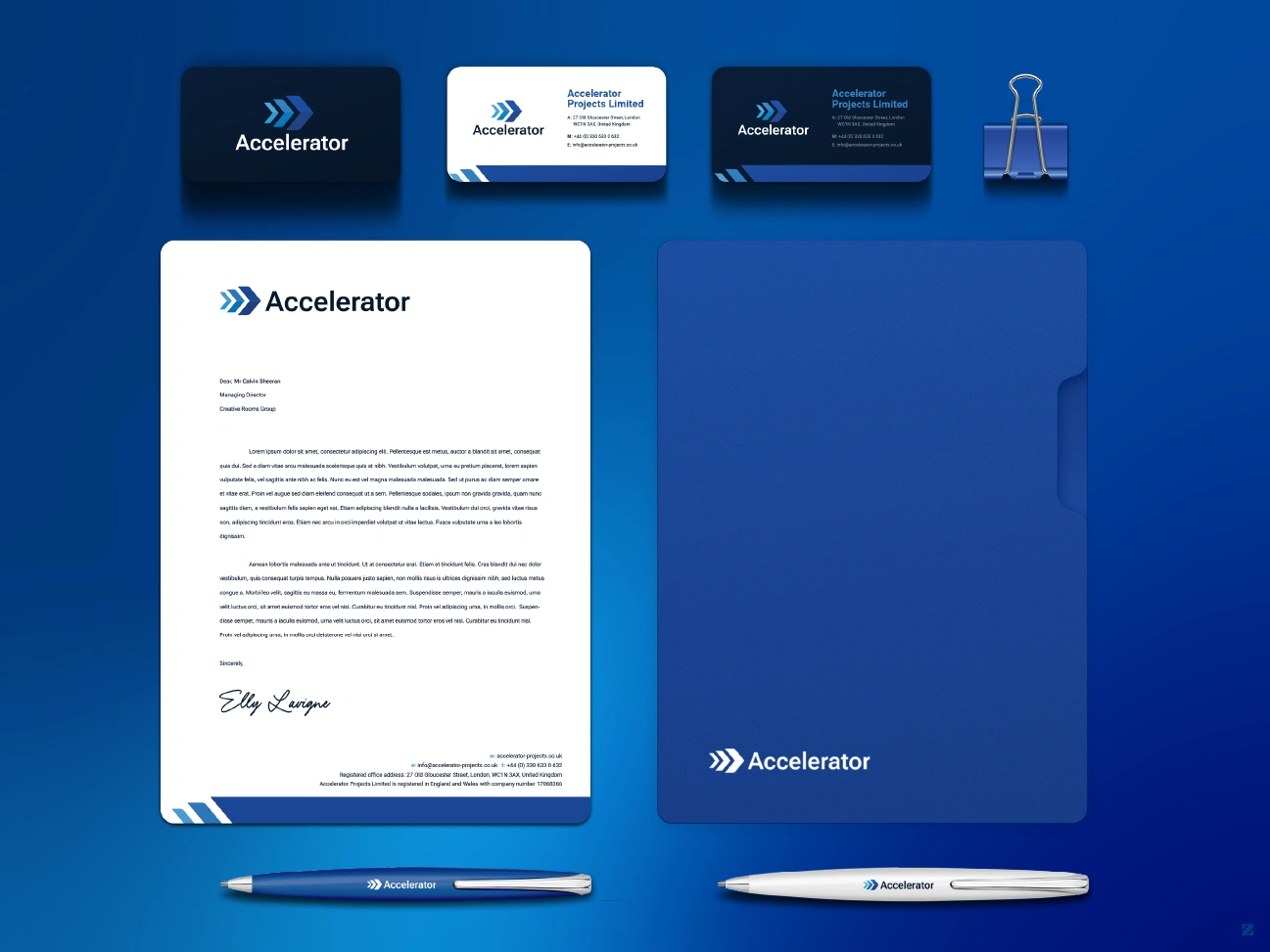
Accelerator Projects branded business cards and letterhead stationery
Investor pitch deck – a 20-slide deck built in Adobe Illustrator rather than PowerPoint, chosen specifically for tighter design control and to keep every slide on-brand. Sample slides (cover, general content, statistics, ROI, and roadmap layouts) were delivered first for sign-off before the full deck was built out, all under a hard investor-pitch deadline. The finished deck was delivered as a fully editable, print-ready source file so the client could keep adjusting slide content themselves right up to presentation day.
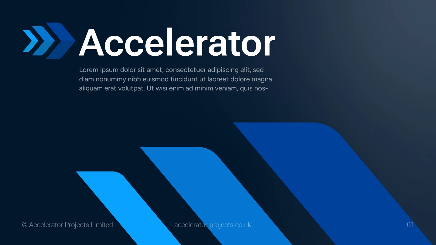
Accelerator Projects pitch deck cover slide with logo
Bringing the Brand to Life: Mockups & Applications case
Alongside the final files, a full set of real-world mockups was delivered so the client could see and present the brand in context rather than as flat artwork:
Presentation & stage screens – the logo and tagline shown on an event stage backdrop, giving a sense of how the brand would look at a live investor presentation
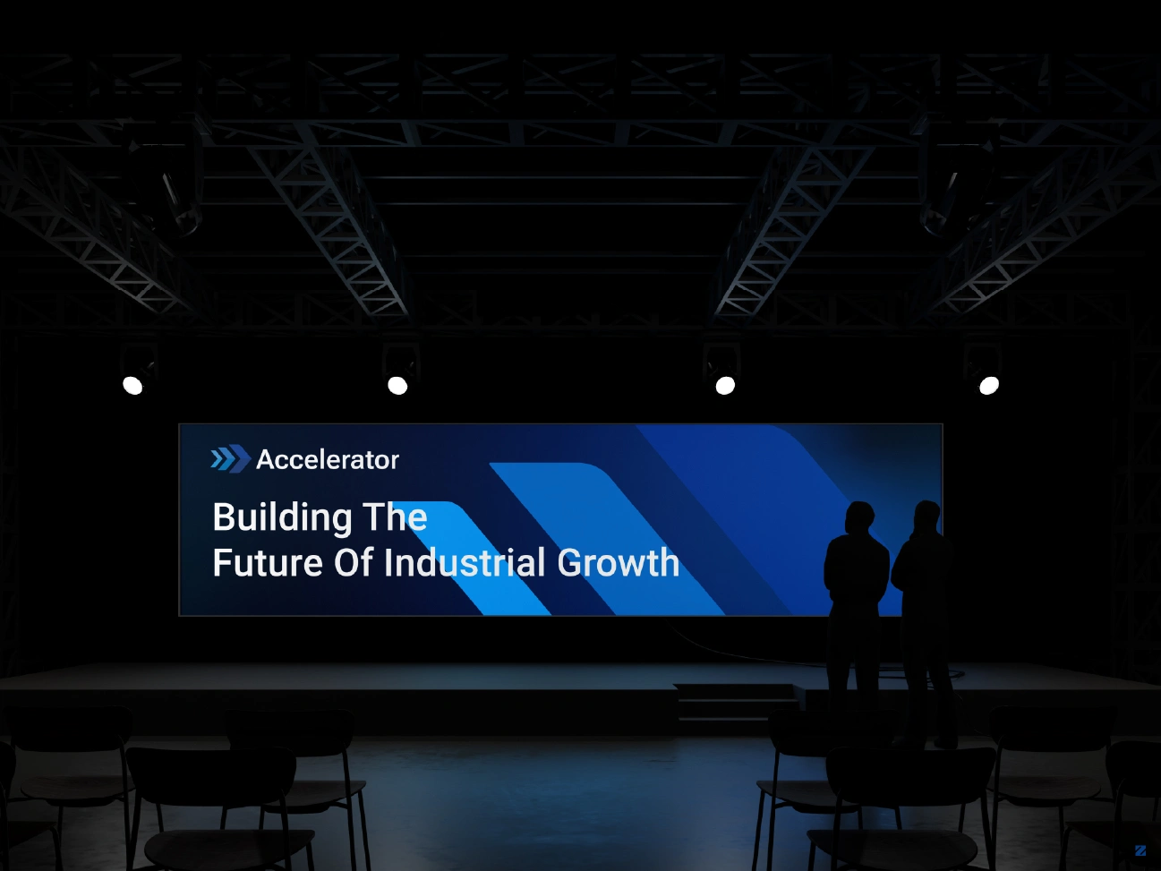
Accelerator Projects logo displayed on investor pitch stage screen
Outdoor billboard advertising – the mark was tested at large scale to confirm it stayed sharp and legible from a distance
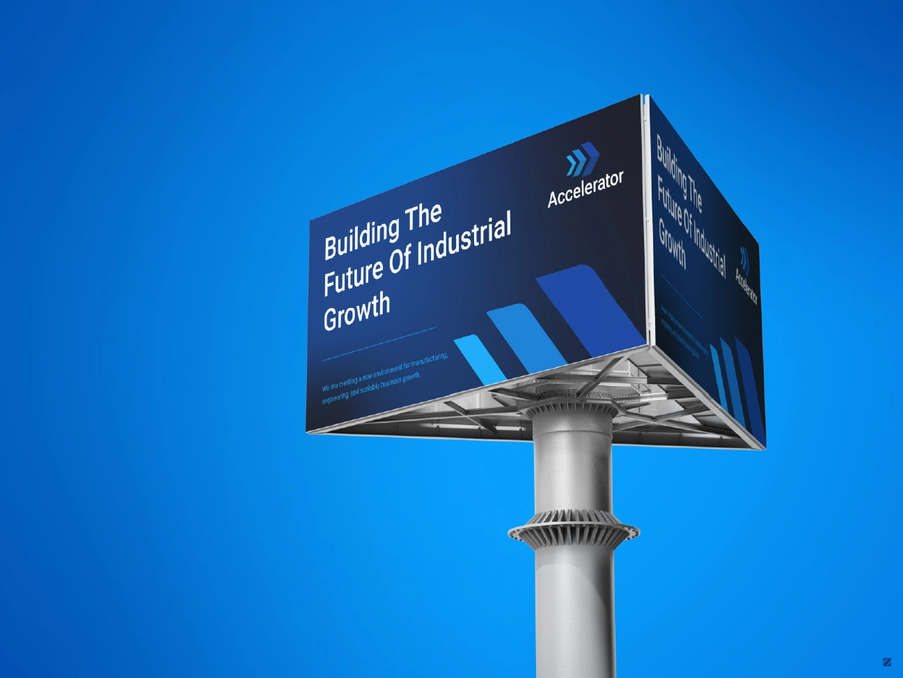
Accelerator Projects logo on outdoor billboard advertising mockup
Building & exterior signage – the logo mocked up on illuminated building signage, showing how it would read in a real corporate environment
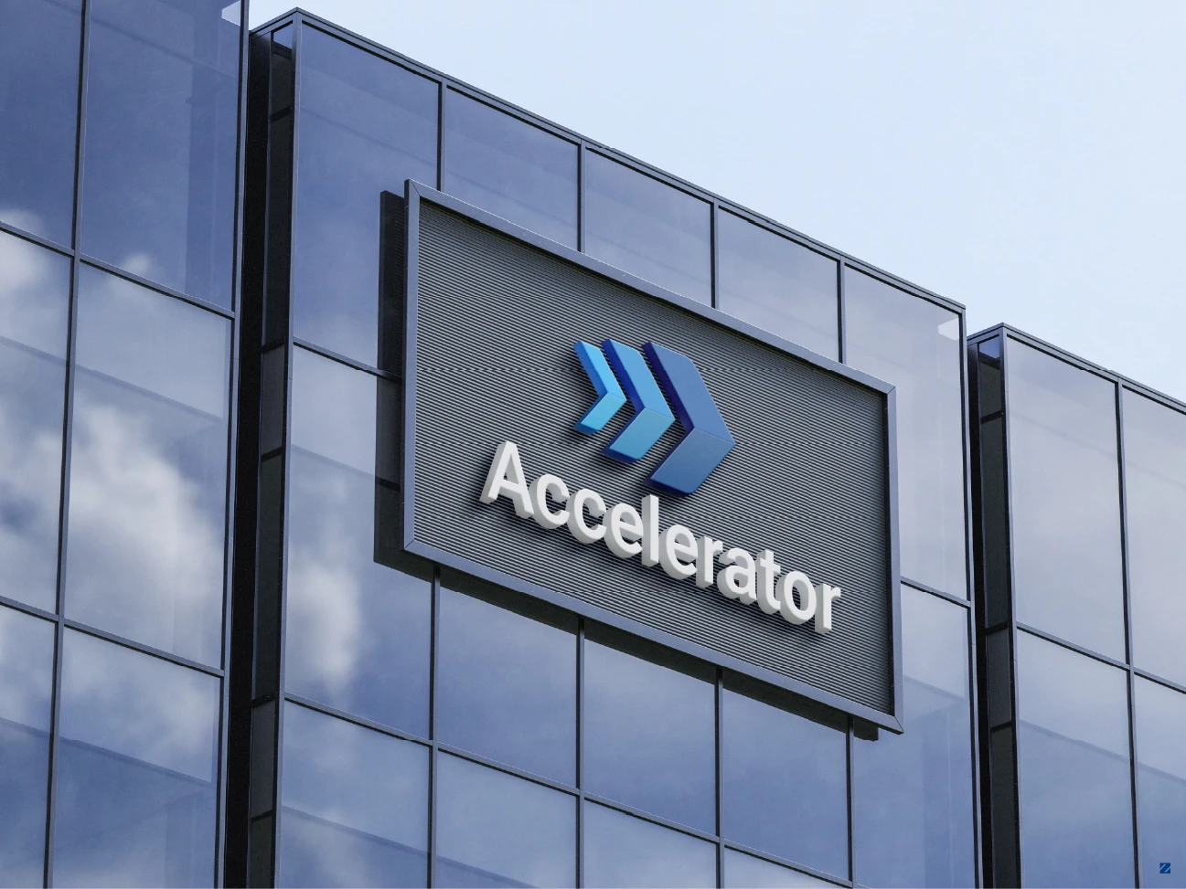
Accelerator Projects illuminated logo signage on office building exterior
Stationery suite mockups – business cards, letterhead, a branded folder, and branded pens shown together as a cohesive set
These mockups did double duty: they gave the client confidence in the brand before committing to print and were reused directly as visual assets inside the investor pitch deck itself.
Working Under a Real Deadline
What made this project distinct wasn’t just the design output; it was the pace. With an investor meeting locked in, revisions and approvals were turned around the same day, with sample slides and stationery mockups delivered ahead of the full build-out at each stage so the client could steer direction before final production. This kind of responsive, milestone-based workflow is central to how we (ZakDesignz) handle time-sensitive brand launches.
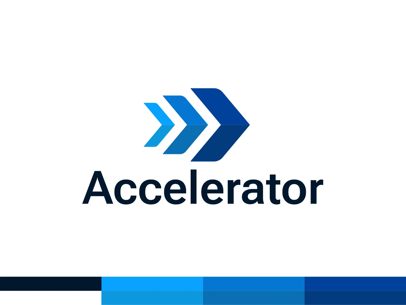
Accelerator Projects geometric arrow logo on white background
A Partnership Built on Trust
The relationship didn’t end at delivery. Once the core identity was locked in, Accelerator Projects came back for a second phase of work: logo variations, refreshed stationery, and the investor pitch deck, a clear sign the first phase had earned their confidence. That kind of repeat engagement is the real measure of a successful brand project: not just a client who’s happy with the final files, but one who trusts the same designer to carry that brand forward as their business grows.
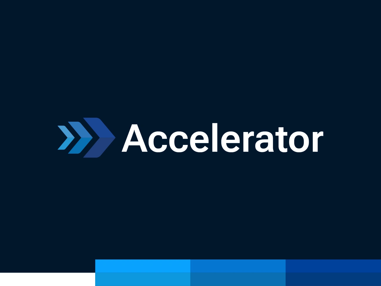
Accelerator Projects geometric arrow logo on dark navy background
The Result
Accelerator Projects walked into their investor pitch with a complete, professional brand system: a finalized geometric logo in two lockup styles, a full set of sub-brand logo variations, print-ready stationery, and a custom-built 20-slide pitch deck all built to be easily maintained and extended by their own team going forward.
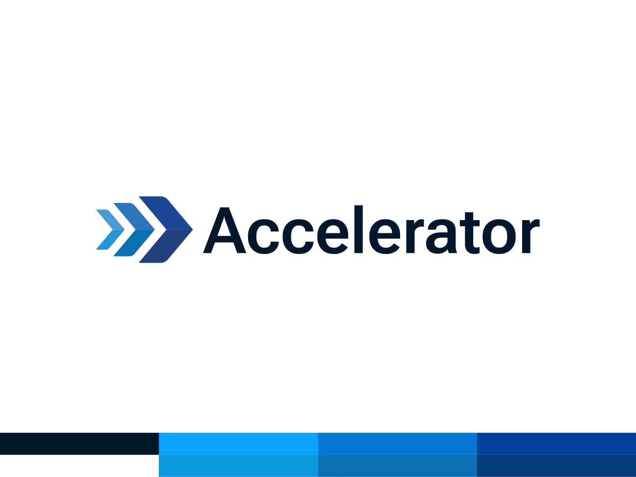
Accelerator brand logo with progressive lean wordmark
Like this project
Posted Jul 20, 2026
A modern, timeless identity featuring a layered blue arrow for progress and a bold geometric wordmark that reflects forward momentum.
Likes
0
Views
5
Timeline
Jan 14, 2026 - Feb 18, 2026