Stay Sharp. Stay Fast. Stay Moving.

Pankaj Shah


RNN Sport - Brand Identity Design
Stay Sharp. Stay Fast. Stay Moving.
Overview
RNN Sport is a bold, kinetic brand built for athletes and go-getters who never stop moving. The client needed an identity that could hold its own on race day something with enough energy to feel fast standing still, and enough versatility to work across apparel, gear, and outdoor signage.
I led the project end-to-end: brand strategy, logomark design, color and typography system, and a full mockup suite showing the identity in real athletic environments.
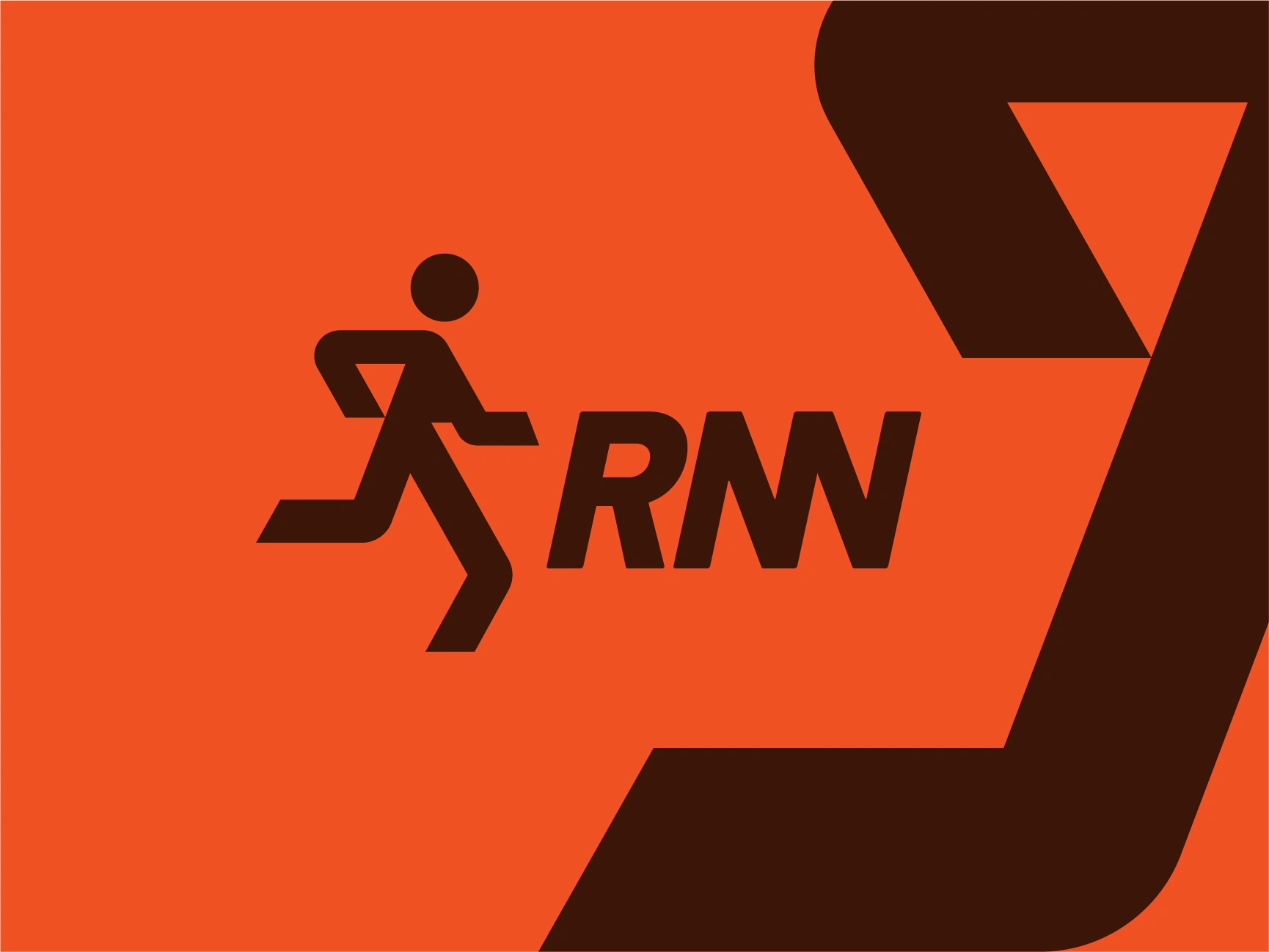
RNN Sport Logo Design
Scope: Brand Strategy · Logo Design · Visual Identity System · Merchandise & Apparel Application · Mockup Presentation
Timeline: 2 weeks
Client: RNN Sport
Industry: Sports & Athletic Wear
Style: Modern Timeless
The Brief
The client wanted a mark that captured motion, energy, and competitive spirit, not just a generic running-shoe or track icon, but a symbol with real momentum behind it. The brand needed to feel equally at home on a race bib, a water bottle, a tank top, or a 12-foot feather flag at a starting line.
A dynamic running icon that reads instantly, even in motion or at a distance
A high-energy color palette that stands out in outdoor, high-glare environments
A system built to survive real athletic use: sweat, fabric, sun, movement
A brand voice built around speed, focus, and relentless ambition
The Concept
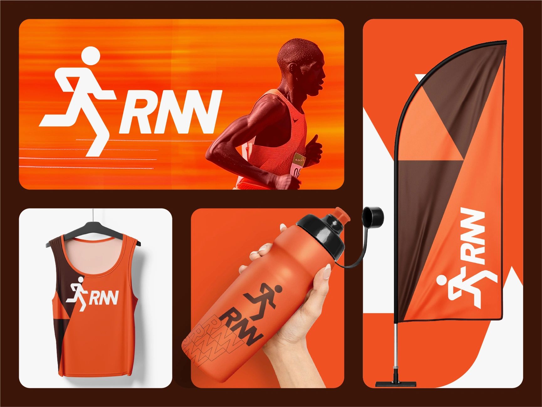
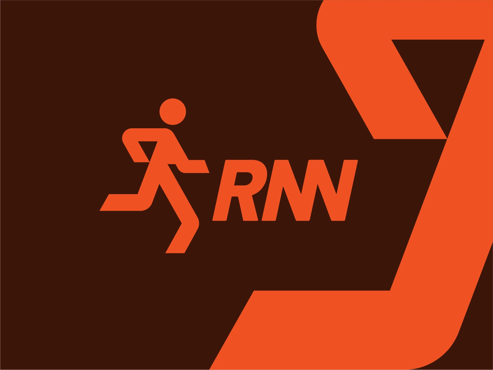
The mark is built around a dynamic running figure, rendered in bold, confident strokes that suggest forward motion even in a static logo. Paired with the "RNN" wordmark in a heavy, tightly-kerned sans-serif, the identity reads fast, sharp, and modern, built for the track as much as the street.
The tagline "Stay Sharp. Stay Fast. Stay Moving." anchors the brand's voice, reinforcing that RNN isn't just a logo; it's a mindset for people who train hard and compete harder.
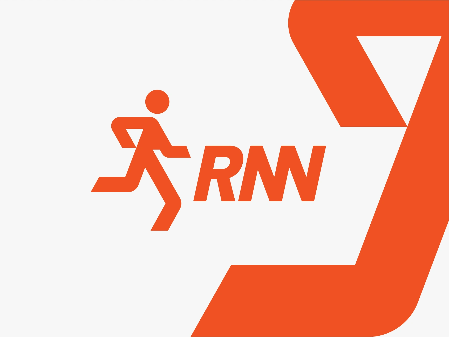
RNN Sport Logo Design
Color System
Color Role
Vibrant Orange Primary - energy, speed, visibility
Deep Espresso Brown Grounding, strength, contrast
Cream/Off-White Breathing room, clarity on merchandise
The orange-and-brown combination was chosen deliberately to break away from the typical blue/red sports-brand palette; it feels warm, bold, and distinct on a shelf full of competitors, while still performing well in bright outdoor lighting.
Typography
Roboto Flex A bold, condensed sans-serif carries the "RNN" wordmark, giving it a compressed, athletic feel that mimics forward lean and speed, even when static.
Identity System & Deliverables
Primary logomark + wordmark lockup
Standalone running icon (for small-scale use: tags, caps, app icon)
Color palette + usage guidelines
Typography hierarchy
Performance tank top/apparel application
Water bottle/shaker bottle merchandise application
Feather flag/outdoor event signage
Hero brand banner (athlete-in-action photography pairing)
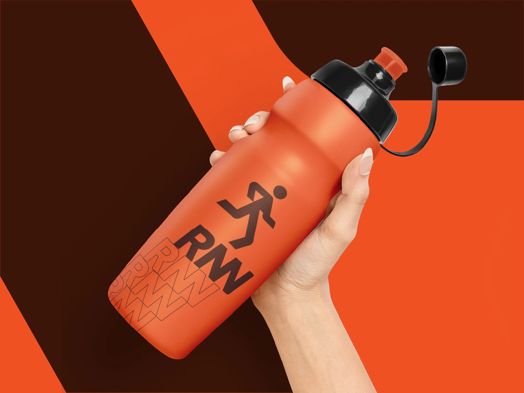
RNN Sport Wter Bottle
Mockup Showcase
To prove the brand could survive outside a design file, I built out a full real-world mockup suite:
Hero Brand Banner - the mark paired with dynamic athlete photography and motion-blur background, showing how the logo holds contrast and legibility against a busy, high-energy image.
Performance Tank Top - the wordmark and icon applied to a color-blocked tank, testing how the mark reads on fabric, on a hanger, and at wearable scale.
Shaker Bottle - the standalone running icon plus wordmark on a matte bottle, including a secondary zigzag texture pattern, to test the brand on a curved, handheld product.
Feather Flag - a tall outdoor event flag mockup, testing the identity's visibility and impact at race expos, starting lines, and sponsor booths from a distance.
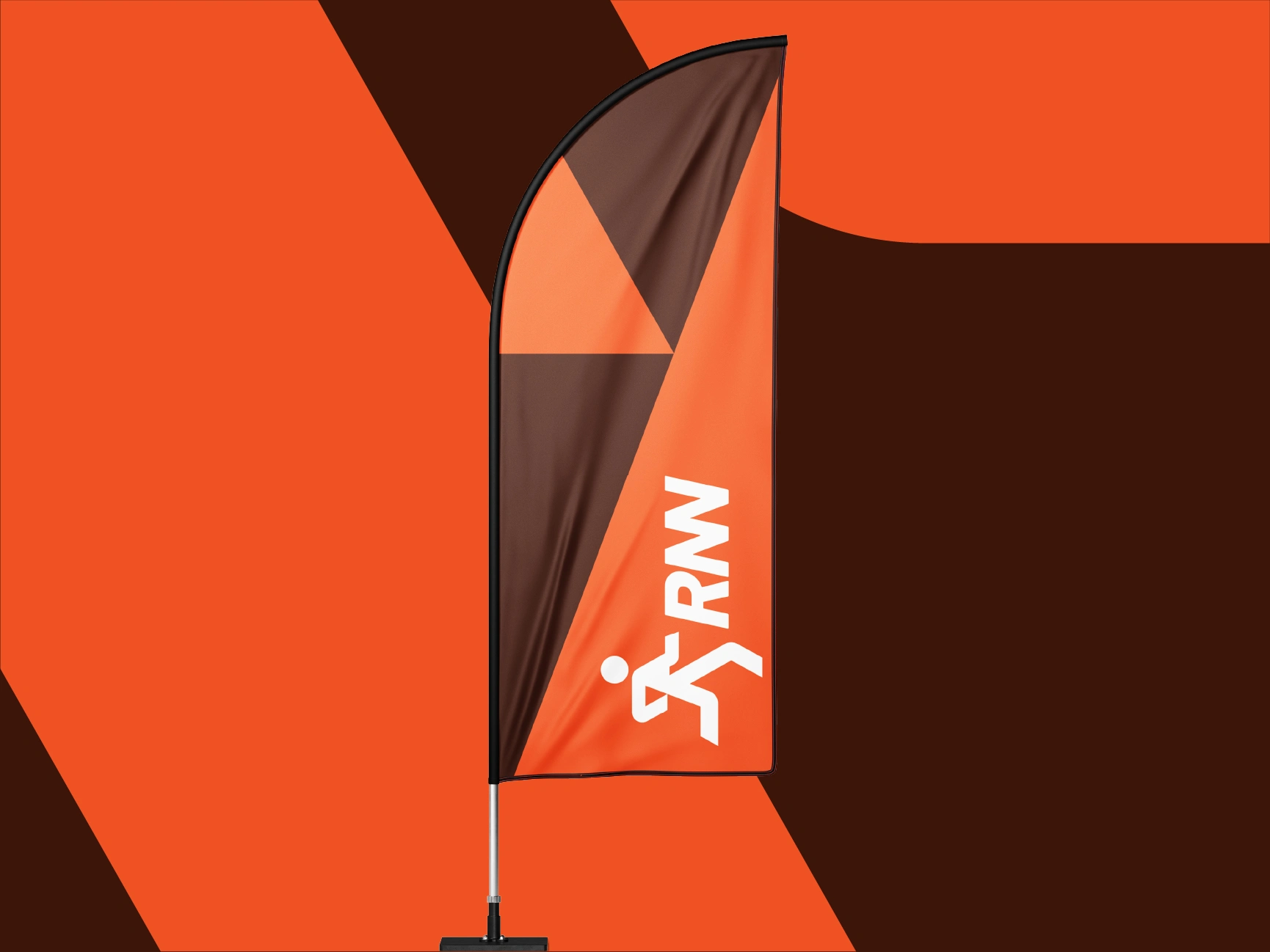
RNN Sport Flag
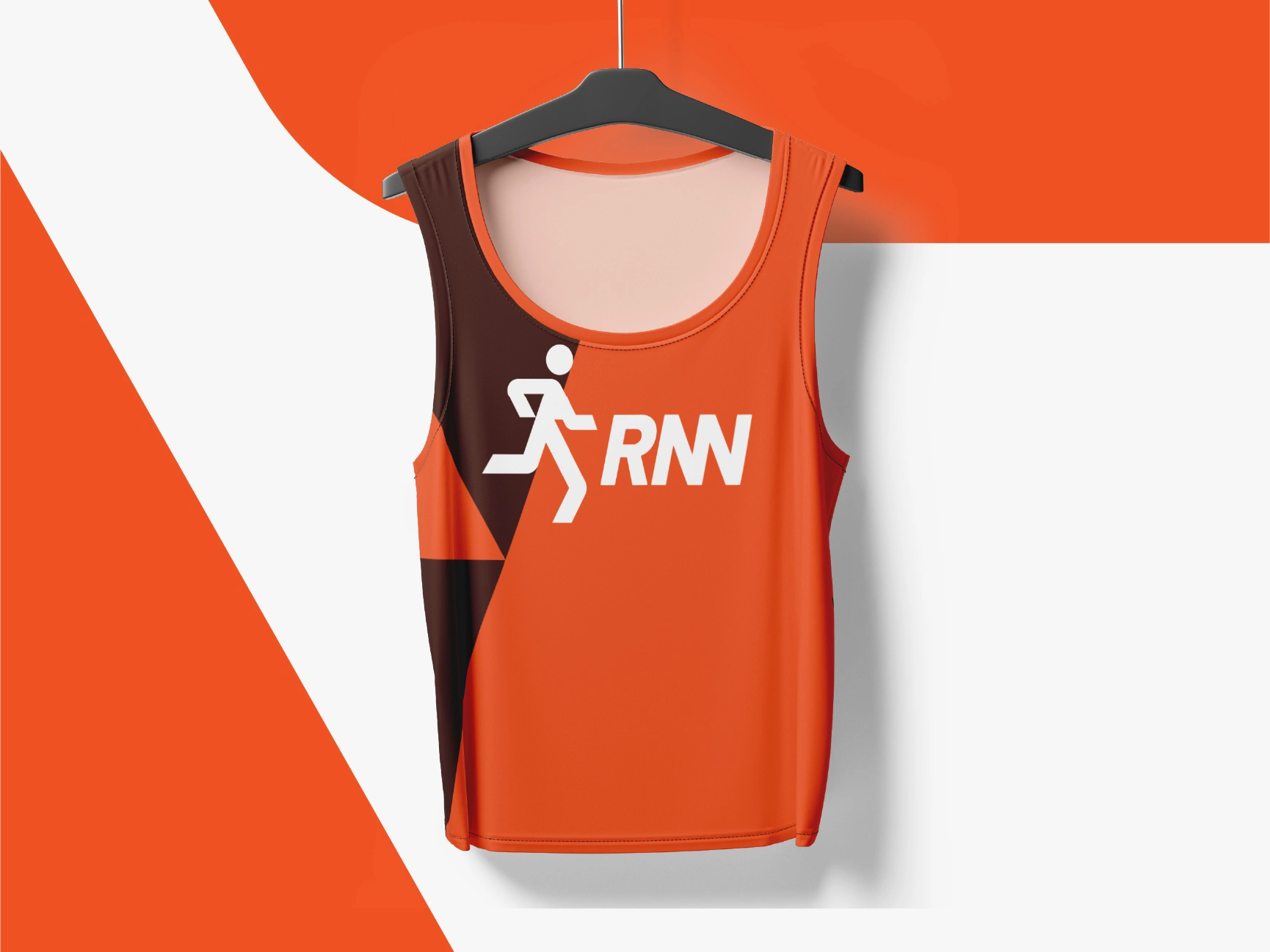
RNN Sport Tank
Result
The final identity gives RNN a mark that's instantly recognizable in motion and at rest, flexible enough to move from a hangtag to a stadium flag without losing its edge. The "Stay Sharp. Stay Fast. Stay Moving." tagline ties the whole system into one consistent, high-energy brand voice built to fuel performance on and off the track.
Tools Used
Adobe Illustrator · Photoshop · Mockup compositing
Let's build your brand.
I design logo and brand identity systems for businesses that want to look bold and complete from day one mark, palette, guidelines, and real-world mockups included.
📩 Get in touch via Contra or zakdesignz.com
Like this project
Posted Jul 3, 2026
RNN is a bold, kinetic brand built for athletes and go-getters who never stop moving. The client needed an identity that could hold its own on race.
Likes
0
Views
6
Timeline
Aug 17, 2022 - Sep 9, 2022