Kimona Consulting Website Redesign

Tolulope Amao


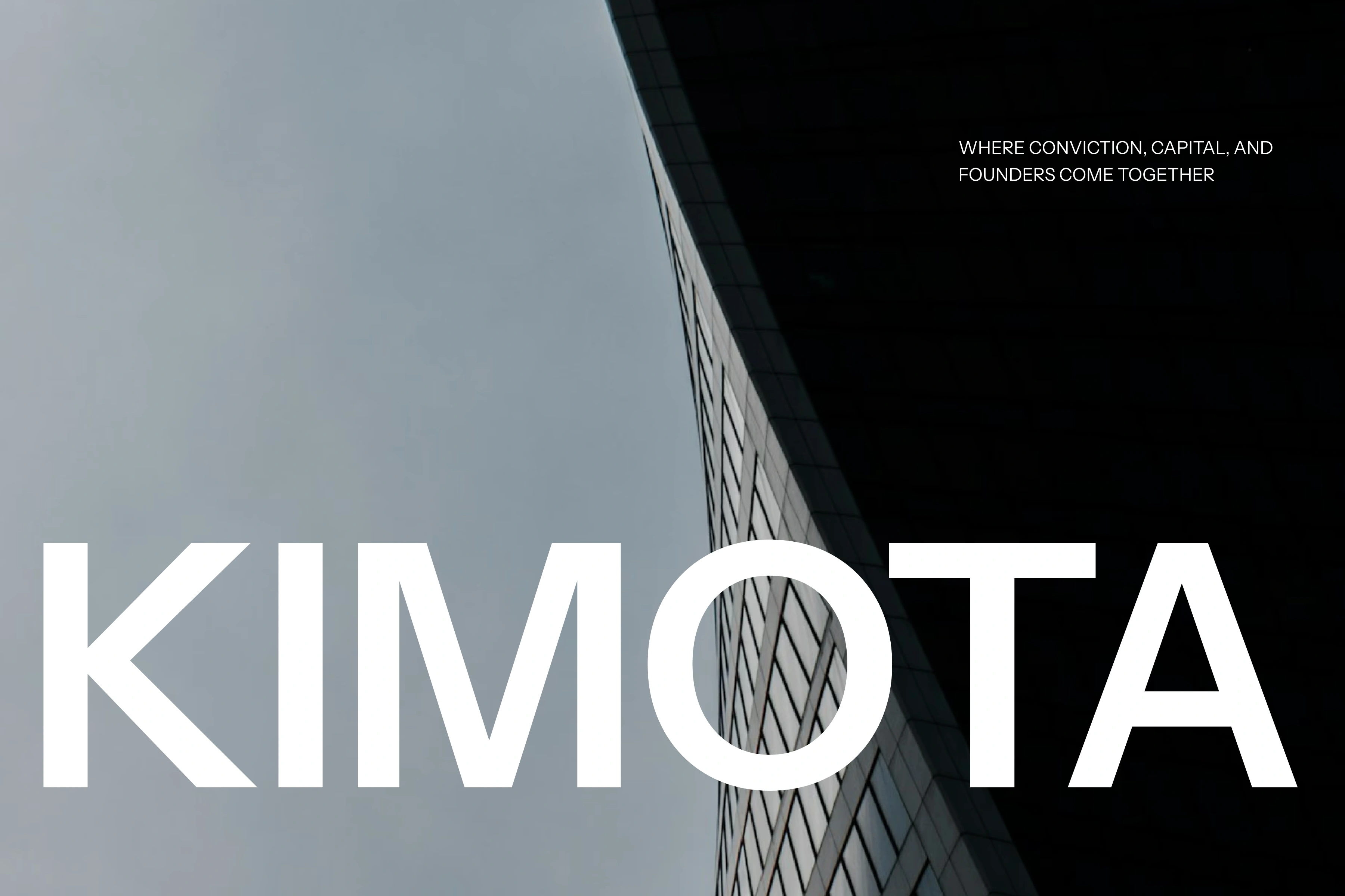
Modern consulting website designed to communicate clarity, strategic thinking, and quiet authority.
View Live Website
Overview
Kimona is a strategically minimal consulting website built to position expertise through clarity rather than complexity. It avoids noise, unnecessary visuals, and over-explanation, focusing instead on structure, hierarchy, and confident messaging.
The experience reflects the type of thinking consulting clients expect: organized, intentional, and results-driven.
What It Does Well
- Clear Strategic Positioning
Kimona immediately communicates that it operates at a strategic level. The messaging is concise, confident, and outcome-oriented — speaking directly to founders and leadership teams who value direction and structured thinking.
Rather than listing generic services, the site frames its value around insight, clarity, and execution. This strengthens brand authority from the first screen.
- Strong Above-the-Fold Experience
The hero section is focused and disciplined. There is no clutter, no competing elements, just a clear headline, supportive subtext, and a confident call to action.
This creates:
• Immediate brand understanding
• Strong visual hierarchy
• A sense of calm authority
• A clear next step
For consulting brands, first impressions must feel controlled and intentional — Kimona achieves that.
- Structured Content Architecture
The layout follows a logical progression that mirrors strategic thinking:
• Introduction of positioning
• Clarification of services or focus areas
• Reinforcement of credibility
• Call to engagement
Each section answers a silent user question without overwhelming them. The pacing between sections feels deliberate, giving space for ideas to land.
This structural clarity reinforces the perception of intelligence and organization.
- Minimalism With Purpose
Kimona uses restraint effectively. Generous spacing, strong typography, and clean alignment allow the content to breathe.
Instead of filling space with decorative graphics, the design relies on:
• Consistent grid structure
• Clear headline hierarchy
• Balanced content density
• Subtle visual transitions
This level of visual discipline communicates maturity — which is critical for a consulting brand targeting serious decision-makers.
- Typography as a Brand Asset
Typography carries much of the visual identity. The type choices feel modern yet authoritative, and the hierarchy is clean and readable across sections.
Large, confident headlines paired with controlled body copy create rhythm and clarity. This reduces cognitive strain and improves scan-ability — important for busy executives.
- Smooth Scrolling & Motion Restraint
The motion design is subtle and supportive. Transitions feel fluid, reinforcing hierarchy and guiding attention without distracting from the message.
Instead of flashy animations, the site uses movement to:
• Signal section changes
• Enhance perceived quality
• Maintain engagement
The motion feels intentional, not decorative — which aligns with the consulting tone.
- Strong Visual Rhythm & Spacing
Spacing is used strategically to create pacing. Sections are not compressed or rushed. White space reinforces focus and elevates the premium feel.
This rhythm helps:
• Separate ideas clearly
• Avoid cognitive overload
• Emphasize key statements
• Improve readability across devices
The site feels breathable and composed.
- Credibility Signaling
Kimona communicates authority through tone and structure rather than aggressive social proof. The experience feels mature, which builds trust organically.
Subtle cues, structured language, confident CTAs, minimal distraction — reinforce the idea that the team operates with clarity and control.
- Mobile Responsiveness & Consistency
The layout structure adapts cleanly to smaller screens without losing hierarchy or rhythm. Typography scales well, spacing remains balanced, and interactions stay smooth.
For consulting audiences who may browse on multiple devices, consistency strengthens brand perception.
- Thoughtful Call-to-Action Placement
Calls to action are not intrusive. They are placed naturally within the content flow, reinforcing trust rather than urgency.
The tone feels invitational:
• Clear next steps
• No aggressive pressure
• Logical progression toward contact
This supports high-quality lead generation rather than casual traffic.
What Elevates It
- Alignment Between Strategy and Design
The UX mirrors the consulting philosophy. Structured layout, disciplined spacing, and clear messaging reflect how the business likely operates.
There is cohesion between:
• Brand tone
• Information hierarchy
• Visual restraint
• Interaction design
This alignment strengthens credibility.
- Quiet Confidence
Kimona stands out by not trying too hard. It doesn’t rely on trend-heavy visuals or over-the-top motion. Instead, it communicates control and clarity.
In consulting, that quiet confidence often resonates more strongly than loud marketing.
- Premium Yet Approachable
While minimal and refined, the site does not feel cold. The spacing, rhythm, and tone create an experience that feels open and conversational.
Visitors are guided, not overwhelmed.
Overall Assessment
Kimona is a strong example of how disciplined UX and restrained visual design can elevate a consulting brand. The site communicates strategic maturity through structure, clarity, and calm execution.
It doesn’t attempt to impress with excess, it builds trust through precision.
The result is a digital presence that feels intelligent, credible, and aligned with serious client conversations.
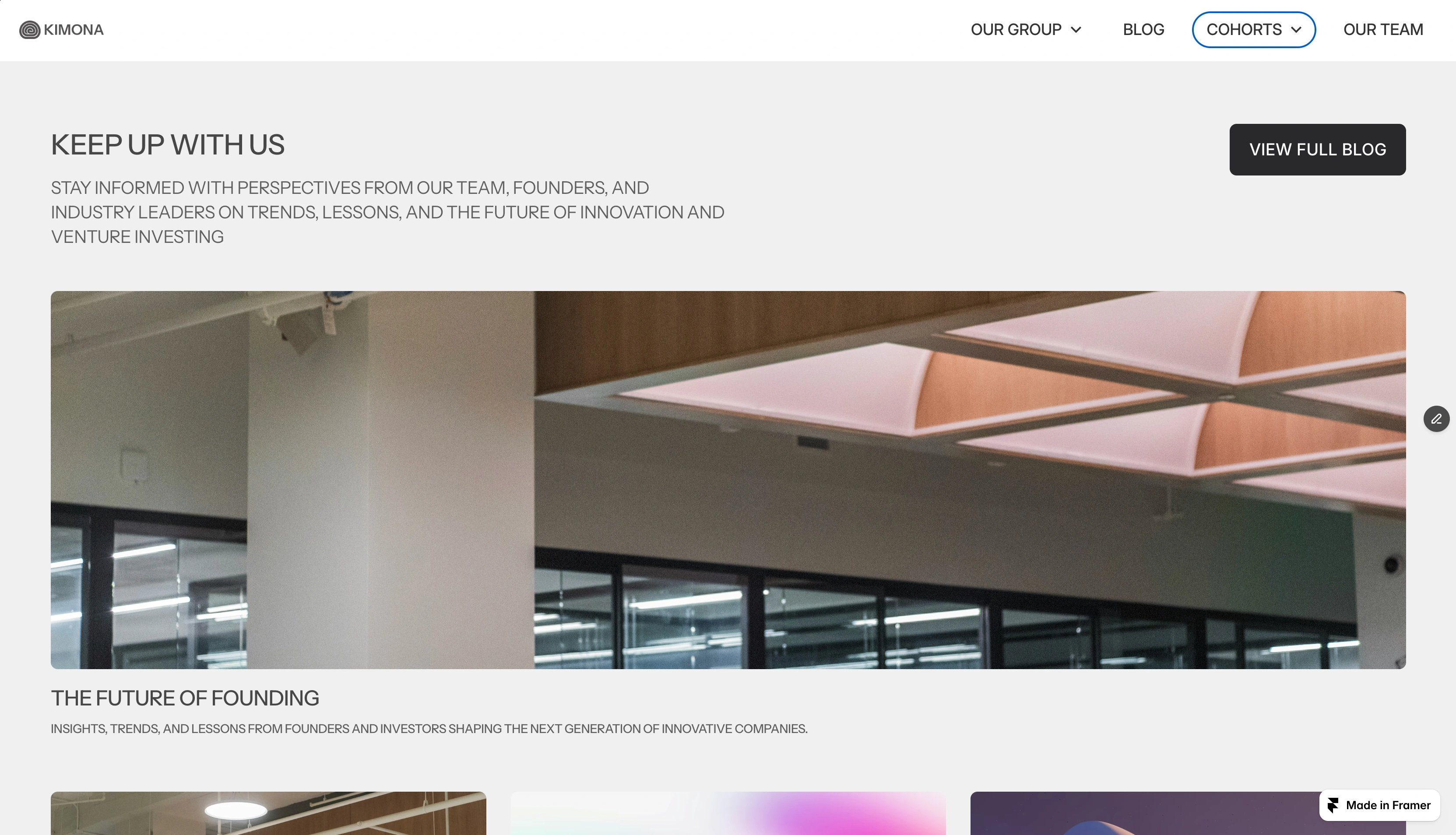
BLOG
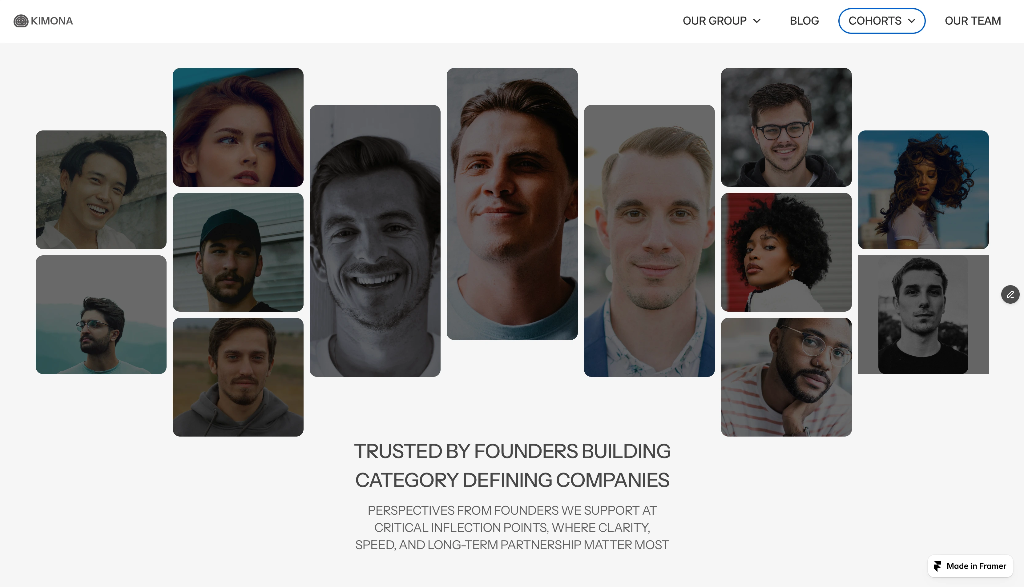
TESTIMONIAL
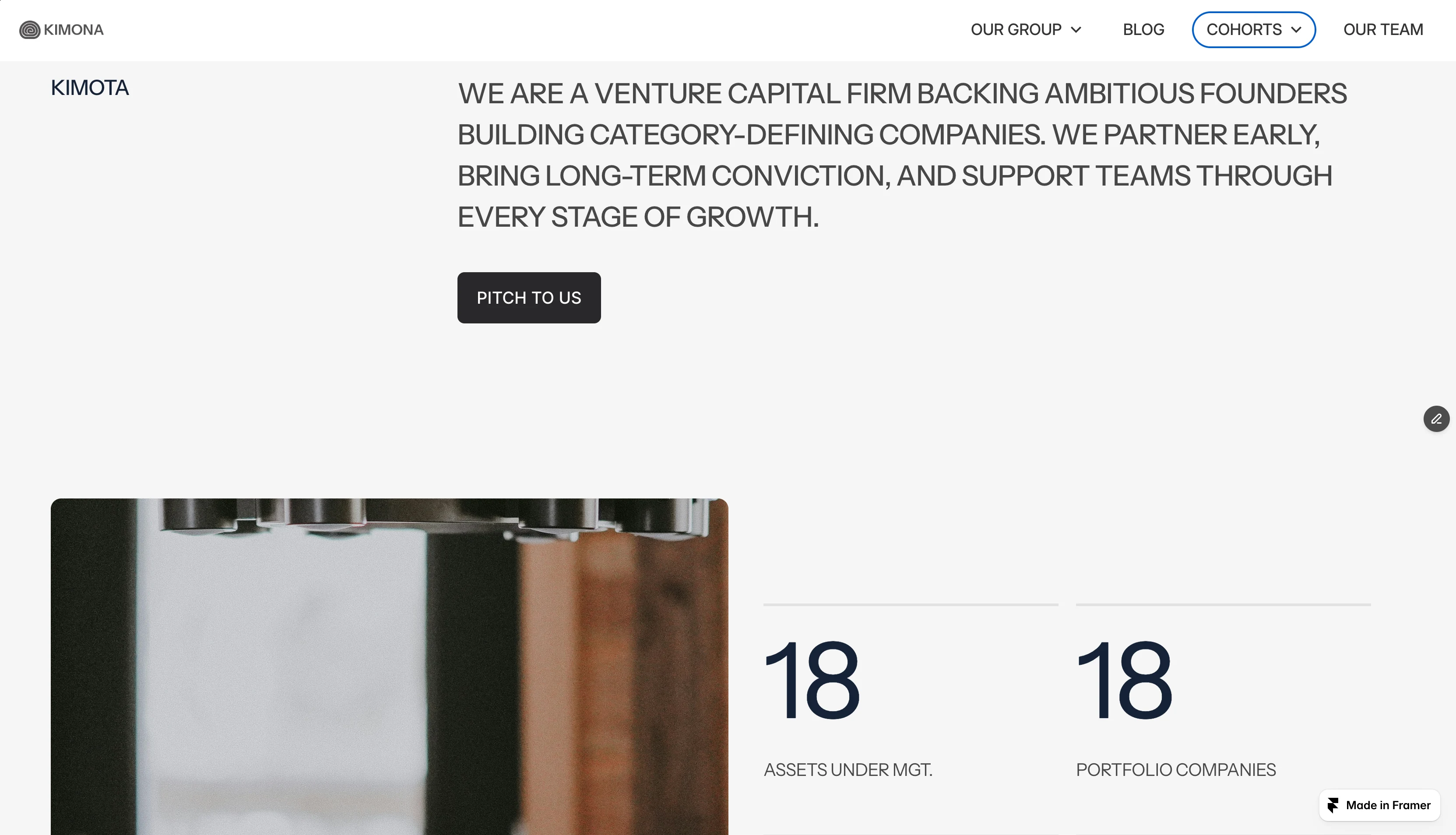
ABOUT
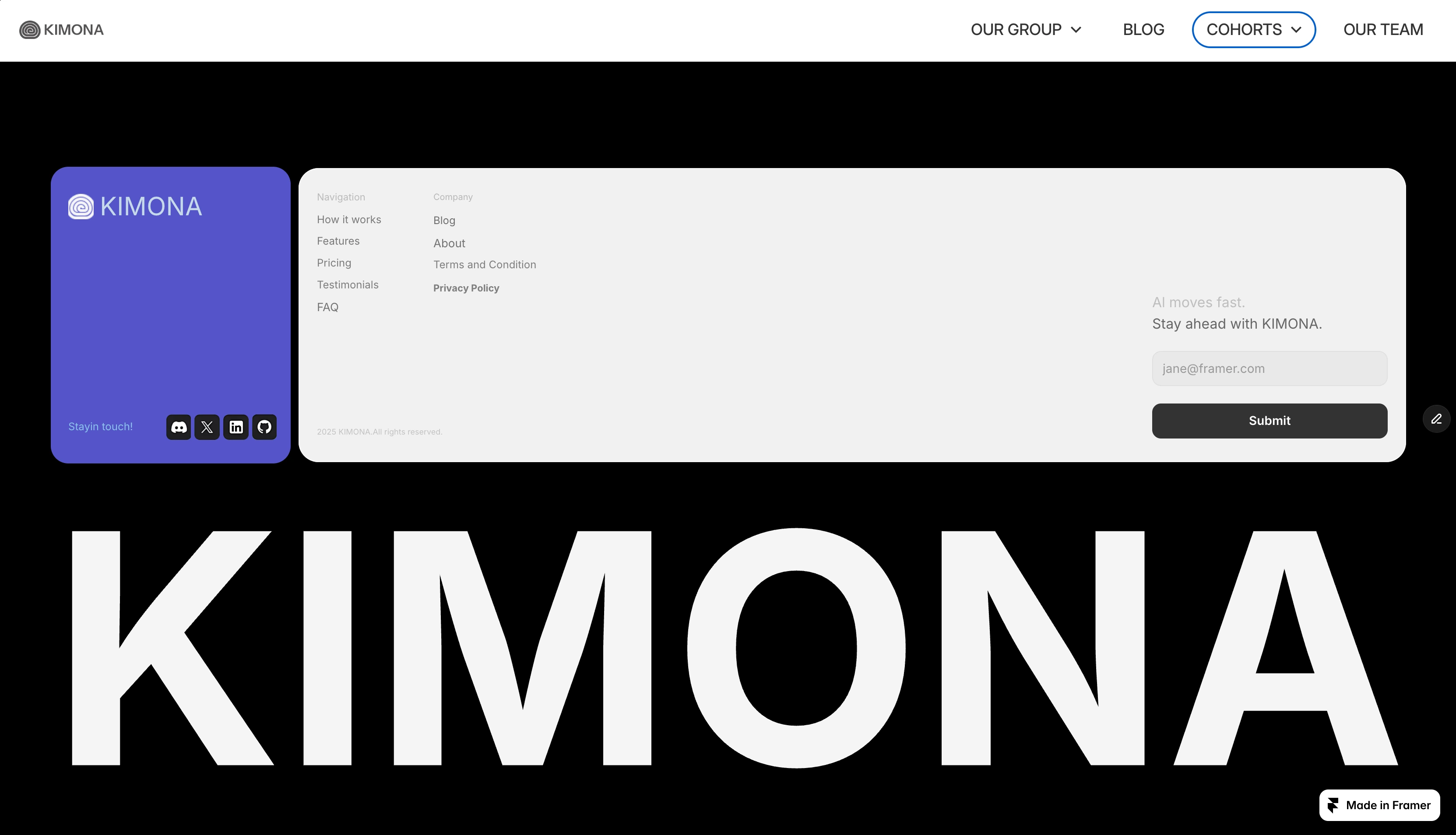
FOOTER
Like this project
Posted Feb 17, 2026
Kimona is a modern consulting website designed to communicate clarity, authority, and strategic discipline through minimal design and structured messaging
Likes
1
Views
8
Timeline
Feb 1, 2026 - Feb 10, 2026