Cliqbox Website Redesign
Favour Stephen
Cliqbox Website Redesign.
From abstract social app to relatable community builder; how I designed a web experience that helps people find activites, create bonds with other people that share their hobbies and makes them feel like they belong.
About the Project
I led the design of Cliqbox’s landing and explore pages, transforming a new social discovery product into an emotionally resonant, high-converting platform. We launched the website just before a live event, and it helped drive over 100 expected activity bookings in the first week.
The Problem
Cliqbox is a social platform that helps people find and create real-life communities. But when we started, the brand had no web presence and no way for users to understand its value quickly, let alone book an experience.
The team needed a site that could:
Introduce the product to two audiences: people who create communities and those who join them.
Build emotional connection, not just explain features.
Let users explore and book experiences directly, without needing the app first.
My Role
As the product designer on this project, I was responsible for designing multiple key flows and pages across the web experience:
Landing Page – To introduce the product, communicate value, and build emotional connection.
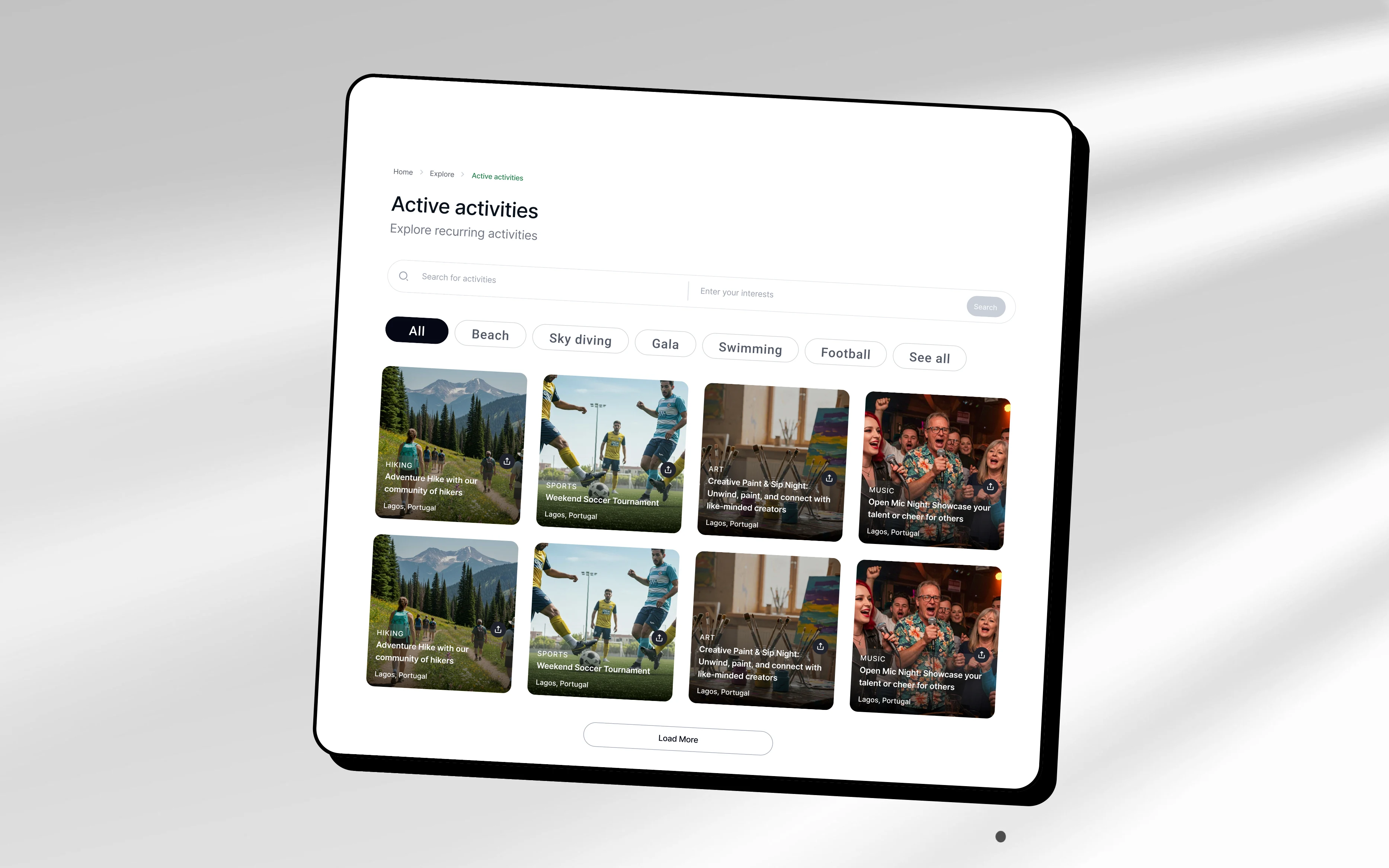
Explore Flow – To allow users to discover real-life activities and filter them by interests, categories, and location.
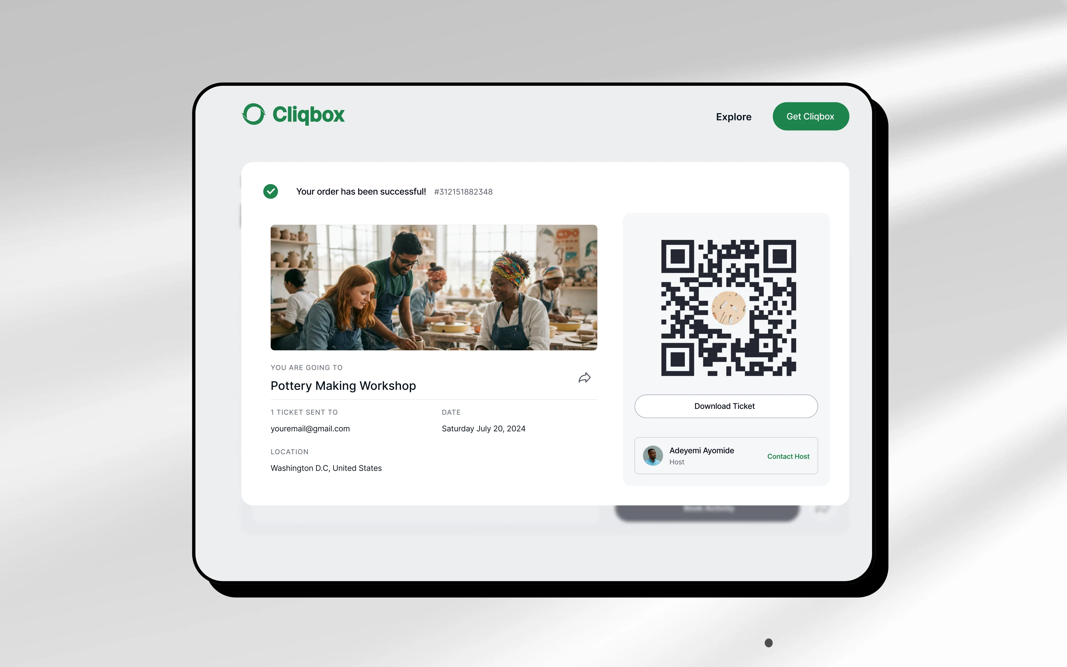
Booking Flow – To enable users to view activity details, book directly on the site, and complete payments with ease.
Partner Flow – For service providers and businesses to sign up as hosts and list their events or communities.
Support / Guide Page – To help users understand how Cliqbox works, troubleshoot issues, and contact support.
I also collaborated with the dev team to ensure implementation aligned with design intentions and user expectations.
The Challenge
Designing for two user types (creators/ service providers and guests) meant we couldn’t rely on generic messaging. I intentionally designed the website to steer away from using jargon words or future dumps and focus more on the benefit users will get. So "Here is how this oroduct will improve your social life" > "Hey, see the very very cool features we have"
The real challenge?
Making users feel like Cliqbox was made for them whether they’re hosting a book club, looking for a dance class, or just want to meet new people.
The Solution
I designed the experience around one core idea: "This could be you."
Here’s how I approached it:
1. Emotional storytelling through visuals
Instead of stock photos, we used authentic, inclusive imagery representing friends bonding, small groups gathering, and diverse activity types. This helped mirror the user and build trust.
2. Benefit-first copy and layout
Every section was written to answer: “What’s in it for me?”
I focused less on what Cliqbox is, and more on what it feels like to use it, the joy of belonging, the ease of having your own community, and the power of showing up in real life.
3. Seamless dual-path UX
Guests and creators/ service providers both have entry points without friction. Whether you're here to find an activity or host one, the site speaks to you directly.
4. Booking built in
Users can browse, book, and pay for activities directly on the site. This turns the landing page into a functional first-touch experience, no app download needed.
The Results
The redesigned website launched alongside a live beach activity organized by the team.
30+ users attended the first Cliqbox event, all onboarded through the redesigned web flow and successfully joined the app.
The booking system gained traction immediately, with over 100 bookings expected in the first week after launch.
The team launched a targeted marketing campaign offering ₦50,000 each to 3 winners. This incentive drove engagement and community creation.
As a result, 5+ new communities were created by participants, each with 10+ members joining during the first activation alone (55+ new activie users in 1 week)
The redesigned website is now a key conversion tool used to explain, onboard, and demo the product, not just the mobile app.
Reflection
This wasn’t just a design task, it was a storytelling challenge.
I learned that a good landing page and website doesn’t just “explain” a product. It invites people into a world where the product already exists in their life.
And for Cliqbox, that world is one where people show up, not just online, but in real life.
Like this project
Posted Jun 11, 2025
Redesigned Cliqbox's website to enhance user engagement and bookings, driving 100+ bookings, 5+ new communities, and 55+ new active users in 1 week.
Likes
3
Views
11
Clients
Cliqbox