Built with Webflow
Sunsama website design and Webflow development
Approve request to show earnings
View

Jithin Kumar
Verified


Sunsama.jpg
A website for Sunsama's daily planner
Sunsama helps people plan their workday. Its marketing website needed to explain the planner, show how it fits into an existing workflow and give visitors enough information to decide whether to try it.
We designed the website in Figma and built it in Webflow. Our work covered the page layouts, interactions and responsive breakpoints. This case covers the marketing website, not the app UI.
Home 1.jpg
Make the product easy to understand
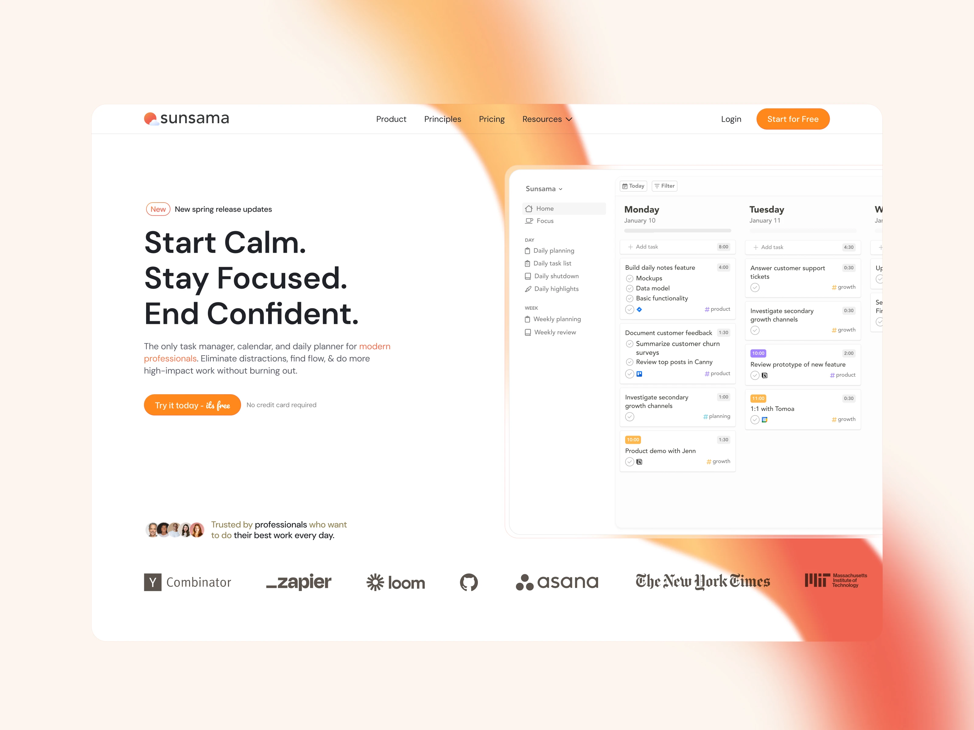
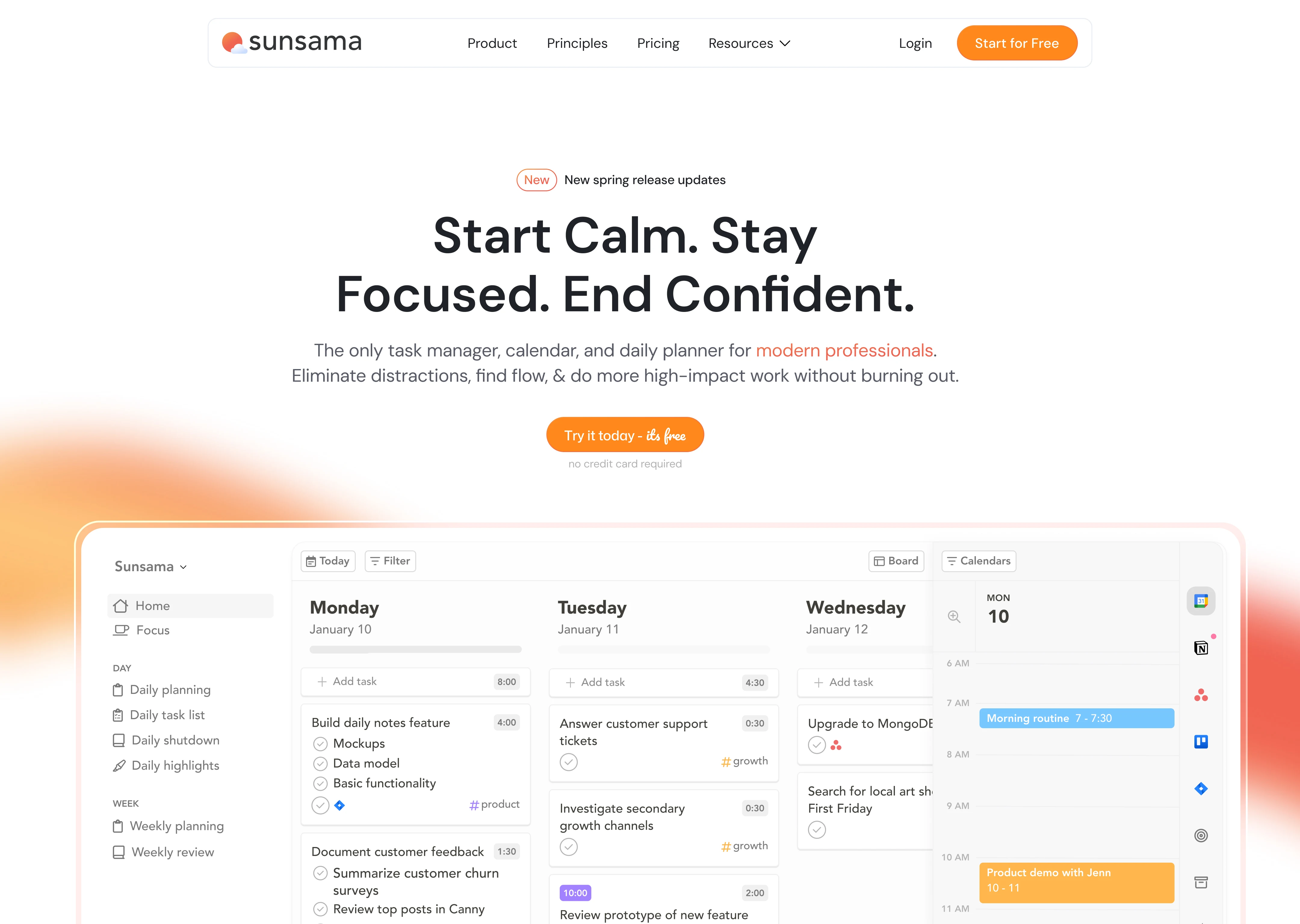
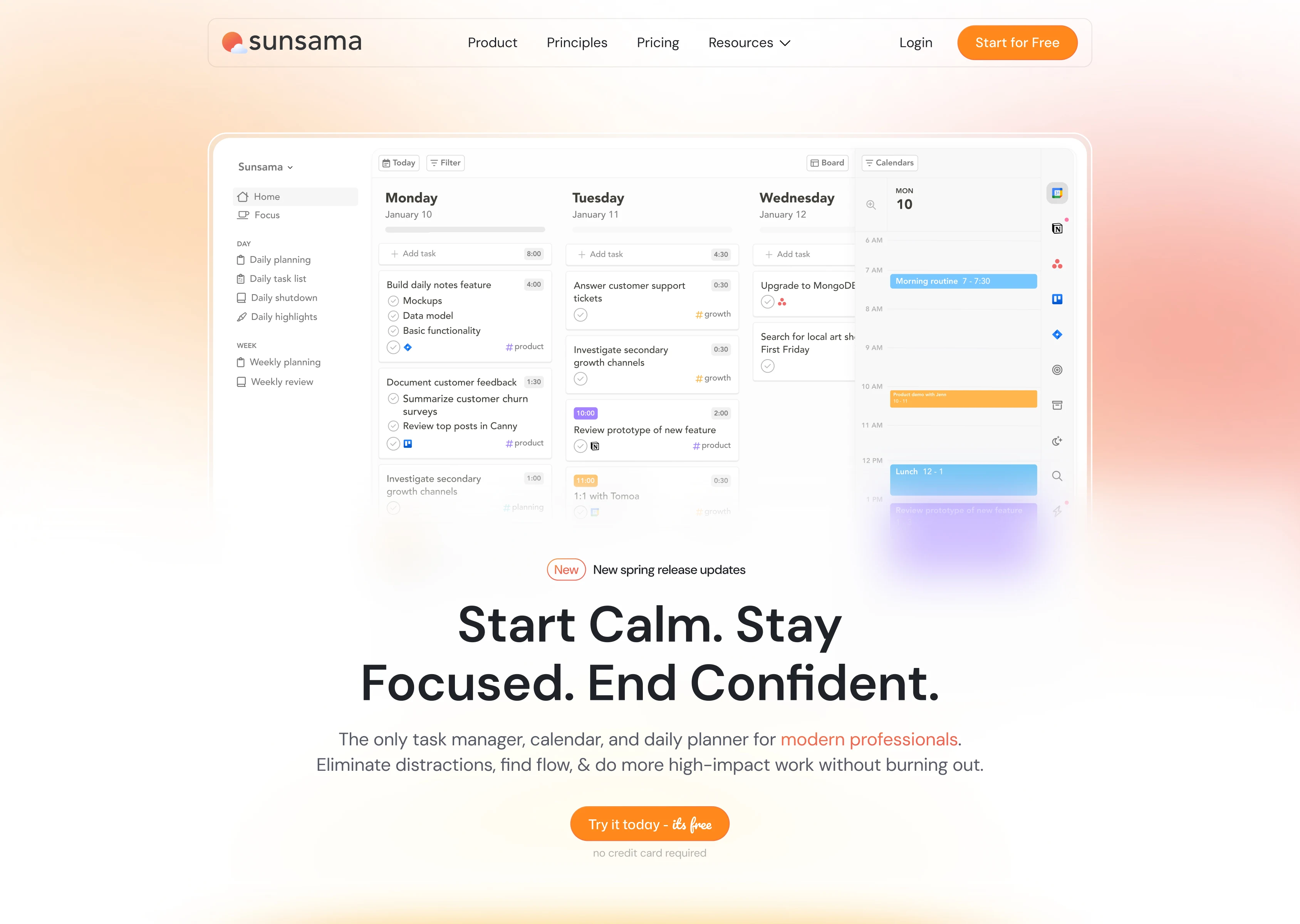
The opening pairs "Start Calm. Stay Focused. End Confident." with a screenshot of the daily planner. Visitors can see the tasks and calendar together before reading the feature details.
We used warm whites, soft neutrals and orange accents. The layout gives each explanation space beside the product imagery.
More options.jpg
Organise the page around the working day
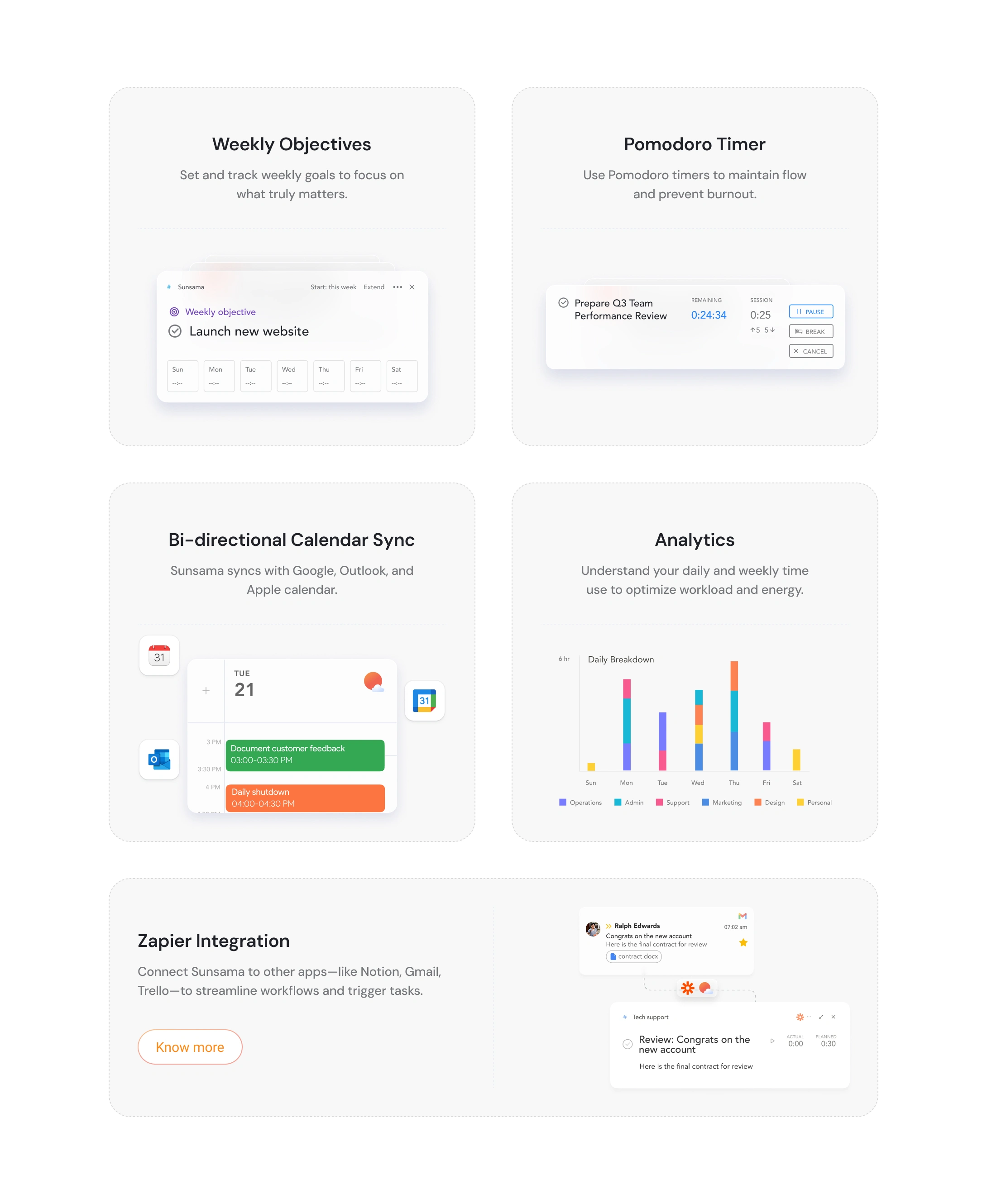
We grouped the product explanations around morning planning, focus during work and the end-of-day review. Each section shows the relevant part of the app rather than one full screenshot for every feature.
The page also explains how Sunsama connects to calendars, task managers and messaging tools. Grouping integrations by category helps visitors check whether their existing tools are supported.
Sansama 2.jpg
Give visitors reasons to try it
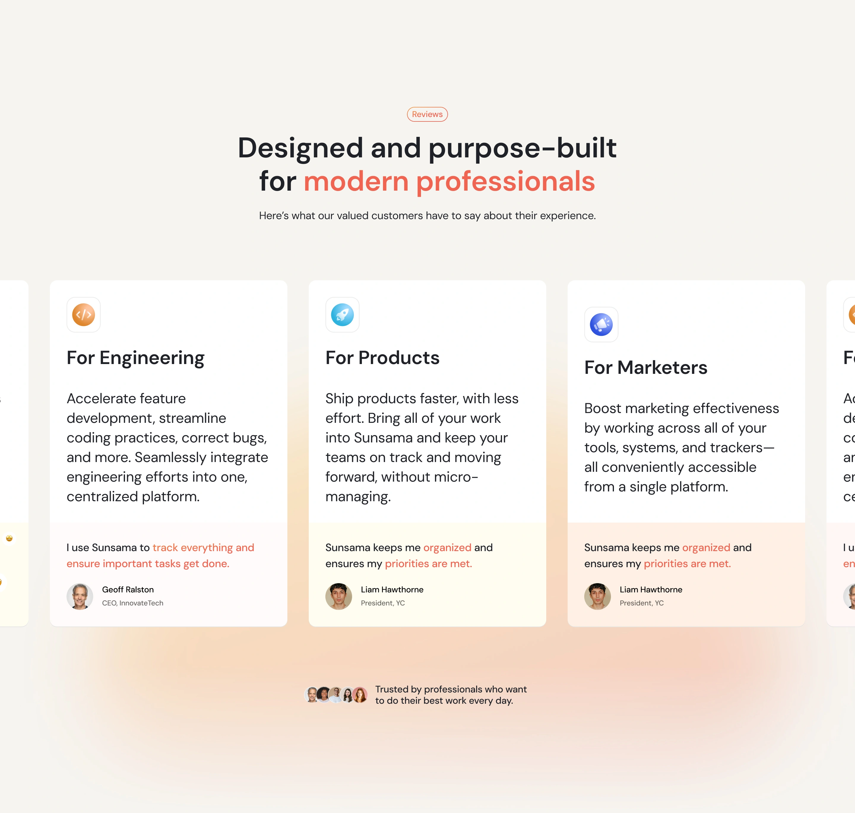
Customer testimonials, publication recognition and a product comparison support the explanations. Trial calls to action appear at several points in the page, alongside the trial terms.
We kept scroll reveals and hover states restrained to suit the visual direction.
Reviews.jpg
What we delivered
We delivered the marketing website in Webflow, with responsive layouts, product and integration sections, a comparison section and interactions. The design work and system were created in Figma.
Need a website for your SaaS product? Send us your current site, the pages you need and your target launch date on Contra.
Like this project
Posted May 18, 2026
We designed Sunsama's marketing website in Figma and built it in Webflow. The work covered page layouts, interactions and responsive design.
Likes
1
Views
78
Timeline
May 20, 2025 - Sep 22, 2025
Clients
Sunsama