Bewy - Property Management Rebrand

Aleksandar Coric


Bewy - Property Management Rebrand
2025
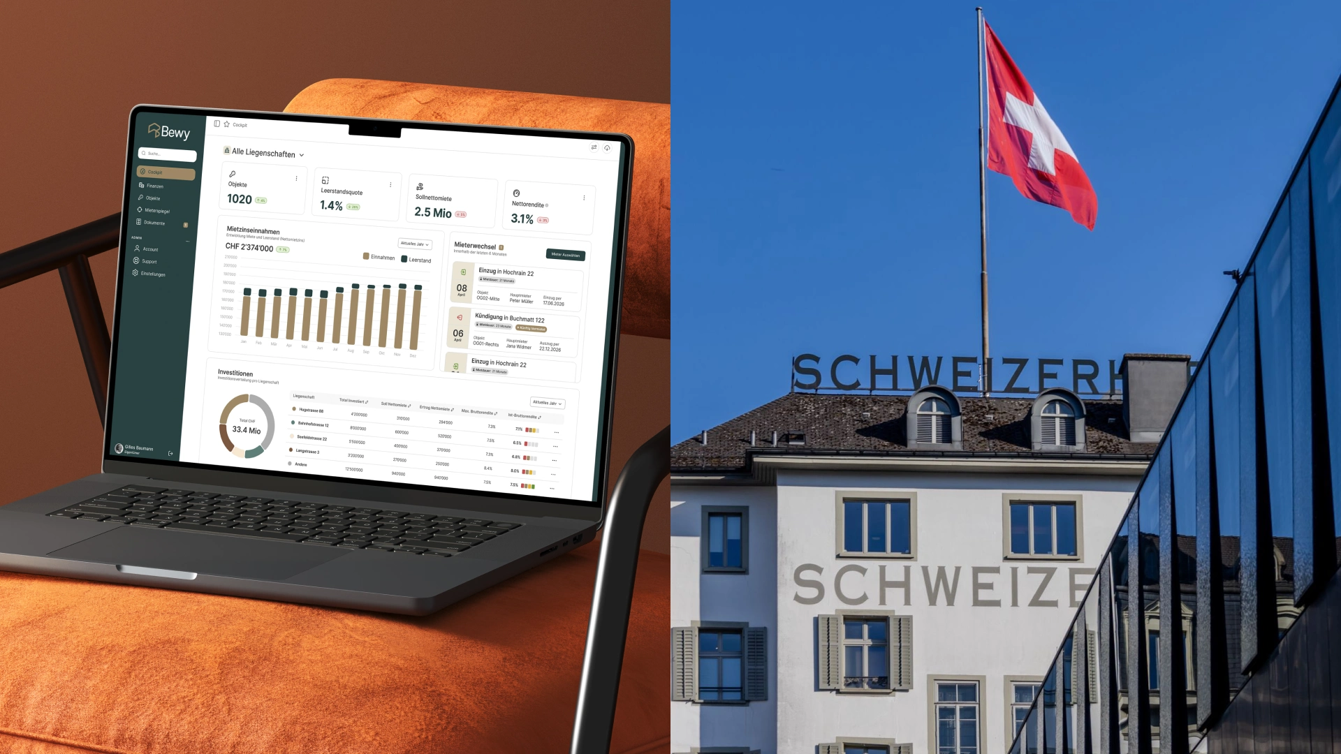
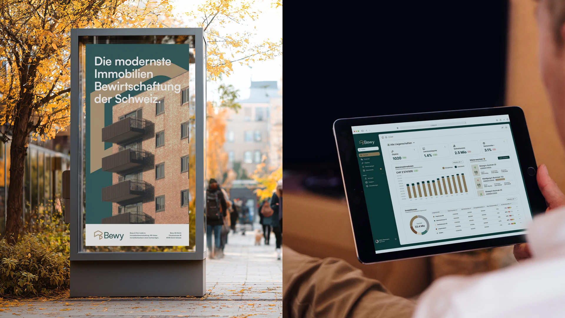
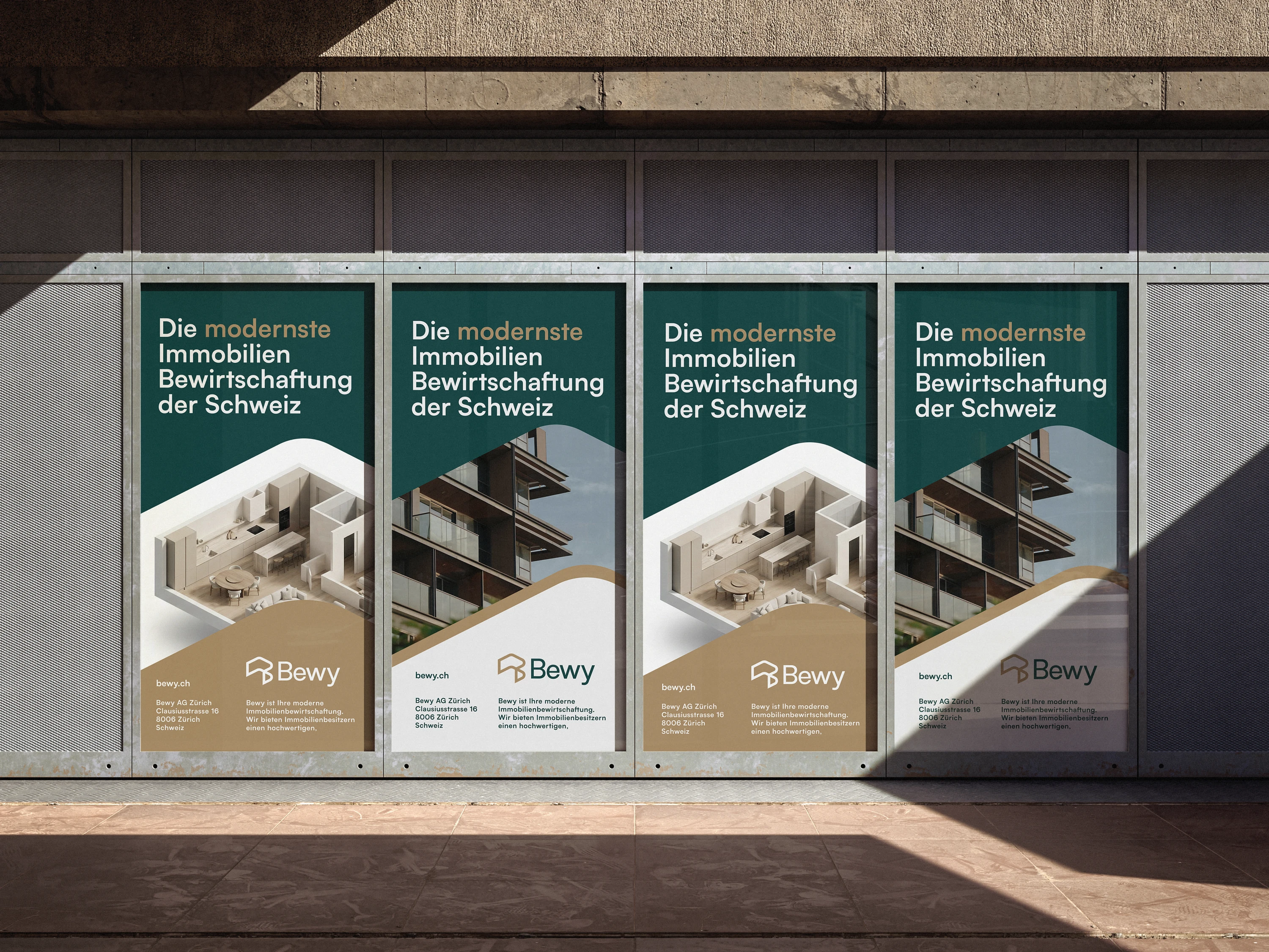
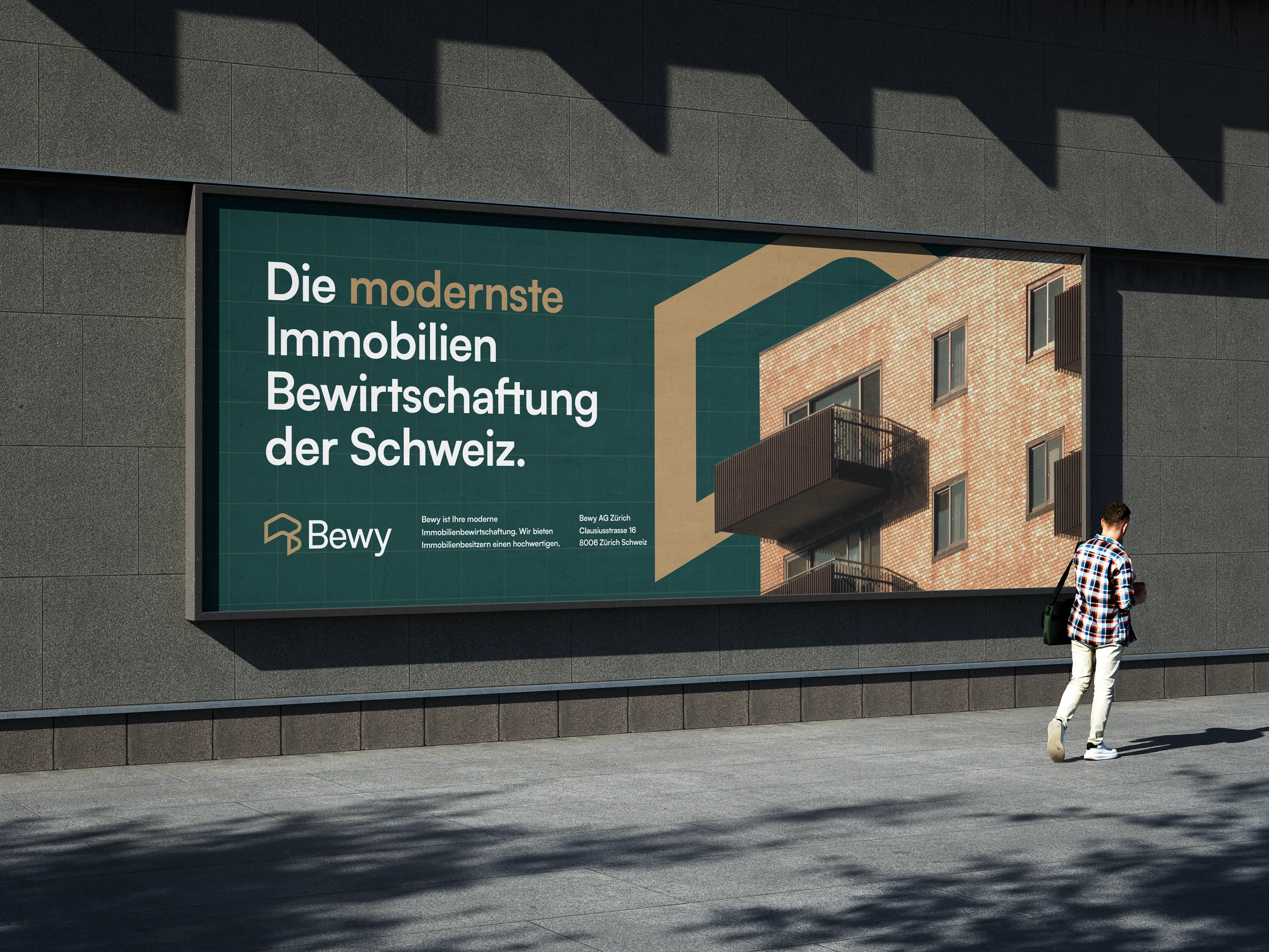
Bewy is modern property management partner. They offer property owners a high-quality, reliable service – personal, proactive, and efficient. With sound expertise and supported by digital tools, they ensure that the property is managed professionally and with a focus on the future.
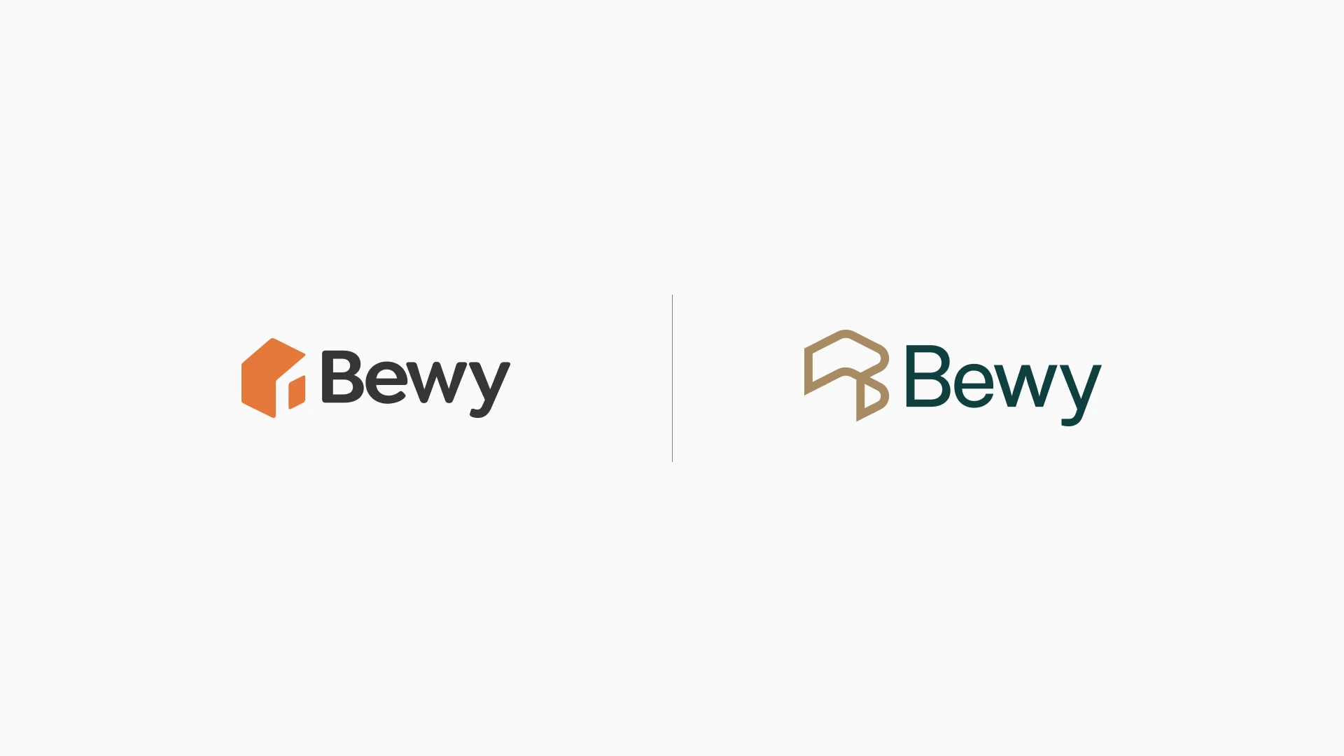
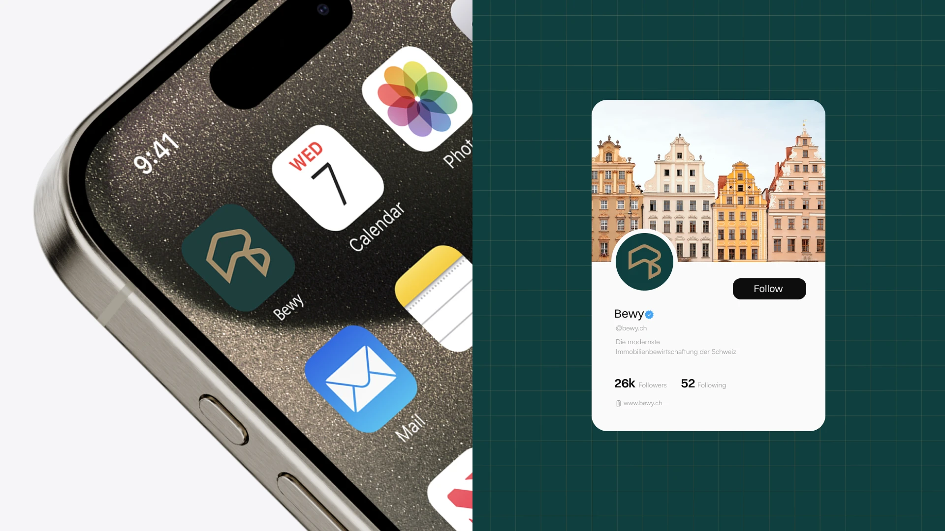
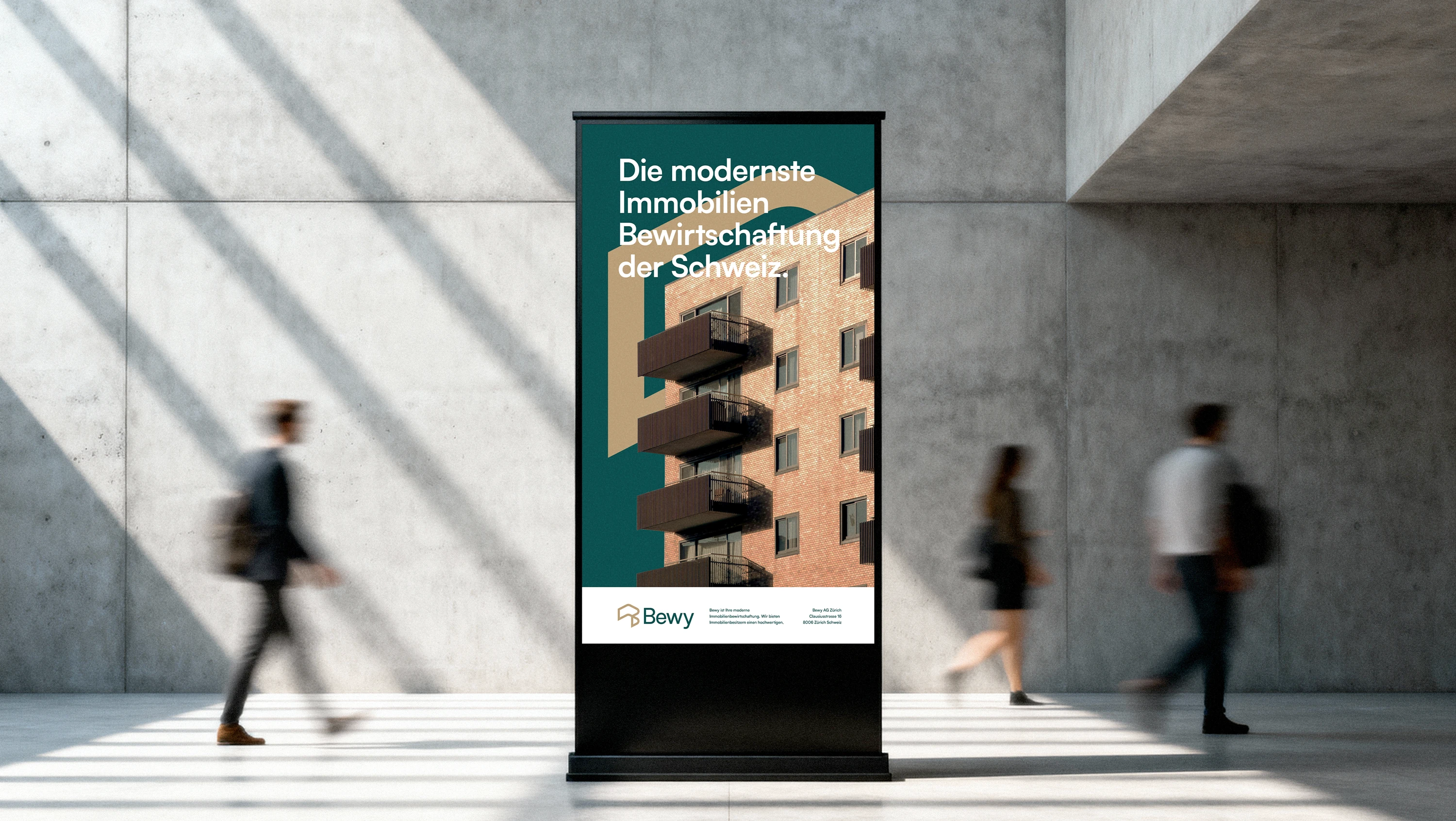
The startup initially launched with a distinct visual identity, but before product launch and investor discussions, it became clear that it no longer reflected the company’s values and ambitions. A refined visual identity was therefore developed through a new symbol and updated typography.
The previous logo felt overly literal, unbalanced, and inconsistent, while its color palette suggested a low-cost rather than premium brand. A redesign was needed to better communicate credibility, quality, and long-term growth.

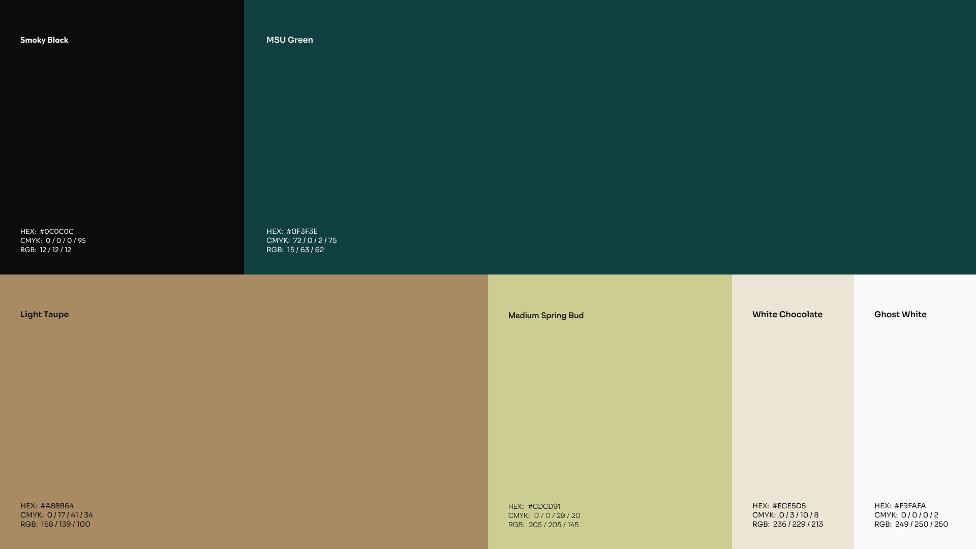
Color Palette
The previous color palette did not align with the brand story, conveying a low-cost rather than premium perception. A new palette centered on dark blue and dark green was introduced to express trust, stability, and sophistication, supported by complementary accent colors for a balanced visual system.
Font
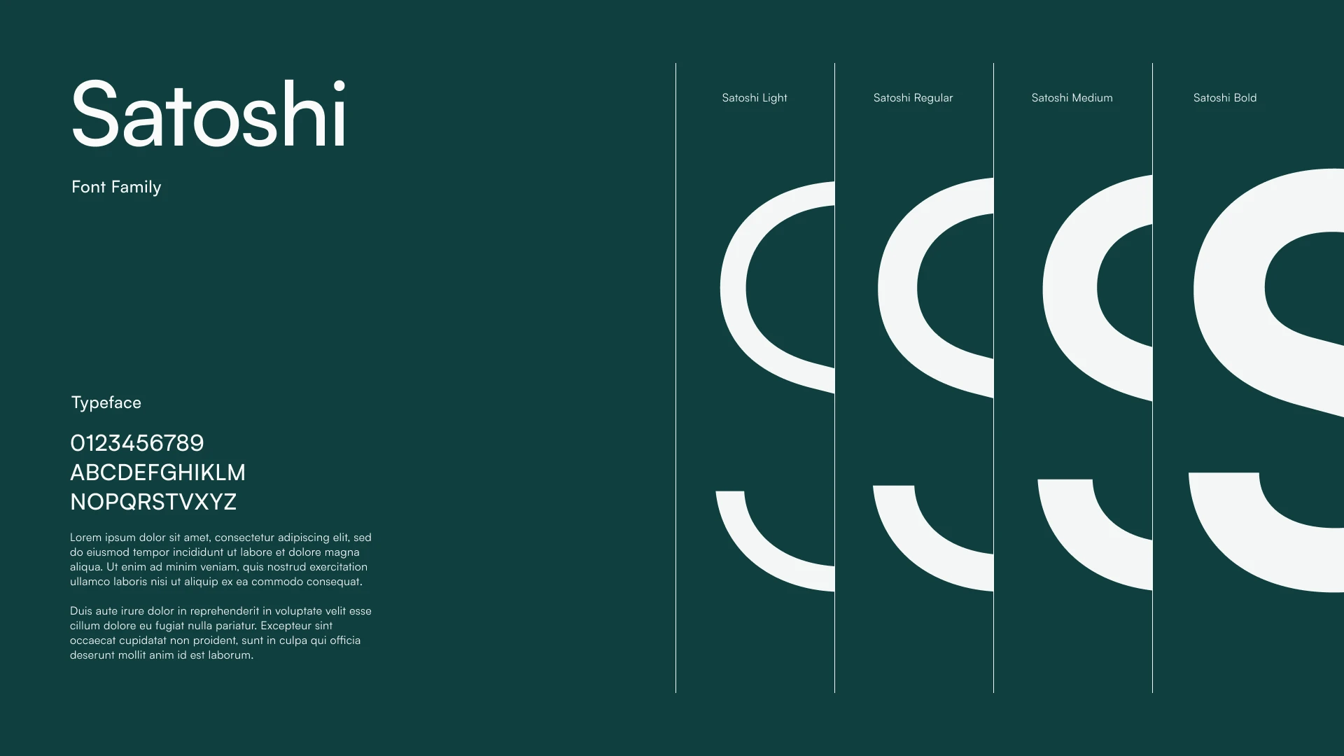
The rounded typeface felt too playful for the brand’s intended positioning. A more refined typeface was selected to communicate professionalism and work effectively both with and without the logo symbol, while maintaining an elegant, approachable, and timeless character.
The New Identity
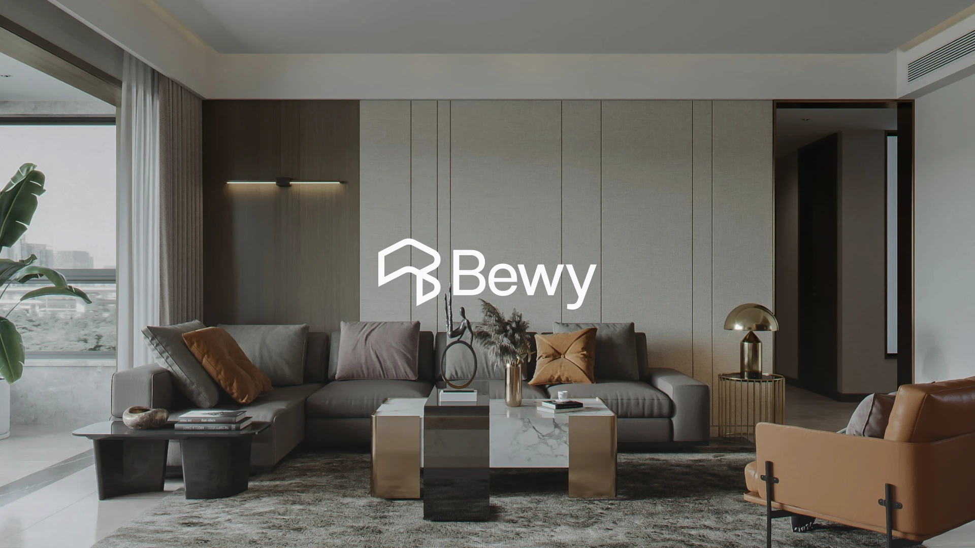
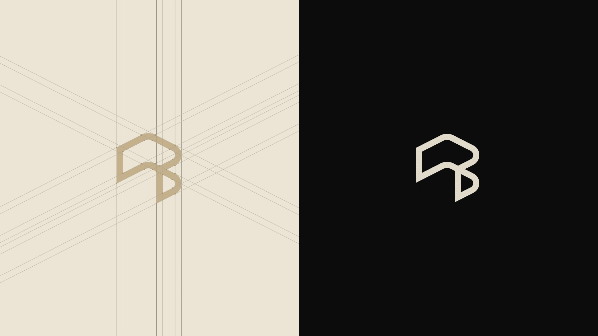
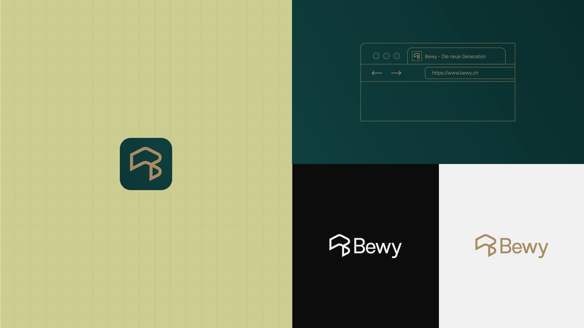
The redesigned Bewy identity is built around a simple yet distinctive idea: space, progress, and the letter B. At the heart of the identity is an abstract symbol representing a space or room, a fundamental element closely connected to Bewy’s purpose and the environments it operates within. At the same time, the geometry of the symbol subtly forms the letter B, creating a direct visual connection to the brand name without relying on a literal typographic interpretation.
The symbol is intentionally oriented toward the upper-right corner, introducing a sense of movement and direction. This subtle gesture represents progress, development, growth, and moving forward, giving the mark a dynamic quality while keeping its overall form simple and stable.
The result is a symbol that works on multiple levels: it can be read as a space, a structural form, or the initial of Bewy. This duality makes the identity both conceptual and immediately recognizable,
while allowing it to remain flexible across different applications and scales.

BETTER PROPERTIES DESERVE BETTER EXPERIENCES.
LET'S BRING YOUR VISION TO LIFE.
Like this project
Posted Oct 16, 2026
Bewy Property Management Rebrand The goal of this project is to visually and strategically position the Bewy brand so that it is perceived as the modern, digital, and service-oriented alternative to traditional property management. The rebranding aims to clearly communicate the values of innovation, transparency, efficiency, humanity, and responsibility, and to establish Bewy as an industry leader in the region. The brand should convey a fresh, professional, yet approachable image that builds trust with investors and owners while simultaneously offering a positive experience for tenants.