Built with Webflow

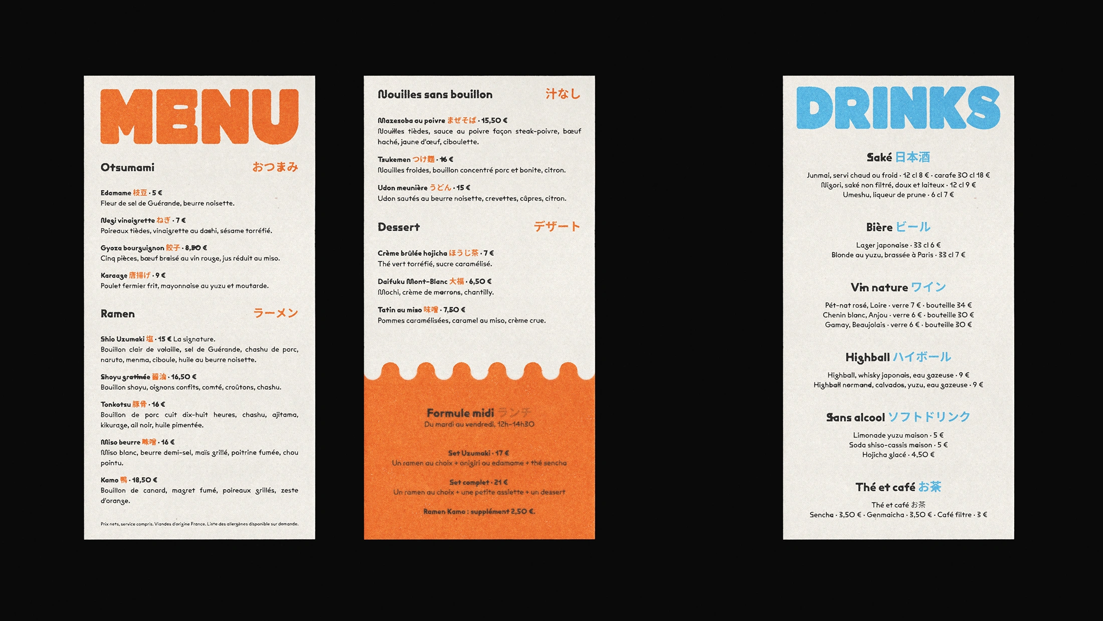
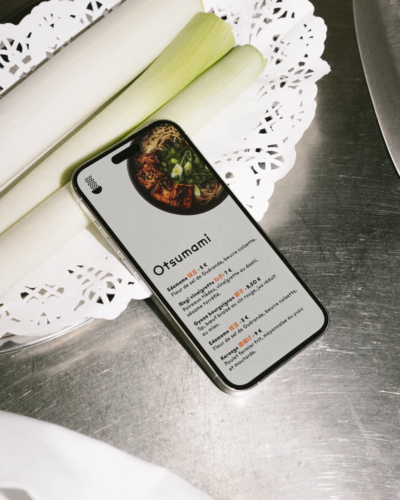
On Uzumaki's menu, the gyoza go bourguignon, the shoyu is gratinéed with Comté and the miso is finished with salted butter. The restaurant sees itself as a modern Franco-Japanese bistro.
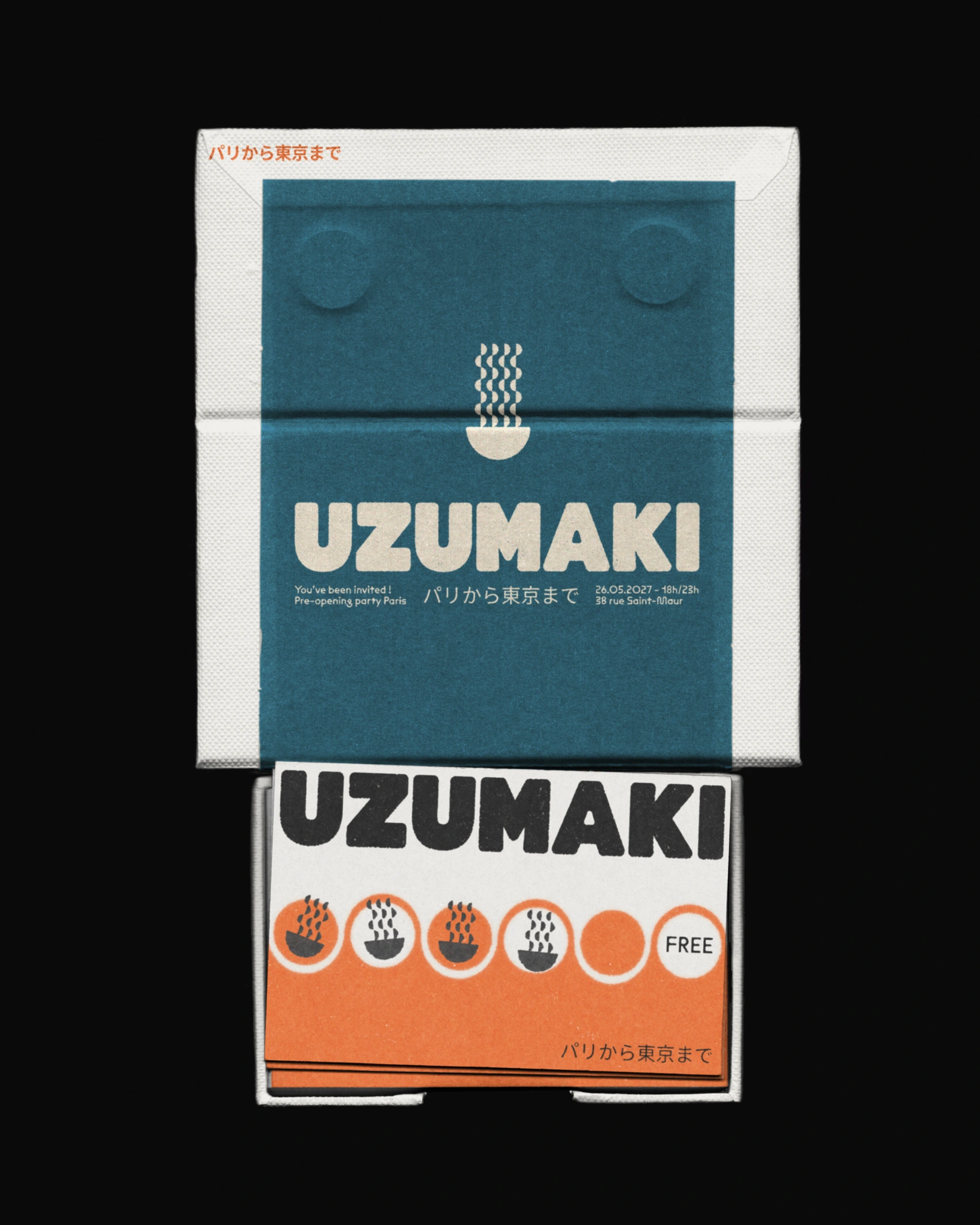
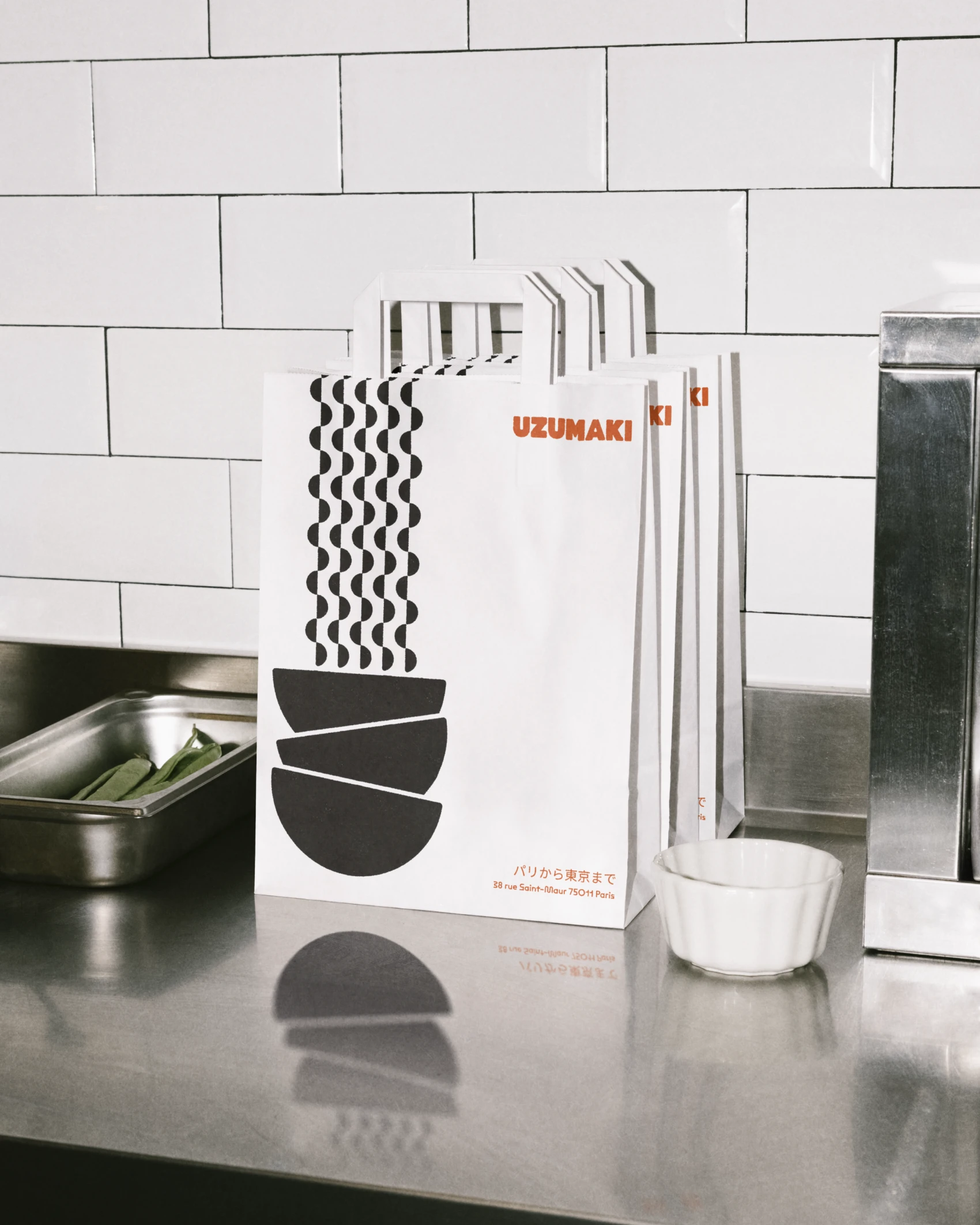
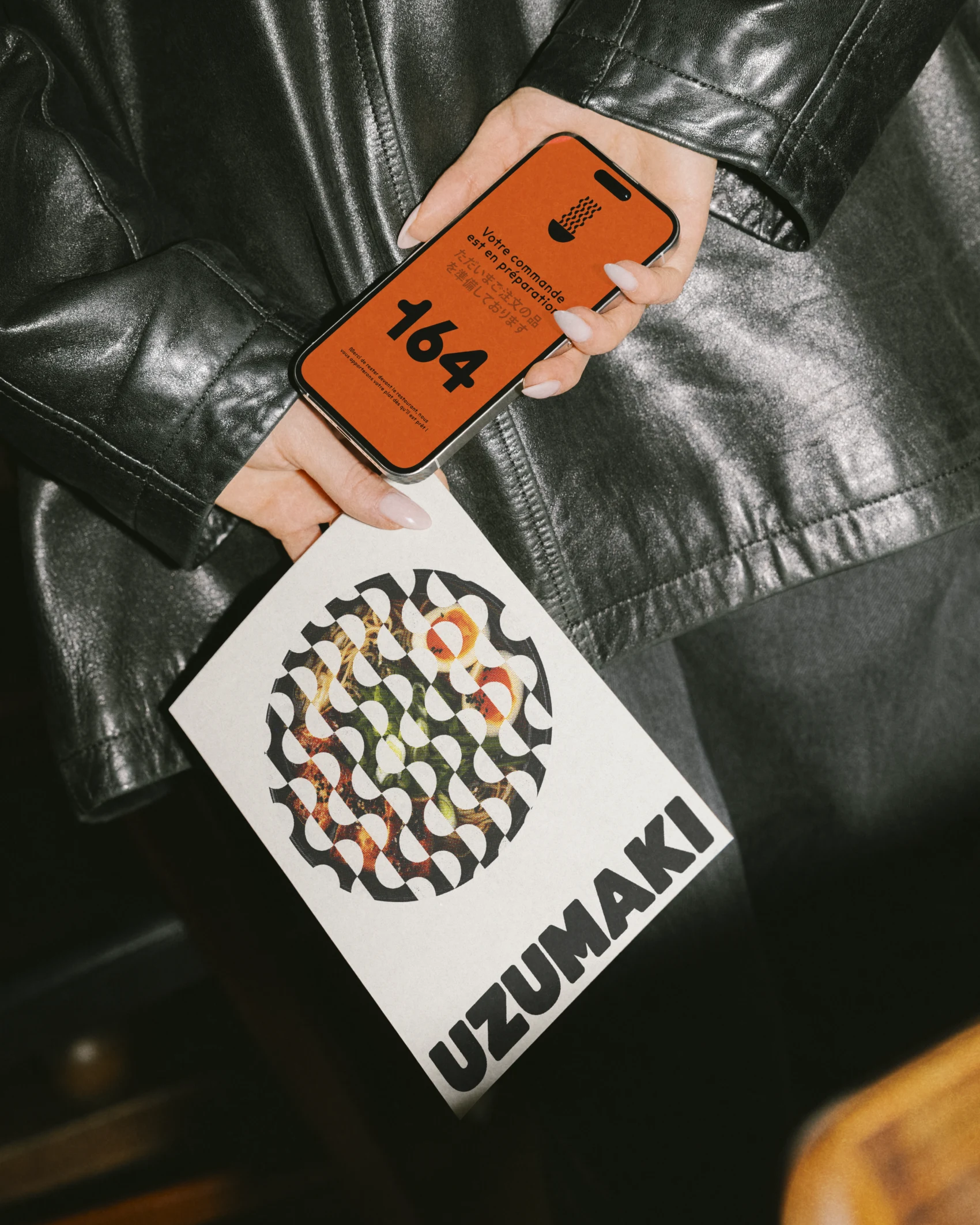
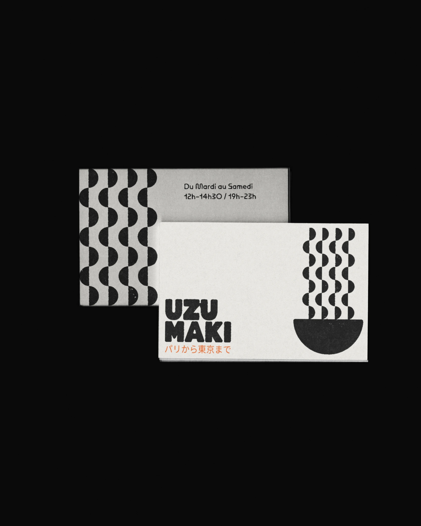
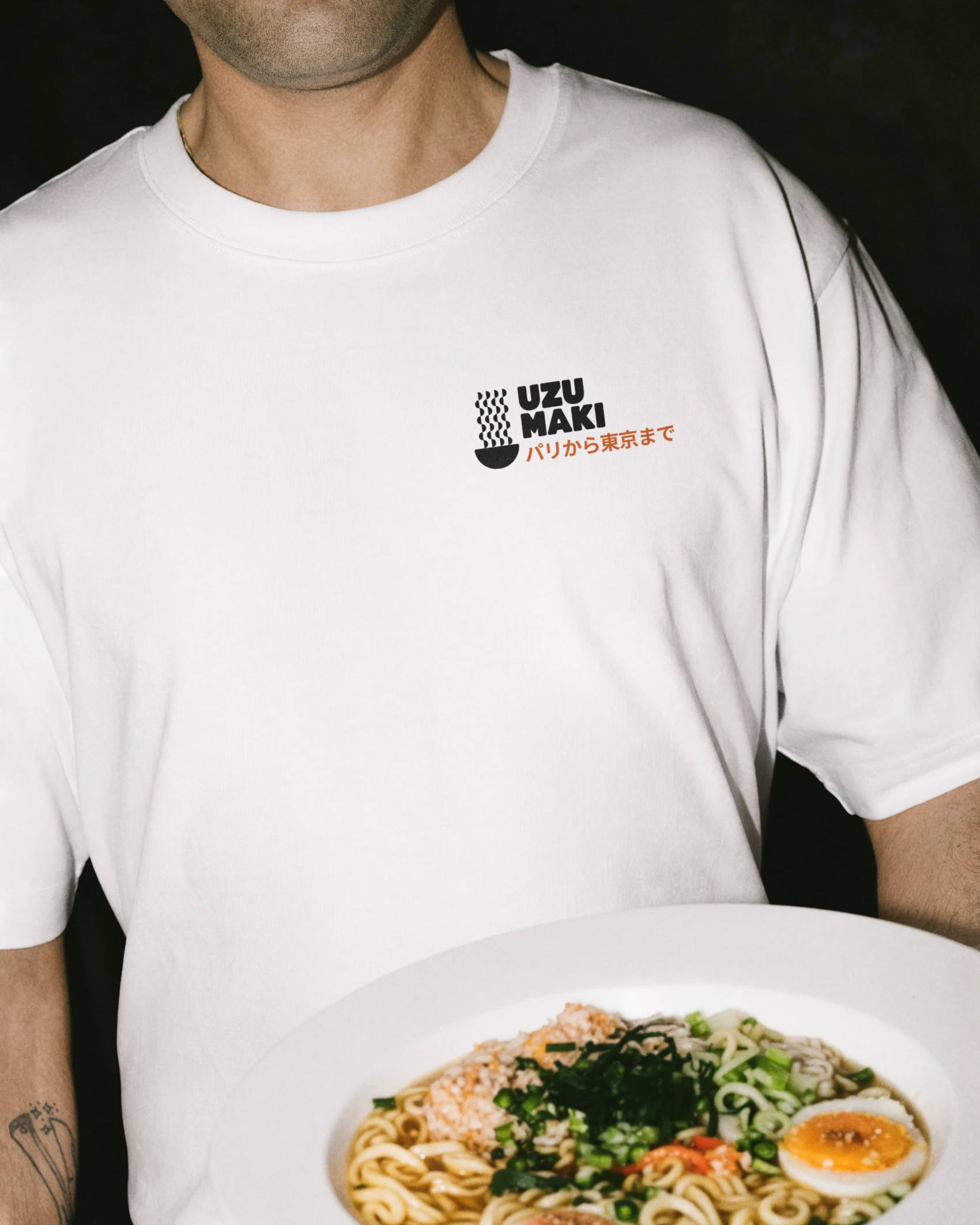
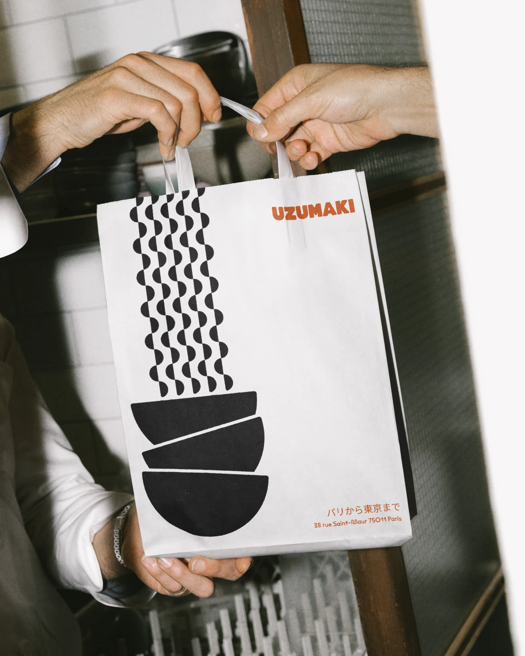
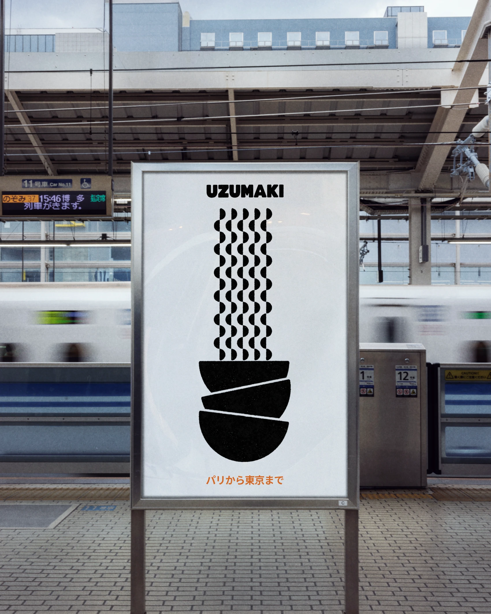
The task was to bring Japanese codes into the identity without falling into the traditional izakaya. We set aside the lanterns, the red and black, the brush calligraphy. Japanese is still there, but small: the signature パリから東京まで, "from Paris to Tokyo", sits alongside the logo on the bags, the cards and the poster.
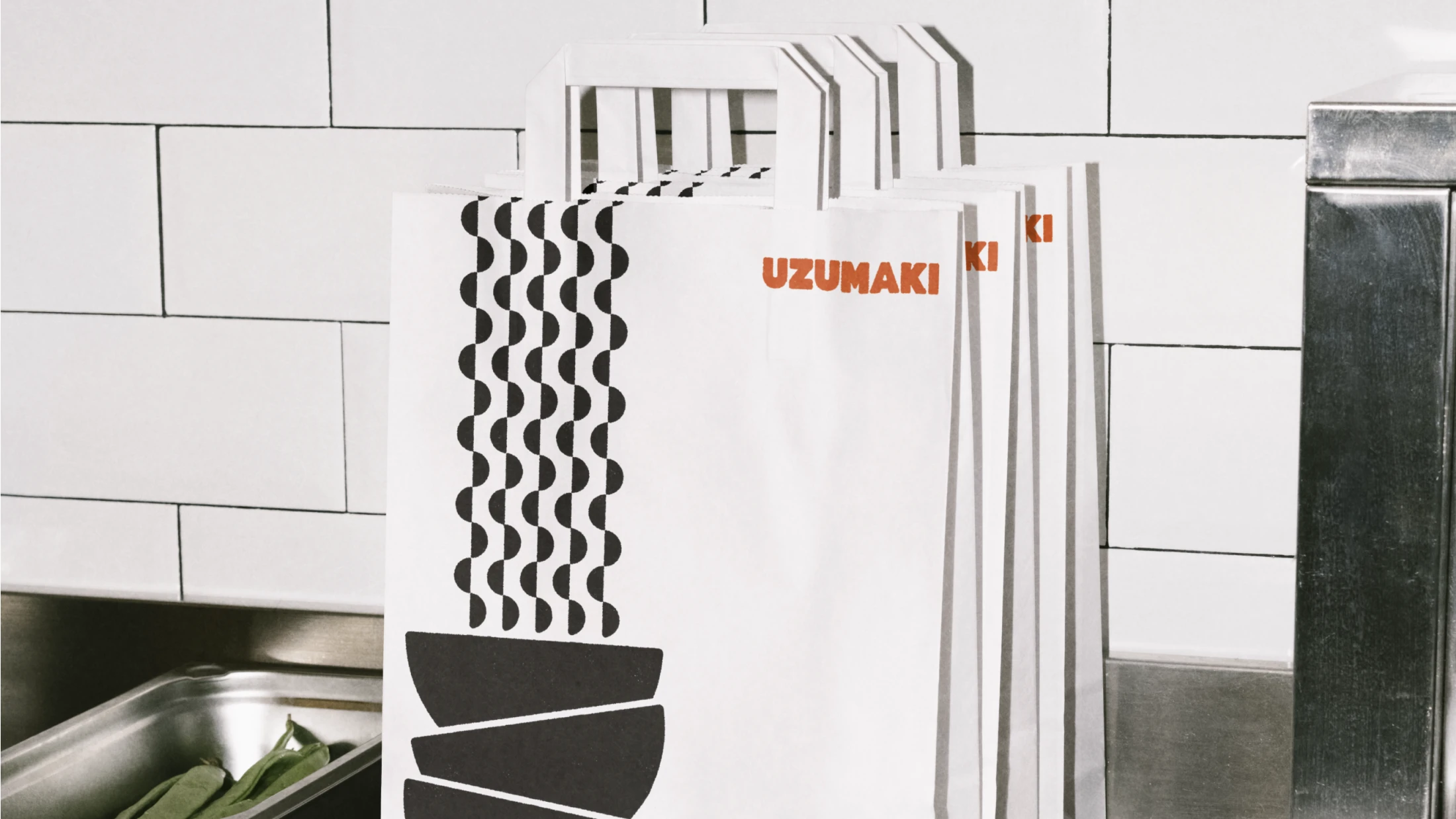
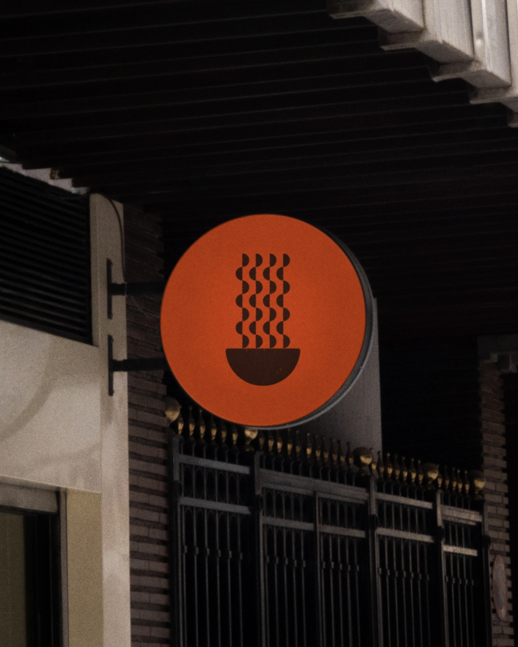
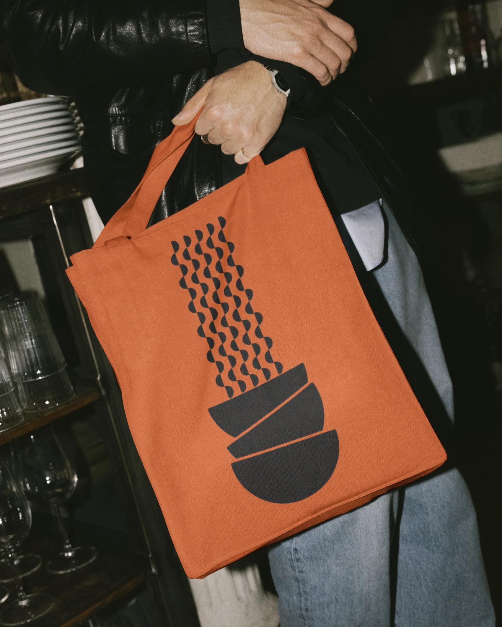
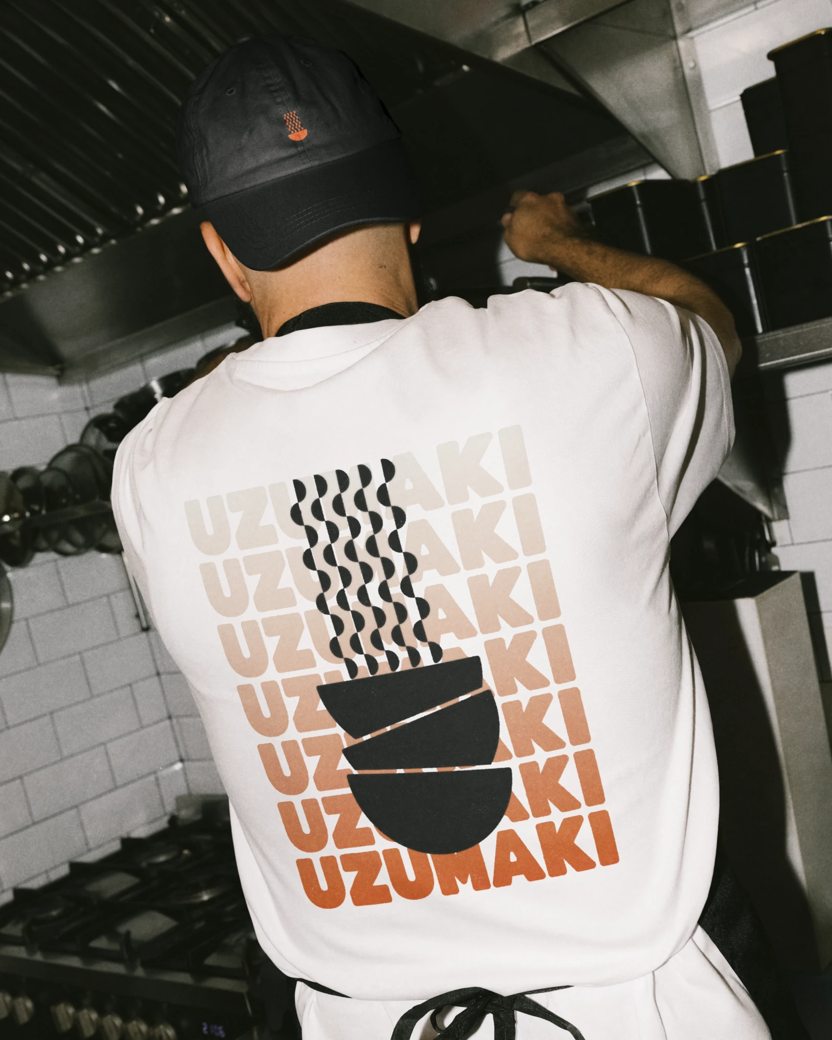
The symbol is made of half-circles only, assembled into a bowl with noodles rising out of it. Simple enough to work as a stamp, it fills the loyalty card: five stamped bowls, and the next one is free. Vectorised, the noodles become a pattern that runs across the bags, the backs of the business cards and the T-shirts. The logotype, very bold, is set in BD Caramel for impact and a pop tone. ABC Maxi Round takes over for headings and body text. Some of its capitals ripple like a noodle.
The brand stays almost monochrome: Burning Orange leads, with Pampas and black for the rest. Deepsky Blue serves as an accent, kept for the invitation cards and the drinks menu.
Client : Uzumaki
Services : [Branding]
Team & Credits : Lucas Vigneu (brand design, visual direction, mockups)
2 likes · 111 views · Feb 6, 2024
Uzumaki is a brand identity concept, developed from a client brief, for a Parisian ramen restaurant that brings together Japanese noodles and French cooking.


