Holy Sh!t Hot Sauce — Brand Identity & Digital

Lee Allan


Speculative Brand Identity & Digital Experience
Overview
Most hot sauce brands compete by shouting louder. Flames. Explosions. Extreme heat. Generic skulls.
Holy Sh!t takes a different approach.
Rather than selling pain, the brand celebrates the unforgettable moment after the first bite: the split second where someone's face says exactly what everyone is thinking.
Holy Sh!t.
The identity transforms a common expression into a memorable food brand that's bold, playful and impossible to ignore.
The Challenge
Create a hot sauce brand capable of standing beside category leaders like Hot Ones, Yellowbird, Melinda's and Torchbearer while feeling instantly recognizable on shelf and across digital.
The brand needed to:
Stand out without relying on cliché fire graphics
Feel premium but humorous
Support multiple flavor extensions
Create a memorable digital experience
Become highly shareable on social media
The Idea
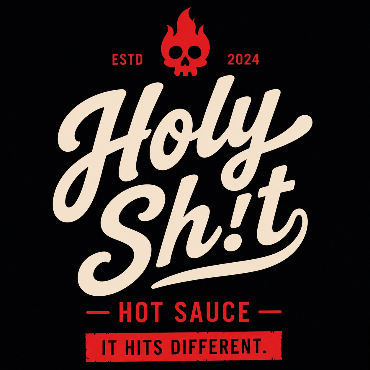
IT HITS DIFFERENT.
Instead of talking about Scoville units, Holy Sh!t focuses on the emotional reaction. Every bottle promises the same thing: a meal transformed from ordinary into unforgettable.
The identity is built around confidence, attitude and bold typography that feels more like a streetwear brand than a traditional condiment company.
Brand Identity
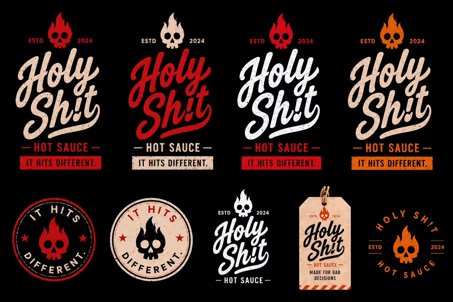
At the heart of the identity is a custom script wordmark paired with a flaming skull icon. The exclamation mark replaces the "i" in Sh!t, turning the profanity into a distinctive visual signature while reinforcing the brand's personality.
The visual language combines:
Vintage Americana packaging
Tattoo culture
Craft beer branding
Screen-printed textures
Bold editorial typography
The result is a brand that feels handcrafted rather than manufactured.
Brand Identity
Packaging Detail
Packaging System
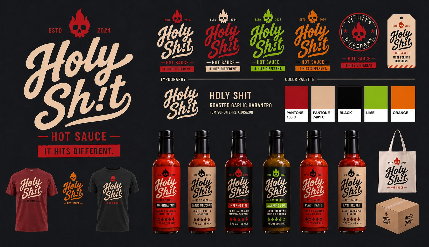
The packaging was designed as a scalable flavor architecture. Each variety shares the same label structure while using bold accent colors for immediate recognition.
Original Sin
Garlic Meltdown
Inferno Fire
Jalapeño Lime
Peach Panic
Last Regret
The consistent system creates instant shelf impact while making future flavor launches effortless.

Packaging System
Flavor Range
Digital Experience
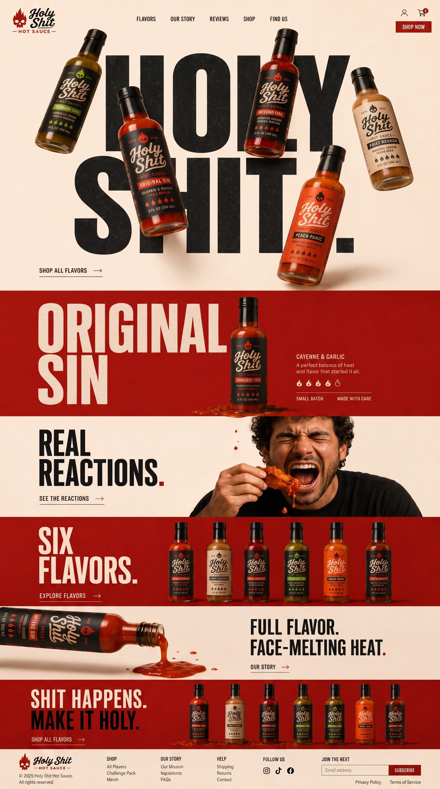
The website was designed as an immersive scrolling experience rather than a traditional ecommerce page. Inspired by editorial layouts and modern beverage brands, oversized typography becomes part of the composition while floating bottles create depth through layered parallax movement.
As visitors scroll:
Bottles drift independently across the page
Flavor sections reveal themselves like magazine spreads
Bold typography slides behind products
Micro interactions reinforce the playful personality
Every section feels like a campaign poster rather than a product listing
The experience transforms shopping into entertainment.
Digital Experience
Website Detail
Photography
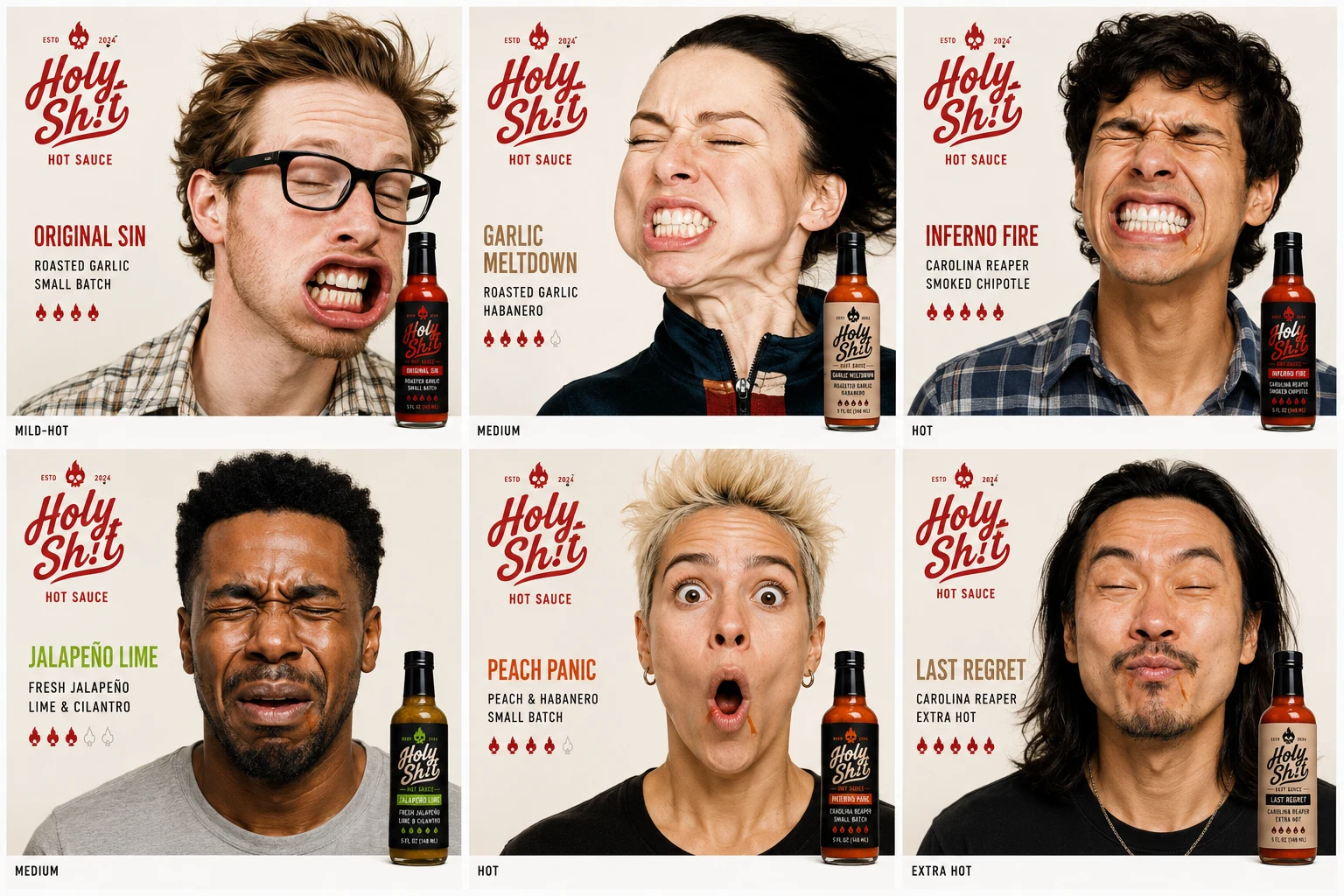
Instead of perfectly plated food photography, the campaign celebrates messy indulgence. Sauce drips. Hands get dirty. Expressions become exaggerated. Heat becomes visible.
Real reactions replace polished food styling, making every image feel energetic and authentic.
Verbal Identity
The brand voice is irreverent, self-aware and unapologetically confident.
IT HITS DIFFERENT.
MADE FOR BAD DECISIONS.
SH!T HAPPENS. MAKE IT HOLY.
ONE DROP. ZERO FILTER.
BOLD FLAVOR. NO BS.
Rather than describing ingredients, every line reinforces the brand's personality.
Motion System
Motion plays a central role in the digital experience. Floating bottles slowly rotate through 3D space. Oversized headlines animate independently from product imagery. Sauce drips naturally between sections, visually connecting the entire page.
Labels subtly catch the light as users scroll, giving every bottle a premium, tactile presence. The result feels closer to an interactive campaign than a conventional online store.
Motion Detail
Outcome
Holy Sh!t demonstrates how strong branding can elevate a familiar product category through personality rather than novelty.
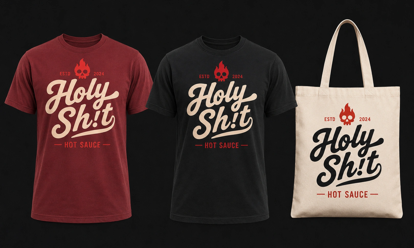
By combining distinctive typography, scalable packaging, expressive photography and an editorial digital experience, the brand becomes more than hot sauce: it becomes something people want to wear, share and remember.
The result is a cohesive identity system that feels equally at home on a bottle, a T-shirt, a social campaign or an immersive parallax website.
Like this project
Posted Jul 31, 2026
A speculative brand identity and digital experience for a hot sauce brand that replaces category clichés with streetwear attitude, scalable packaging, and an editorial web experience.