Brand Identity for Modo Mio

natalia moin fanner

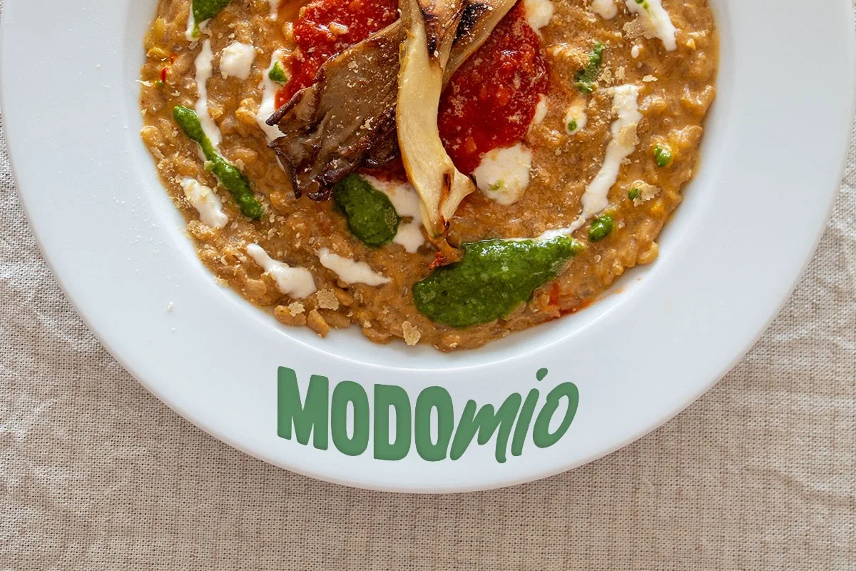
Brand Identity for a Plant-Based Dining Concept
Year : 2025/26
Industry : gastronomy
Client : Modo Mio
Bases: Milan, Italy
The concept
MODOmio is an itinerant plant-based dining experience built around "Mesa de Domingo", a slow, seasonal Sunday lunch format that brings together Italian culinary tradition and Argentine warmth. The experience travels: guests gather in private homes, agriturismos, and unique spaces, never the same place twice.
The design challenge
The brand needed to attract two very different audiences simultaneously: guests who want to attend, and hosts who want to offer their space. Each has a different emotional need. The visual identity had to speak to both without losing coherence.
Key decisions
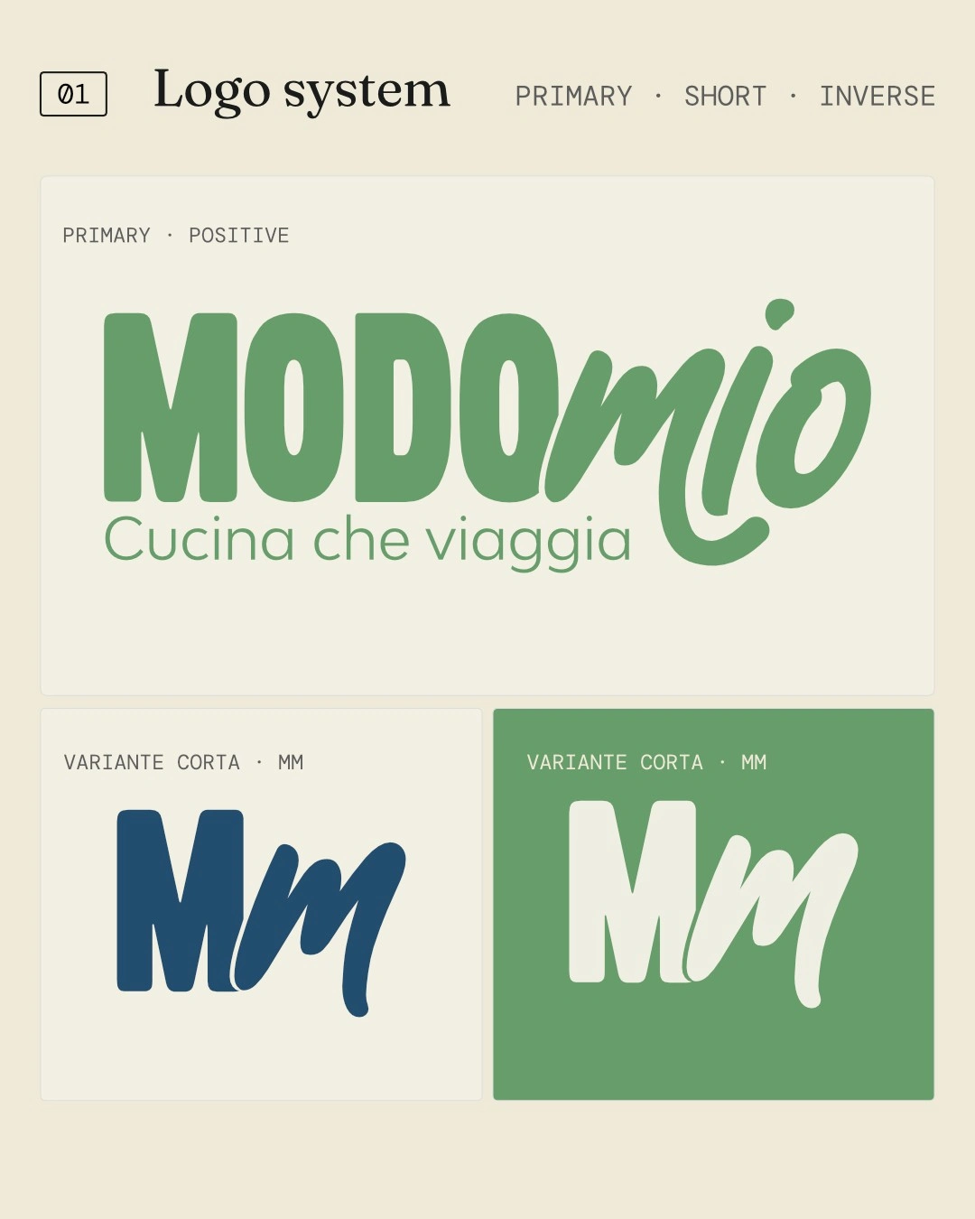
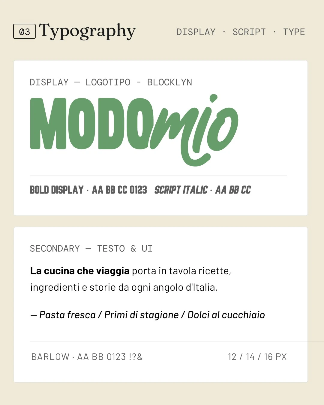
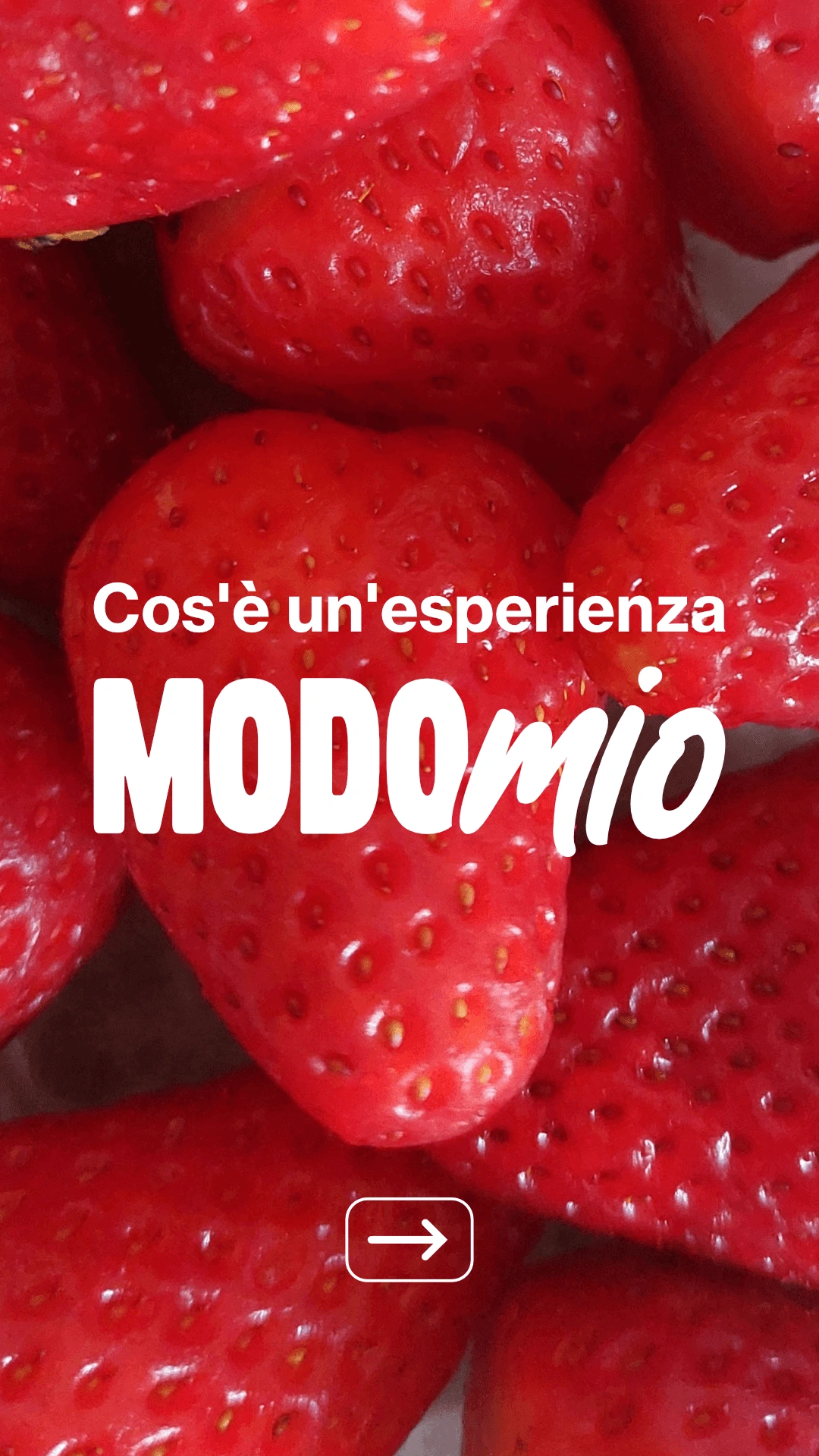
Logo: Bold condensed "MODO" paired with organic script "mio", a deliberate typographic tension. Structure meets warmth, precision meets spontaneity. The duality of the concept in one mark.
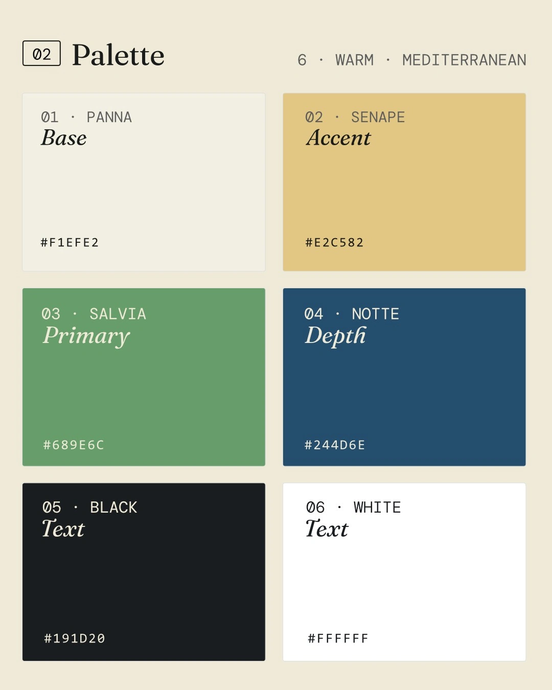
Color palette: Earth tones: gold, sage green, navy, near-black. Grounds the brand in food, nature, and intimacy without falling into generic plant-based clichés. Works equally on a printed flyer and on screen.
Slogan: Cucina che viaggia, three words that explain the entire format without describing it literally.
Web: Built in Framer around the two audiences, each with their own entry point and narrative flow. Hosts and guests land in different emotional territories within the same site.
Collateral: Outreach materials designed for direct venue prospecting, flyers taken in person to restaurants and spaces. Design that works at human scale, without a screen.
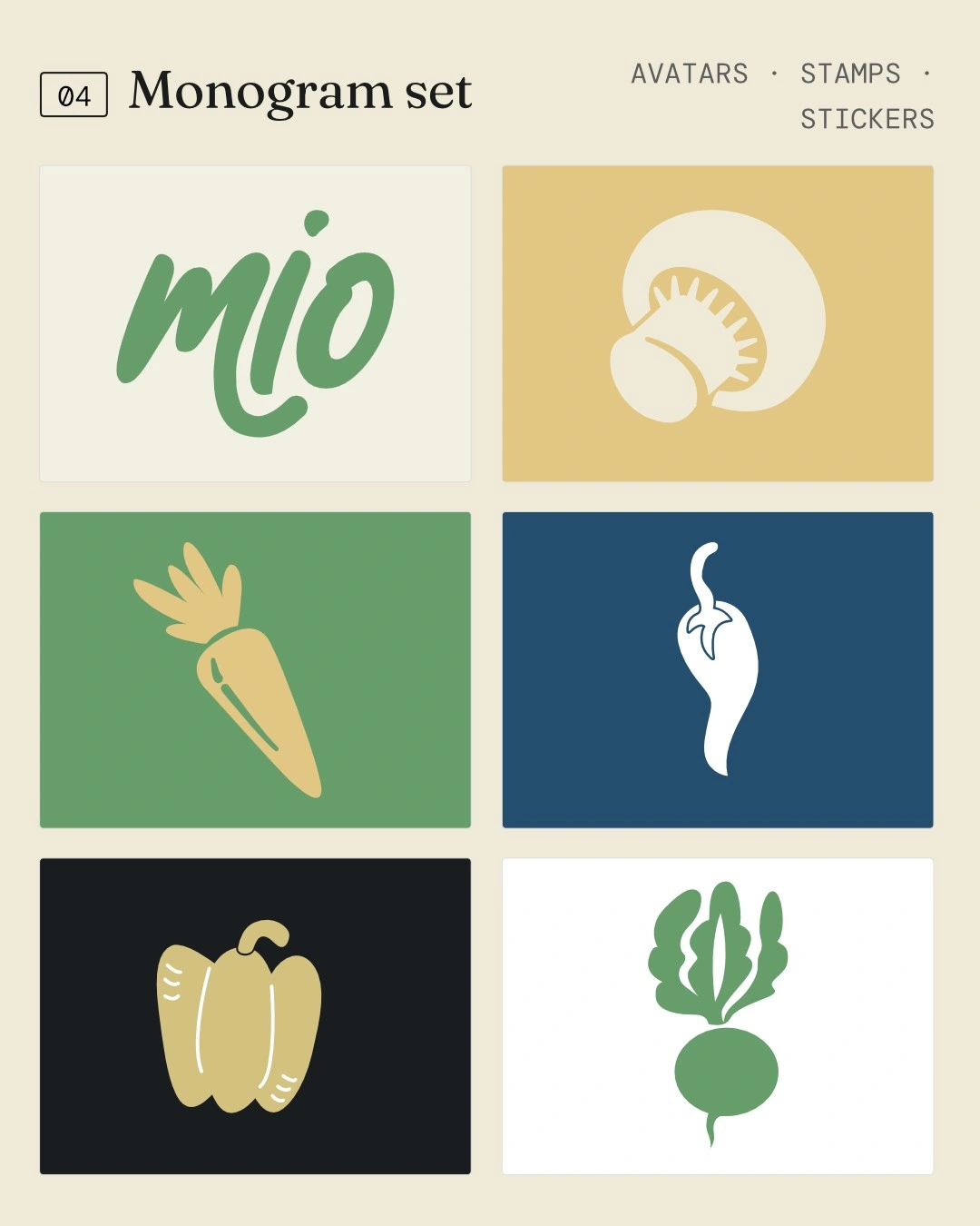
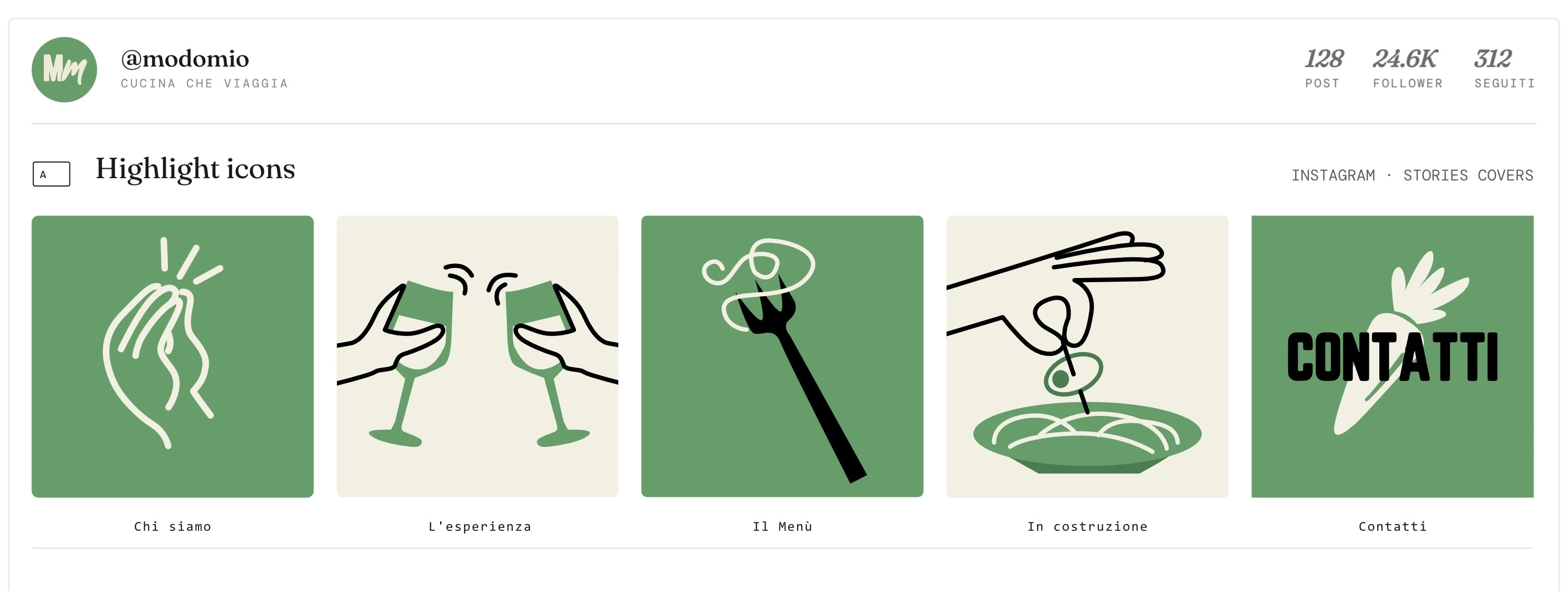
Illustration system: Custom hand-drawn style, hands, glasses, pasta, vegetables, giving the brand warmth and specificity that photography alone couldn't achieve.
Branding:
Website:
Illustration system:
Social Media
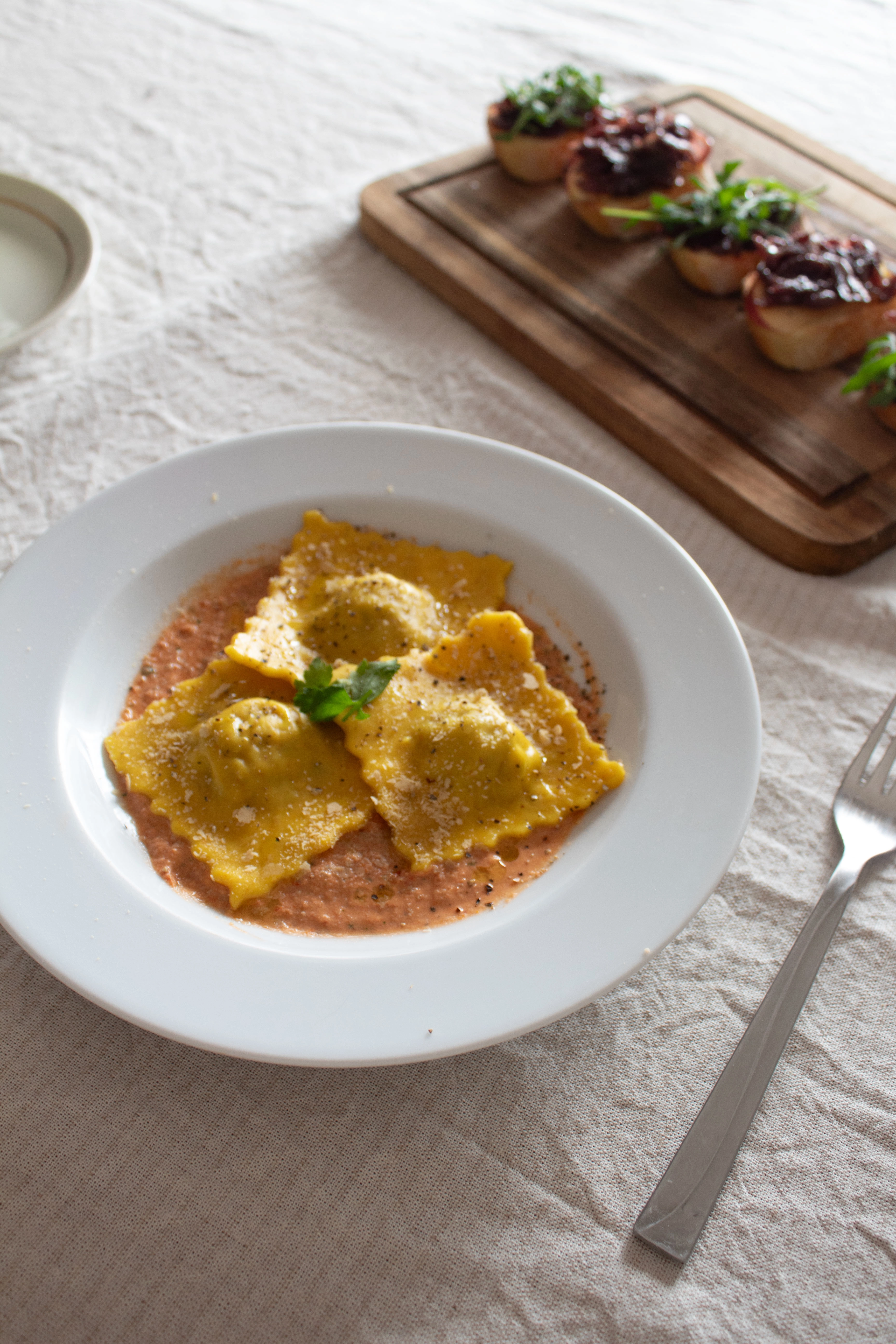
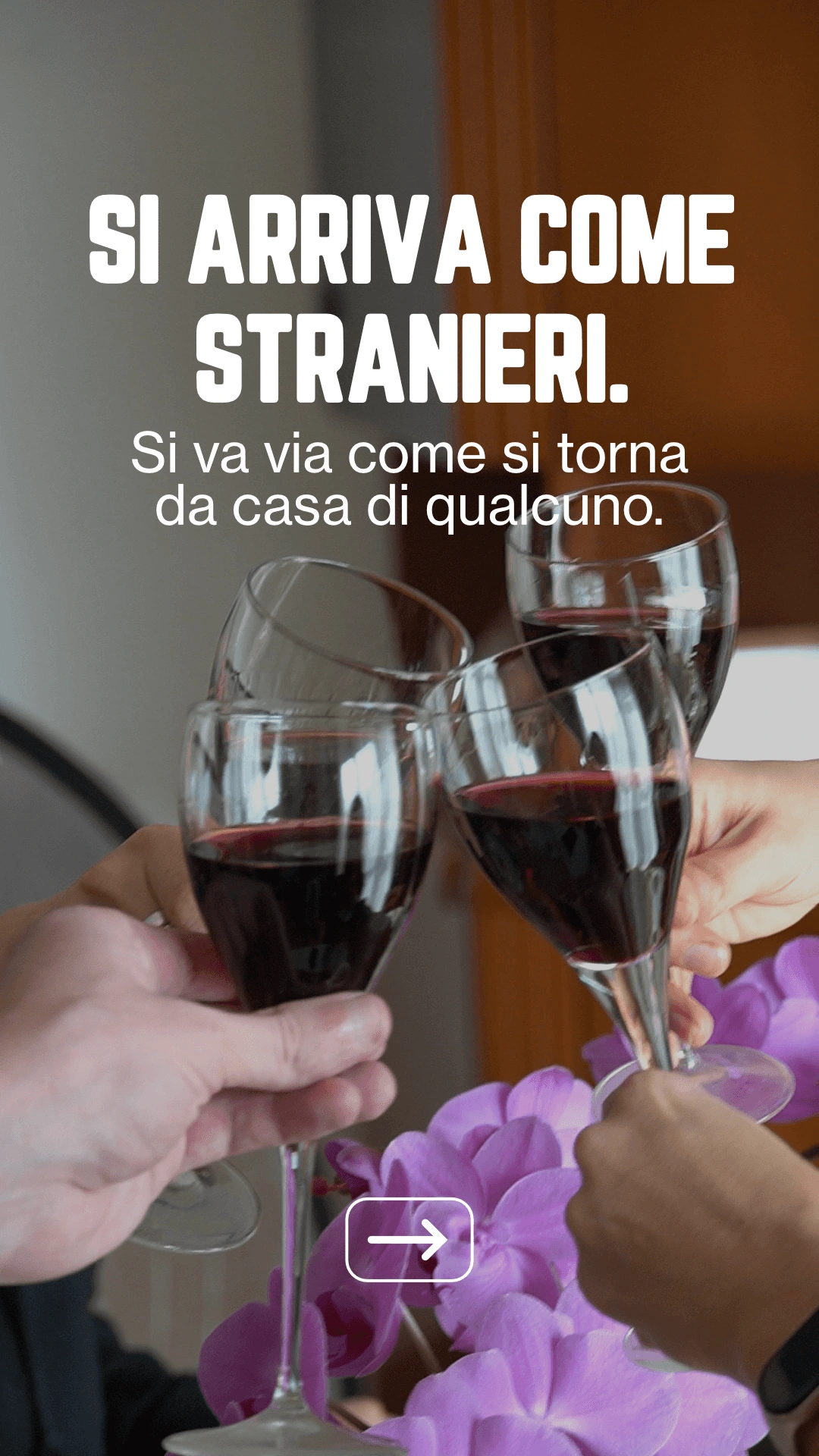
Stories
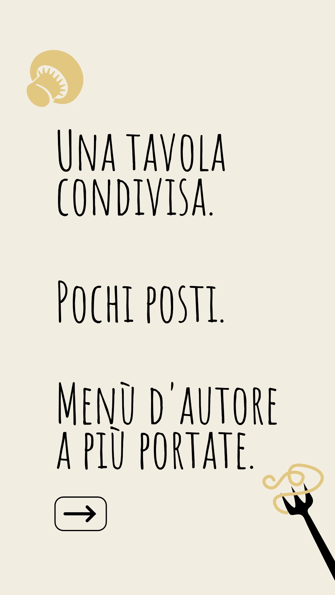
Result
Branding a concept that doesn't fit existing categories is the most interesting design problem there is. When there's no reference point, every decision has to justify itself from first principles. The test wasn't aesthetic, it was whether an avenue owner reading the flyer for the first time understood immediately what was being offered and wanted to be part of it.
Like this project
Posted May 20, 2026
Brand identity and design for a plant-based dining experience in Milan.