Rai Kai | Brand Identity Design
Rohan Barwal
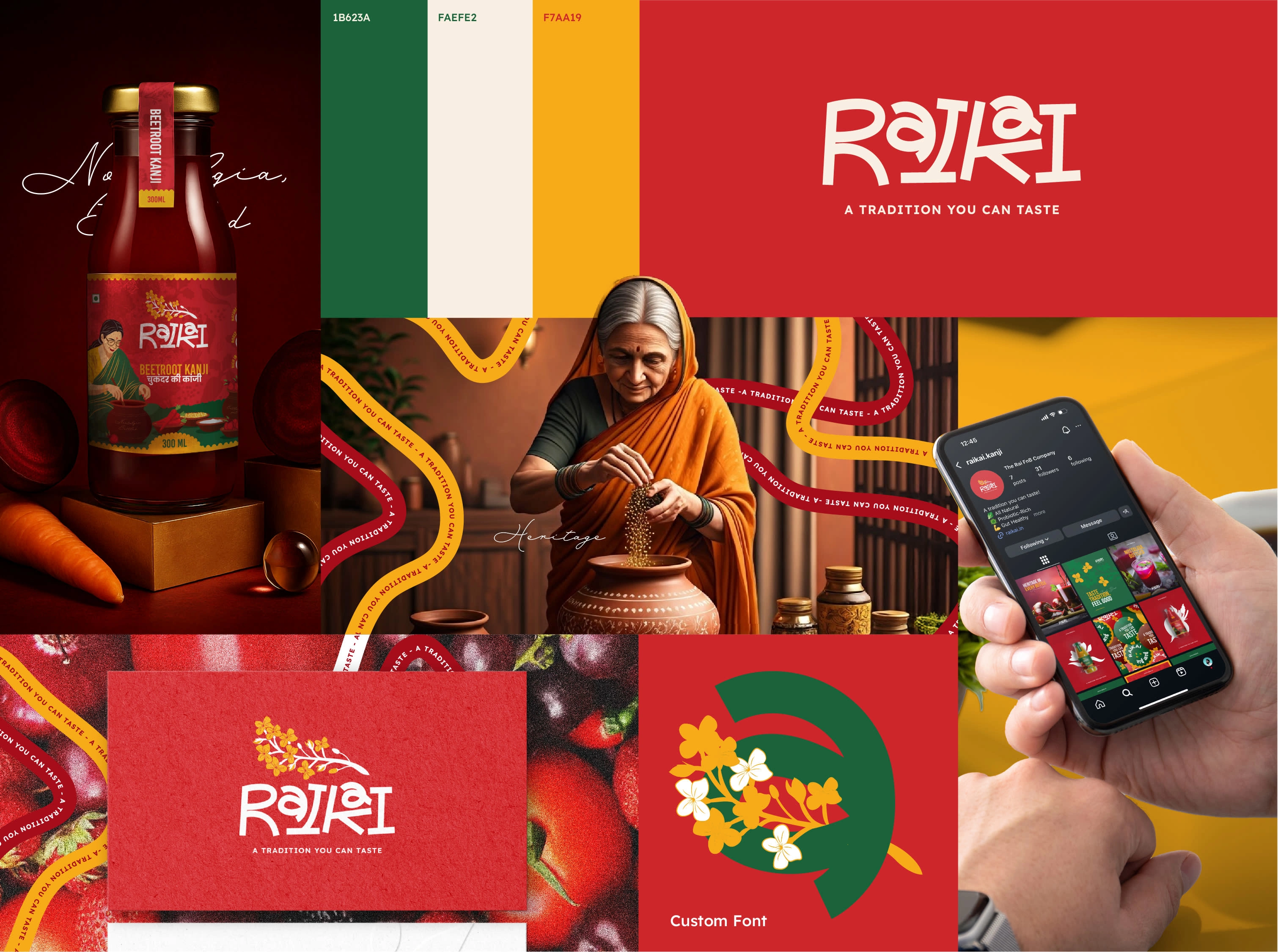
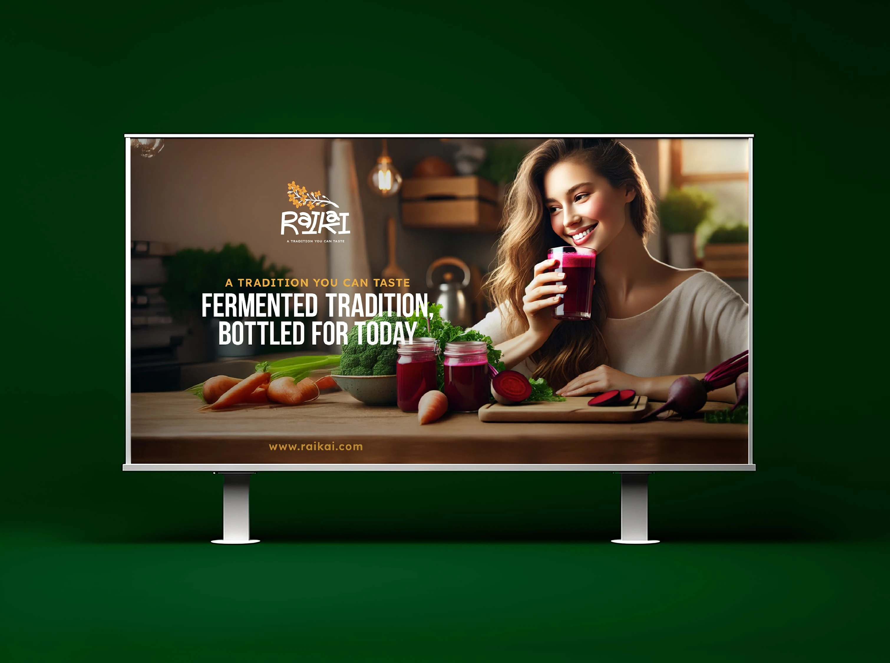
Rai Kai | A Tradition You Can Taste
Project Type: Branding, Packaging, Visual Identity, Social Media
Location: India
Overview:
Rai Kai is a homegrown brand built around India’s beloved traditional fermented drink — Kanji. The brand celebrates the nostalgia and warmth of homemade recipes while presenting them through a modern, contemporary lens. The objective was to design an identity that feels rooted in heritage yet visually engaging for a younger, urban audience.
Approach:
The process began with understanding the emotional and cultural depth behind Kanji — a drink often made during festivals and family gatherings. The brand identity had to evoke comfort, authenticity, and a sense of storytelling.
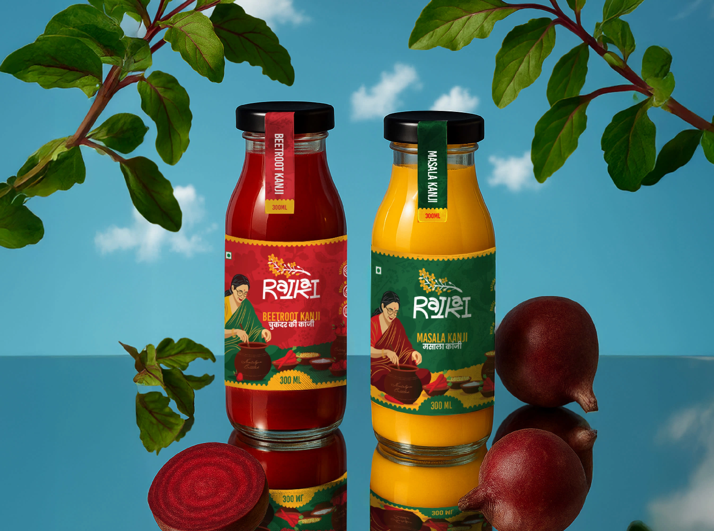
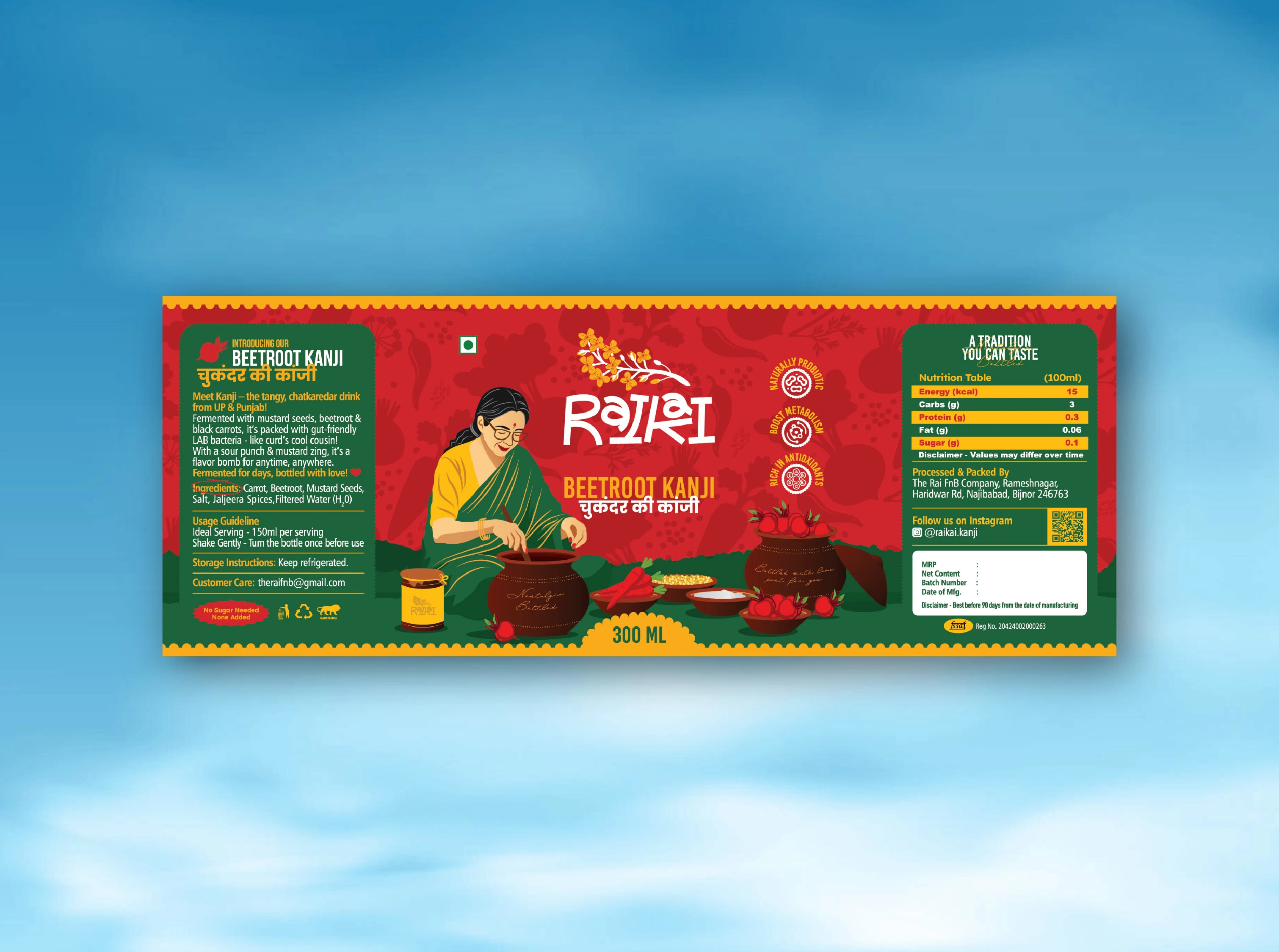
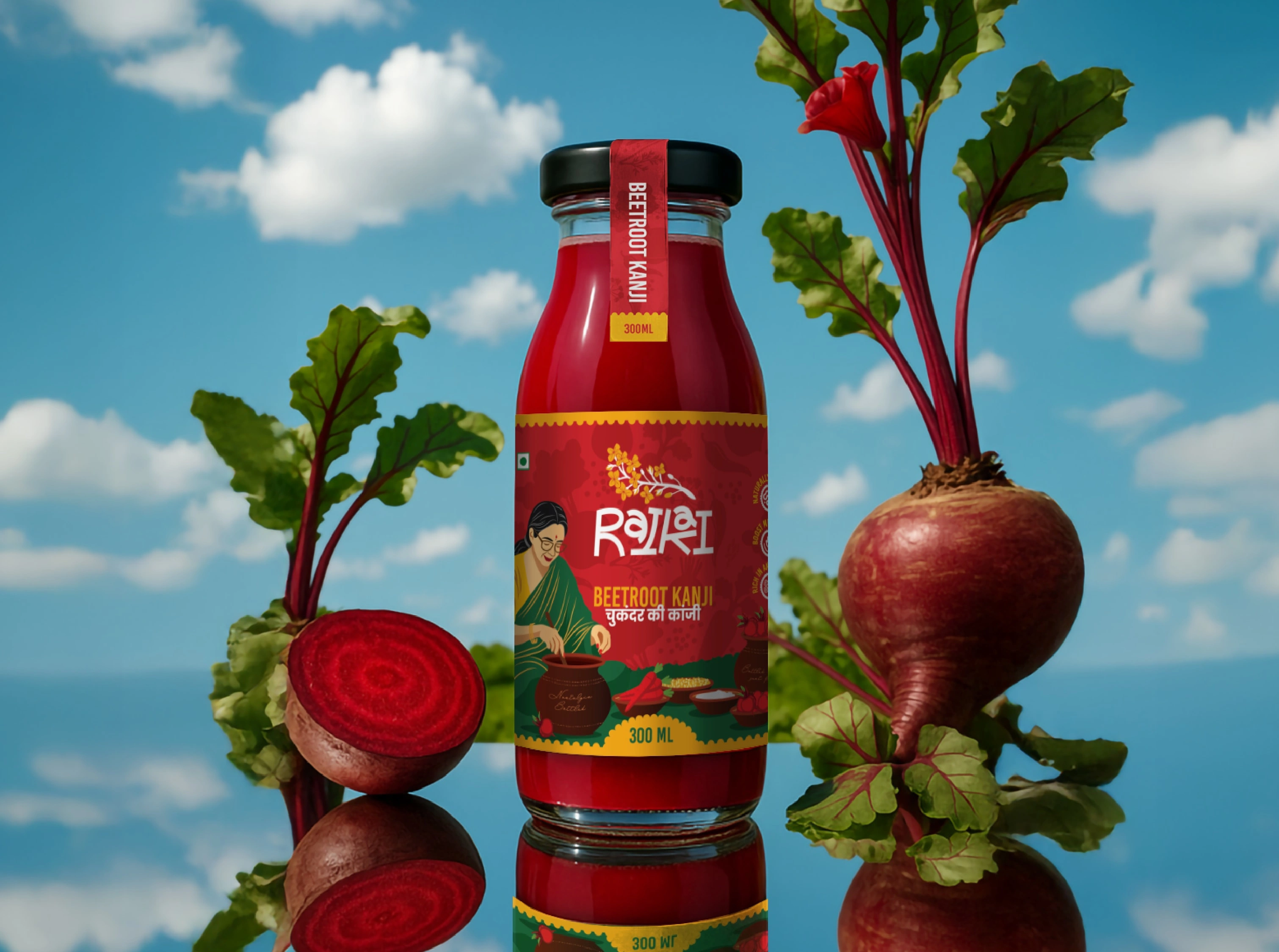
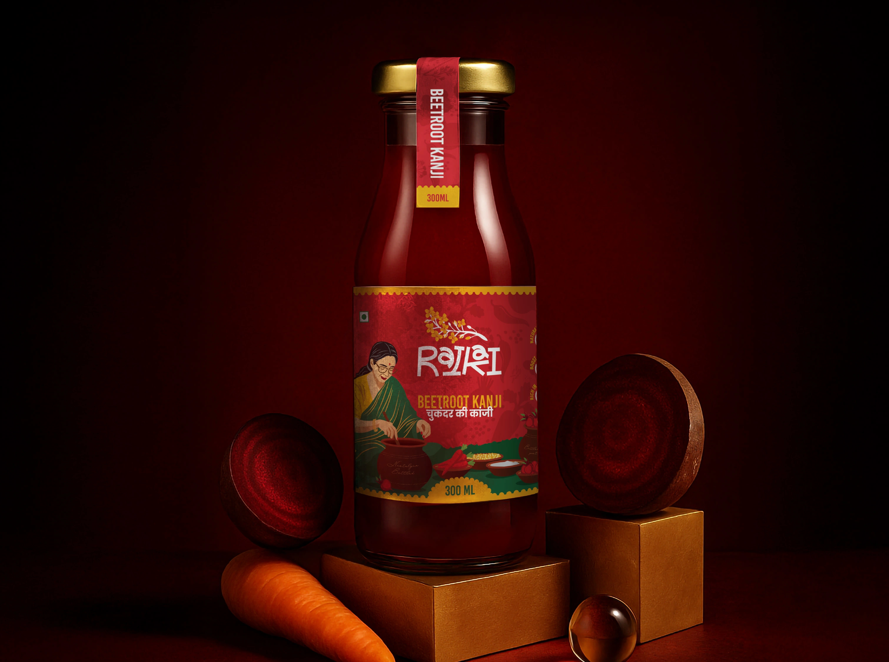
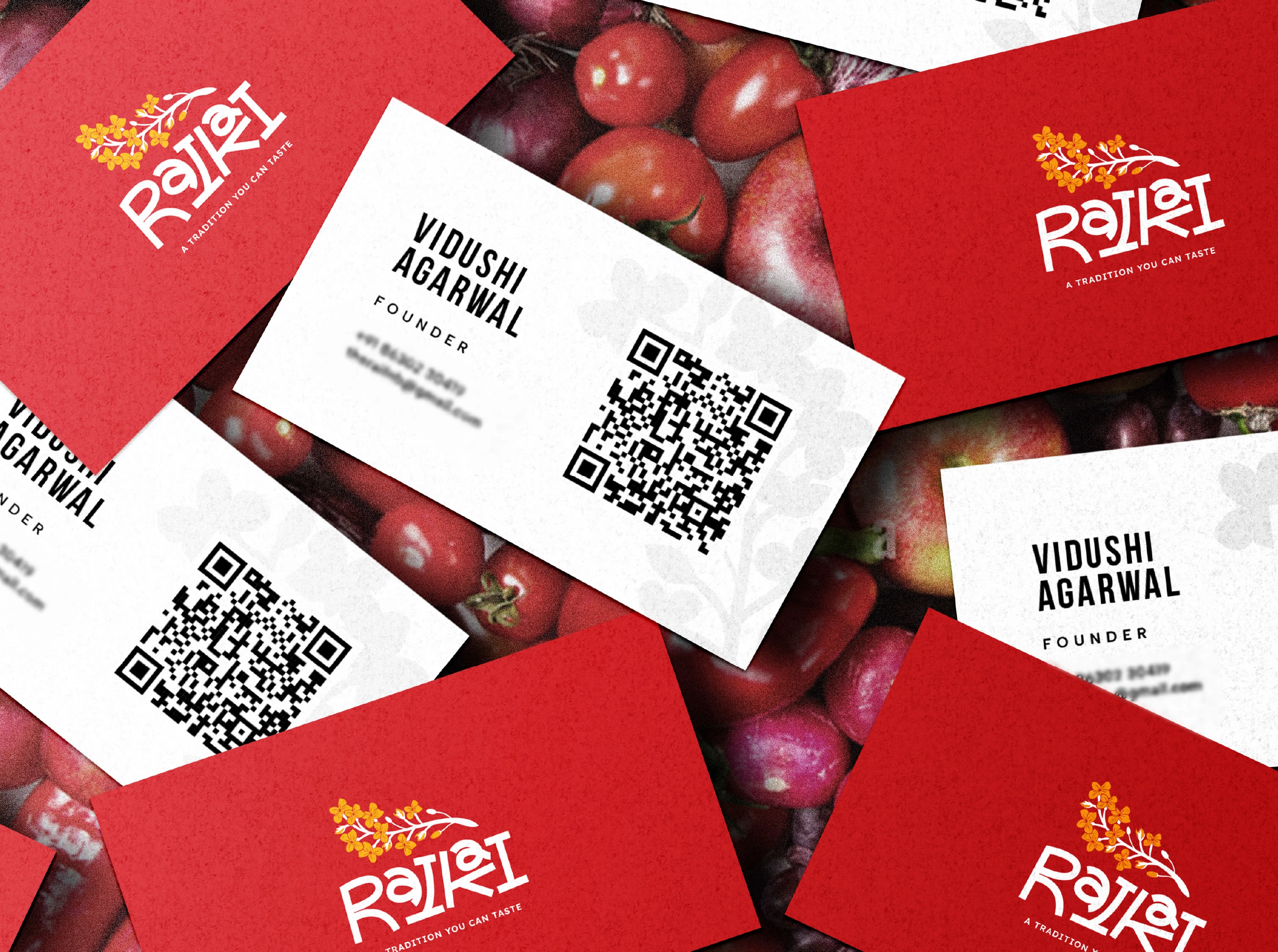
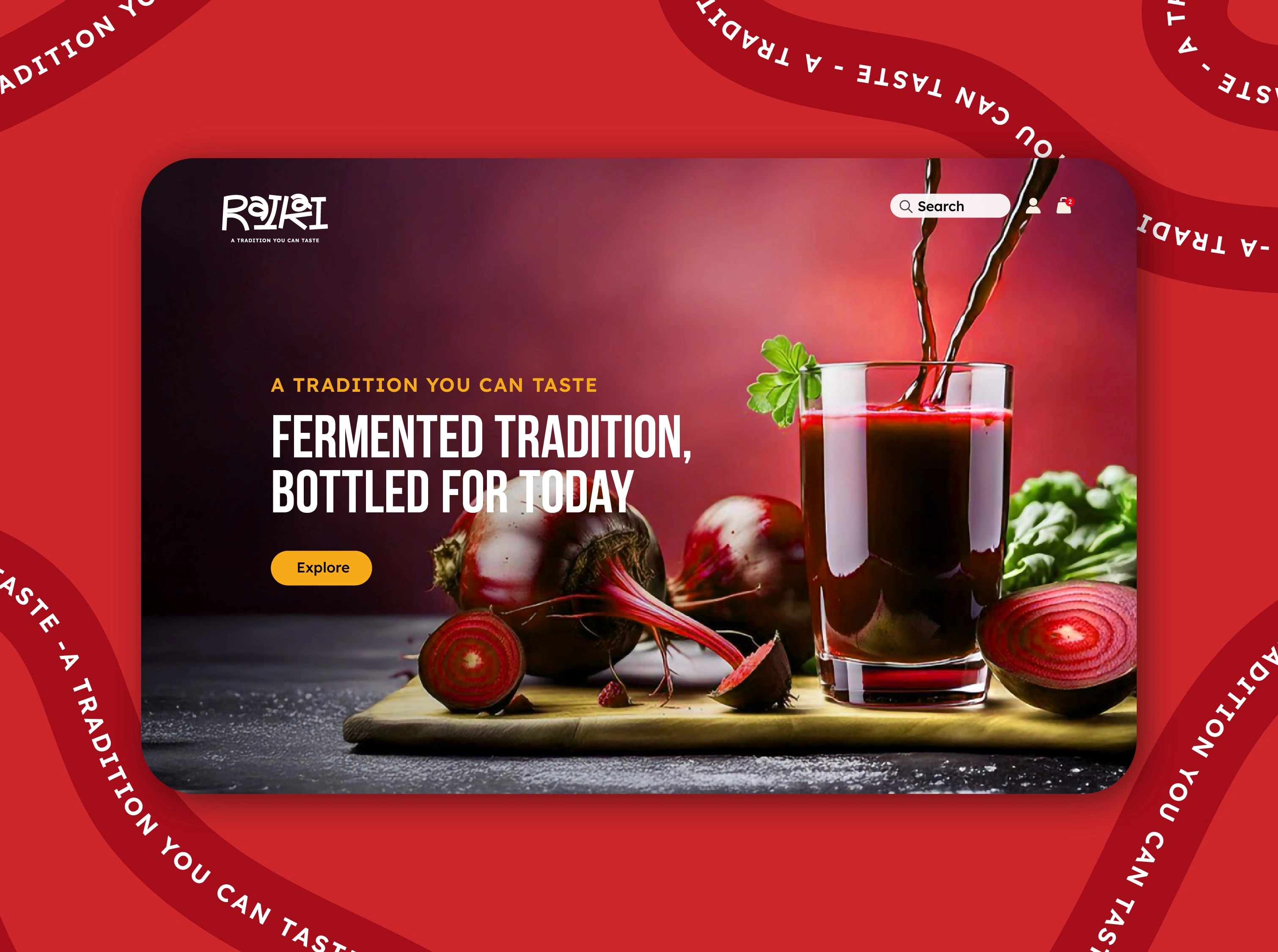
A custom logotype was crafted to resemble mustard seeds and leaf forms, symbolizing purity and tradition. The earthy yet bold colour palette reflects the vibrancy of Indian kitchens — deep red for warmth, green for freshness, and yellow for tang.
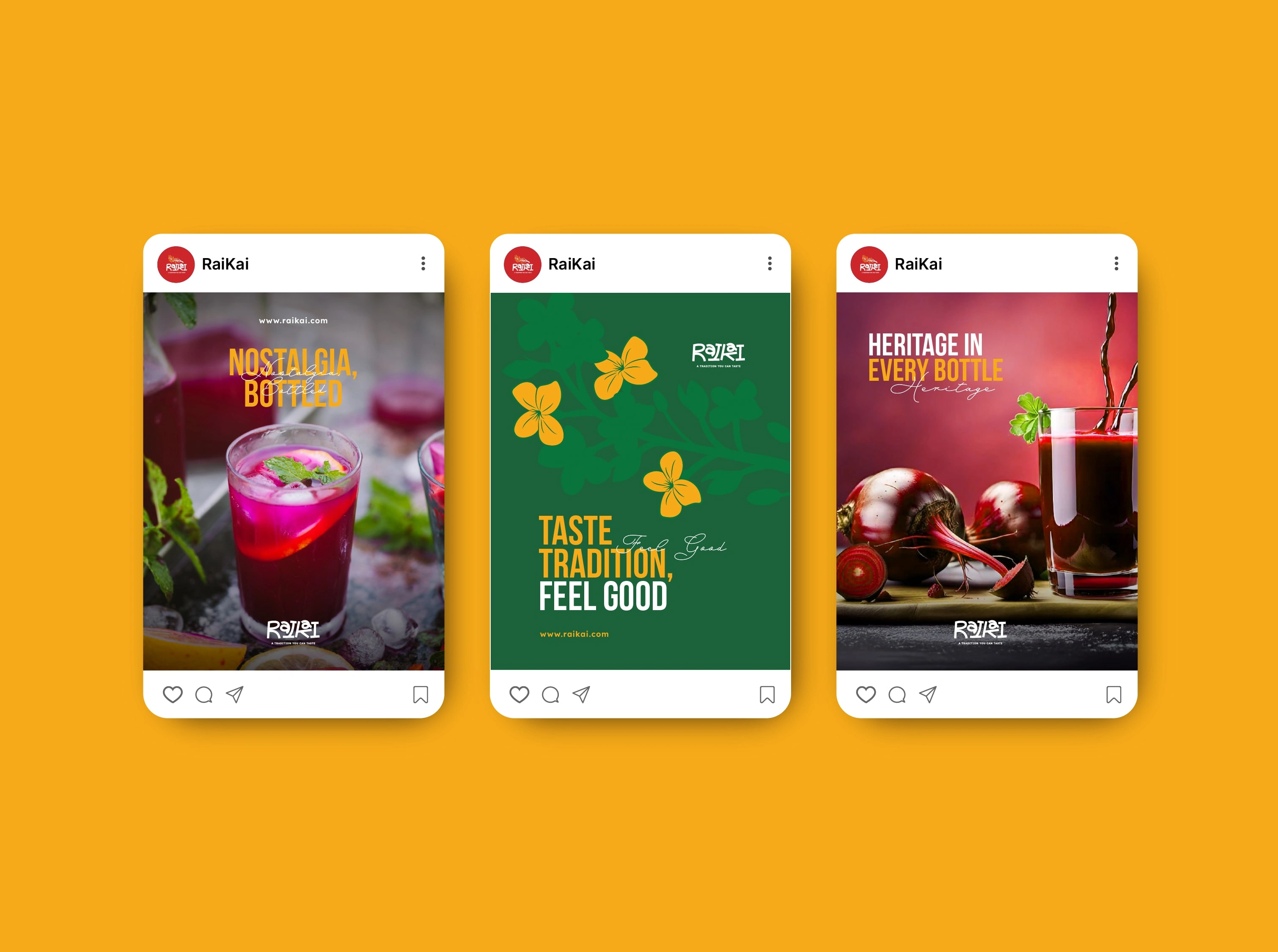
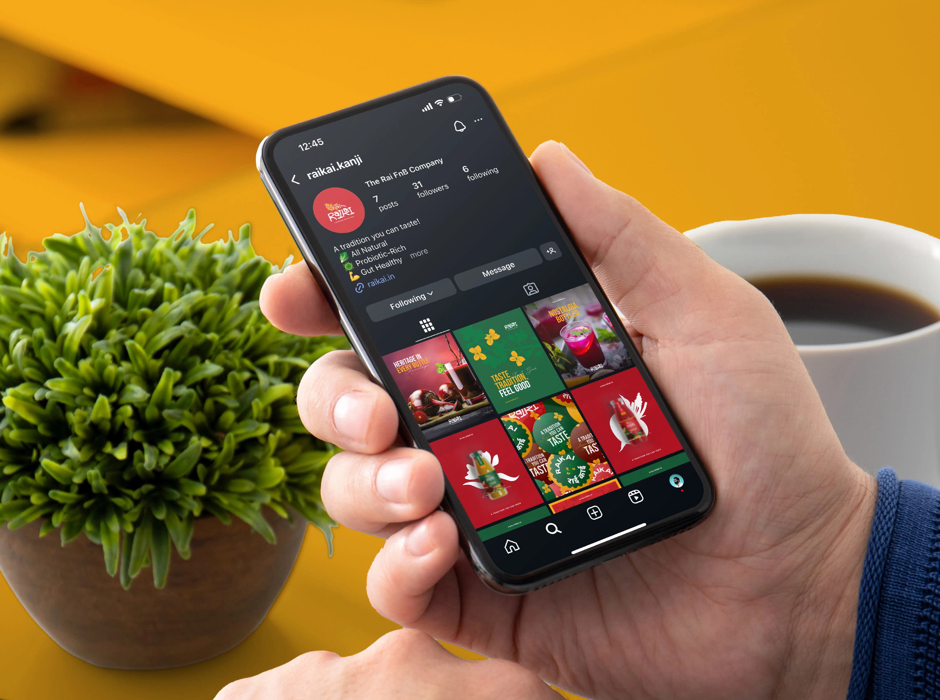
The packaging design brings the homemade charm of Kanji into a modern retail-ready format, while the semi-3D mockups and textured backgrounds enhance the sensory appeal. The social media templates and brand communication were designed to carry forward this emotional storytelling, making tradition feel current and relatable.
Result:
The new brand identity positioned Rai Kai as a fresh, heartfelt voice in India’s emerging artisanal beverage market. It connects the wisdom of age-old recipes with today’s visual culture, proving that tradition, when designed thoughtfully, can feel timeless and relevant.
A heartfelt thank you to Manik and Vidushi, the young founders who trusted me to shape their dream into a brand. Their belief in preserving India’s culinary heritage while embracing modern design made this collaboration truly special.

Like this project
Posted Oct 11, 2025
Rai Kai is a homegrown brand built around India’s beloved traditional fermented drink, Kanji.
Likes
3
Views
11
Timeline
May 1, 2025 - Jun 10, 2025