Promote.fun - Product Design
Dominik Mészáros

Case Study: Promote.fun Product Design
Client: Promote.fun
Scope: Product Strategy, UI/UX Design, Dashboard Design, Design System
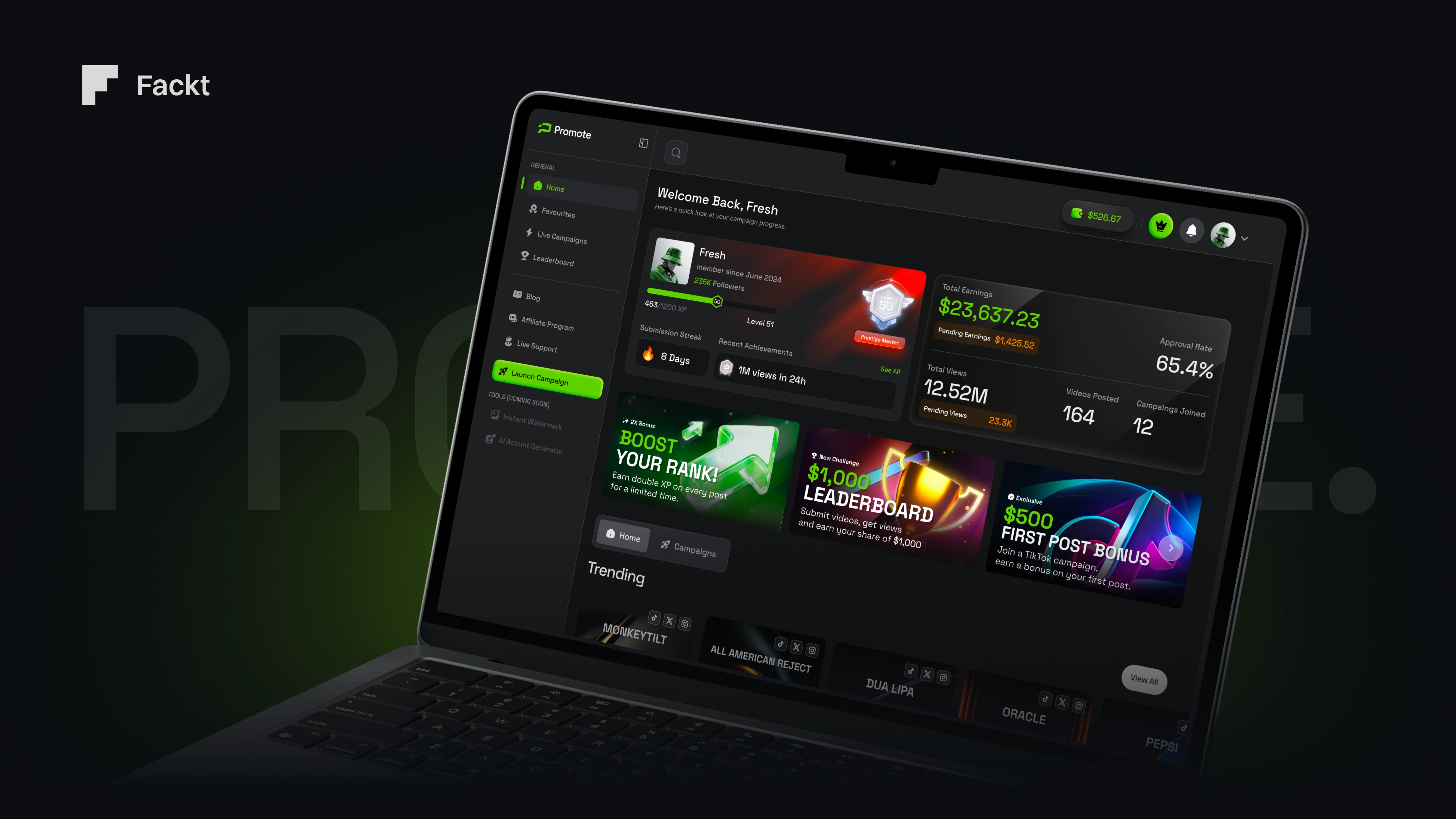
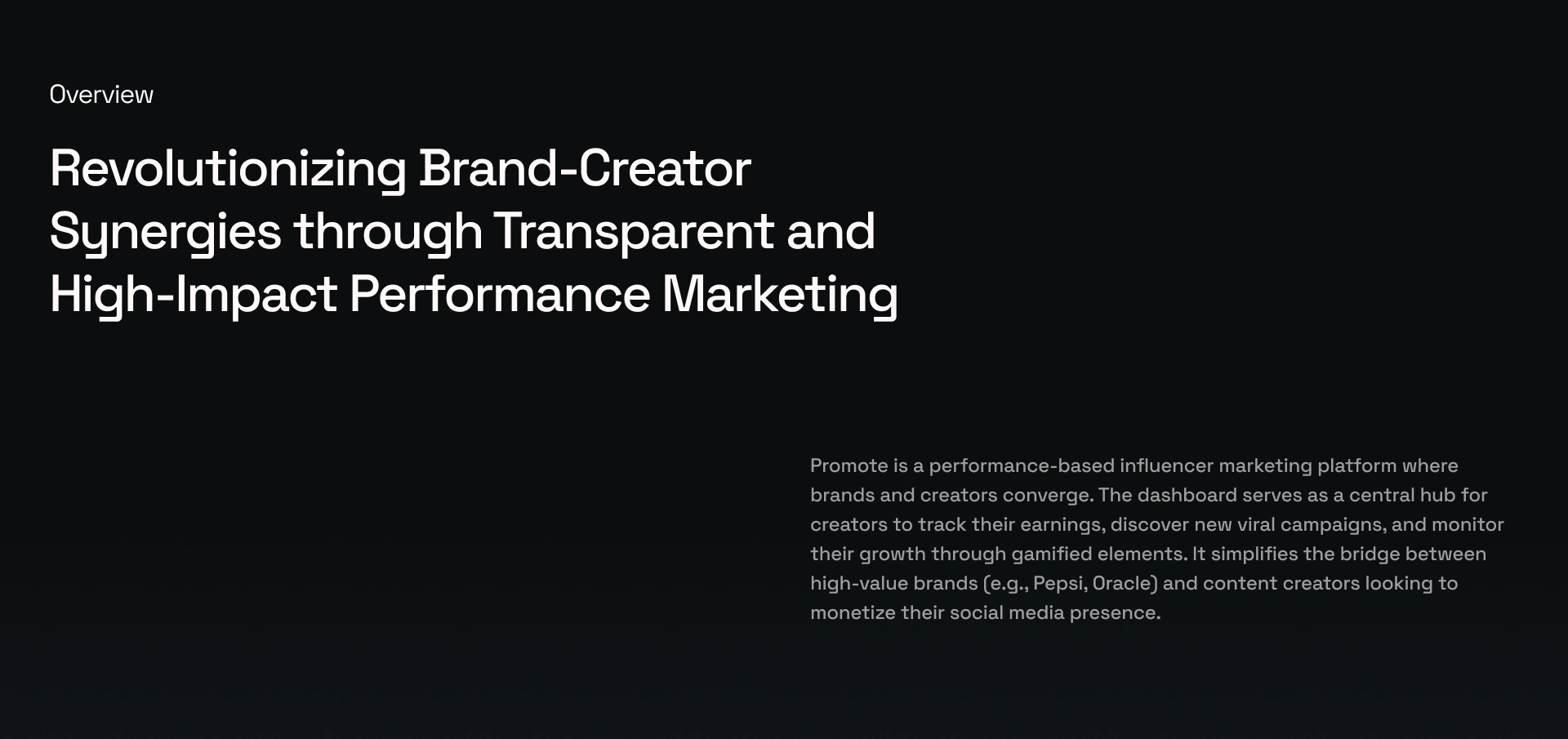
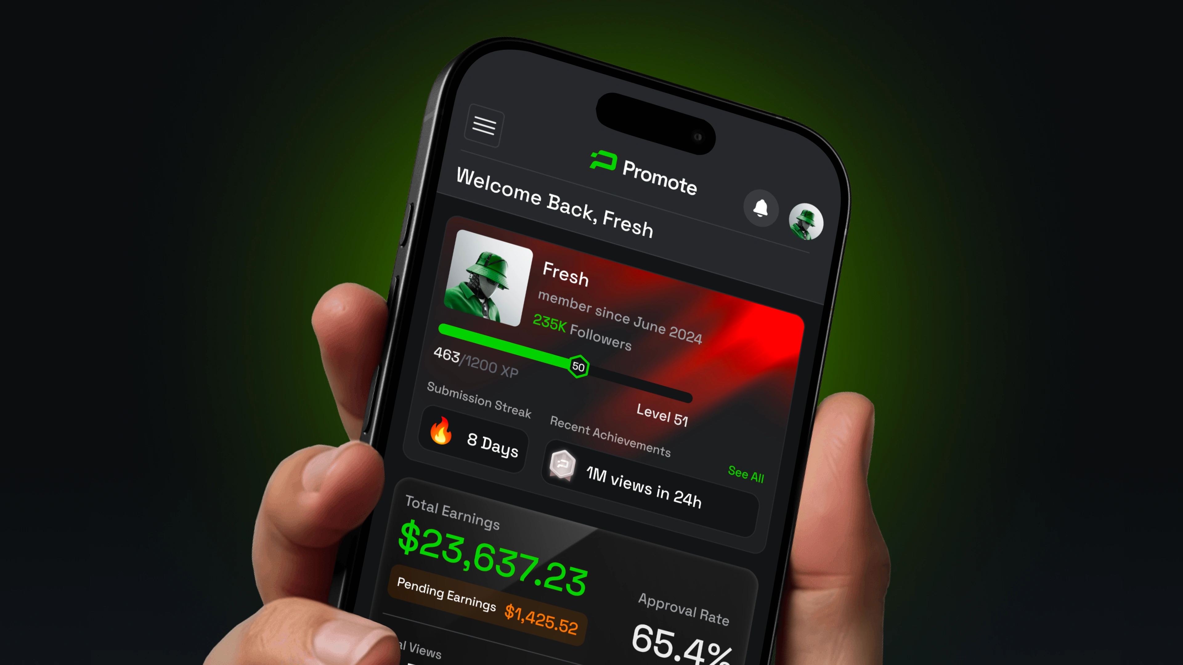
Promote.fun partnered with us to design a performance marketing platform built around transparency between brands and creators. The challenge was to take a data-heavy, multi-sided product and make it feel clear, motivating, and premium — without stripping away the depth that power users need.
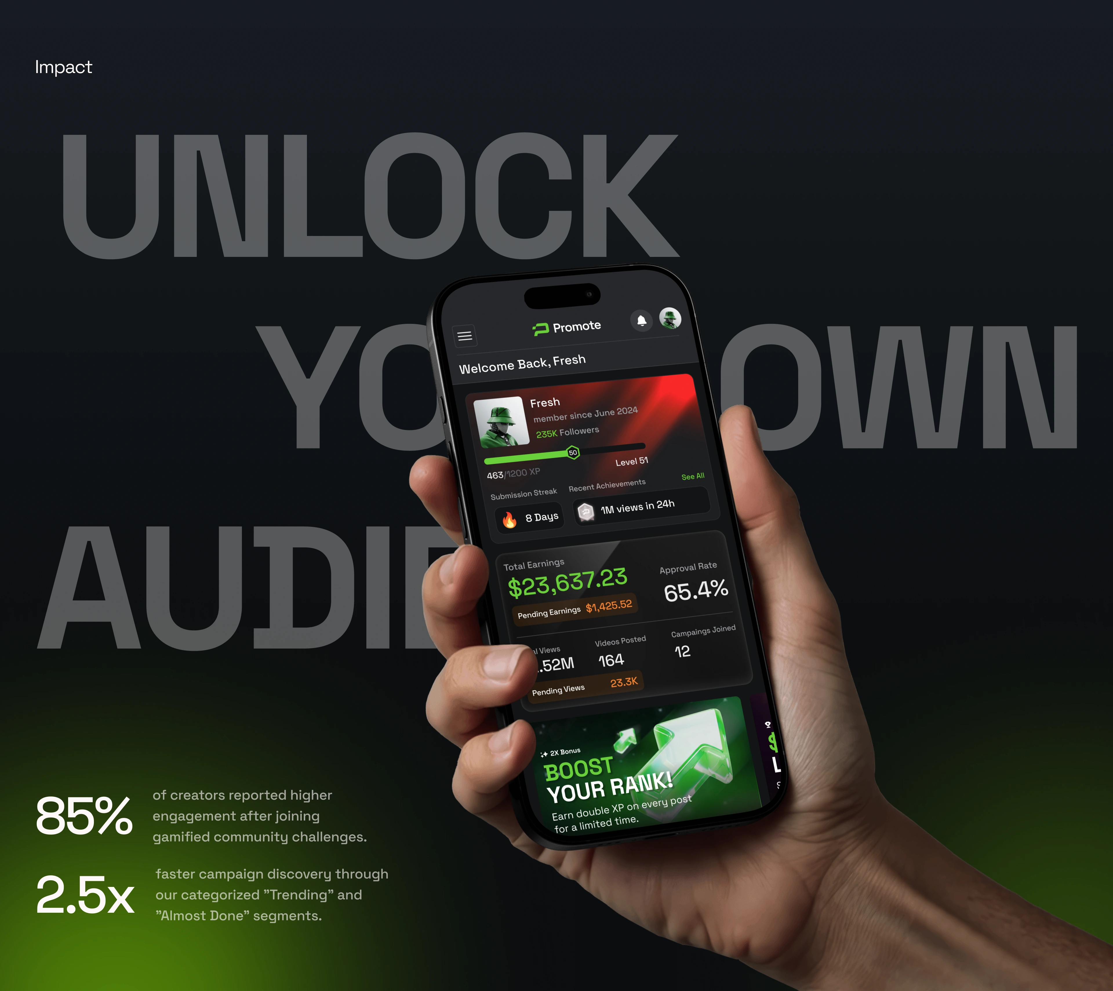
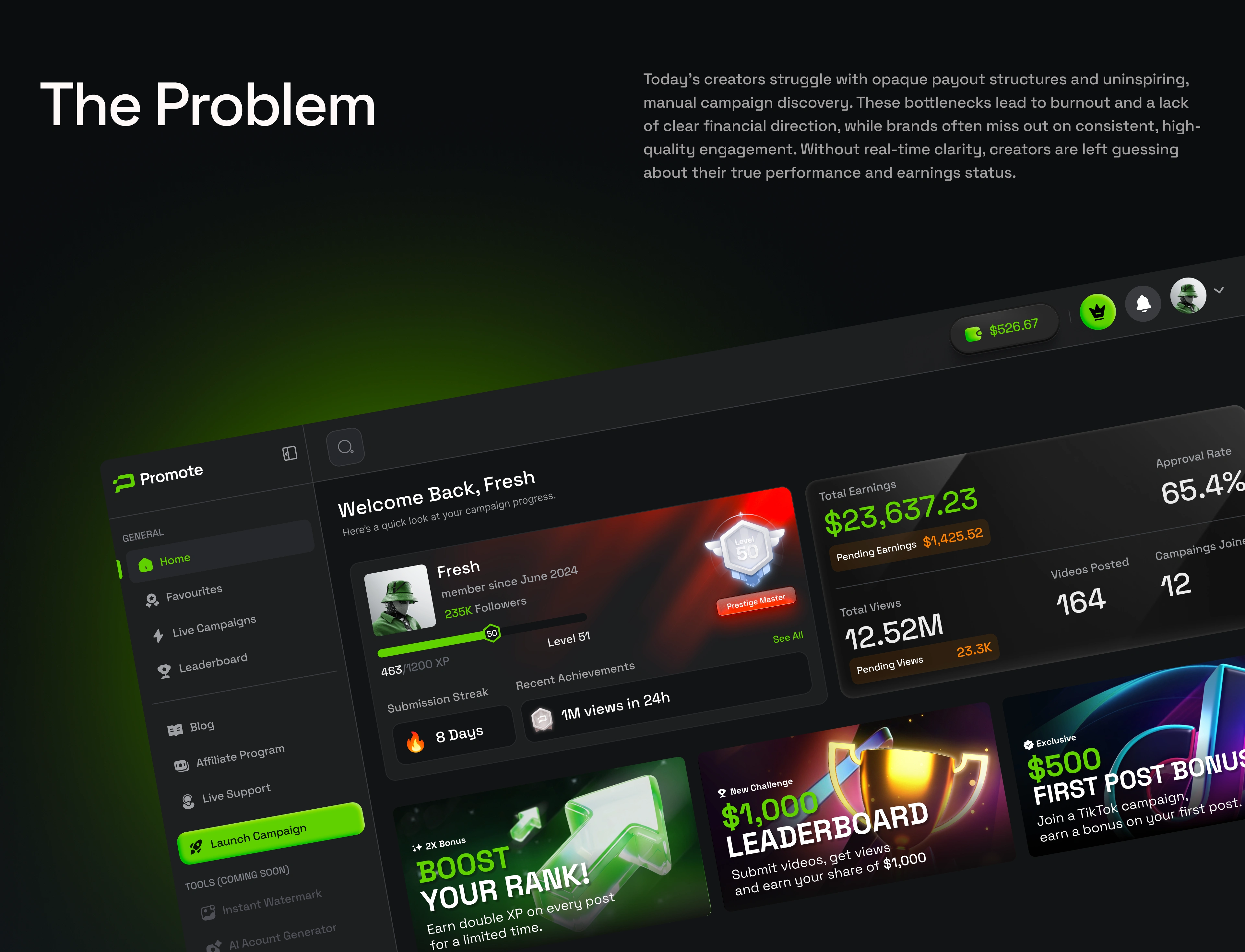
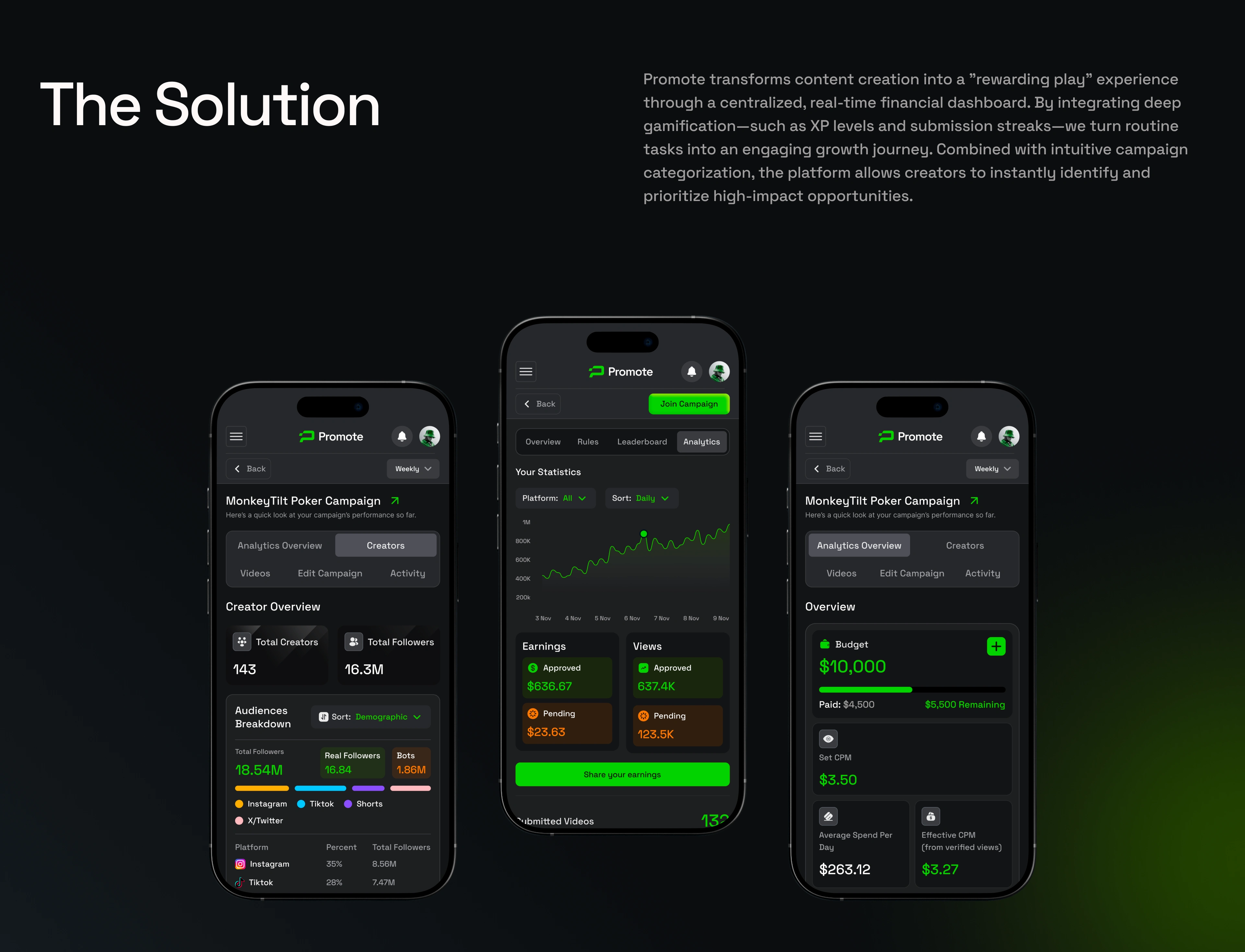
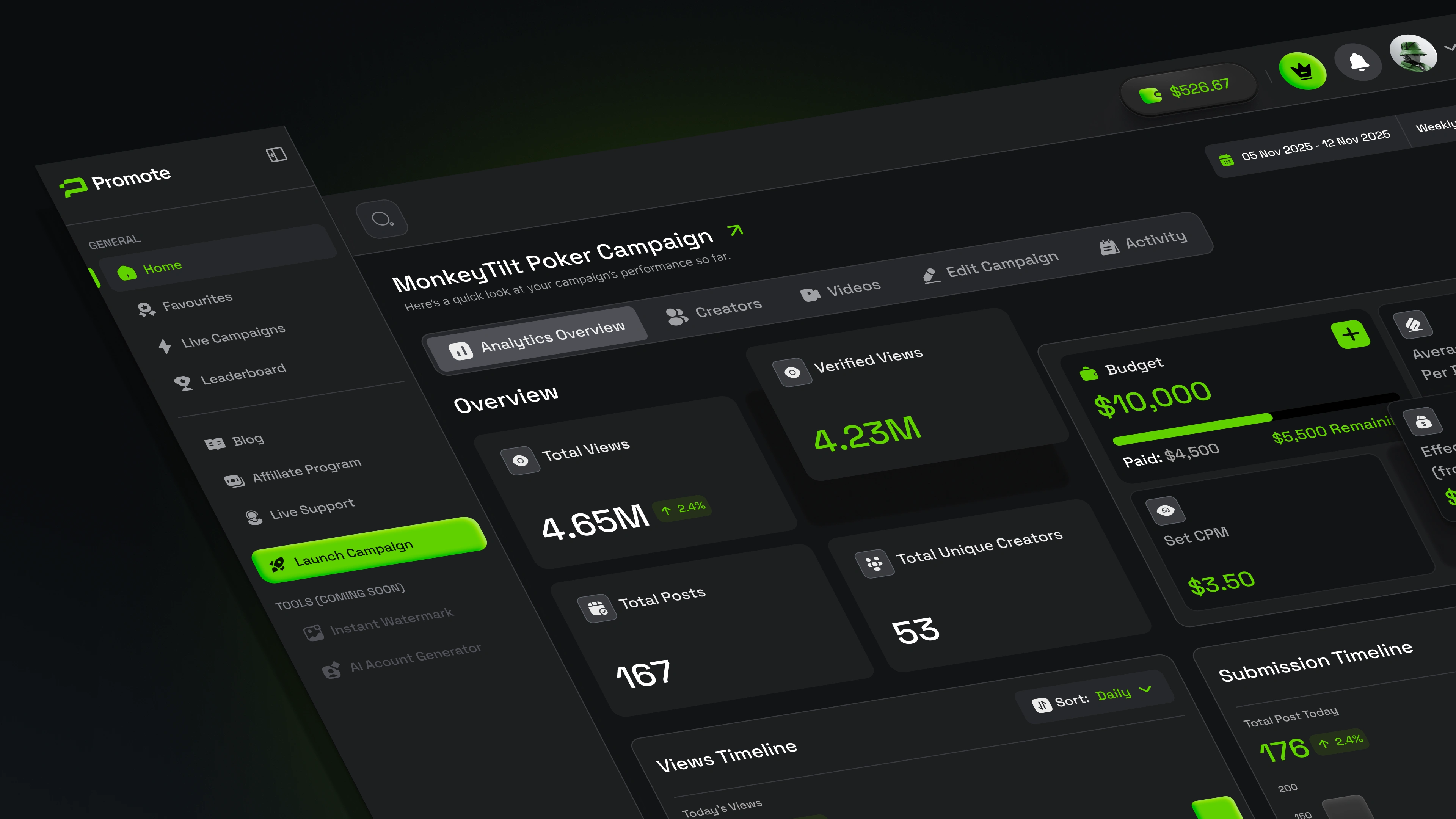
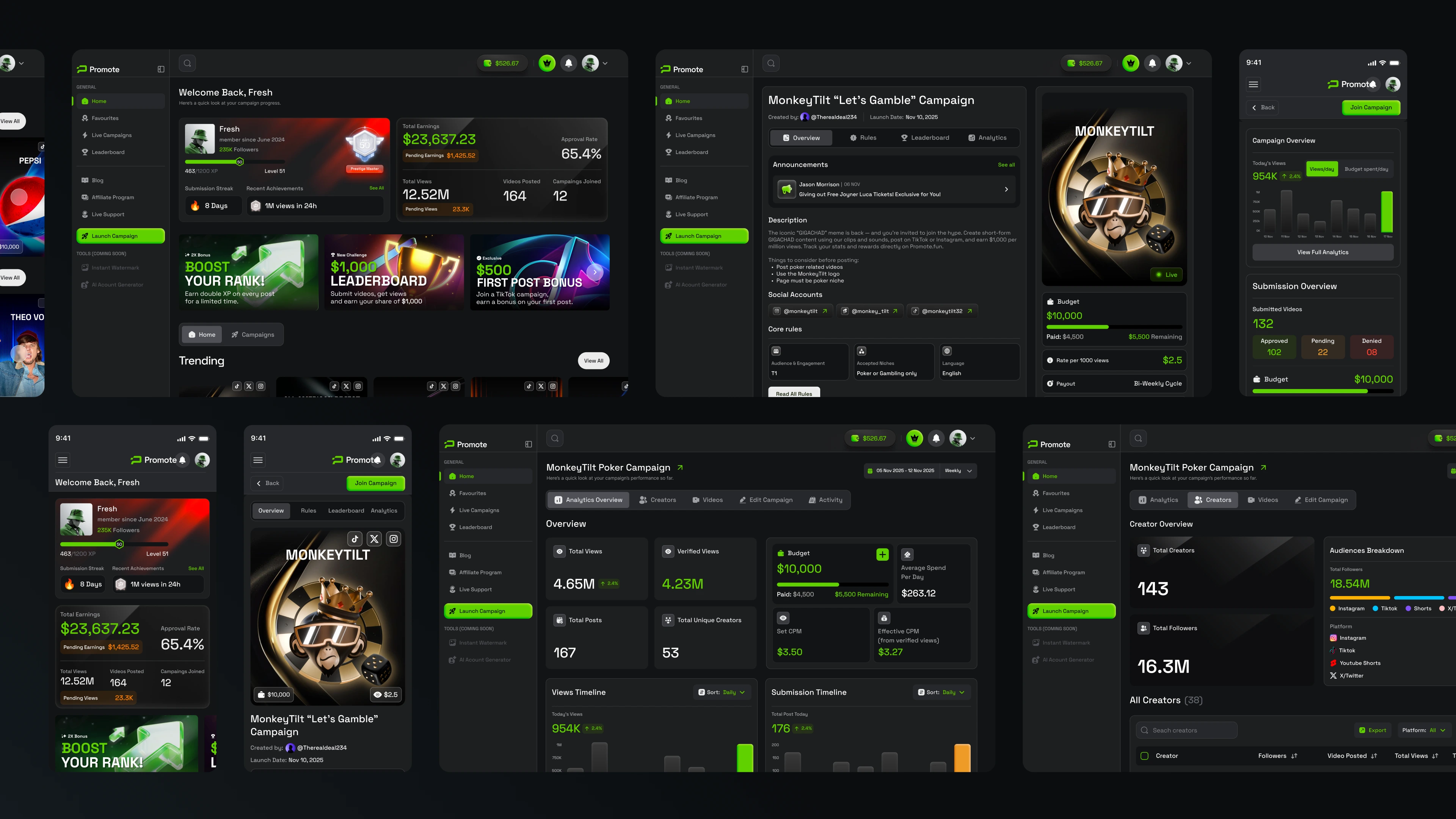
Our goal was to make complex performance data feel actionable rather than overwhelming. We focused on building a bold visual system with strong hierarchy, ensuring that metrics, rankings, and earnings were always scannable at a glance while the overall experience felt cohesive and high-end.
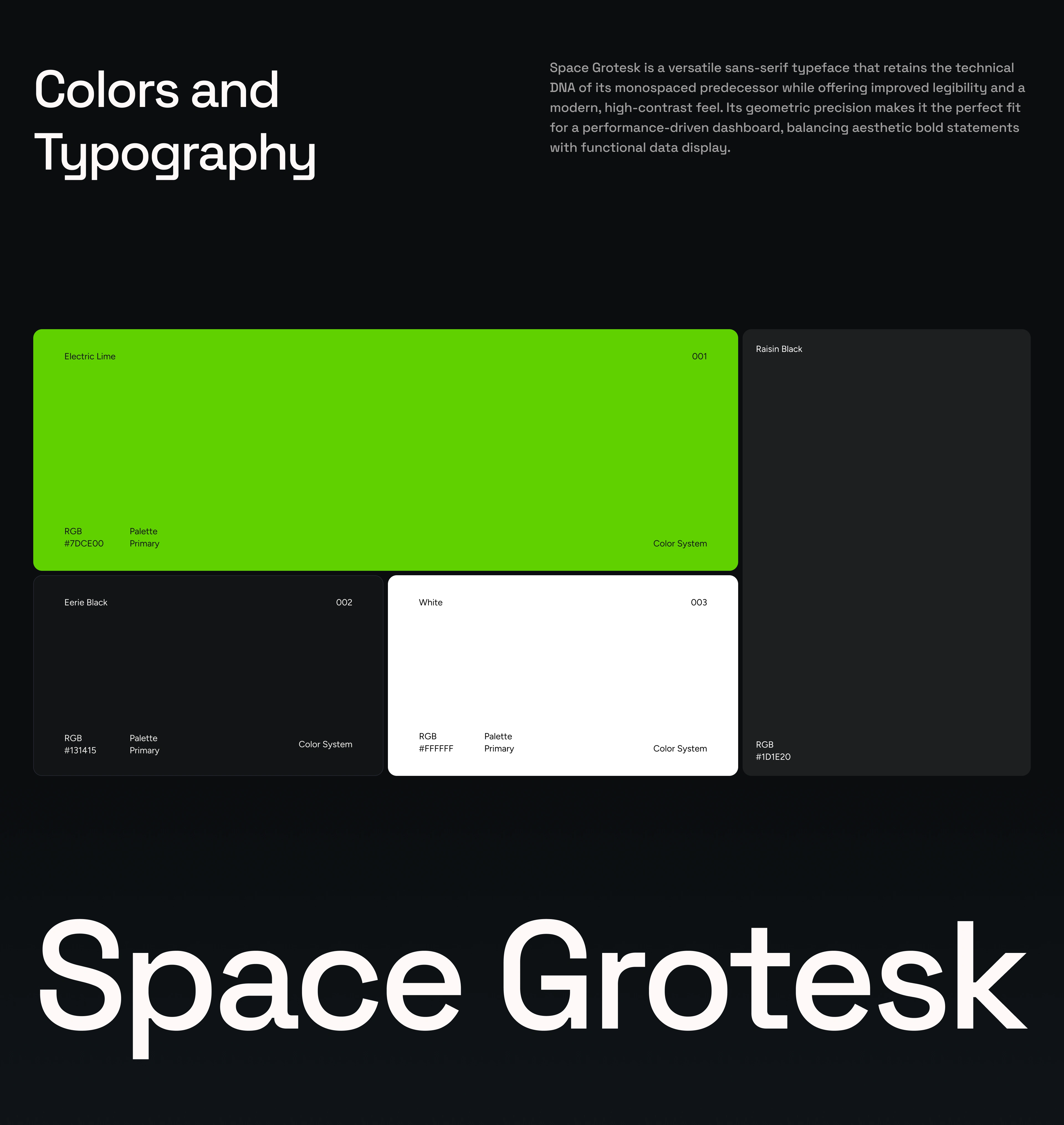
The process started with product strategy and information architecture, defining how different user roles interact with the platform and what information needed to be front and center at every stage. From there, we developed a high-contrast dark UI system with a signature neon green accent palette and Space Grotesk as the typographic foundation — chosen for its geometric precision across both display headlines and dense data layouts. Components were designed as a unified system, ensuring consistency held across dashboards, leaderboards, profile views, and mobile breakpoints.
The Result:
A sleek, data-driven platform that turns performance marketing into a transparent and motivating experience. Promote.fun now combines clear UX, a distinctive visual identity, and structured information hierarchy to build trust between brands and creators while driving engagement on both sides of the marketplace.
Like this project
Posted Feb 17, 2026
A high-contrast design system for a creator-brand platform — where dense dashboards, real-time data, and multi-role interfaces come together.
Likes
0
Views
32