
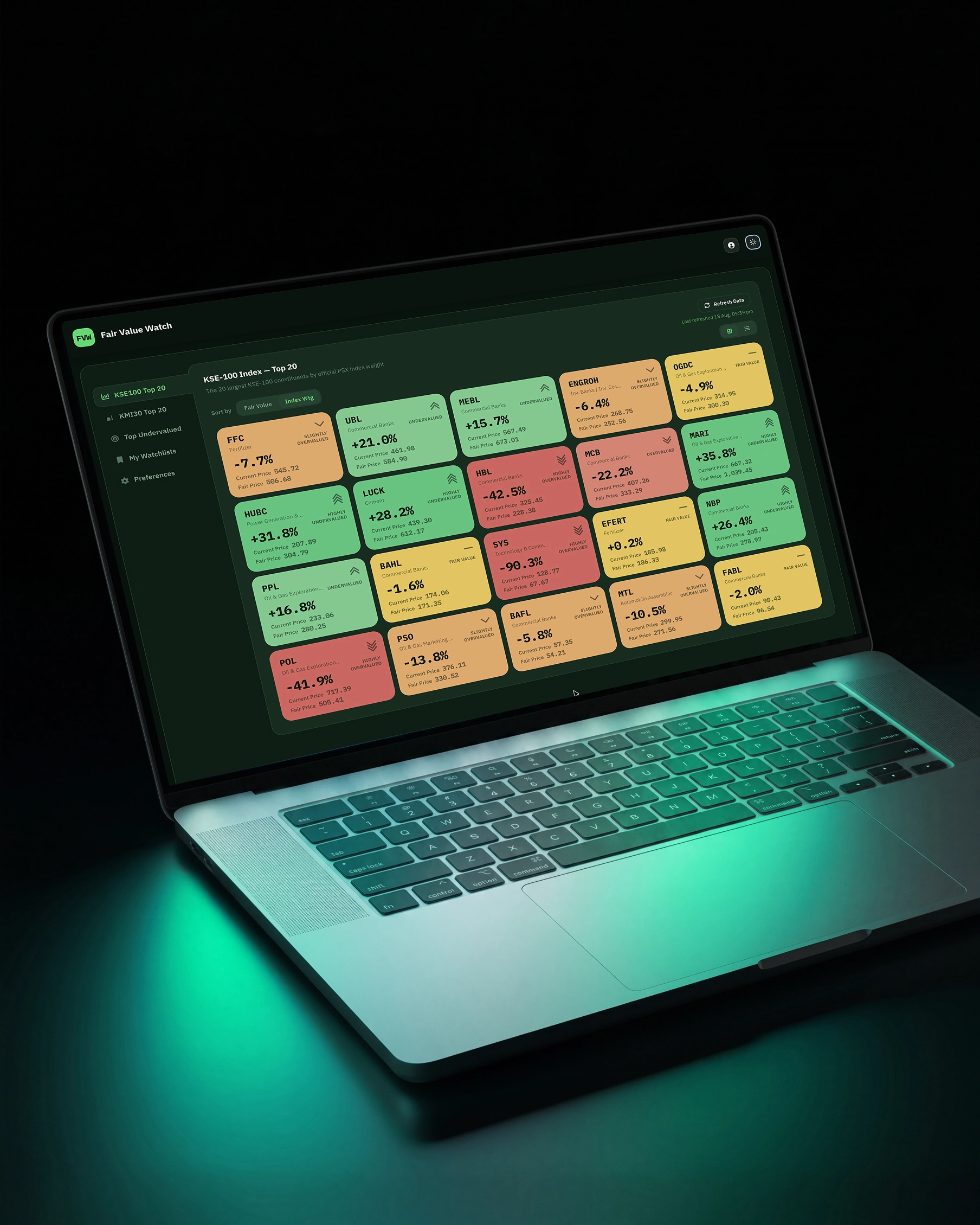
Exploring how color can make complex financial data feel instantly understandable.
For this fintech concept, I’m using a six-step color scale to create visual hierarchy across valuation cards—making the data easier to scan without adding unnecessary UI noise.
A small color decision can have a big impact on how information is perceived.
#Fintech #UIDesign #ProductDesign #DataVisualization #UXDesign #VisualDesign
0 likes · 0 views · Aug 21, 2026
Exploring how color can make complex financial data feel instantly understandable. For this fintech concept, I’m using a six-step color scale to create visua...

