Architectural Website Using Framer
Qing Chen
Architectural Website Using Framer
This project demonstrates how Framer can be used to build sophisticated, visually engaging websites with consistent styling, smooth interactions, and responsive layouts — all while effectively showcasing a brand’s creative work.
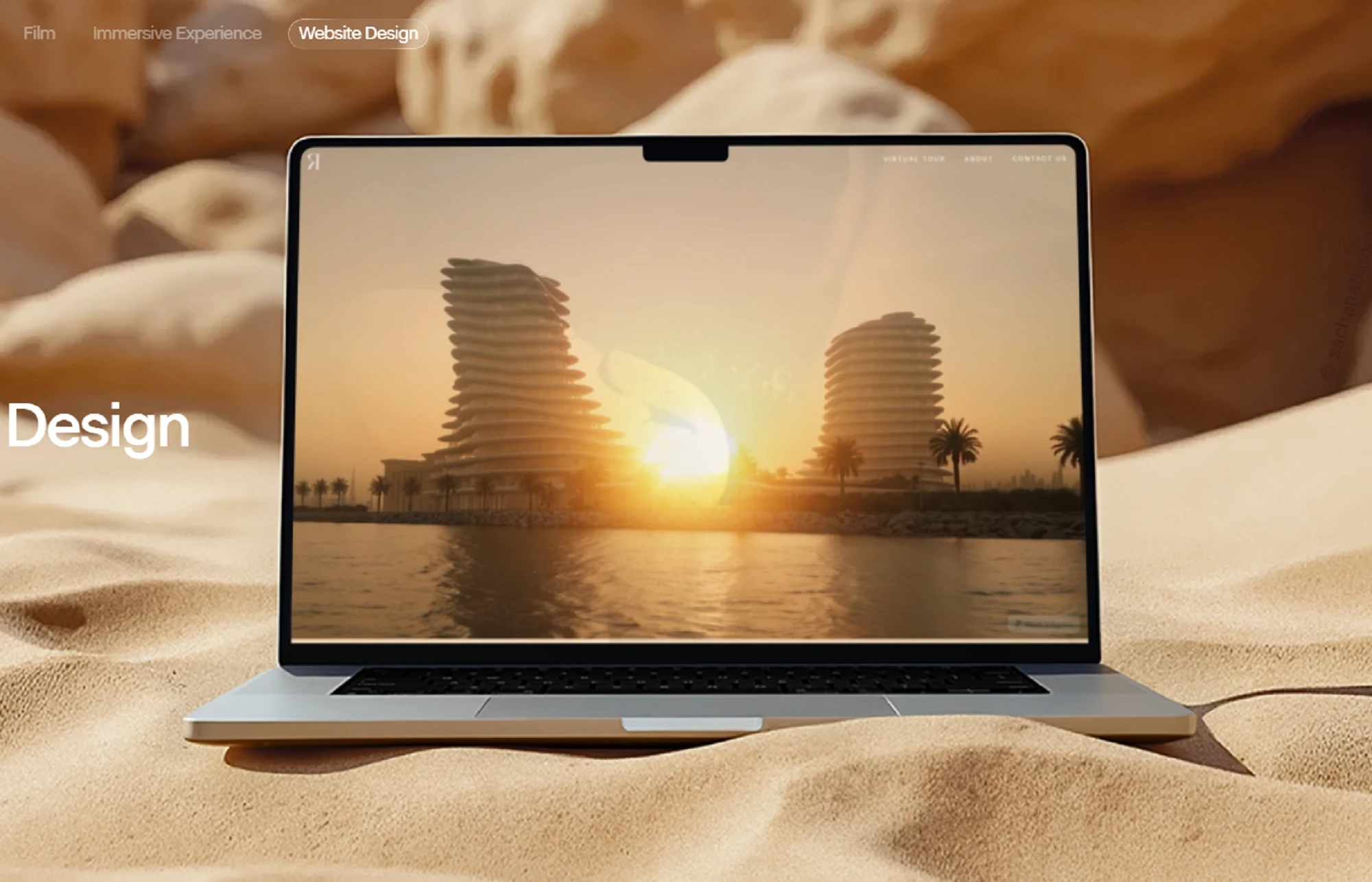
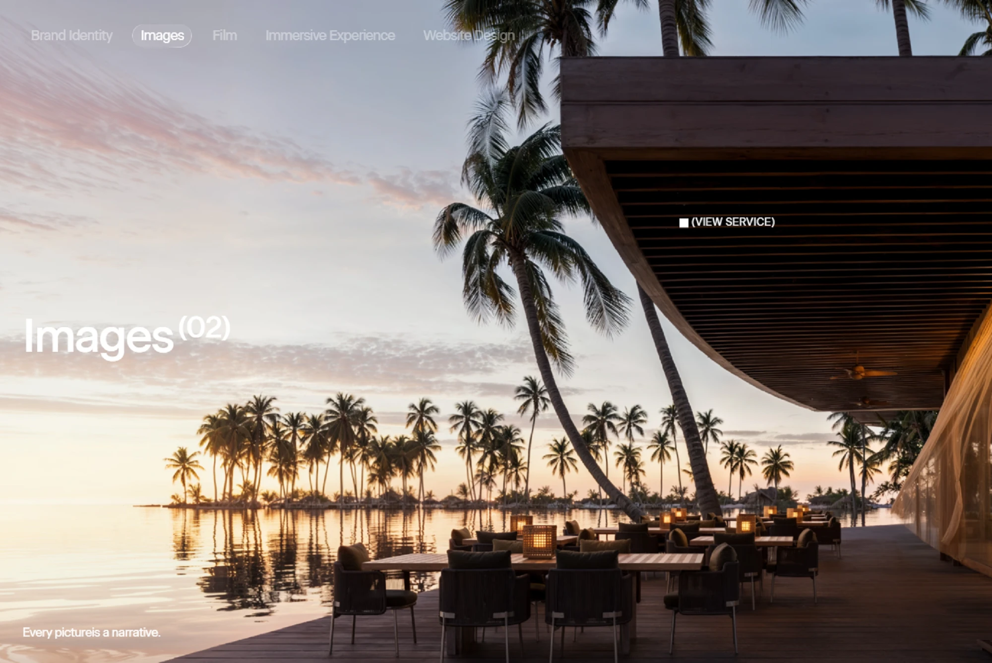
Design using Framer
I built the architectural visualization studio using Framer to create a visually rich and interactive portfolio. The site features immersive project showcases, smooth hover effects, and scroll-triggered animations, all designed to reflect the studio’s premium brand identity. I used Framer’s Frames, Stacks, and Grids to create responsive layouts that work seamlessly on desktop, tablet, and mobile, while motion animations bring the visuals to life. The project highlights my ability to combine design aesthetics with technical implementation, delivering a polished, interactive, and user-friendly website.
How I Built It in Framer:
1) Project Setup:
Started a new Framer project and defined the site’s structure, including homepage, project pages, and contact section.
Created global styles and theme tokens (colors, fonts, spacing) to maintain consistency.
2) Layout & Design:
Used Frames and Stacks to build responsive layouts.
Implemented Grid and Flex layouts to display projects dynamically.
Designed full-bleed hero sections with high-resolution images to showcase visual work.
3) Interactive Components:
Leveraged Framer’s interactive components for smooth hover effects, clickable project previews, and scroll-triggered animations.
Used motion animations to animate image transitions and content appearance.
4) Responsive Design:
Built layouts that adapt to desktop, tablet, and mobile.
Used auto-layout and breakpoints in Framer to ensure images and text scale correctly.
5) Performance & Optimization:
Compressed images and used Framer’s optimized image handling to reduce load times.
Ensured animations are smooth and don’t affect performance on lower-end devices.
6) Publishing & Showcase:
Deployed the site directly from Framer’s hosting for fast, production-ready delivery.
Used Framer’s preview mode to test interactions and responsiveness before publishing.
Key Highlights:
Seamless user experience with immersive visuals.
Fully responsive across devices.
Smooth transitions and micro-interactions using Framer Motion.
Centralized design system for consistent styling.
Like this project
Posted Sep 16, 2025
Developed a responsive, interactive Framer website for an architectural visualization studio, enhancing user experience and visual presentation.
Likes
0
Views
11