Derwent London: Network One

Richard Nash
Web Designer
Product Designer
UI Designer
Adobe Creative Suite
Figma
Miro
Introduction
Understanding problems and objectives
Building on the flexible framework designed for Derwent London's 'Baker Street' building, we were challenged to create a site that could respond across both mobile and desktop devices and adapt to large interactive screens in physical spaces. We leveraged and matured this to curate a site that helps Derwent London, alongside various property suppliers and partners, showcase and market this amazing space to potential retail business and consumer customers.
Problems
The foundational elements of the design needed to encompass a mobile-first approach while being tailored to large interactive installations. Ensuring the experience delivered a good user experience across all screen sizes was crucial. For installations, optimisation needs to be considered based on the space and the user's physical ability to interact with such a large touchscreen. Accessibility was another key factor, ensuring that all users could enjoy a consistent experience in the marketing space.
Objectives
Create a cohesive experience across digital and physical spaces
Maintain the visual aesthetic defined by the marketing brand
Factor content to deliver the best possible experience at different screen sizes
Greater focus on the mobile experience compared to the 'Baker Street' development
Underscore the broader marketing message and project information
Each of Derwent London's buildings brings something unique to the communities and people it serves across retail and workspaces. The identity of each development, both in communication and marketing, is critical as it represents the communities and organisations it serves. The digital experience should reflect this visual communication, presenting the space to potential customers.
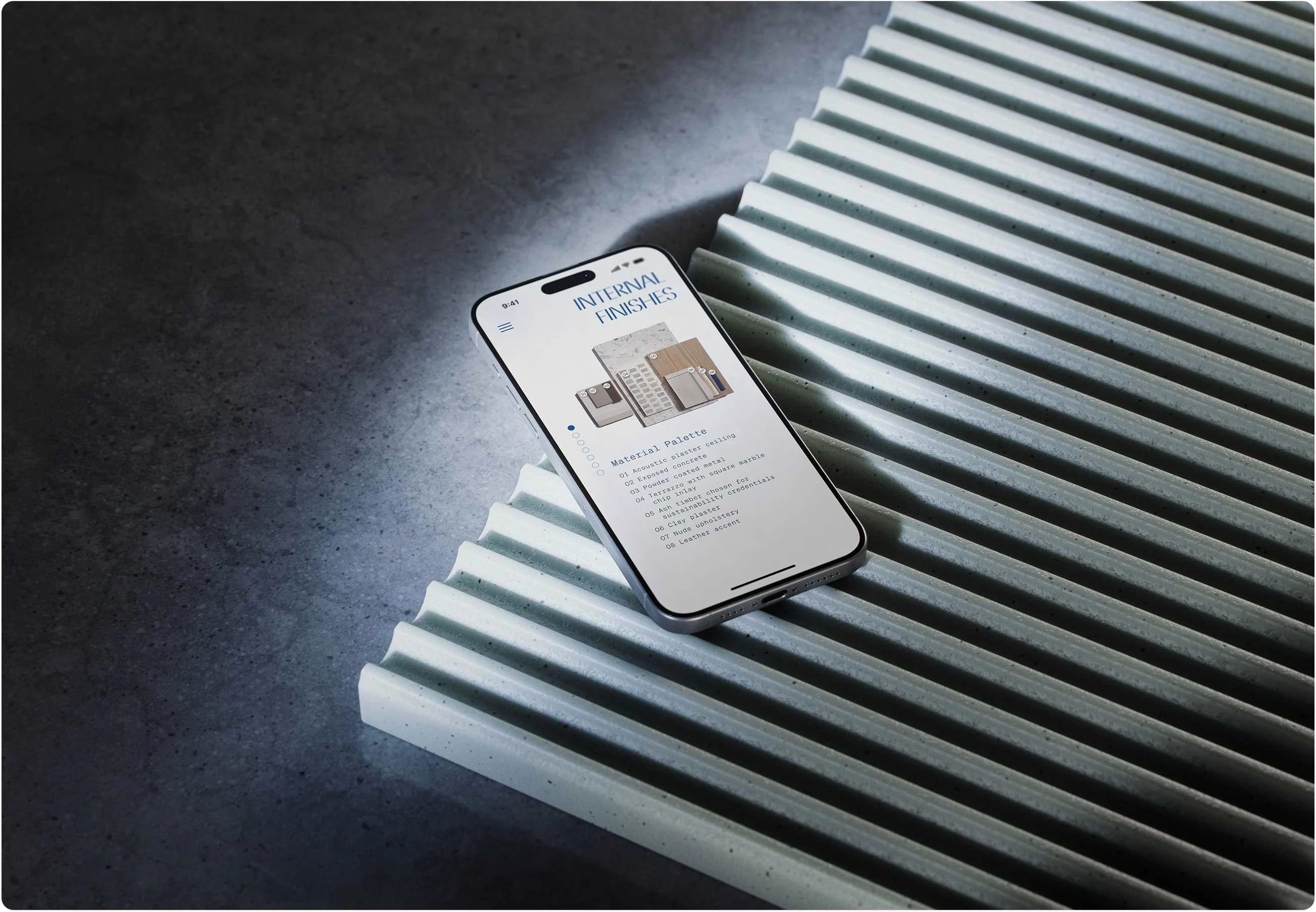
A key component is how the digital experience reinforces the in-space experience through interactive installations. Users are invited to immerse themselves in the textures and form of the building, learning about materials and its environmental and social credentials.
Outcomes
We made significant improvements in refining the broader delivery process over the original 'Baker Street' project. This led to greater efficiency and a much smoother quality assurance and testing phase. Improved cohesion between the various partners across the project, specifically the brand and broader marketing partnerships, allowed us to translate the print design elements of brochures into the digital experience.
Network One required a greater emphasis on the mobile experience over the large interactive touchscreen, which focused our team on enhancing the UX elements on mobile for improved usability and performance.
Design Process
A design thinking approach
By combining design thinking and agile methodologies, we empathised with users, defined problems, ideated creative solutions, prototyped, validated, and implemented the best ideas. This iterative process ensured a deep understanding of user needs and efficient project execution, fostering collaboration and delivering exceptional user experiences.
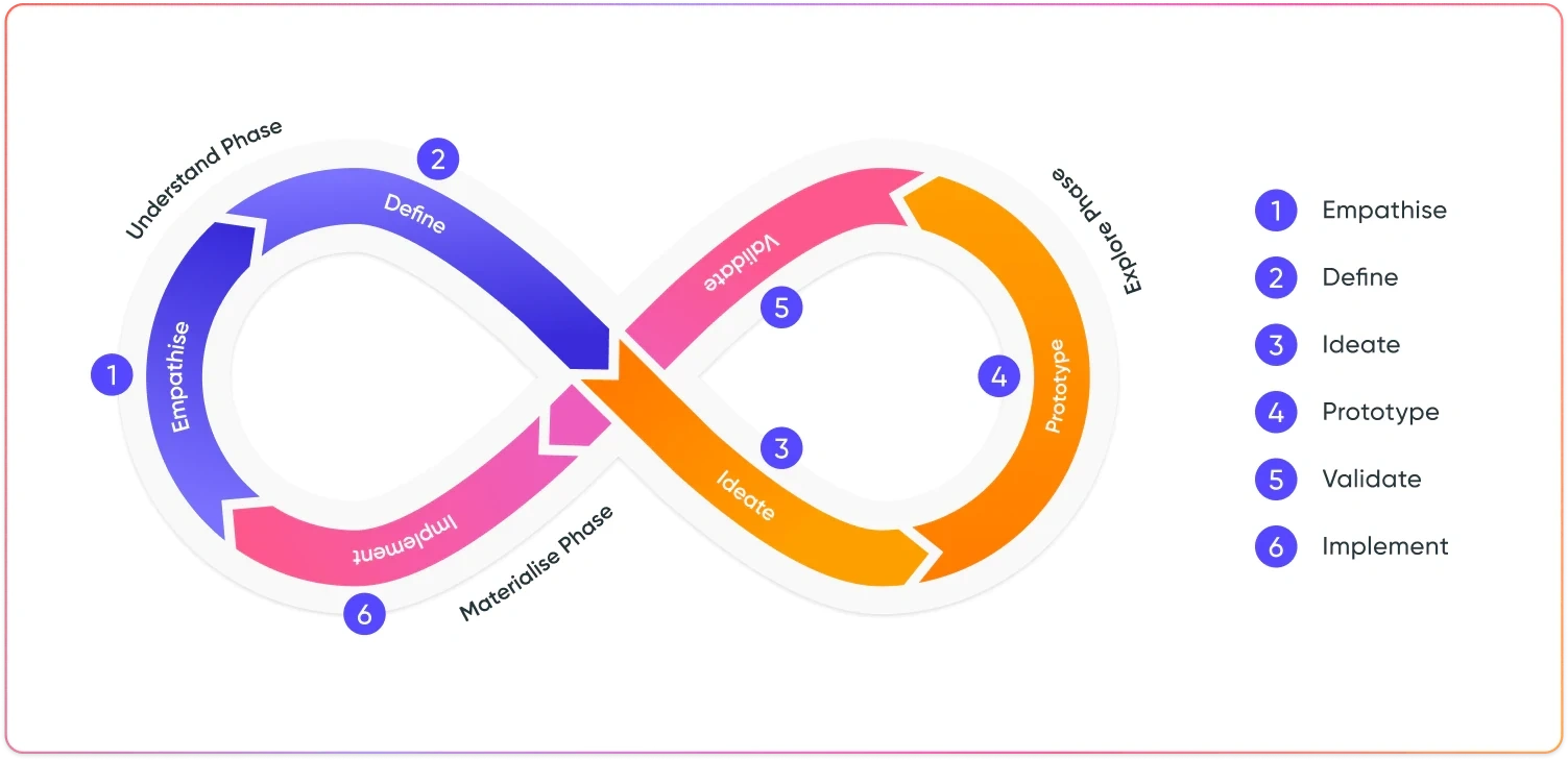
Diagram of the 'Design Thinking' approach to my agile design process
Understanding Phase
Empathise with users and define the problems
The Network One project was built on the framework we'd previously developed for the client. The goal was to create a flexible and highly responsive web app that could function both as a standard web experience across desktop, tablet, and mobile devices, and be installed locally on Smart TVs and large interactive touch screens for installations.
Ensuring flexibility across different screen sizes, combined with user accessibility and human-computer interface design, was an exciting challenge. Another consideration was translating the brand and marketing materials from their print counterparts into digital elements. As the project was designed to be a framework for future projects, it was important to consider how the process would impact the project over time, given that brand and marketing partners could change.
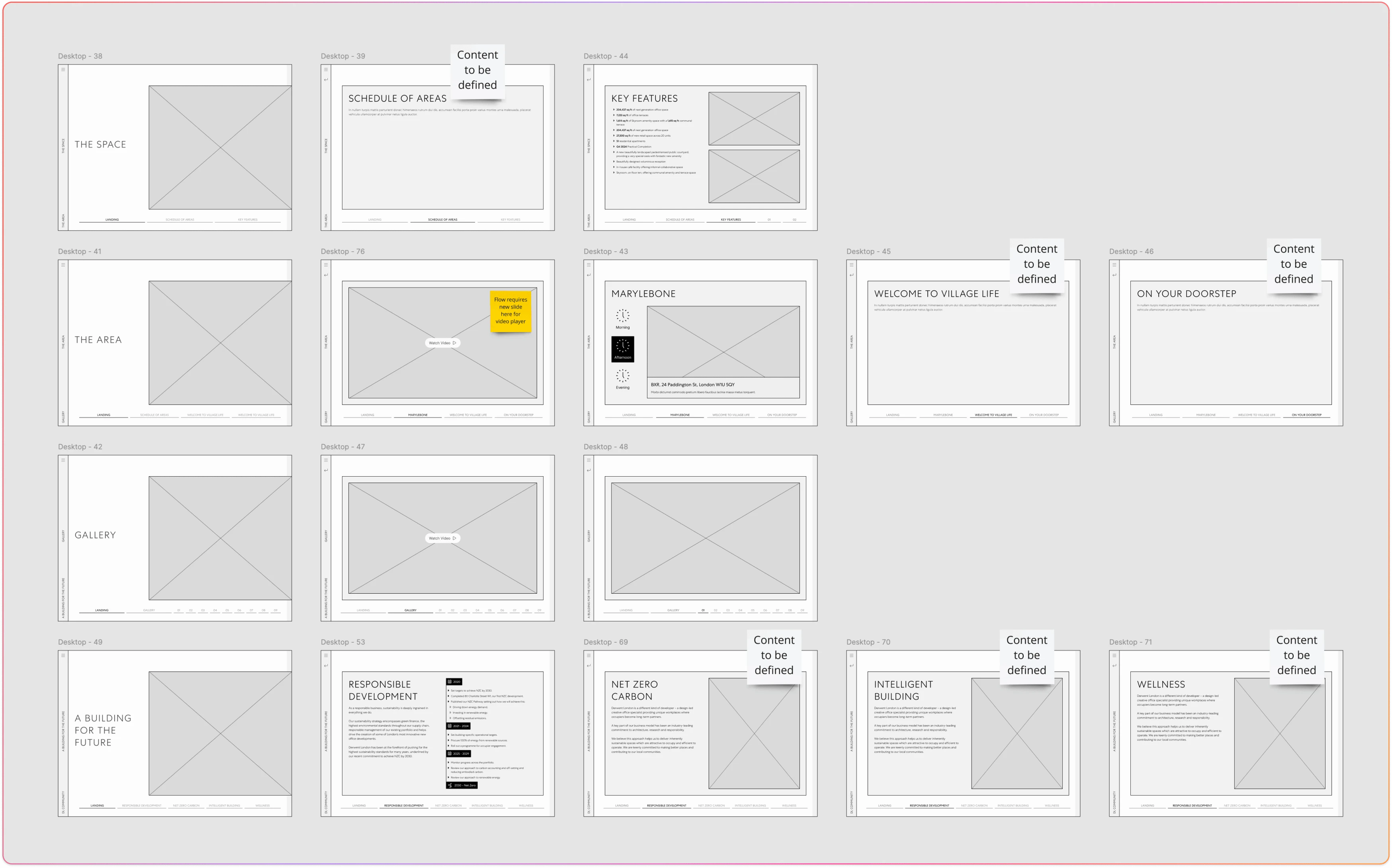
Early wireframes
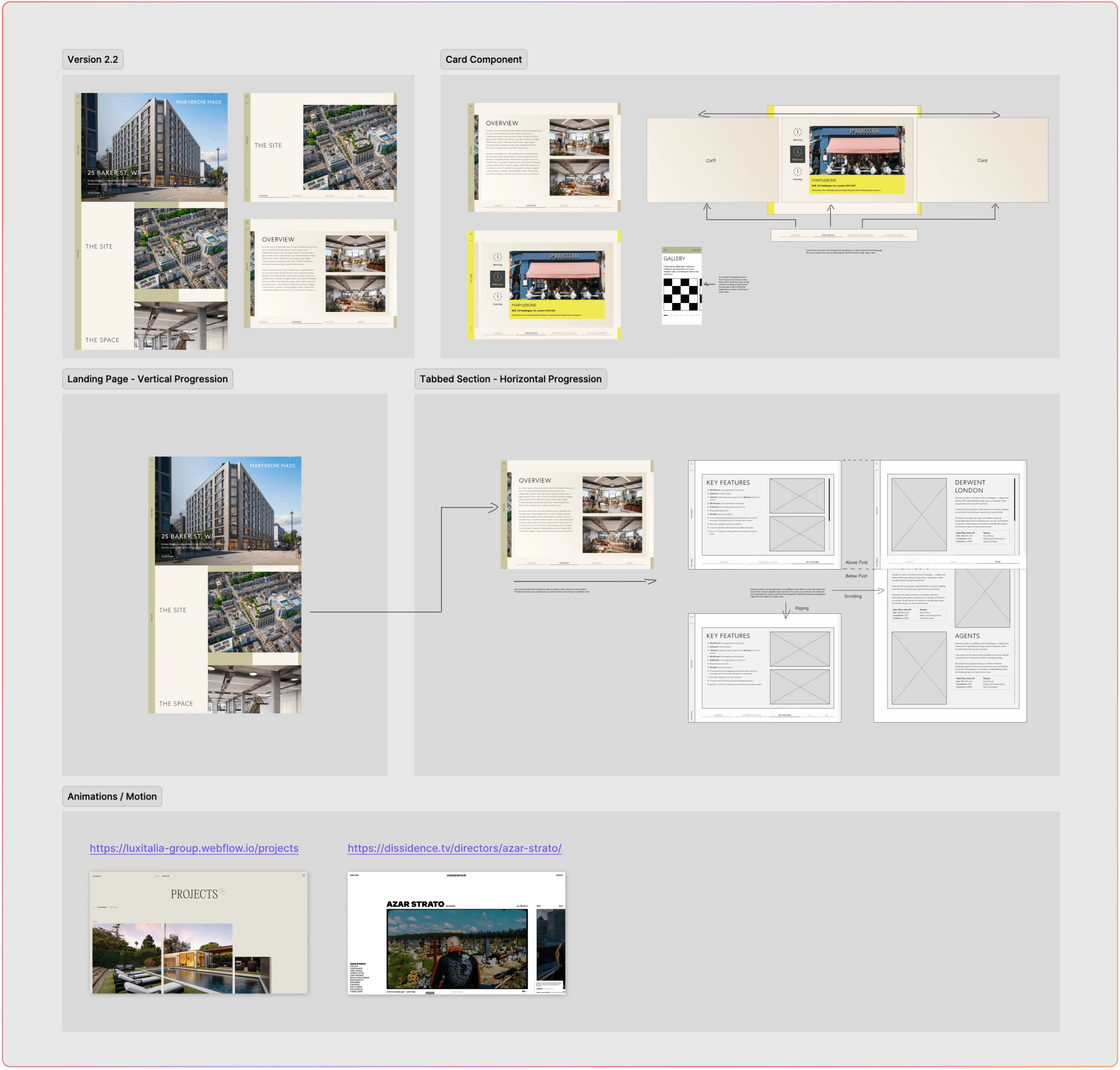
Stakeholder engagement and reviewing initial versions for further refinement
Several design explorations were conducted to better understand the implications of supporting such a wide variety of screen sizes and needs. The initial 'Baker Street' project focused more on the large touchscreen experience installed in the physical space. User accessibility was critical—specifically the physical interactional elements and constraints such as other items in the installation and how users would interact with the experience alongside sales staff.
For users with constrained physical abilities, we devised a paired remote/mirror function between a second touch device and the primary large touchscreen. This allowed users unable to reach larger screen touch elements to control and engage with the full experience.
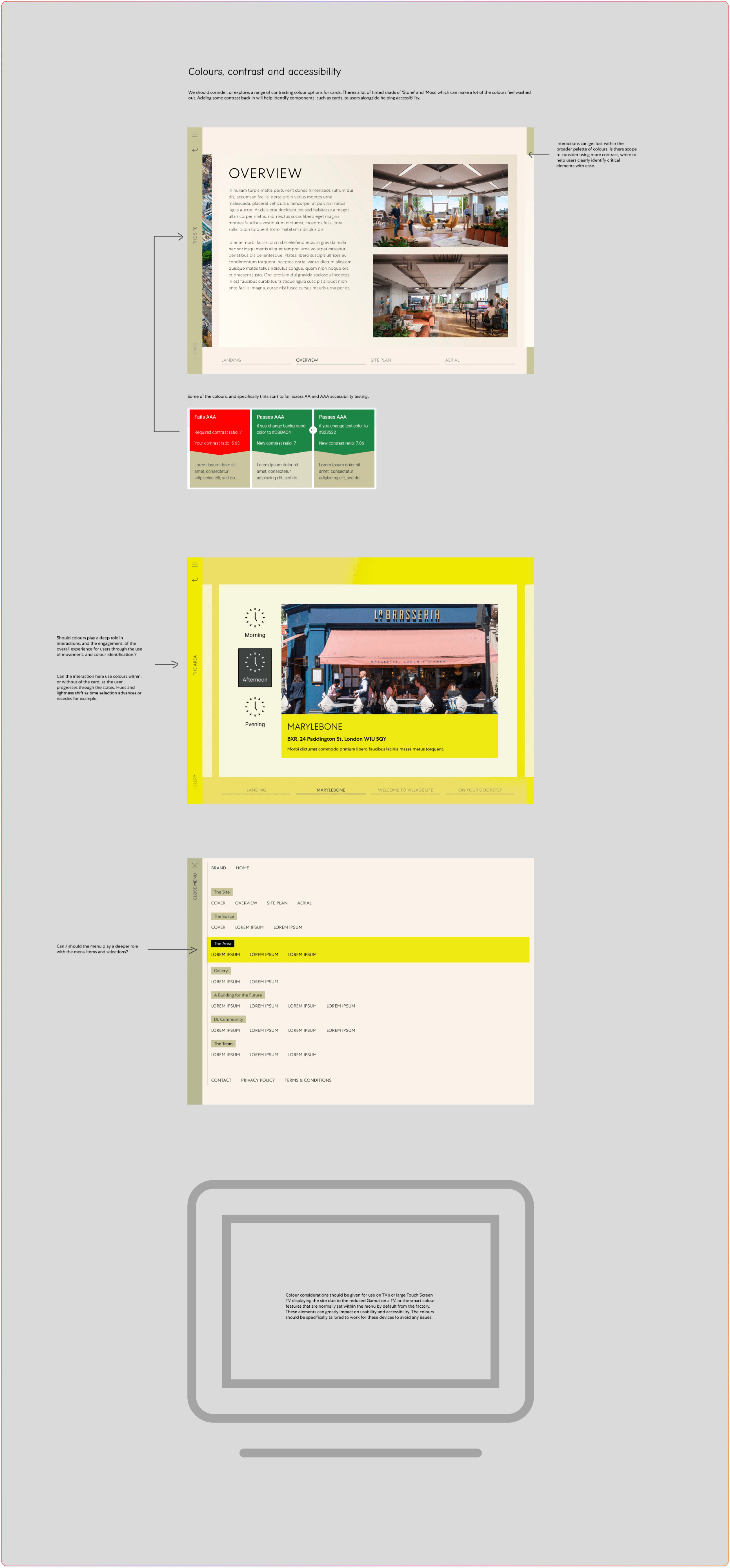
Accessibility discussions and considerations
Explore
Ideate solutions and prototype
Several key factors emerged from the initial discovery phase. Firstly, we needed to consider scalability, from mobile devices to large interactive touchscreen panels used in physical installations. While some design elements needed to adapt, many still required responsiveness.
We also had to account for the visual brand, which was defined by a third-party partner. The interactions and elements on the screen added additional complexities to the design process. Several design attempts were made to explore and understand how we could meet our design objectives.
One key challenge was navigation. The underlying experience needed to be flexible enough to function across these different formats. For example, the larger installation required different navigation layouts, as traditional menus would not be physically accessible to users in a showroom space.
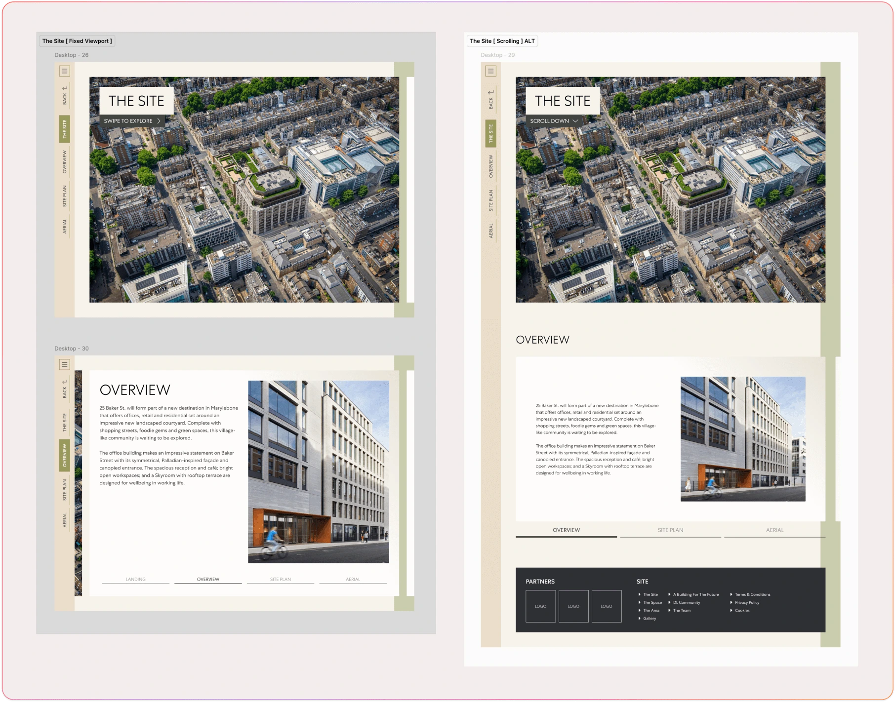
Version 1.0 - 2.0 explorations
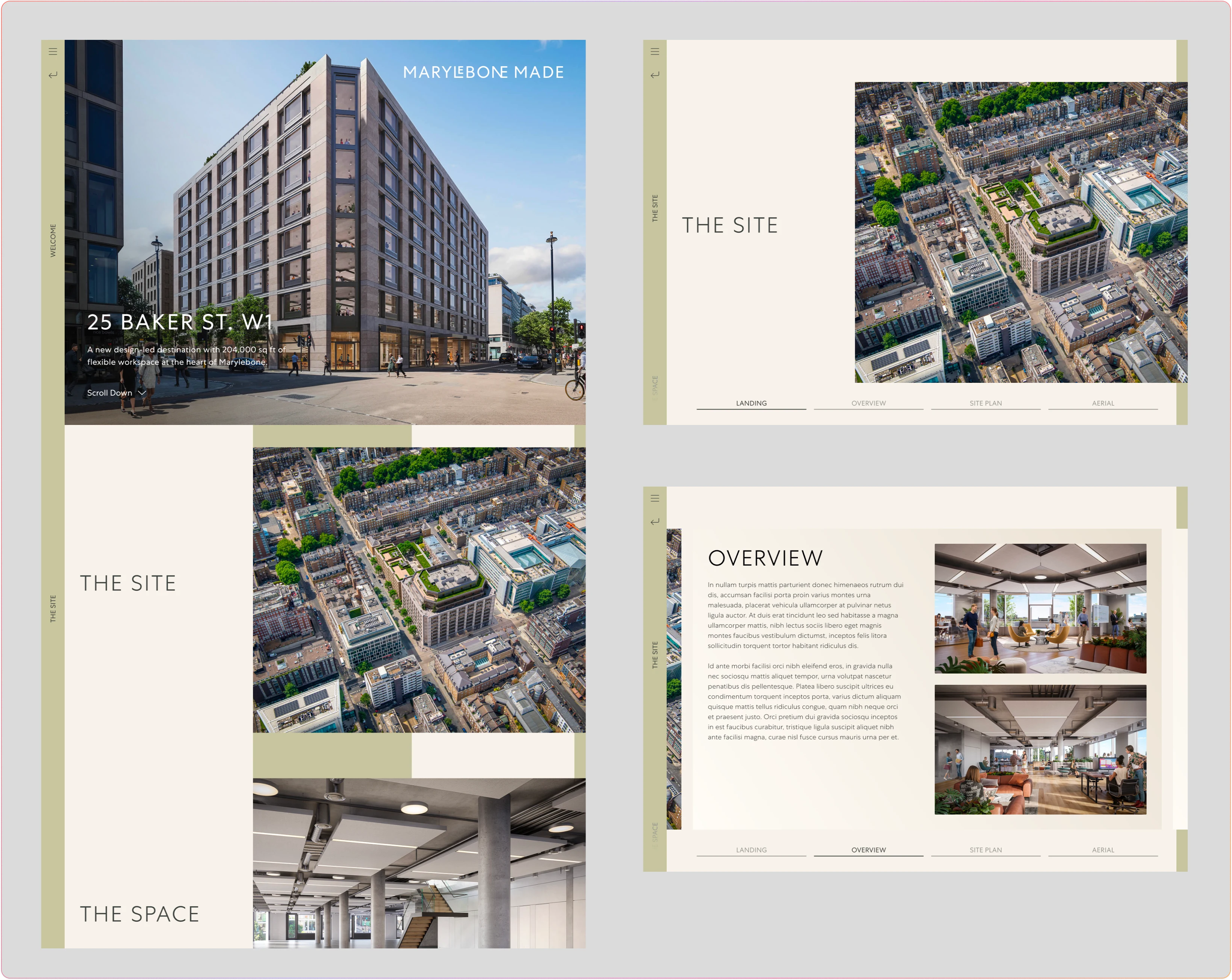
Version 2.1 - 2.2 explorations
Through several iterations of the design (versions 1.0 to 2.3), we explored how best to manage primary and secondary navigation. We aimed to make it usable while ensuring that users above four feet tall could reach and engage with the content. Anchoring navigation in a location that didn’t obstruct other users from viewing the content was essential. As a result, we moved the sub-section navigation from the bottom of the screen to a slim column next to the primary navigation bar on the bottom left.
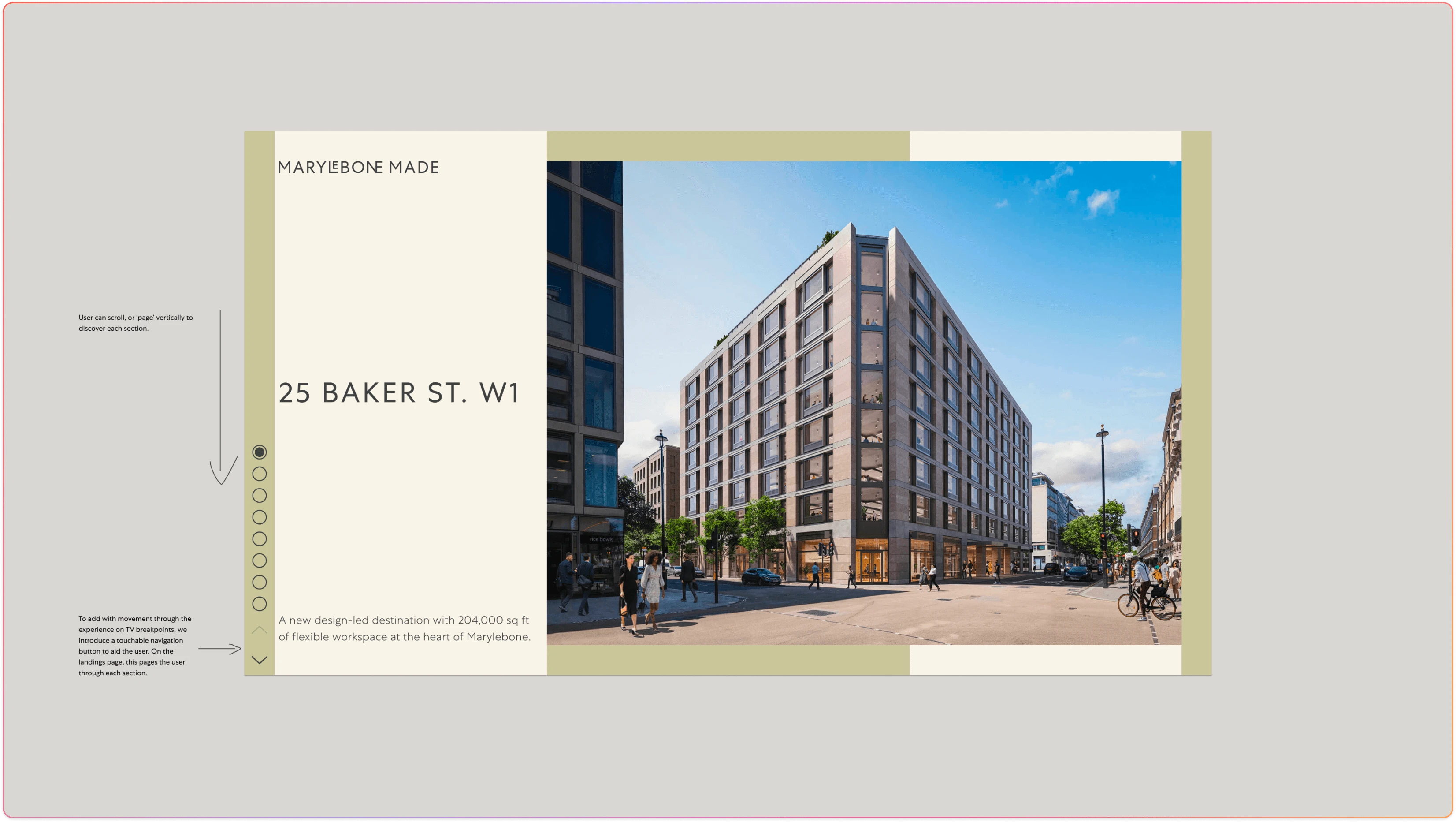
Version 2.3 landing page refinements
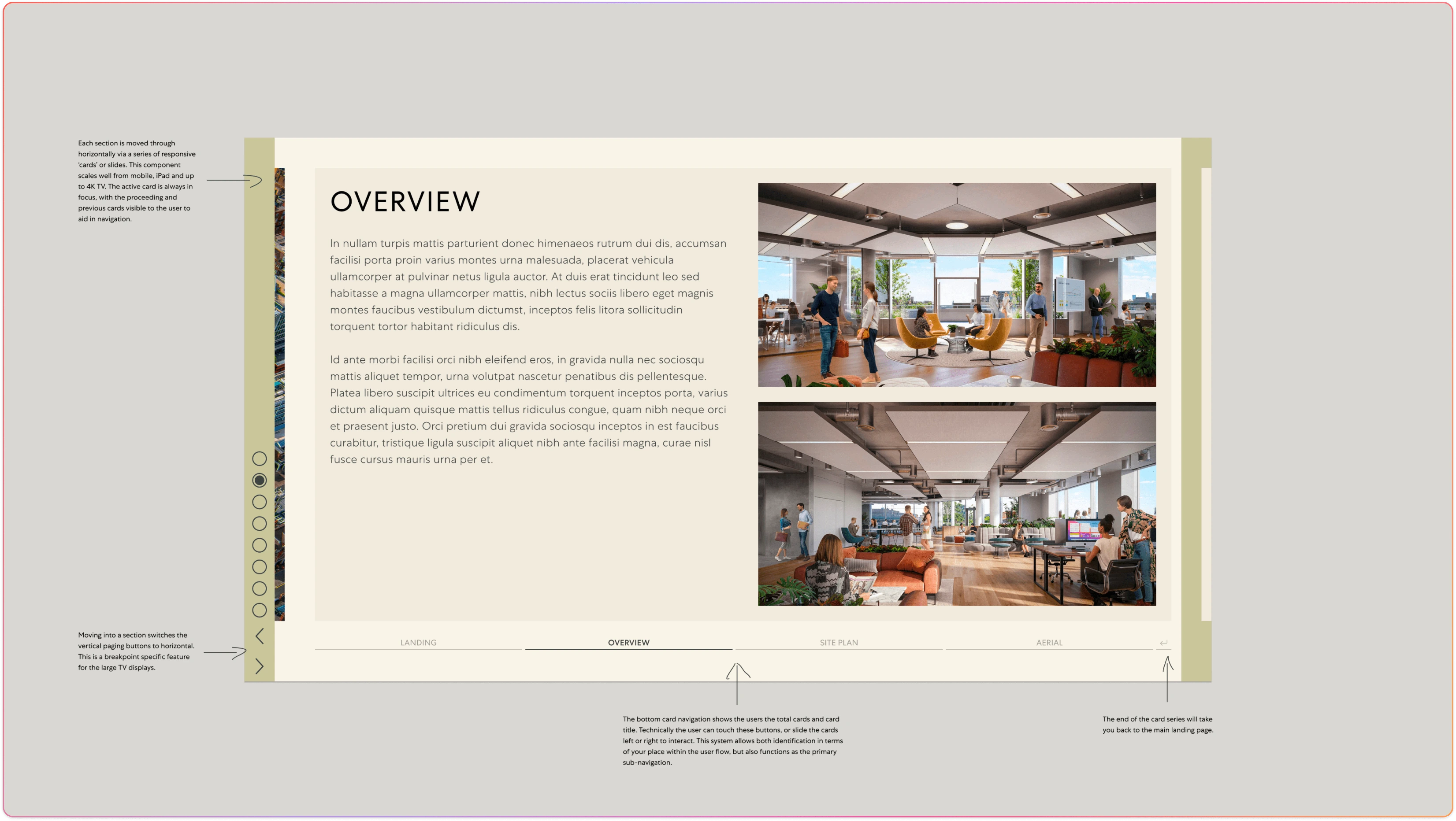
Version 2.3 sub-section nav remained horizontal
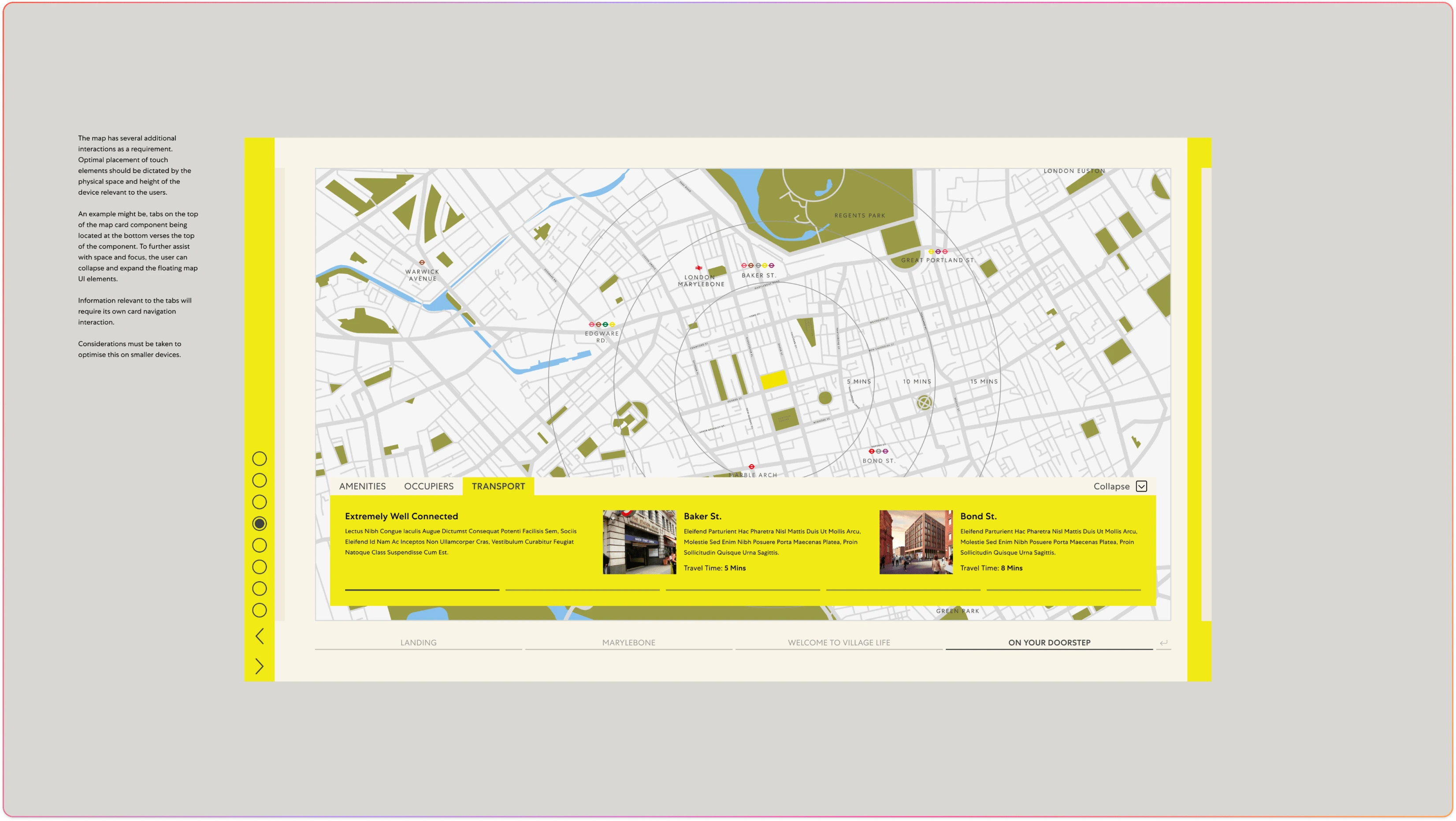
Version 2.3 sub-section map with interaction map markers
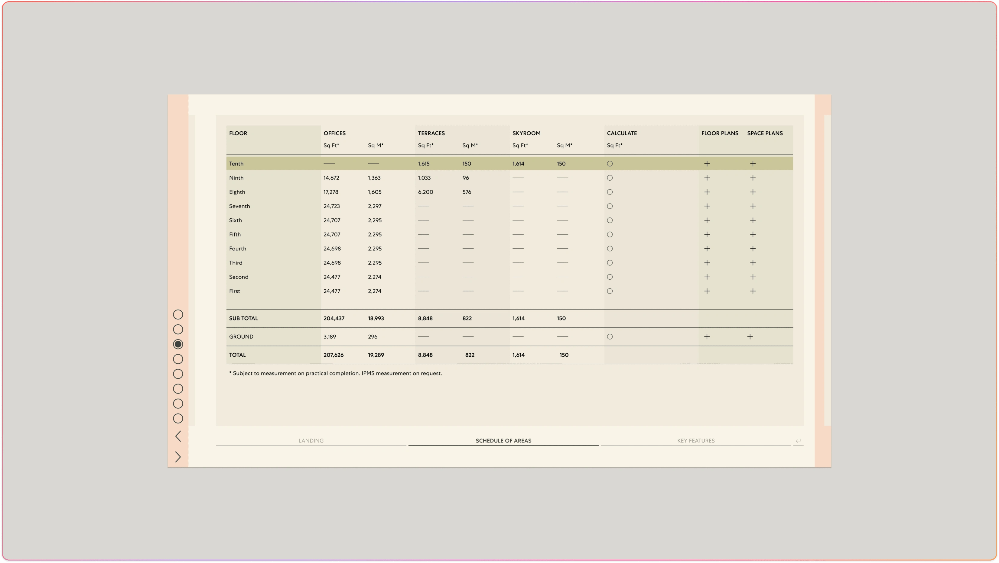
Version 2.3 interactive floorpan table
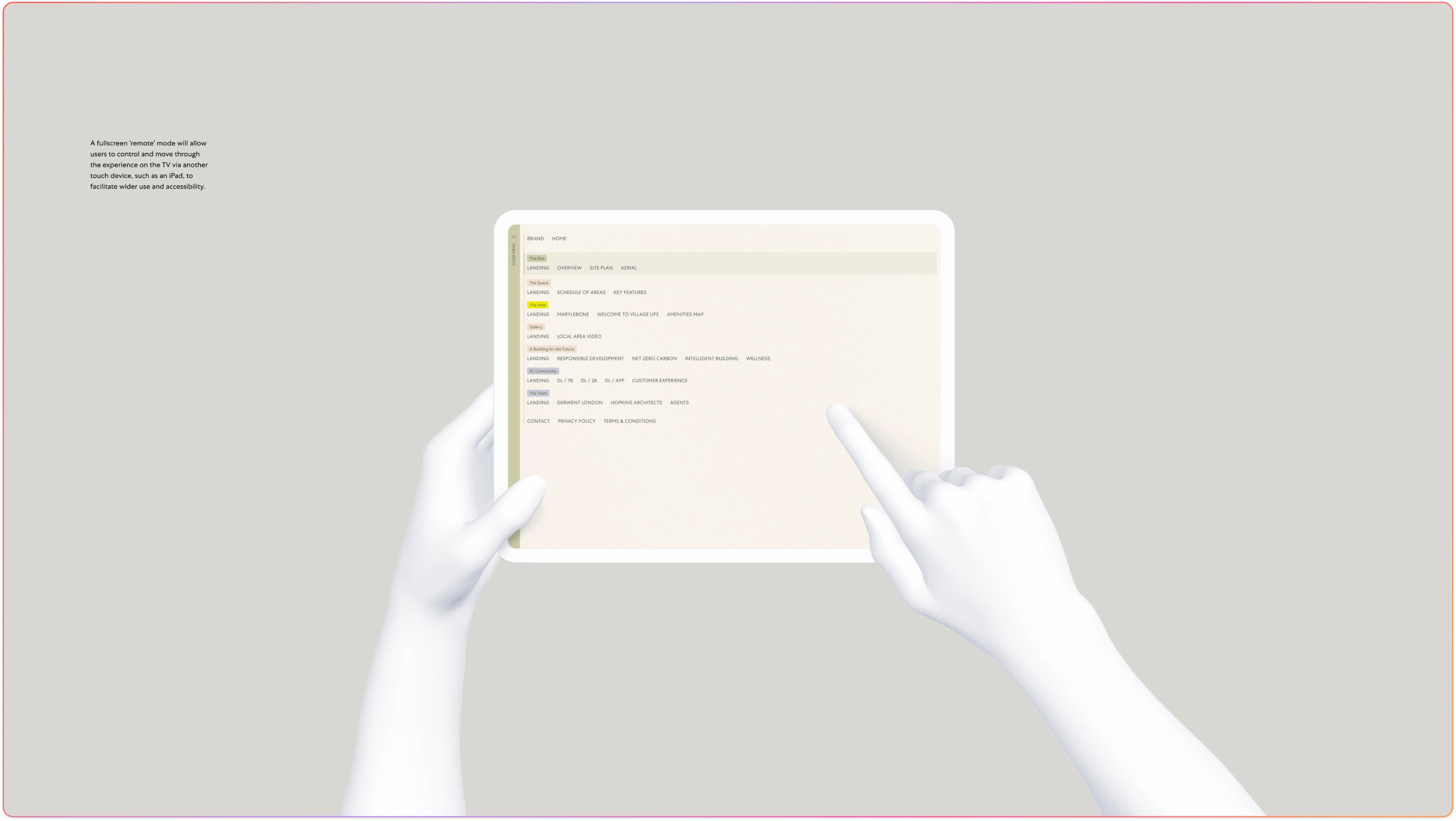
Version 2.3 remote control / paired device explorations
Materialise
Validate and implement
Network One represents the first iteration built on the foundations laid in the 'Baker Street' project. Throughout this case study, we have explored the design process and challenges we faced. By the end of the initial project, we had gained valuable insights, which we applied during the Network One project, particularly in improving the mobile experience.
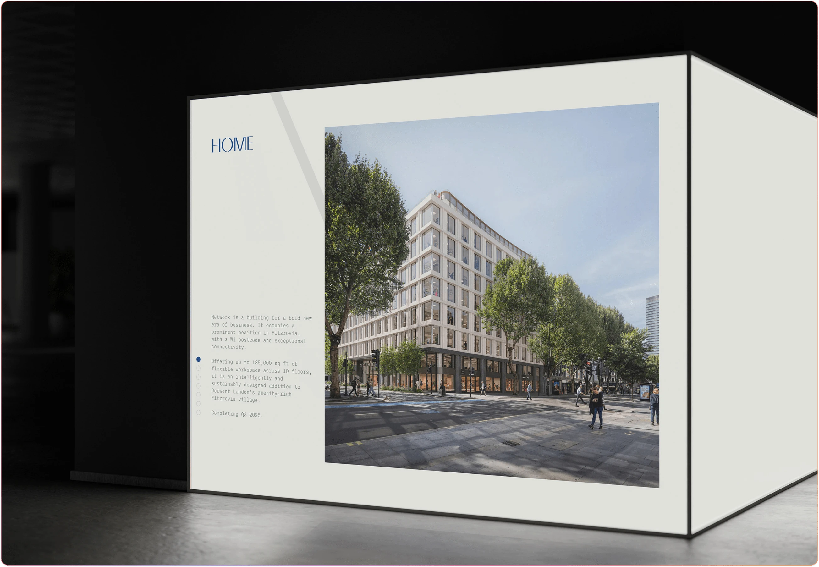
The brand design for Network One was clean and simple, translating well into the framework for the site. This style worked harmoniously with the skinned interface elements, enhancing visual communication. We worked closely with stakeholders and partners to refine the interactive table and modals, especially given Network One's mobile focus.
In particular, we made the floor plans interactive, improving on the complexity of the CAD software outputs that had been an issue during the Baker Street project. The improvements in performance and quality were substantial, resulting in faster page loading times.

Network One - Home Page
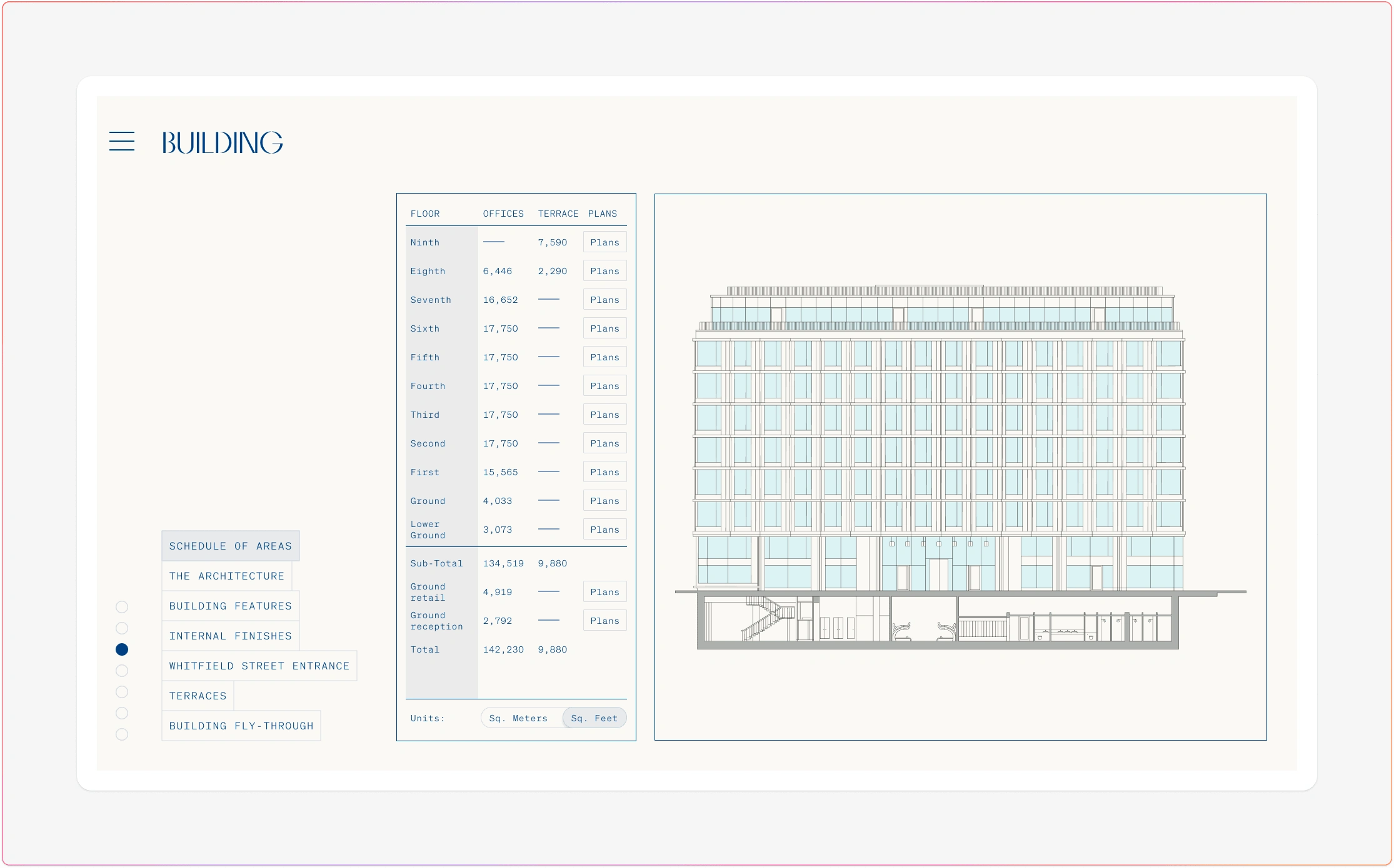
Network One - Floor Plans
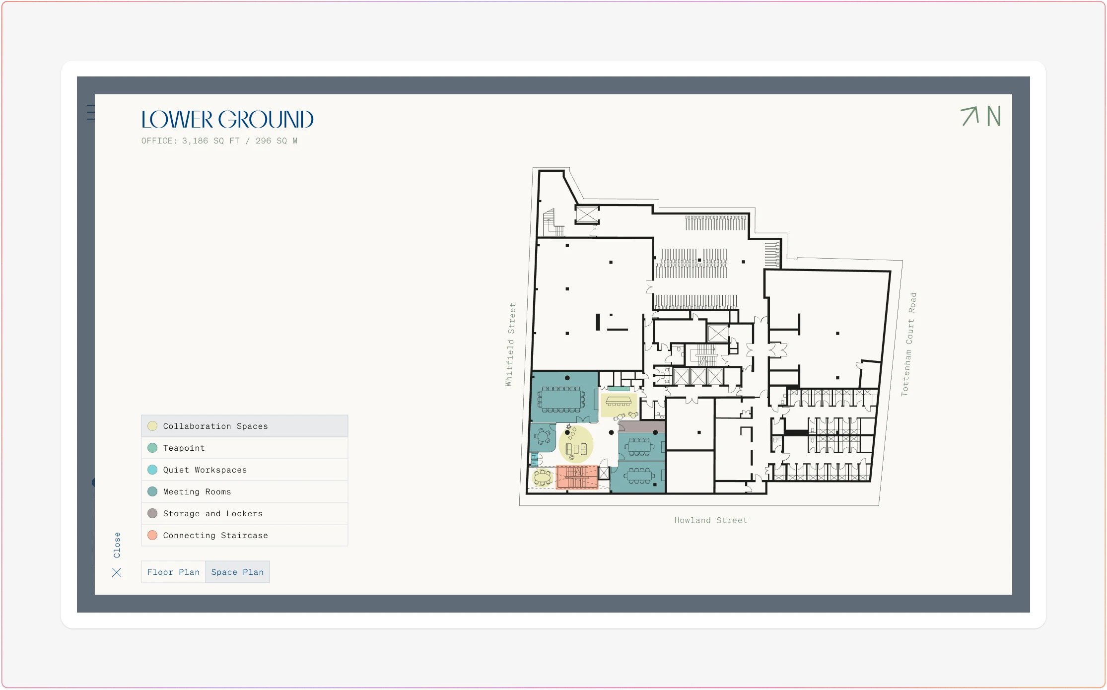
Network One - Lower Ground Floor expanded floor plan in modal
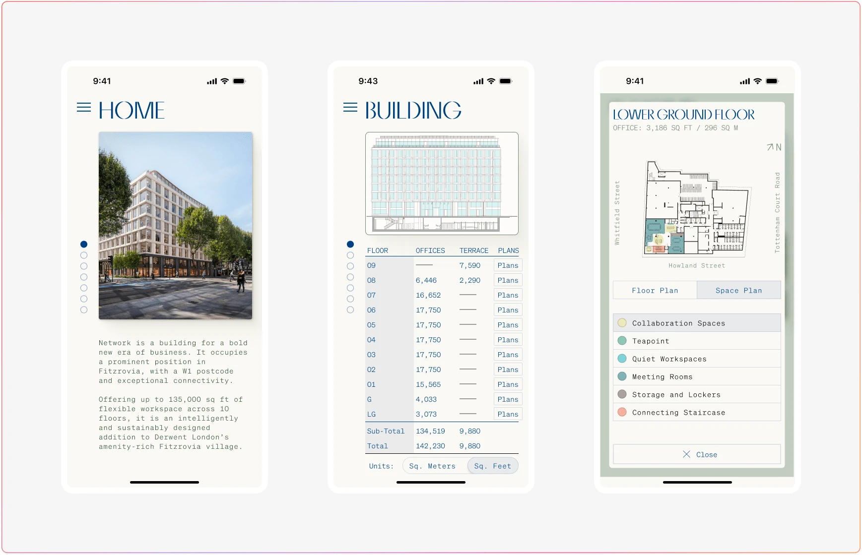
Network One - Mobile screens
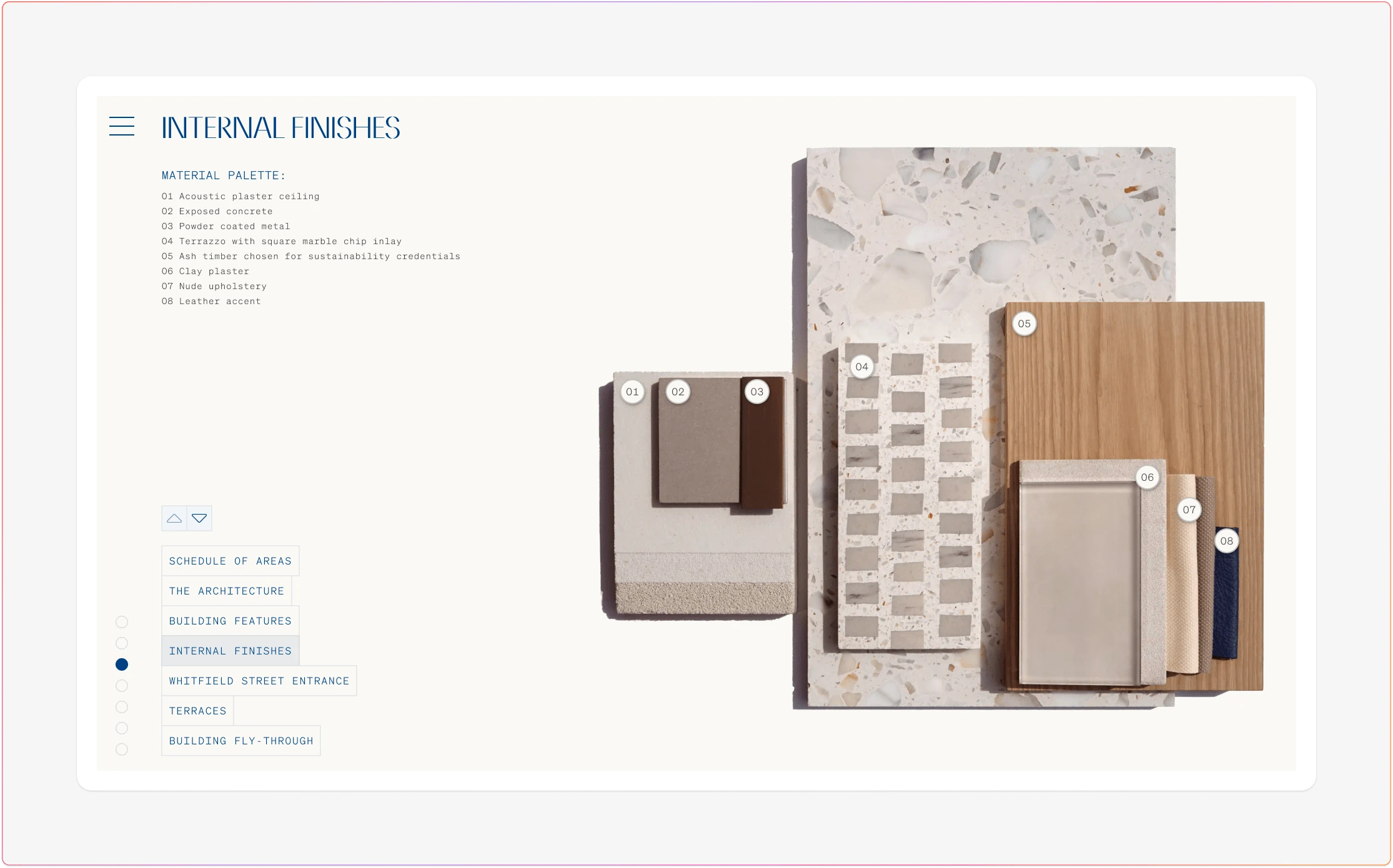
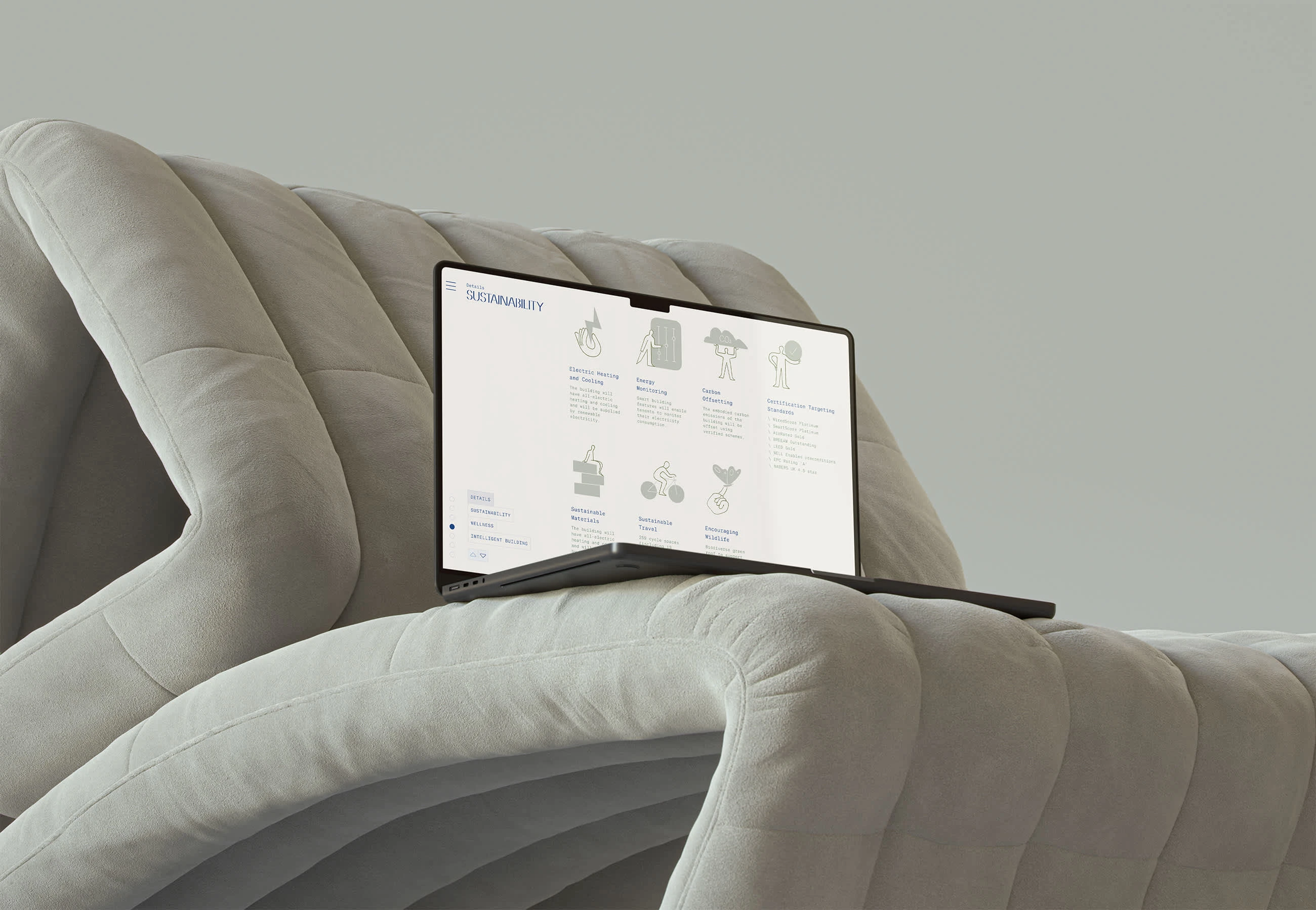
Network One – Materials screen
Conclusions
Realising efficiency and cost-effectiveness
The Network One project demonstrated significant improvements in design efficiency, user experience, and overall project management. Building on the foundational framework from the Baker Street project, we were able to enhance mobile usability while addressing the unique challenges of large, interactive touchscreens. Our collaboration with stakeholders and marketing partners allowed us to deliver a cohesive experience that seamlessly integrated brand elements across both physical and digital spaces.
By refining the design process, particularly in areas such as navigation and interactive content management, we reduced development complexity and improved performance, especially with interactive elements like floor plans. These advancements led to a smoother quality assurance process and more efficient delivery, ultimately driving cost-effectiveness for the client.
This case study highlights the value of an adaptive framework that can scale across diverse display environments while maintaining a consistent and accessible user experience. As a result, the Network One project sets a strong precedent for future work in responsive design for interactive installations, ensuring that both mobile-first and physical space interactions are equally engaging and functional.
Thanks!
Checkout my other projects on Contra. Product Design can help business deepen their connection with users, helping to convert on their business strategies. This drives engagement, develops retention all while improving revenues for the products and services that matter to you.


