Subtle Pictures on Behance
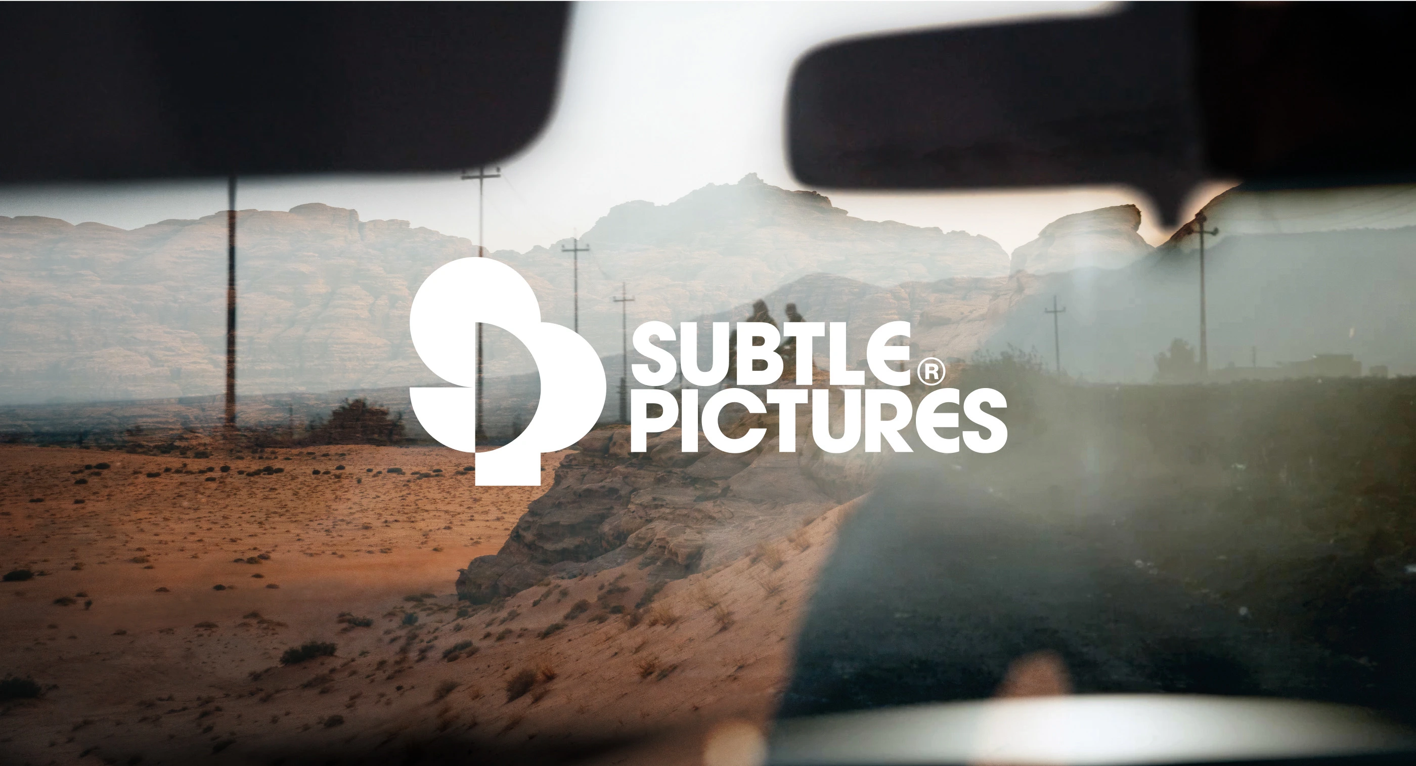
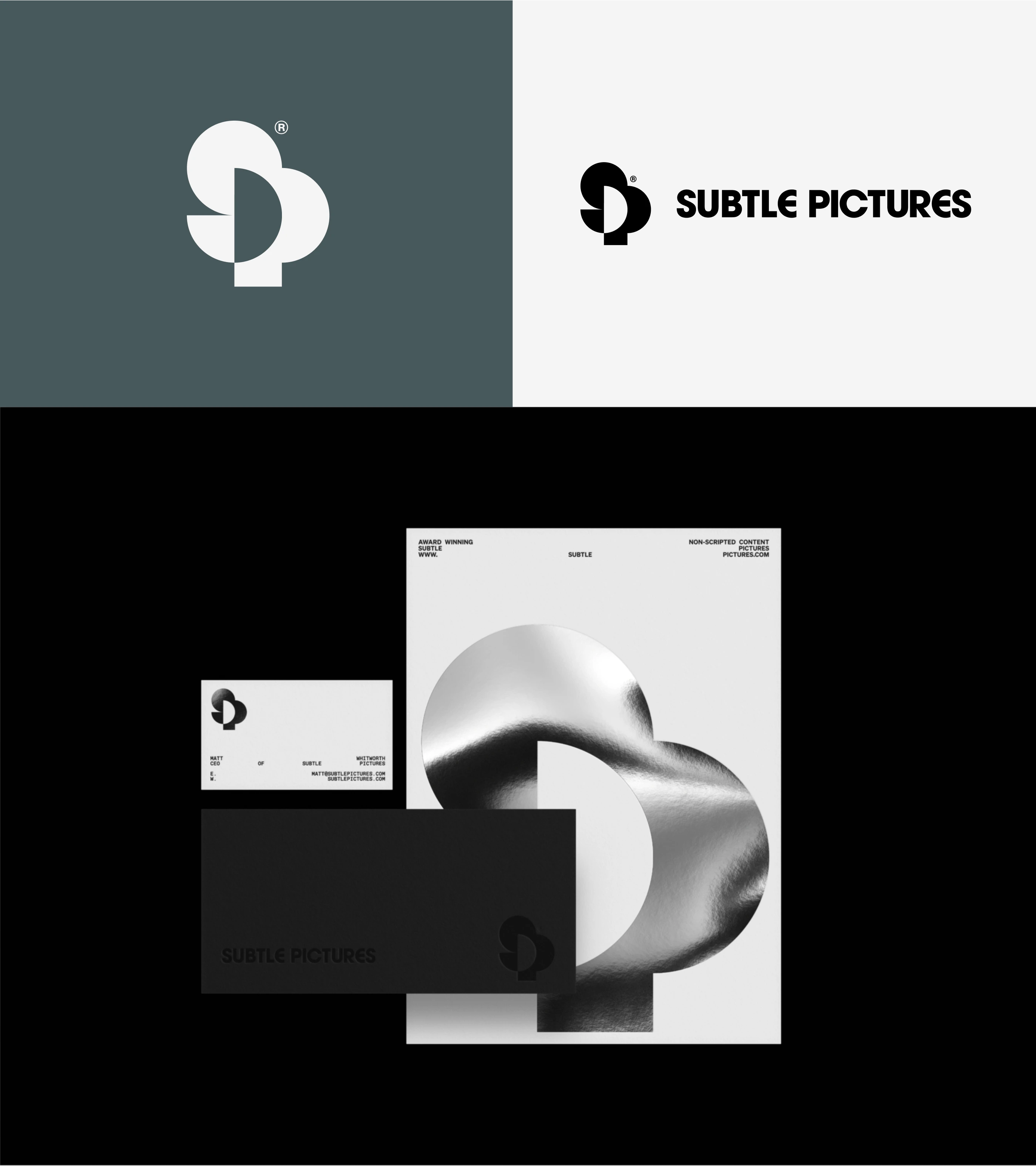
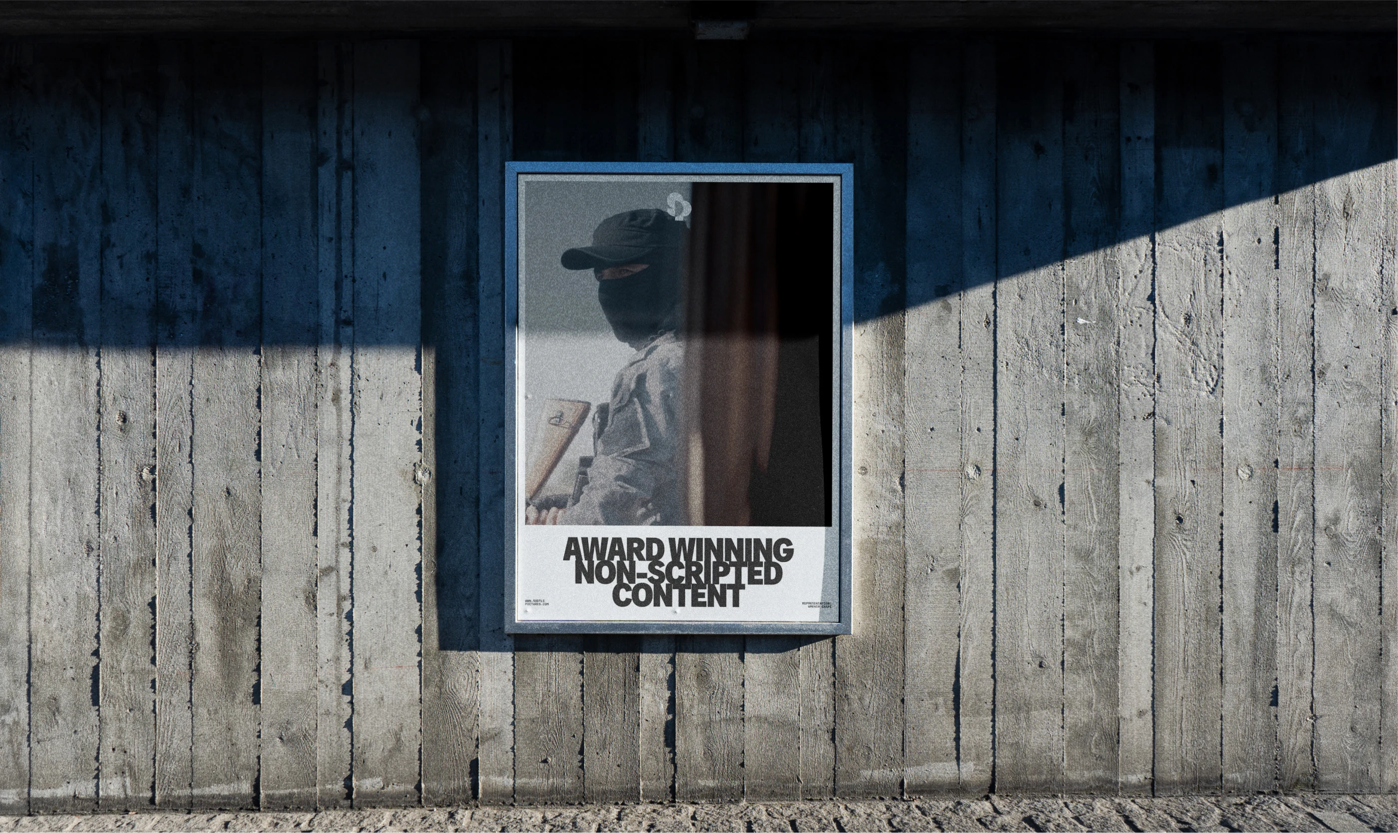
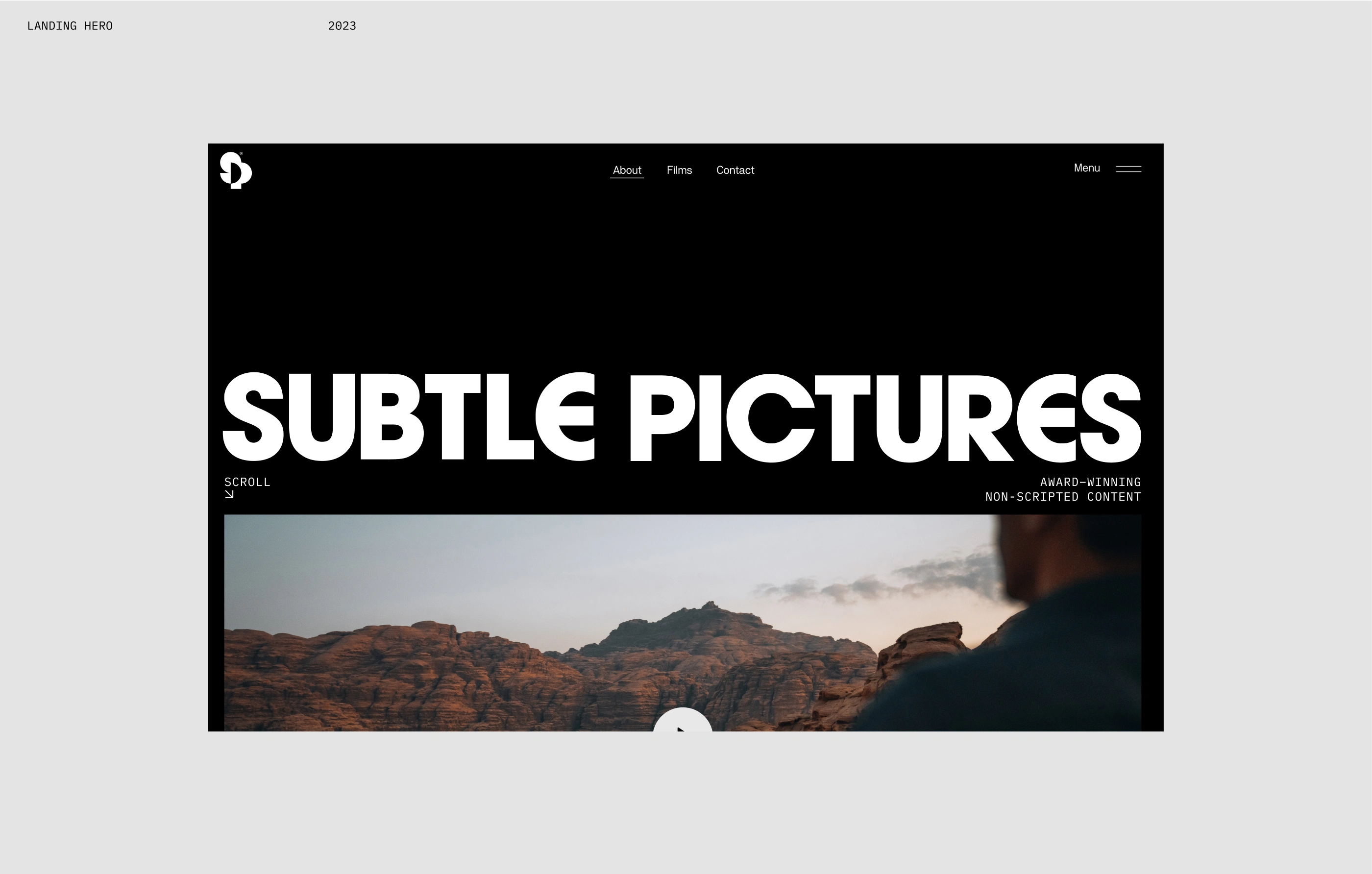
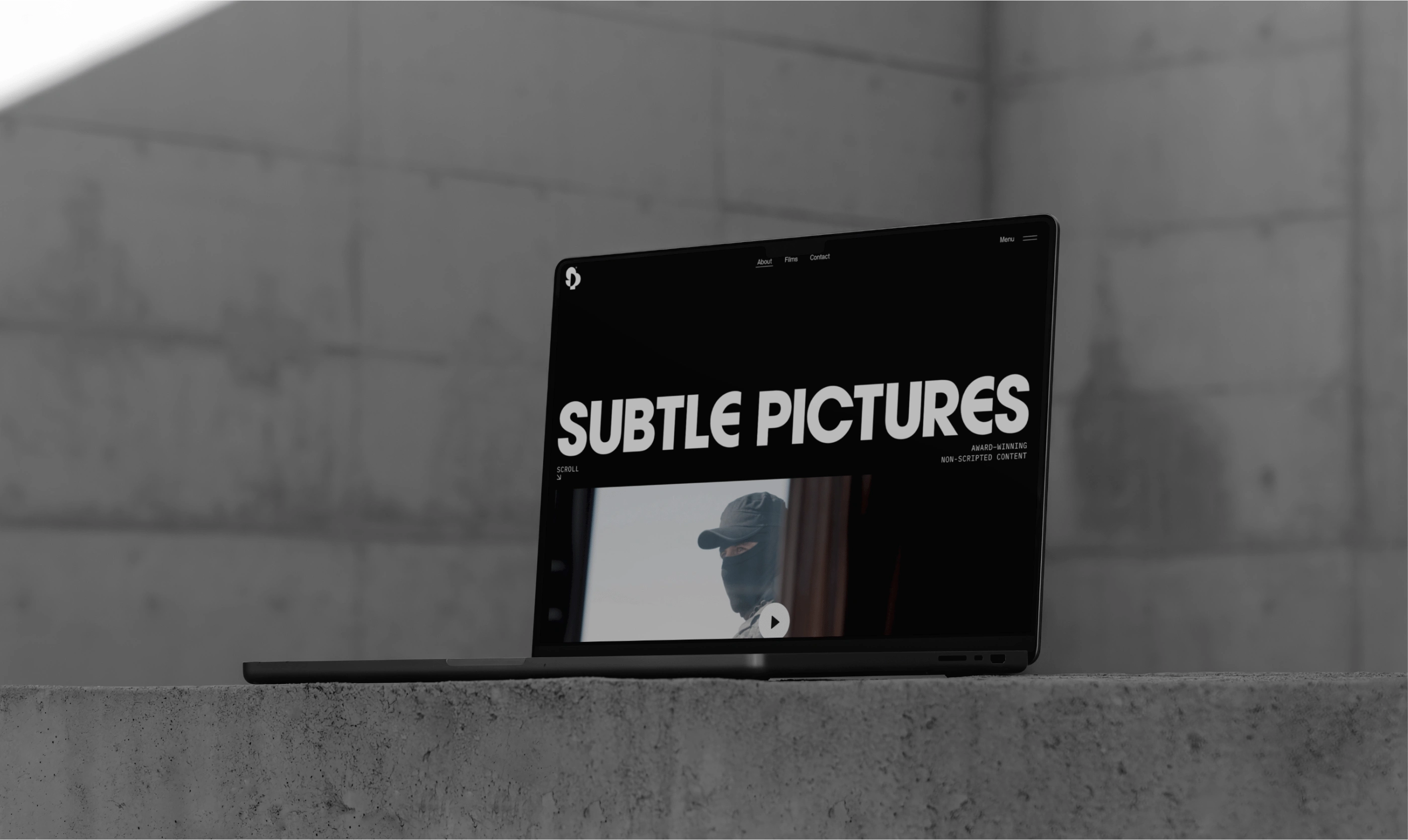
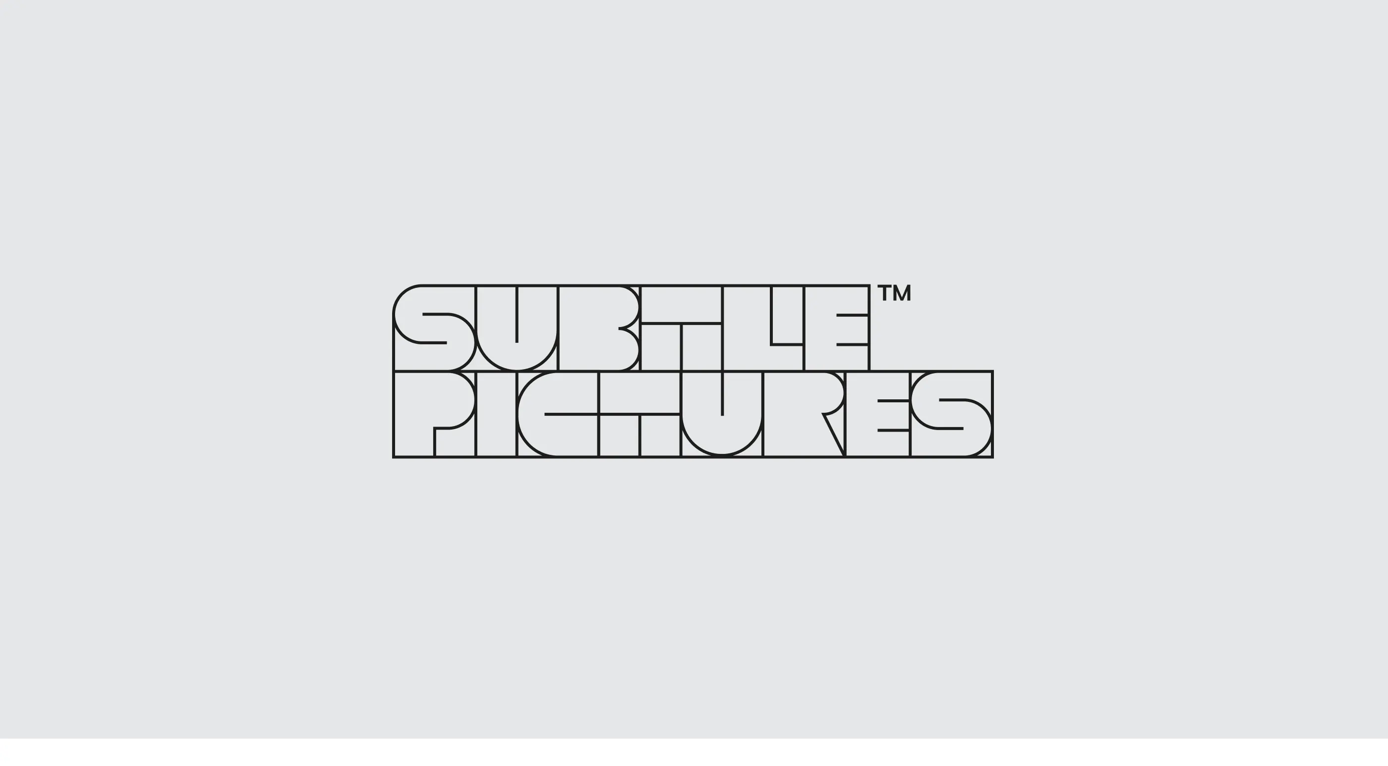
We were approached by Matt Whitworth, the CEO of Update, to create a new identity for Subtle Pictures, a film production company based in New York specialising in award-winning non-scripted pictures. Our task encompassed developing a logo, visual identity system, landing page, and other brand touch points.
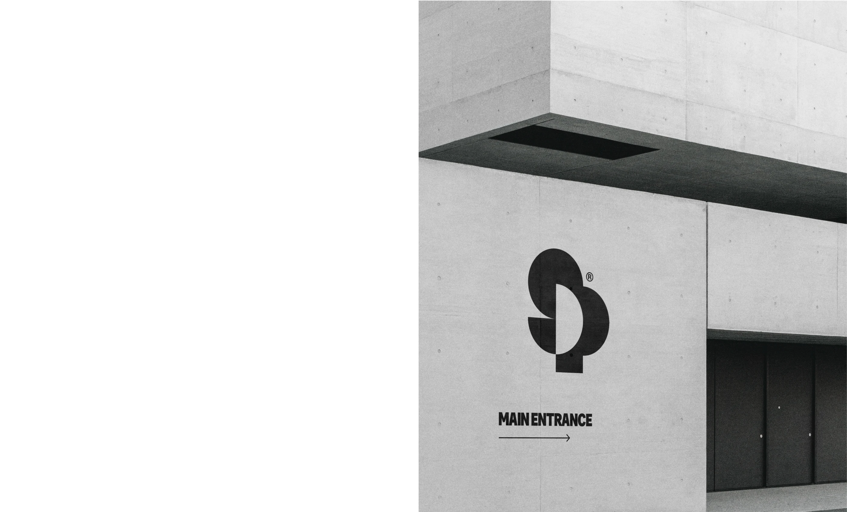
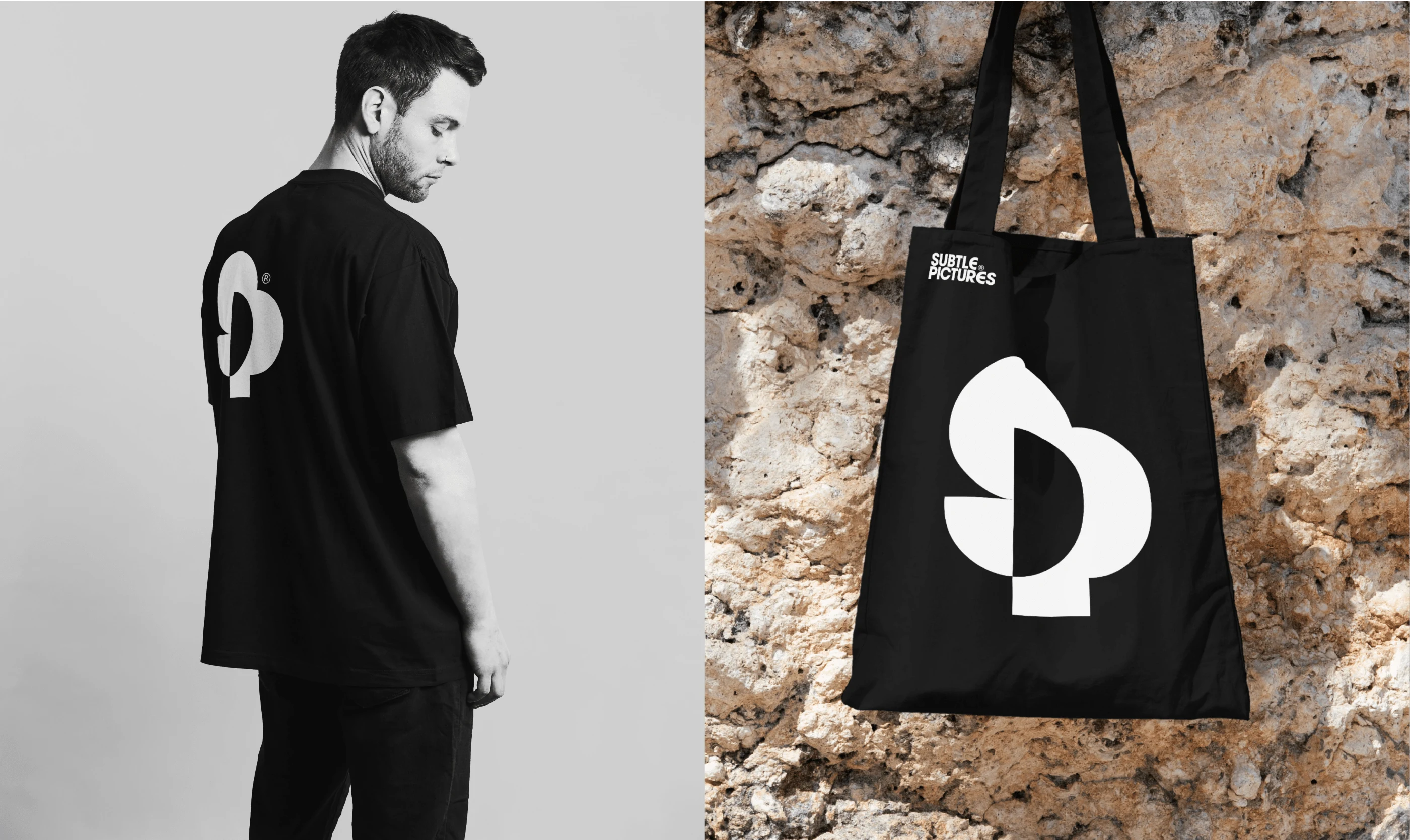
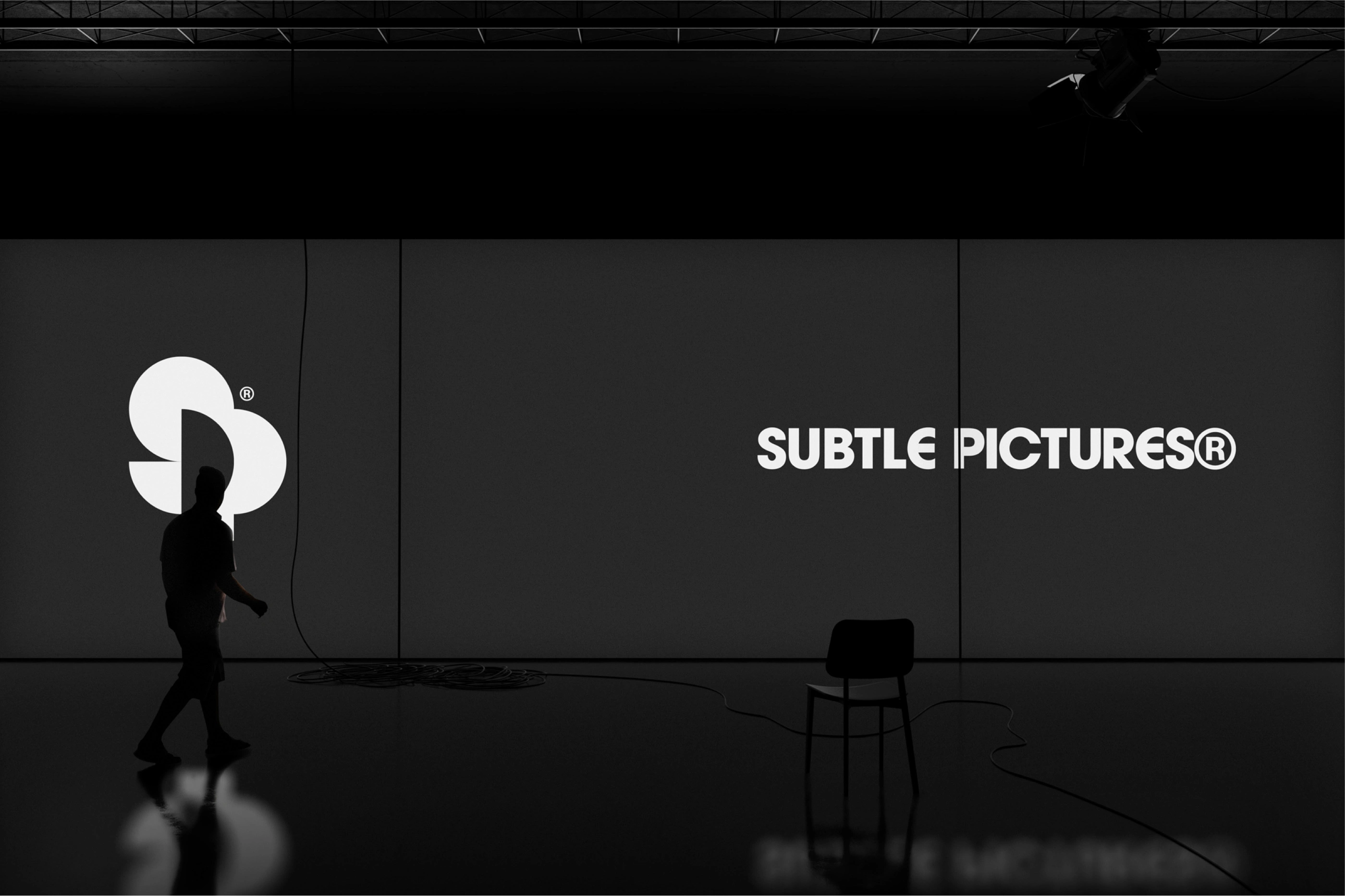
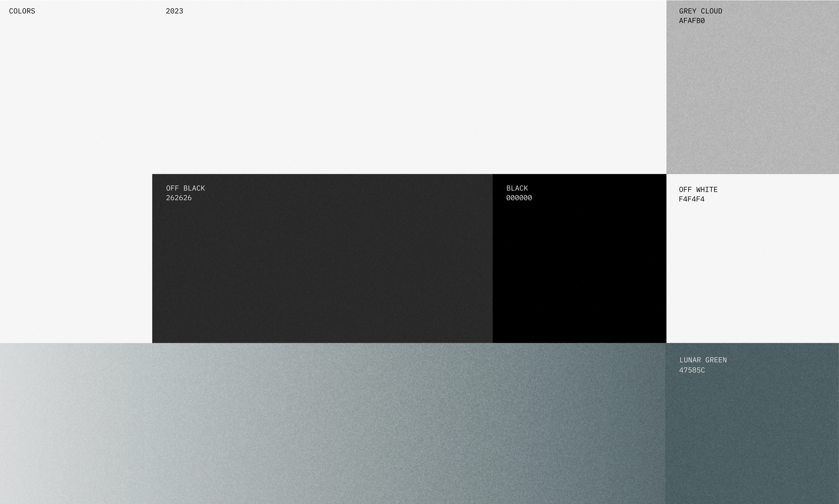
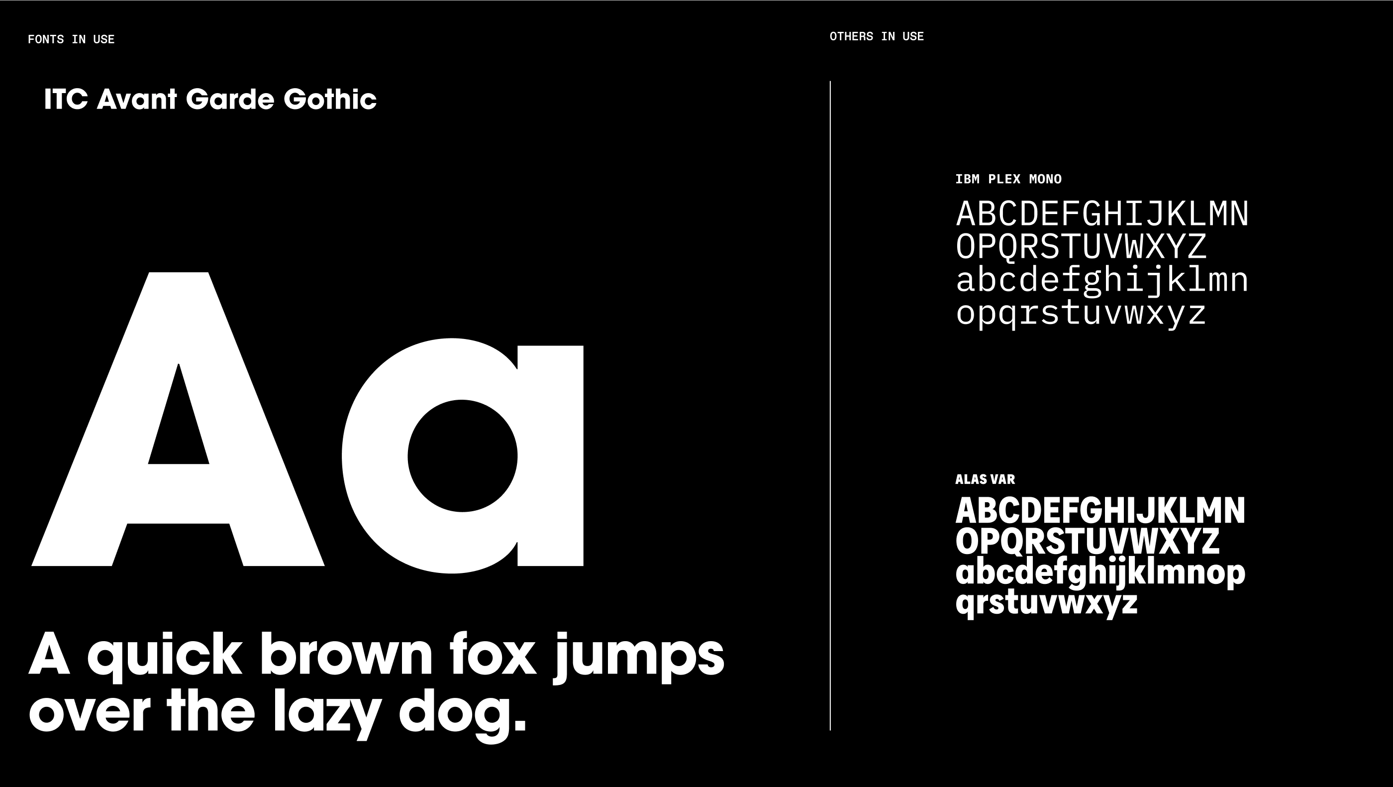
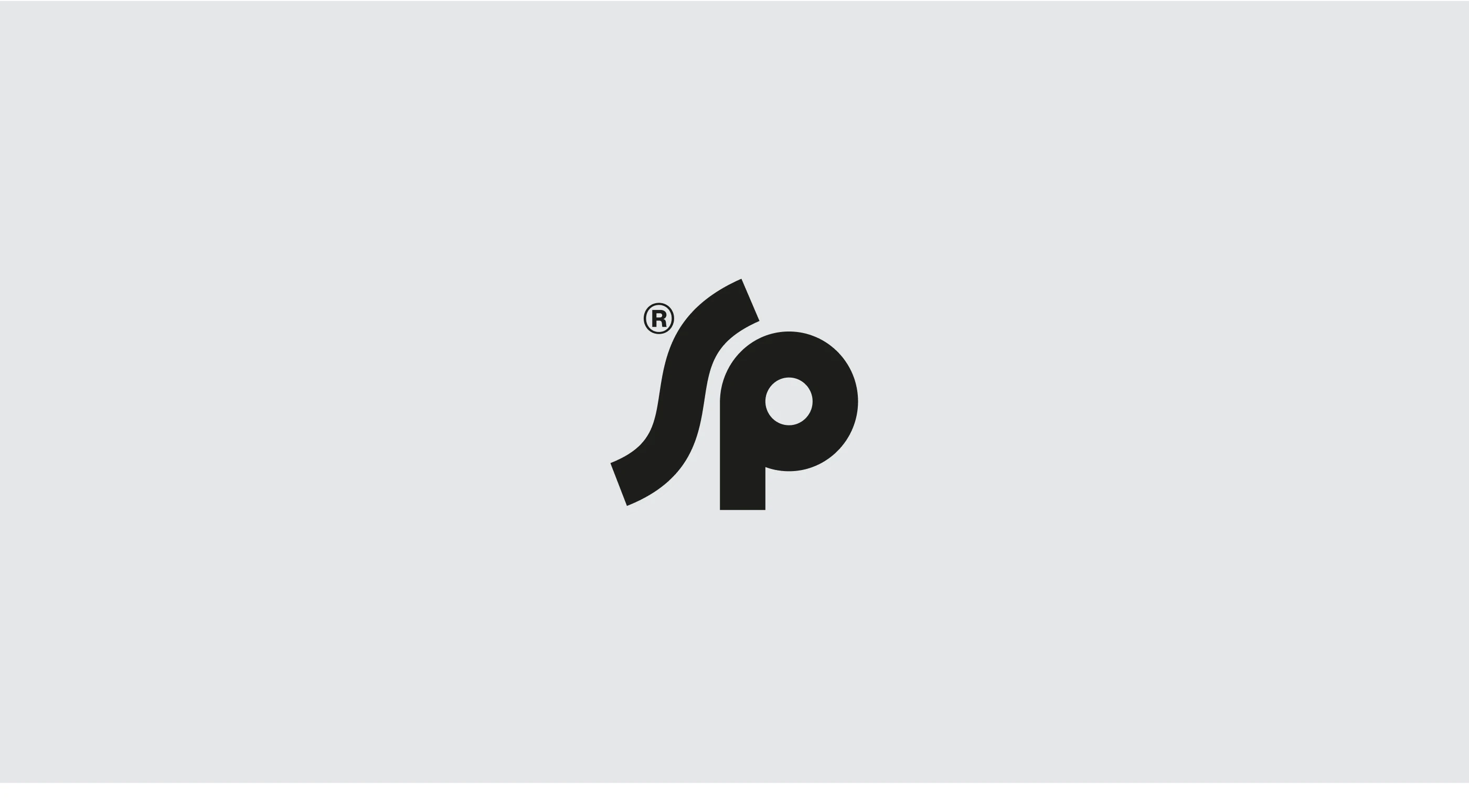
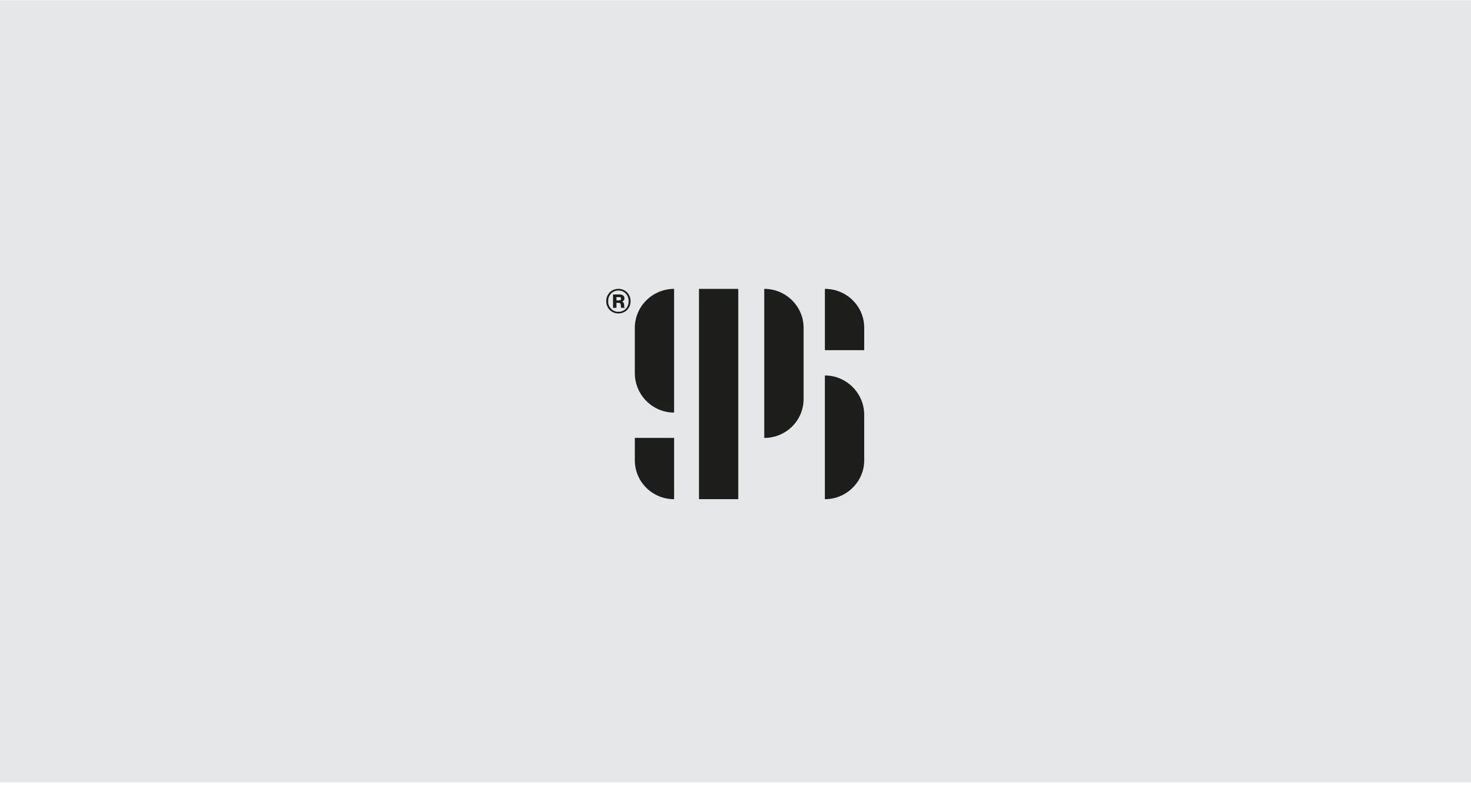
After exploring numerous logo concepts, it became evident that the monogram style, artfully combining the letters 'S' and 'P,' stood out the most. Once the decision was made, we centered the entire visual identity around this distinctive mark. Given the factual and documentary-style theme of Subtle Pictures' films, our primary goal was to evoke the same feeling and emotion through their overall identity. Thus, we carefully selected a color palette that avoided overly bold hues and embraced more subdued shades. Additionally, we opted for typography that exuded professionalism and elegance while avoiding any playful fonts.
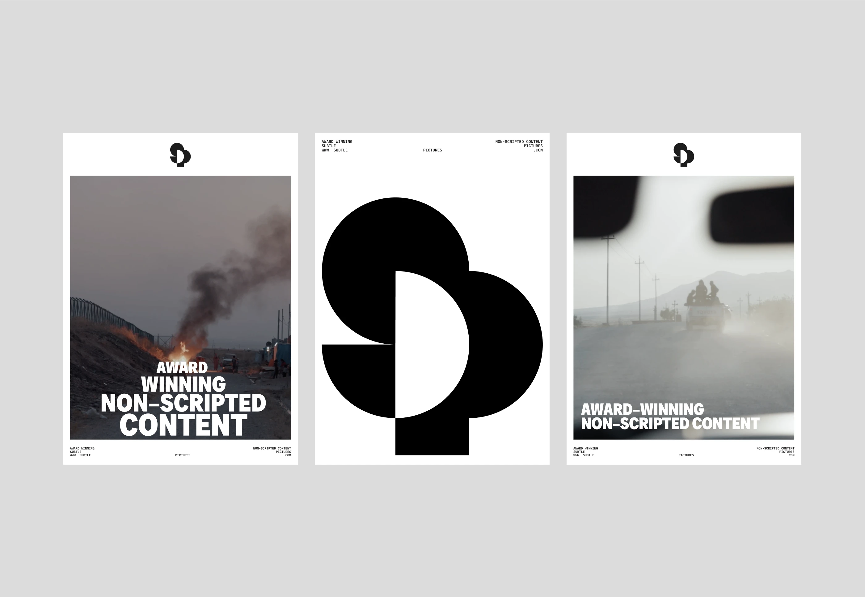
One essential aspect of our design process was to celebrate the exceptional quality of the films produced by Matt and his team. We crafted a cohesive system that enhances their work rather than distracts from it, allowing the films to shine through the branding.
Scope:
– Logo Design
– Colours
– Typography
– Posters
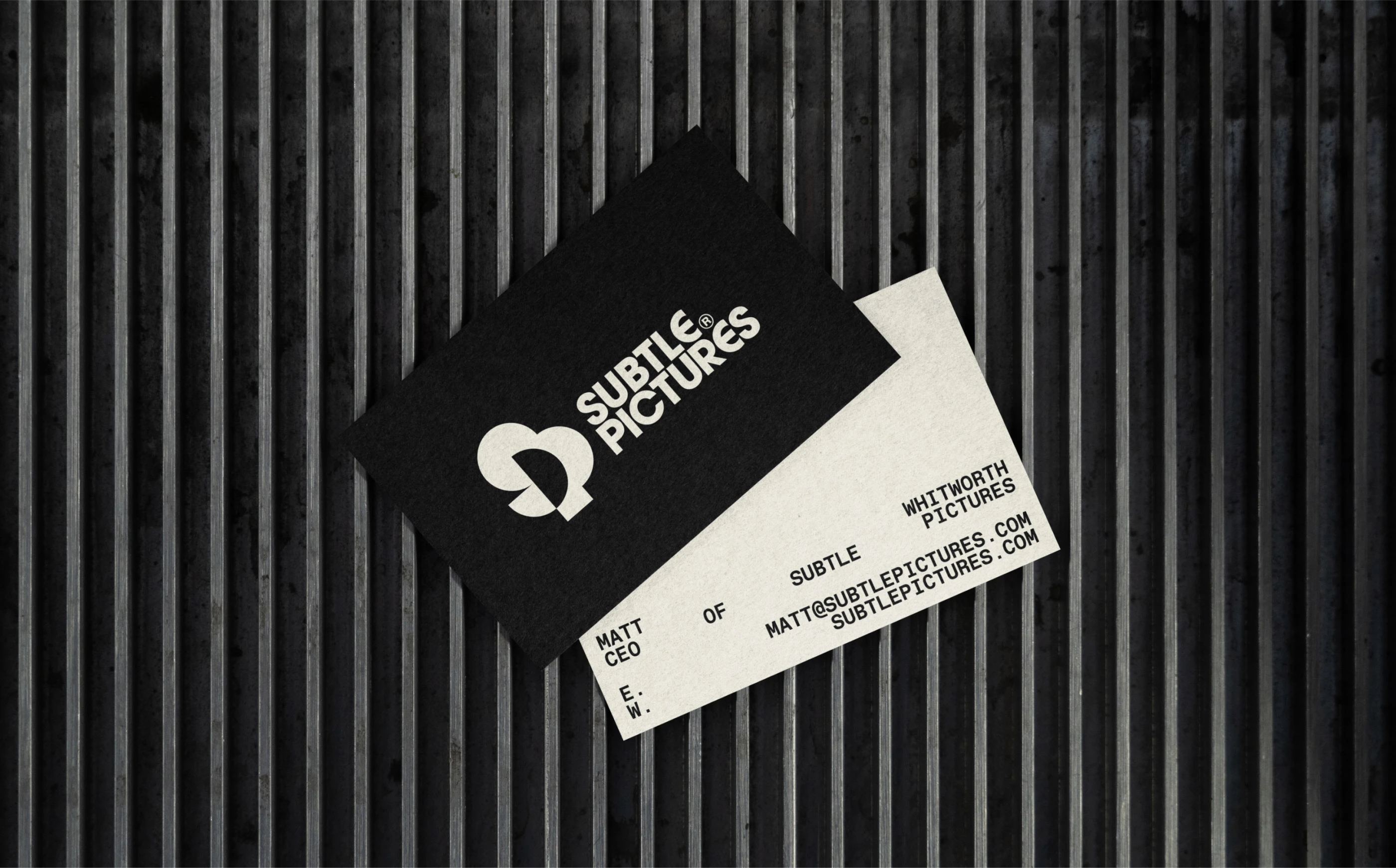
– Business Cards
– Landing Page


Like this project
Posted Aug 7, 2023
Subtle Pictures – Brand Identity design 2023
Likes
31
Views
271

