Designing an Accessible Savings App for the Unbanked
Designing for Accessibility: Empowering the Unbanked
Picture this: You’re in Okene, Kogi State. A middle-aged truck driver is working hard to make ends meet. He dreams of saving for his future or maybe even investing, but he’s unbanked, unfamiliar with technology, and has never used an app in his life. Now, imagine designing a product just for him—something simple, accessible, and empowering.
That was my challenge: to create a savings and investment app for someone like him. A product that works seamlessly for users with limited literacy, minimal tech exposure, and a unique set of needs.
The Problem
Let’s start with the basics:
Our user lives in a rural area, likely facing:
Limited literacy.
Health challenges make complex interfaces daunting.
A lack of familiarity with technology.
And here’s the big question:
How do we design an app that feels effortless for someone like this?
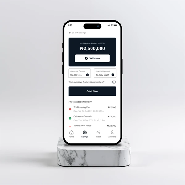
The Approach
Now, here’s where things get interesting. I broke the challenge into three core principles:
Accessibility: Every interaction had to feel natural—no tiny buttons or hard-to-read text.
Clarity: Simplicity was key. I needed a clear, step-by-step flow that anyone could follow.
Focus: Too many options? Forget it. Each screen needed to focus on one thing and do it well.
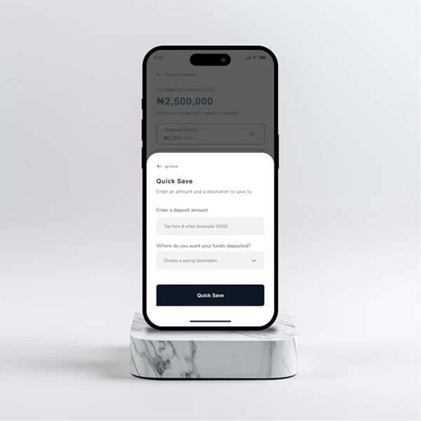
The Solution
Clickable Areas:
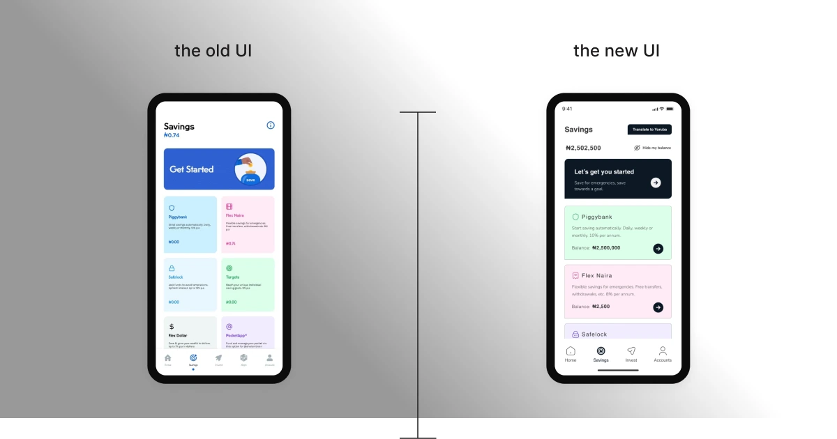
I made all interactive elements—buttons, icons, everything—larger. Why? So they’re easy to find and even easier to click, especially for someone who’s not used to smartphones.
Simplified Screens:
Each screen focused on one action at a time. Whether it’s saving, investing, or reviewing their progress, the app guides the user step by step. No clutter, no distractions.
Typography & Colors:
Fonts were kept large—16px minimum. Colors? High contrast to make everything pop, ensuring users with aging eyesight can easily read and interact.
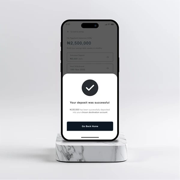
The Results
The outcome? A product that works for the user, not against them.
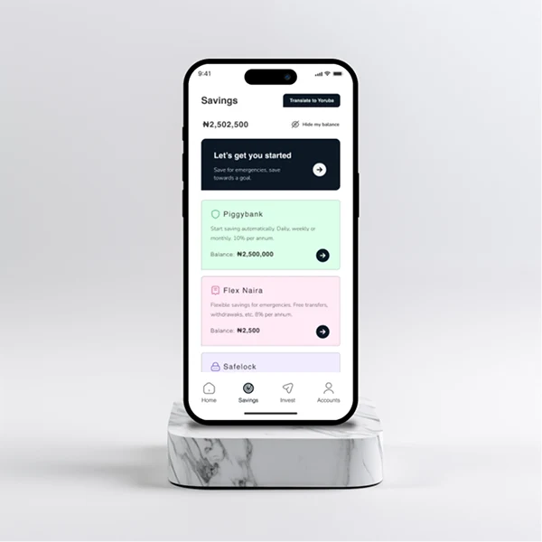
Big, clickable buttons: Easy to navigate, even for a first-time user.
High-contrast colors: Everything’s clear and visible, no squinting required.
Simple screens: Fewer distractions mean more confidence in completing tasks.
This wasn’t just an app—it was a bridge. A way to connect someone in Okene to tools they never thought they could use.
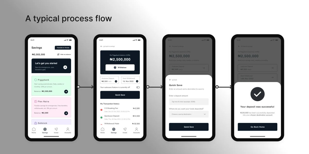
Like this project
Posted Jun 10, 2025
Designed an accessible savings app for unbanked users with limited tech exposure.

