Compleo

Project Brief
Compleo is a revolutionary time management app that harnesses the power of artificial intelligence to help individuals take control of their time. The company aims to empower users to achieve their goals and be more productive by providing personalized productivity solutions. A core belief of the brand is that everyone deserves to have access to effective time management tools and the brand vision is to make time management more accessible.
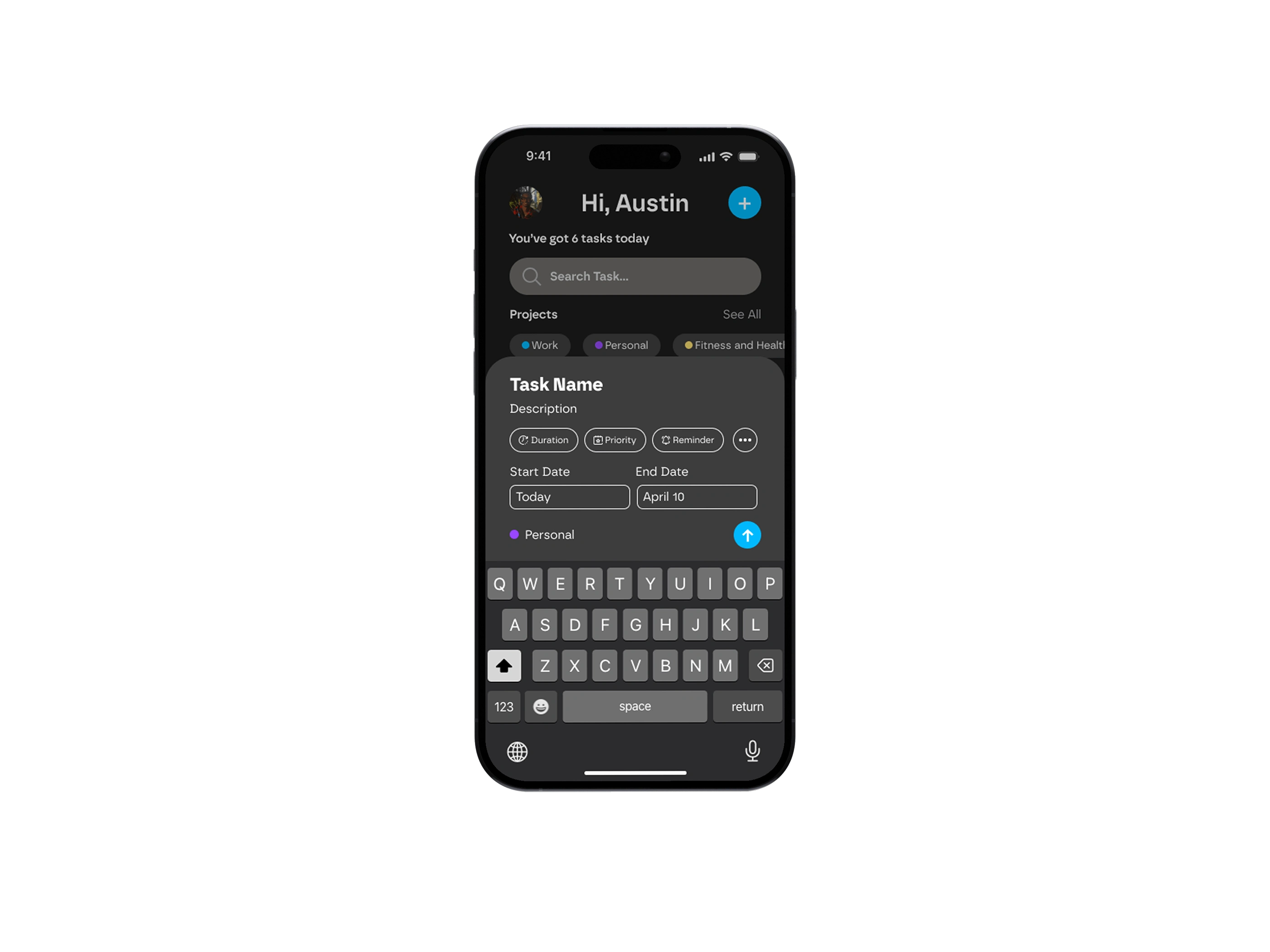
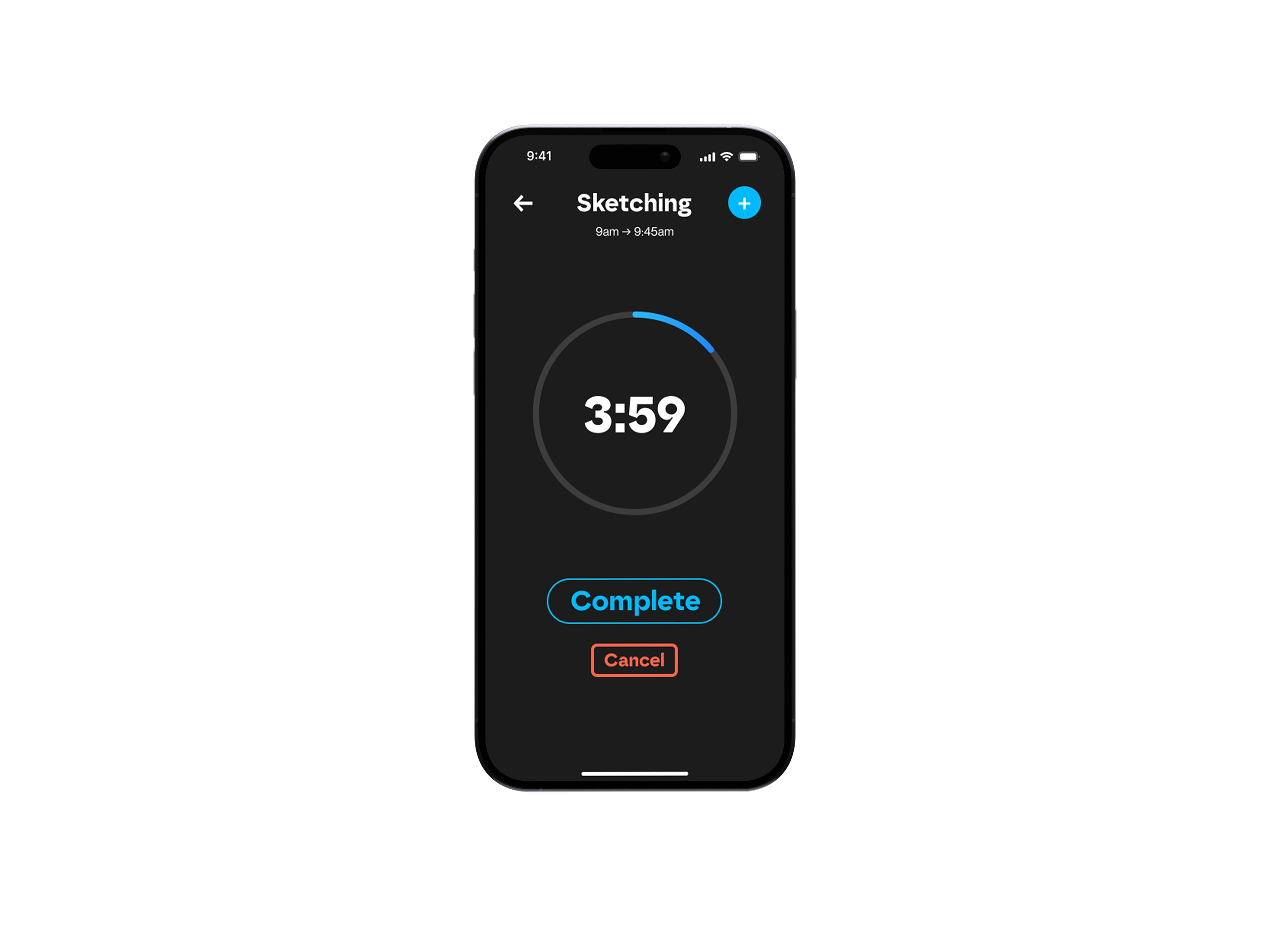
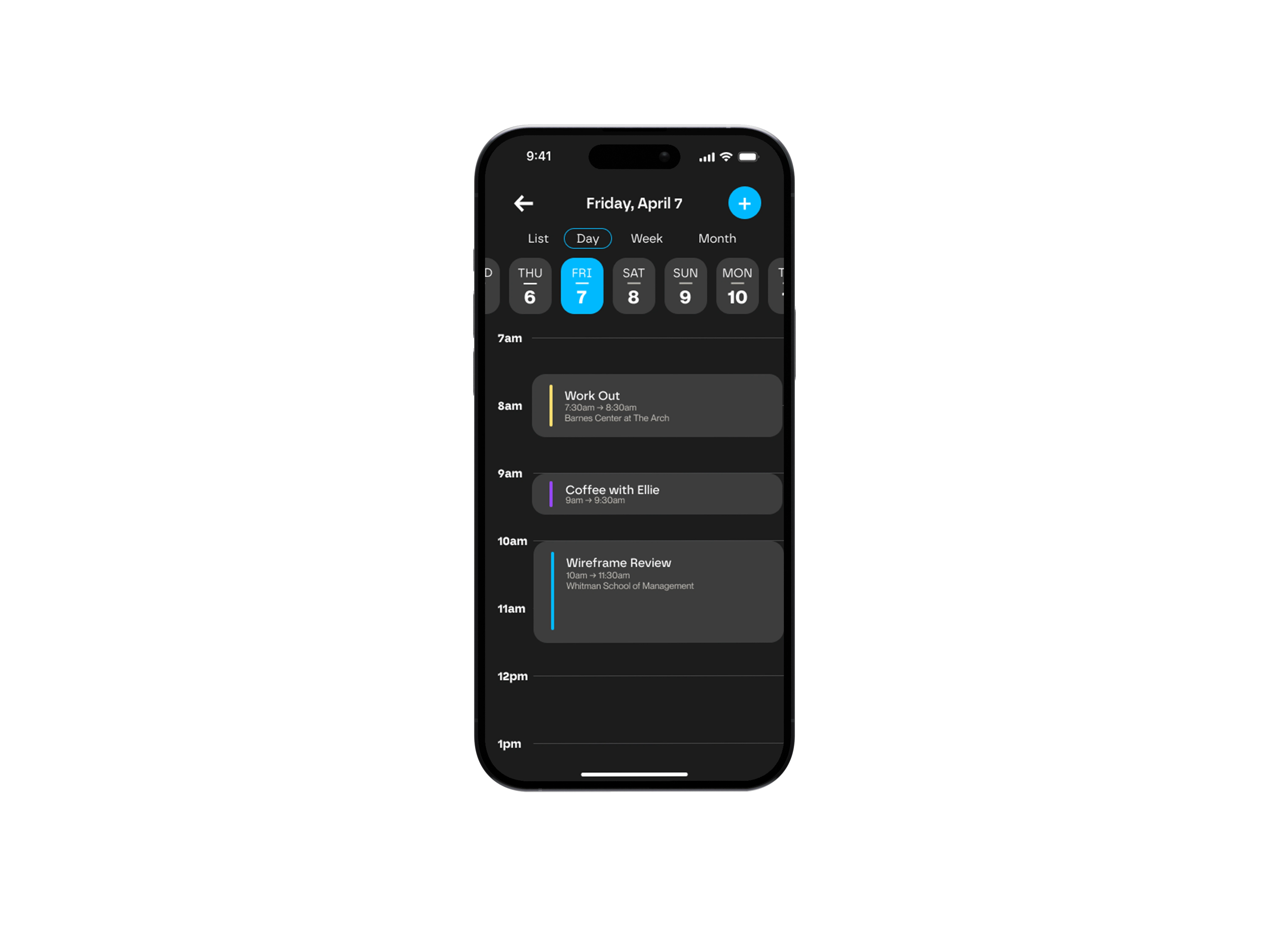
Compleo uses AI and machine learning to curate the perfect schedule for each user based on the Eisenhower Matrix and the Pomodoro Technique. The app incentivizes and motivates users to complete tasks through a points and reward system and creates a personalized weekly time-saved report to show users the positive impact that Compleo has had on their productivity. With Compleo, users can master their day and achieve their goals with ease. The app is the ultimate productivity solution for high-achievers who want to get more work done and make the most of their time.
Problem
According to a study conducted on employees across a wide range of industries in the United States by Timewatch in 2022, about 88% of people reported not having a designated time management system. The majority reported using a convoluted mixture of email inboxes, calendar apps, and to-do lists. Many also reported taking on tasks as they come along or procrastinating until the very last minute to begin them. Within their typical work week, 57% of people reported not feeling in control at least 2 out of 5 work days each week. As a result of this study and primary research conducted, Compleo concludes that there is a need in the market for a user-friendly time management system that is highly collaborative and offers different forms of data visualization.
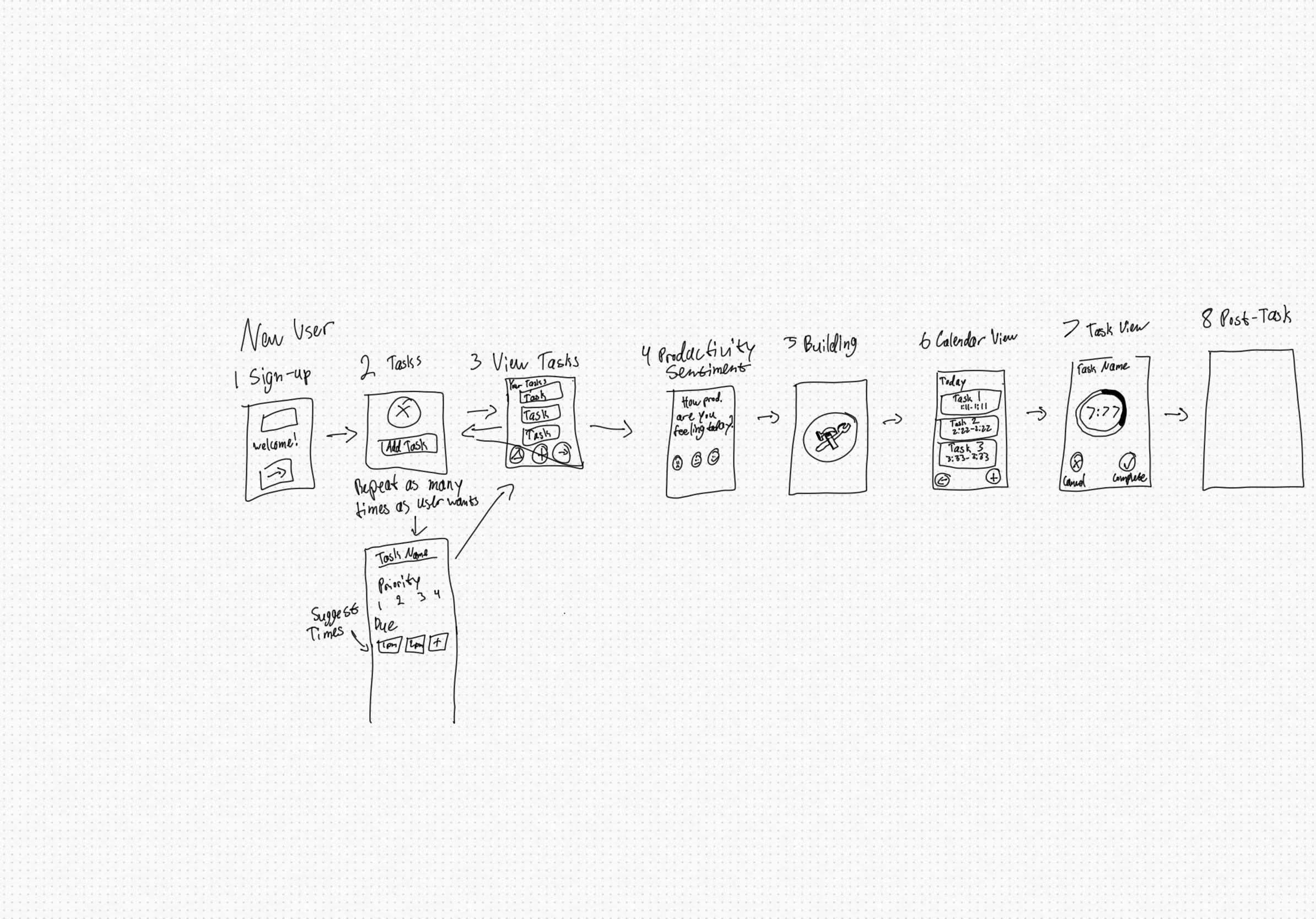
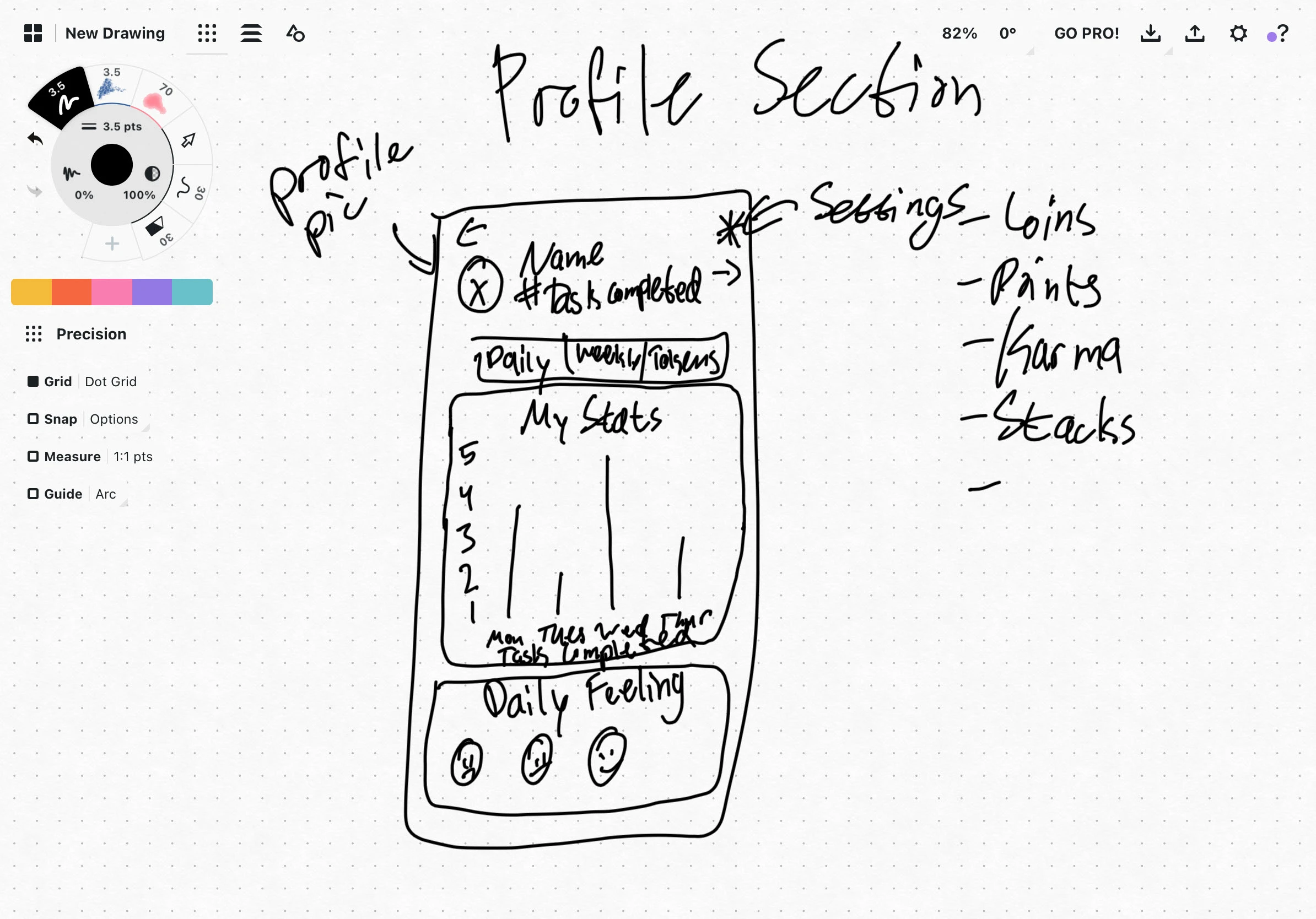
Compleo needed a full branding package along with marketing collateral and a working prototype of their app. Through market research, I was able to develop a user interface that was easy, simple, and frictionless.
Initial Sketches

Design Philosophy
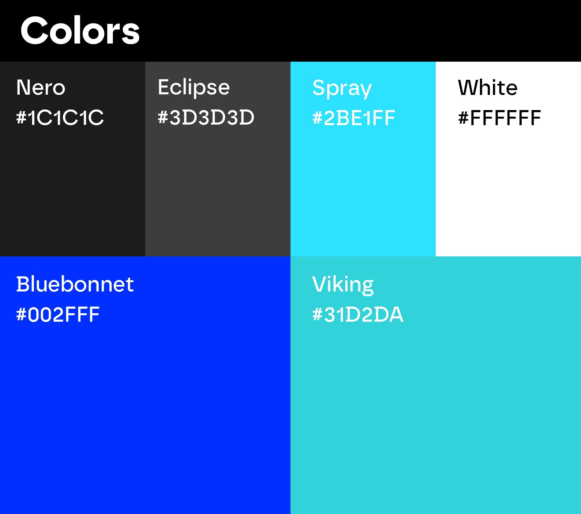
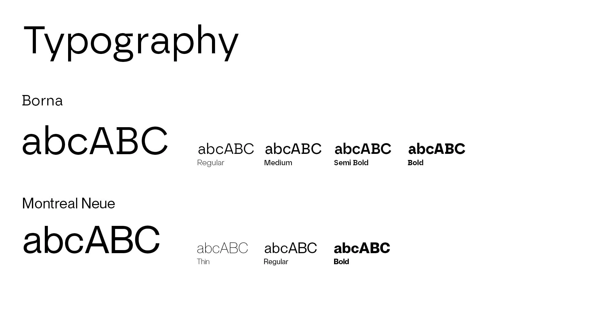
The design of the Compleo app and its branding were created with the goal of being simple, elegant, and easy to use. The app's minimalist approach was intended to promote productivity by allowing users to focus on their tasks without being overwhelmed by unnecessary features or visual clutter. The color palette, featuring shades of blue and green, was chosen to evoke feelings of calmness, balance, and growth. The use of bold typography and modern graphics in the branding aimed to represent the app's contemporary and creative approach to productivity.
Overall, Compleo's design and branding were developed to provide a seamless and visually pleasing experience that reflects the app's core values of modernity, productivity, and creativity.
Prototype
Mockups
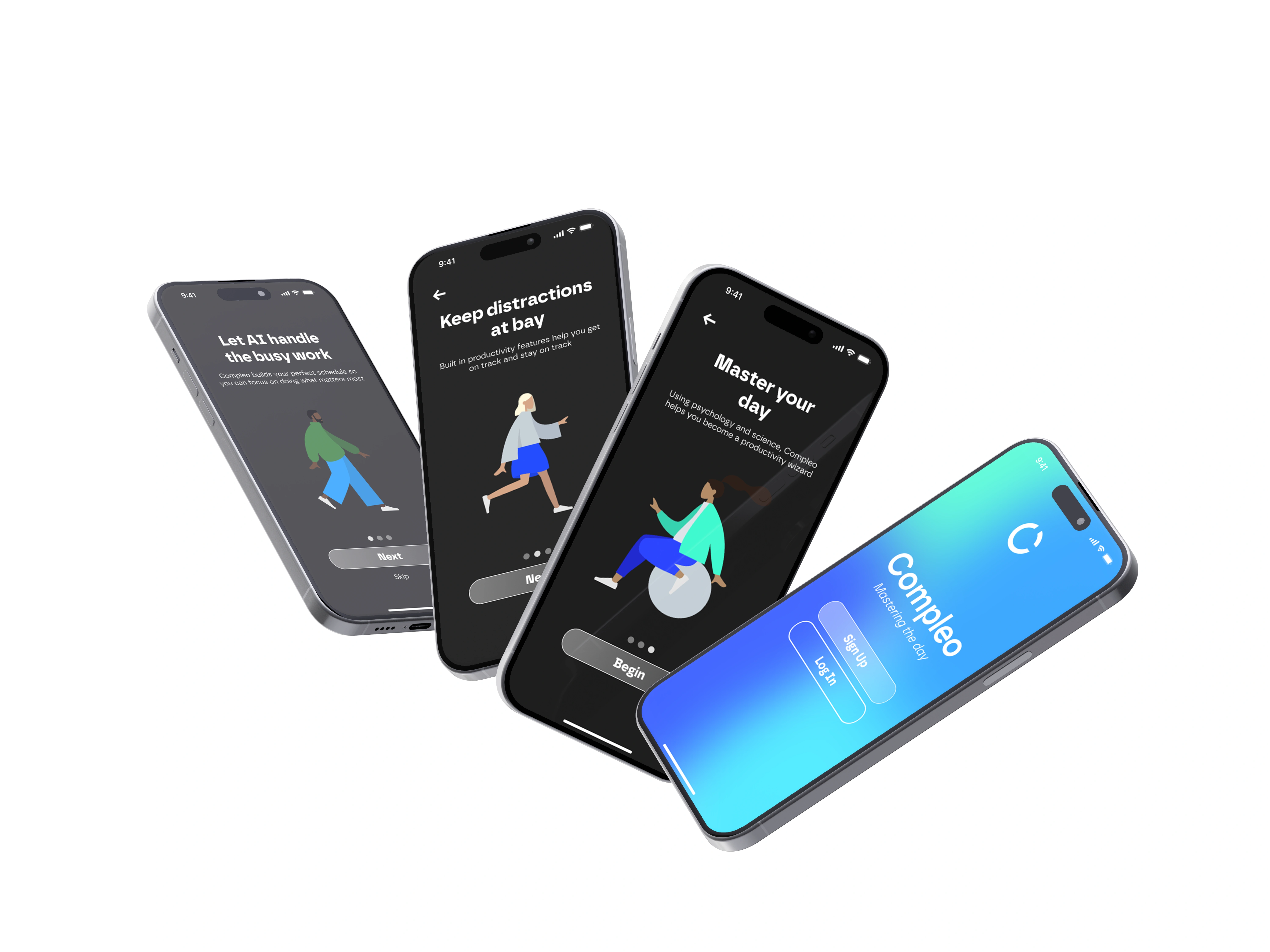
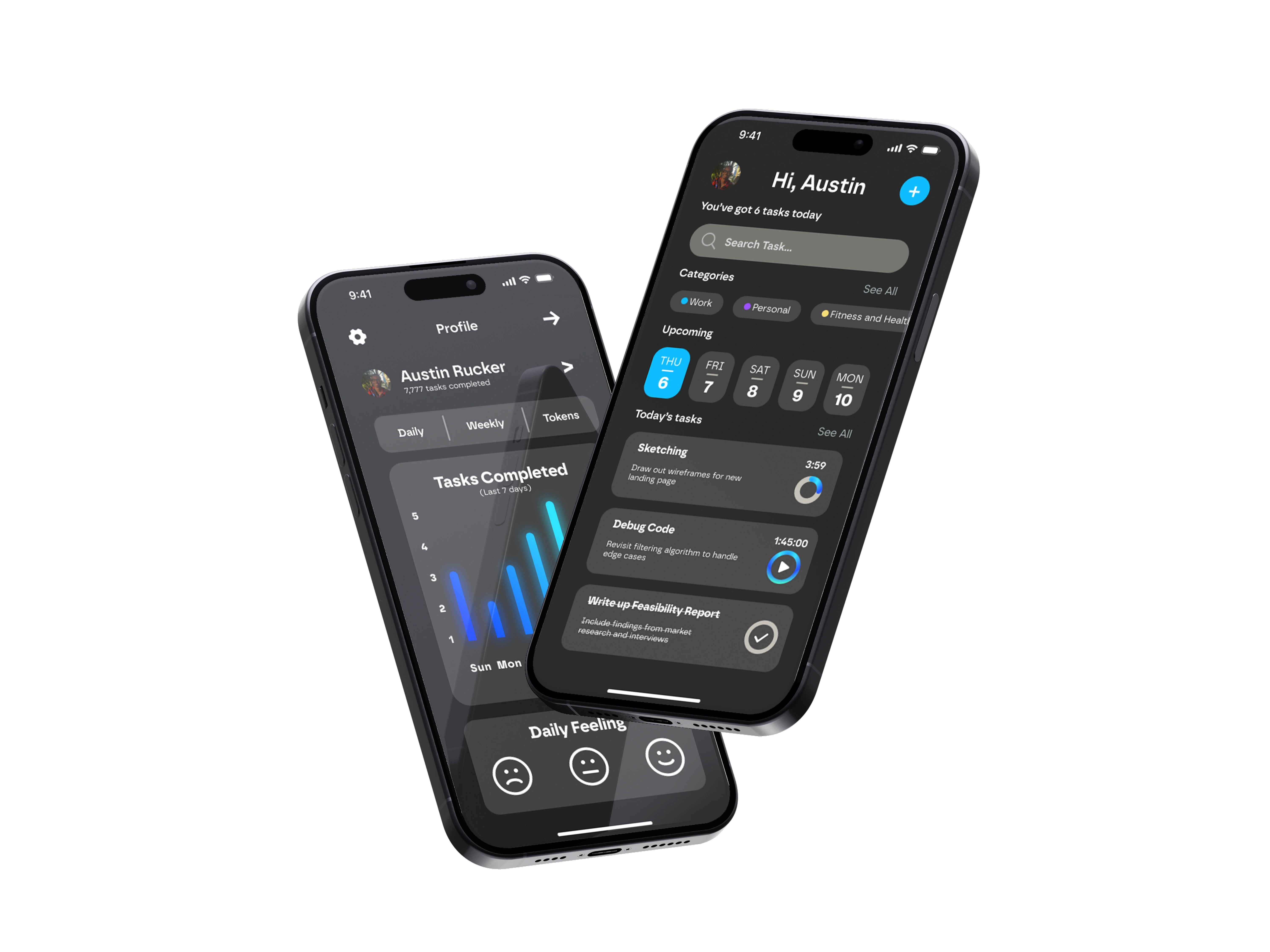
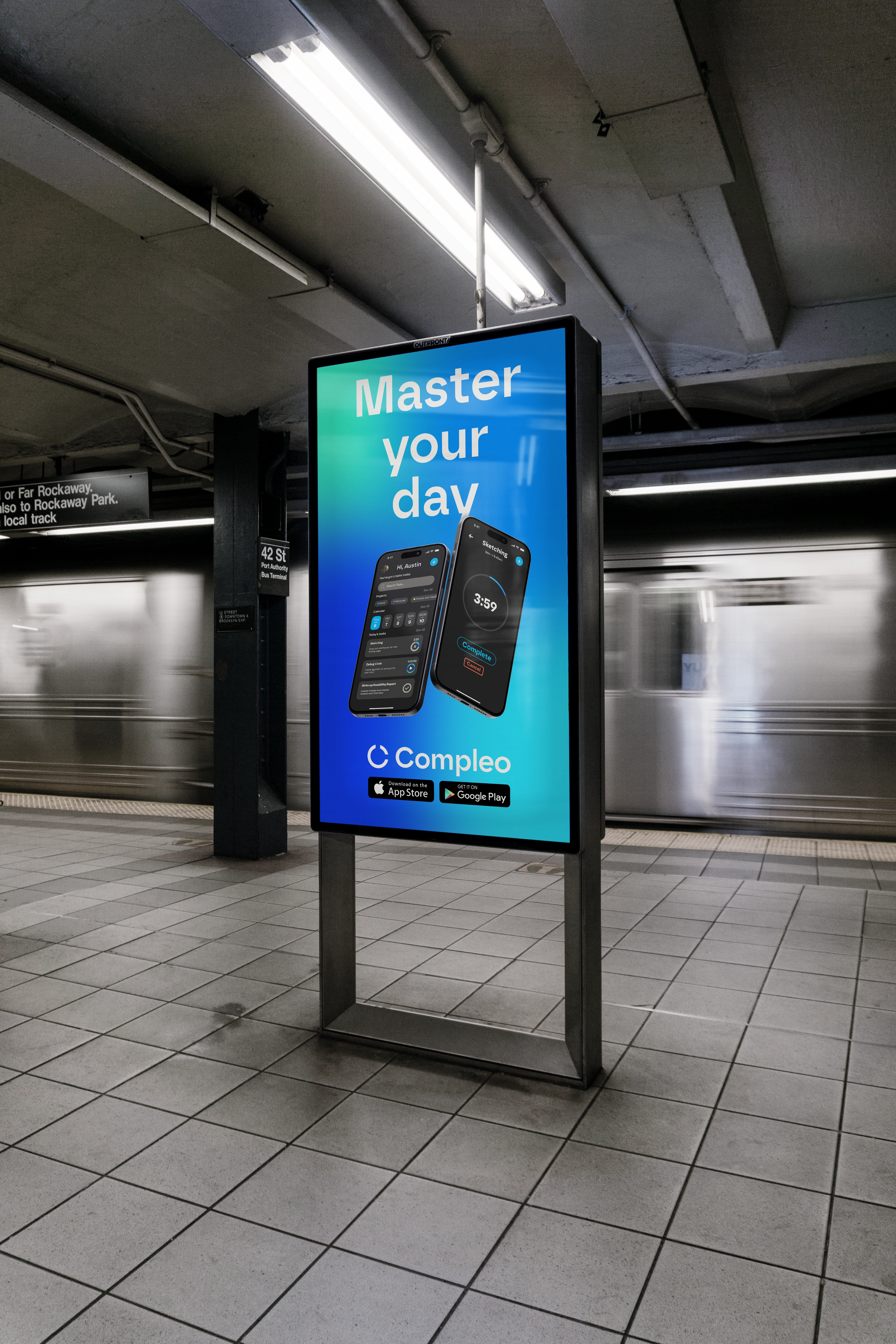
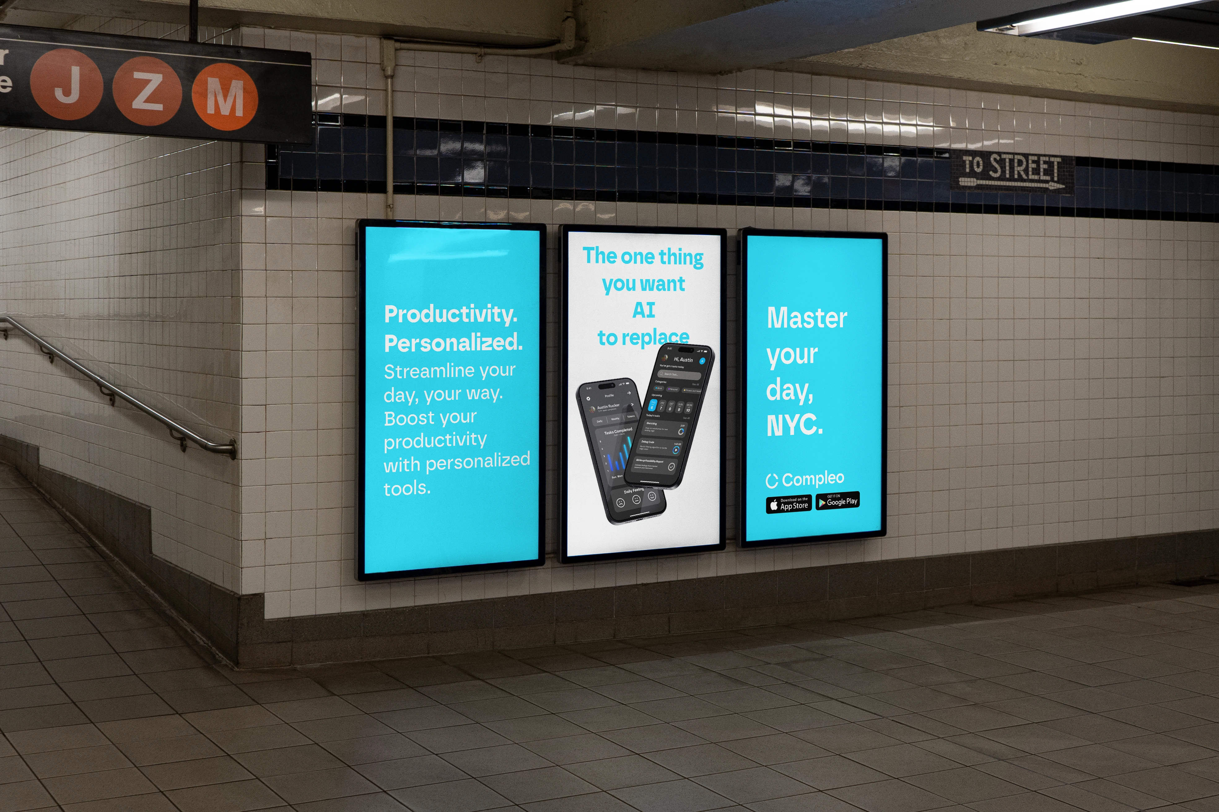
Seeing the app along with its marketing collateral in real-world scenarios breathe a sense of life into the project and make it easy to understand the philosophy behind the product.
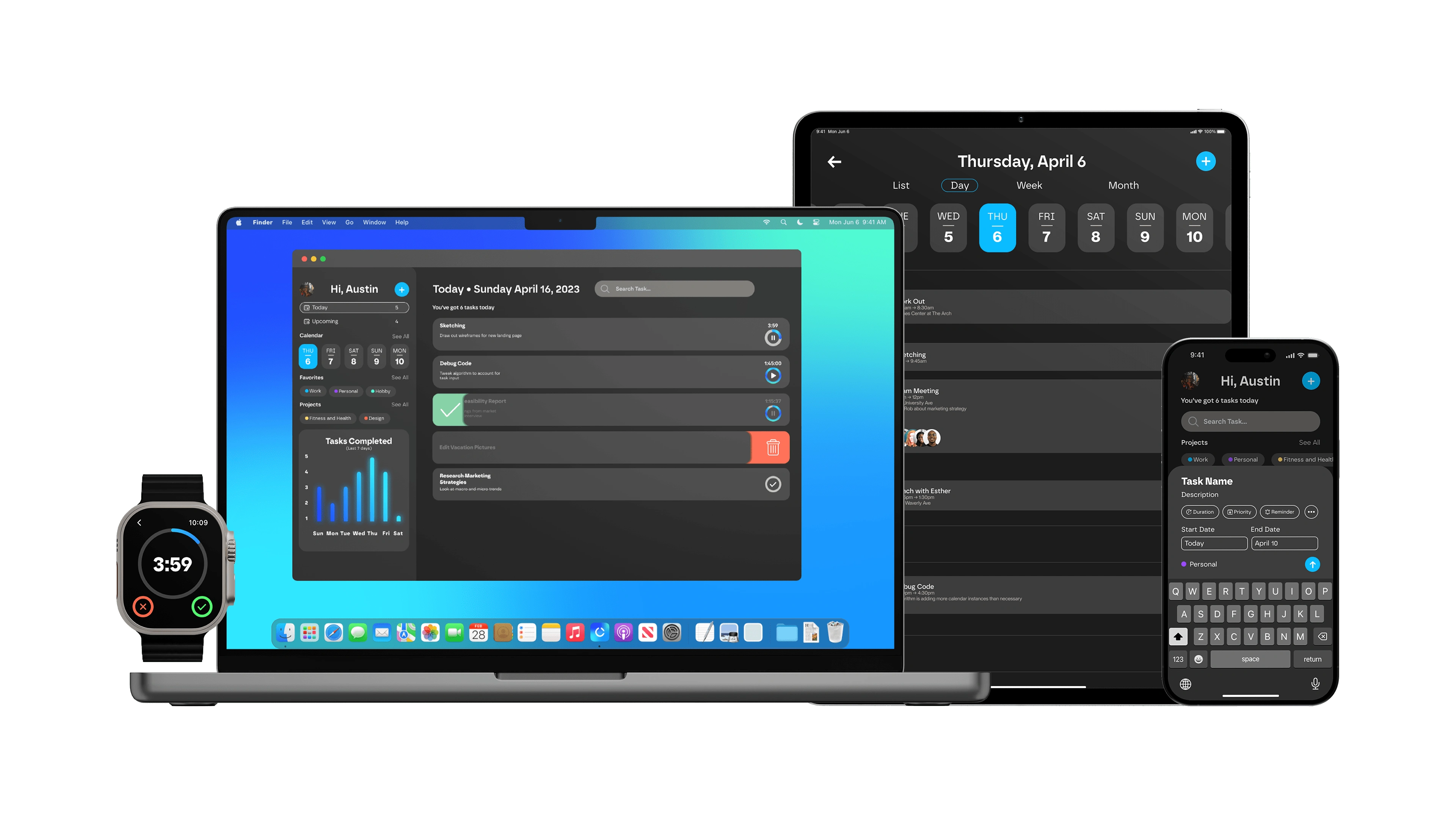
Compleo was designed as a full ecosystem that works across multiple devices meaning that you don't have to worry about where you can be productive.


Like this project
Posted Jan 16, 2024
Master your day


