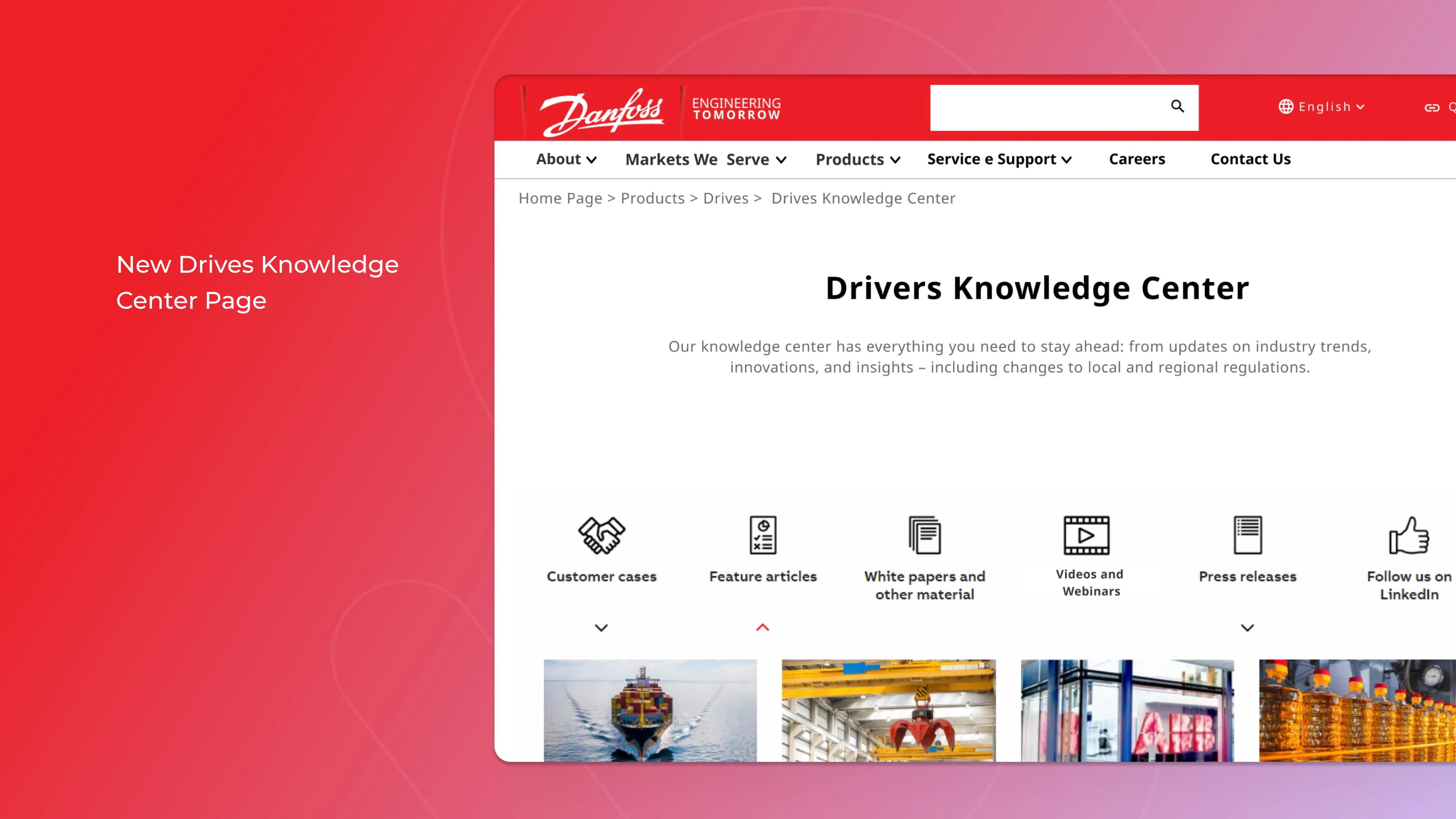
Drivers Knowledge Center Enhancement Project
Crafted a user-friendly design, strategically improving information organization to boost user engagement and enhance findability 🚀
Overview 👀
Over the course of 12 intensive weeks, I embarked on a solo mission, crafting a tailored, user-friendly design in response to Danfoss's specific requirements.
Problem & Solution 🤝
I solved the problem by making the Drivers Knowledge Center page easier to find and more appealing for engineers seeking updates in the field, as well as for internal employees looking to become familiar with new technologies.
Additionally, I enhanced FAQ integration and seamlessly incorporated campaign content from related products through customization.
Requirements:
Streamlined information organization
Creation of a captivating user experience
Enhanced FAQ integration
Process 🛣️
1️⃣ Analysis of the website's information architecture: To gain a deeper insight into page placement, I discovered that the page could be better located and decided to test it using the Card Sorting technique.
2️⃣ Analysis of website metrics: To understand how users arrived at the page and what caught their attention.
3️⃣ Research: Through surveys and user interviews, I gained a better understanding of the site's user profile. This allowed me to prioritize their interests and streamline content access through quick filtering.
4️⃣ Design: I rapidly and practically mapped out ideas without committing to elaborate designs.
5️⃣ Testing: I conducted user testing to ensure that design choices aligned with both user and business objectives.
Solutions 💡
Streamlined information organization 🗂️
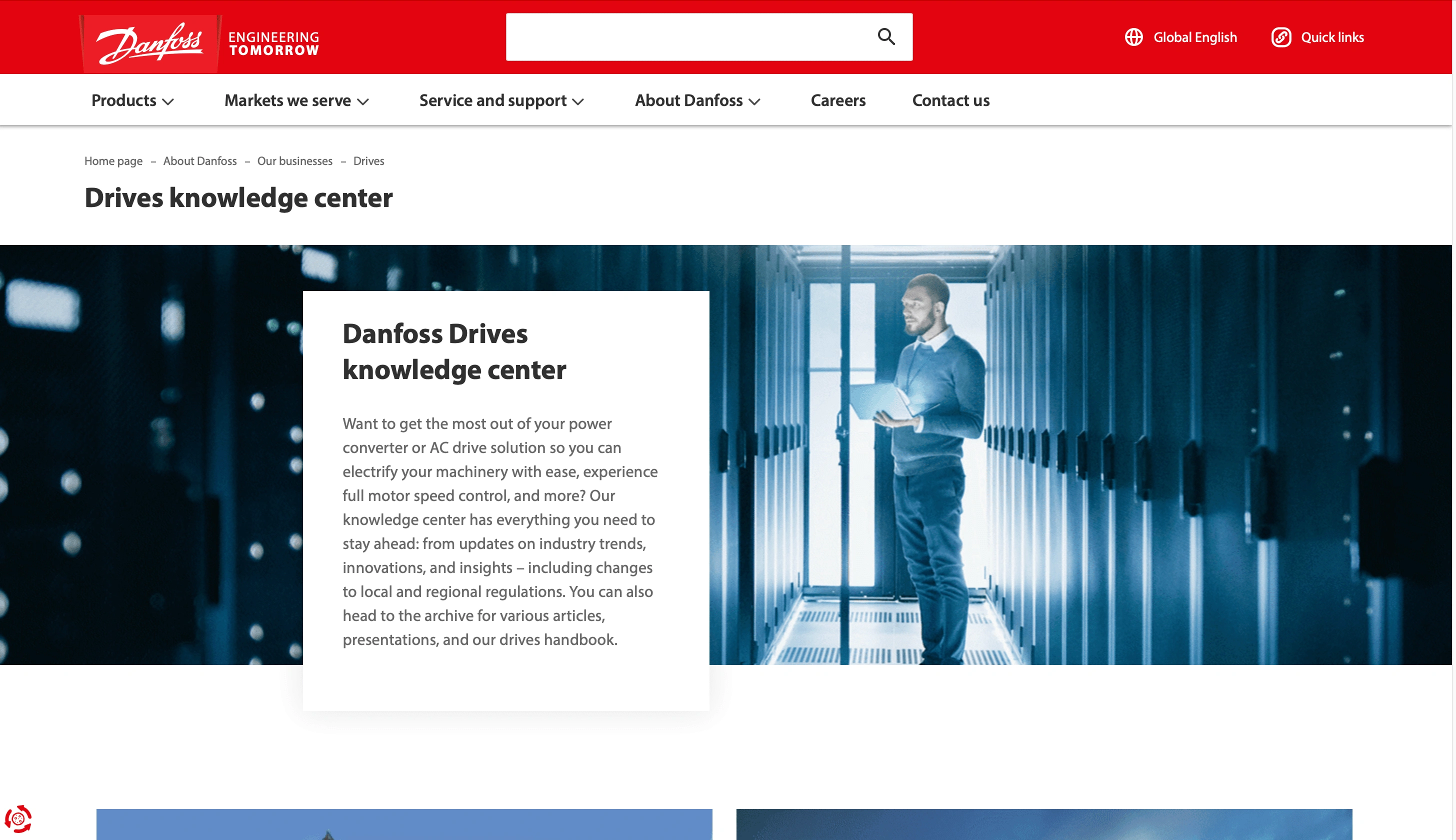
Old Drives Knowledge Center Page
Optimized Image Size and Interactive Content: Reduced large images and introduced more interactive content at the top of the page, addressing user behavior where many users didn't scroll beyond the header and often abandoned the site.
Navigation Bar Reorganization: Enhanced navigation bar and relocating the Knowledge Center page from "Our Businesses" to the product-specific "Driver" page, making it more intuitive for users seeking familiar information.
Icon Implementation for Enhanced Visual Appeal: Introduced icons to make the screen more visually appealing, ensuring quicker page loading and promoting sustainability through reduced energy consumption—goals in alignment with the product's values.
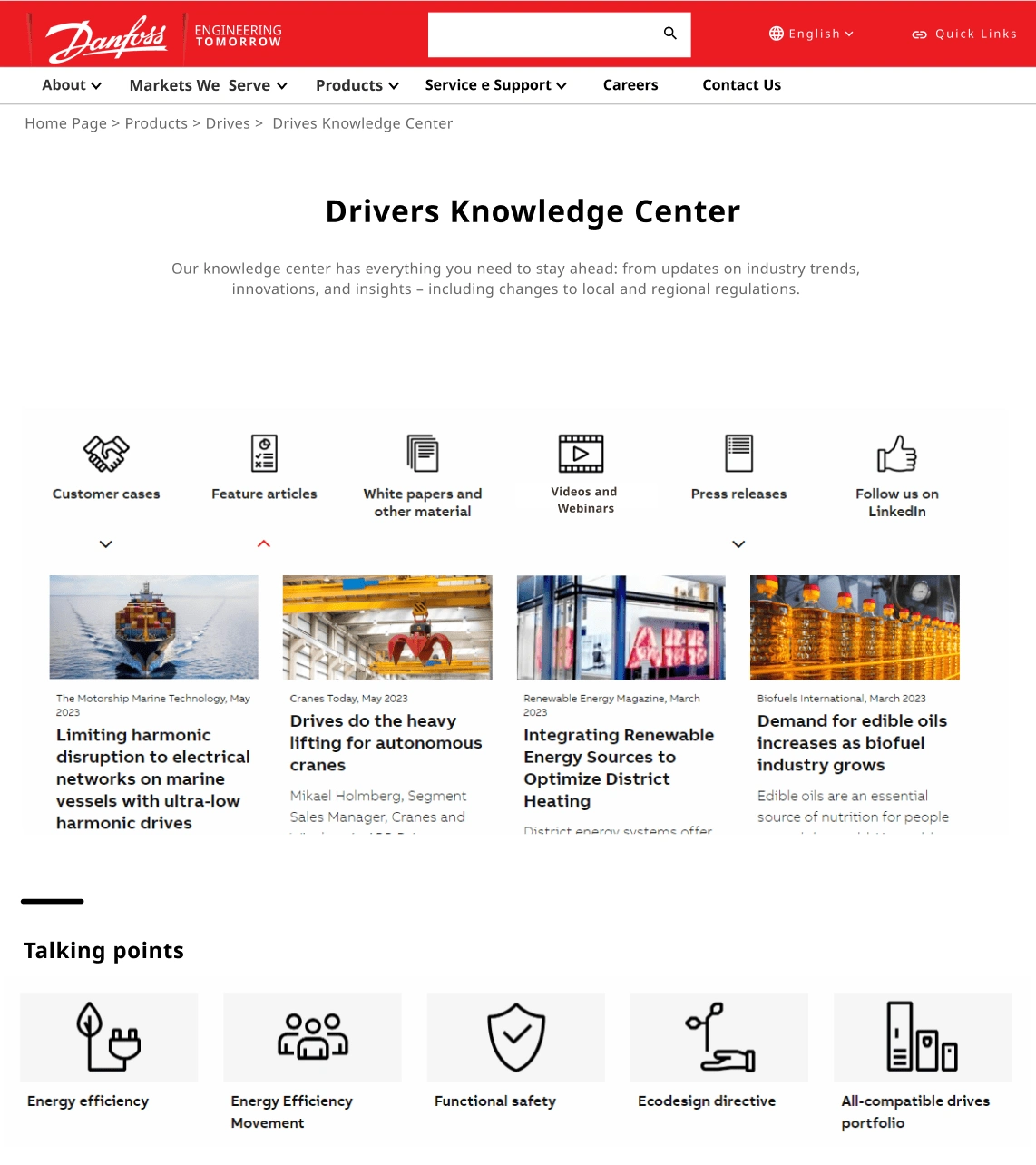
New Drives Knowledge Center Page
Enhanced FAQ integration ❓
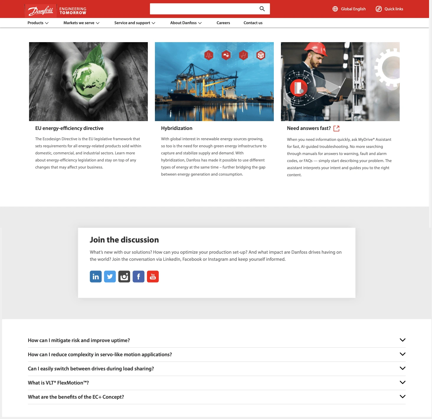
Old Botton Page
Consolidated Help Resources: Created a unified tool, the "Help Center," to centralize all inquiries and additional support resources for engineers and employees, improving user accessibility and avoiding duplicities.
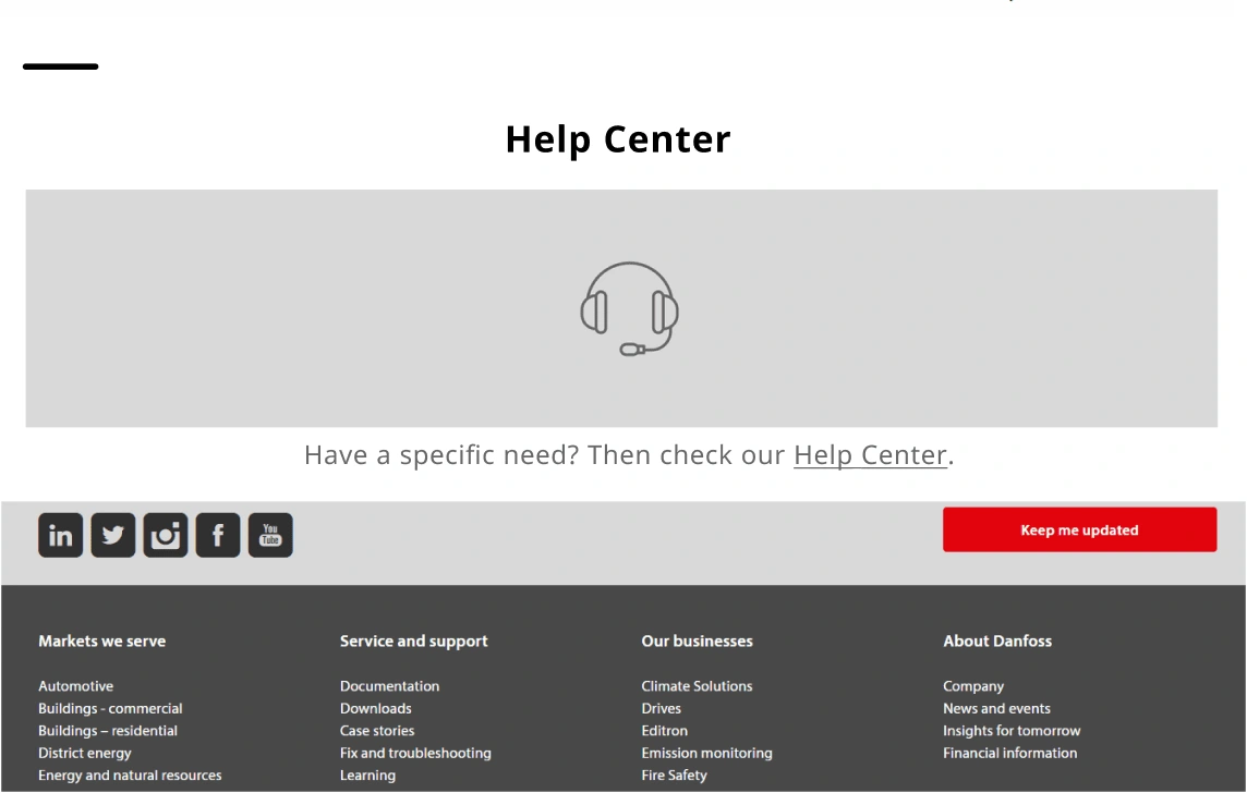
New Help Center
Takeaways 🤓
Consider wireframes carefully, as making design alterations in the later stages can be challenging.
Emphasize that aesthetics should always be accompanied by utility and usability to serve a meaningful purpose.
Encourage users to provide additional information at the end of research sessions to gather valuable feedback.
Conduct periodic design testing at various stages to improve outcomes and reduce biases.
Recognize the importance of sustainability in visual design, aligning with the company's values and business objectives for consistency.
Check out the project in the video below 🎥
Like this project
Posted Sep 14, 2023
The solution not only boosted engagement but also facilitated easy navigation for Danfoss company users 🌟


